Data Tables Overview
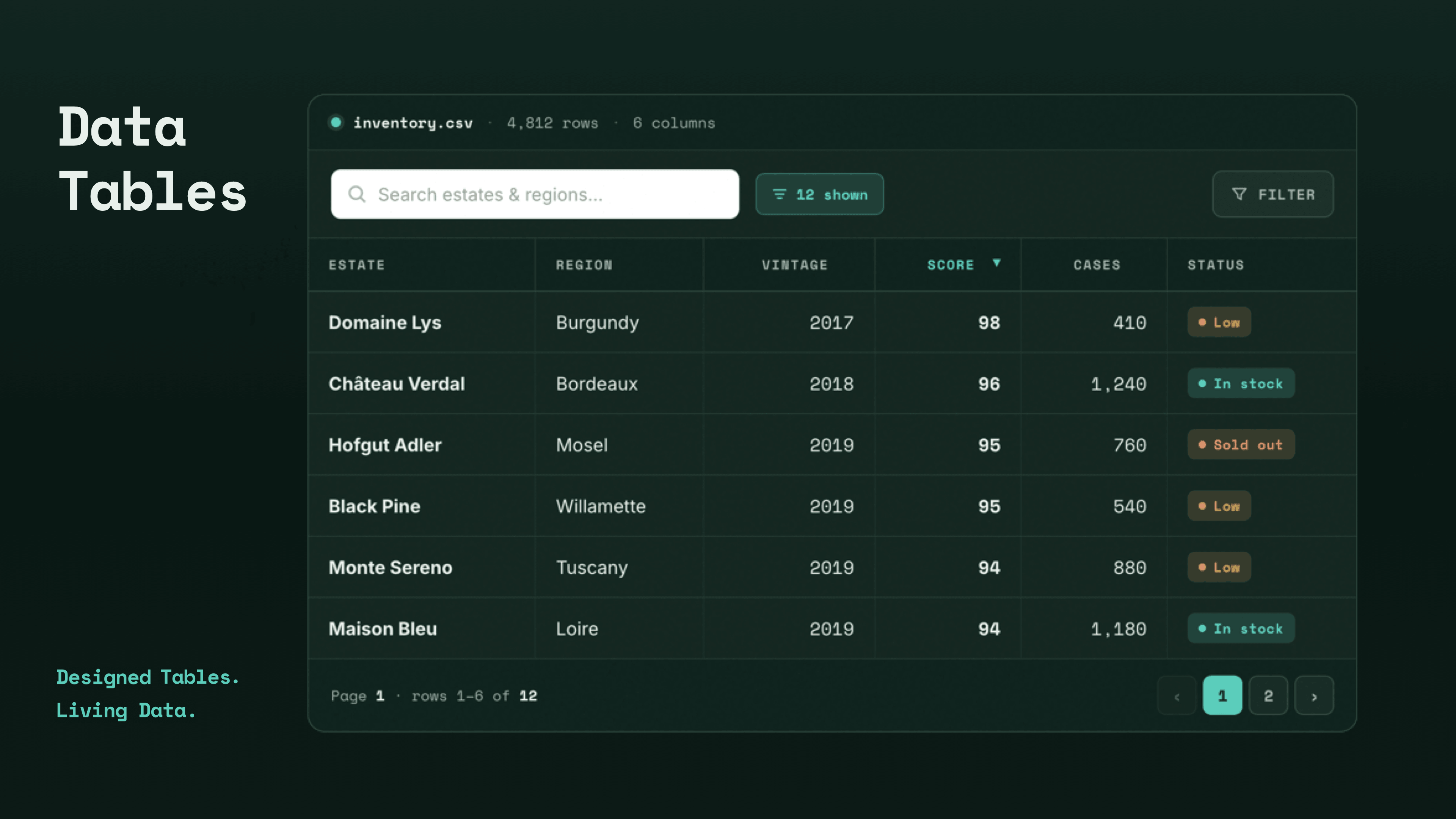
Data Tables extend the native Table Element with search, sorting, pagination, an entries menu, column filtering, and an optional AJAX mode powered by Loopers — all without a third-party library.
Product
Data Tables is a Max product that adds a Data Table Element to the Cornerstone Builder. It is built directly on top of Cornerstone's native Table Element inheriting all of its Table, Row, and Cell styling then layers interactive behavior on top: live search, click-to-sort ordering, pagination with an entries-per-page menu, a "showing X to Y of Z" info summary, a per-column filter dropdown, and an optional responsive card layout. None of this relies on a third-party JavaScript library; every feature is wired up natively so it stays fast and fully customizable inside Cornerstone.
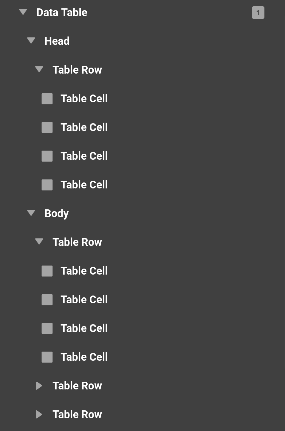
Because a Data Table is a Table under the hood, you build its content exactly the way you build any table — with Table Section, Table Row, and Table Cell Child Elements — and each cell can hold any Element you like. Pair that with a Looper and you can generate an entire sortable, searchable, paginated table from a query.
Access
Once purchased, go to the Max section of the validation page and follow the prompts to install and activate. Data Tables requires Cornerstone 7.9+.
The Data Table Element Group
Installing the product adds a Data Table element group to the builder containing two Elements:
- Data Table – The main Element. It renders a real HTML
<table>(identical markup to the native Table Element) wrapped in a.cs-datatablecontainer that also holds the search box, header/footer bars, and pagination. - Loading Area – An optional overlay child, covered below.
Building Your First Data Table
Drag a Data Table onto the canvas. Like the native Table Element, it starts by scaffolding a Table Section (tbody) so you have a structure to fill. From there you build the table the normal way:
- Add a Table Section with its tag set to
theadfor your header row. - Inside each Table Row, add Table Cells. Use the
thtag for header cells andtdfor data cells. - Drop any content — text, images, buttons — into each cell.
For a full breakdown of the Section / Row / Cell controls, see the Table Element doc, since the Data Table inherits all of them. The controls unique to Data Tables are described below.
Client Mode vs. AJAX Mode
Data Tables can operate in one of two modes, and understanding the difference is key to using them well:
- Client Mode (default) – Every row is rendered to the page up front, and searching, sorting, and pagination all happen in the browser against those rendered rows. This is perfect for static content or a Looper that outputs a reasonable number of rows.
- AJAX Mode – Only one page of rows is rendered by the server (from a Looper), and the table fetches additional pages, search results, and re-sorts from the server without a full page reload. This is what you want for large datasets where rendering every row at once would be slow. AJAX mode is deeply tied to Dynamic Content — see the Data Tables Dynamic Content doc for the full picture.
You switch modes with the Enable AJAX toggle in the Setup section.
Setup
The Setup control section holds the feature toggles that turn each piece of table interactivity on or off:
- Enable Search – Show a search input that filters the table.
- Enable Pagination – Break the rows into pages with page buttons.
- Enable Ordering – Let visitors click a header to sort by that column.
- Enable Info – Show the "Showing 1 to N of N entries" summary.
- Enable Filter – Show a Filter button that drops down per-column value checkboxes.
- Enable Entries Menu – Show the "Show X entries" page-size menu (only when pagination is on).
- Previous / Next Buttons – Show the prev/next arrows around the pagination (only when pagination is on).
- Enable AJAX – Switch to server-side pagination (see above).
- Page Length – The number of rows per page (5–100).
Features
Each feature has its own dedicated control section for both behavior and styling.
Search
A search box that filters the visible rows as the visitor types. You can set the placeholder text, position it left or right, toggle a leading search icon, and fully style the input. In AJAX mode the search term is sent to the server so the query itself is re-run.
Ordering
When ordering is enabled, each header cell becomes clickable to sort that column. A sort icon is added to sortable headers automatically (you can pick the icon and its default/active colors). In Client Mode, columns sort by the cell's visible text — or by an underlying value if you set the cell's Table Data field (see Dynamic Content). In AJAX Mode, a header only sorts if you give it an Order Column value naming the query field to sort by.
Pagination & Entries
The Pagination section styles the page buttons across their default, current, hover, and disabled states. The Entries section styles the "Show X entries" page-size menu, which lets the visitor change how many rows appear per page at runtime (10 / 25 / 50 / 100, plus your configured Page Length).
Info
The Info summary reads "Showing START to END of TOTAL entries." The _START_, _END_, _TOTAL_, and _MAX_ tokens are substituted at runtime, and you can fully rewrite the text — including a separate empty string and a filtered string ("filtered from MAX total entries"). The summary can live in the footer (default) or be moved up into the header bar, and it supports an optional leading icon.
Filter
Enabling the filter adds a Filter button to the header that opens a dropdown panel. In Client Mode the panel lists the distinct values of the columns you choose (via the column picker) as checkboxes, letting visitors narrow the table to matching rows. In AJAX Mode the panel collapses to a single text search that drives the same server query as the search box. The button and panel are fully styleable, and the panel is rendered outside the table wrapper so it can't be clipped by the table's scroll area.
Card Layout
Because Data Tables inherit the native Table Element, they also inherit its Card Layout mode, which restacks each cell into its own spaced-out row — a compact, mobile-friendly presentation where each cell can show its column header as a label. See the Table Element doc for details.
Layout & Styling Sections
Beyond behavior, the Data Table exposes several styling sections:
- Table – The full inherited native Table styling (table layout, borders, row colors, cell defaults, and so on).
- Size – Dimensions of the outer
.cs-datatablewrapper. - Table Container – A separate wrapper around just the
<table>that can be sized and scrolled independently. Set a max height and overflow here to make the table body scroll while the header, search, and pagination stay put. This is also where you enable scrolling needed for Infinite Scroll in AJAX mode. - Design – Background, margin, padding, border, and box-shadow for the wrapper.
- Header / Footer – The bars above and below the table that hold the search, entries menu, info, and pagination. The header bar can be given full flexbox control.
Loading Area
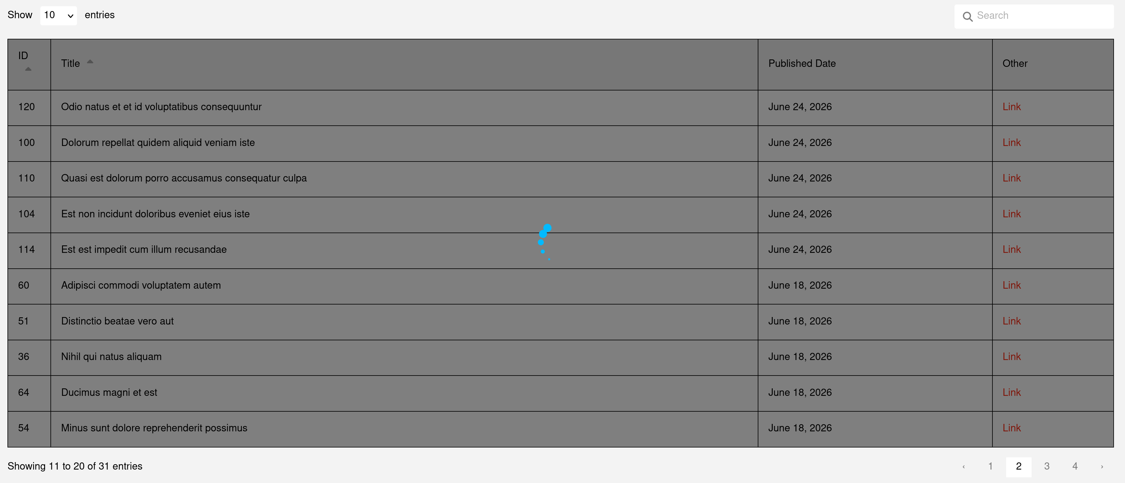
The Loading Area is an optional child Element you can drop inside a Data Table. It ships pre-configured as an absolutely-positioned, centered, dimmed overlay containing a looping Lottie spinner — the same prefab used by Cornerstone Forms. Because a <div> can't legally live inside a <table>, the Data Table automatically lifts the Loading Area out and renders it as a sibling overlay of the table.
On the front end it stays hidden until an AJAX request (search, sort, or paginate) is in flight, then reveals itself for the duration of the request. Since it's built on the Div Element, you get the full Div inspector to restyle it, plus a Show in Preview toggle so you can reveal and style the overlay in the builder.
Next Steps
- Data Tables Dynamic Content — The special Dynamic Content that powers AJAX mode and dynamic, Looper-driven tables.
- Table Element — The native Table, Section, Row, and Cell controls the Data Table is built on.
- Loopers — Generate table rows dynamically from a query.
See something inaccurate? Let us know