Layout and Design
In this article, we're going to explain how to set the general layout and design of your website in X and Pro.
Layout Settings
The important settings available in this section will determine the overall layout and design of your website.
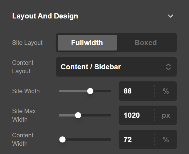
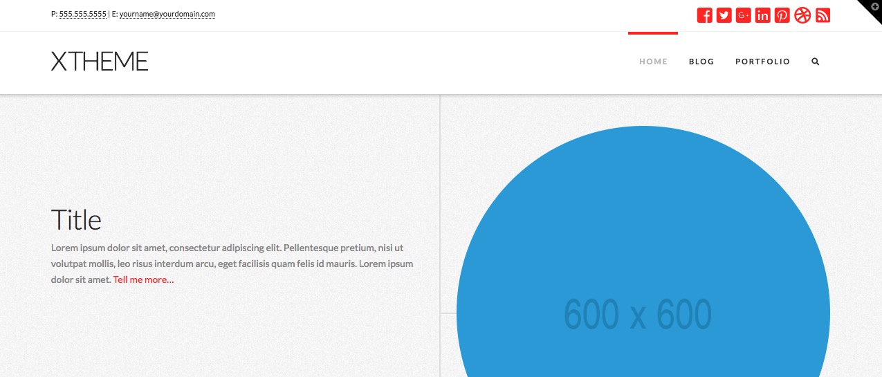
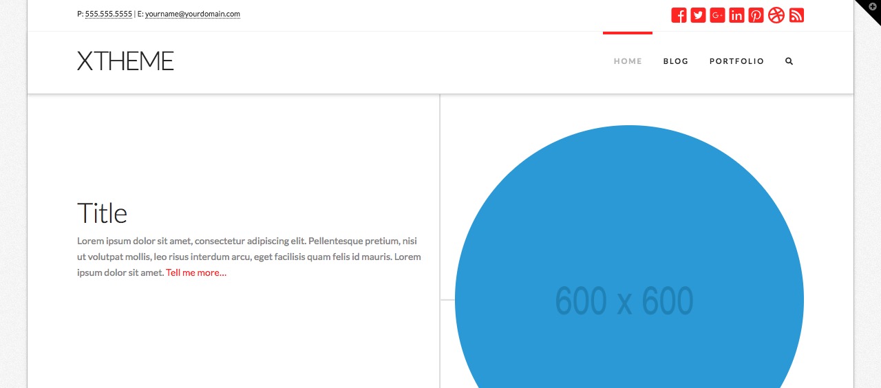
- Site Layout: If you select Fullwidth, the website will have a fullwidth layout where the content goes to the very edges of the browser window. If the Boxed option is selected, the content will be limited to a frame which separates the content from the very edges of the browser window.
- Site Max Width (px): Use this option to determine the maximum width of the content area. The content may get smaller if you have a smaller device, but whatever you set here is the maximum threshold of the website width. This option is output in pixels. If you use the slider to set the maximum width you can not go beyond
1500px, which is recommended. However, if you want to have a bigger number you need to directly type the number in the text box. - Site Width (%): This option is the percentage of the screen your site should take up.
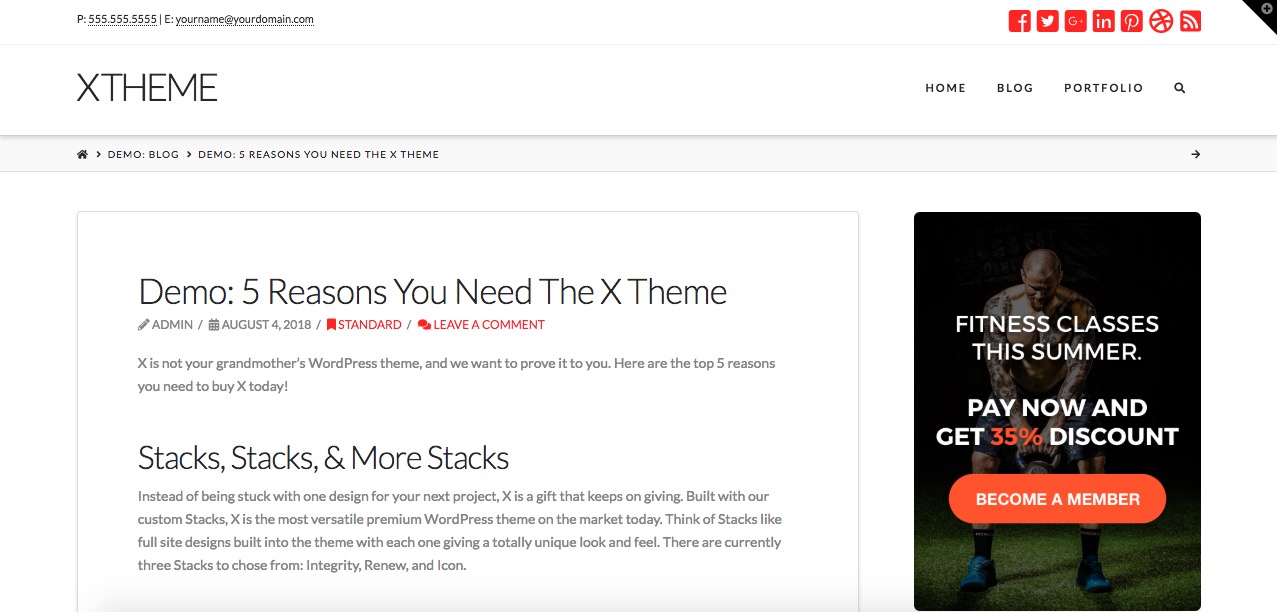
- Content Layout: You can have 3 layout options for the content of your website, Content Left - Sidebar Right, Content Right - Sidebar Left, and Fullwidth, which determines if you want to have a sidebar for your website or not.
- Content Width (%): This is a percentage based option which shows how much width the main content should have. The rest of the width will be occupied by the sidebar if one is present.
Fullwidth View:
Boxed View:
Content width Sidebar:
Background Settings
The background section settings contain options to add a background to the whole website. There are different options to set the background as you wish.
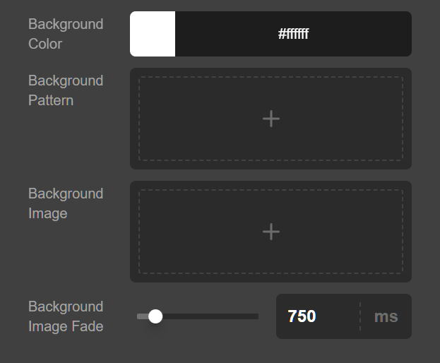
- Background Color: Use this option to add a solid background color to your website.
- Background Pattern: Use this option to upload or select an image from the media modal of the WordPress to act as a background pattern. This image will repeat horizontally and vertically across the background of the website.
- Background Image: Use this option to upload or select an image from the media modal of the WordPress to act as a background image. The image selected will cover the background.
- Background Image Fade (ms): Use this option to add how much it will take to show the background of the website with a fade in effect. The value is in milliseconds. If you do not want a fade in effect for the background, simply set this option to 0.
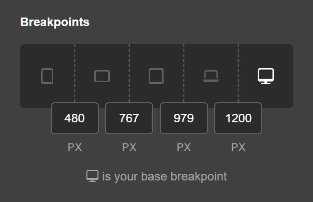
Breakpoints
The Base Breakpoint is part of the Responsive Styling. You can learn about the Base Breakpoint in our Responsive Styling documentation.
Summary
And that's it! Now you know how to configure a full-width vs. boxed layout and make adjustments to the global presentation of your content.
See something inaccurate? Let us know