Pagination
In this article, we're going to introduce to you the Pagination Elements and we'll explain to you what they are used for.
Pagination is utilized in many different ways across websites whenever we need to break up content into more manageable chunks. Typical pagination styling will often look something like the following example:
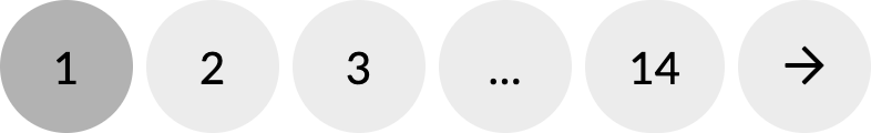
When we talk about presenting more manageable chunks of content, imagine you had a blog with thousands of posts—it would be very overwhelming to the user (both visually and for performance) to display all of this content at once. Instead, paginating this content would involve selecting a specific number of posts to show at any given time when a user comes to your blog index.
Setup
The Setup control group of the Pagination Element is where you will begin with some basic presentational aspects of your output:

While most of the controls in this group are fairly straightforward (i.e. Base Font Size, Width, et cetera), controls of specific note include:
- Breakpoint to Hide # – The breakpoint chosen here is when the numbered output of your Pagination Element (including dots) will disappear. This is important to set based on how you want things to behave responsively. For example, if you only have a few pages of posts you might be able to select the SM option and have them hide much later than a blog with thousands of posts. Alternately, if you wish to permanently hide the numbers at all breakpoints you can select the XL breakpoint to just display the previous / next buttons. Finally, if you deselect this control completely you will keep your numbers visible at all breakpoints, which may be desirable for certain patterns.
- End & Mid # Count – These inputs allow you to specify how many pagination numbers should appear for certain parts of your output. The End Count is how many numbers should appear in between the dots and the previous / next buttons. The Mid Count is how many numbers should appear on either side of the “current” item.
- Justify – Horizontally orients the numbers in the Pagination Element using flexbox justification. Experiment with different values to see which option works best for your desired output.
Items Setup
The Items Setup control group contains some helpful controls to manipulate the output of each individual item (e.g. numbers, dots, previous / next) inside your Pagination Element.

- Prev / Next Type – Choose between Icon or Text based on the kind of output you would like to have for these links. For example, selecting Text would present you with the following inputs and output:
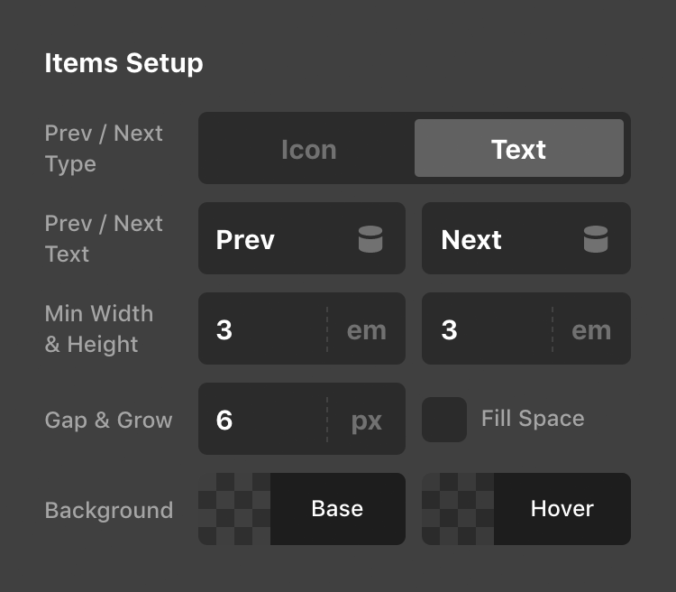

- Gap – The Gap control specifies the horizontal and vertical spacing between items within your Pagination Element.
- Grow – When selected, items within the Pagination Element will grow to fill all available space. This can be helpful when hiding all numbers / dots and you wish to have the previous / next links have a split layout. Below is an example of how this might look when enabled with numbers and dots still present:

Current, Dots, Prev / Next
The Current, Dots, and Prev / Next control groups all feature color controls that override the defaults set for items within the Pagination Element. The Current control group is always on by default as distinguishing the current page styling is important from a UX standpoint; however, the Dots and Prev / Next control groups are opt-in based on your styling preferences:
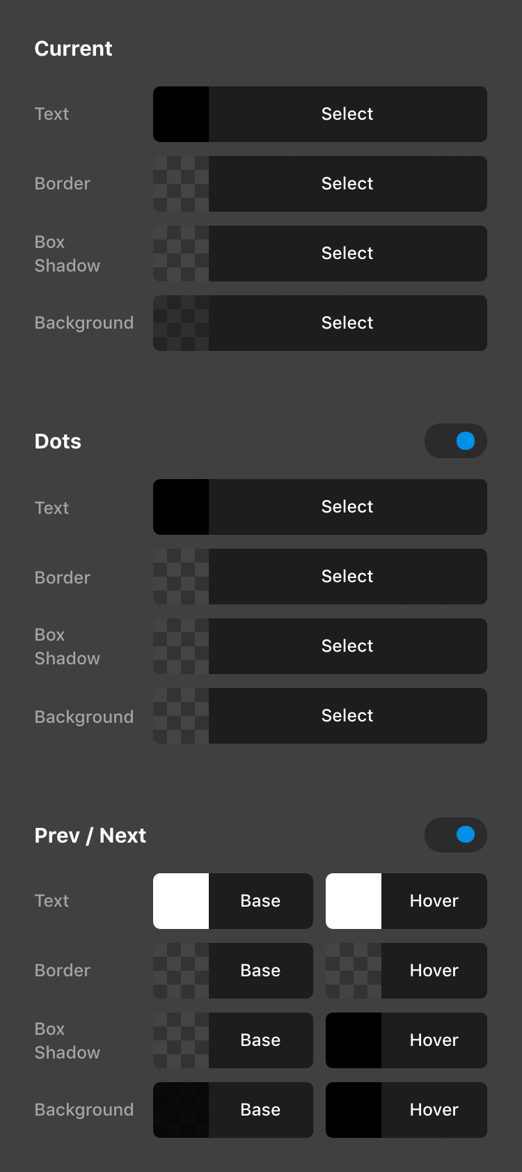
Enabling the Dots and Prev / Next control groups would alter the default Pagination Element styling like the following example, but can of course be altered to suit your own design:

Pagination Comments
The Pagination Comments Element is intended to be used when WordPress comments are setup to be paginated. This can be done in the WordPress admin area by going to Settings → Discussion → Other comment settings and then locating the checkbox that begins with “Break comments into pages…” which is where you can set the number of top level comments that should appear per page in addition to the overall order they are displayed in.
Pagination Posts
The Pagination Posts Element is to be used along with Pro's Layout Builder whenever creating an “Archive” Layout that is assigned to a blog index or taxonomy archive. This Element allows users to get to subsequent pages of your blog based on how many posts per page you are showing in your installation. To adjust this setting, go to Settings → Reading → Blog pages show at most in the WordPress admin and set its value accordingly.
Pagination Products
Much like the Pagination Posts Element, the Pagination Products Element is to be used along with Pro's Layout Builder whenever creating a “WC Archive” Layout for WooCommerce that is assigned to a shop index or product taxonomy archive.
Post Navigation
A brief note on the Post Navigation Element: this Element utilizes the exact same styling options as the Pagination Elements with the exception of the Breakpoint to Hide # and End & Mid # Count controls, which are removed due to the fact that they are not applicable.
The Post Navigation Element also differs from general pagination in that the Post Navigation Element is meant to navigate to the previous / next posts in your current post type while on that singular view (e.g. a blog post, a WooCommerce product, et cetera).
Demo
To see live demos of the Pagination / Post Navigation variations, see below:
See something inaccurate? Let us know