Meta Line
In this article, we're going to discuss the Meta Line Element and its settings. The Meta Line Element can be used as a quick starting point to output meta information on Posts, Products, et cetera.
Oftentimes when working on a layout for a Post, Product, et cetera, it is common to include a Meta Line in the design, which references important pieces of information about the entry. This may include things like the date it was published (or subsequently updated), who the author is, a reference to how many comments have been made (if available), and various taxonomies that are in use such as categories or tags (among other things).
While the Meta Line does not have to include all of these pieces of information, you will typically find that it looks something like the following:

Here we can see a simple line of text with four important pieces of information, each separated by a divider to give it some formatting. The Meta Line Element serves as a quick starting point that wires up all of the appropriate Dynamic Content and Loopers to make this possible along with some simple styling to get this pattern up and running in no time, which you can then take and adjust to your liking from either a stylistic or content perspective.
Introduction
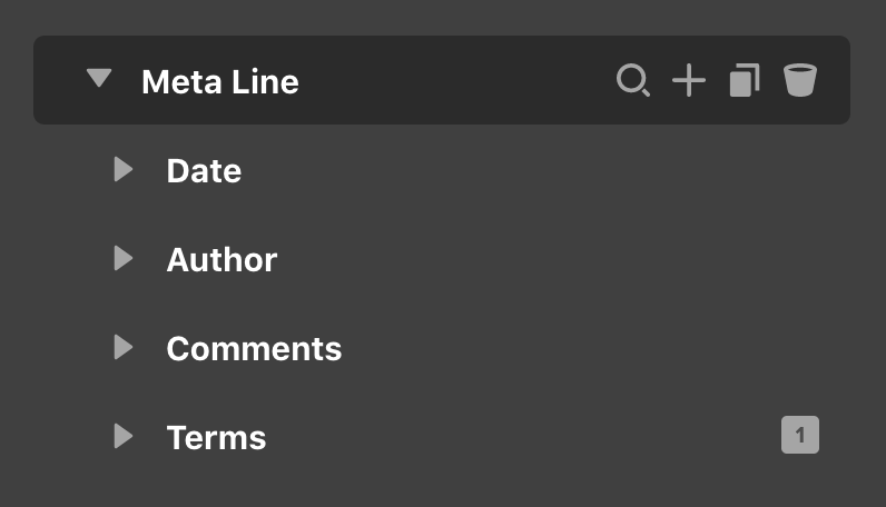
The Meta Line Element is a "prefab" Element, which means that it is composed of the core Elements from our Library across all Builders. Its topmost Element is a Div Element, with its four children (also composed using the Div Element) serving as a wrapper for their subsequent data and dividers if necessary:
The one control of note on the base Div for the Meta Line is its Flexbox control, which is set to use Row as its direction as well as allowing content to Wrap. This ensures that each direct child will move to a new line automatically when necessary. Additionally, the content has been horizontally aligned to the Start and vertically to the text's Baseline, which helps to ensure that each individual child lines up more like a single string of text would.
Each child Div has its own Flexbox control set to use Row as the direction with the Wrap checkbox disabled, which ensures that its direct content does not break onto separate lines.
Date
Let's begin breaking down the Meta Line Element piece by piece. Upon expanding the Date child in the Outline pane, you will find the following Element structure that contains a Text Element and a Divider, which is also a Text Element, just renamed for clarity's sake.
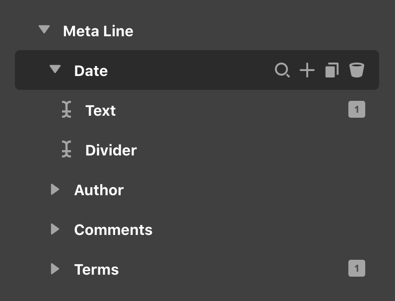
The primary text is populated with the {{dc:post:publish_date}} Dynamic Content string, which outputs the published date of the current asset you are viewing (e.g. Post, Product, et cetera). The Divider inside—which is used to separate the published date from the next item—has / as its content. is an HTML entity, which outputs a non-breaking space, ensuring that the whitespeace placed there will not be collapsed by the Flexbox controls of the parent.
Author
Much like the Date child, you will find that the Element structure of the Author child is setup in the same way:
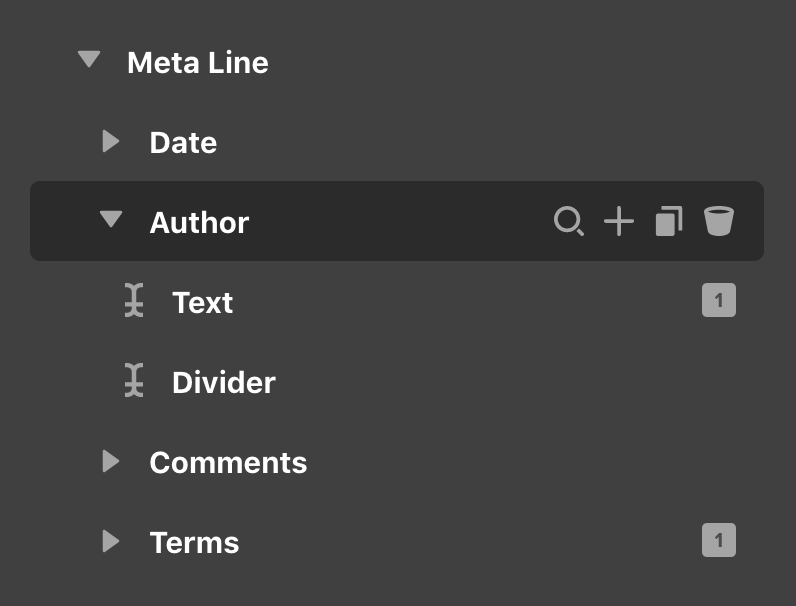
The primary text is populated with the {{dc:author:display_name}} Dynamic Content string, which outputs the Display Name set by a user in their WordPress admin profile. This is most commonly used as it gives users individual control to determine how their name gets output, but if you wish to have more finite control over this, you could the {{dc:user:meta}} string, which allows you to access other meta information from the user profile page. The Divider here uses / again, as explained in our previous section.
Comments
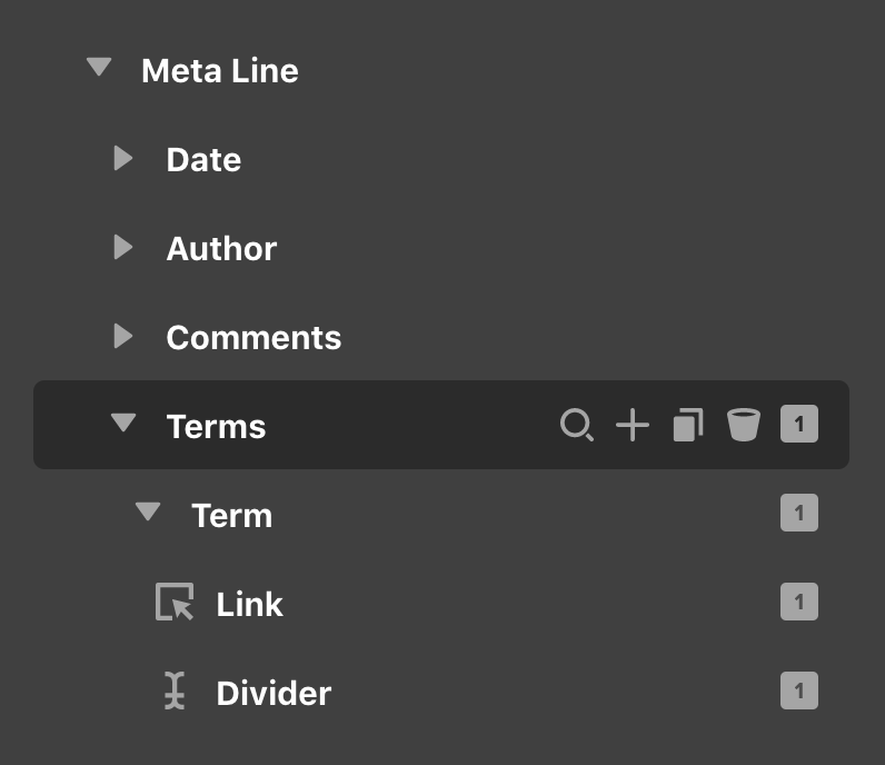
The Comments child is where things start to change up just a bit. Upon expanding this Element in the Outline pane, you will find the following structure:
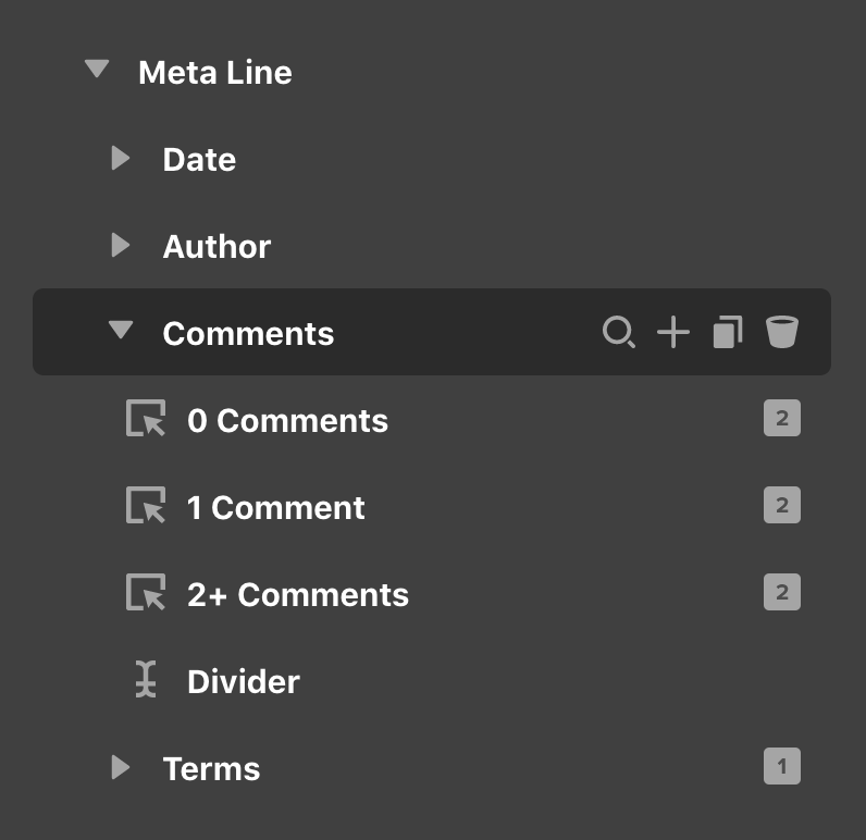
Inside we can see 3 Button Elements, all of which are styled to exactly match the Text Elements of our previous children (i.e. removed all padding, background colors, and shadows, in addition to duplicating typography settings) along with another Divider just like our two previous items. Each of these Buttons uses {{dc:post:comment_link}} for their href to take users down to the comments section on a page.
The reason for using 3 separate Buttons here comes down to our need for outputting variable content based on differing conditions. For example, if no users have left any comments on your Post, it is often best to write out some form of prompt like “Leave a Comment” rather than “0 Comments,” as it focuses more on the positive action of engaging with your site rather than the potential lack of activity. This is seen from our first image in this article:
However, once a user has left at least 1 comment, at that point you will likely want to output some text to showcase this:

And finally, if users have left 2 or more comments on your site, you will need to update the text from the singular “Comment” to the plural “Comments,” like so:

To accomplish this, we utilize these 3 separate Buttons, each with their own unique primary text string and Element Condition, ensuring when it should be displayed. The 0 Comments Button in the Outline has “Leave a Comment” as its primary content and also features the following Element Condition on the Customize control tab:
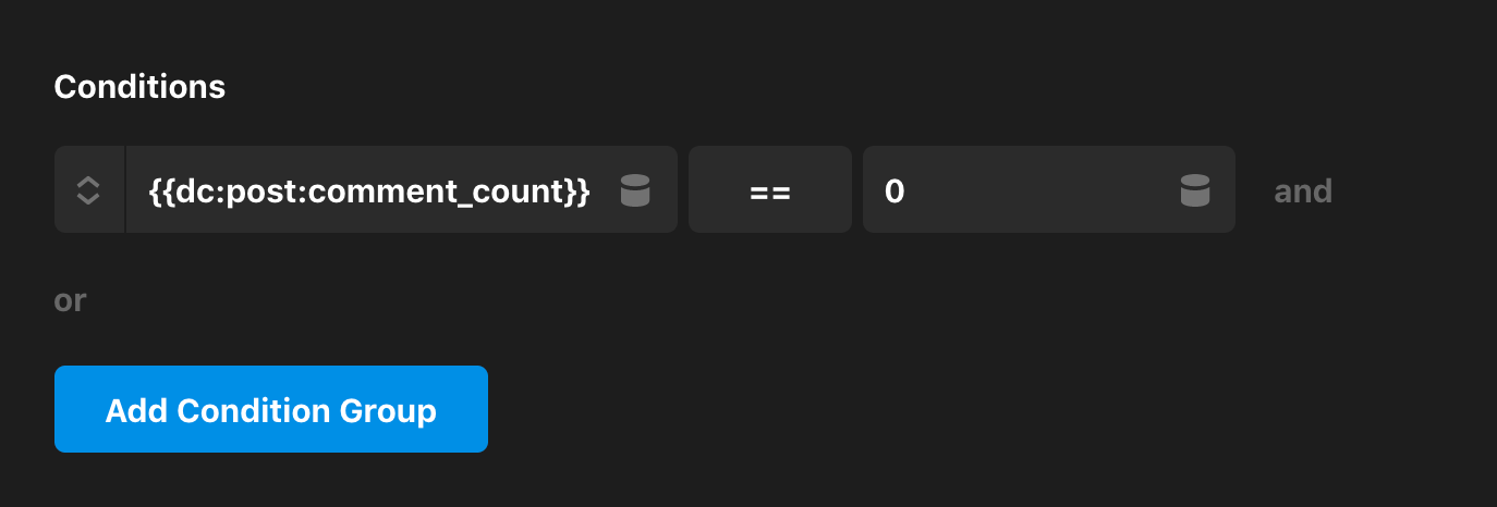
This is Condition is using an Expression that is comparing two values and returning a true or false value accordingly. The interesting thing here is that we can use Dynamic Content strings on either side of the equation, which we can see at play here with the {{dc:post:comment_count}} string on the left side of the == operator. This will return the actual number of comments posted to your asset, which is then being compared to a value specified on the right (in this case 0). So we can see from this statement that this first Button is only output if the comment count on the page is exactly 0.
Next, we have our Button only used if 1 comment is present on the current asset, which features {{dc:post:comment_count}} Comment as its primary content and implements the following Element Condition:
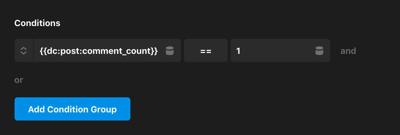
Similar to our previous condition, we are still comparing the comment count but this time we are looking to see if its value is exactly 1. If the current asset only has 1 comment, then this Button will be displayed.
Finally, we have our “2+ Comments,” which is to be displayed on the page if 2 or more comments are present. It uses {{dc:post:comment_count}} Comments as its primary content and implements the following Element Condition:

Notice here that we have finally changed our operator from using “strict equality” with == and are instead using the “greater than” symbol, > (operators can be cycled through by clicking on the button). Here we are checking to see if the comment count on the current asset is greater than 1, and if it is, then this Button will be output.
Terms
Finally, we have the Terms child, which is where we will now introduce our first Looper to output the appropriate content needed. Expanding this item in the Element Outline pane will reveal the following structure:
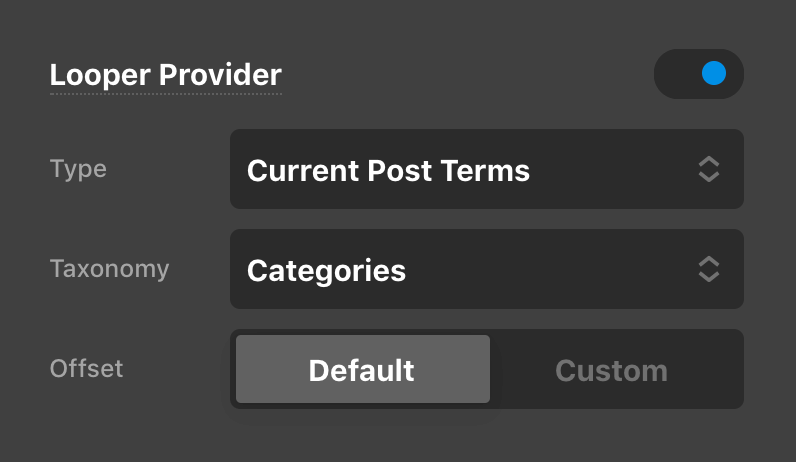
The Terms Element is where our Looper Provider is defined, allowing us access to the Current Post Terms on our asset (click here for more information on Loopers and their Provider Types if you are new to this feature):
This is then accessed by the Looper Consumer enabled on the Term child. Because the Term is where the Consumer is enabled, this is the Element that will be looped for how many terms you have setup on your asset.
Inside each Term is a Button Element, which utilizes {{dc:term:url}} for the href and {{dc:term:title}} for the primary content. This will give us the label of each term assigned, as well as link it to its respective taxonomy archive.
Next, we have another Divider, but this one functions differently from the other Dividers seen throughout our Element structure. Since these terms are output as the final item in our Meta Line, this Divider is actually used as a separator between each term output buy the Looper. For example, if you had a Post that only had one Category of “Travel” assigned, this is what it would output:
However, what if you had multiple Categories assigned? It wouldn't look very good to see them all scrunched up next to one another without any separation or logical division, and this is where our Terms Divider comes into play. If you inspect this Divider, you will see that is primary content is made up of , , which is just a comma followed by a non-breaking space (so that the Flexbox controls do not collapse our whitespace, similar to the other Dividers seen previously). Next, if we go to the Customize control tab of this Element, you'll find the following Element Condition applied:

This is a Looper Condition, which can look at the index of each item being looped and see if it meets a specified condition. In this case, its saying that this Divider will only be output if the term being output is not the last one in the list. As you can see from our image above, we do not see our comma divider because “Travel” is the only—and consequently, the last—term being output.
However, if that same Post had multiple Categories assigned to it, the output would look something like this:

Notice how there is no comma present after “Music” as it is the last item in the Looper…huzzah!
Things to Keep in Mind
- This Element's formatting is by no means the only way to accomplish this sort of output. Depending on the type of structure or content you're looking for, you may need to make significant changes to the markup or styling of each constituent part to achieve your desired end goal.
- If you are planning (more-or-less) on keeping the style used here (i.e. text-based, responding like paragraph text), there are a few typography controls where it is absolutely critical that they remain uniform across all Elements. For example, the Line Height on all text, dividers, buttons, et cetera is set to
1.65. If you were to change this for one Element in the tree, you must ensure that this value is set for all Elements. Another one to be aware of that could throw off the vertical rhythm is Font Size. - Expanding on the point above, if applying a style to something like the Comments Buttons, ensure that you have applied the same uniform styling to all the Buttons in that Element. Remember that you will only be seeing one at a time given the current condition of the page, but you can momentarily ignore these using the Ignore toggle for the Element Conditions control in the Preview dropdown. The main takeaway here is to make sure you haven't forgotten any currently "hidden" Elements when making changes.
Demo
To see a live demo of the Meta Line Element click here.
See something inaccurate? Let us know