Header Builder
In this article, we're going to introduce you to the Cornerstone's Header Builder (part of the Layout Builder) and walk you through its functions.
The Header Builder provides users with a similar building interface to that of the Page Builder, allowing designers to take advantage of a drag and drop interface for crafting custom header designs.
One primary difference is that Headers can be powered by a different set of Structural Elements that are used to layout your designs. In addition to Sections, you will take advantage of Bars and Containers, which utilize unique controls specific to the needs and requirements of modern headers.
On top of that, you can assign your Headers that you have created to different pages or posts on your website, as you can with the Footer Builder, allowing you to create complex site layouts that respond to the contextual needs of a particular area of your site.
Getting Started
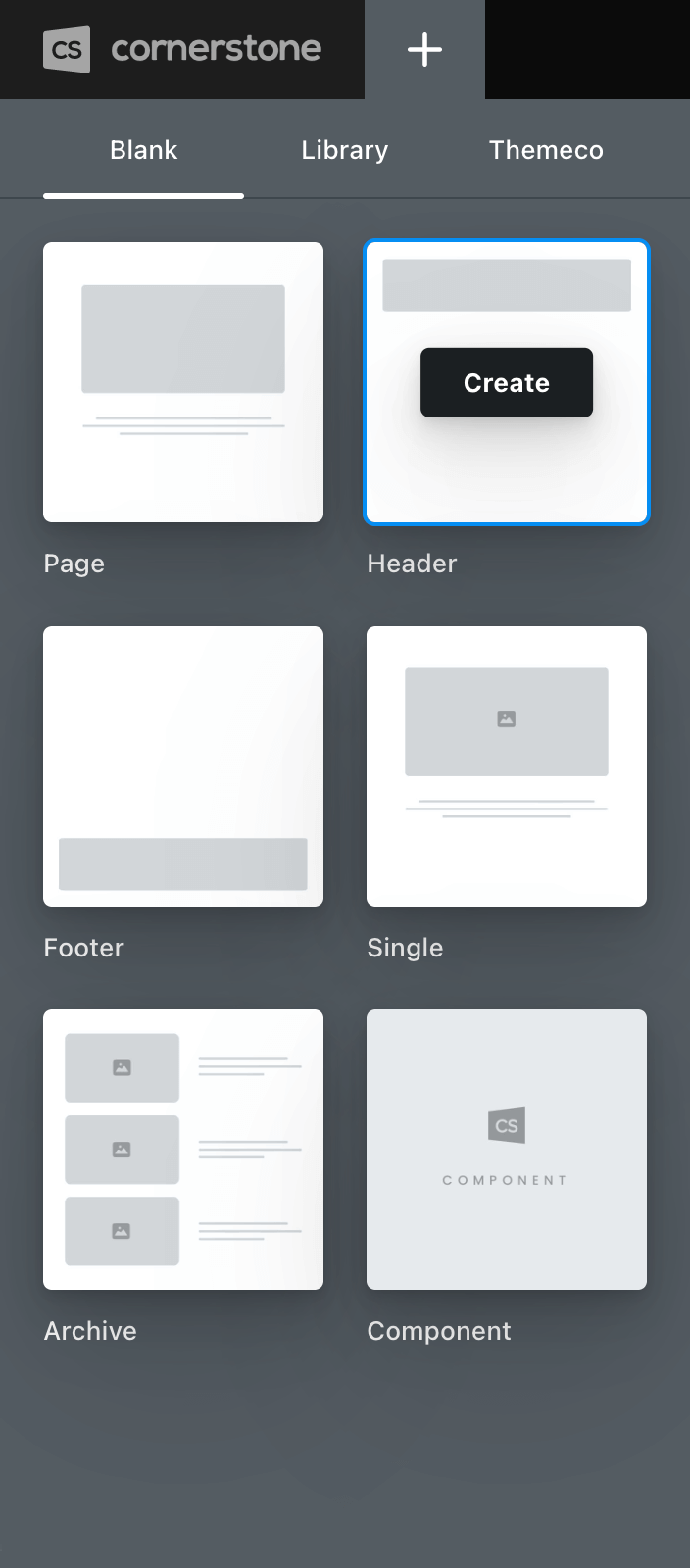
To begin working with the Header Builder, click on the plus sign (+) in the top bar to reveal the New Document pane, then click on Header:
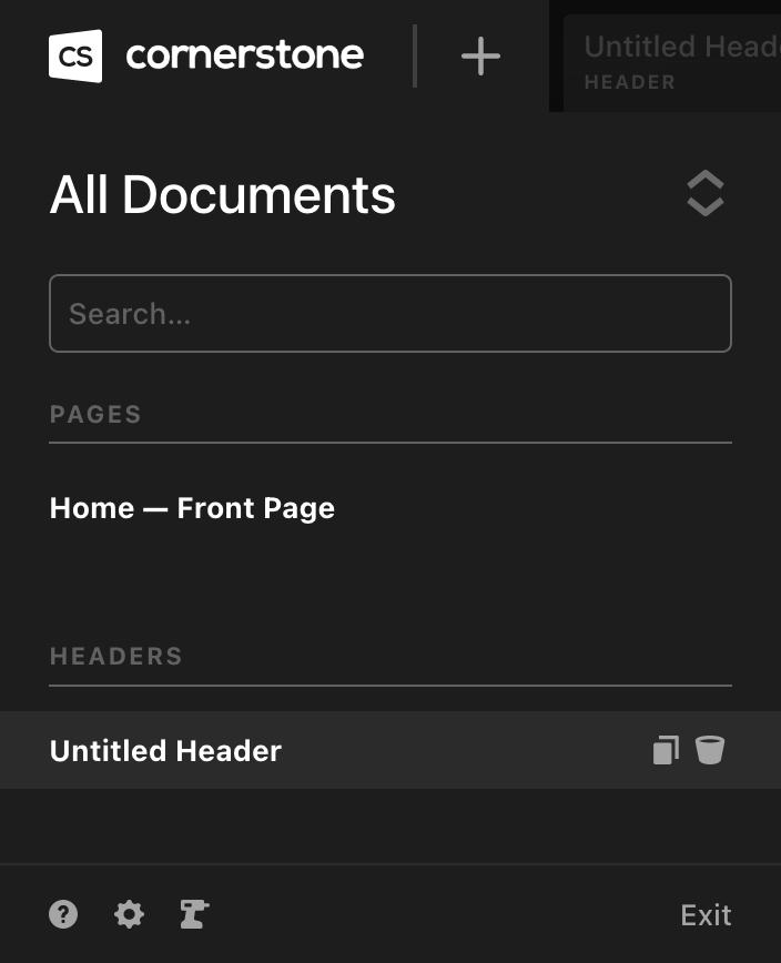
Upon clicking “Create,” a new document of the type you selected will be added to your site and a tab will be opened for you to begin working:
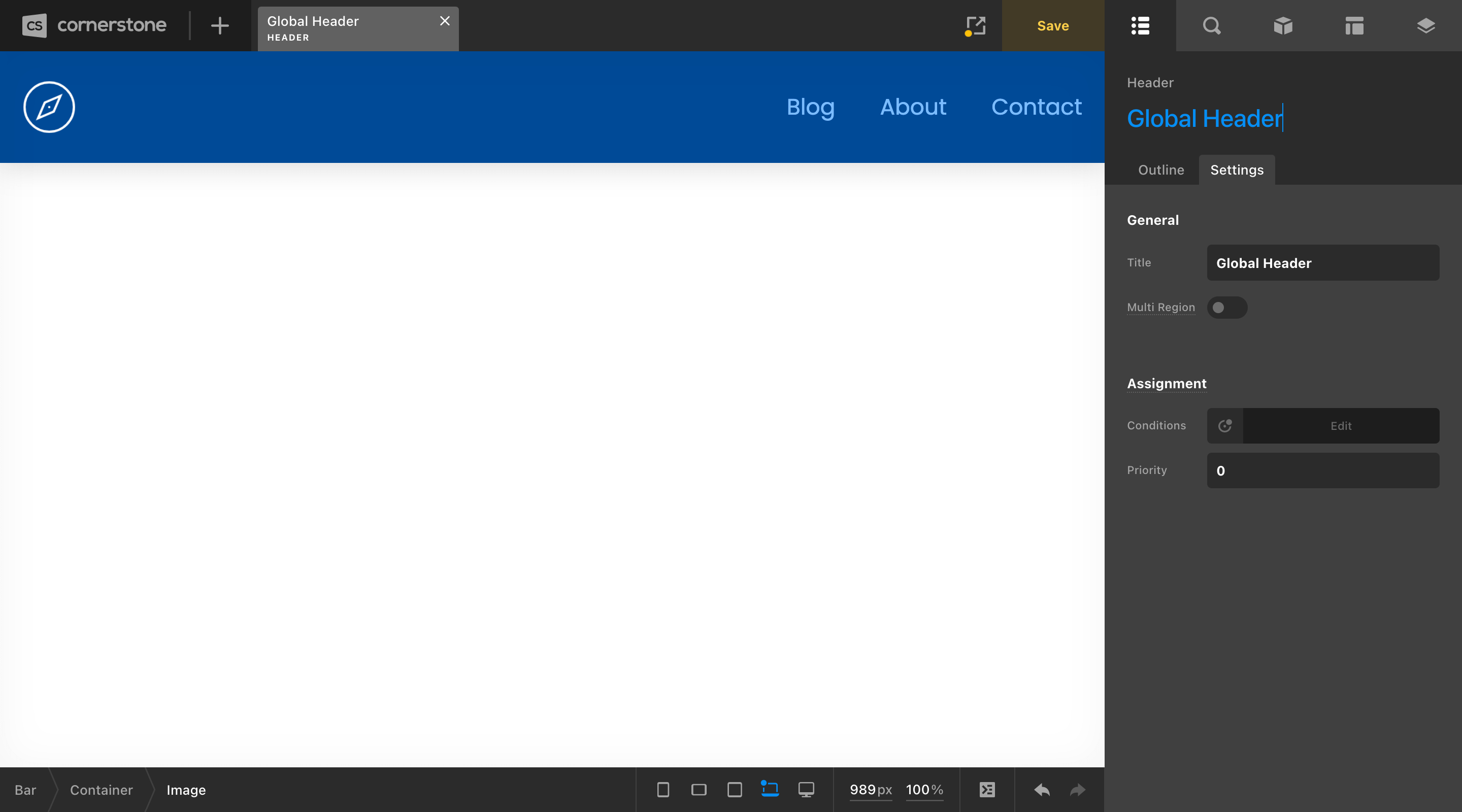
To rename your document, you can double-click in the workspace header title or go to the Settings tab found on the Outline pane. Once finished, clicking the Save button will apply your changes:
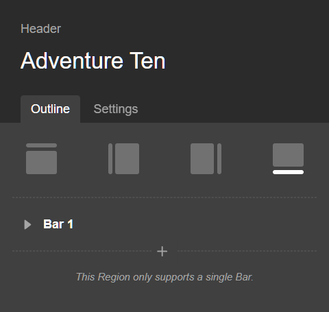
Designing Your First Header
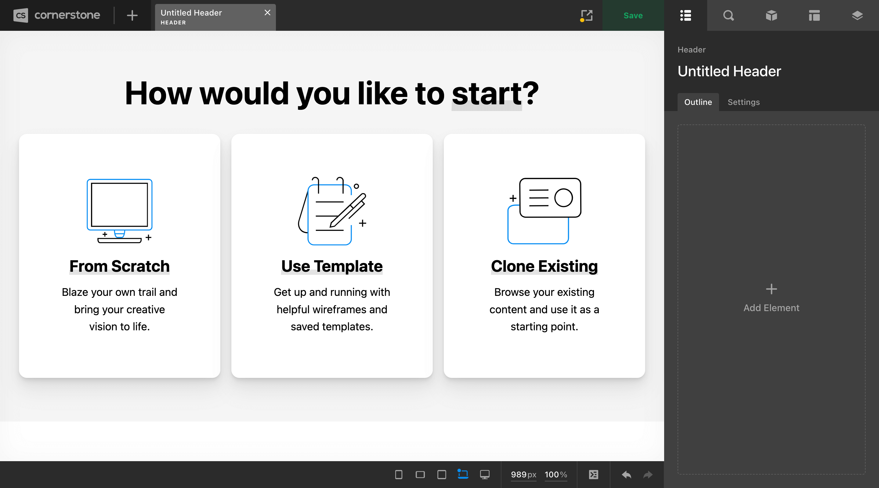
Once you have entered the asset you wish to work on, if it is completely empty (i.e. does not have any Bars) you will see the following group of selection to start from in the live preview:
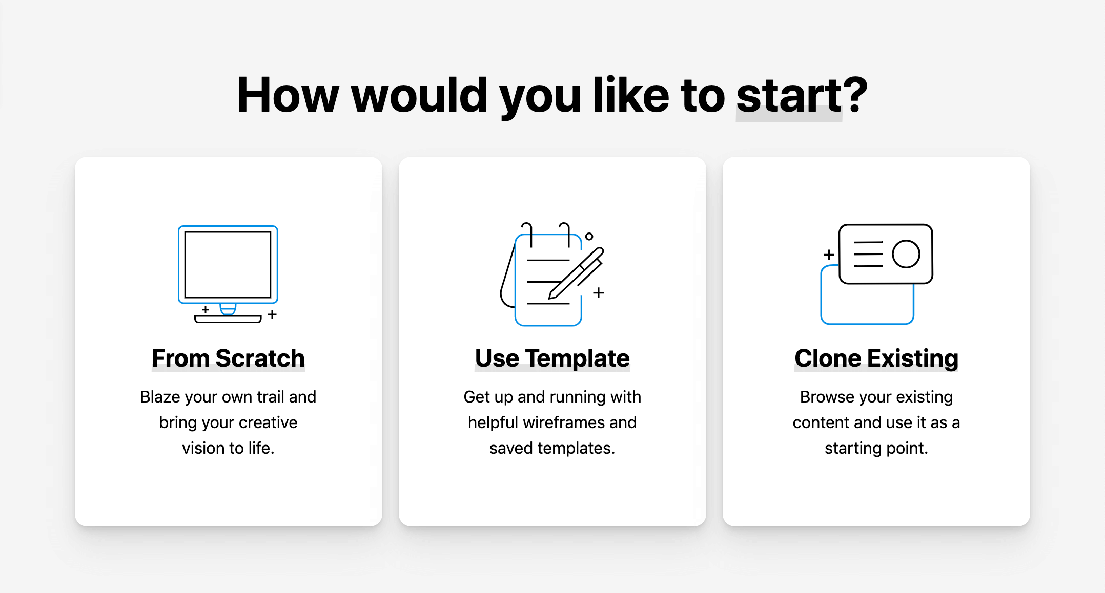
Clicking on From Scratch will simply add your first Bar to the design, just like clicking anywhere in the Outline pane of an empty design. Clone Exiting will allow you to copy over an existing asset if you did not already start from a saved template in the submenu above. Finally, selecting Use Template will allow you to start with a template if you desire.
At this point, hopefully you're starting to connect some of the dots for the huge role that the Header Layout Builder serves in the site building process. Having full control over the base layout and design for global or specific asset opens up many functional and design possibilities.
Assigning Your First Header
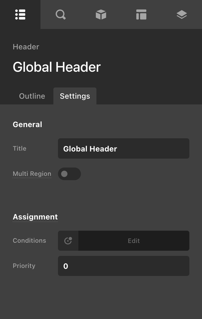
Now that we've created our asset, all that we have left to do is assign the asset to the appropriate context on your site. To do this, click on the Settings tab on the Outline pane and locate Assignment → Conditions:
Clicking on that control will reveal the following popup:
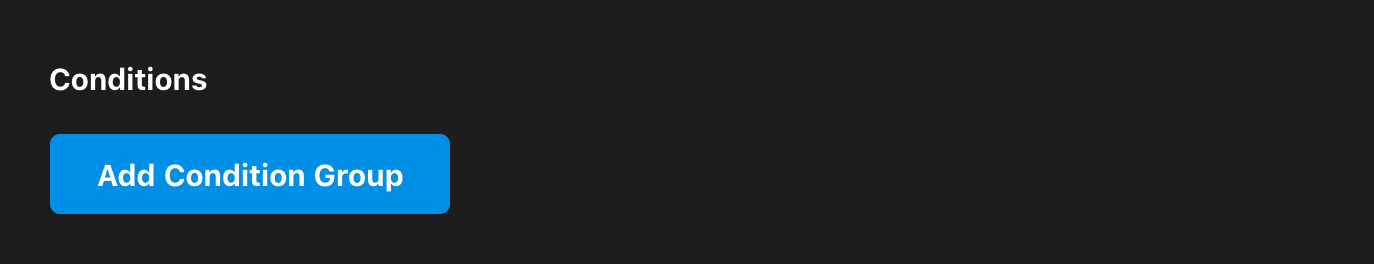
To get started, click Add Condition Group to specify a context in which you would like your asset to be used. For example, if you wanted your asset to show up for your entire site, you would select “Entire Site” in the first dropdown (which is the default selection when adding your first condition, as most will want to assign their assets globally):
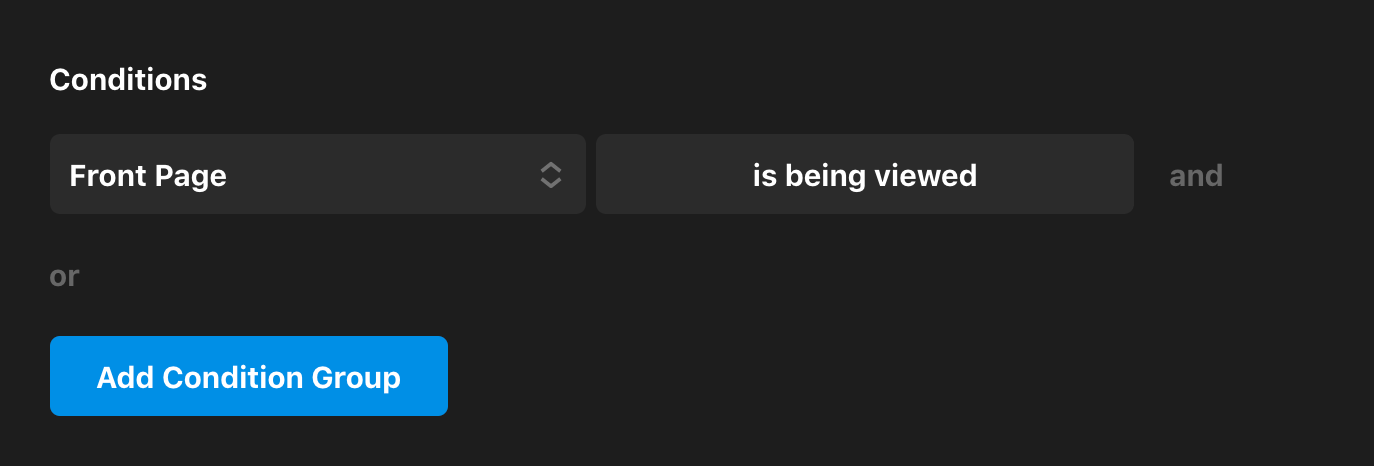
There are other helpful preset selections you can choose from as well such as “Front Page,” which will assign your asset to the home page on your site only. The second control after the dropdown will default to “is being viewed,” which can be changed to “is not being viewed” by clicking on the button to quickly give you the inverse if desired:
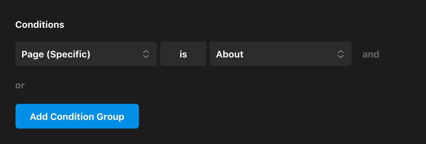
Another option you may wish to explore with assignments is placing an asset on a specific page or post in your installation. To do this, select “Page (Specific)” from the first dropdown, set the middle toggle to “is,” and then specify the page you want in the final dropdown:
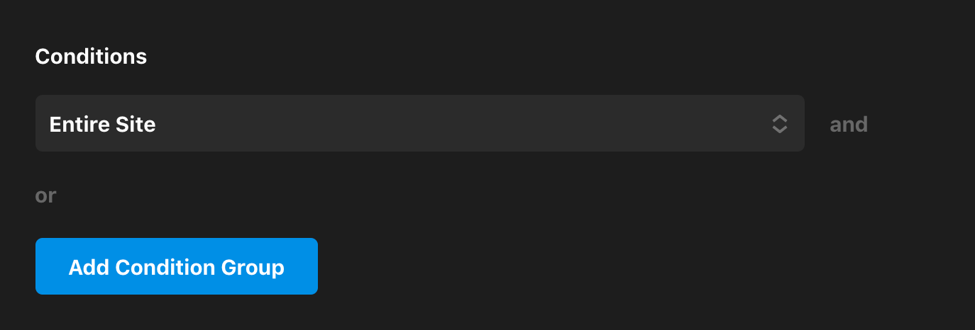
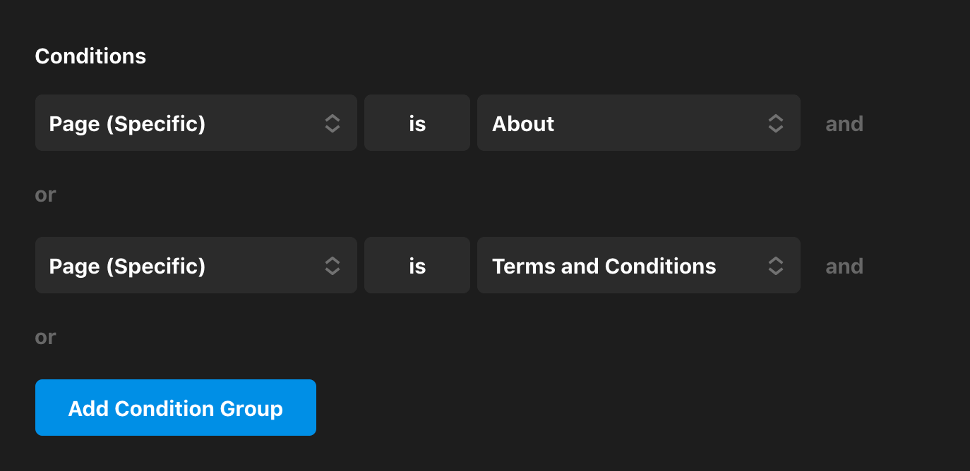
You can also assign to multiple specific pages or posts by adding new condition groups, which will function as an or statement:
The Assignment Control is incredibly powerful and there are many ways you can leverage it to accomplish unique outcomes on your site. To learn more about this control, check out our Assignment Control article.
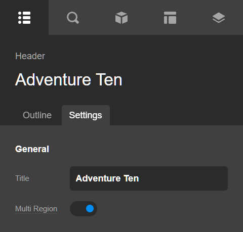
Multi Region
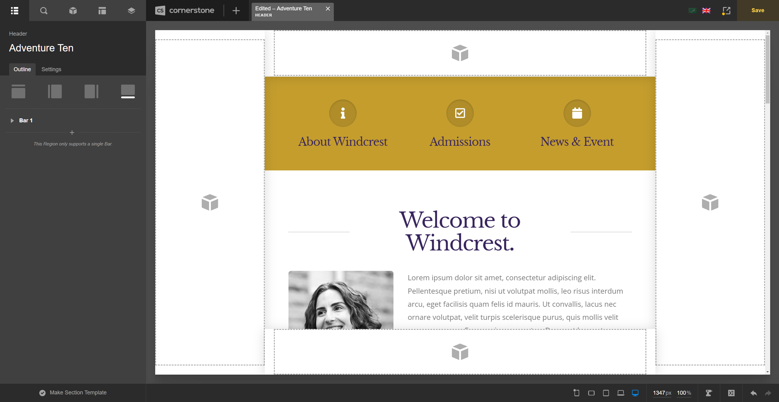
The Multi Region option adds additional header areas so you'll have the default Top Region, Left Region, Right Region and the Bottom Region. The Left, Right and Bottom Regions are sticky. That means they stay on the screen all the time. The additional regions are commonly used for side navigation and placing important buttons below the screen.
You can activate a region by adding a Bar element on it. Adding a Bar on each region including the Top region would look like the following screenshot.
Videos
We've put together several videos exploring various concepts when building Headers for your install, so we definitely recommend checking those out! We also routinely add new videos to our YouTube Channel so be sure to subscribe to get the latest.
Summary
We've covered an introduction to the Header Layout Builder, how to design and assign assets, in addition to video tutorials you can explore for more concepts. We hope you enjoy these powerful additions to Cornerstone!
See something inaccurate? Let us know