Breadcrumbs
Breadcrumbs are helpful architecture-type Elements. They help improve the user experience of the site, and in this article, we'll teach you how to use and configure the Breadcrumb Element.
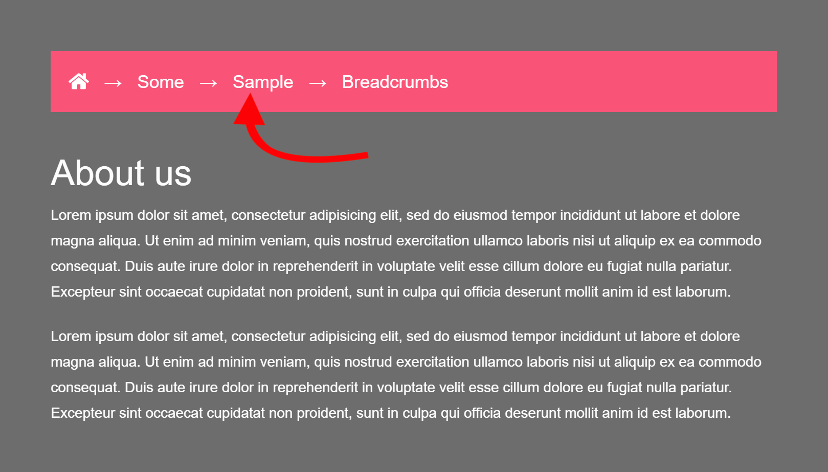
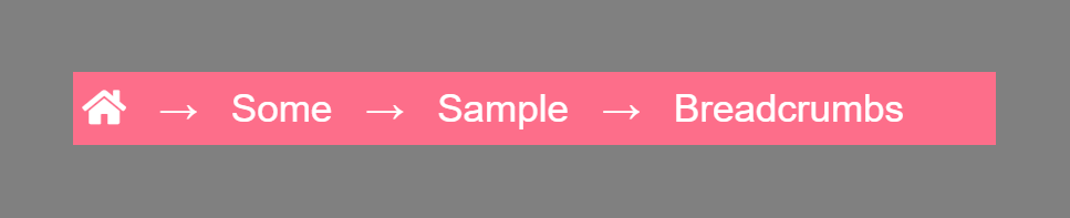
If this is your first time to hear about the term "Breadcrumb" used in web design, let me show you what it looks like:
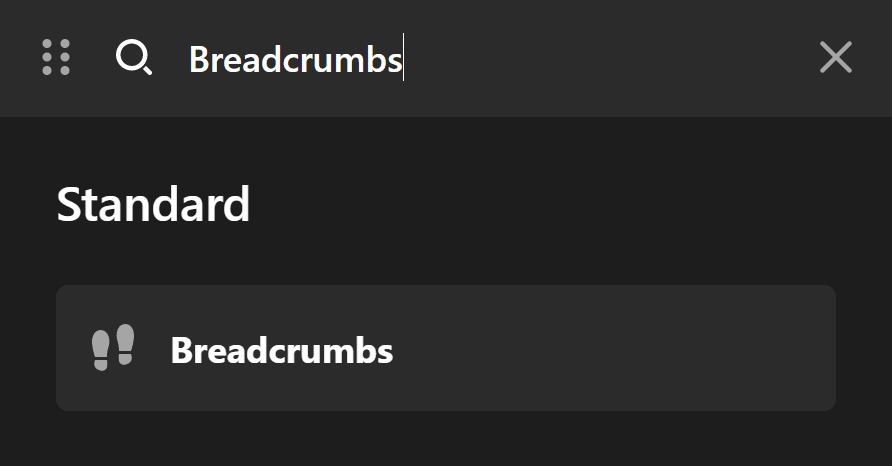
I'm pretty sure you've encountered it in the websites you've visited. Now, let's add one on your website. To add the Breadcrumb Element, simply search for "breadcrumb" on the Elements panel and drag the Breadcrumb Element to the content pane.
You'll be able to see something like this:
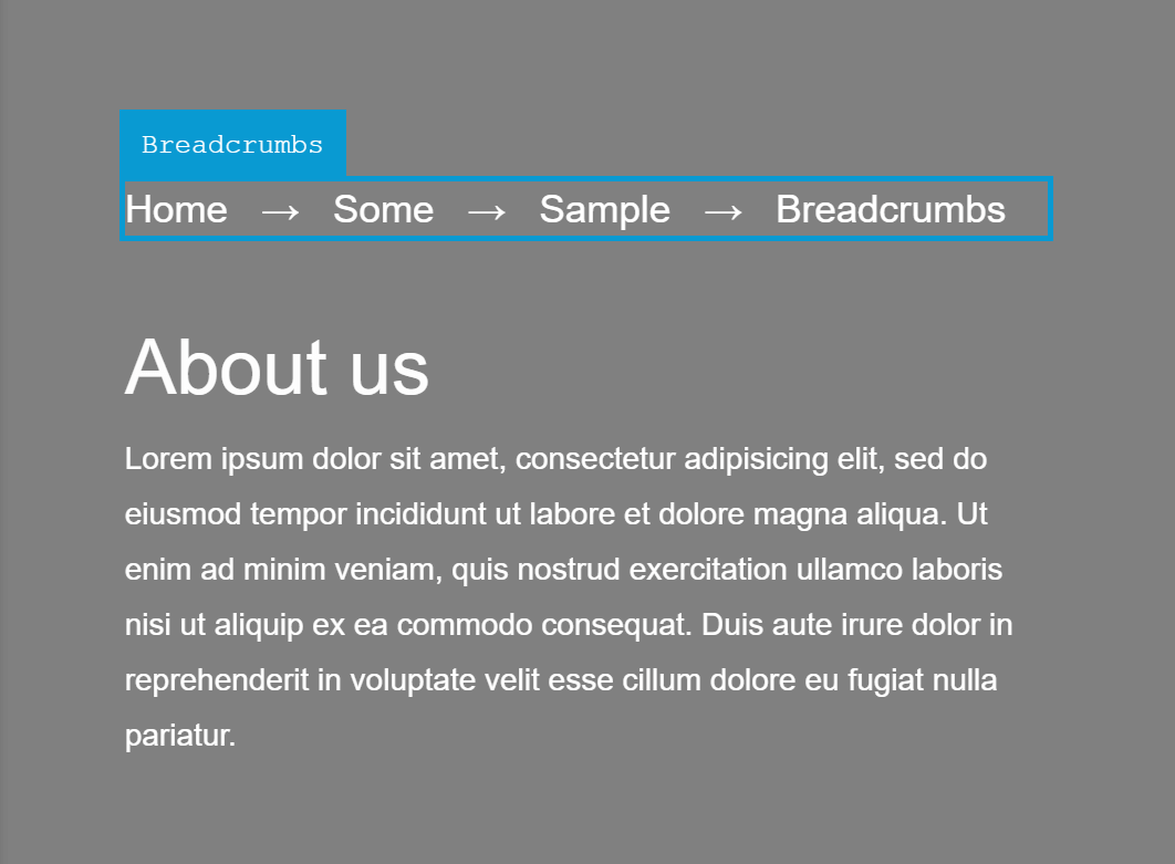
Now, the text you are seeing in Cornerstone is not the actual text that will appear on the front-end of your site. That's merely a placeholder. On the front-end, you'll see the hierarchy of the webpages starting with the link to the Home on the left-most part, then moving one child further on the right.
In this case, since the page we are creating is the Company Profile, which in this example is a child of the About Us page, the structure is: Home > About Us > Company Profile.
Breadcrumbs Setup
Under the Setup field group, you'll see the following fields:
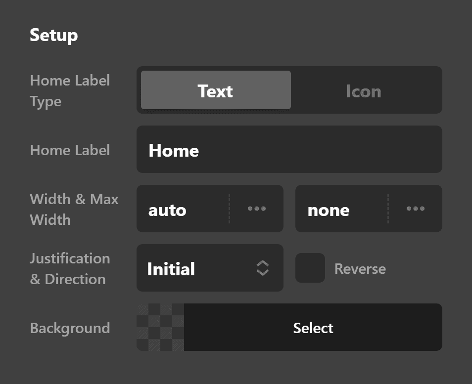
Home Label Type
You can choose whether to use a plain text (e.g. Home) for the home page link or to use an icon instead.
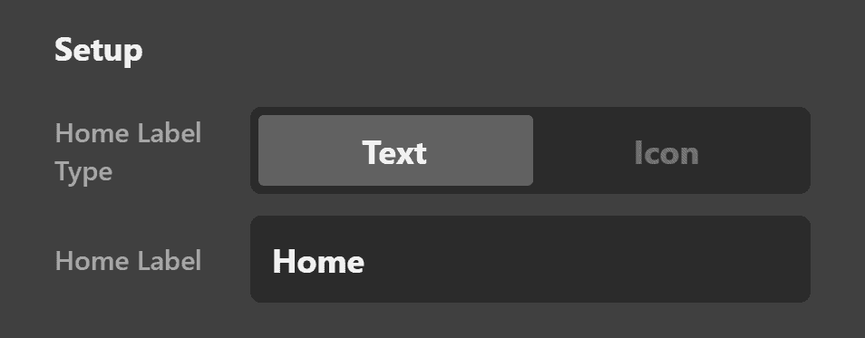
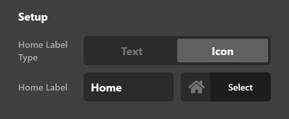
Home Label
If you selected Text on the Home Label Type field above, you can change the text from saying "Home" to something else (e.g. Blog, News).
If you chose Icon, you'll be given the option to choose the icon to use.
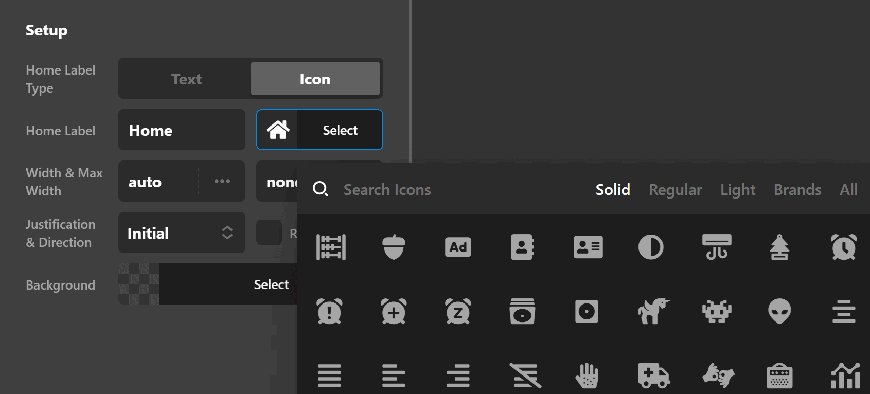
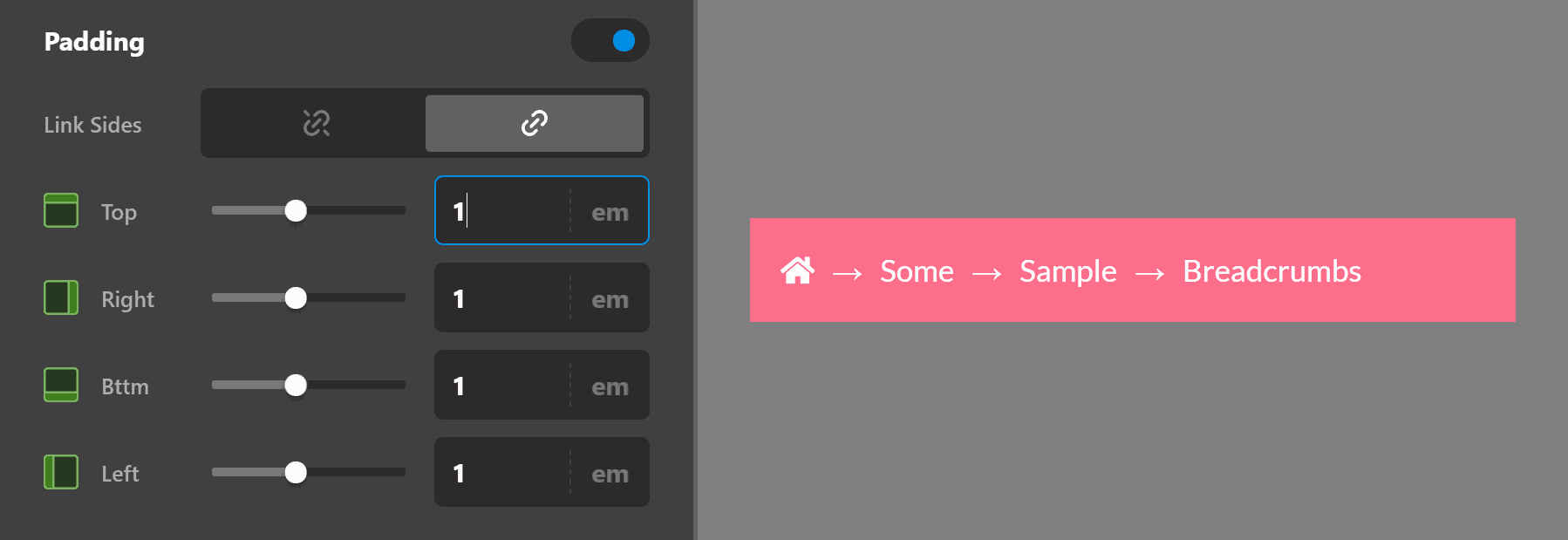
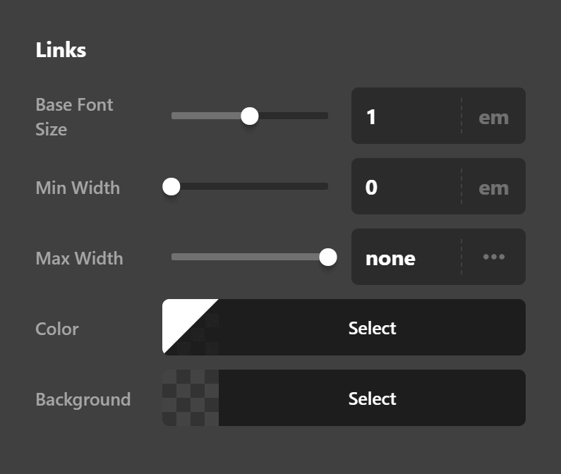
Width & Max Width
You can set the default width of the Breadcrumb Element. You can also set its maximum width so that it cannot go beyond that width.
Justification & Direction
This lets you change the set the Flex CSS properties of the Breadcrumb Element. If you're not familiar with Flexbox, there's a helpful introduction here.
Background
You can add a background color to the Element.
Breadcrumb Design Settings
You can set the breadcrumb Element's fonts, margins, paddings, box-shadows, borders and border radius. You'll see these very properties on the controls panel:
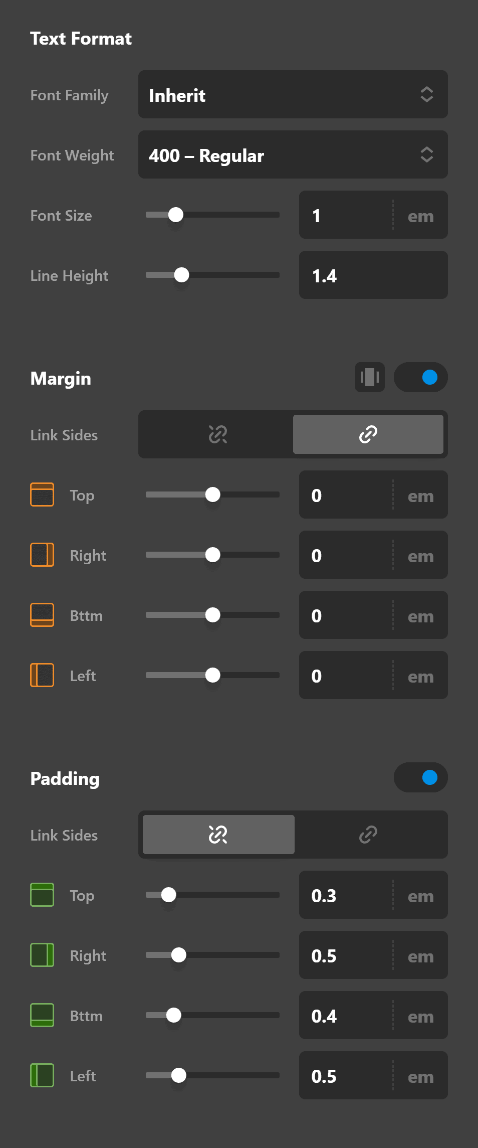
Do note, that these properties mentioned, when configured, are for the entire Breadcrumb Element and not for individual links inside the said Element. That means, if you set the Paddings, it will apply to the entire Element.
Later we'll discuss how to configure individual links inside the breadcrumb.
Breadcrumb Delimiter Settings
In breadcrumbs, "delimiters" are the separators of each link.
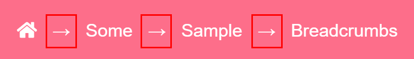
The default delimiter is an arrow but we can change that and even remove that altogether. The settings can be found on the Delimiter Setup field group.
Now let's discuss the individual settings.
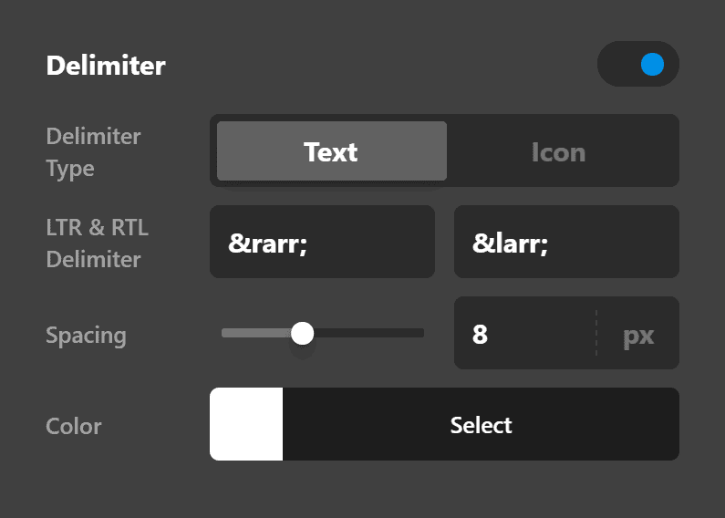
Enable
By default, delimiters are turned On but you can turn it Off, thus removing any delimiter.
Delimiter Type
Just like in the Home Label Type under the Setup field group discussed earlier, you can choose whether to use Text or Icon for the Delimiter Type. When we say "Text," it doesn't necessarily mean words, though words are allowed. What is generally being used are ASCII codes. The default delimiter, → is an ASCII code which generates the arrow.
If you choose Icon as the Delimiter Type, you'll be shown the icon selector field to choose icons you want to use.
LTR & RTL Delimiter
LTR means "Left to Right" while RTL means "Right to Left". These basically mean the direction in how we read letters. For example, you are reading this article starting from the left to the right, thus, this is LTR. Languages like Arabic and Hebrew read their characters and words starting from the right going to the left.
Some websites support multiple languages where both LTR and RTL are supported. This setting gets your breadcrumb delimiter ready by allowing you to set not only the LTR delimiter but also what to use when RTL is enabled.
Spacing
The value you put here will be set as the distance on both the left and right side of the delimiter. So if you set 10px as the value, each delimiter will have a space of 10px on its left and another 10px on its right.
Breadcrumb Links Settings
Links Settings are virtually the same as the Setup and Design settings combined. The main difference is that Links Settings are specific to the individual links while the first two are applied to the Breadcrumb Element itself.
The Links Setup allows you to also set the text color and background color of all links inside the breadcrumb the mouse is hovering on a link.
Customize
The Customize pane consists of various features that allow you to take further control over your Element's styling and functionality:
- ID – Sets an HTML ID on the Element.
- Class – Sets an HTML Class on the Element.
- Element CSS – Use this feature for increased stylistic control of your Element, especially over nested markup. Click here for more detailed information on this feature, such as using
$elto dynamically target the base tag, et cetera. - Hide During Breakpoints – Hides the Element at different screen sizes when design alterations are needed. Click here for more information.
- Conditions – Adds / removes Elements from the page when certain criteria are met (e.g. “If a featured image is set...”). Click here for more information.
- Custom Attributes – Use this option to add custom HTML attributes to the root tag of the Element (e.g.
data-info="123"). This can be particularly helpful when integrating with various scripts and libraries.
Demo
To see a live demo of the Breadcrumbs Element click here.
Summary
In just a few minutes, you've learned how to add and setup Breadcrumbs in Cornerstone. You've learned how to design the Breadcrumb Element as well as its individual links. Finally you've also learned how to configure the delimiter to your liking.
See something inaccurate? Let us know