Use Flex Layout
In this article, we're going to explain how to use Flex Layout and the power of Flexbox to its full potential.
What is the Flex Layout?
Flex Layout utilizes the power of Flexbox to provide you with an easy to use system for harnessing the potential of Flexbox in your website layouts. Simply put, it allows you to manage how Elements behave (and child Elements) with regards to spacing in and around and how they are positioned.
Flex Layout Settings
Let's go through all the different settings that our Flex Layout provides.
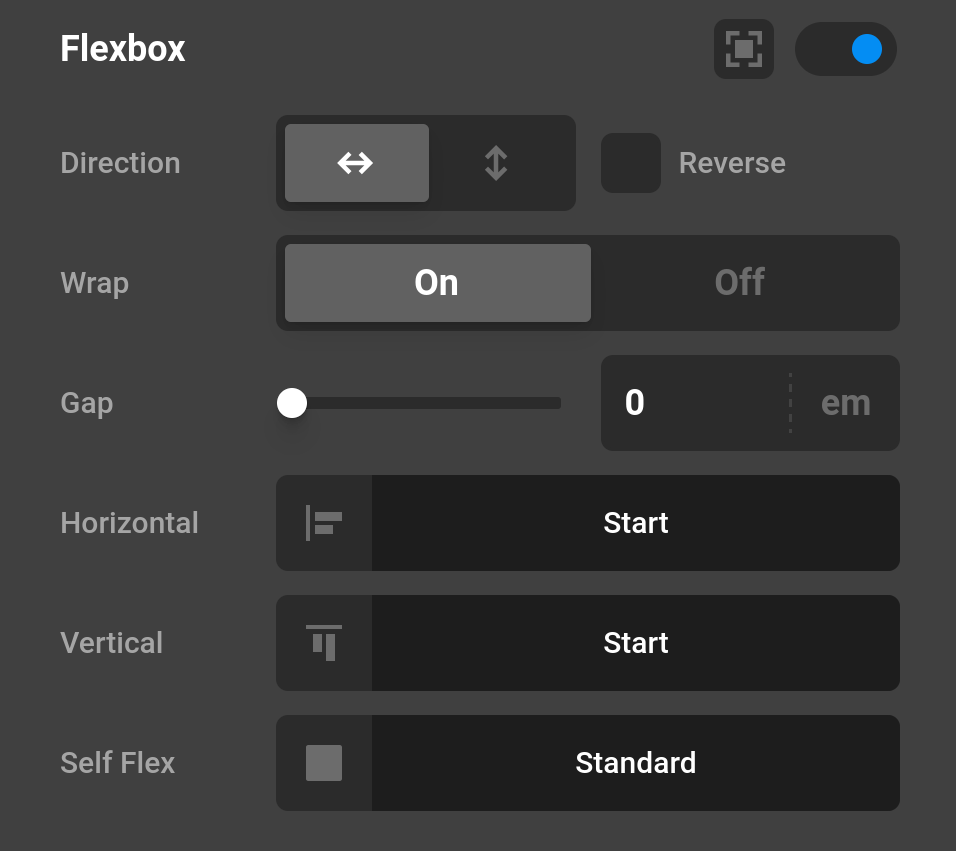
Layout - This option defines the direction of the children meaning they can either be positioned side by side or under each other.
- Row
- Column
Reverse Layout - If you want to reverse the order of the children then make sure to check this option. Basically imagine this like using a mirror.
Wrap Children - By default Flexbox will try to keep the elements on a row or column so wrapping children is a good way if you want to prevent this from happening.
Flex Gap - @since Cornerstone 7.5.0 defines the size of the gap between the rows and between the columns. (Cornerstone Video Tutorial).
Horizontal - Depending on your Layout settings you can define how the children are orientated.
- Start - Positions the boxes in the beginning.
- Center - Positions the boxes centered.
- End - Positions the boxes at the end.
- Space Between - Adds space between the boxes.
- Space Around - Adds space around the boxes.
Vertical
- Start - Positions the boxes in the beginning.
- Center - Positions the boxes centered.
- End - Positions the boxes at the end.
- Stretch - Stretched the boxes out evenly.
Self Flex Settings
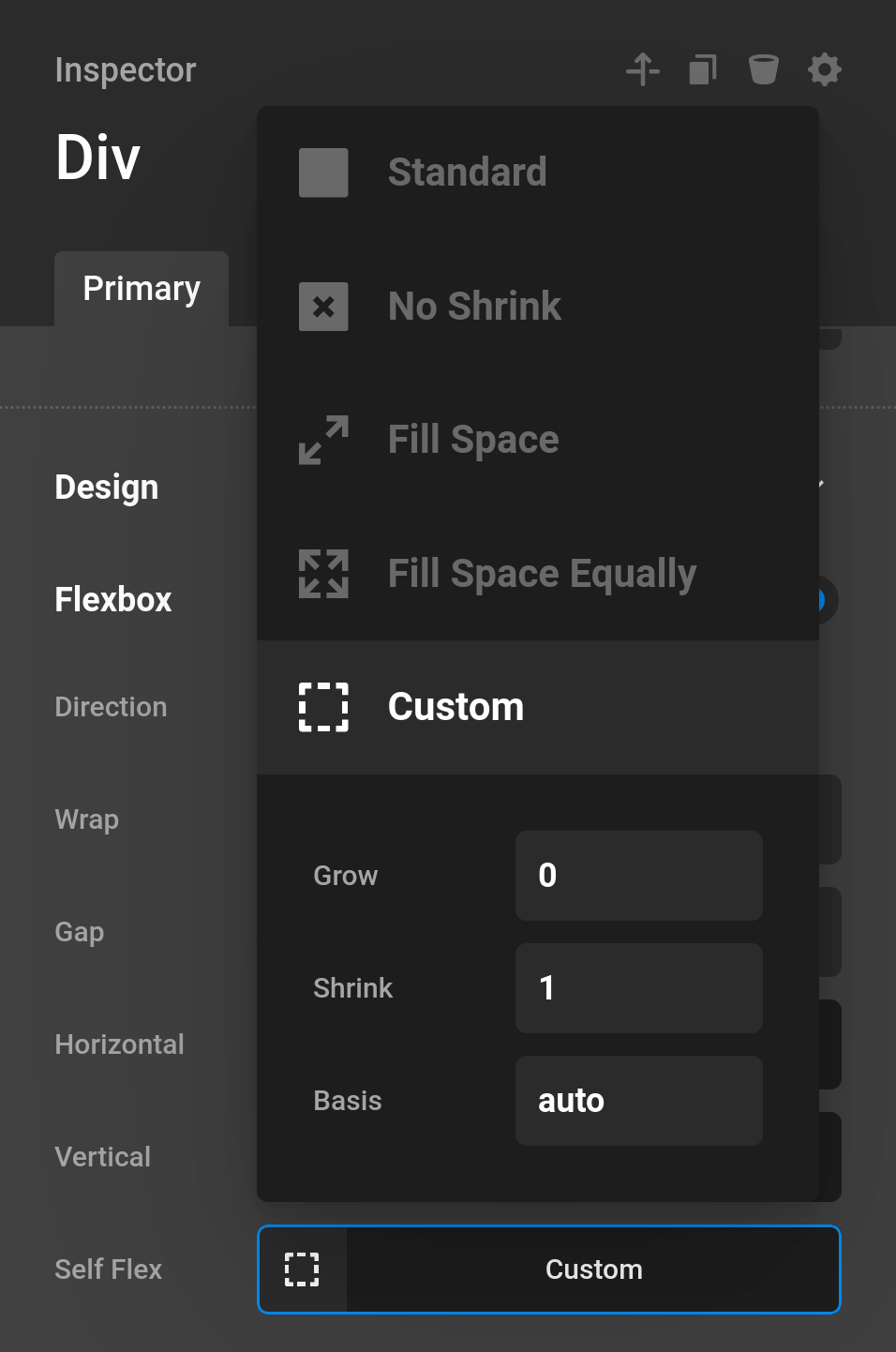
Preset
- Standard
- No Shrink - Preventing the box from shrinking.
- Fill Space - Sets the box to fill available space.
- Fill Space Equally - Fills the space equally.
- Custom - Control the grow, shrink, and basis properties manually
Flex Grow - If there is extra space in a column and you utilize this function then it will "grow" that column to make use of the unused space.
Flex Shrink If you want to prevent a container from shrinking you can set this option to 0. A 1 would indicate a shrink if possible.
Flex Basis - Defines the fundamental dimension a box should take up.
Intro Video
As there is a learning curve for Flexbox, we've created a video that gives you a great introduction of Flexbox and how to use it. Make sure to check it out to get a full understanding of the potential.
More Information
Looking to understand more of the technology behind Flexbox? We've recommend you check out the two articles here and here to get a good understanding of all the mechanics.
Summary
You've just learned the basics of how to use Flexbox to create complex layouts and structures all backed by the powerful Cornerstone Builder.
See something inaccurate? Let us know