Effects Module
In this article, we're going to discuss the Effects Module and how to add beautiful website effects and animations in WordPress — all native, no extra plugins needed!
This video is from our Getting Started w/ Cornerstone Series.
All Elements within Cornerstone include an Effects module, which allows users to take advantage of the CSS properties opacity, filter, and transform (along with a few other goodies). Additionally, these properties can be transitioned on interaction as well as during scroll events. This powerful new group of controls unlocks a completely new toolset for designers and developers to leverage in their builds.
Getting Started
You can locate the Effects module as a top-level control group on any Element you're currently inspecting, like so:
Clicking on that top-level control group will reveal the following set of controls:
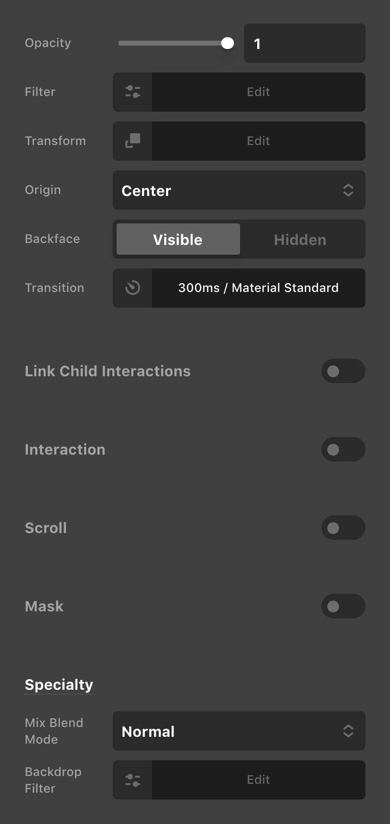
From here you will see the five main control groups within the Effects module: Base, Interaction, Scroll, Mask, and Specialty. The Base control group allows you to set static effects on your Element that serve as a foundation that either doesn't change at all, or might act as a starting point for another interactive or scroll effect to play off of. Interaction, Scroll, and Mask are all opt-in groups, which can be enabled via the toggle next to their headings. Finally, the Specialty control group contains additional static controls that are more experimental and should be utilized with a certain degree of caution (more on this later).
Base: Introduction
Let's kick things off with the foundational controls:
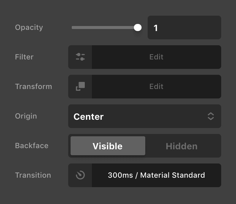
As mentioned previously, the three main CSS properties that we are working with in the Effects module is opacity, filter, and transform. If you are unfamiliar with any of these properties, below is a brief description of each:
opacity– Allows you to specify a variable transparency on the Element.filter– Enables the use of visual effects such as blurring, grayscale, hue rotation, et cetera.transform– Alters the appearance of the Element without changing it's physical placement. Can be used to move, skew, and rotate Elements.
The Opacity control is relatively straightforward, so let's jump ahead to Filter. Clicking on that control will reveal the following popup:
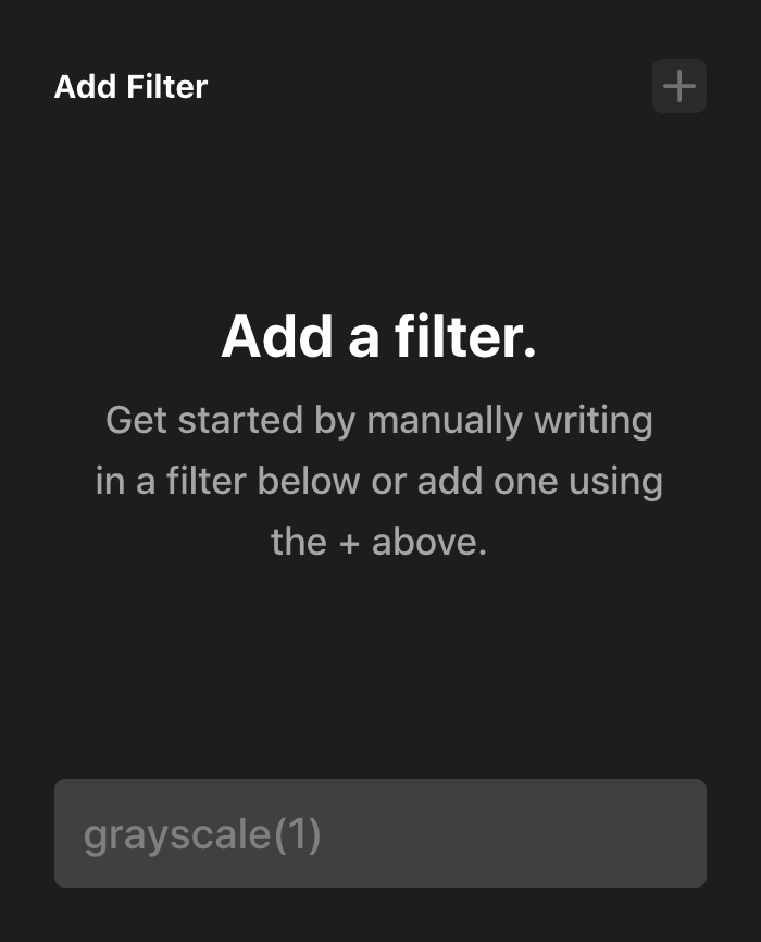
The nice thing about the Effects module is that the more complex aspects of it will feature a guided interface to help you along, even if you are unfamiliar with that particular CSS property. From the screenshot above, you can see that you can just jump in and start typing the property value in the input if you wish, or you can click the + button to add a "layer" to this property and see the guided interface:
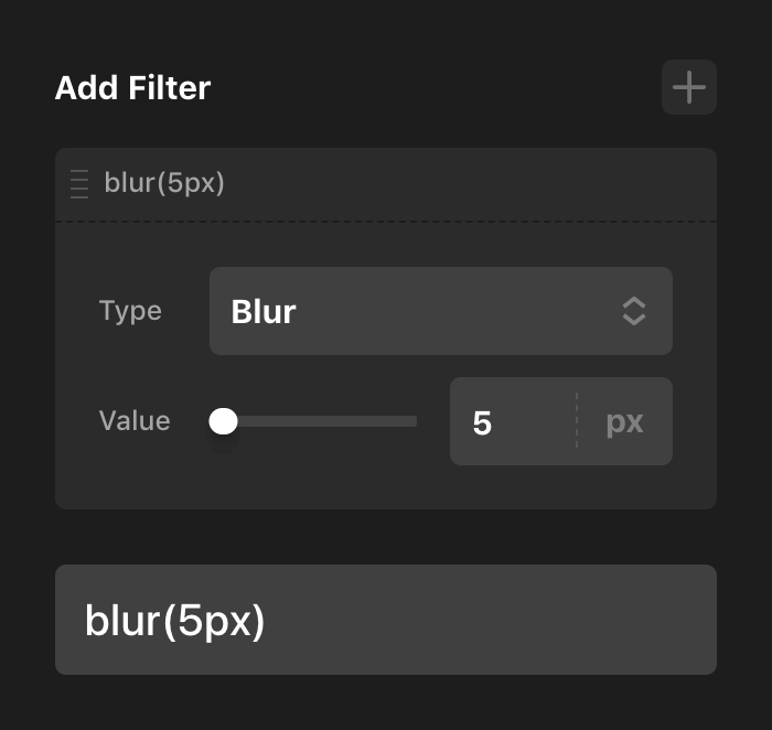
In the screenshot above we've selected the blur() function for our Filter control, which presents you with a slider you can use to adjust the value. All of this is composed for you by default and output to the input below. Now, let's say that you wanted to add a second filter:
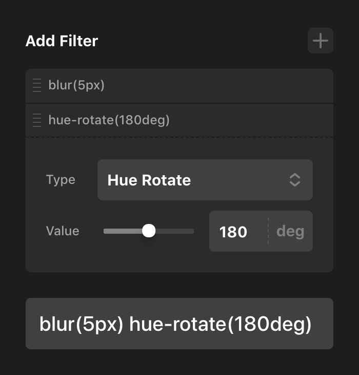
For this layer we've chosen the hue-rotate() function, which features a relevant slider just like before. Note that since this layer is second in the list, it is output as the second value in the input below. This is a very important piece of information to keep in mind: filters—and transforms—are linear in their output. What this effectively means is that the order you place them in matters and will give you different results in some scenarios.
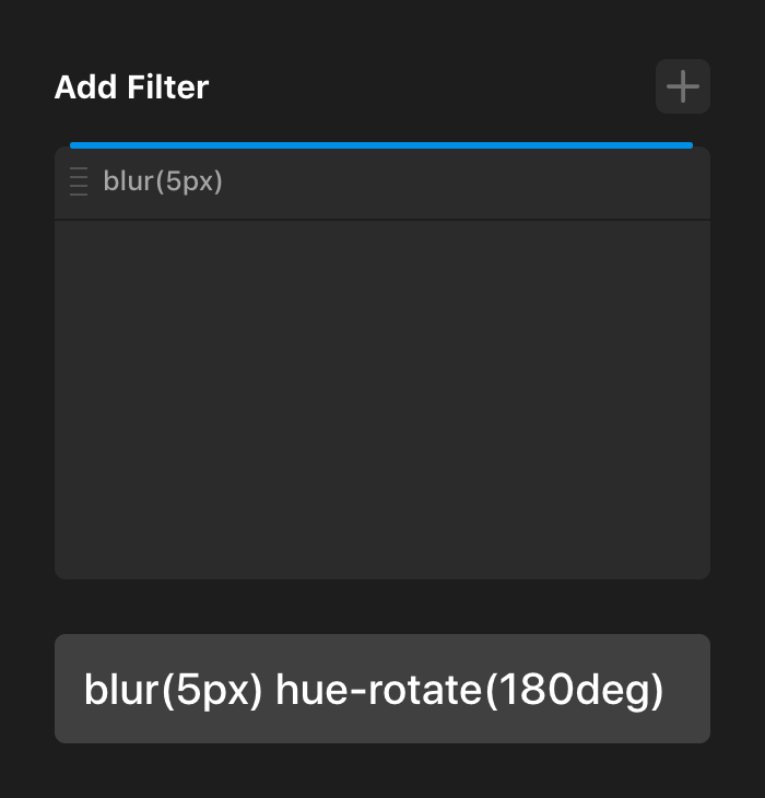
If you wanted to move the hue-rotate() function to the first position in your output you could copy and paste it in the input below, but the easier way to do this would be to grab the layer in the list above and drag it to the first position:
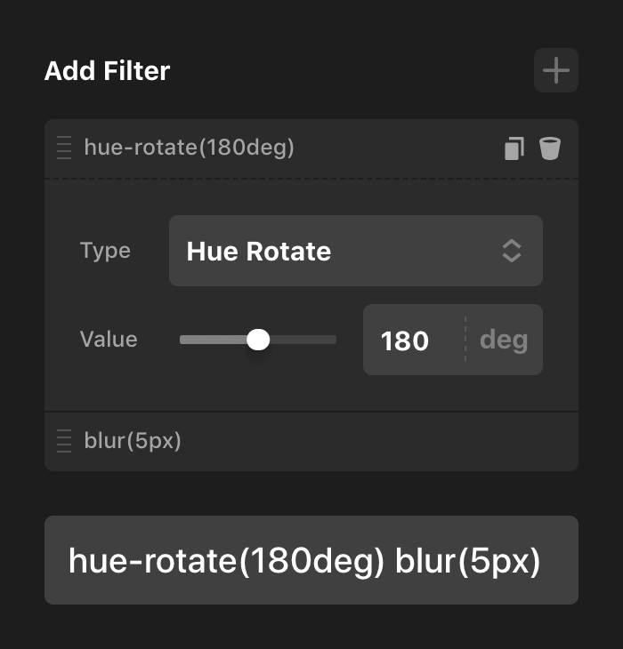
Once it is dropped, you will notice that the hue-rotate() function has been moved to the first slot on the list as well as the input below. This allows you to quickly experiment with different orders and see how it affects the overall output of your effect:
Now that we're a little more familiar with this guided process for the Filter control, let's jump to the Transform control:
You will notice a similar interface like what we saw above with the Filter control. Just as in that context, clicking the + button will reveal our guided settings for the Transform control:
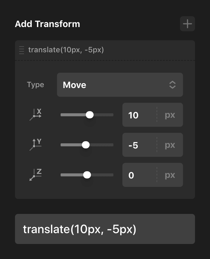
In this interface you will be able to experiment with “moving” (translating), skewing, and rotating your Element, as well as the order of these transforms.
Base: Transition
The final control in the base control group is the Transition control. Clicking on that picker will reveal the following popup:
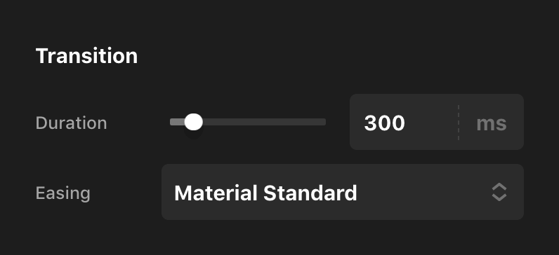
You can use these controls to set the general transition-duration and transition-timing-function of your Elements. These values will be applied to not only the Effects transitions of the Element, but also that Element's colors, shadows, graphics, particles, et cetera. These values are used for the transition between the base and interaction styles of your Element.
All Elements have a default value for both of these settings. For the vast majority of them, the default Duration is 300ms and the default Easing is Material Standard. If these values are not changed, no dynamic CSS will be output as they are handled by the static stylesheets of the theme, which keeps your generated styles as lean as possible.
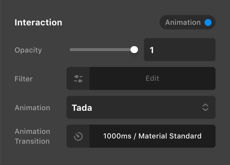
Interaction
Next, let's move to the Interaction group, which features a near identical set of controls. The primary difference here is the Type selection as well as the Transition control:
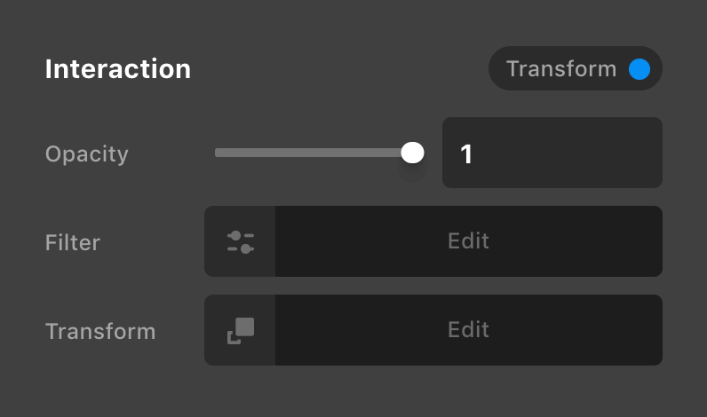
This allows you to choose between utilizing a Transform or a pre-baked Animation when interacting with the Element. There are a couple things to keep in mind with the one you choose (and how you have your base controls set):
- Transform – Selecting this option will allow you to create an additive transform that builds on any transforms set in the Base control group. For example, say you set a
skew()in your Base group and on hover you wanted it to keep thatskew()but alsotranslate()up some, you could use this control to do that and the transition would be smooth between the two. - Animation – The animations available in the Effects module are based on animate.css. Because many of these animations are built using their own transforms, you typically will not be able to use these in conjunction with a Base transform. Practically, this means if you want to use an animation on interaction (or scroll), it is recommended that you leave your base Transform control blank. You can however still utilize base / interaction
opacityandfilterin conjunction with these animations though.
When selecting Animation, the Transform control will be replaced with a dropdown allowing you to select the desired effect:
Additionally, you will notice that an Animation Transition control appears as well. This allows you to specify the timing of the animation only on your Element. This can stack with the Transition control in the base control group, meaning that you could set a value on that control to manage the transition between colors and opacity and filters, but then have an entirely different duration for your interaction animation...lots of options to explore!
Scroll
And now for the Scroll control group:
This control group might look like there is a lot more going on, but you'll notice that we have a lot of the same repeated controls from before. The main difference here is that we have two variants of each CSS effect—an “Entrance” and an “Exit” style. The “Entrance“ style is what is used when the Element comes into view and the “Exit“ style fires as the Element leaves the viewport.
For example, if you wanted to create a simple fade-in transition with the Element translating from the side as you scroll to it, you could do the following:
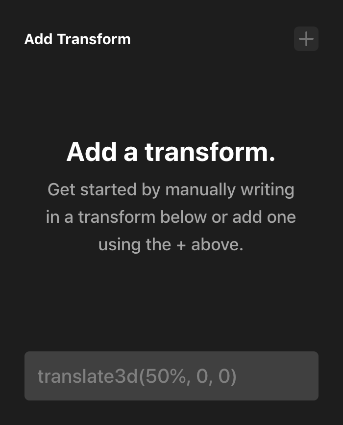
- Exit –
opacityset to0andtransformset totranslate(50%, 0) - Entrance –
opacityset to1andtransformset totranslate(0, 0)
This would push your element to the right a bit and have it faded out, and then as you scroll to it, it would translate back to its original position and fade into view. This is just one very simple example of what you can do with the scroll controls. Once you start pairing this with filters and changing the offsets and behavior…the options are near limitless.
Alternately, just as in the Interaction control group, you can select Animation as the type and use pre-built animations instead, which is great if you don't need as much fine-tuned control and just want to get something up and running:
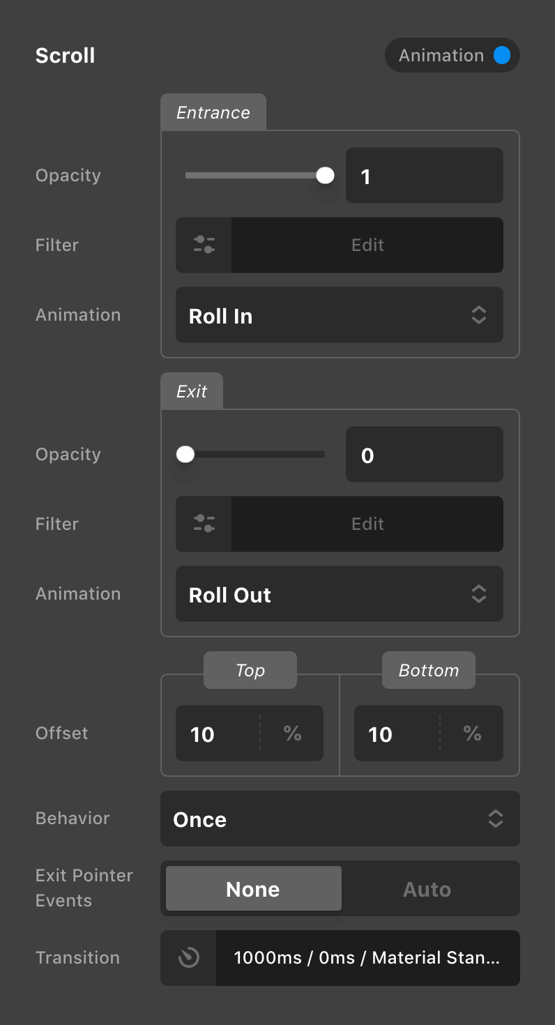
As with the Interaction control group, if using the Animation option here, it is recommended that you do not have any Base or Interaction Transform controls in use to avoid potential styling conflicts.
After you have your effect setup, you'll want to ensure that your Behavior is set how you want it. The available options do the following:
- Once – Your Element will instantiate with the “Out” style and fire one time once it has come into view, ending with the “In” styles.
- Reset – Your Element will instantiate with the “Out” style and transition to the “In” styles when you scroll down to it, and it will remain in that state until you scroll back above it where it will reset back to the “Out” style. It will retrigger each time you scroll down to it.
- In-Out – Your Element will instantiate with the “Out” style and transition to the “In” styles when it comes into view, then transition back to the “Out” styles as it leaves the viewport again. It will keep retriggering at the top and bottom of the viewport each time it enters and leaves.
The Offset control can be set using % or px units with % values being based off the viewport height. For example, if you set your Top and Bottom values to 10% each, your Element styles would be triggered when 10% away from the top and bottom edges of the viewport respectively. Alternately, if you utilized 50px each, the styles would be triggered when 50px away from the top and bottom edges of the viewport respectively.
Finally, Transition is used to set the timing of the scroll effect. The primary difference here is the presence of a Delay control, which can allow you to stagger Elements as they enter and exit with your scrolling effects.
Mask: Intro
In our ongoing commitment toward making “Photoshop-in-the-browser” a reality, let's talk about masking. There are four different masking modes available:
- Linear: Allows you to apply a simple
linear-gradient()mask across either the X axis or Y axis of an Element. - Radial: Applies a circular or elliptical mask on top of your content, while also allowing you to take advantage of the
radial-gradient()CSS function in some unique ways in this context. - Image: Affords you the opportunity to use any transparent
.pngas a mask on top of your content, with the opaque areas serving as the “window” for content to be seen through and the alpha transparency areas blocking out content. - Custom: Can be used to write in multiple mask images as well as mix and match types if desired. For instance, you can mix multiple gradient types along with images to create complex masking layers.
Below we will discuss each of these modes in detail. The Repeat, Size, and Position controls present on each mode will be discussed in their own section as they play an important role in determining how the mask is output.
Mask: Linear
The Linear mask applies a simple linear-gradient() mask across either the X axis or Y axis of an Element.
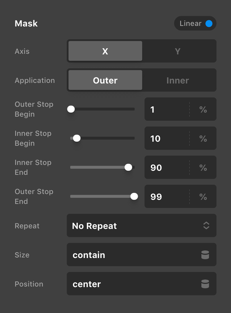
The first thing you'll choose here is which Axis to work across in addition to the Application method, which we will cover more in a moment. Beyond that, we have our Inner and Outer Stops, which determines how our linear gradient will begin and end across the entirety of the mask.
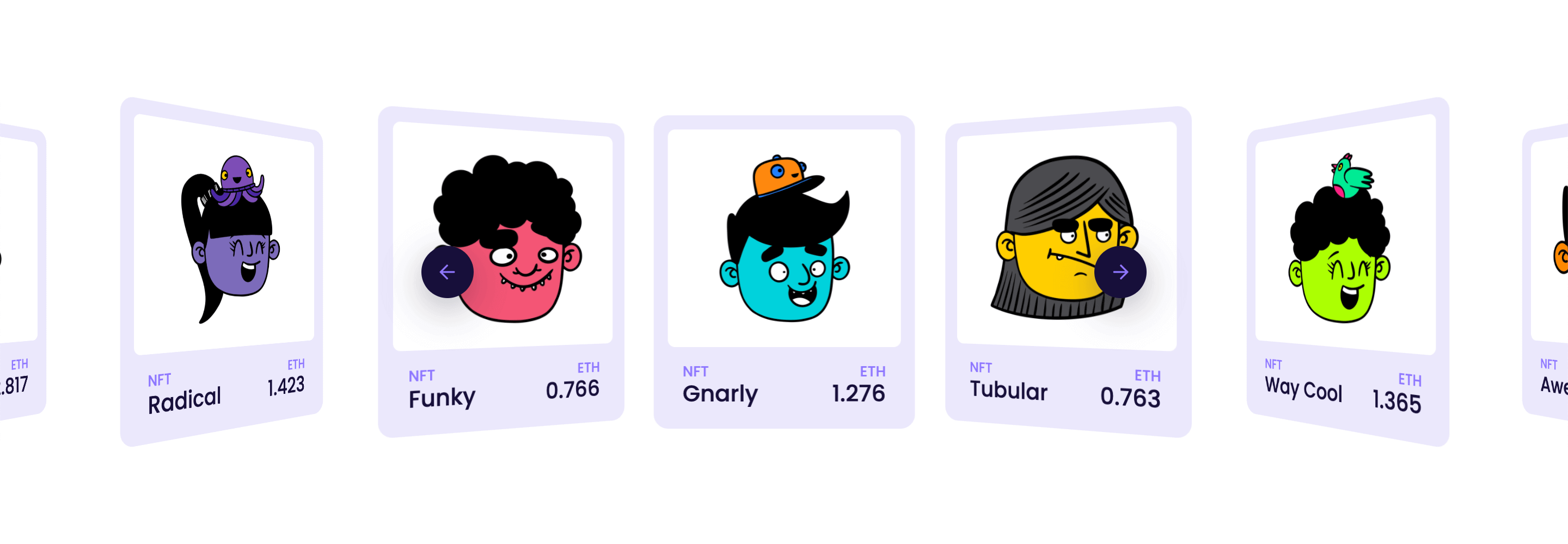
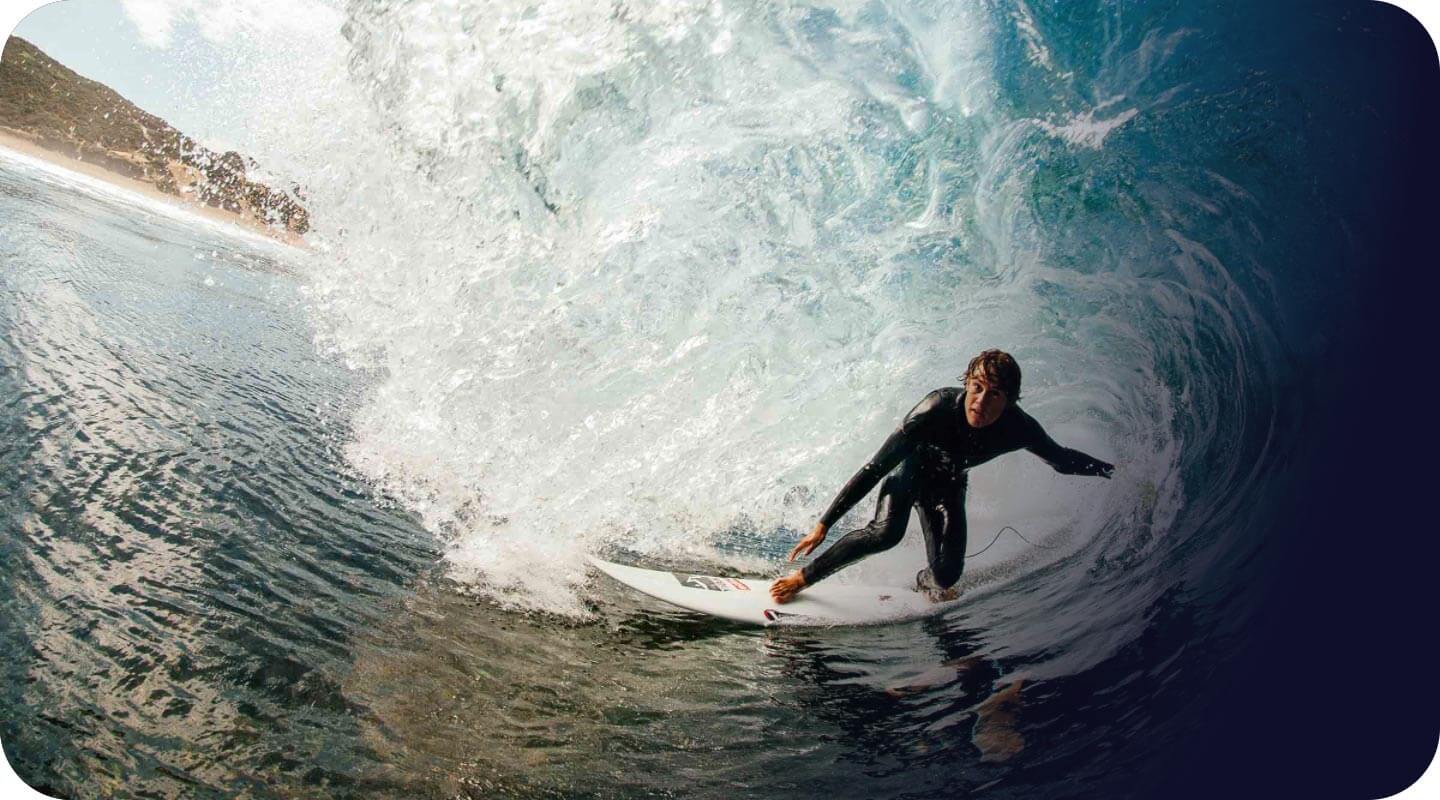
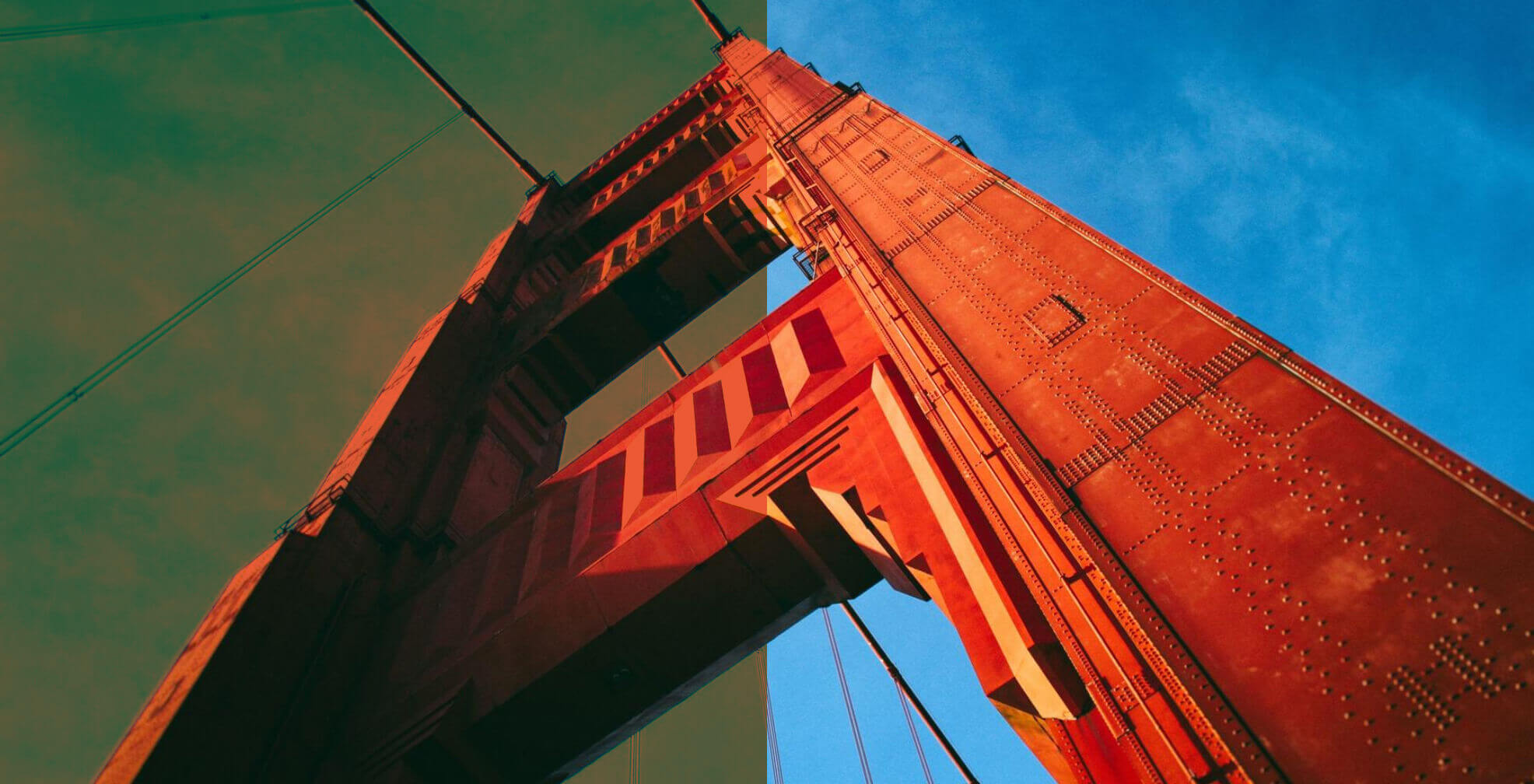
To see how all of this might play out if we enable the Linear mode on an image, let's take a look at the following example:
This example is an Image Element set inside a Div Element. The Div Element has a background color and a border radius applied, in addition to having its overflow set to be hidden, which is visually rounding out the corners of the Image Element. This is important to keep in mind because we are going to apply our mask to the Image Element, which is what will allow the background color on the Div Element to show through.
Remember from earlier that our stop values were as follows:
- Outer Stop Begin –
1% - Inner Stop Begin –
10% - Inner Stop End –
90% - Outer Stop End –
99%
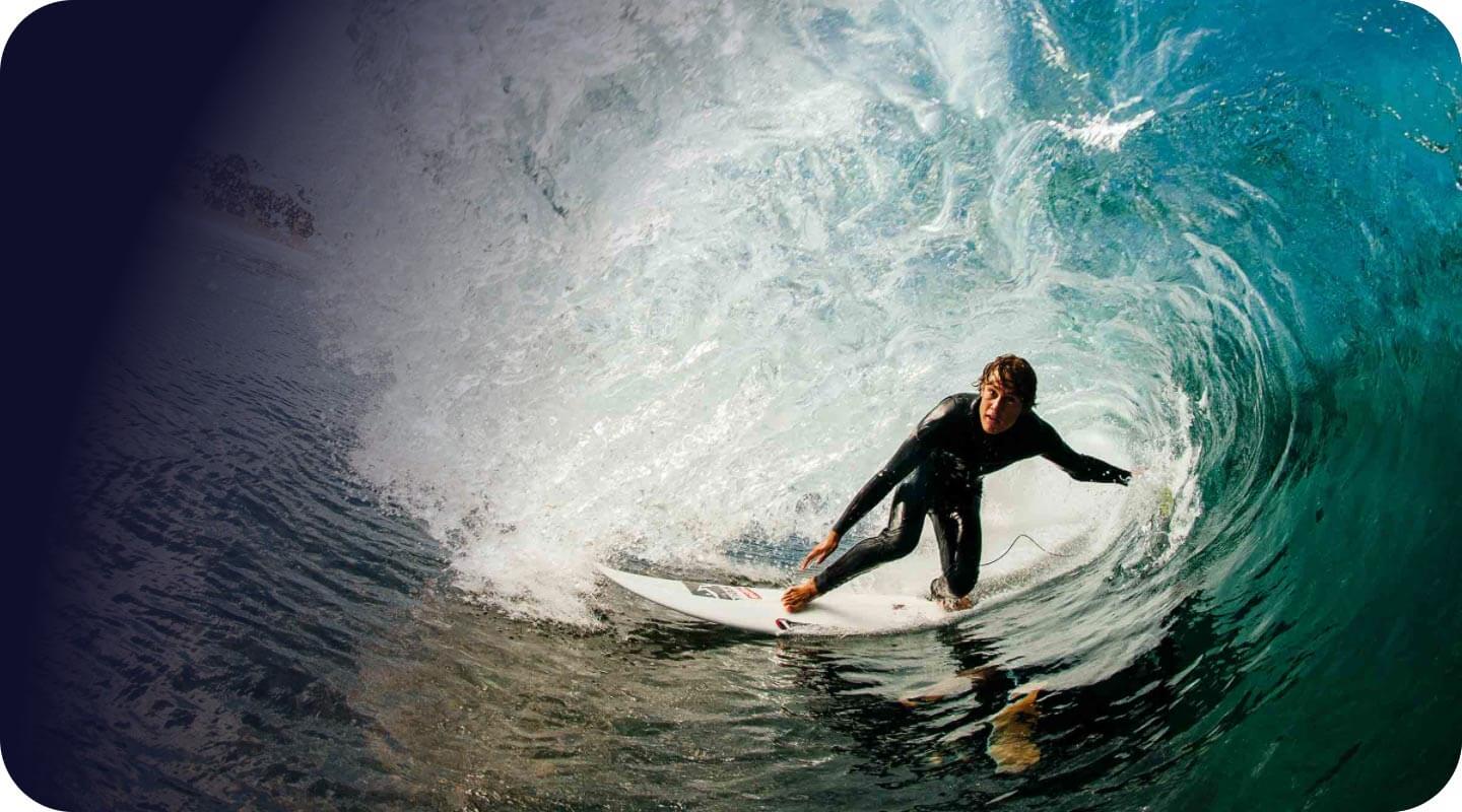
As we can see, these stop values are used to determine how the gradient mask should output over the source material. Because we have full control over the beginning and end values for each side of the gradient, we can make these asymmetrical if desired, or remove one side completely by setting both of its values to 0%.
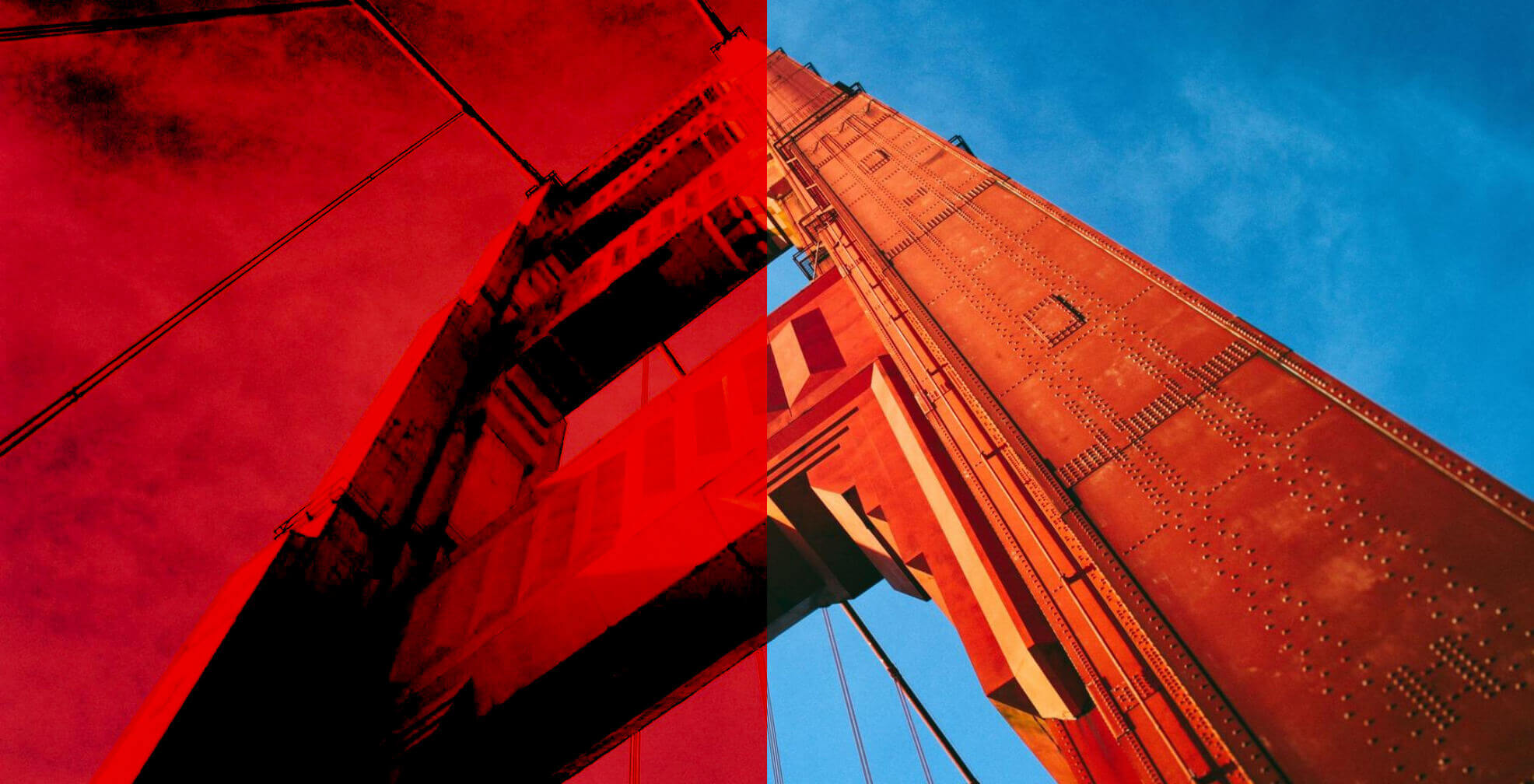
Also, remember to keep in mind the Application control from earlier. This can be used to invert your mask if you're wanting to remove the central part of your content by setting its value to Inner:
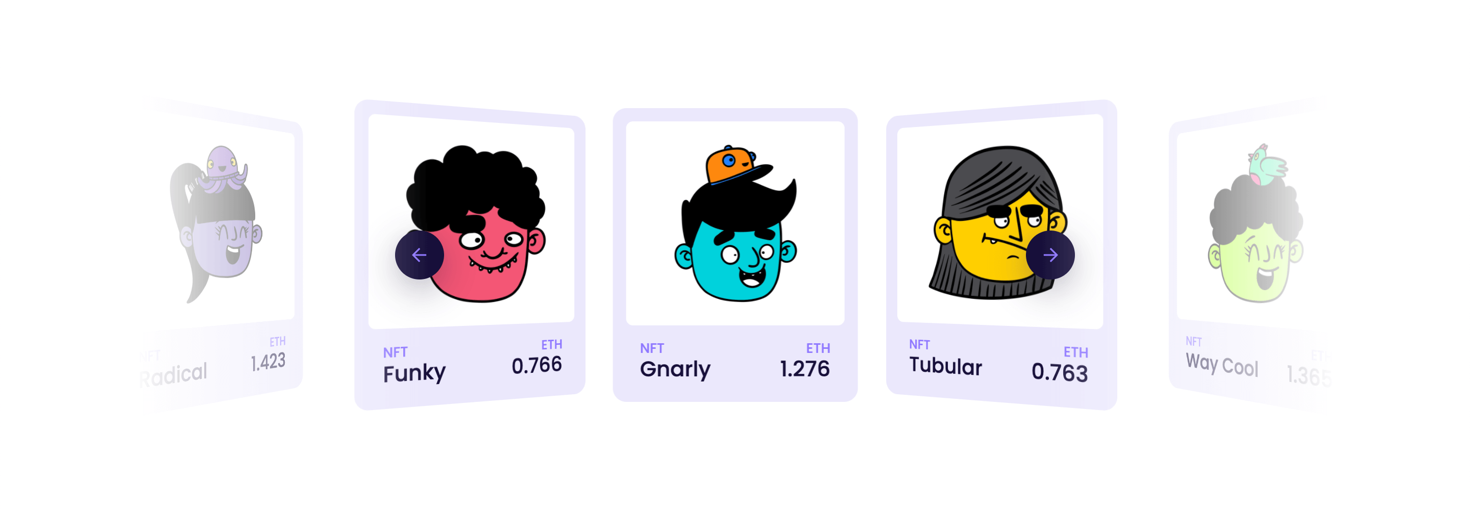
The Linear mode can be particularly useful on scrollable areas or sliders where you want to gracefully fade out your content on larger screens, or use the subtle way to indicate that there is more content to scroll to on mobile devices (a common pattern used in these scenarios).
For example, take the Perspective Carousel Slider pattern from our Modern Sliders course on a very large screen:
While the content naturally spreads from one edge of the screen to the other, you may find that having the ability to mask out the edges gives it an intriguing look that appears to gracefully fade in and out on either side:
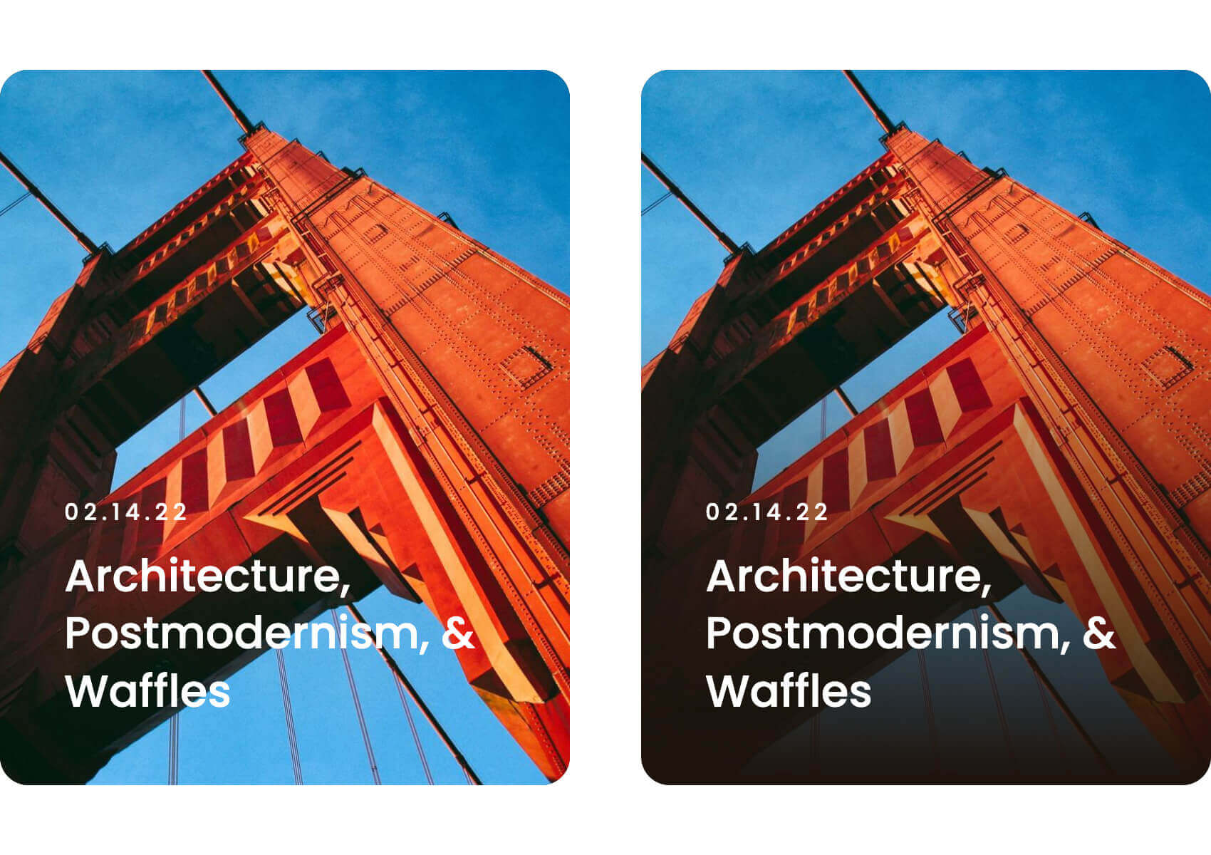
Another helpful use case for the Linear mask would be creating subtle fades on images that have content on top. In our simple example below, notice how the first instance on the left doesn't have quite enough contrast for some of the words that fall into the lighter areas of the image. The mask on the second example helps to offset this content some and make it more readable, while still maintaining the overall visibility of our background image:
Mask: Radial
The Radial mode applies a circular or elliptical mask on top of your content, while also allowing you to take advantage of the radial-gradient() CSS function in some unique ways in this context:
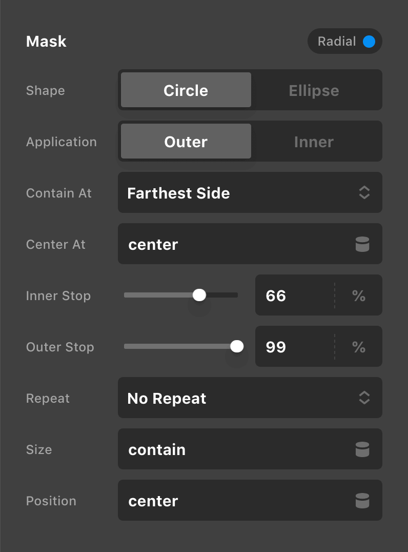
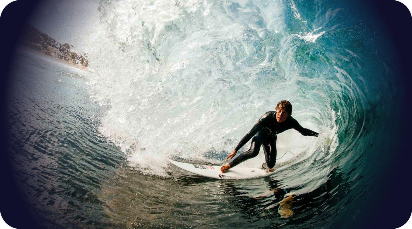
Notice that this mask is powered by a couple stops similar to our Linear mask, but the main difference here is the Contain At and Center At controls, which can allow you to do some unique things when positioning your mask. For example, with the default value of center for the Center At control, the mask's central point is placed in the middle of the content and the stops radiate out from there:
However, we could place the radial gradient's central point in the upper-left corner by setting this control to 0% 0%:
Or the lower-right corner with 100% 100%:
And all of this is very interactive with how you set the Contain At control, in addition to all of the other sizing and repeat parameters. To better understand how some of these features work, we highly recommend taking some time to read up on the radial-gradient() syntax.
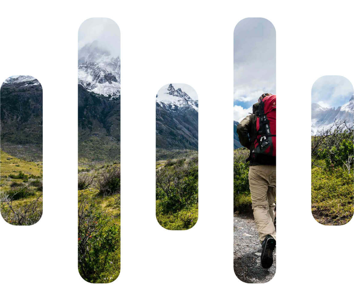
Mask: Image
The Image mode affords you the opportunity to use any transparent .png as a mask on top of your content, with the opaque areas serving as the “window” for content to be seen through and the transparent areas blocking out content.
One simple way this could be employed is using an intriguing shape (a faux logo in this case) as the mask over an Element with a background image, showcasing only the parts of the image that reside in the same part as the mask:
Mask: Custom
Can be used to write in multiple mask images as well as mix and match types if desired. For instance, you can mix multiple gradient types along with images to create complex masking layers:
To learn more about the syntax and options available here, definitely check out the mask-image documentation online, in addition to the mask-composite documentation. Keep in mind that mask-composite is a more experimental feature that employs some cross-browser polyfills, so it may not work consistently all the time. Additionally, mask-composite will only work when two or more mask-images are applied.
Mask: Repeat, Size, and Position
The Repeat, Size, and Position controls toward the bottom of each mode play a very important part in determining how your mask will behave. By default, these controls are set to no-repeat, contain and center:
These are based off of the mask-repeat, mask-size, and mask-position properties respectively. It is important to take some time to review the documentation on these properties to fully understand how they work together so that you can get the most out of your masks.
Specialty: Mix Blend Mode
In addition to the properties mentioned above, there is also a Mix Blend Mode control in the Specialty control group. This particular control is completely static and does not have an alternate setting in the Interaction or Scroll control groups. If you are unfamiliar with the mix-blend-mode CSS property, we strongly recommend that you learn more about it to understand it more fully.
Essentially, the mix-blend-mode CSS property sets how an element's content should blend with the content of the Element's parent and the Element's background. To see some examples in action, let's take the following situation:

The above screenshot is a Row Element with no gap and two Columns, both set to have the same background color Yes, we promise there are two even though you can't see it—we're not messing with you. 😊
Now, we're going to add an Image Element to the first Column and set its height to 100% and its width to 200%, forcing it to span the entire length of the Row:

So our Image Element is physically only in the first Column but visually spanning both Columns. This will allow us to see how changing the value of the Mix Blend Mode control affects one half of the image while the other half remains the same. For instance, here is the Darken setting:
The following is a demonstration of Color Burn:
Here is Exclusion:
And finally, Luminosity:

Keep in mind that these are only four examples out of a very large list of selections, including:
normalmultiplyscreenoverlaydarkenlightencolor-dodgecolor-burnhard-lightsoft-lightdifferenceexclusionhuesaturationcolorluminosity
In addition to the MDN resource linked above, we would also recommend checking out this CSS-Tricks article, which features many great examples of mix-blend-mode in action in addition to explaining the various property values.
Note: mix-blend-mode is not supported in IE11. Because of this, we recommend using it as more of a progressive enhancement in your designs.
Specialty: Backdrop Filter
Another item found in the Specialty control group is the Backdrop Filter control. This particular control is completely static and does not have an alternate setting in the Interaction or Scroll control groups. If you are unfamiliar with the backdrop-filter CSS property, we strongly recommend that you learn more about it to understand it more fully.
The backdrop-filter property lets you apply graphical effects such as blurring or color shifting to the area behind an Element. Because it applies to everything behind the Element, to see the effect you must make the Element or its background at least partially transparent.
So let's see a simple example of what is possible using backdrop-filter. Take the common example of placing a Button as a call-to-action within a Section that has a hero background image:

For this particular example I've applied a slight transparent background to the Button. Because of how busy the image is behind Button, the text inside the Button is getting lost in the noise a little bit. Now, we could lower the contrast on our background image or reduce the transparency of the background color on our Button, but let's see what applying a backdrop-filter can do:

In the image above, we've applied blur(10px) to the backdrop-filter of our Button. Notice how this single change has helped to separate the content of the button away from the background of the Section. The neat thing about blur() is that we can still see the general form of the image behind our content (e.g. take note of the diagonal line of the table), just in a more abstract way. Now let's try a different filter with contrast(50%):

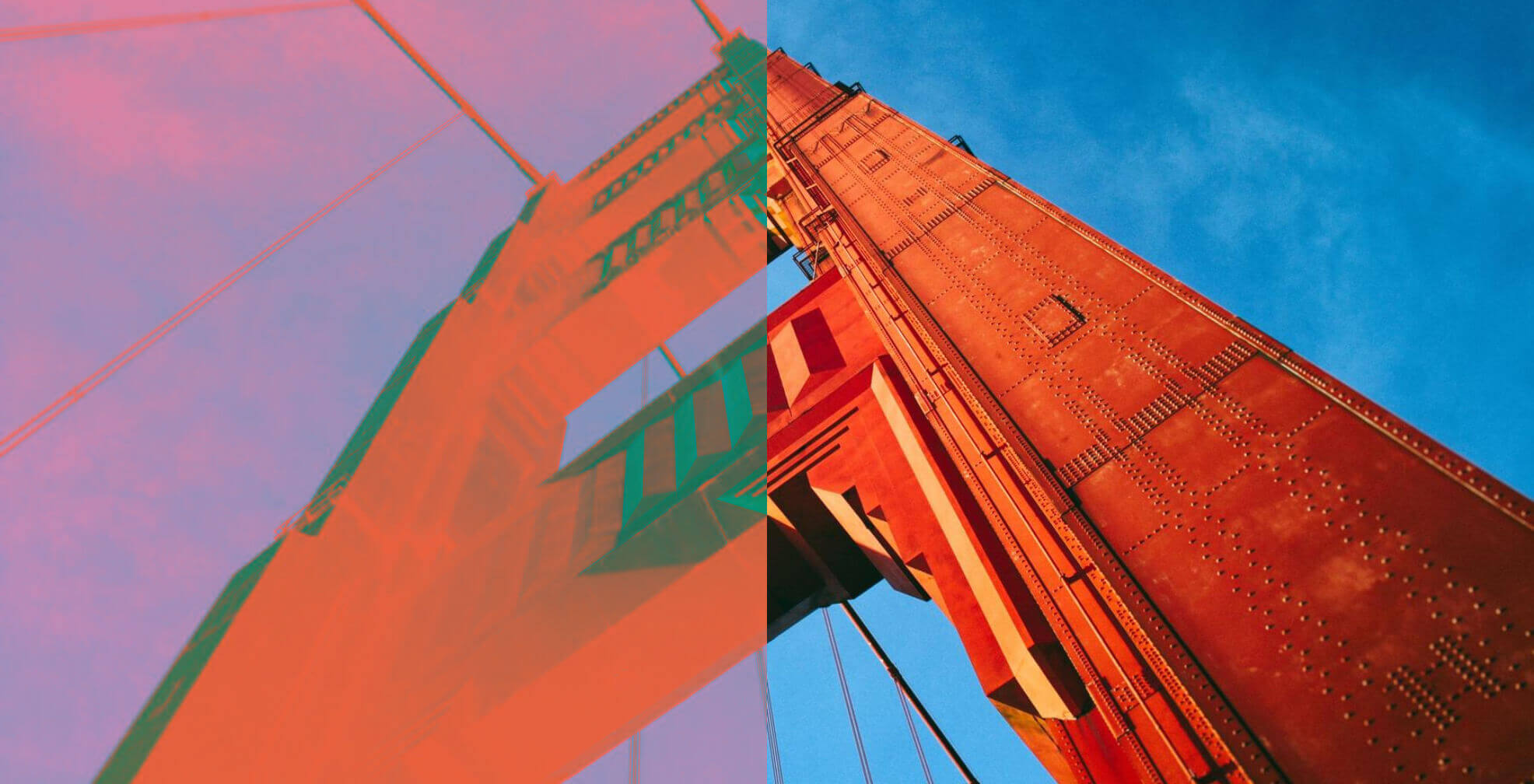
Again, notice how the simple reduction in contrast of the colors behind our Button helps to offset it from the background. Now, let's try something a little different with the hue-rotate() filter:

For this particular example, while the color shift of the background colors is interesting, I wouldn't say that it has helped to offset our content much. In this particular example we are just using hue-rotate(-50deg). The neat thing about backdrop-filter though is that similar to filter, you can stack multiple functions to create intricate effects:

In the image above we're using the following chain of functions: blur(10px) contrast(75%) hue-rotate(180deg). Notice how this particular combination of functions allows us to add subtle depth and detail to our design. This is just one very simple example of what is possible when using backdrop-filter, but there is so much more to explore in your designs!
Note: backdrop-filter is not supported in IE11 and has to be enabled by users in Firefox. Because of this, we recommend using it as more of a progressive enhancement in your designs.
Link Child Interactions
One final item to discuss is the Link Child Interactions control group. This particular control group is only present on structural Elements—Section, Rows, Columns, Grids, Cells, and Divs:
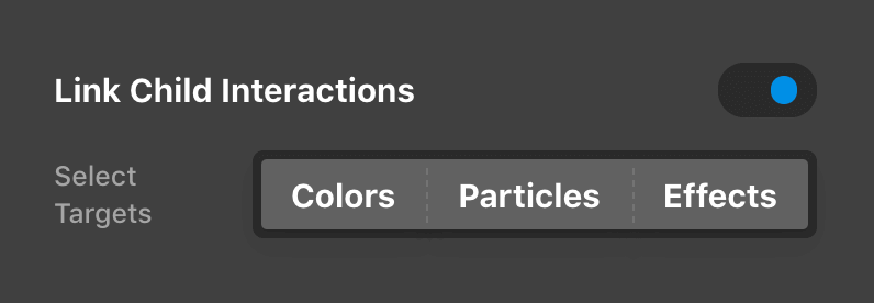
This control allows you to chain child Element transitions based on interactions occurring on their parent. For example, let's say that you have a linked Column you've created and you want all Elements inside of it to go to their interaction state when you hover over the Column. To do this, you would turn on the Link Child Interactions control on that Column and by simply doing this all "interactive" Elements inside that Column will change when hovering over the Column Element.
The really cool thing about this though is that you can breakout which pieces of the Child Elements should be triggered when hovering over the Column using the selection control seen above:
- Colors: if this option is selected, hovering over the interaction provider Element will trigger all nested Elements that have an "interaction" color to transition to that color.
- Particles: if this option is selected, any nested Element with a Particle will have that Particle trigger to its interactive state when hovering over the interaction provider. Particles are present on all structural Elements and Buttons.
- Effects: if this option is selected, any nested Element that has an interactive effect style will have that triggered when hovering over the provider. This means explicit effects created with the Effects Module (e.g.
opacity,filter, andtransform) as well as prefabricated Effects, such as transitions on the graphics found inside Buttons and Headlines.
The very powerful thing about this interaction provider is that you can mix and match any of these targets. For example, you might have a linked Column with a Button inside it and that Button might have some color transitions as well as an Effect added (let's say that it translates up slightly). If you only enabled Colors on your interaction provider, that would mean hovering over the Column would trigger the color change on your Button, but the Effect transition would not take place until you hover directly over the Button...this is only scratching the surface of what is possible using the interaction provider!
Putting it All Together
All of the facets of the Effects module are stackable and able to be combined with a few minor caveats to keep in mind:
- Do not combine transforms and animations.
Keyframe animations have their own easing timeline they operate in and if atransformis defined for that animation it will overwrite your base value while that timeline is running. For example, if you set a statictransformwith a rotation and then use an animation for your interactive style that defines a transform without that exact same starting and ending rotation, you will end up seeing a "flicker" as the transforms applied to your Element jump between the static and animated variants. TL;DR if you wish to use the pre-built animations in the Effects module, do not set a statictransformand use an animation for any interaction and scroll styles you opt into. opacityandfiltercan (almost always) be used additively.
While you should not combine the transition types mentioned above,opacityandfiltervalues can often be introduced additively to transforms and animations. For example, you may choose to enable your Scroll control group and set your “In” animation to Roll In and your “Out” animation to Roll Out. This particular animation sets anopacityandtransformtimeline up within its definition, but you could add afilteron top of this to enhance it—you might addblur(5px)to your “Out”filterandblur(0px)to your “In”filter, which would introduce the appearance of the object coming in and out of focus.- Filters are fun, but use them with caution.
The CSSfilterproperty has opened up lots of fun and exciting new design possibilities within the browser, particularly using functions likeblur(),hue-rotate(),grayscale(), and more to alter the appearance of our markup within the browser. That being said, be aware that not all browsers treat filters with equal performance and certain elements should likely avoid using filters at all. For example, you can do things like apply agrayscale()filter to a video in the browser to alter its appearance, but doing so will cause some browsers to spike in CPU usage and can bring your site to a halt. Use these functions with awareness and always make sure to test anything you're doing in multiple browsers. - Mix Blend Mode and Backdrop Filters are fun, but use them with caution.
Pretty much for the exact same reasons as the previous bullet point.
Videos
- Effects Module Overview - Deep dive of the Effects Module.
- Element Effects Deconstruction - Detailed walkthrough of a more in-depth interaction.
Subscribe to our YouTube channel for all the latest.
See something inaccurate? Let us know