Lists
In this article, we're going to discuss the various List Elements and their settings. The List Elements can be used as a quick starting point to output styled ordered and unordered lists.
Who doesn't enjoy a beautifully styled list? Sometimes it's nice to use something a little more unique and custom to your build than some out-of-the-box <ul> or <ol> markup. When working across our family of builders, you'll have access to four List Elements that feature two unique approaches to managing content in addition to two styling techniques. The Elements available are:
- Static List (Baseline)
- Static List (Centered)
- Looper List (Baseline)
- Looper List (Centered)
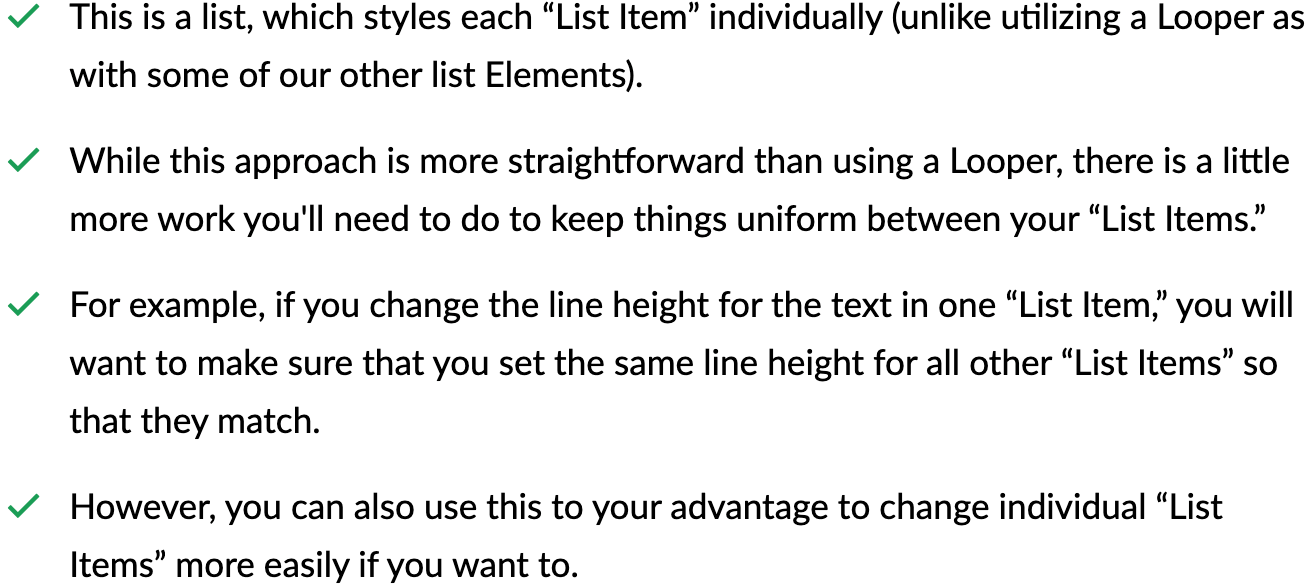
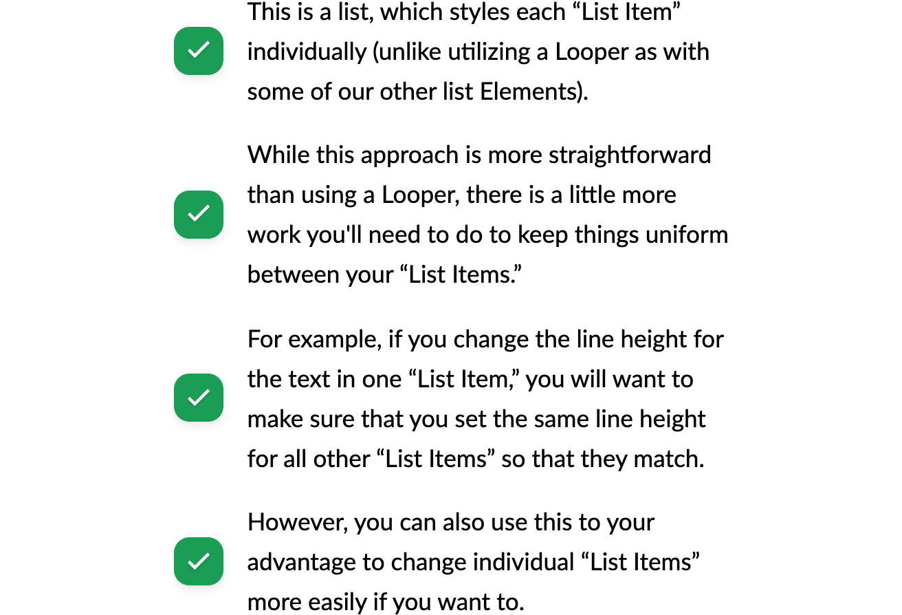
If you were to drag in the Static List (Baseline) Element into a page, the output would look something like this:
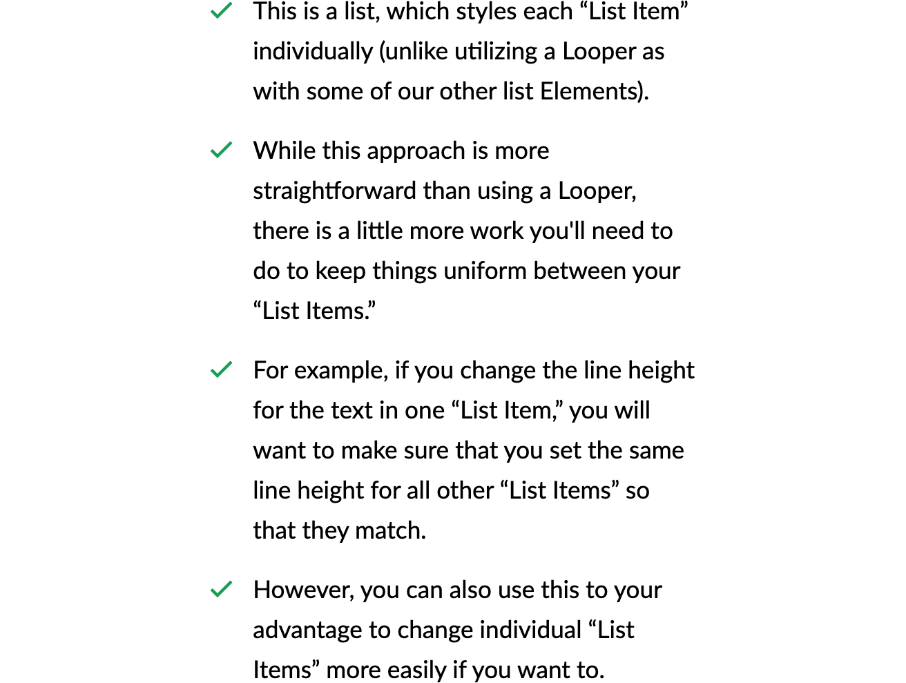
By default, each List Element will fill the entire width of its parent container. However, since each List Element is a “prefab” (i.e. an Element built out from our library of Standard Elements) based on our Row Element, you can easily bring the max-width in some if you'd like via the Workspace controls:
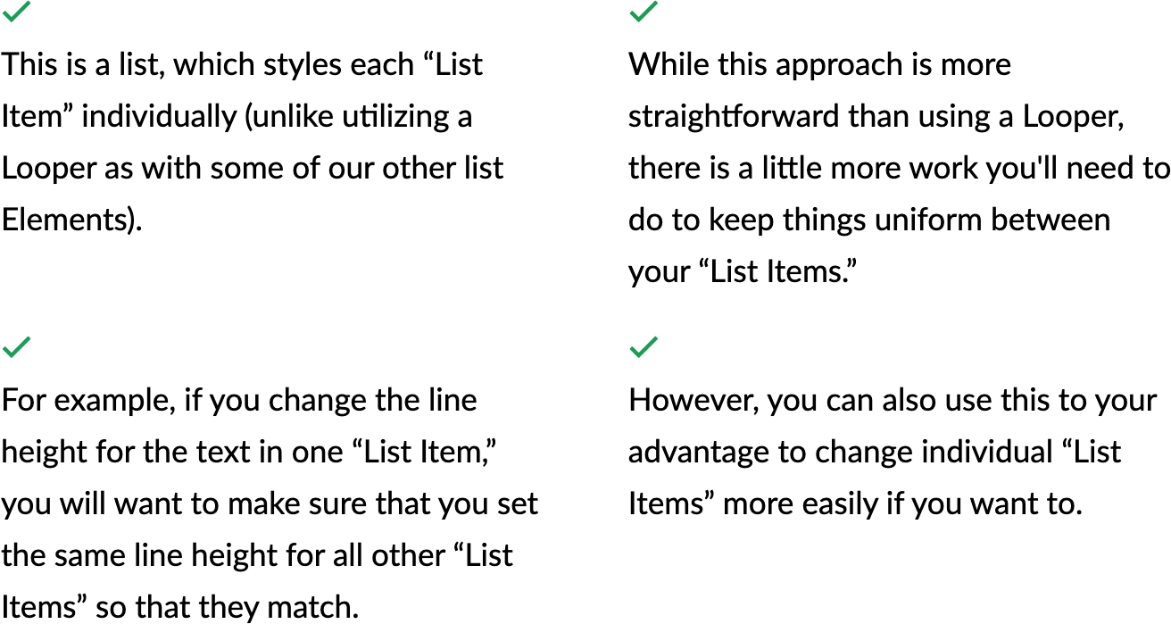
Additionally, another nice feature of each List variation being built off of the Row Element is that you can easily take your single-column List and break it up into multiple columns, like so:
There's a lot to dig into with our List Elements, so let's dive right in!
Content Management Variations
Of the four List Elements available to you, there are two variants that deal with how the content of each List is created. Depending on your wants and needs, you may find that you prefer to work with one method or the other. These content management variations are denoted as:
- Static List – A List crafted exclusively from literal Elements in the Live Preview. Each individual “List Item” is an actual item added to the Outline, which can be individually altered from one another.
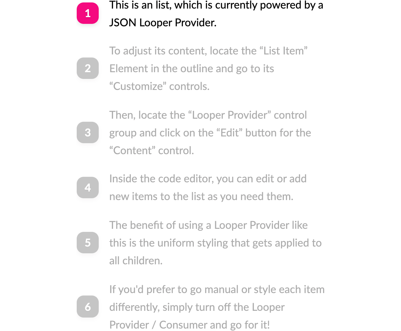
- Looper List – A list crafted by leveraging our JSON Looper Provider Type, which uses one Looper Consumer “List Item” as a model, which is then used to style the remaining virtualized Elements output from the Looper, allowing for content and styling to be easily updated from one place.
You can tell the Static Lists apart from Looper Lists in a few ways (aside from their labels in the Library, of course):
- By default, the Static Lists are designed using Icons as the bullet point, while Looper Lists utilize an incrementing Text number as the bullet point.
- Static Lists start out with a green color for each Icon, while Looper Lists use a more saturated pink for their bullet points.
- Finally, each “List Item” in a Static List will be individually inspectable as they are literal Elements in the document as mentioned previously, while Looper Lists will have the typical Looper style of one inspectable Element proceeded by additional greyed out “virtualized” Elements built off of that first Element model:
Stylistic Variations
Of the four List Elements available to you, there are two variants that deal with how the content of each List is styled. Depending on your wants and needs, you may find that you prefer to work with one method or another. These stylistic variations are denoted as:
- Baseline – A more “text-based” approach where the Icon or Text number output as the bullet point for each “List Item” will align vertical with the first line of text in that item.
- Centered – This style uses more of a “graphic-based” approach, where the Icon or Text number output as the bullet point for each “List Item” is styled more extensively to give a little more weight to each item. Also, as its name implies, the bullet / content of each “List Item” will be vertically centered off one another.
So far in this article all of the screenshots you've seen have been taken of Baseline variations for the List Elements. Below are two examples of the Centered Static and Looper Lists respectively:
Element Structure
When analyzing the overall structure we've used for each List Element, you will find that the composition of both Static List variants is the same (just styled differently between “Baseline” and “Centered”). Below is a screenshot showcasing the Element structure of both Static List variations:
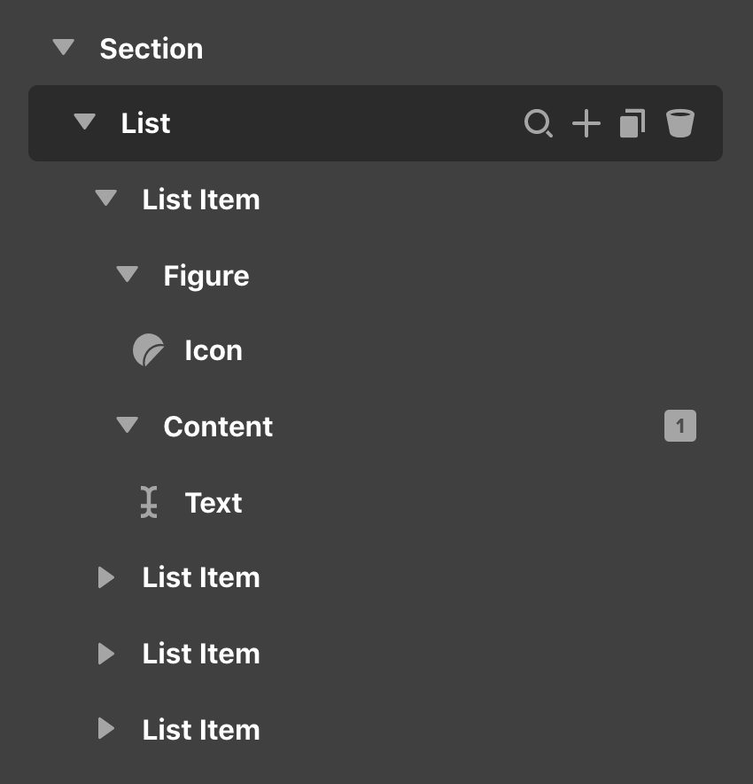
Again, take note of how this List contains four separate “List Item” Elements, each of which features the same markup found in this first expanded example. As mentioned previously, remember that any change to any individual Element must be made to each “List Item” so that they match if that is your desired outcome.
Similarly, both Looper List variants feature the same Element structure with differing style to achieve the looks between the “Baseline” and “Centered” versions. Below is a screenshot showcasing the Element structure of both Looper List variations:
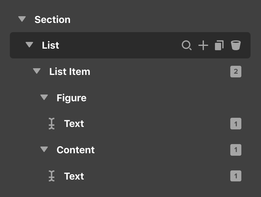
Notice that the primary difference here is that there is only one literal “List Item” in the Outline. This is because the “List Item” in this version leverages both a Looper Provider and Consumer to serve as a model for each successive virtualized Element in the Live Preview.
What you can see amongst all four of these variations though is that they essentially have the same structure for each “List Item” in the Outline. Each “List Item” is a Column within its parent Row that has its internal Flexbox layout turned on and set to a Row that can Wrap so that the items within can respond accordingly. Within that, we have a Figure that will feature either an Icon or Text Element to output a dynamic count for each item and a Content Element containing the main Text of each piece.
Both the Figure and Content Elements in these “List Items” are setup using Div Elements so that their dimensions and flexbox controls can be utilized for responsive styling. The Content Div has a fade-in effect setup by default, but this can easily be turned off or altered via the Effects Module if desired.
Editing the Looper Lists
There are a couple points of note with the Looper List that you will want to be aware of if you wish to use this pattern. The two following Dynamic Content strings are used in the initial Element model like so:
{{dc:looper:index}}– This is the Dynamic Content string that powers the numbered bullets for this pattern. This string will dynamically output the next available number in the list whenever a new item is added, eliminating the need to update these bullets manually.{{dc:looper:field key='text'}}– This references a particular field from the JSON code setup in the Looper Provider on the Element. Thetextvalue references the particularkeysetup in that JSON code, which can of course be updated to whatever you would prefer.
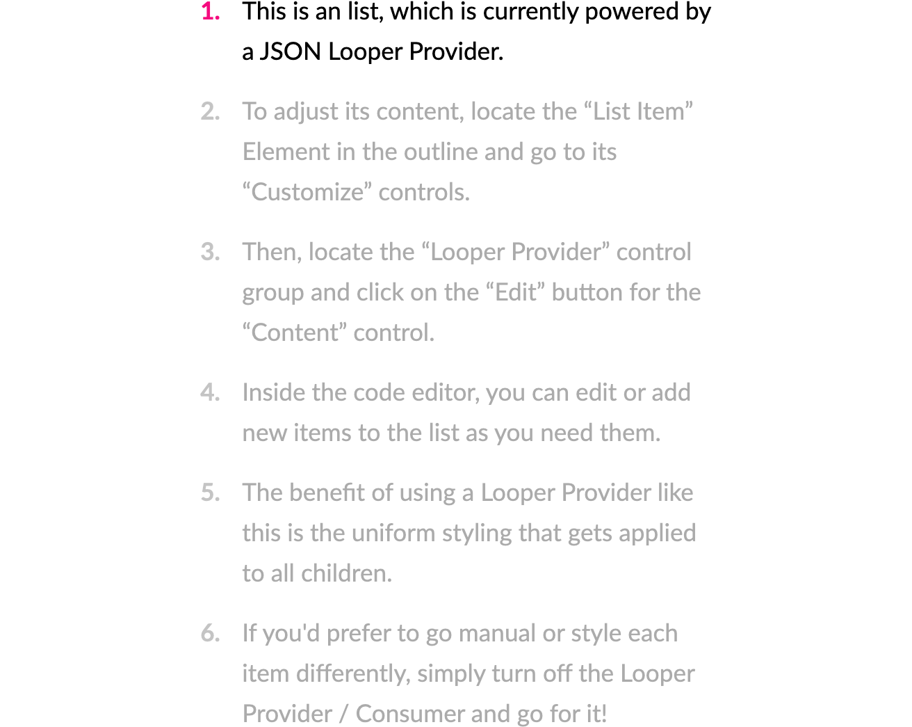
The actual content for each “List Item” can be found on that same Element by going to the Customize control tab and clicking on the JSON content editor, which will reveal the following markup:
[
  {
    "text" : "This is an list, which is currently powered by a JSON Looper Provider."
  },
  {
    "text" : "To adjust its content, locate the “List Item” Element in the outline and go to its “Customize” controls."
  },
  {
    "text" : "Then, locate the “Looper Provider” control group and click on the “Edit” button for the “Content” control."
  },
  {
    "text" : "Inside the code editor, you can edit or add new items to the list as you need them."
  },
  {
    "text" : "The benefit of using a Looper Provider like this is the uniform styling that gets applied to all children."
  },
  {
    "text" : "If you'd prefer to go manual or style each item differently, simply turn off the Looper Provider / Consumer and go for it!"
  }
]
This is a JSON array of object, which can contain any number of data points you wish to later reference in your Element. For this particular example, we only have on item, our text key, which is referenced in our Element by the {{dc:looper:field key='text'}} Dynamic Content string as mentioned earlier. So if you wish to edit any of these items, all you need to do is delete the current string and update it with your own text and that “List Item” will update accordingly. If you wish to add a new item, you can copy one of the items already available objects (e.g. {...}) and add it to the end of the array (e.g. [...]).
One very important note about this is that you must ensure that each object is separated by a comma, but your last object must not have a comma after it for its syntax to be valid. Similarly, if you wish to add more items within each object to later reference in your Element, each new key / value pair must be separated by a comma, but the last item must not have a comma after it.
Things to Keep in Mind
- Out of the box, each Looper list is setup as a
<ol>because it is numbered by default, while each Static list is setup as a<ul>as it is not ordered. This can of course be edited if you change up the design or content in any way. - Building off our last point, just because the Looper List is ordered by default does not mean that you cannot use this pattern to output an icon based list. Alternately, the Static Lists can be amended to use Loopers if desired. These are all just starting points to use and get inspired from.
Demo
To see live demos of the List Element variations, see below:
See something inaccurate? Let us know