Component Builder Overview
In this article, we're going to discuss Cornerstone's Component Builder and how it can be used to open up incredible design possibilities on your site.
What Are Components?
You can think of Components as Element Templates plus Global Blocks...on steroids. Similar to how Global Blocks functioned, Components are living versions of your design patterns that will update in real-time all throughout your site should you ever need to make updates to them in the future. The two main functions of Components are to provide a centralized repository of all your design patterns that is easily maintainable and to abstract away complexity so that the page building process can be streamlined.
For example, imagine you have a button style you wish to use all throughout your site, and you plan on using it in 100+ places. If you first made that button style into a Component and down the road you decided to change every button from red to blue, you could go update the core Component and all 100+ instances of your button would update their color at once!
That being said, there are some notable differences and improvements to how Components function compared to Global Blocks:
- Whereas Global Blocks were always wrapped in a Section Element, Components do not have to be.
- Components are managed in “Sets,” documents that can export one or more individual Components within. This is beneficial in that it allows you to manage multiple Components from one location if desired. For example, you may wish to create a “Buttons” Set that contains every button style present on your site. From this one document you can manage and export dozens of different styles if needed, rather than having to sort through numerous of individual entries when going into the Component Builder.
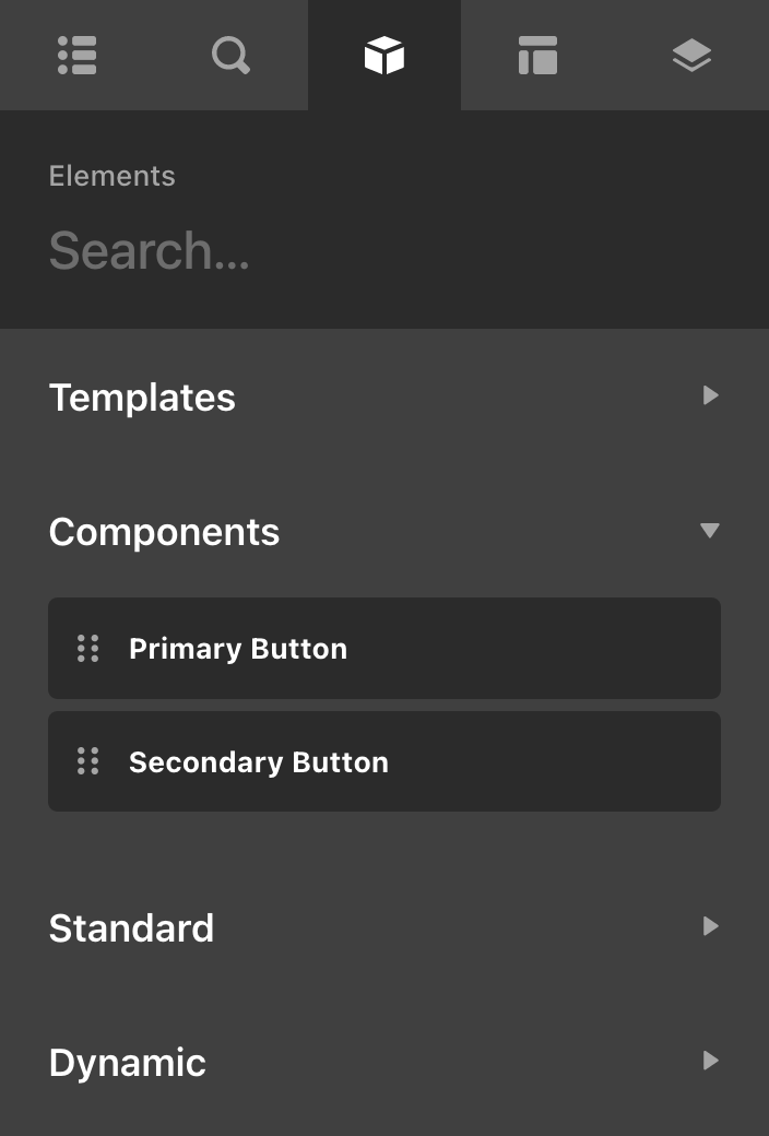
- Your Component exports will show up directly in the Element Library, effectively allowing you to create custom Elements.
- They will not show up in the Element Library tab if they are a top level element (Like Sections or Bars). To access them hold command/ctrl in the outline tab and click "Add Element" to open the Element Library popup. Find and click your component to add it to your document.
Your First Component Set
Let's run with the example mentioned above and say we wanted to build out a Component Set called “Buttons,” where we planned on managing all of our site's button styles. To get started, go to the Component Builder in the main navigation menu and click on the + in the upper-right corner to reveal the creation screen. Give your Component Set a label, then click Create Component Set:
For the sake of this example, let's say that we only needed two button styles for our design, a Primary Button and a Secondary Button. In this situation, our Component Set might look something like the following:
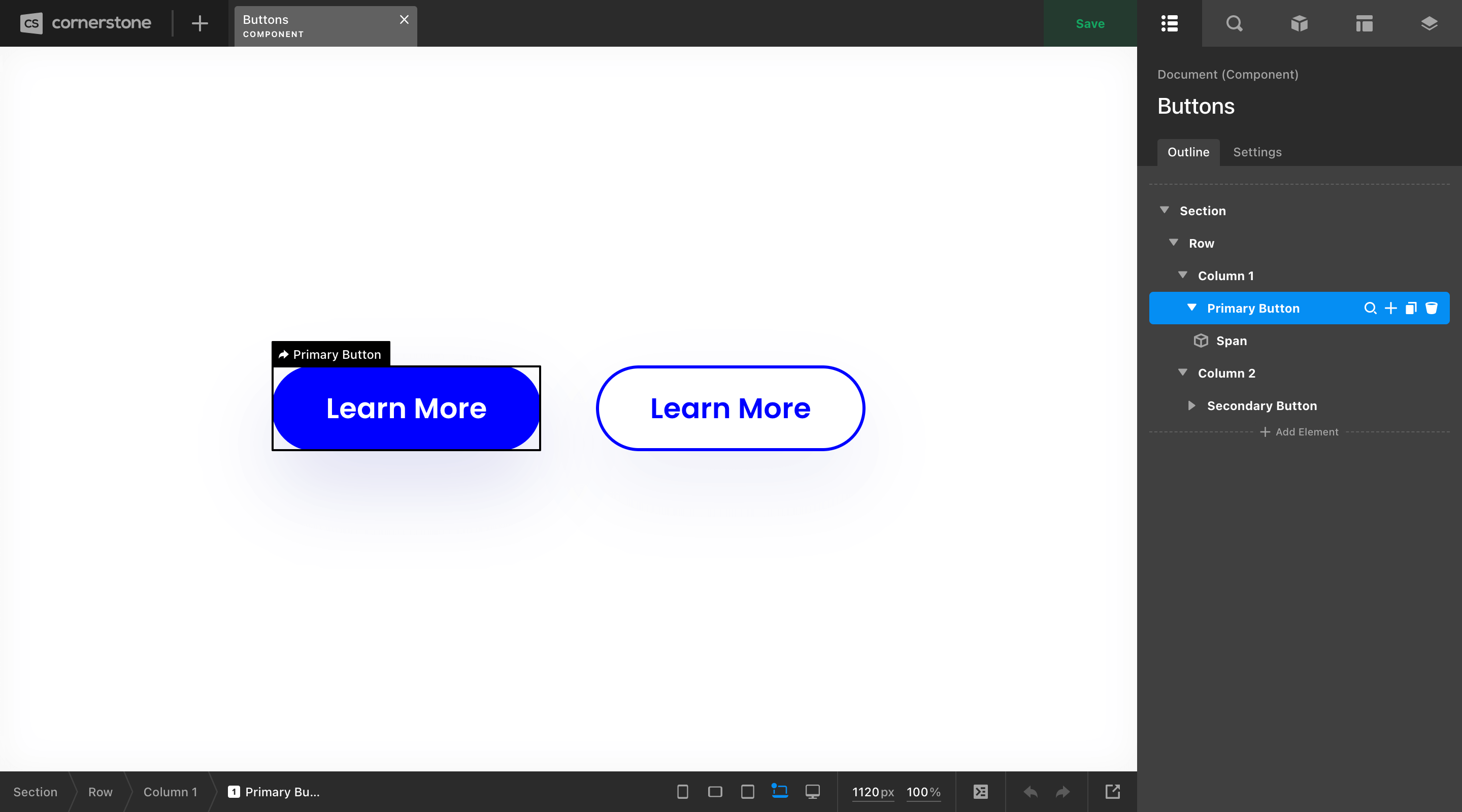
The Section, Row, and Column markup around our buttons are only there for structural purposes, giving us a canvas of sorts to organize our Elements in a clean way. None of this markup will be output with our Components because it has not been flagged for export.
To export any set of markup within this interface as a Component, open the Element Manager and locate the Export Component control and enable it:
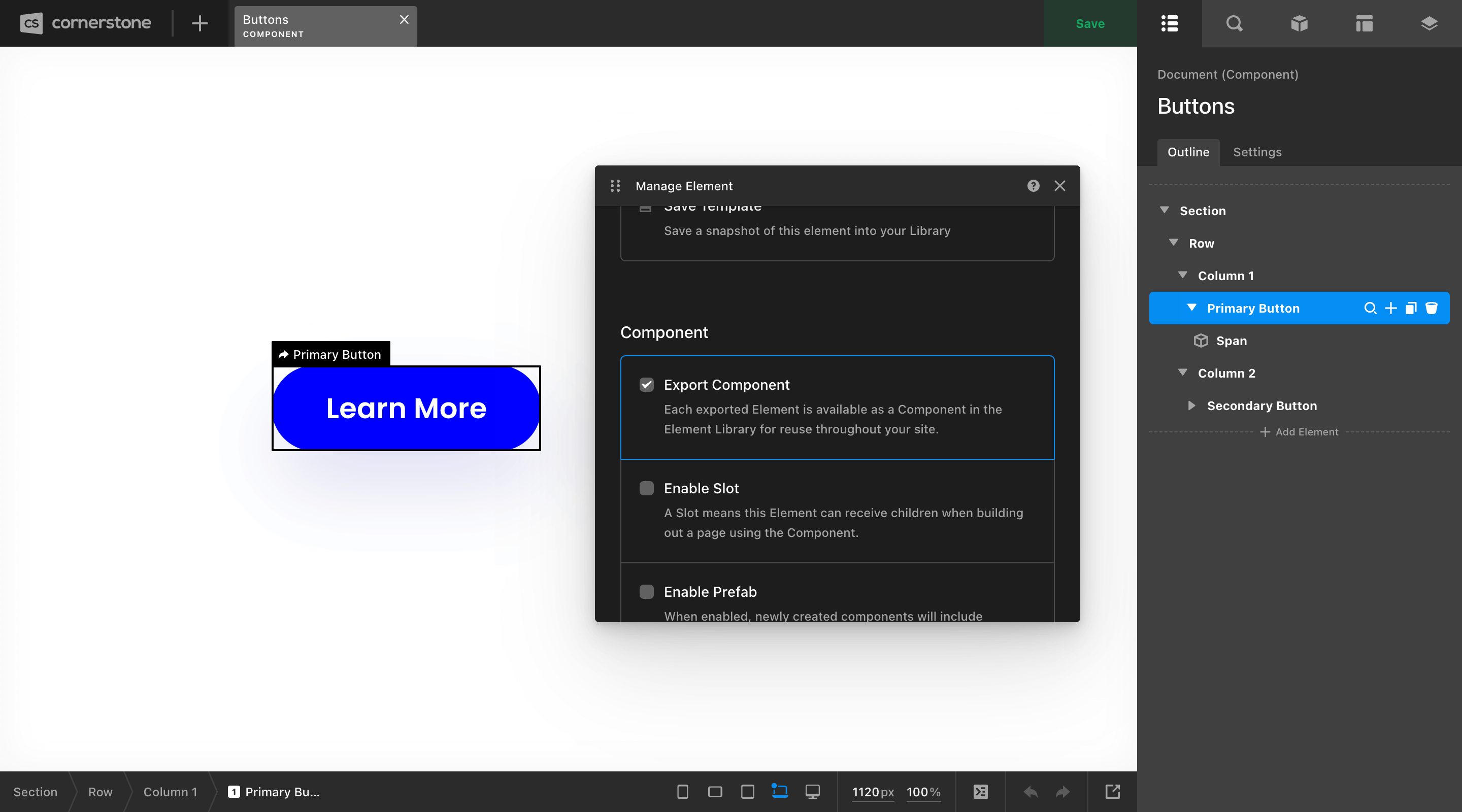
Once this is done, you will see a new status item of Component Export appear on that Element, allowing you to keep track of any individual exports you've made within a Set. As mentioned previously, you can export multiple Components within a particular set, and any exported Component will show up directly in your Element Library for use later on. In the case of this example, we have exported both of our button styles, which will show up in our Element Library like so:
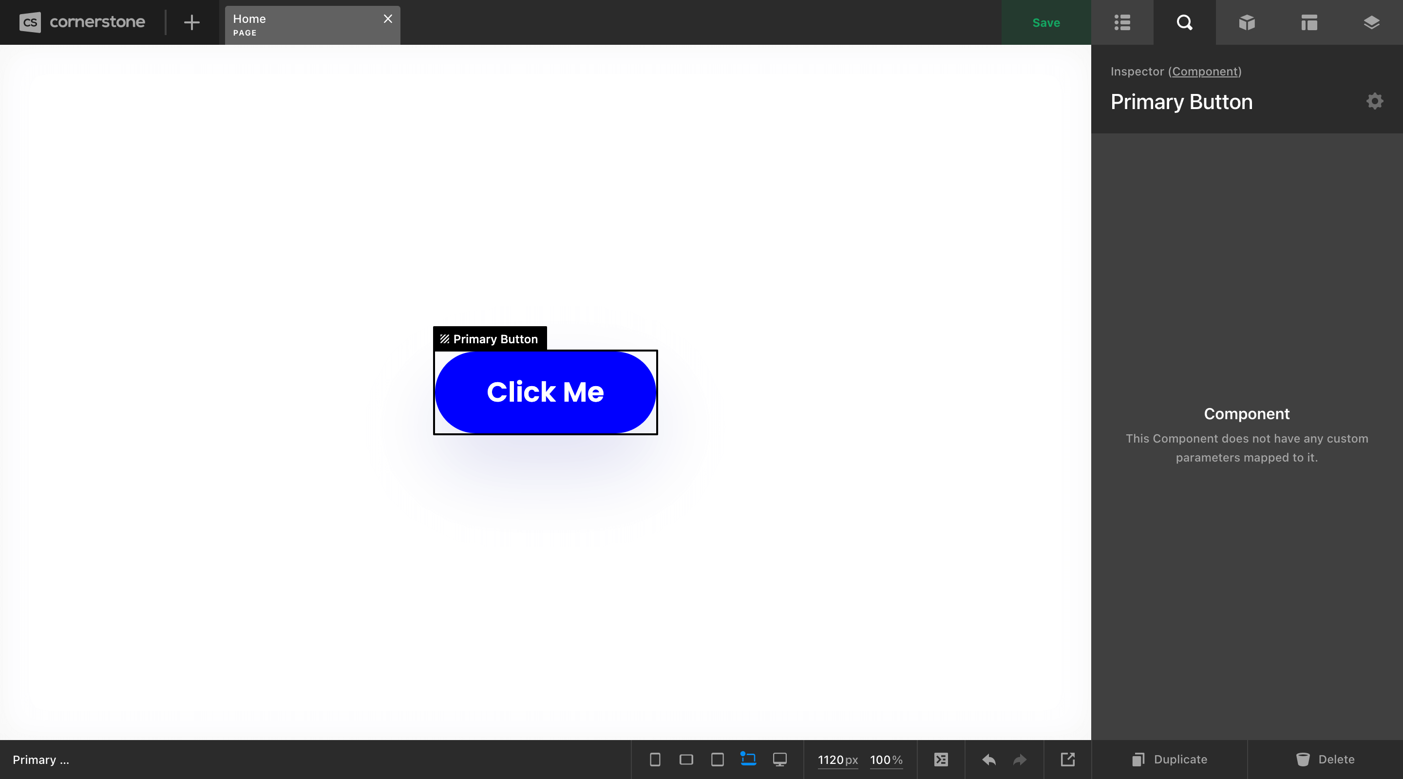
The main difference between using a Component or a standard Element in one of the other Builders is what you'll see in the inspector pane. Whereas a standard Element will be filled with controls allowing you to make adjustments, the Component will keep all of that information tucked away at the Component level, keeping things clean on the page you're working on:
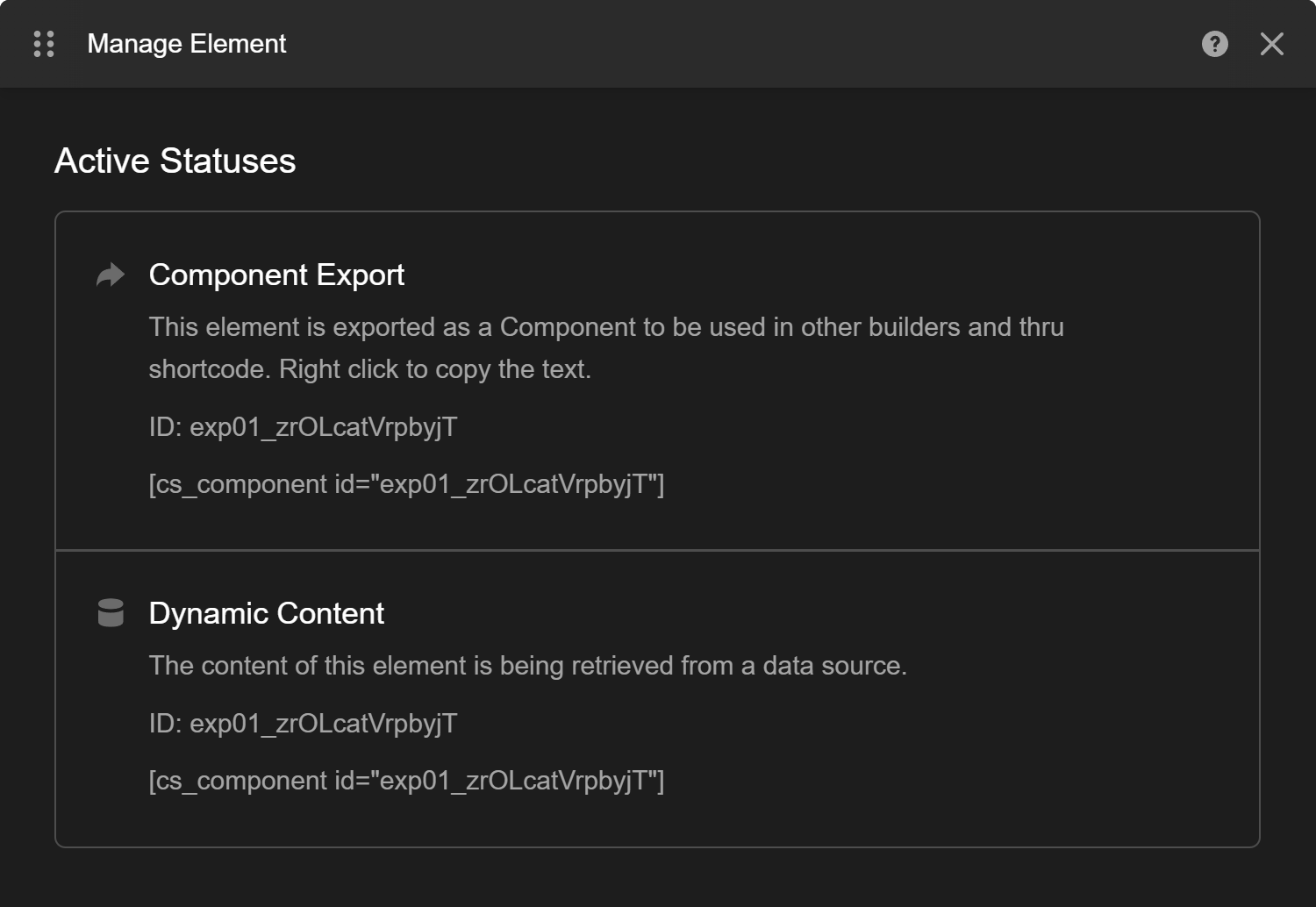
Component Shortcode
Display your component anywhere in your site using the Component's Shortcode which you can access under Manage Element > Active Statuses.
Parameters in Shortcode
In Pro 6.1.3 we introduced a way to pass parameter data to the component shortcode. You can use parameters passing in a JSON string.
<!-- This example is for a component with a parameter called "text" -->

<!-- From a parameter JSON -->
[cs_component id="..." parameters='{ "text": "This is parameter data" }']
no_wrap
@since Cornerstone 7.4.21
Adding in the attribute no_wrap will prevent the output from adding in a wrapping div. This can limit the number of HTML tags outputted. This will sometimes cause issues depending on the theme as the wrapping div that is outputted adds a subtle CSS reset to style the content correctly.
[cs_component id="..." no_wrap="true"]Limitations
The following issues exists in Component Shortcodes
- Using flex box in your component can have issues if your container is not setup for flex box.
- Animations and transforms don't trigger properly
- Off canvas elements will not work properly
Advanced Component Usage
There are a few features beyond basic Component exports that you will find very helpful for certain situations in your builds. The first of which is enabling an Element within an export as a Slot. You can think of a Slot as a consistent dropzone applied to a specific area of a Component.
For example, say that you wanted to build out a Component called “Picture Grid,” which always featured a large image to one side, and a bit of content to the other. The catch here is that you need to be able to put different content inside this component depending on where you're using it. You could enable any layout Element (i.e. Div, Cell, or Column) inside that Component as a Slot to receive variable content when you use it on the frontend.
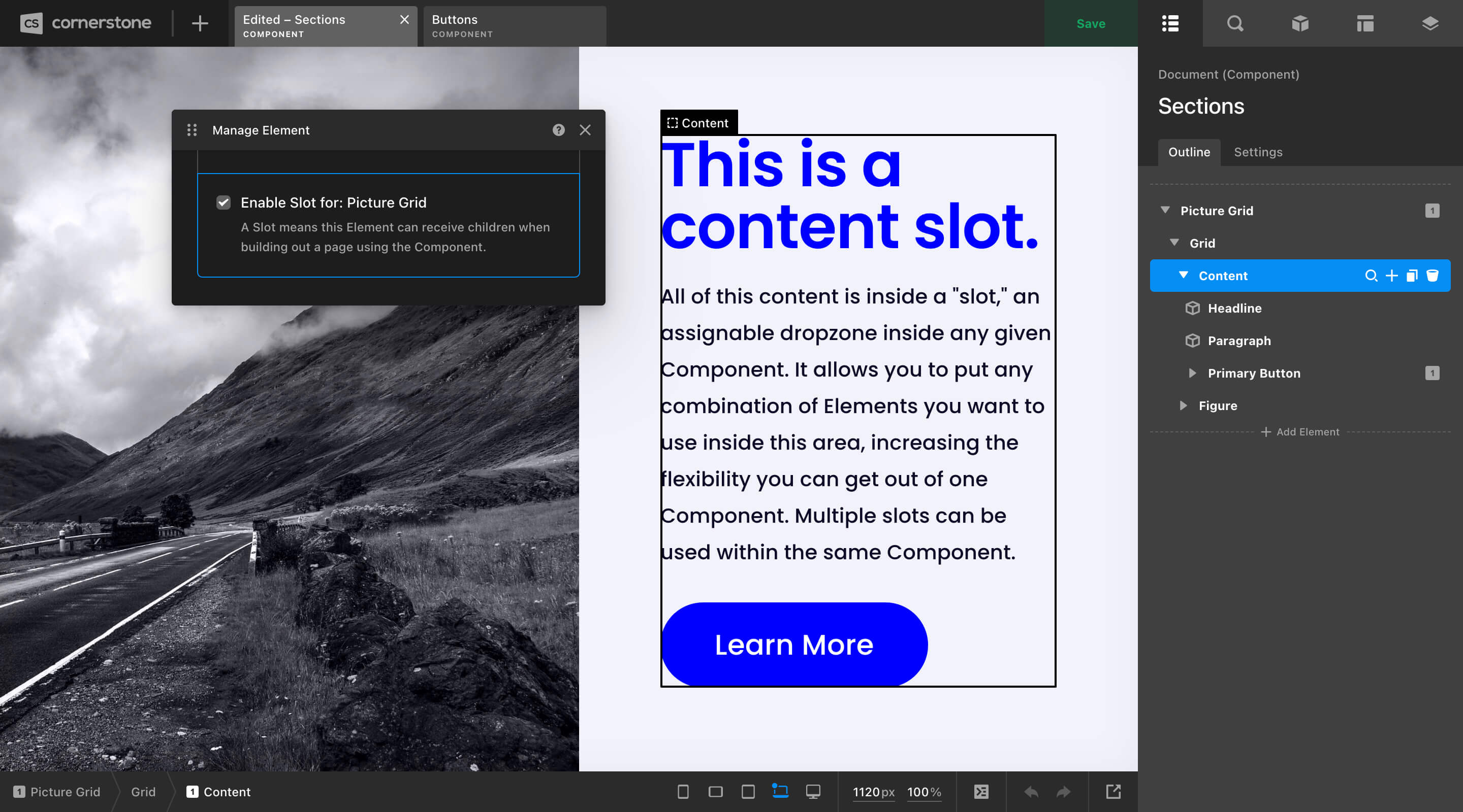
When you use this Component later on in the Page or Layout Builders, the Element you flagged as a Slot will show up as a dropzone inside the Component with a matching label based on what you called it in the Component Builder (in this case, “Content”). Similar to exports, Components can contain multiple Slots, meaning you could craft as many unique dropzones for content as you need inside any pattern you're working on.
Beyond that, there are a couple more options you might find helpful in certain situations:
- Enable Prefab: Exporting a Component as a “Prefab” means that the exact way you have it styled in the Component Builder is how it will be output when you drag it in. It also means that any children you have nested within your Component will come out looking exactly like that as well. This is a very powerful way to nest Components within Components and have them come out in a pre-styled fashion. It's almost like a gray area between presets and Components because you get all the performance, usability, and markup gains of Components, but it's basically like taking a snapshot of that Component at a moment in time. The main thing to remember is that a prefab Component will not update globally like a standard Component if you change a core value on it (e.g. if your Primary Button had a
paddingof1emand you change it on a Component to2em, every instance of that Component will now use2em). If your Component is a prefab, the moment you drag it into the builder it is using those default values. - Hide Children Control: When inspecting an instance of this Component, the “Children” control will be hidden. This is useful for bringing focus to other top-level content.
- Make Private: Private Components are only available for use in the Component Builder. This can be helpful in creating patterns to organize Sets with multiple exports, crafting internal documentation, et cetera.
- Library Top Level: Useful for layout Elements. These exports will only be shown in the Element Library when adding an Element at the top level of the Document Outline (similar to how the Section Element can only be added in this way).
Additionally, the following options are only available on each Component instance that you place into your documents. This means that this must be initialized on a case by case basis:
- Allow Customization: Makes the “Customize” controls accessible when using the Component in other builders.
While the Slot pattern mentioned previously works great for large blocks of variable content, it doesn't address some of the following scenarios you might have already been thinking to yourself about while working through these examples:
- “What if I want to pick a custom color for my button on a case-by-case basis?”
- “How do I change the text label or
hrefvalue for each instance of my button?” - “Is there a way to change the image and background color of the ‘Picture Grid’ pattern as needed?”
The answer to all of these questions lies with Element Parameters.
See something inaccurate? Let us know