Responsive Styling
In this article, we're going to discuss how to leverage responsive styling to design sites that work for all devices.
Getting Started
Let's take a closer look at how responsive styling is implemented into the UI. We'll start with a simple example centered around a Button Element:
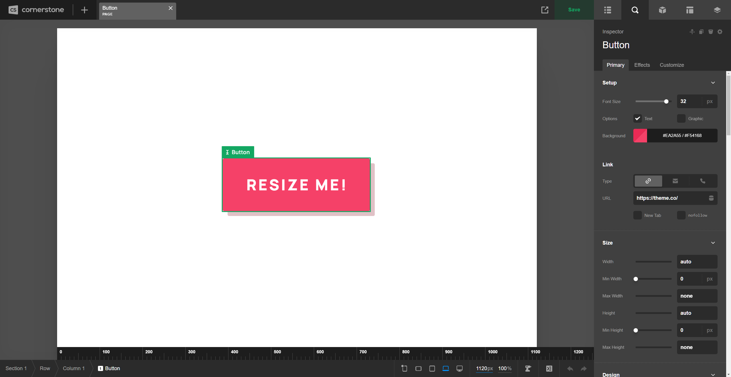
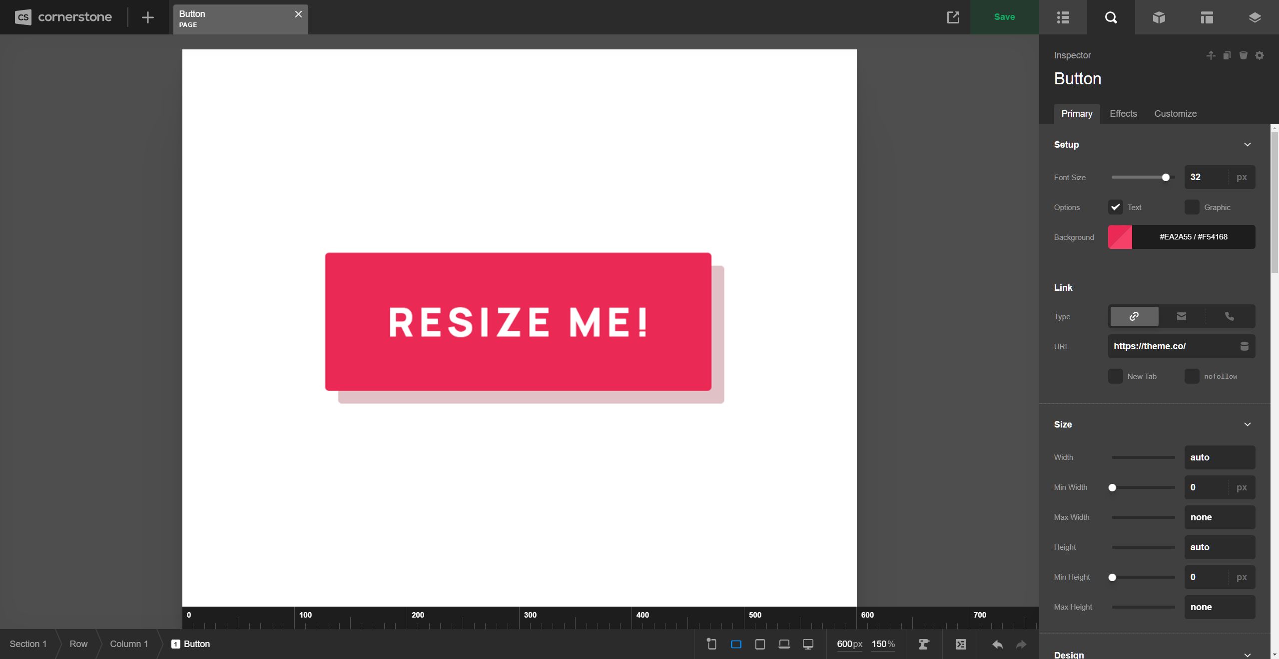
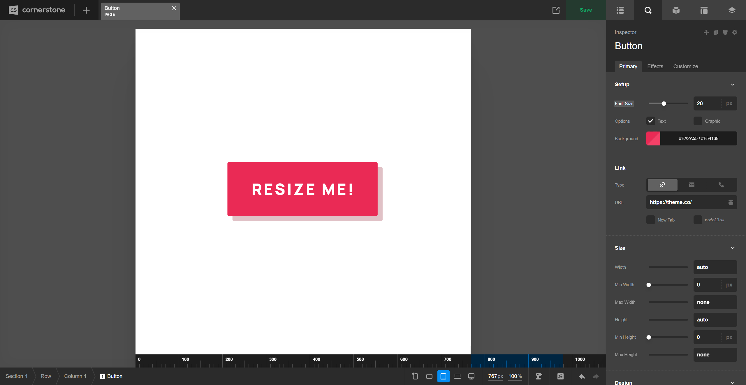
Here we have a Button with a base Font Size of 32px, which you can see in the Workspace to the left-hand side of the screen. In addition to that, you may have already noticed a slight change to the Toolbar—the updated “Preview Resizer,” which has changed in a couple key ways:
- The breakpoint toggles to the left are now permanently visible in the Toolbar at all times (as opposed to appearing in a popup when a toggle is clicked), allowing for quick updates to the preview area's size at any point during the page building cycle.
- The
px/%values to the right display realtime information about the live preview area. Currently, this live preview area is sitting at1120pxwide and is scaled to100%(preview scaling is a new feature of this release cycle and is something we will cover in more detail later on). Both of these values are inputs, meaning you can type specific values into either side to resize the live preview to your exact specifications.
Preview Scaling
Before jumping into all of the responsive fun found below, let's take a moment to discuss preview scaling. This update includes the addition of realtime data as it pertains to the live preview:
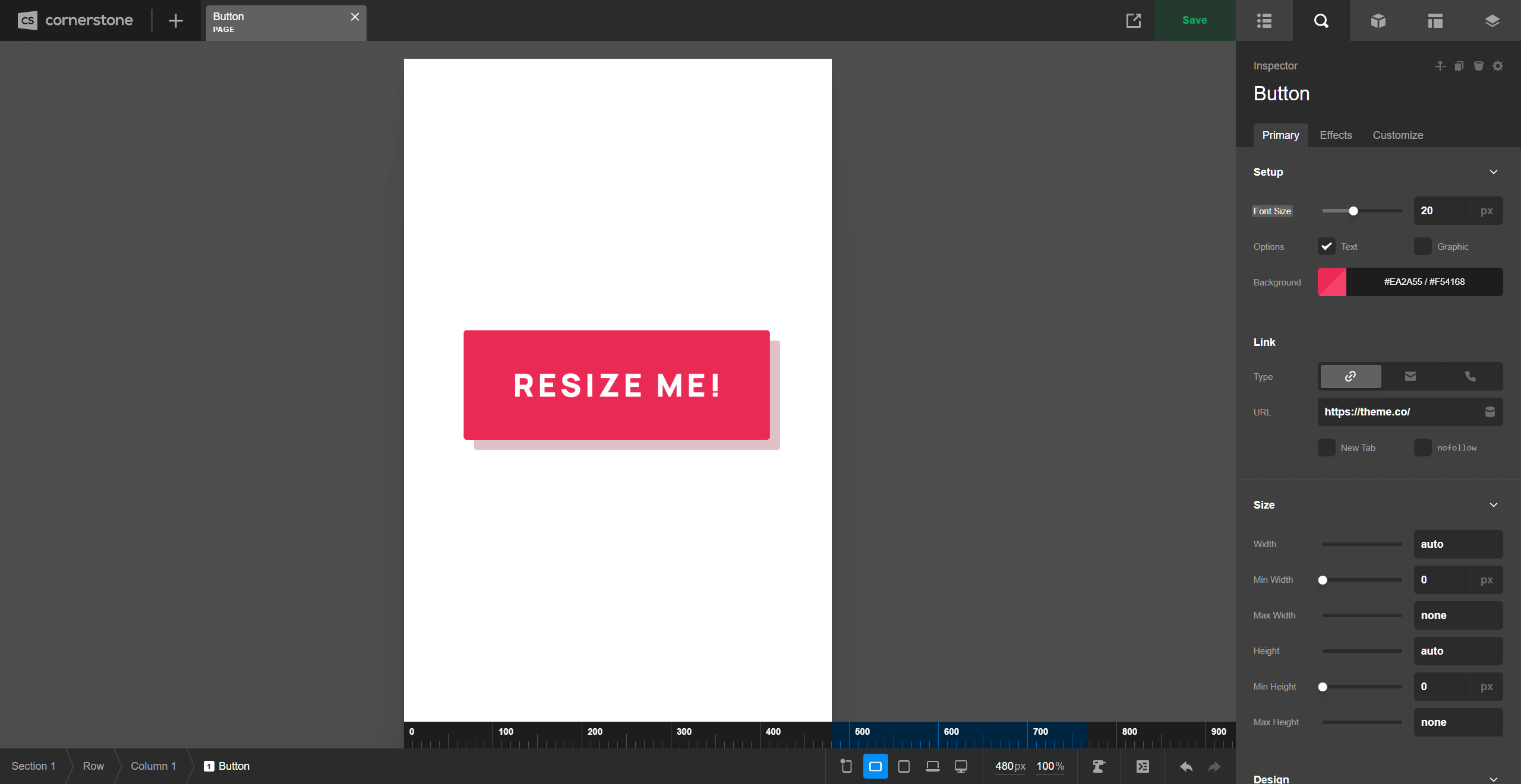
As your browser is resized (or you drag the handles found at either side of the live preview) the px value found in this section will update in realtime, giving you instant feedback on the width of your live preview. This is immensely helpful when looking to target a specific width to get a better sense of how things might look on a particular device.
However, depending on how big your device is that you're designing on, you might run into an issue like you see in some of our previous pictures. Even with Cornerstone taking up the entire computer screen, we can only see partly into the LG breakpoint due to the fact that the side workspace is cutting into our live preview. On smaller laptops, it might even be the MD device toggle that appears as your largest viewable breakpoint.
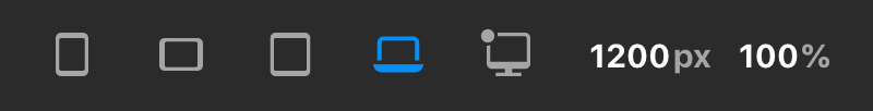
To remedy this, we've made the live preview scalable, allowing users on smaller devices to zoom out to see “extra large” designs on smaller screens. For example, take note of what happens when the XL breakpoint is selected on this device:
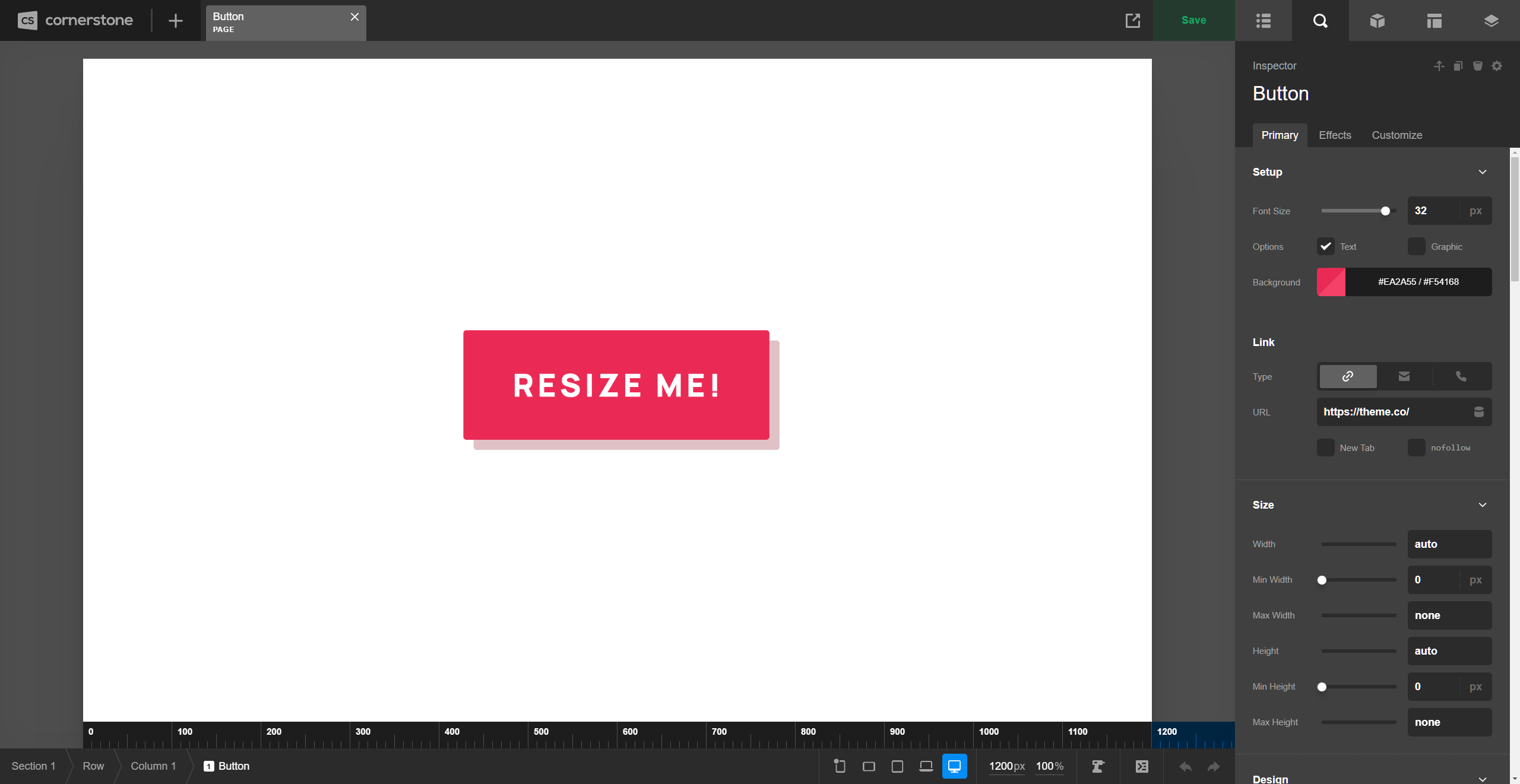
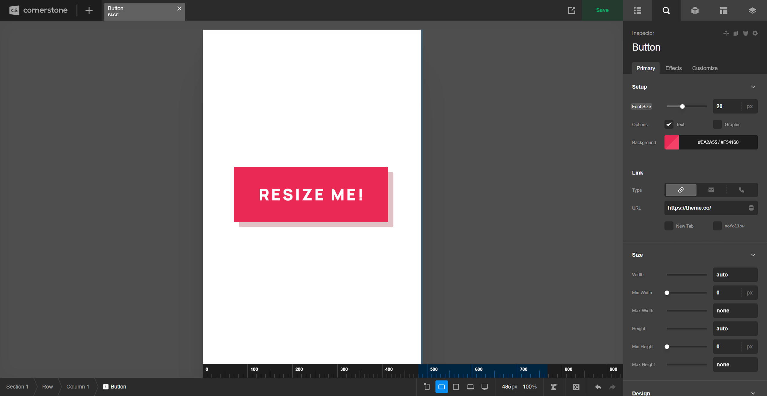
You'll see that the live preview has been resized to 1200px wide, which is the minimum value for when that breakpoint starts; however, this device is only capable of seeing 1120px with the Workspace set to the side of the screen as you can see from previous screenshots.
So how is this all working? 🤔 We use some simple calculations to apply a scaling transform to the entire live preview by dividing the “actual” preview area width by the desired width (e.g. 1120px / 1200px in this instance). This gives us a scaling factor of 93.33%, which is automatically applied in this instance, allowing us to see all 1200px within the physical space of 1120px.
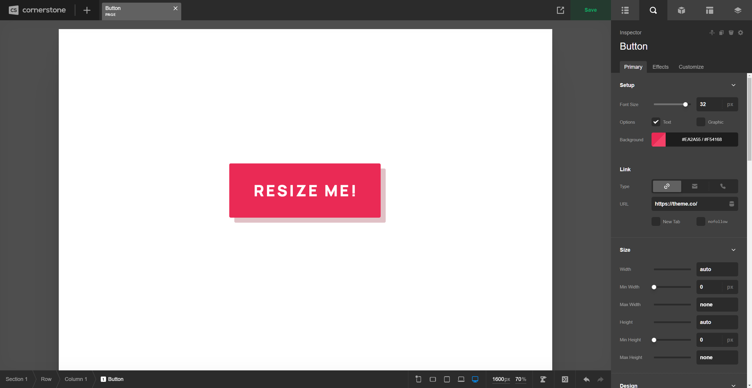
All of this is done automatically for you if you click one of the breakpoint toggles in the Toolbar or if you manually type in a px value in the input itself. For example, if you wanted to see how your site looked at 1600px, simply typing 1600 into the input would automatically apply a scale factor of 70% to ensure that all of this would fit into your viewport:
There are a couple key takeaways from managing the preview scaling feature:
- Any time you manually type in a
pxvalue first, the%scale will be automatically updated so that the entire value you entered can be seen in the live preview. - Once you have entered in a
pxvalue, if you wish to adjust the scale and preserve thepxwidth, updating the%scale will allow you to do this independently.
This can also work in the opposite direction, where perhaps you are doing some detail work and you'd like to be able to see what's going on more clearly. In that case, you can enter a larger scale % to get a closer look at things:
The Base Breakpoint
As you begin working on your content, changes made in the workspace are applied to your Base Breakpoint. The styles applied to your Base Breakpoint will automatically cascade throughout your design unless a responsive overwrite is applied at a later time. The Base Breakpoint is denoted by a dot found in the upper-left corner of any one of the device icons in the Toolbar:
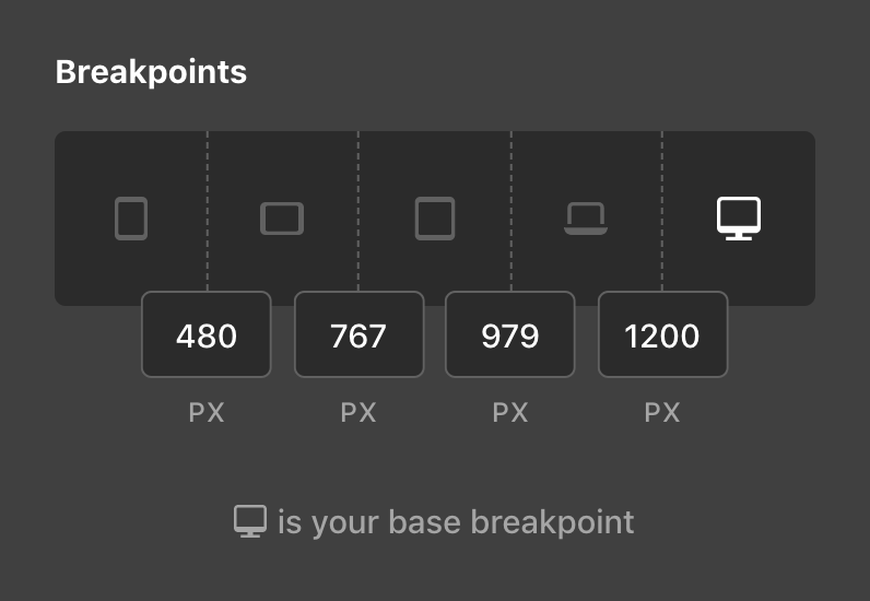
By default, the XL breakpoint is set as the base, but you can alter this if you so choose by going to Theme Options → Layout & Design → Breakpoints:
Depending on the device you work on, you may even wish to set your Base Breakpoint to something in-between. For example, if your primary computer defaults to the LG breakpoint when inside Cornerstone, you may wish to set your Base Breakpoint to LG and have your styles originate from that point.
Going Responsive
You can introduce a responsive overwrite to any valid control by clicking on its side label. The label of any valid control will highlight on hover, indicating that it can be adjusted responsively. As an exercise, let's adjust the Font Size of our example Button, which was set to 32px from our screenshots above:
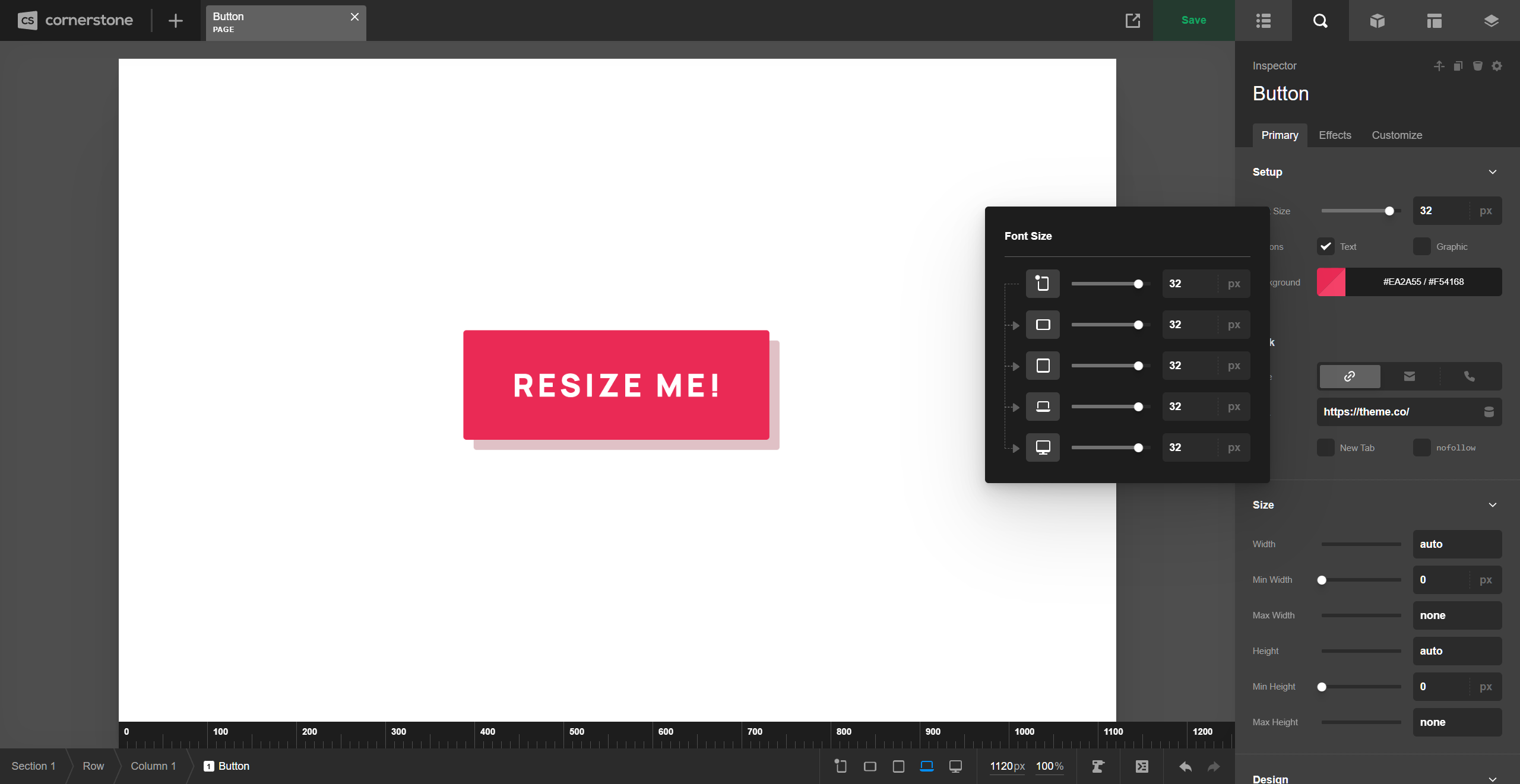
The dropdown that appears when clicking on the label is how responsive styles across breakpoints are managed. It displays a representation of the control you are working on for each breakpoint, in addition to showcasing the flow of inheritance for that control's value:
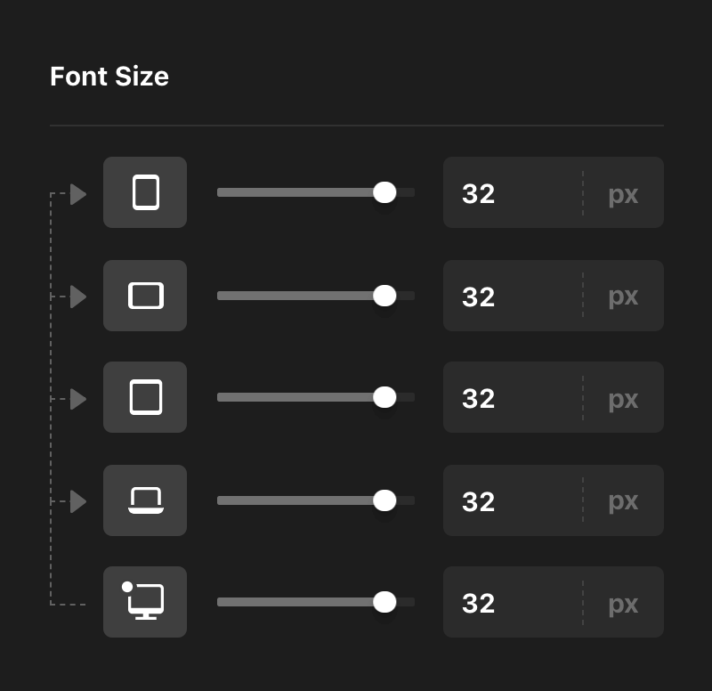
Take note of the arrows, which are used to help illustrate the flow of inheritance for control's values. We can see that the base value of 32px set here is indeed originating from the XL breakpoint. Now, let's say that we wanted to reduce the Font Size of our Button on the MD breakpoint:

In addition to the fact that we now have two sets of inheritance going on (as demonstrated by our groups of arrows), you will also notice some new colors that have been set on the device icons. These colors help to represent the status of the value present on each breakpoint and where it is originating from:
- Base – Indicates that the breakpoint you are viewing is getting its value from the Base Breakpoint, or is itself the Base Breakpoint value.
- Current – Yellow indicates that the value of the breakpoint you are viewing is currently set on that breakpoint. This means that it is an overwrite of the base value and serves as new base value for any breakpoints after it.
- Inherited – The blue label tells us that this breakpoint's value is being inherited from a breakpoint before it that is not the base value.
These colors are important as they are mirrored on the Workspace labels, providing contextual feedback once a responsive style has been applied. For example, now that we have initiated a responsive style on the Button's Font Size, viewing the Workspace on the LG or XL breakpoint will show the gray label style:
Viewing the Workspace on the MD breakpoint will display the yellow status along with the updated value inside the input:
And viewing the Workspace on the XS or SM breakpoint will display the blue status along with the inherited value inside the input:
Take note: once a responsive style has been enabled on a control, responsive styling is always active for that control at any breakpoint. This means that you can make responsive edits for any control you see with a highlighted label directly within the workspace. Keep this in mind to ensure that you don't accidentally alter your inheritance structure when working on an Element.
Now let's say you decide that you don't care for the change made on the MD breakpoint and you wanted to reset your value so that it was inheriting from the Base Breakpoint again. One method you can perform is a soft reset from the Workspace or the responsive dropdown by going to the breakpoint where you applied an overwrite and manually match it back to your base.
This can work well for simple values like our Font Size, but for more complex inputs that feature color combinations, intricate layouts, or lengthy strings (e.g. transforms and filters), you may want to explore using the reset action in the responsive dropdown. Any control you've overwritten can be reset to inherit from its next available breakpoint by hovering over the device icon to reveal this action:
When hovering over these breakpoints, you will notice that the device icon has been swapped out for the “reset” icon used throughout Cornerstone in addition to adding back an inheritance arrow, giving you a preview of where your value will come from if you click this action. This can be particularly useful if you have overwritten values at every breakpoint, as you can quickly move through the inheritance structure and clear things out if you so desire.
Non-Responsive Controls
Not all controls found in the Workspace allow responsive overwrites. Some examples include (but are not limited to):
- Any form of “content” such as text inputs, icon pickers, images, et cetera. If you wish to showcase variable content across breakpoints, utilize the Hide During Breakpoints control found under the Customize control module instead.
- Controls that pertain to various JavaScript or PHP functionality.
- Inline or specialty styling applied to certain Element partials such as advanced backgrounds, separators, et cetera.
TL;DR if the label highlights when you hover over it, you can click on it and adjust it responsively, otherwise…you can't.
The Ruler
Another UI element added to this release is the ruler, which appears at the bottom edge of the live preview when resizing or when a breakpoint toggle is active. Additionally, when a breakpoint toggle is active, you will see that breakpoint's range represented by a blue highlight within the ruler. For example, if you selected the SM breakpoint, you would see the following highlight on the ruler:
Selecting a breakpoint toggle will resize your live preview to the lower bound of that media query. When resizing the live preview using the handles found to the sides of the iframe, you will be able to quickly move between the lower and upper bounds of that range without moving beyond those points:
The great thing about this mechanic is it allows you to quickly move back and forth between the lower and upper bounds of the current breakpoint, giving you the chance to check your design at both extremes of the breakpoint without having to worry about being super precise while resizing.
Control Remappings
The control label status indicator is a crucial part of working with responsive styling in Cornerstone, which means that every control capable of responsive styling requires its own unique label so that a status indicator can be applied when necessary.
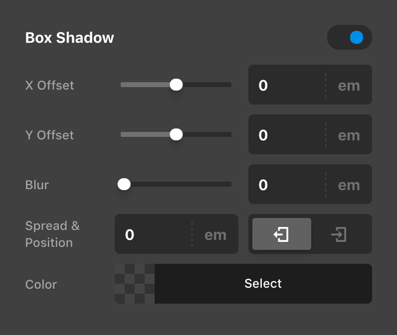
Because of this, all Element control mappings have been shuffled around slightly to give every control their own, individual label. This meant doing away with some of the previous UI conventions like occasionally having two controls to a line. For example, here is a previous iteration of the Box Shadow control:
And here is its updated layout with every control on its own line:
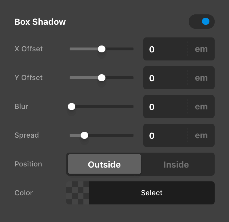
In performing these updates, we actually found that in general this helped to make things more clear due to the fact that each label now directly correlates to one control, eliminating the need to process two labels in one space. Additionally, with every control taking up the full width of their container, it gave us room to use more descriptive labels when possible (e.g. “Outside” and “Inside” for the box-shadow position as opposed to an abstract set of icons).
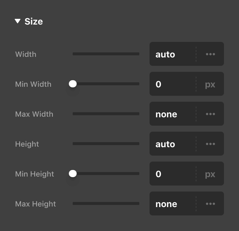
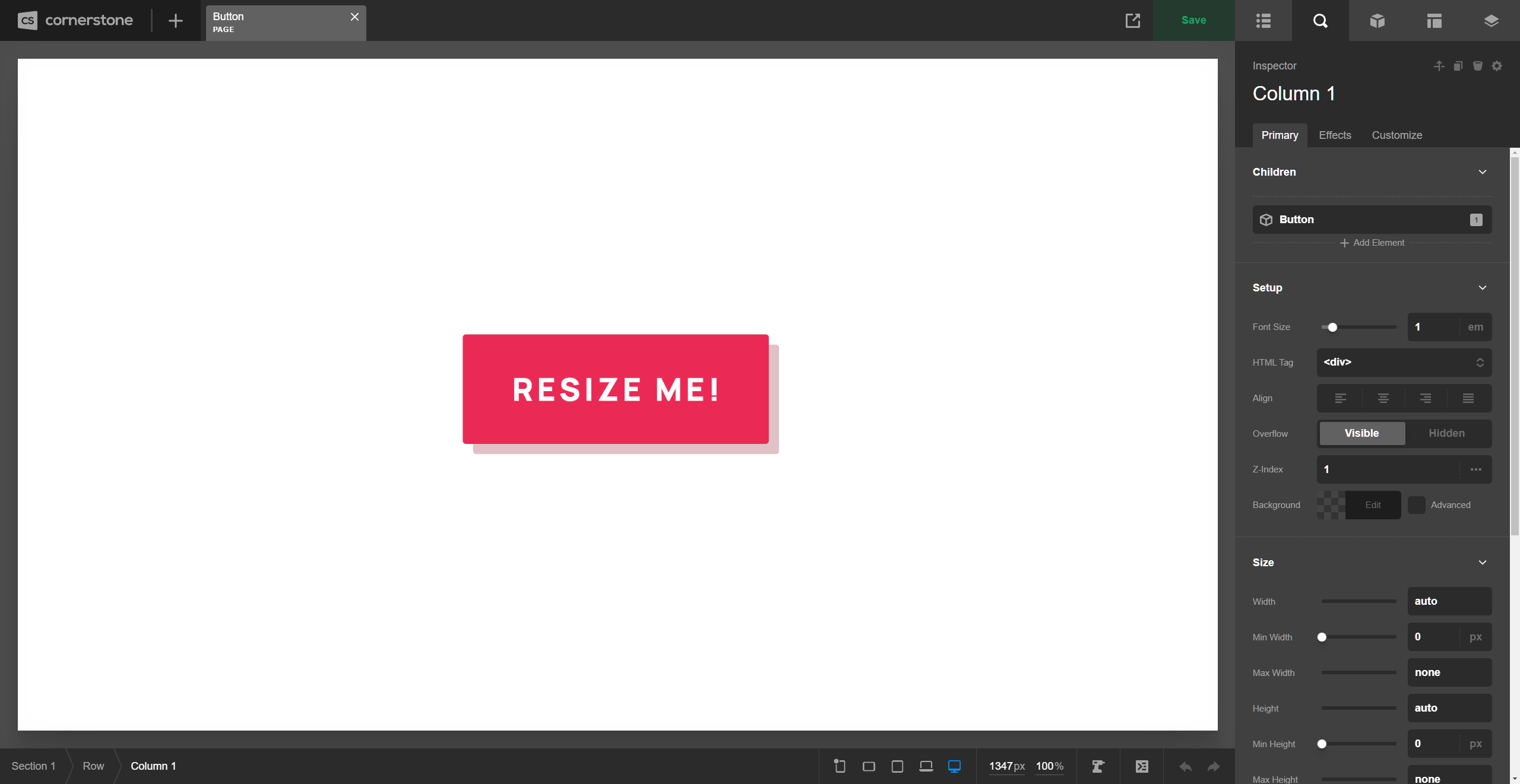
In other instances, remappings were a little more involved. For example, in recent updates the sizing controls for Elements like the Column, Cell, and Div were all bundled up into the “Setup” control group along with many other controls as a 2x2 grid. However, once we broke these controls out into their own lines, the control group felt quite busy with far too many controls going on (we feel there is a somewhat flexible upper-limit based on the context as to how many controls feel manageable within a particular group). Because of this, the sizing controls across all Elements have been broken out into a new Size group, that you will find near the top of most Elements:
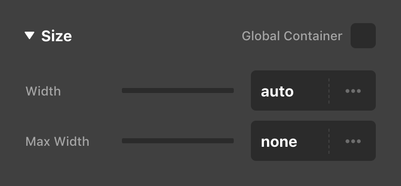
Additionally, for Elements that feature the Global Container option like the Row and Grid, we were able to work that option into this new control group in a way that echos other patterns throughout the tool such as the “Auto Placement” state of the Cell Element. On these Elements, when the Global Container is enabled (the default state), you will see the following informational placeholder below the Size control group:
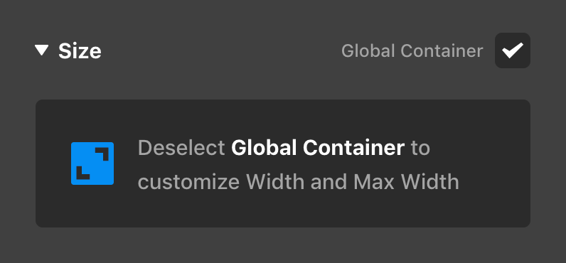
Once you deselect the checkbox found to the upper-right of the control group (or click on the message itself), the prompt will be replaced with the Width and Max Width controls that have always been present on these Elements:
This messaging helps to make things much more clear as to where certain sizing is coming from, rather than all of these controls simply being crammed together into a general “Setup” group.
Finally, we've included collapsible control group headings for top-level and sub-level control groups within the Workspace for the vertical orientation (horizontal mode displays the traditional control groupings). For example, inspecting a Column might look something like the following in your vertical Workspace:
Notice how the top-level headings match the control navigation seen in the lower-left corner of the above screenshot.
Additionally, you'll notice how the sub-groups are also collapsible, allowing you to quickly hide or show entire groups as you need them in your workflow. Multiple sub-groups can be open at a time and you can CMD / Ctrl + click any sub-group heading to quickly expand or collapse all sub-groups at once.
See something inaccurate? Let us know