Cornerstone Forms Elements
Explore all available Form Elements — Inputs, Dropzone, Date Picker, Select and more — along with their controls and styling options.
- Form Element
- Shared Input Controls
- Input Element
- Text Input
- Email Input
- Reset Input
- File Input
- Number Input
- Password Input
- Range Input
- Color Input
- Checkbox Input
- Radio Input
- Submit Input
- Hidden Input
- Search Input
- Tel Input
- URL Input
- Week Input
- Month Input
- Textarea Element
- Select Element
- Checkbox / Radio List Element
- Date Picker
- Dropzone Element
- Save URL in Field
- Loading Area
- Summary
Form Element
This should be your starting point on any Form. When inserting to your page it will also give you a sample Input and Action.
The Form element has almost all the same controls as the Div Element. However we force the tag as <form>.
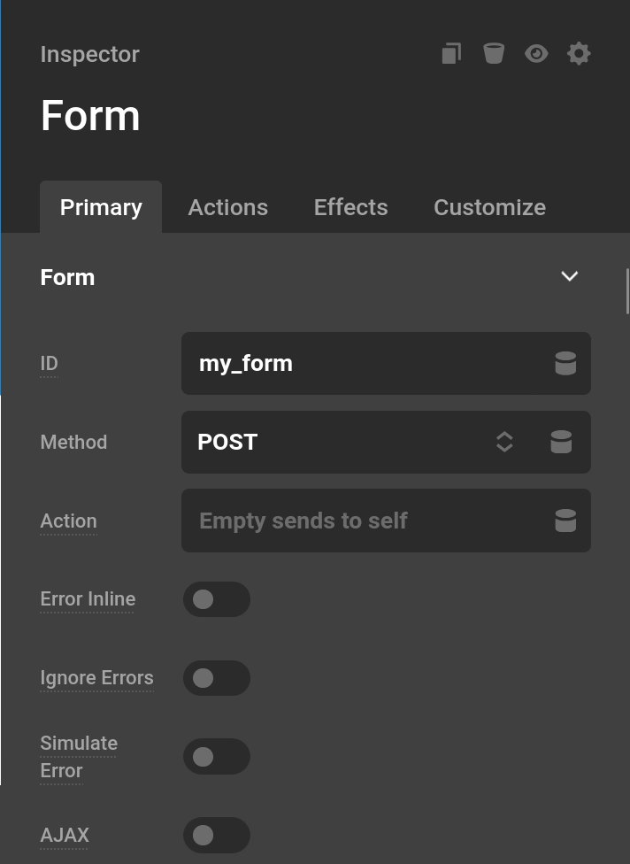
- ID : A unique identifier for the form element. This is also the key under which form submissions are stored in the database. If left blank, an auto-generated ID is used. Using a meaningful ID like
contactmakes it easier to reference submissions and identify forms in your admin area. - Method : You will typically only use
GETorPOSTwhen it comes to the Method. A good rule of thumb is any link you would share (think a filtered post list) you should useGET. Any action that sends data (think a contact form) or has sensitive information should usePOST.PUTandDELETEare also available for custom REST API integrations. - Action : You should leave this blank unless you want form processing to happen on a different page. You can always use the Redirect Action if you want the form to end on a different page.
- Error Inline : When this is turned on errors will display next to the input they relate to. If this is turned off all errors will display at the bottom of the form.
- Ignore Frontend Errors : When this is turned on any error that could be trigged by the frontend or JavaScript will be ignored. This is only useful if you have a quiz that can have wrong answers or you are testing the backend validation process for testing.
- AJAX : When this is turned on the form will send via AJAX or will be a single page form. Certain actions like redirect or file downloading are most likely not going to work when you have
AJAXturned on. This is best used on pages that filter post results. - Auto Send Changes : This is only used by AJAX. Whenever you make any change to the form, the form will send an AJAX request. This is useful for forms that filter post results.
- Change Selectors : This is used by AJAX. If left empty the entire page will update when a form is sent which can be slow or even caused unwanted results. Each entry in this list is a query selector. If you had a page that filtered results, the change selector could be the ID or custom class on the results themselves.
- Simulate Error : This is a builder preview-only option. When enabled, it simulates an error state directly in the preview so you can style your error messages without needing to actually trigger a validation failure.
- Reset On Submit : When enabled, inputs will not repopulate with the last submitted values after a submission with errors. By default, form inputs retain their values so users do not have to retype everything if a validation fails. Enable this option if you prefer inputs to always start blank after each submission attempt.
Submission
When enabled, each successful form submission is saved as a post under Cornerstone > Form Submissions in the WordPress admin. This gives you a built-in record of every submission without requiring a third-party service.
- Submission : Toggle this on to enable storing submissions. When active, two additional fields appear.
- Title : The title of the saved submission post. Supports Dynamic Content so you can include submitted values, for example
Message Received From {{dc:form:data key="email"}}. - Content : The body content of the saved submission post. Also supports Dynamic Content, making it easy to capture the full message or any other field value.
Form Errors
The Form Errors tab controls the styling of error messages displayed when a validation fails. Error messages are rendered as list elements, which is why there is a List Style control. Set the Type to None to hide the bullet markers completely.
- List Style : Controls the bullet marker type (disc, circle, square, none, etc.) and whether it appears inside or outside the text flow.
- Padding : Inner spacing applied to each error message item.
- Margin : Outer spacing around the error message container.
- Text Format : Full typography controls for error message text including font family, weight, size, line height, letter spacing, color, style, alignment, decoration, and transform.
Shared Input Controls
- Name : This is the name you'll refer to when referencing data with Dynamic Content. For instance using a name of
my_field, we would use{{dc:form:data key="my_field"}} - Value : This is the default value to put into the form. When it's required for a user to input a value, then leave this blank.
- Placeholder : This is a text indicator in the input when the input is completely empty. It's usually best to have info to the user or an example value in this field.
- Autocomplete : Tells the browser how to autofill the input. Choosing a specific token like
EmailorGiven Namelets browsers and mobile devices offer the user previously entered values that match. Set toOffto disable autocomplete for the field entirely. ACustomoption is also available for tokens not covered by the preset list. - Required : When this toggle is on, the user must fill in this field before the form can be submitted. Leaving it empty will produce a validation error.
- Disabled : When this toggle is on, the user will be unable to input into the input.
- Features : Checking
Labeloutputs an HTML<label>element linked to the input, and checkingDescriptionoutputs a<p>element of helper text. Enabling either feature wraps the input together with these elements in a container<div>. Each enabled feature unlocks its own styling tab (Label and/or Description), and the Container styling tab. - Validations : This control has a list of Validations needed to pass to submit the Form. See our Validations Guide.
- Input Conditions : When toggled on, this input will only be visible when the specified conditions are met based on the live values of other inputs in the form. See Frontend Conditions for the full breakdown of how condition logic and grouping work.
Input Element
This element actually contains a number of different "Elements" or "Types" as we'll see. The reason is that this element can actually act as a standard text input, or many other types of standard inputs.
General
All of the Shared Input Controls above appear in the General tab. In addition, the General tab includes a Type selector and several controls that only appear for specific input types.
- Type : Switches the input between all available HTML input types. The available types are:
Text,Password,Email,Number,Date,Checkbox,Radio,File,Submit,Reset,Button,Hidden,Color,Range,Search,Tel,Url,Week, andMonth.
The following controls only appear when File is selected:
- Accept : A comma-separated list of allowed file types. Accepts MIME types, wildcards, or file extensions (e.g.
.doc,.pdf,image/*). Leave blank to allow any file type. - Multiple : When enabled, the user can select more than one file at a time.
- Save URL in Field : Uploads the file immediately on submission and stores its URL as the field value, making it available as a link in the data table and other field outputs. See Save URL in Field below for the full breakdown.
- Max File Size : The maximum size allowed for each uploaded file. Choose from preset limits (1 MB, 5 MB, 10 MB, 25 MB, 50 MB, 100 MB), select
Customto enter an exact byte value, or leave atNo Limitto allow any size. Validation runs both in the browser before submission and on the server after upload.
The following control only appears when Checkbox or Radio is selected:
- Checked : Controls the default checked state.
Nameautomatically checks the input if the submitted form data contains a matching value for this field's name — useful for preserving state after page reload.Yesalways renders the input pre-checked.Noalways renders it unchecked.
The following controls only appear when Range is selected:
- Min : The minimum numeric value of the range slider.
- Max : The maximum numeric value of the range slider.
- Step : The increment between selectable values on the slider.
The following controls only appear when Date is selected:
- Min : The earliest selectable date. Accepts a specific date or relative values like
todayor+1 day. - Max : The latest selectable date. Accepts the same values as Min.
- Step : The number of days between valid date selections. For example, if Min is a Monday and Step is
7, only Mondays will be selectable.
Label
The Label tab is only available when Label is checked in Features. It controls the appearance of the <label> element that is linked to this input.
- Content : The text of the label.
- Position : Whether the label appears
Before(above) orAfter(below) the input. - Size : Width, min/max width, height, min/max height, and flex grow/shrink for the label element.
- Text Format : Full typography controls — font family, weight, size, line height, letter spacing, color, style, alignment, decoration, and transform.
- Margin : Outer spacing around the label.
- Required Marking : When enabled, appends a small marker (default
*) to the label when the input is required. Sub-controls let you change the marker Text, its Color, and the Spacing between the marker and the label text.
Description
The Description tab is only available when Description is checked in Features. It controls the appearance of the <p> element of helper text that is rendered alongside the input — useful for hints, examples, or instructions that don't belong in the label or placeholder.
- Content : The text of the description.
- Position : Whether the description appears
Before(above) orAfter(below) the input. - Size : Width, min/max width, height, min/max height, and flex grow/shrink for the description element.
- Text Format : Full typography controls — font family, weight, size, line height, letter spacing, color, style, alignment, decoration, and transform.
- Margin : Outer spacing around the description.
Container
The Container tab is only available when Label or Description is checked in Features. It styles the <div> that wraps the label, description, and input together.
- Flexbox : Controls the flex layout of the container, including direction, alignment, justification, gap, and the container's own flex grow/shrink behaviour.
- Design : Background, margin, padding, border, border radius, and box shadow for the container.
Size
Controls the dimensions of the <input> element itself.
- Width / Min Width / Max Width : Horizontal sizing of the input.
- Height / Min Height / Max Height : Vertical sizing of the input.
- Flex : Grow and shrink behaviour when the input is inside a flex container.
Design
Controls the default appearance of the <input> element.
- Background : Background color of the input.
- Text Format : Typography controls for the text the user types into the input.
- Placeholder : Color of the placeholder text.
- Outline : What happens to the browser focus outline when the input is active.
Browserkeeps the default browser outline.Borderreplaces it with the input's border styling.Ignoreremoves it entirely — use with caution for accessibility. - Margin / Padding : Outer and inner spacing.
- Border / Border Radius : Border style and corner rounding.
- Box Shadow : Drop shadow on the input.
Active
Controls the appearance of the Element when it is focused or being interacted with. All values here layer on top of the Design tab values, so you only need to set what should change.
- Text Color : Text color while the input is focused.
- Background : Background color while focused.
- Placeholder : Placeholder text color while focused.
- Margin / Padding : Spacing overrides while focused.
- Border / Border Radius : Border overrides while focused.
- Box Shadow : Shadow override while focused.
Error
Controls the appearance of the Element when it has a validation error. Works the same way as the Active tab — only set what should differ from the Design tab defaults.
- Text Color : Text color in the error state.
- Background : Background color in the error state. Defaults to a light red.
- Placeholder : Placeholder text color in the error state.
- Margin / Padding : Spacing overrides in the error state.
- Border / Border Radius : Border overrides in the error state. Defaults to a red border.
- Box Shadow : Shadow override in the error state.
Text Input
This is the default type of input.
Email Input
This looks identical to Text on desktop. On mobile however the text input will display characters more valid to an email like the @ symbol.
Reset Input
This looks just like button. However when you click it, the form will reset itself. Useful for forms you could submit multiple times or a filtering form.
File Input
When clicked, this input will open the users file manager allowing them to select a file or multiple files. You can also limit the types of file allowed to input. This input should also be used in conjuction with the File Upload Action.
Number Input
This is similar to the text input, but there is a increment and decrement button. This also provides a user friendly way to input numbers if you are on mobile.
Password Input
We're sure you've used this input before, even if it was a secret.
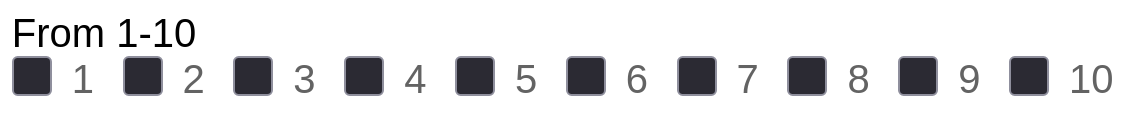
Range Input
Between 1 to 10, how awesome is Cornerstone Forms? With this input, users can tell you very easily.
Color Input
What's your favorite color? The popup of this element varies between operating systems.
Checkbox Input
Do you accept the terms and conditions? Well if you mark the field as required, the user will have to. See also Checkbox List.
Radio Input
When using the same name as another Radio Input element, you will only be allowed to select one option. Radio Input is great if you are looping over data to create the radio list. If you have a specific and non changing number of items, you should use the Radio List.
Submit Input
Renders a submit button styled as a native <input> rather than a <button> element. Clicking it submits the form. The Value field sets the button label text.
While we provide this as a type you should use the Prefab Submit Button which uses the Button element.
Hidden Input
Invisible to the user but included in the form submission data. Use this to pass fixed values, tokens, or metadata along with a form without any user interaction.
Search Input
A text field that hints to the browser it is used for search. On some browsers and operating systems it renders with a small clear button once text has been entered.
Tel Input
A text field for telephone numbers. On mobile devices this prompts the numeric keypad, making it easier to enter a phone number.
URL Input
A text field that validates that the entered value looks like a URL before the form is submitted.
Week Input
Lets the user select a specific week of a year using the browser's native week picker. The submitted value follows the format 2025-W04.
Month Input
Lets the user select a month and year using the browser's native month picker. The submitted value follows the format 2025-01.
Textarea Element
When a couple words isn't enough, the Textarea has you covered. This shares a lot of controls with the Input Element. It also adds in a resizable control which controls if a user can resize a Textarea.
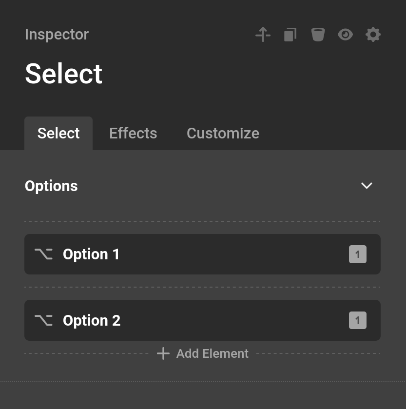
Select Element
The select or dropdown as it's sometime called, works great for a large list of options. You can also use the multiple control to allow for multiple choices to be selected.
Each select will have a number of different Option or Option Group elements which we will go into in the next section.

Option
Options are defined by their Label and Value. The value can also be blank.
Option Group
Option Group can group certain options together. Each Option Group has a number of different Option elements similar to the Select itself.
Checkbox / Radio List Element
Checkbox should be used when a number of different options can be selected.
Radio List should be selected when only option is allowed be selected.
Each Option is a child element of this element. It is very similar to the Select element.
Date Picker
This element displays a nice calendar when a user selects the input. On mobile it will display the touch calendar unique to their device, but this can be disabled through the Disable Native option. There are a large number of configuration and styling options organized across several tabs.
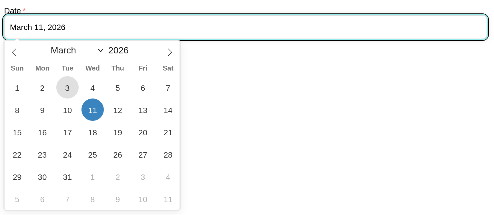
General
- Mode : Controls how dates are selected.
Singleallows one date,Multipleallows any number of individual dates to be selected, andRangelets the user select a start and end date. - Enable Time : Adds a time picker below the calendar.
- Inline : Displays the calendar directly on the page instead of in a popup.
- Manual Input : Allows users to type a date directly into the input field instead of only using the calendar picker.
- Click to Open : When enabled, clicking the input opens the calendar. Disable this if you want to open the calendar programmatically.
- Disable Native : On mobile devices, browsers typically show their own native date picker. Enable this option to always use the Flatpickr calendar instead.
The following options are only available when Enable Time is on:
- 24 Hour Time : Use a 24-hour clock format instead of AM/PM.
- Seconds : Show a seconds selector in the time picker.
- Time Only : Hides the calendar entirely and shows only the time picker.
The following options are only available when Time Only is off:
- First Day : Sets which day the week starts on in the calendar grid. Defaults to Sunday.
- Months : The number of calendar months to display side by side. Useful when using
Rangemode so users can see a wider span of dates at once. - Week Numbers : Shows the ISO week number in a column to the left of the calendar days. Only available when
Monthsis set to 1. - Abbreviated Months : Shows shortened month names (Jan, Feb, Mar) in the calendar header instead of the full names.
- Calendar Position : Controls where the calendar popup appears relative to the input. Options include
Auto,Above,Below, and variants with left, center, or right alignment. This option is hidden whenInlineis enabled.
Format
- Date Format : The format of the date value that gets submitted with the form. Uses PHP date format characters (e.g.
Y-m-dfor2025-01-31,m/d/Yfor01/31/2025). This is the value stored in form submissions. - User Format : When enabled, a separate display format is shown to the user in the input while the
Date Formatvalue is what actually gets submitted. This lets you show a human-friendly date while keeping a consistent server-side format. - Display Format : Only available when
User Formatis on. Controls the date format shown to the user in the input field. Uses the same PHP date format characters (e.g.F j, Ydisplays asJanuary 31, 2025).
The following PHP date format characters are supported:
Date
d | Day of the month, 2 digits with leading zeros (e.g. 01–31) |
D | Day of the week, abbreviated (e.g. Mon–Sun) |
j | Day of the month without leading zeros (e.g. 1–31) |
jS | Day of the month with ordinal suffix (e.g. 1st, 2nd, 3rd) |
l | Day of the week, full name (e.g. Monday–Sunday) |
w | Numeric day of the week (0 = Sunday, 6 = Saturday) |
W | ISO-8601 week number of the year (e.g. 01–52) |
F | Month, full name (e.g. January–December) |
m | Month, 2 digits with leading zeros (e.g. 01–12) |
M | Month, abbreviated (e.g. Jan–Dec) |
n | Month without leading zeros (e.g. 1–12) |
Y | 4-digit year (e.g. 2025) |
y | 2-digit year (e.g. 25) |
| Character | Output |
|---|
Time
H | Hour in 24-hour format, zero-padded (e.g. 00–23) |
h | Hour in 12-hour format, zero-padded (e.g. 01–12) |
g | Hour in 12-hour format without leading zeros (e.g. 1–12) |
i | Minutes, zero-padded (e.g. 00–59) |
s | Seconds, zero-padded (e.g. 00–59) |
A | AM or PM (uppercase) |
a | AM or PM (uppercase — same output as A) |
| Character | Output |
|---|
Full Date/Time
c | ISO 8601 date string (e.g. 2025-01-31T14:30:00) |
U | Unix timestamp (e.g. 1738332600) |
| Character | Output |
|---|
Constraints
- Min Date : The earliest date a user is allowed to select. You can enter a specific date or use relative values like
today. - Max Date : The latest date a user is allowed to select. Accepts the same values as
Min Date. - Disable Dates : A list of specific dates or date ranges to block from selection. Each entry has a
Fromdate and an optionalTodate. If onlyFromis set, that single day is disabled. If both are set, the entire range between them is disabled. - Enable Dates : A list of specific dates or date ranges that are the only ones users can select. All dates not included in this list will be disabled. Each entry works the same as
Disable Dates.
Calendar (Styling)
Controls the appearance of the calendar popup container.
- Background : Background color of the calendar popup.
- Font Family : Font family used throughout the calendar.
- Font Weight : Font weight used throughout the calendar.
- Border : Border around the calendar popup.
- Border Radius : Corner rounding of the calendar popup.
Header (Styling)
Controls the appearance of the calendar header row containing the month/year and weekday labels. Hidden when Time Only is enabled.
- Background : Background color of the month/year navigation row and weekday label row.
- Date Size : Font size of the month and year text.
- Date Color : Text color of the month and year text.
- Day Size : Font size of the weekday labels (Mon, Tue, etc.).
- Day Color : Text color of the weekday labels.
- Arrow Color : Color of the previous/next month navigation arrows, with an interactive state color.
Days (Styling)
Controls the appearance of the individual day cells in the calendar grid. Hidden when Time Only is enabled.
- Size : Font size of the day numbers.
- Color : Text color of the day numbers, with an interactive hover color.
- Selected Color : Text color of a selected date.
- Selected Background : Background color of a selected date.
- Today Background : Background color of the current day.
- Disabled Background : Background color of dates that cannot be selected.
- Disabled Color : Text color of dates that cannot be selected.
- Hover Background : Background color of a day cell on hover.
- Months Color : Text color for days that belong to the previous or next month shown in the grid.
- In Range Background : Background color for the days between the start and end of a selected range. Only available in
Rangemode. - Border : Border around each day cell, with an interactive state color for selected/range states.
- Border Radius : Corner rounding of each day cell.
Time (Styling)
Only available when Enable Time is on.
- Font Size : Font size of the time picker inputs.
- Color : Text color of the time picker inputs.
- Hover Background : Background color when hovering over the time inputs.
Dropzone Element
The Dropzone element is a visual and user-friendly way to upload multiple files. Users can drag and drop files onto it or click to open their file manager. Much like the File Input you can specify which file types are allowed. This element should be used in conjunction with the File Upload Action using the allow multiple control.
The Dropzone container itself is styled using the standard Primary, Effects, and Customize tabs (it extends the Div element), so you have full control over its appearance. The dedicated Dropzone tab holds the upload-specific options.

General
- Name : The field name used to reference uploaded files in actions and Dynamic Content, the same as other form inputs.
- Accepted Types : A comma-separated list of allowed file types. Accepts MIME types, wildcards, or file extensions (e.g.
image/*,application/pdf,.psd). Leave blank to allow any file type. - Required : When enabled, the user must upload at least one file before the form can be submitted.
- Clickable : When enabled, clicking the dropzone area opens the file manager so users can browse and select files. When disabled, users must drag and drop files directly onto the zone.
- Save URL in Field : Uploads the dropped files immediately on submission and stores their URLs as the field value, making them available as links in the data table and other field outputs. See Save URL in Field below for the full breakdown.
- Max Files : The maximum number of files a user can upload at once. Set to
0for unlimited — only recommended for trusted users. - Max File Size : The maximum size allowed for each uploaded file. Choose from preset limits (1 MB, 5 MB, 10 MB, 25 MB, 50 MB, 100 MB), select
Customto enter an exact byte value, or leave atNo Limitto allow any size. Validation runs both in the browser before submission and on the server after upload.
Messages
- Intro Message : The text displayed inside the dropzone before any files are added. Defaults to "Drop files here to upload".
- Invalid File Type : The error message shown when a user attempts to upload a file that does not match the
Accepted Typessetting.
Save URL in Field
Save URL in Field is a toggle available on the File Input and the Dropzone Element. It changes how an uploaded file is stored in the form's submitted data.
Normally a file input only carries the raw uploaded file, which is then handled by the File Upload Action. The file itself is not part of the field's value, so referencing that field with Dynamic Content or viewing it in a submission returns nothing useful.
When Save URL in Field is enabled, the file is uploaded to the WordPress Media Library immediately on submission, as soon as validation passes. The resulting attachment URL then becomes the value of the field. This makes the upload behave like any other piece of submitted data:
- It appears in the Form Submissions data table as a clickable link that opens the file in a new tab.
- It is returned by Dynamic Content tokens such as
{{dc:form:data key="my_file"}}, so you can output the URL in the submission title/content, email actions, or anywhere else on the page. - For a single file, the value is the file's URL. When the input allows multiple files (File Input with
Multipleon, or the Dropzone), the value is a list of URLs.
A few things to keep in mind:
- The upload runs only after the form passes validation. If a file cannot be uploaded, a field error is added and the submission fails.
- On the Dropzone, the field name comes from the element's
Name(itsdropzone_paramName). The saved URL is registered under that name automatically so it is included in the submission data. - This option uploads the file on its own. You do not need a File Upload Action solely to capture the URL — though you can still use one if you want additional handling of the file.
Loading Area
The Loading Area is a prefab Div element in Cornerstone Forms designed to provide visual feedback and improve user experience during AJAX form submissions.
Here is a breakdown of what it is and why it is used:
1. What is it?
Technically, it is a Prefab element (a pre-configured set of elements) that consists of:
- A Container: A
divwith the class.cs-form-loading-area. It is styled to be absolutely positioned, covering 100% of its parent container. - An Overlay: It usually has a semi-transparent background color (default is
rgba(0, 0, 0, 0.5)) that dims the form contents. - An Animation: It includes a Lottie animation (a high-quality, lightweight vector animation) that serves as a loading spinner.
2. What is it for?
Its primary purposes are:
- Visual Feedback: In modern web design, when a user clicks "Submit" on an AJAX form, there is often a short delay while the server processes the request. The Loading Area tells the user that their request has been received and is being processed, preventing them from feeling like the page is "stuck."
- Preventing Double Submissions: Because the Loading Area overlays the entire form with a high
z-index(10 by default), it physically blocks the user from clicking the "Submit" button multiple times while the first request is still in flight. - Professional Polish: Instead of a simple browser "spinner" or text-based "Loading..." message, it uses a smooth, stylized animation that stays consistent with the theme's design.
3. How it behaves
- Hidden by default: It starts with a class called
is-not-active, which sets it todisplay: none. - Triggered on Submit: The moment the form starts its AJAX request, the JavaScript removes the
is-not-activeclass, making the overlay and animation appear instantly. - Removed on Finish: Once the server responds (whether the submission was successful or had errors), the class is added back, and the overlay disappears, revealing the form's updated state or success message.
To make the Loading Area work in Cornerstone Forms, you need to follow a specific configuration workflow. The loading area is an AJAX-driven feature that won't trigger unless the form is specifically instructed to track changes in certain parts of the page.
Step-by-Step Guide
1. Add the Loading Area Element
First, ensure the Loading Area element is placed inside your form hierarchy.
- In the Cornerstone builder, search for the Loading Area prefab element.
- Drag and drop it inside your Form element.
- By default, it will be invisible (
is-not-active) and positioned absolutely to fill its parent container.
2. Enable AJAX
The loading area only triggers during AJAX submissions.
- Select your Form element.
- In the Form settings (the "Form" tab), find the AJAX toggle.
- Turn AJAX ON.
3. Configure Change Selectors (Critical Step)
This is the most common reason why it "doesn't work." The JavaScript logic specifically looks inside the elements defined in the Change Selectors list to find and toggle the loading area.
- On the Form element, find the Change Selectors list (under the AJAX toggle).
- Click Add Item.
- Enter a CSS selector that matches your form or its container (e.g.,
#my-formor.my-form-container). - Why this is required: If this list is empty, the plugin assumes you want to replace the entire page body on submission, and it skips the logic that triggers the loading animation.
4. Ensure Correct Positioning
Since the Loading Area is set to position: absolute with 100% width and height:
- Ensure the parent container (usually the Form or a Column) has its Position set to Relative.
- This ensures the loading overlay stays contained within the form rather than covering the whole screen or misaligning.
Loading Area Setup Checklist
| AJAX | Must be ON |
| Loading Area Element | Must be Inside the form |
| Change Selectors | Must contain at least one selector (e.g., #form-id) |
| Feature | Setting |
|---|
How it works technically
When the form is submitted, the plugin's JS (cornerstone-forms.js) iterates through your Change Selectors. It finds the corresponding elements on the page, looks inside them for any element with the .cs-form-loading-area class, and removes the .is-not-active class to reveal the lottie animation. Once the AJAX request finishes, it adds the class back to hide it.
Summary
Elements are the building blocks of every Form. Once your Elements are in place, connect them to Actions to define what happens on submission, apply Validations to protect data quality, and use Dynamic Content tokens to reference submitted values anywhere on your page.
- Cornerstone Forms Overview — Getting started with Forms
- Form Actions — What happens after submission
- Form Validations — Validate submitted data
- Form Conditions — Control Form visibility
- Dynamic Content — Access Form data with tokens
- Developer Guide — Register custom Input types
See something inaccurate? Let us know