Dropdown
In this article, we're going to discuss the Dropdown Element and its settings.
All Builders now have access to a new dropzone-powered Dropdown Element that gives users the ability to compose its content using pieces from the Element Library. This is a tremendous step forward in the ability to design intricate dropdown layouts. The Dropdown Element is made up of two constituent parts:
- Toggle: Essentially a Button Element that triggers the opening of the Dropdown.
- Dropdown: The actual content area where your Elements are placed when composing your designs.
In this article we will focus exclusively on the styling options available to the Dropdown portion of the Element. If you wish to know more about the controls found for the Toggle, you can check out are article about Buttons.
Children
The first control group within the Dropdown Element is the Children control group, which features a sortable where new Elements can be added, reordered, and removed as needed:
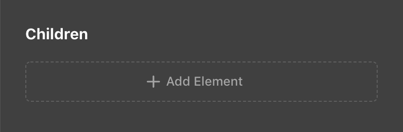
This makes it very easy to work with the immediate children of the Dropdown Element without needing to go to the global Outline view.
Setup
Next we have the Setup control group, which features a general collection of important controls centered around both appearance and functionality:
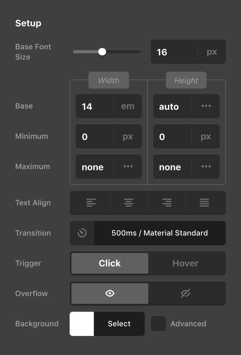
- Base Font Size: Sets the
font-sizeproperty on the Dropdown itself. This is particularly helpful for setting a new foundational value for any children. - Dimensions: The dimensions group is made up of the various
widthandheightcontrols found in the screenshot above. These can be used to specify fixed dimensions on the Dropdown itself if necessary. - Text Align: Applies a
text-alignvalue to the Dropdown itself similar to other Layout Elements. - Transition: Allows you to alter the
transition-durationandtransition-timing-functionof how the Dropdown should enter and exit. - Trigger: Depending on how your Dropdown is meant to function, you might wish for it to be opened by either a user clicking on the Toggle or simply hovering over it.
- Overflow: By default, the Dropdown's
overflowisvisible, but you can set it tohiddenhere if you wish to accomplish a certain look for your design. - Background: The base
background-colorcan be set here along with enabling an optional “Advanced Background,” which allows users to take advantage of hero images, videos, parallax effects, and much more!
Design
After the initial “Children” and “Setup” control groups, a series of Design controls are available, allowing for further customization of the Dropdown. Of these controls, an especially helpful control to be aware of is the Flexbox setup:
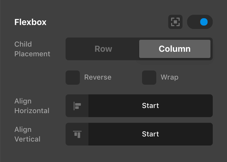
This control will allow you to optionally enable an internal flexbox layout context for the Dropdown's direct children. This functions similarly to the Flexbox controls found on other Layout Elements such as the Column, Cell, or Div.
Beyond that, another item to be particularly aware of is the First Dropdown Margin control and why you might want to use it:
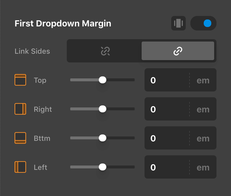
By default, the Dropdown will position itself at the exact edge of it's closest trigger or containing Element. In some situations, this might mean that it is placed directly against the Toggle. If you wish to move the Dropdown away from the Toggle just a bit to give them both some spacing, you can use this control to adjust that initial Dropdown only and any nested Dropdowns will not be affected by this value.
Controlling the Element
See the docs on Toggleables
Demo
To see a live demo of the Dropdown Element click here.
See something inaccurate? Let us know