Rating
In this article, we're going to discuss the Rating Element which can be used to add star rating or custom reviews.
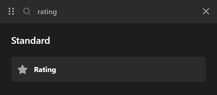
The Rating Element adds a star rating or custom review on the page. To add the Rating Element, simply search for "Rating" and drag "Rating" to the canvas.
Setup
The Rating Element consists of the empty, half full, and full stars section that can be an icon or image. The Rating Element also contains an optional text section to show the numeral representation of the rating or any other custom text you want to add.

The Setup control group in the Rating Element options contains a set of options to initialize the Rating Element. The following is a details description of each option in the Setup control group.
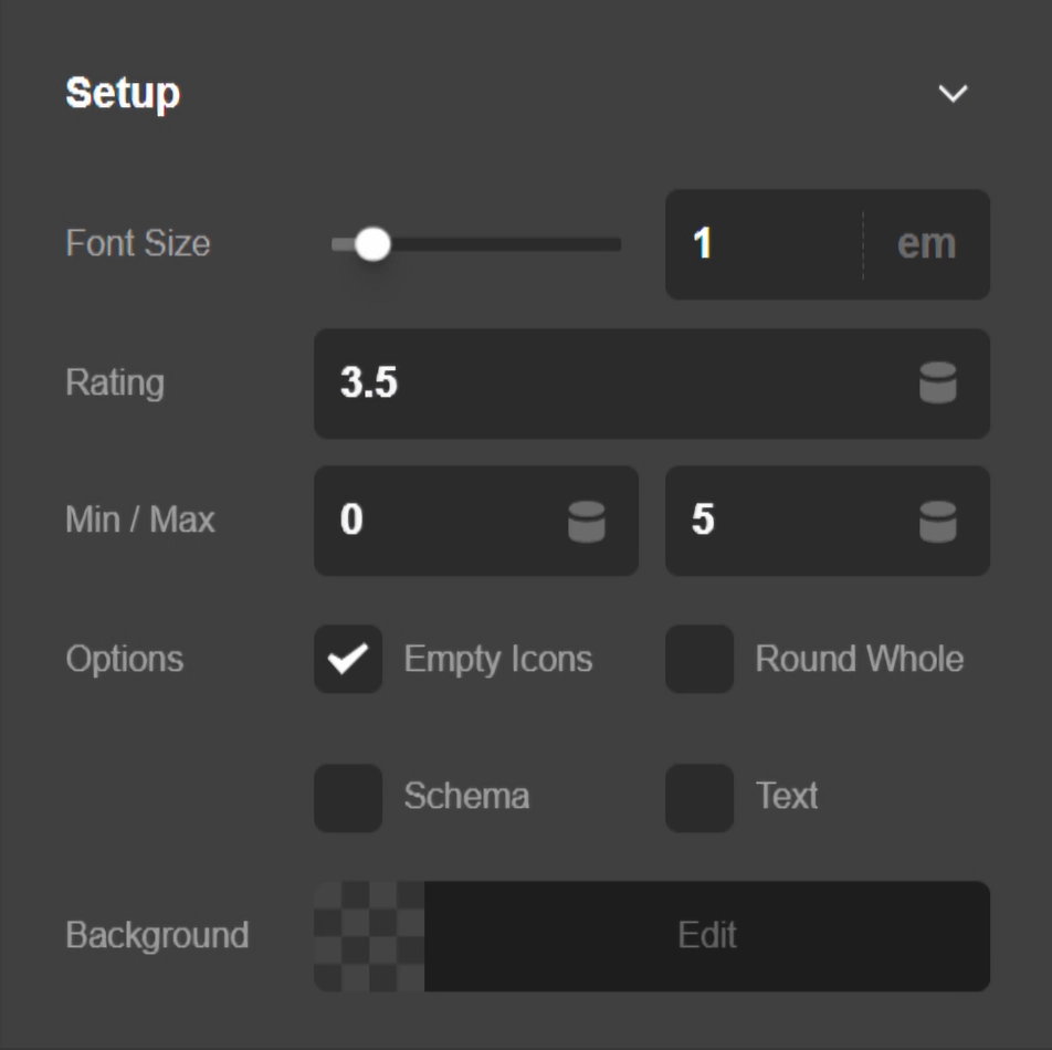
- Base Font Size - Use this option to make the stars and text section of the Rating Element smaller or bigger.
- Rating - Use this option to set the actual rating. For example, if you add
3.5as the value of this option, there will be three full stars and a half full star as the rating. - Min & Max Scale - Use this option to set the minimum and maximum stars for the rating. For example, if you set the minimum scale to one, and a maximum scale to five, you will have a five star rating system that can be rated from one star to 5 stars.
- Width & Max Width - Use these options to set the width and maximum width of the Rating Element.
- Background - Use this option to set the background color of the Rating Element.
- Options
- Empty Icons - Use this option to decide whether to show the empty stars or not. If disabled, it will show only the full and half full stars.
- Round Whole - Use this option to round whatever value you add into the Rating option. The end result will be a rating system without half full stars. For example, if you set the Rating option value to
3.5, it will round it to4.
Schema Settings
The Schema control group will show if you enable the Add Schema option from the Setup control group. Schema is the code for Structured Data, that gives extra information to Google search engine, to help it understand the content of your page, in this case, the Rating Element.
The Schema control group gives some options to help you describe the Rating Element to Google. Structured Data contains a variety of topics and you can learn more about the schema code here.
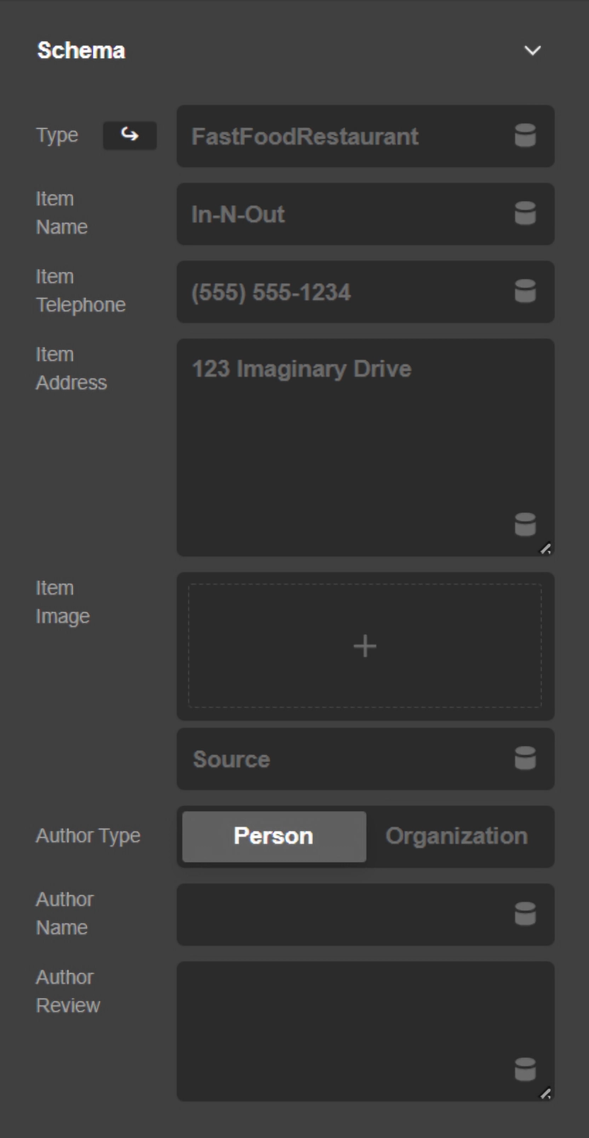
- Type - This option adds
Typeproperty and whatever value you add into the option as the value. The Rating Element adds the Review type automatically, that is why you need to add a type for your organization or business here and notReview. - Item Name - Use this option to add the name of your organization or business.
- Item Telephone - Use this option to add the phone number of your organization or business.
- Item Address - Use this option to add the postal address of your organization or business.
- Item Images - Use this option to add an image for your organization or business.
- Author Name - Use this option to add the author name which will be added into the
Reviewschema type'sauthorproperty. - Author Review - Use this option to add a review for the Rating Element. The value of this option will be used as the value of
reviewBodyproperty in theReviewschema type.
Graphic Settings
The Rating Element has the graphic section which is the icons for the empty, half full, and full states. The default icon for the graphic section is the star icon, but you can change the icons to whatever you want, or use custom images instead of the icons for the graphic section.
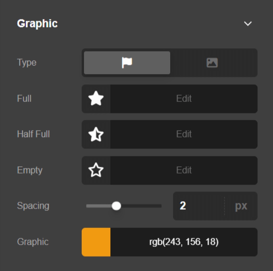
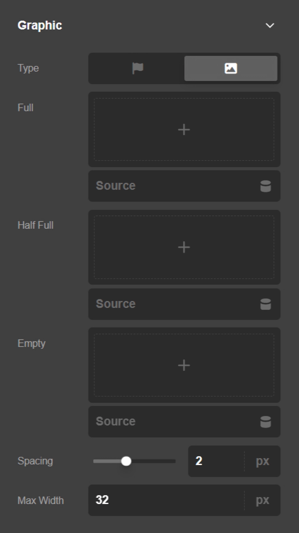
- Type - Use this option to decide whether you want the graphic section of the Rating Element to be icon or custom image.
- Full - Use this option to select the icon or custom image of the graphic section in full mode.
- Half Full - Use this option to select the icon or custom image of the graphic section in half full mode.
- Empty - Use this option to select the icon or custom image of the graphic section in empty mode.
- Spacing & Color - Use this option to set the spacing between each icon and set the color of the icon. This option will show if you set the Icon graphic type.
- Spacing & Max Width - Use this option to set the spacing between each custom image that is used instead of the icon and the maximum width of each image. This option will show if you set the Image graphic type.
Design Settings
The Design settings consist of control groups to set the margin, padding, border, and other design-related aspects of the Rating Element.
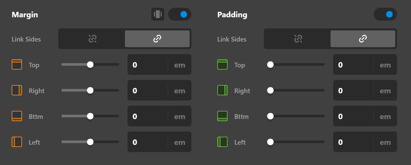
Margin
Use this option to set the margin of the Rating Element. You can change the settings for all the sides of the Rating Element or modify them individually.
Padding
Use this option to set the padding of the Rating Element. You can change the settings for all the sides of the Rating Element or modify them individually.
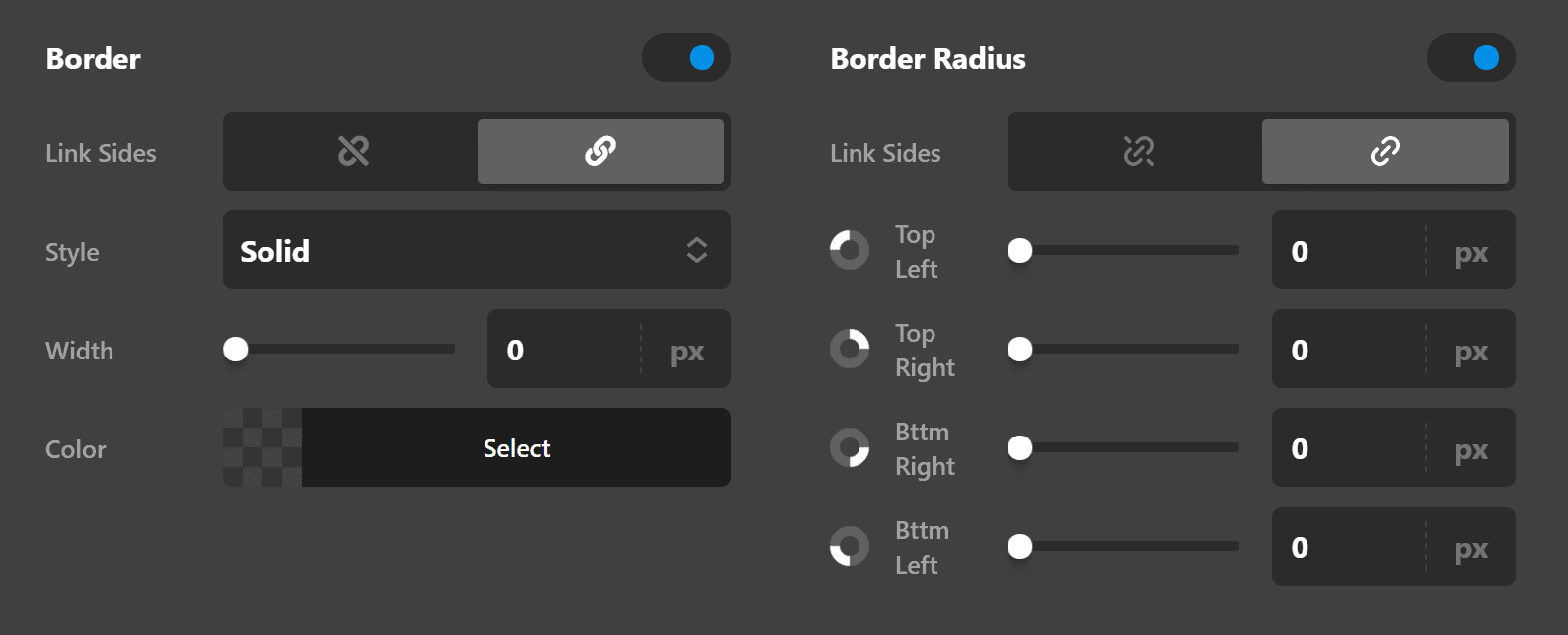
Border
Use this option to set the border of the Rating Element. You can set the style, width and color of the border on all sides or each side individually.
Border Radius
Use this option to set a border-radius for the Rating Element. You can set the curve on all sides or set them individually.
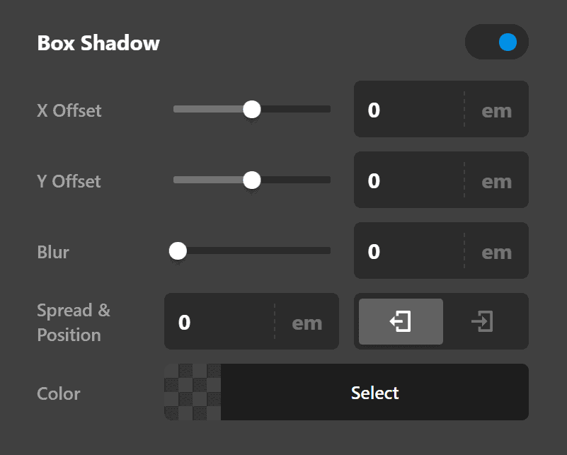
Box Shadow
You can set a shadow over the Rating Element using the box-shadow control group.
- X-Offset - Use this option to set the X offset of the shadow in the Rating Element.
- Y-Offset - Use this option to set the Y offset of the shadow in the Testimonial.
- Blur - Use this option to set the intensity of the blur effect in the Rating Element.
- Spread & Position - Use this option to set the spread amount of the items section shadow and decide if you want the shadow to sit inside or outside of the Rating element.
- Color - Use this option to set the color of the Rating Element shadow.
Text
The Text settings consist of control groups to set the characteristics of the text section of the Rating Element.
Content
This option will show if you enable the Show Text option. Using this option you can add custom text after the star section of the Rating Element. The default text uses the Dynamic Content feature to show {{rating}} / {{max}}. rating retrieves the value you added in the Rating option and max retrieves the value that you add in Max Scale option.
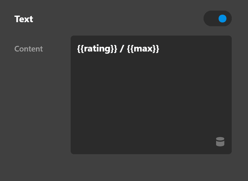
You can change the text however you want, for example, if you change the value to {{rating}} of {{max}} the final result will be like this:

Text Flexbox
The Text Flexbox section contains controls to set the positioning of the Rating Element graphic and text sections using the CSS Flexbox display.
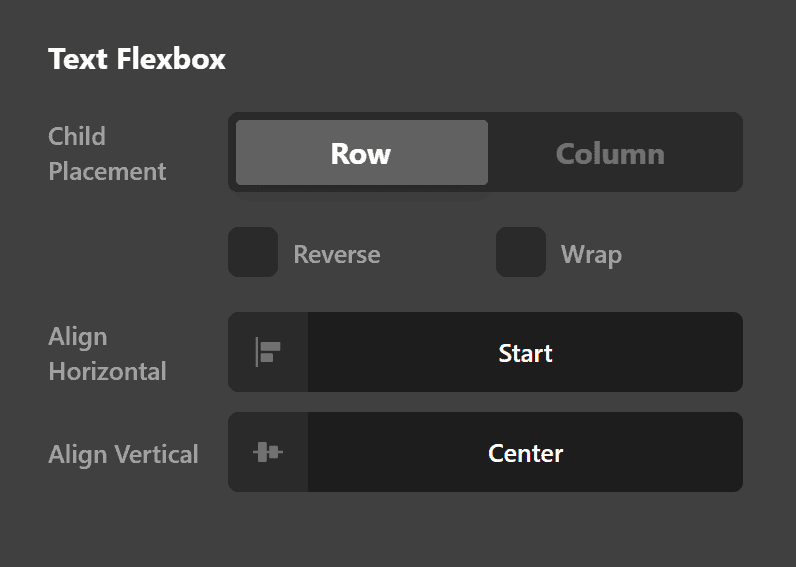
- Child Placement: Use this option to decide if the items of the Rating Element should be laid out vertically (Column) or horizontally (Row).
- Reverse: Enabling this option will cause the Rating Element to be laid in a reverse manner.
- Wrap: Enable this option to wrap the Rating Element when there is not enough space in smaller devices.
- Align Horizontal: Use this option to layout the Rating Element horizontally.
- Align Vertical: Use this option to layout the Rating Element vertically.
Click here for more information about the Flexbox display.
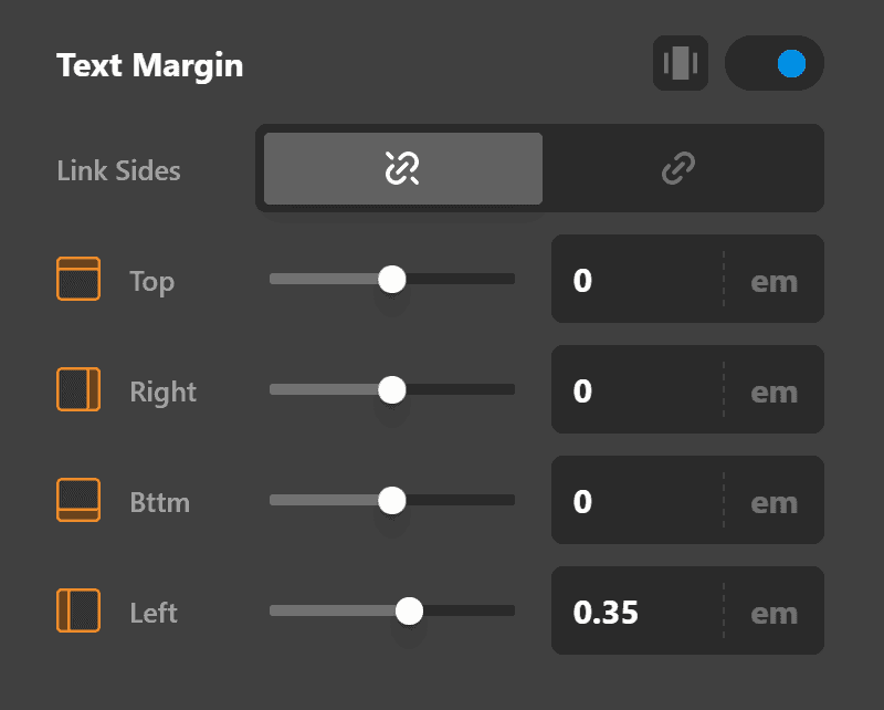
Text Margin
Use this option to set the margin of the Rating Element text section. You can change the settings for all the sides of the text or modify them individually.
Text Format
You can use this control group to set the format of the text in the Rating Element.
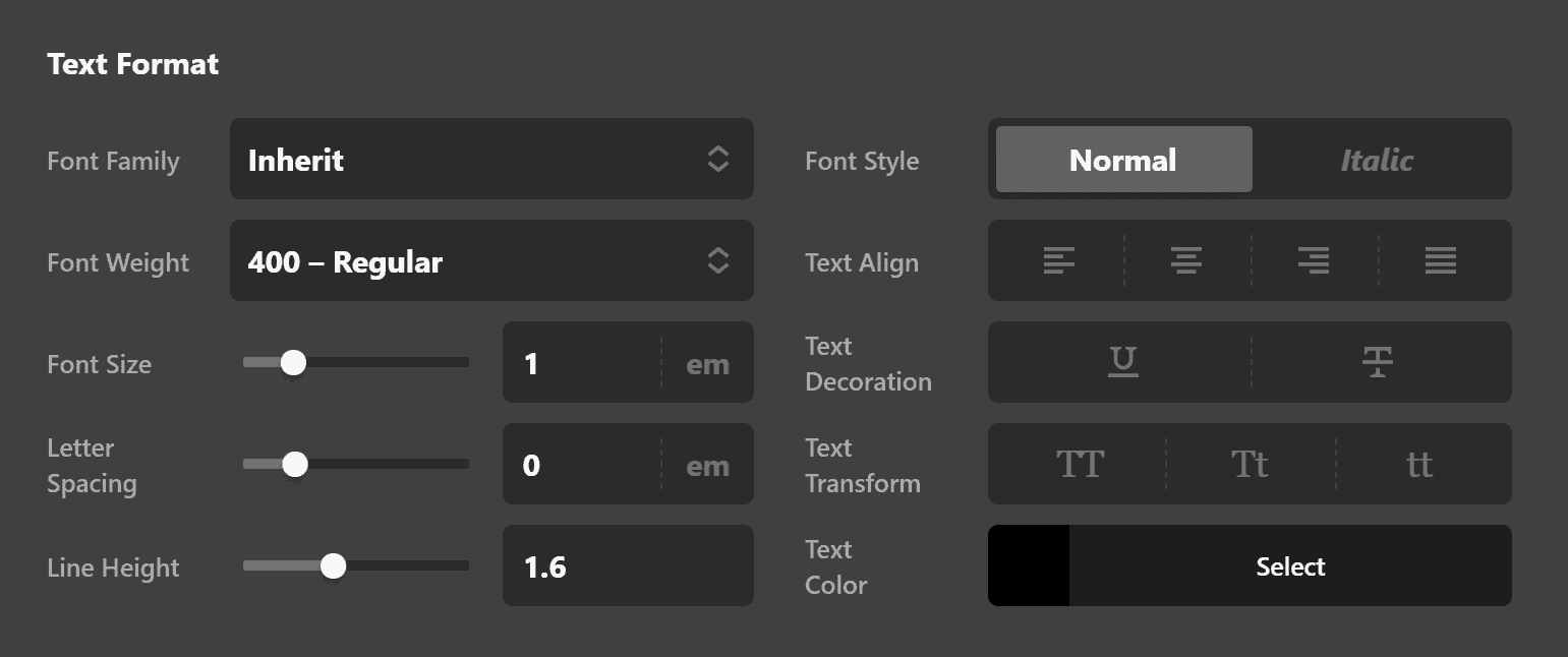
- Font Family - Use this option to set the font of the Rating Element text.
- Font Weight - Use this option to set the weight or thickness of the font. The values may differ depending on the selection of the font and if the select font supports weights or not.
- Font Size - Use this option to set the size of the font.
- Letter Spacing - Use this option to set the spacing between letters.
- Line Height - Use this option to set the spacing between each line.
- Font Style - Use this option to decide if you want to have a normal or italic style.
- Text Align - Use this option to set the alignment of the text. Possible values are left, center, right, and justify.
- Text Decoration - Use this option to force an underline or linethrough style.
- Text Transform - Use this option to set the case of the text. Available options are uppercase, camel case, and lowercase.
- Text Color - Use this option to set the color of the text.
Text Shadow
The text-shadow control group contains settings to set a text-shadow for the Rating Element text.
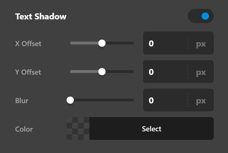
- X-Offset - Use this option to set the X offset of the text-shadow.
- Y-Offset - Use this option to set the Y offset of the text-shadow.
- Blur - Use this option to set the intensity of the blur effect in the text-shadow.
- Color - Use this option to set the color of the text-shadow.
Customize
The Customize pane consists of various features that allow you to take further control over your Element's styling and functionality:
- ID – Sets an HTML ID on the Element.
- Class – Sets an HTML Class on the Element.
- Element CSS – Use this feature for increased stylistic control of your Element, especially over nested markup. Click here for more detailed information on this feature, such as using
$elto dynamically target the base tag, et cetera. - Hide During Breakpoints – Hides the Element at different screen sizes when design alterations are needed. Click here for more information.
- Conditions – Adds / removes Elements from the page when certain criteria are met (e.g. “If a featured image is set...”). Click here for more information.
- Custom Attributes – Use this option to add custom HTML attributes to the root tag of the Element (e.g.
data-info="123"). This can be particularly helpful when integrating with various scripts and libraries.
Demo
To see a live demo of the Rating Element click here.
Summary
To sum up, we've discussed the Rating Element. We've discussed that a Rating Element is an easy tool for adding ratings and star reviews on a page and we've learned how to change it's content and design. Finally, we delved into details of the Rating Element settings.
See something inaccurate? Let us know