Modal
In this article, we're going to discuss the Modal Element and its settings.
The Modal Element is a dropzone-powered Element that gives users the ability to compose its content using pieces from the Element Library. This is a tremendous step forward in the ability to design intricate modal layouts. The Modal Element is made up of two constituent parts:
- Toggle: Essentially a Button Element that triggers the opening of the Modal.
- Modal: The actual content area where your Elements are placed when composing your designs.
In this article we will focus exclusively on the styling options available to the Modal portion of the Element. If you wish to know more about the controls found for the Toggle, you can check out are article about Buttons.
Children
The first control group within the Modal Element is the Children control group, which features a sortable where new Elements can be added, reordered, and removed as needed:
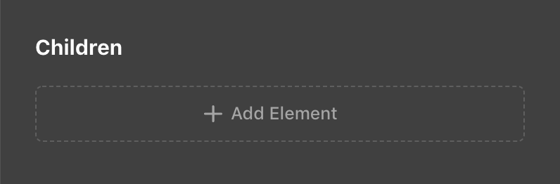
This makes it very easy to work with the immediate children of the Modal Element without needing to go to the global Outline view.
Setup
Next we have the Setup control group, which features a general collection of important controls centered around both appearance and functionality:
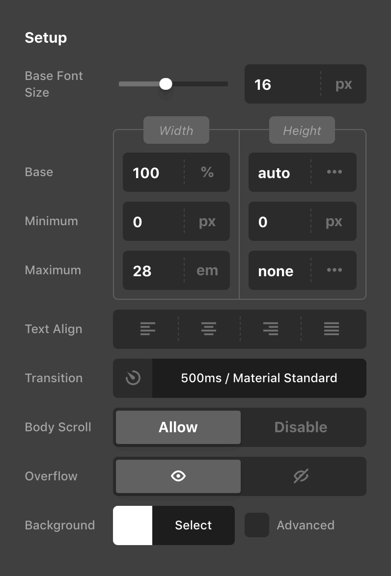
- Base Font Size: Sets the
font-sizeproperty on the Modal itself. This is particularly helpful for setting a new foundational value for any children. - Dimensions: The dimensions group is made up of the various
widthandheightcontrols found in the screenshot above. These can be used to specify fixed dimensions on the Modal itself if necessary. - Text Align: Applies a
text-alignvalue to the Modal itself similar to other Layout Elements. - Transition: Allows you to alter the
transition-durationandtransition-timing-functionof how the Modal should enter and exit. - Body Scroll: This control allows you to optionally disable the scroll events happening on the
bodywhen a Modal is open. - Overflow: By default, the Modal's
overflowisvisible, but you can set it tohiddenhere if you wish to accomplish a certain look for your design. - Background: The base
background-colorcan be set here along with enabling an optional “Advanced Background,” which allows users to take advantage of hero images, videos, parallax effects, and much more!
Backdrop & Close
The Backdrop & Close control group contains a succinct group of options geared towards finishing out the overall style of your Modal:
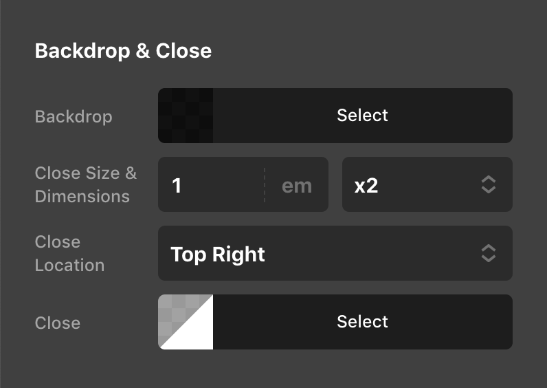
While the Backdrop and Close color pickers are relatively straightforward, there are a few more controls specific to the “Close” button that are particularly helpful to be aware of how they function:
- Close Size & Dimensions: While &ldqup;Close Size” sets the base
font-sizeon the button itself, the “Dimensions” control specifies how much physical space the button should take up overall. For example, if you set your base size as20pxand set your dimensions tox2.5, the button'swidthandheightwould come out to50pxoverall, with the icon inside only taking up the base20px. This is important to be aware of as it plays a part in how the Modal is spaced from the edge of the screen. - Close Location: Allows users to specify which corner of the screen the button should appear in.
Design
After the initial “Children” and “Setup” control groups, a series of Design controls are available, allowing for further customization of the Modal. Of these controls, an especially helpful control to be aware of is the Flexbox setup:
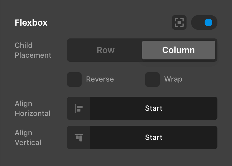
This control will allow you to optionally enable an internal flexbox layout context for the Modal's direct children. This functions similarly to the Flexbox controls found on other Layout Elements such as the Column, Cell, or Div.
Controlling the Element
See the docs on Toggleables
Demo
To see a live demo of the Modal Element click here.
See something inaccurate? Let us know