Structural Elements
In this article, we're going to discuss the Structural Elements of the Cornerstone Builder and how to use them.
Introduction
When working within Cornerstone, your page structure will be created using a handful of Structural Elements:
- Sections
- Rows / Columns
- Grids / Cells (Pro Only)
- Divs
If you are using Pro, you will have access to all of these Elements within the Layout Builder as well. Let's take a moment to discuss each of these Elements:
- Sections: The foundational building block of all pages to help organize content. By default, Sections will fill up the entire width of whatever parent container they are placed in. Additionally, the only direct child Elements allowed within Sections are Rows, Grids, and Divs.
- Rows / Columns: The primary structural paradigm that most people are used to within page builders. Rows allow you to layout content horizontally using Columns. Rows must have at least one Column, which is where you will then begin to start placing your Elements on your page. The Row Element in our builders is powered by CSS Flexbox.
- Grids / Cells: The Grid Element functions like Rows / Columns in that at least one Cell is required within the Grid to start placing Elements. The big difference from Rows is that the Grid Element is powered by CSS Grid.
- Divs: A new Structural Element available as of Pro v4.0.0, X v8.0.0, and Cornerstone v5.0.0. Divs differ from Rows and Grids in that they are singular and do not have any required children. Divs are to be used as layout helpers to assist with simple nested layouts where you don't want to have to utilize the additional layers of Columns or Cells.
Adding Your First Section
To get started on a new page or layout, go to the Outline Pane in your Builder. If you are starting on a completely new design, you will see the following:
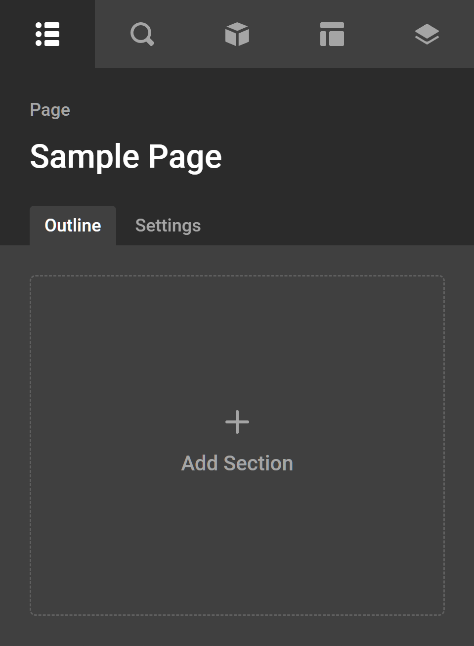
Clicking on the Add Section button seen above (the entire workspace is a button in this state) will allow you to introduce your first Section to your design:
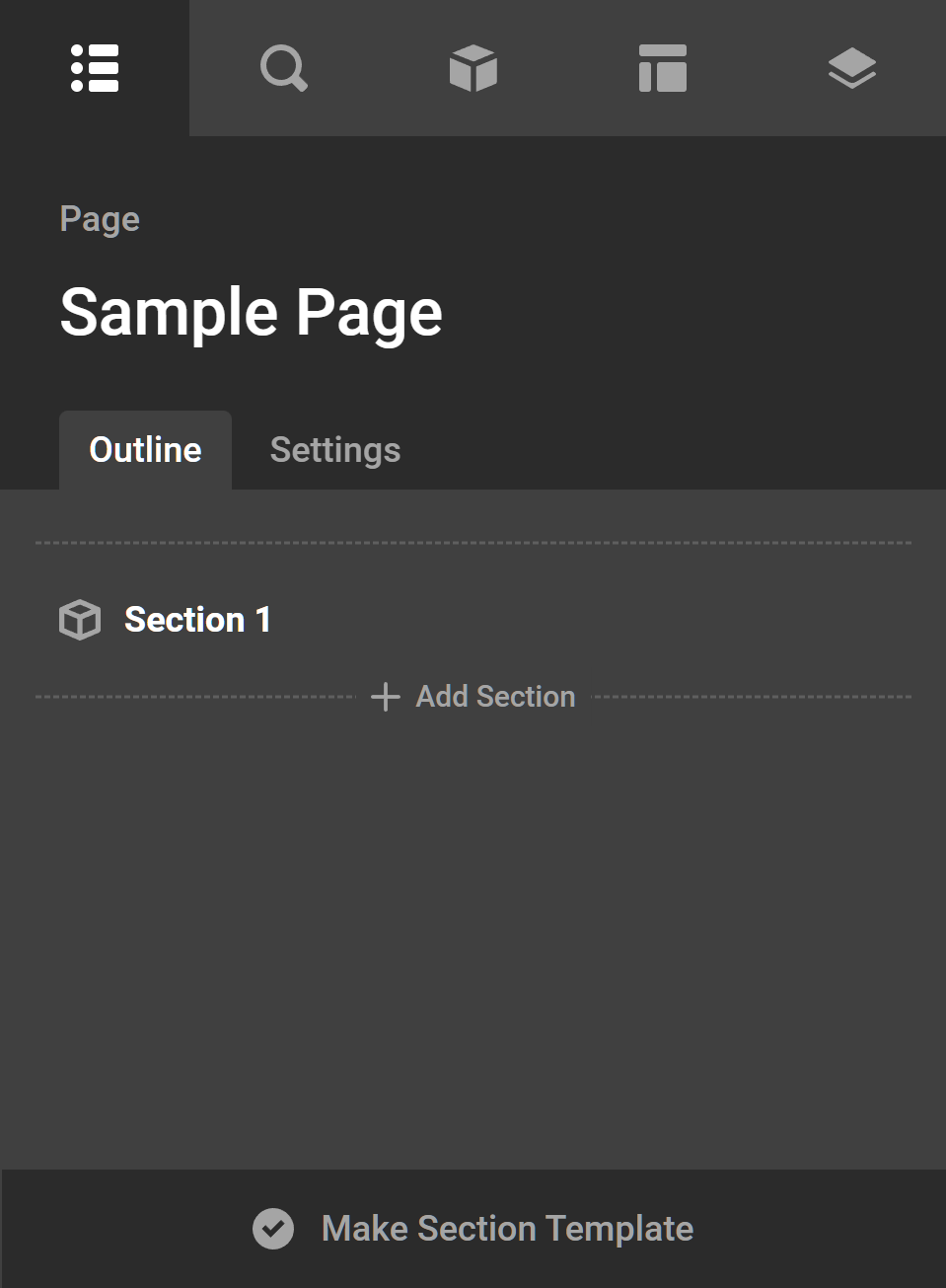
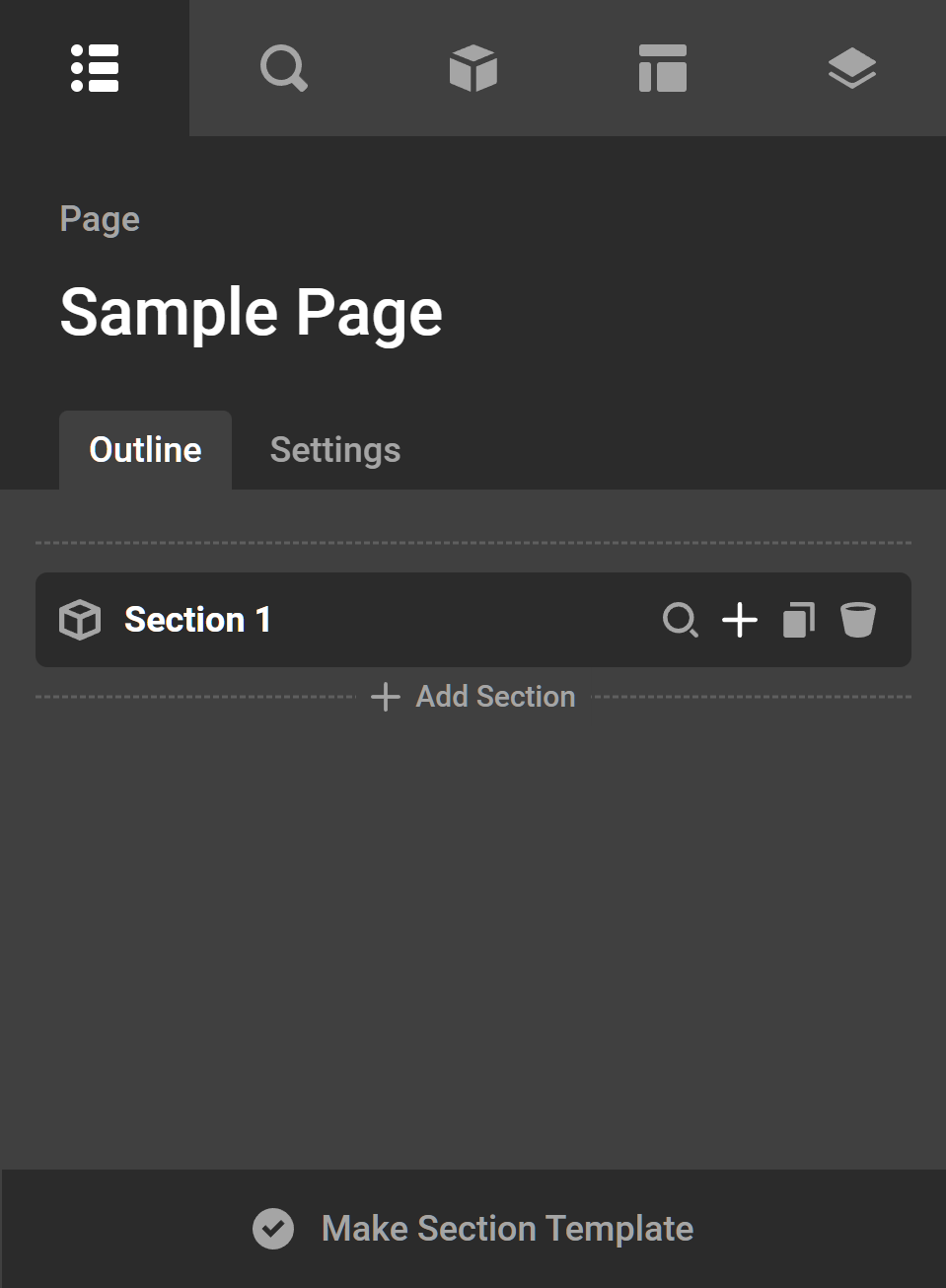
Adding Your First Row or Grid
When adding a new Section to your design you will see a new item added to your Outline pane as seen above. Once you have done this, you will need to add your first Row or Grid to your design. There are a few different ways to do this. Firstly, if you simply want to add a Row or Grid by itself to your Section without any child Columns or Cells, you can click the + button that appears when you hover over your Section in the Outline Pane:
Alternately, any empty Section, Row, or Grid will show you a prompt in the live preview to Choose a Layout. These prompts are quickstart actions that can help get you up and running in no time at all.
Empty Rows (or empty Sections if you've chosen Rows as your Default Layout Element in Preferences) will display the following prompt in the live preview:
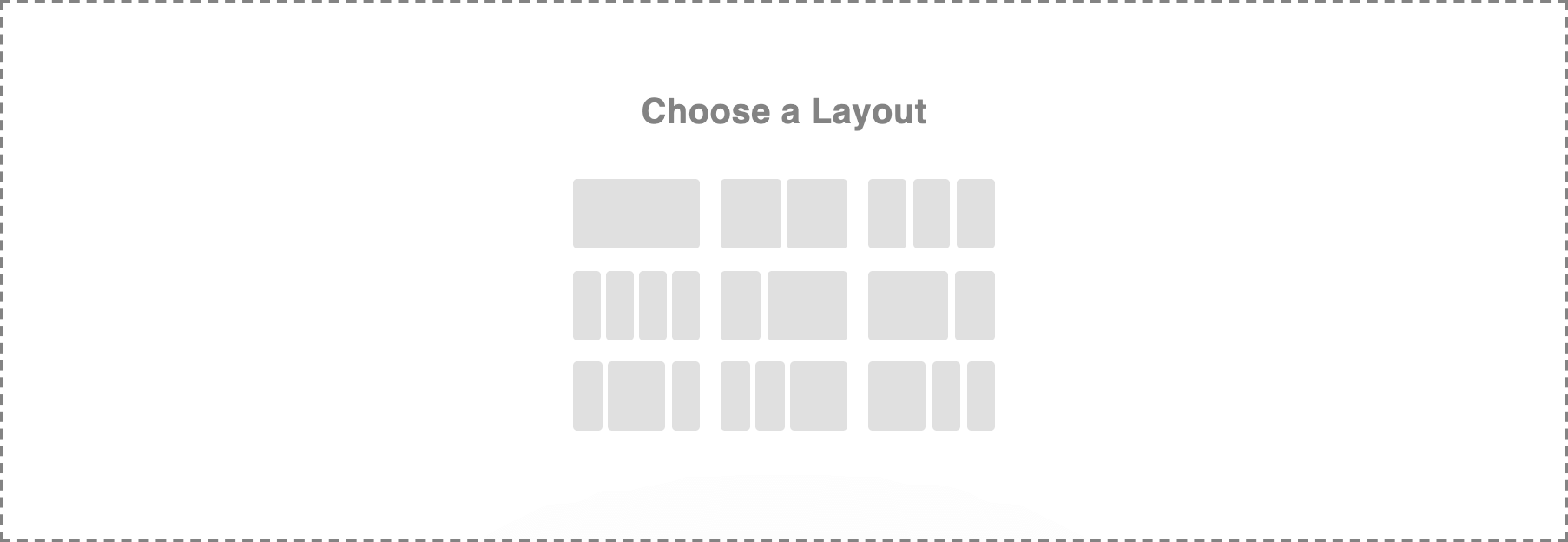
Clicking any of these icons will setup your Row for you by adding the appropriate number of Column Elements and automatically applying a responsive layout. For example, if you select the four column layout on your LG breakpoint, the Element will automatically apply some sensible defaults that should work well responsively (e.g. it might go to two equal columns on MD and one full column on SM). Learn more about the Row Element in depth.
Empty Grids (or empty Sections if you've chosen Grids as your Default Layout Element in Preferences) will display the following prompt in the live preview:
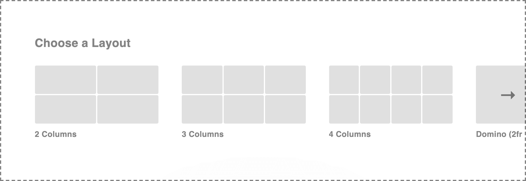
This prompt differs from the Row Element's empty prompt in that it scrolls horizontally (or you can click the side arrows) to navigate the presets. Similar to the Row Element, selecting any of these quickstart options will perform many actions at once for you such as adding the appropriate number of Cells and applying sensible responsive defaults across all breakpoints. Learn more about the Grid Element in depth.
Adding Your First Element
Let's say that you have added a new Section to your layout and selected the single column layout preset from the live preview. After adding your first Element, to the live preview your Outline Pane would look something like the following:
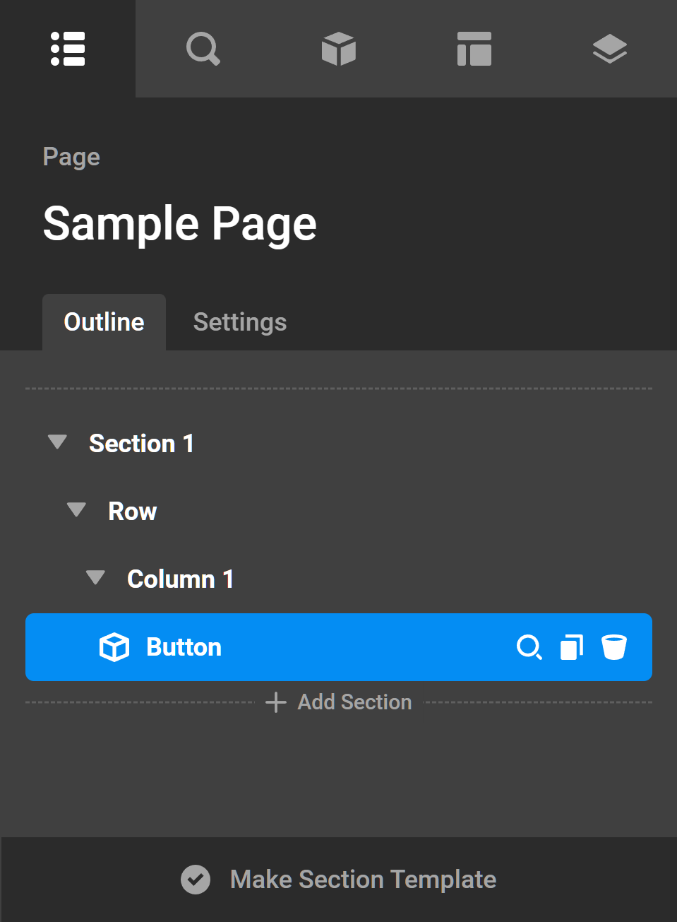
Notice that as children are added to parent Elements, its icon to the left is replaced with a caret, which can be clicked to reveal the sub-structure within that parent.
Nested Structure
One thing of note when working on designs is that Elements are infinitely nestable, although we do recommend that you attempt to keep your layouts as simple as possible to help with management. This means that you can place structural Elements within one another (e.g. you might want to place a Grid within a Column or a Row within a Cell for some additional sub-structure).
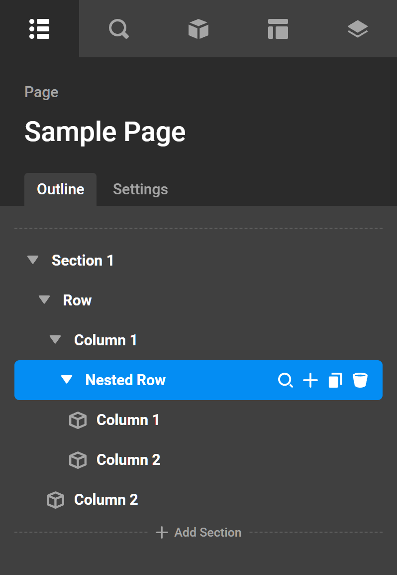
For example, let's say that you have a 50/50 layout setup for your Row Element:
You may want to have some additional control over the Elements within one of these Columns. To do this, you could add another Row Element as a child of the Column, giving you responsive control over the layout at multiple levels. To set this up, click on the + of the Column you wish to add the Row to in your Outline Pane, or drag in a Row from the Elements Library.
For example, let's say that we wanted to add our nested Row to the first Column seen above, this would look like so in the Outline Pane:
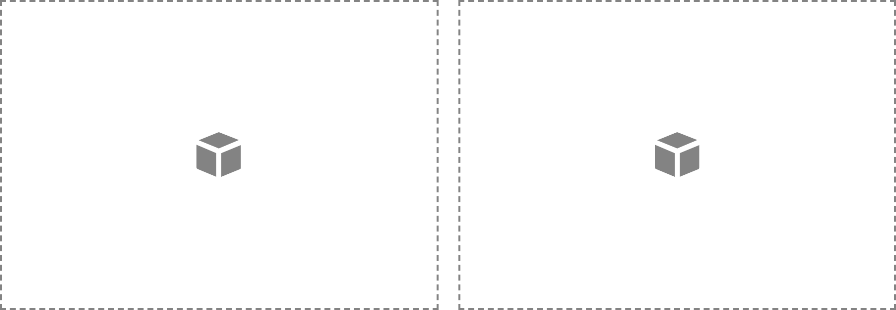
And in the live preview, you would then see three Element dropzones: the two smaller dropzones of the nested Row in the first top-level Column, and the larger dropzone of the second empty top-level Column:
See something inaccurate? Let us know