Sliders
In this article, we're going to introduce to you the various Elements used to create your own native Sliders in Cornerstone.
Base Elements
While crafting the systems that would eventually become the pieces to the Slider puzzle in Cornerstone, we knew early on that we would want to deconstruct the idea of a Slider into its constituent parts to afford more flexibility to the end user as they implemented these systems into their designs. These include:
In addition to building from scratch, you can also use one of our…
Prefab Elements
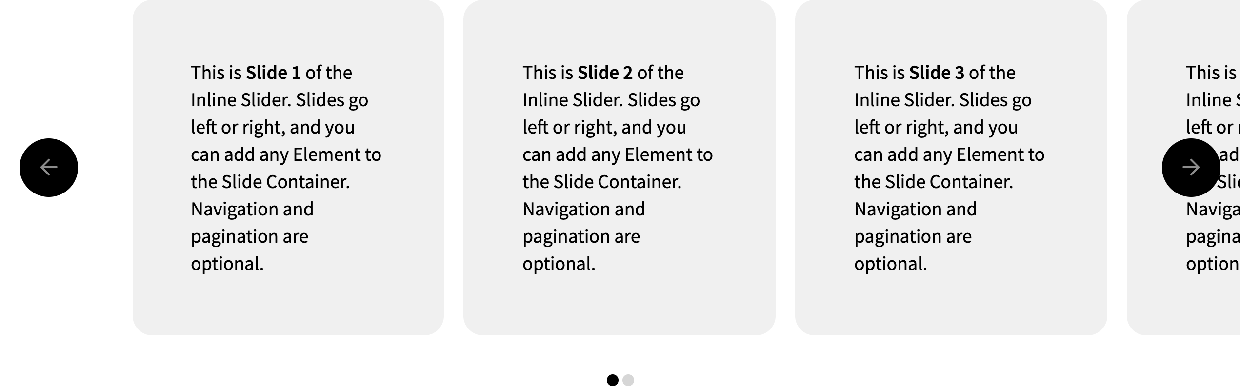
Cornerstone comes with two basic Sliders fully wired up for you and ready to be customized straight out of the box. This includes the Slider (Inline) Element, which is laid out in a linear fashion. Navigating this type of Slider will result in a lateral movement from side to side as each page is brought into the viewport:
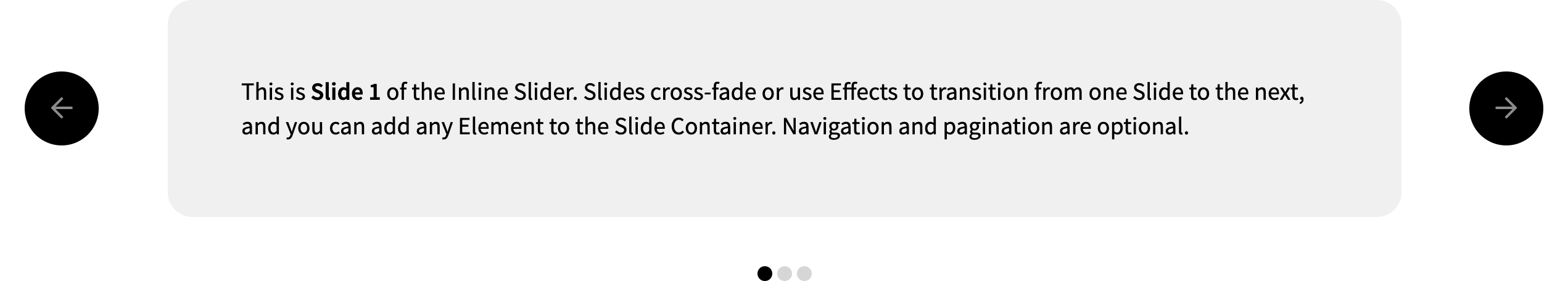
Additionally, the Slider (Stacked) Element can be used when it is desirable to show one slide at a time with a crossfade or effect transition into one another as you navigate through the Slider:
Each of these Prefab Sliders can be fully customized to match your designs as you see fit, and simply serve as a starting point for you to get up and running quickly without having to wire anything up. Each of these Slider Elements comes with the Slide Container, Slide Navigation, and Slide Pagination base Elements mentioned above baked in.
Note: the styling included with these Prefabs is meant to serve as a baseline to give you some context when placing these Elements onto your page, you can adjust anything you want by inspecting any Element within the Prefab and adjusting it accordingly.
Of particular note is the Slide Navigation in these Prefab Sliders, which utilizes a special technique to vertically center itself on the Slide Container while also not interfering with its layout or click events. To achieve this effect, a wrapping Div is placed around the Slide Container and Slide Navigation, which serves as a relative container to position the navigation within. Next, the Slide Navigation is given the following block of final CSS output from Cornerstone:
/*
// Notes
// ~~~~~
// 01. Comes from the Position control group on the Div.
// 02. Comes from the Effects Module on the Div.
*/

position: absolute;              /* 01 */
top: 50%;                        /* 01 */
left: 0;                         /* 01 */
right: 0;                        /* 01 */
transform: translate(0px, -50%); /* 02 */
This vertically centers the navigation while also having it stretch from left to right within the parent container. The final transform of translate(0px, -50%) is needed to achieve true vertical centering by bumping it upwards by 50% of its intrinsic height, as top: 50%; along with absolute positioning will actually place the navigation slightly below the mid-line of the wrapper. Finally, a value of 1em is applied to the padding-left and padding-right values of this Div to offset the arrows from the edges of the viewport a bit.
If the navigation pattern you are looking to implement with prev / next buttons relies more on being directly in the flow of the document or has a much different style that you're after, you might find it easier to simply delete the navigation within this Prefab and then drag in a new Slide Navigation Element and start building from scratch with that.
Slide Container Element
The Slide Container is the core piece to any Slider you plan on building in Cornerstone and is the parent container for your individual Slides (think of this as an analog to the Row, which is the required parent of any Column). This is also where many configuration options regarding the base layout and functionality of your Slides can be found. Upon dragging it into your live preview, you will see the familiar “Choose a Layout” UI found in other Layout Elements:
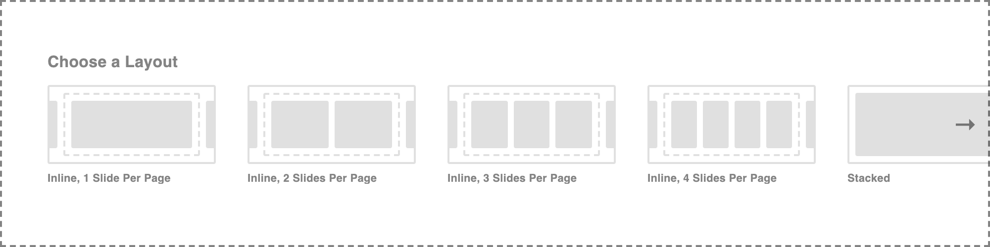
This will only be shown while no Slides are present in your Slide Container and serves to provide a few quick-start points when building Sliders from scratch by adding a pre-determined amount of Slides and making a few simple adjustments.
If you are wanting to completely build up your Slider from scratch, you will want to direct your attention to the Inspector's controls for the Slide Container. The Layout and Option controls will look slightly different based on how you configure things, but the primary difference comes down to whether or not you choose between an Inline or Stacked Layout.
Slide Navigation Element
The Slide Navigation Element is a simple Div as the parent with two Div Elements inside serving as buttons to navigate from one slide to the next for any given Slider. Each button has a pre-wired custom attribute that we will discuss later, which can be added to any Element to turn them into navigation buttons.
Slide Pagination Element
The Slide Pagination Element renders dynamic Slider pagination that will automatically update its markup as your Slider pages adjust responsively.
The Viewport and Content Sizing
Before moving on to any other options, it is important to understand how the Slide Container's viewport overflow and Content Sizing controls work in tandem to create the base structure for your Slider, and why you might want to alter them.
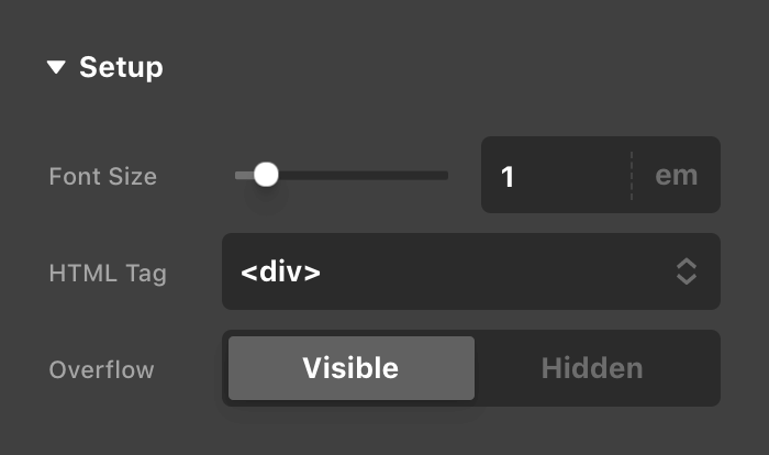
By default, every Slide Container you drag in will have its Overflow control in the Setup control group set to Hidden:
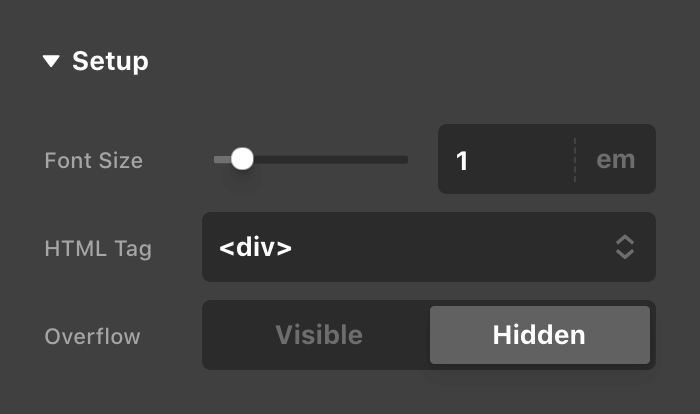
This Overflow control is applied to the Slide Container's viewport, which is the outermost HTML element wrapping all of the Slider markup. It is set to “Hidden” by default primarily for the usage of Inline layouts, where your slides will end up moving laterally across—and beyond the edges of—the browser, and is used to avoid triggering unwanted horizontal scrollbars on your content.
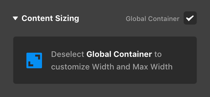
The Content Sizing control group found farther down the Inspector is in charge of defining the containing dimensions for the content inside your Slider. Much like a Row or Grid, if you place the Slide Container as a direct child of a Section, the Global Container will be enabled by default:
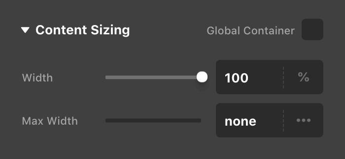
If your Slide Container is nested within a Div, Row, or Grid, this option will be disabled by default with the Width set to 100%:
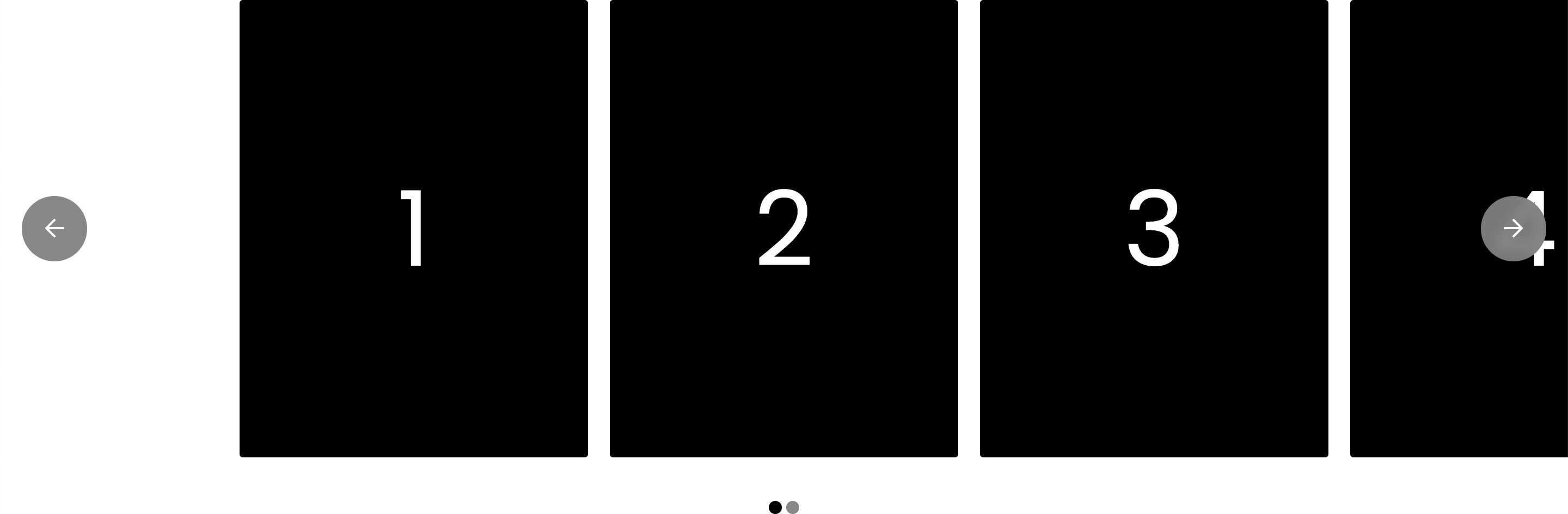
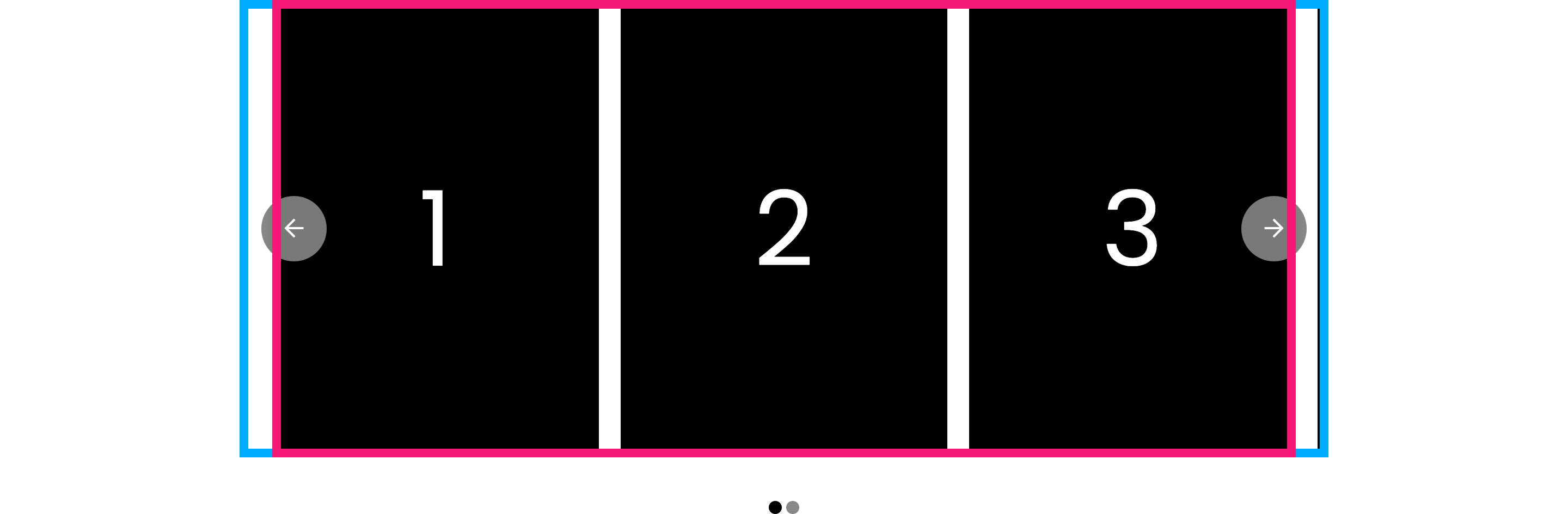
So how does this all work together? Well let's drag in our Slider (Inline) starter (slightly redesigned with some different content to keep better track of things) as a direct child of a Section and see how that is output:
Now we'll add some outlines to better visualize what is happening. The viewport will be represented by the blue outline, while the main content dimensions set by the Content Sizing control will be represented by the pink outline (these outlines can be seen by adding the class show-outlines to your Slide Container if you ever need to troubleshoot anything yourself):
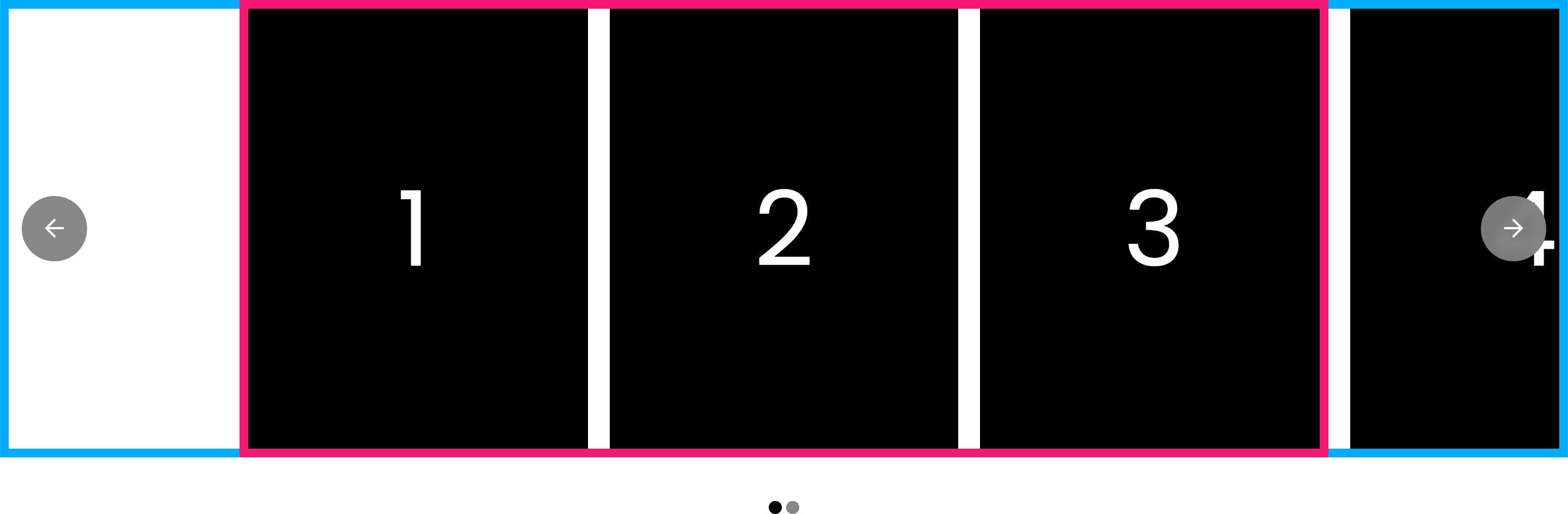
Notice how the viewport stretches from end to end within the browser as it is unobstructed by a parent Div, Row, or Grid with a container already set. However, the main content of the Slide Container is still centered and contained, due to the fact that its Global Container option is enabled (for this screenshot, the Global Container was using 94% for the Width and had a Max Width of 1000px, which will become more relevant in a moment).
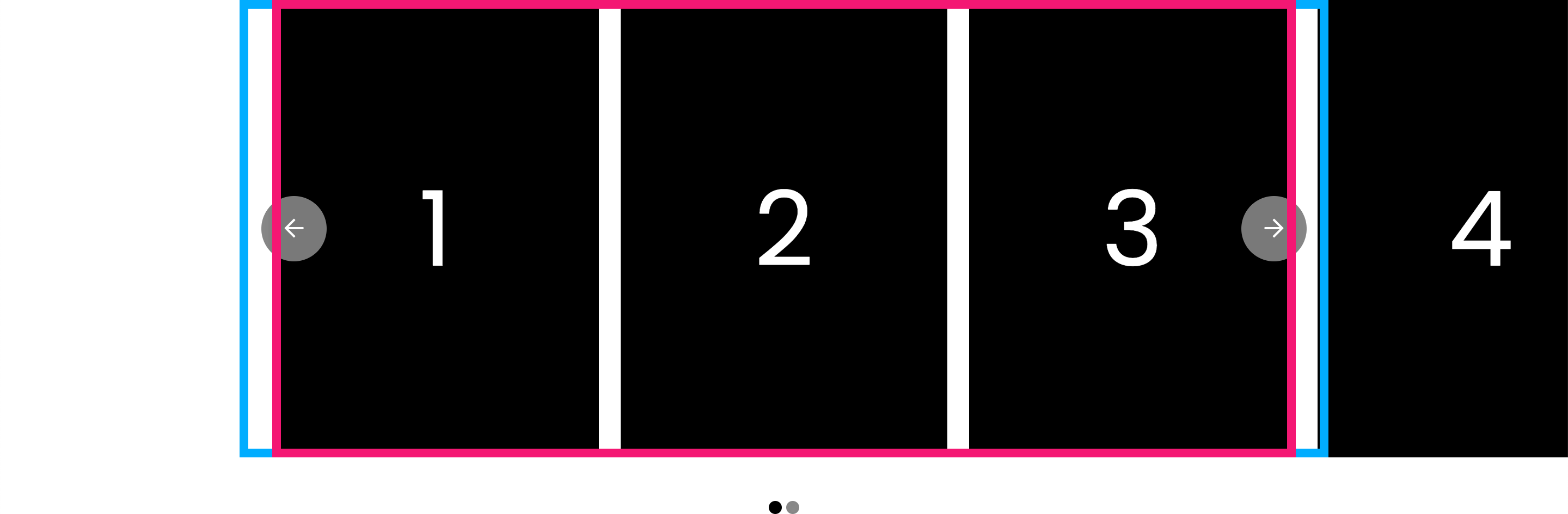
Now let's see what would happen if we added a Row, put a Global Container on that Row, and then dropped our Slide Container as it currently stands into that particular context:
You can see that the viewport is still spanning 100% of its parent container, which in this case is a Row with a Global Container already enabled, which is why it is no longer the width of the entire browser. Since our Slide Container's Content Sizing control is set to utilize a Global Container as well, it is inset slightly due it using the same 94% value mentioned earlier. Keep in mind that in this scenario, you may wish to adjust your Content Sizing values to span the entire width of the viewport so that you are not getting this double containment effect.
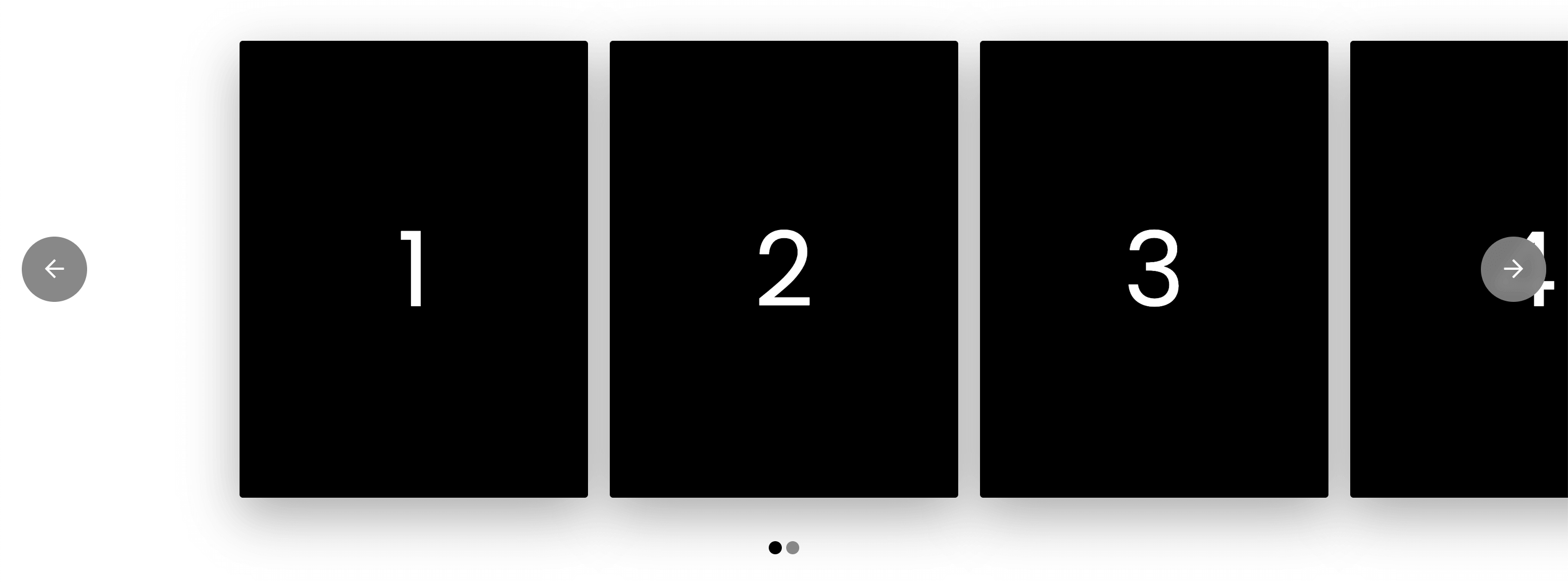
Take note of how the Slides in this scenario have been cut off due to the viewport not being able to span the entire width of the browser. This may be an intended design decision for your desired output; however, in the case that you need to place a Slider inside a Row, Grid, et cetera, but still wish have it span the width of your browser visually, this is the perfect scenario to go back up to the Setup control group and adjust the Overflow control to use the Visible value instead:
This will result in the following output where you can have a Slider physically contained by a parent Element, but still have it visually appear to operate within the entirety of the viewport:
Another common scenario where you might wish to utilize this feature in your designs is box-shadows. Since the viewport is flush with its Slides by default, if you add a shadow they will appear cut off without any adjustments:

However, allowing the overflow to be visible on our viewport will allow for the full shadows to be shown:
This is a helpful “escape hatch” to use when absolutely necessary, but keep in mind that removing the overflow from the Slide Container could force a horizontal scrollbar on your content. To avoid this issue, go up to the parent Section of your slider and set its Overflow control to Hidden. This will avoid any undesirable effects across devices.
One final thing to be aware of here is the Padding control found under the Design section. The value of this control is output directly to the viewport of your Slide Container, and is another helpful way to create an offset required by shadows or any other content that appears visually beyond the bounds of the Slide Container's viewport without needing to disable its default Overflow value.
Layout Controls
The Layout controls of the Inline and Stacked Slider types are as follows:
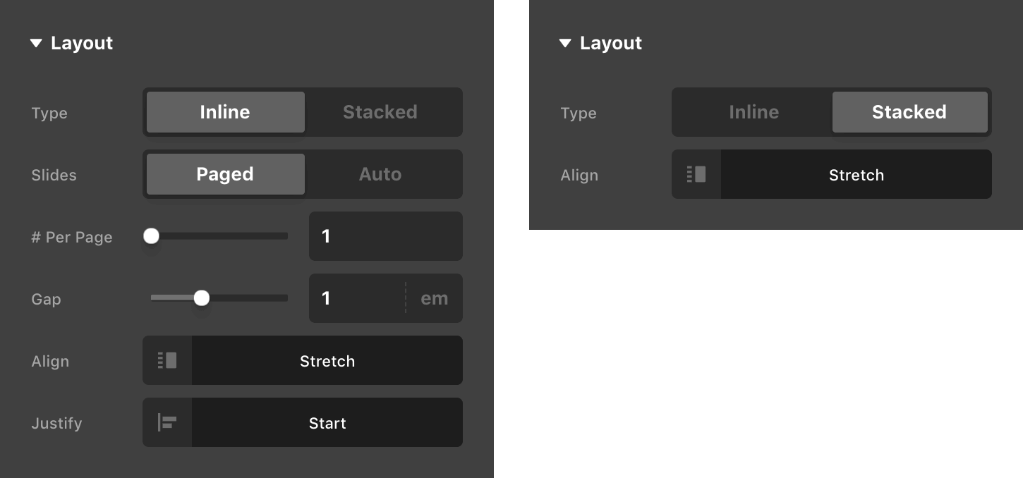
You will notice that there are considerably more options available when utilizing an Inline layout. Let's take a moment to run through the Inline-specific controls, and then discuss how the Align control works across both Slider types at the end.
The Slides control allows you to select between Paged or Auto, which we will discuss at more length later on.
Paged is likely what you will want to use for most situations, as it evenly distributes your Slides across the content area. This is paired with the # Per Page control found on the line below, which specifies how many Slides should be shown per page. Using the settings seen above, you would see the following output:
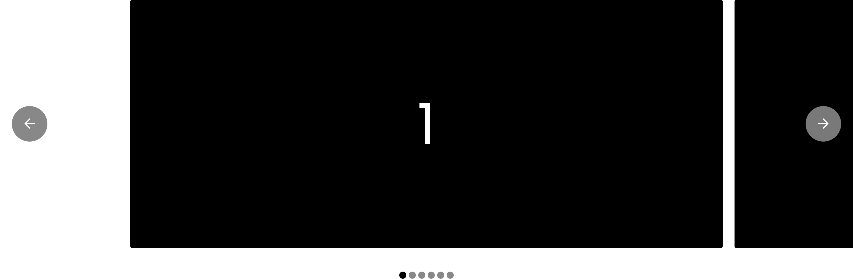
Notice how the content area is completely filled with only one Slide. If we were to change the # Per Page control to 2, we would see the following result:
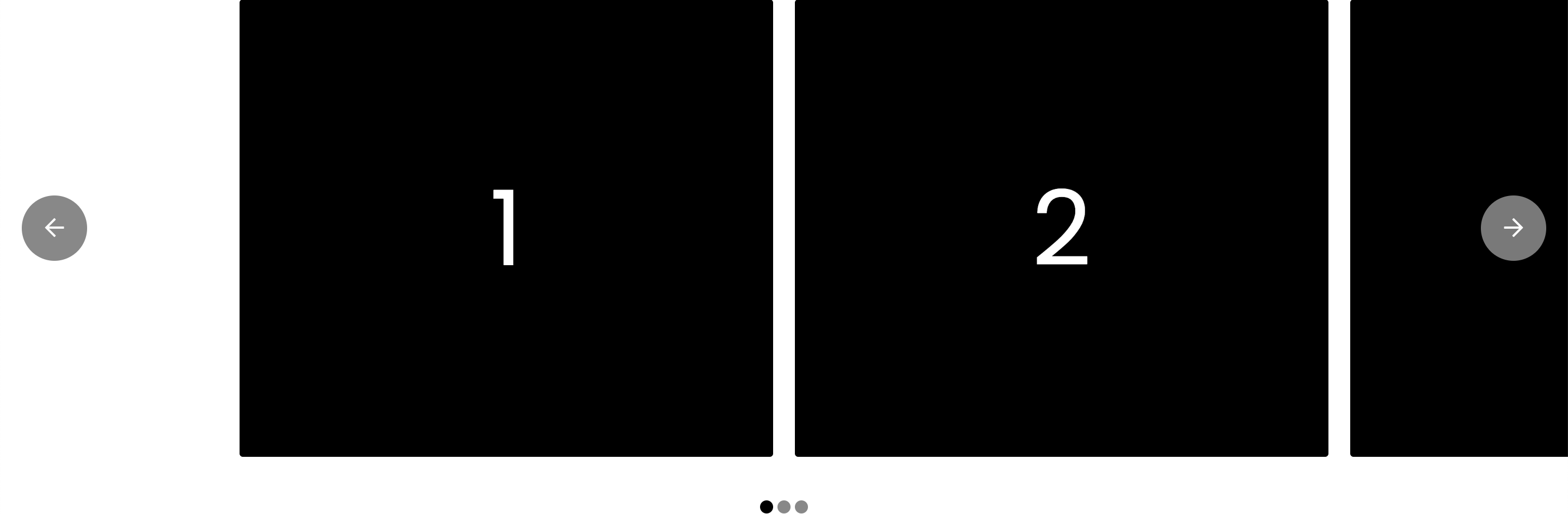
You will notice that we are now seeing two Slides evenly distributed amongst our content area in addition to the fact that our Slide Pagination Element has updated its pagination count. Since we have six Slides in our example, the pagination count updated like so:
- When # Per Page is
1, 6 items are shown in Slide Pagination. - When # Per Page is
2, 3 items are shown in Slide Pagination.
The great thing about the # Per Page control is that it is fully responsive, meaning you can update how many Slides are shown in your content area across various devices. For example, you might wish to show 3 Slides per page on desktop, then have it respond to 2 on tablet and 1 on mobile. This allows you to have much greater responsive flexibility so your Slides do not end up getting too scrunched on smaller screens, and any associated Slide Pagination Elements will update their item count accordingly with these responsive changes.
Next, we have the Gap control, which allows you to change the spacing between your Slides. You can increase this amount or even remove it completely to have your Slides flush with one another. Like the # Per Page control, Gap is fully responsive, meaning you can change the gaps between Slides across different devices, affording you a great deal of flexibility in your designs.
The Justify control for Inline Sliders deals with how content is distributed across the horizontal axis of your Slide Container. This is more of an advanced feature that you won't see any observable change with unless you are using it in tandem with a couple other configuration options, which we will discuss later.
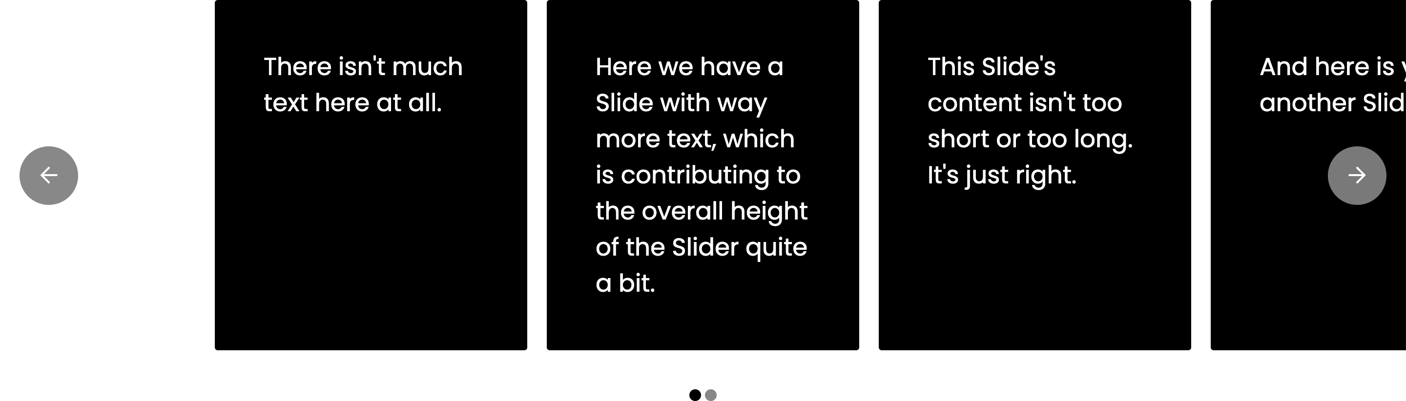
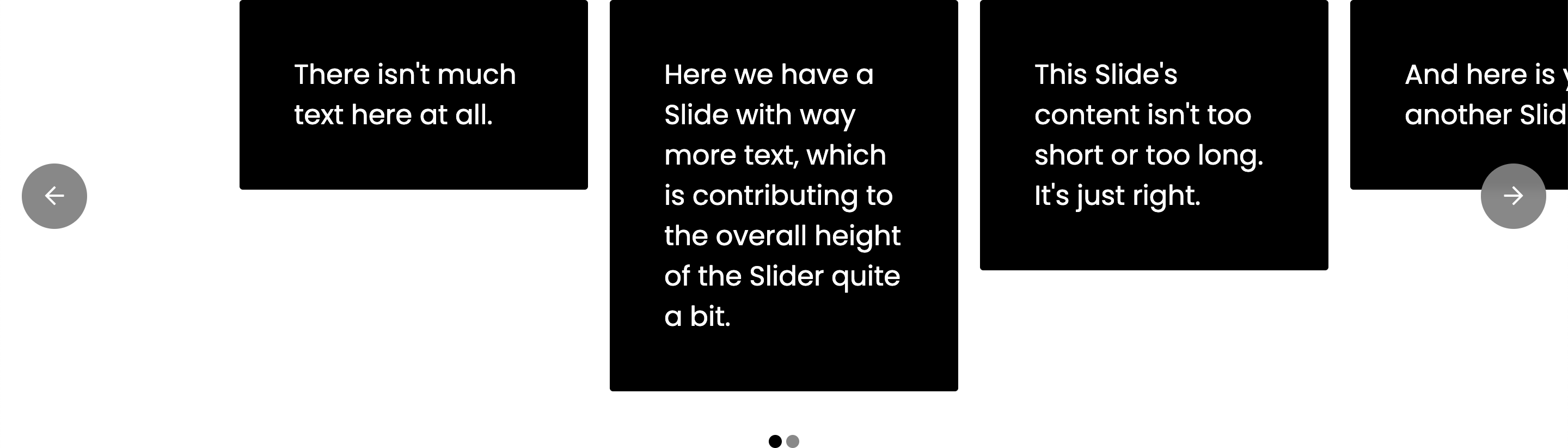
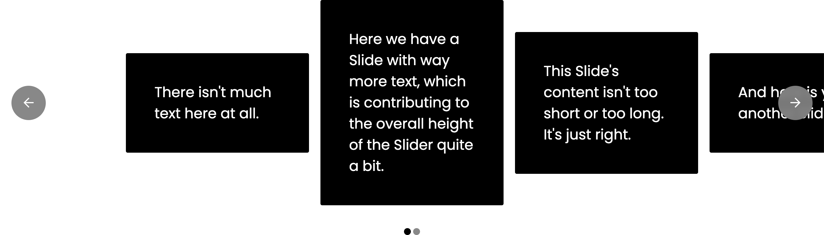
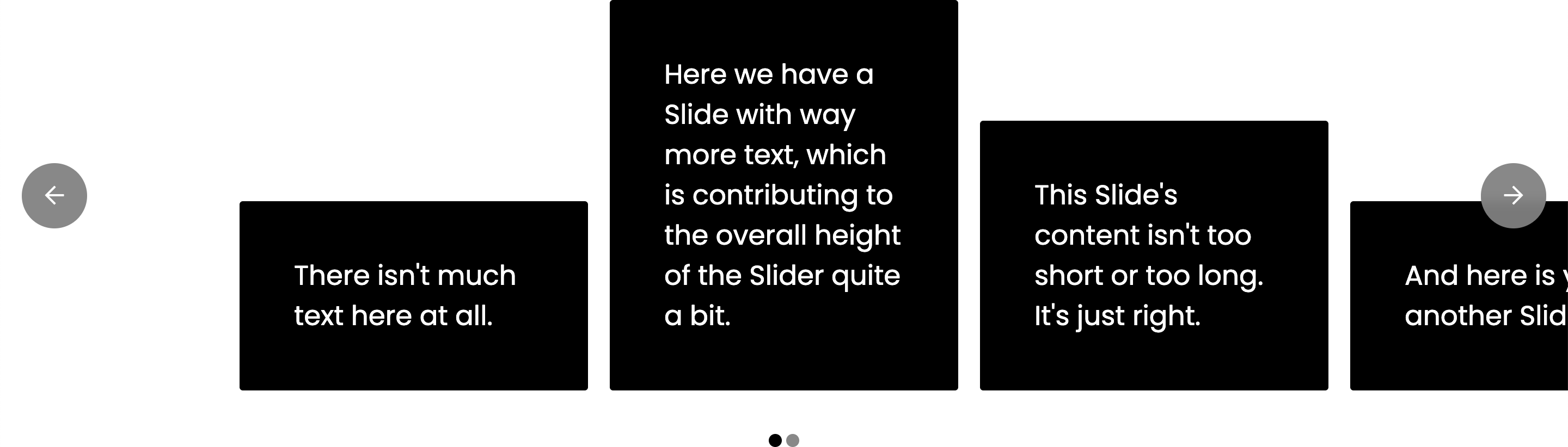
The Align control for both Inline and Stacked Sliders deals with how content is distributed across the vertical axis of your Slide Container, which won't appear to have any effect unless your Slides have differing heights based on their content. For example, let's say that you had a Slider with some simple text content in each Slide, the default Align value of Stretch would ensure that all Slides appear to have equal heights, even if their content does not match:
Setting the control to Start would align all Slides to the top of the Slide Container:
Center would appear as follows:
And End would appear as follows:
While the Inline Slider uses Flexbox to power its layout, the Stacked Slider uses a 1x1 CSS Grid layout with each Slide positioned on that cell space. This was done to avoid needing any sort of heavy-handed JavaScript to ensure equal-height amongst the content of your Slides. This means that by default, every Slider you create will always assume the max height of the tallest Slide in your setup. Keep this in mind as you work with your content.
Options Controls (Inline)
The Options controls of the Inline Slider type are as follows:
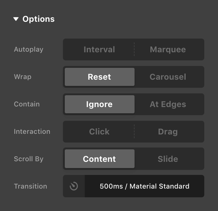
- Autoplay – Disabled by default. If set to Interval, a timing control will be displayed below, which determines how long a Slide / Page should remain as the “currently active” Slide / Page before progressing to the next one automatically. If Marquee is selected, a speed control will be shown below, which is used to determine how fast the linear movement of your content should progress.
- Wrap – Set to Reset by default, which means when you reach the end of your content, clicking the “next” navigation button will reset to the first position in your Slider. Alternately, Carousel will clone your content at either end, creating an endless loop of content.
- Contain – Set to Ignore by default, which instructs newly active Slides / Pages to fill the space of previously active ones. Contain will ensure that current Slides / Pages always align to an “end” of the main content in the Slide Container.
- Height – Hidden unless Align is set to something other than Stretch, due to the fact that if all Slides are stretched, they will be the same height and this feature cannot work. Set to Static by default, which means that the Slide Container will always be the height of the tallest Slide in your list. Setting this control to Adaptive will have your Slide Container's
heightbe set dynamically via JavaScript to match the height of the tallest Slide in your current content. This means that your Slider will only be as tall as the largest current content, ensuring that it doesn't visually appear to take up too much height when it isn't needed. This is desirable in some situations but should be used sparingly due to potential performance considerations on lesser-powered devices. - Interaction – Disabled by default. If set to Click, clicking a Slide in your Slider that is not an anchor will navigate to that slide. If set to Drag, swipe gestures are supported to navigate through your content.
- Scrolling – Hidden unless Interaction is set to Drag. Set to Snap by default, which ensures after a navigational movement or touch gesture, the currently active Slide will settle into their appropriate alignment based on the general layout of the Slide Container. Free allows Slides to be scrolled freely and not snap into place.
- Scroll By – Set to Content by default, means that with each navigational movement of the Slider, content will be translated by the width of the main content area. If set to Slide, the content will only move by one Slide at a time, no matter the layout (for example, you could set your Slide Container to be Paged in the Layout and show 3 slides per page, but only have it more 1 slide at a time rather than the whole width of the content using this setting).
- Transition – Sets the duration and easing curve of how your Slider content should move when navigated.
Options Controls (Stacked)
The Options controls of the Stacked Slider type are as follows:
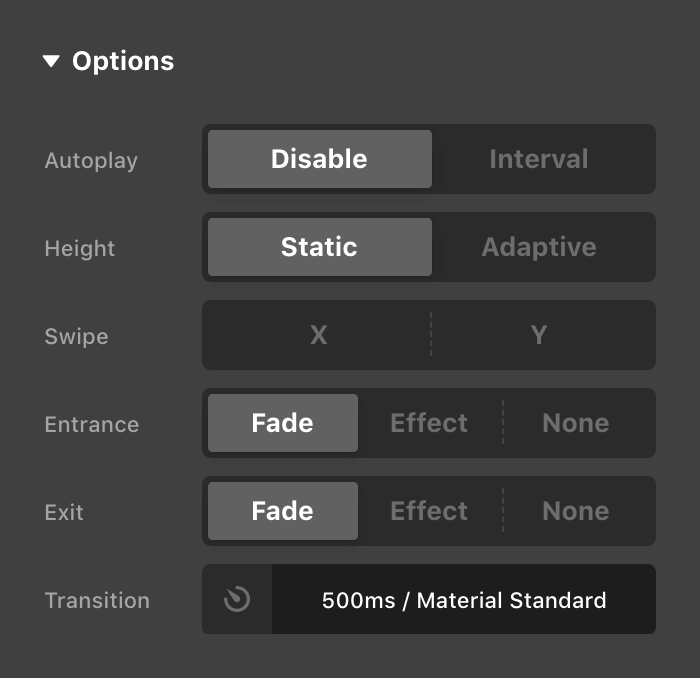
- Autoplay – Disabled by default. If set to Interval, a timing control will be displayed below, which determines how long a Slide should remain as the “currently active” Slide before progressing to the next one automatically.
- Height – Hidden unless Align is set to something other than Stretch, due to the fact that if all Slides are stretched, they will be the same height and this feature cannot work. Set to Static by default, which means that the Slide Container will always be the height of the tallest Slide in your list. Setting this control to Adaptive will have your Slide Container's
heightbe set dynamically via JavaScript to match the height of the tallest Slide in your current content. This means that your Slider will only be as tall as the largest current content, ensuring that it doesn't visually appear to take up too much height when it isn't needed. This is desirable in some situations but should be used sparingly due to potential performance considerations on lesser-powered devices. - Swipe – Disabled by default. You can enable touch interactions on the X or Y axis independently, or both if desired. These options can be helpful if you are trying to create a faux vertical slider using Effects, for instance; in which case you may not want to have interactions on the X axis be used to determine navigational intent.
- Entrance & Exit – Both set to Fade by default, which will produce a simple crossfade effect as you transition from one Slide to the next. If set to Effect, the Slide's Scroll Effects in the Effects Module for their corresponding state will be used. If set to None on Entrance, transitions will happen instantly going from one Slide to the next. If set to None on Exit, the previous Slide will remain stationary while the new current Slide moves in on top. This can be used to create unique layering effects if desired.
- Transition – Sets the duration and easing curve of how your Slider content should move when navigated.
Using Scroll Effects
The Scroll Effects in the Effects Module are tightly integrated into Cornerstone's Slider systems, and can be used to create highly interactive and unique designs.
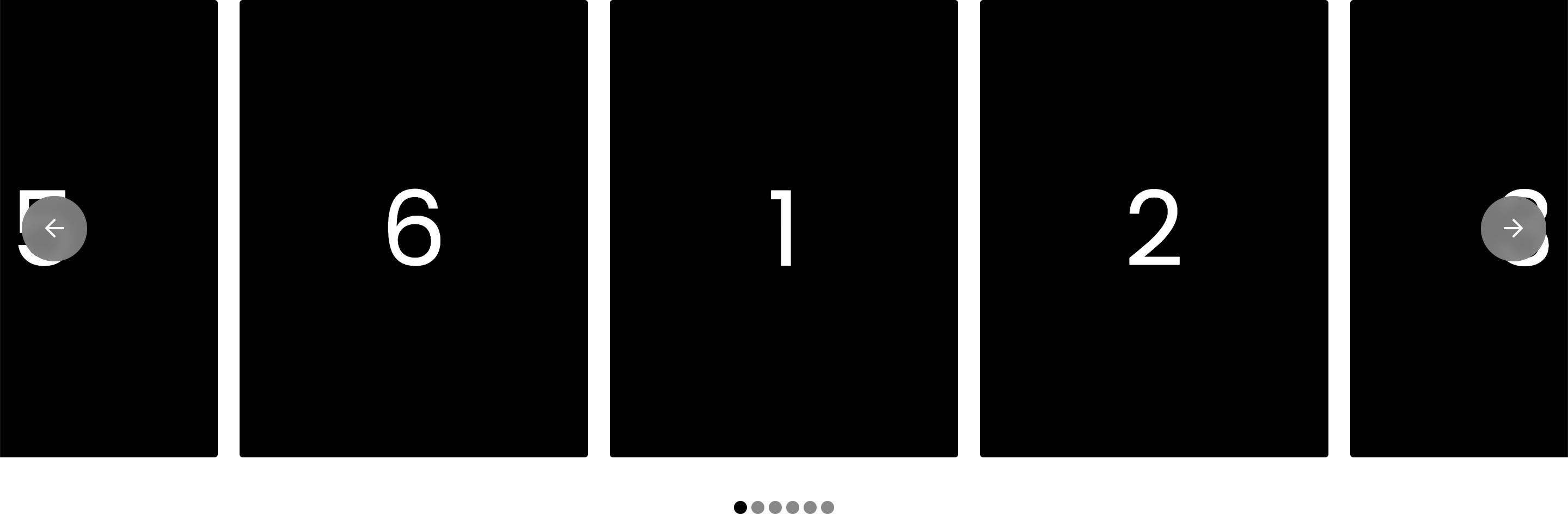
As an example, here is an Inline Slider that is currently Paged with its # Per Page control set to 3, giving 3 evenly spaced Slides within the main content. Next, the Wrap control has been set to Carousel so the content loops (which is why you are seeing “6” right before the “1”), and then Scroll By has been set to Slide, so we're only moving by one Slide at a time as we navigate and not an entire page (this also ensures that only one Slide at a time is considered “active”). Finally, the Justify Layout option is set to Center, meaning that my currently active Slide should always be in the exact center of the main content:
Now that we have our basic setup, let's have a play with the Scroll Effects on each Slide. For this example, I'm going to shoot for a look where my current Slide is full opacity and scaled up to its full size, whereas my other Slides are faded out and scaled down a bit. To do this, you might set your Entrance and Exit Scroll Effects on each Slide like so:
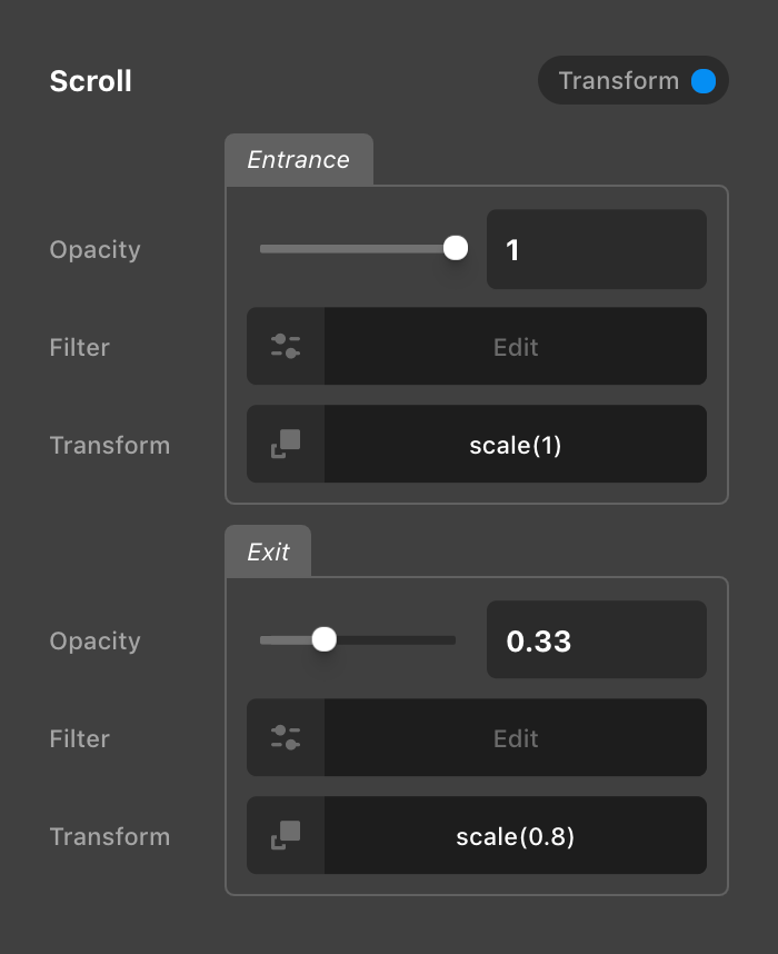
Doing this would result in the following output:
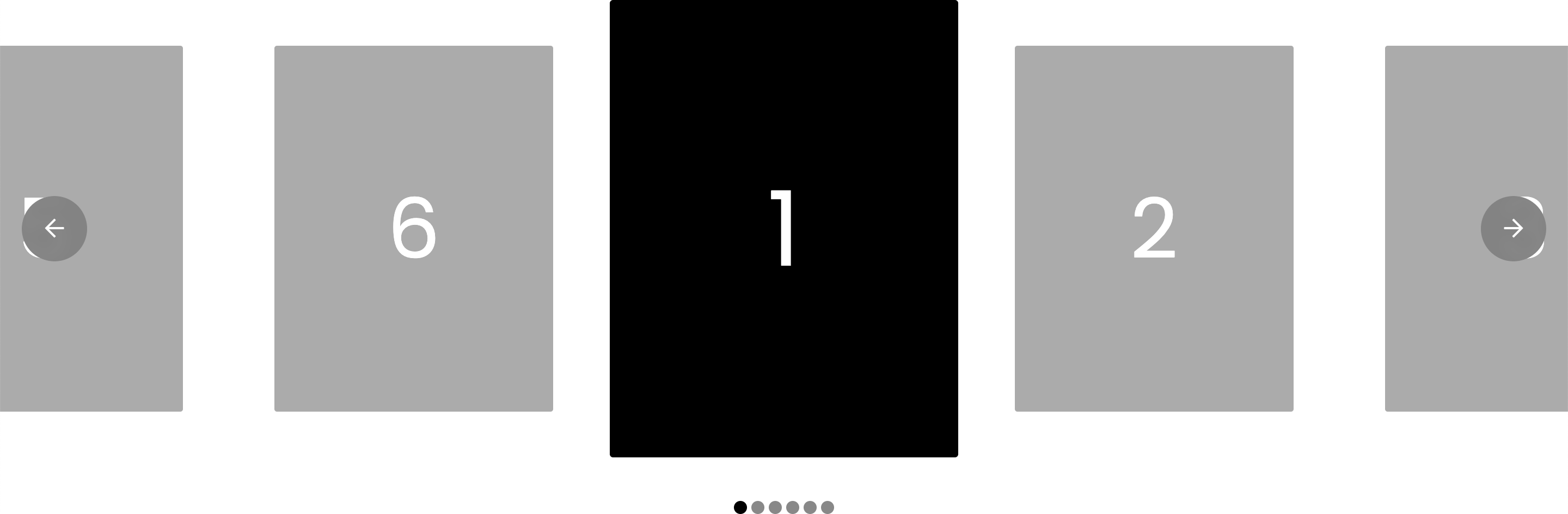
Now, as you navigate through your content, your Slides will transition in and out of this state as they enter / exit the “current” position of the Slider. The timing of these Effect transitions will be determined by the Transition control of the Slide Container, ensuring that everything lines up perfectly.
Scroll Effects for nested Elements are also respected by this mechanic, meaning you could have a Slide full of content that as it transitions into the “current” position triggers its children with Scroll Effects to perform their Entrance Effects (and conversely, their Exit Effects as they move out of that position). Child Element Scroll Effects within a Slider are not synced with the Transition control values of the Slide Container, allowing you to performed stepped animations and time things out in creative ways. Additionally, while Slide child Elements still display their Offset and Behavior controls under Scroll Effects, these are inactive in this context.
Custom Attributes
There are a few custom attributes you will want to be aware of when creating your own Sliders from scratch, as these can be used to help define the functionality of certain pieces of markup.
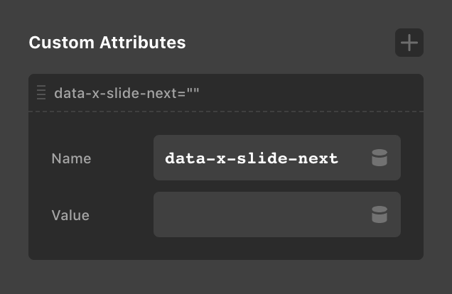
data-x-slide-context– Not required, but can be used to more clearly define the “context” of a Slider and which Elements should relate to one another. By default each Slide Container creates its own context and any navigation / pagination Elements placed near it should “just work” out of the box. However, if you are placing multiple sliders with multiple navigation Elements all within one Section, that is a situation where you might want to go up to the unique parent of each Slider and place this attribute on it to avoid any cross-talk between the Sliders. Additionally, this will move some helpful custom properties we've introduced for advanced styling purposes from the Slide Container to this context, allowing you to use those on other Elements in your designs (more on this later).data-x-slide-prev– Add to any Element to make it a navigation item for your Slider that will take you to the previous page / Slide in your list.data-x-slide-next– Add to any Element to make it a navigation item for your Slider that will take you to the next page / Slide in your list.data-x-slide-goto– Add to any Element to make it a navigation item for your Slider that will take you to the specific numeric index of any page / Slide in your list that you provide. For example, applyingdata-x-slide-goto="3"to any Element would mean that clicking that Element would always take you to the third Slide in your content. This can be used to create entirely custom navigation for your Sliders with any Elements from the library. The one caveat here is that your markup cannot respond to changes made in the # Per Page option in the same way the Slide Pagination Element does.data-x-slider-id–@since Cornerstone 7.5.0this is similar todata-x-slide-contexthowever it is sometimes required to reference a slider that could be in a Modal or another element that is not displayed in the same place as your typical markup.data-x-slide-goto-trigger–@since Cornerstone 7.5.4This will change the event that is used by the slider navigation attributes.mouseenterfor example can be used here in conjunction with thedata-x-slide-gototo then change the active slide when the mouse has entered your navigation element.
Each of these attributes can be added where desired using the Custom Attributes control found under your Customize control group on any Element:
@since Cornerstone 7.5.14
data-x-slide-goto-keep-activewhen this attribute is added when a slide is selected through yourdata-x-slide-gotoattribute, it will keep it's active / interactive state.
This can be enabled by default through the following JS filter in your Global JS or Page JS.
window.csGlobal.csHooks.filter('slide-goto-keep-active', function(keep, el) {
return true;
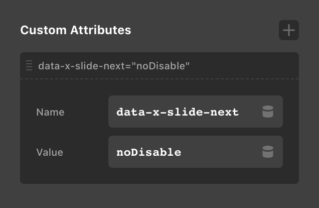
});Note: data-x-slide-prev, data-x-slide-next, and data-x-slide-goto support Scroll Effects just like Slides. The way this works is that if you are using a non-carousel Slider and apply a Scroll Effect to these navigation items, they will transition to their Exit state when you are at their corresponding “end” of the Slider. Conversely, they will transition to their Entrance state when there is content they can navigate to.
For example, if you apply a Scroll Effect that is intended to fade out your data-x-slide-prev item, whenever your Slider is on the first Slide this item would be faded out (because there are no “previous“ Slides to navigate to). As soon as you move forward to your second Slide, the data-x-slide-prev would fade in to its Entrance state since there is now content it can navigate back to. This works the same for your data-x-slide-next item, only regarding content towards the end of your Slider.
There are some situations where you might need to apply a Scroll Effect to your data-x-slide-prev and data-x-slide-next items, but you don't want them to respond to the ends of the Slider content (for example, if your navigation items are inside a Slide and you are using the Scroll Effects to have them fade in when the slide is “current”). If this is the case, you can add noDisable as a value to your custom property, and it will turn off this feature:
Custom Properties
If you're really looking to take things to the next level in your Slider designs, you might want to think about leveraging Cornerstone's custom properties available on both the slide context and individual Slides. These can be used in your CSS to create dynamic Elements and transitions that add a whole new level of sophistication to your designs.
There are three properties available on the Slide Context of your Slider. Remember, this is going to be the Slide Container by default, or wherever you apply the data-x-slide-context up your markup tree as mentioned previously:
--x-slide-current– Returns an integer that reflects the current active state of your Slider.--x-slide-total– Returns an integer that reflects the total number of Slides in your Slider.--x-slide-autoplay-progress– If your Slide Container has its Autoplay control enabled, this custom property returns a constantly incrementing floating point number from0to1indicating the progress of the current slide. For example, if you setup your Slide Container to use Autoplay and wanted you current Slide to remain on screen for8000ms, it would return0at0ms,0.25at2000ms,0.5at4000ms, so on and so forth. Remember, the values for this custom property are constantly incrementing, meaning they can be used to create linear easing transitions on Elements within your Slides that are tied to its progress.
Additionally, every Slide in your Slider will receive the following two custom properties:
--x-slide-balance– Returns-1,0, or1depending on where the Slide is positioned relative to the “current” Slide.-1for before,0for current, and1for after.--x-slide-distance– Returns a positive integer based on how far away a Slide is from the “current” Slide. Returns0for the active Slide, then1for the next Slide out,2for the next slide out, et cetera.
So how might you use these custom properties? Well, let's build off of our previous example and see if we can create a cool overflow effect. To do this, you could do the following for the Exit state:
perspective(1000px) rotateY(calc(20deg * (var(--x-slide-balance) * -1) * clamp(1, var(--x-slide-distance), 2)))And the following for the Entrance state:
perspective(1000px) rotateY(0deg)All of this would be entered into each Slide's Scroll Effects values as mentioned earlier:
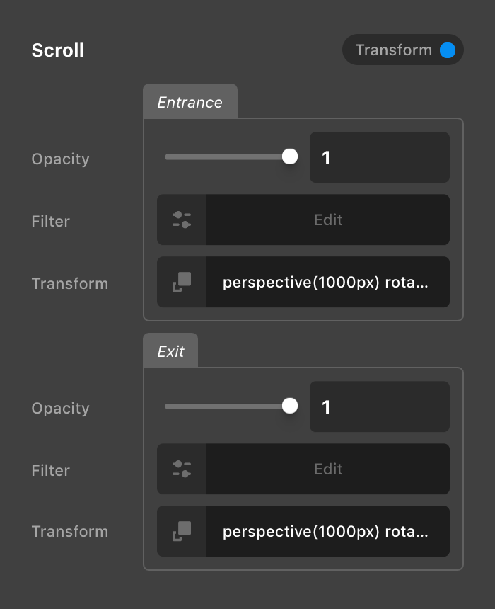
And would result in the following, where each Slide that moves further away from the “current” Slide is increasingly rotated out in the direction that it is moving:
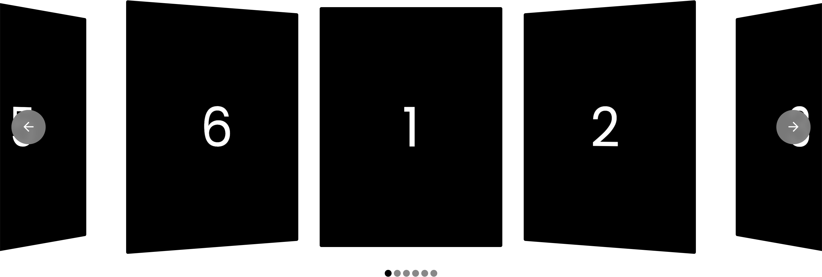
So how is this all working?
- Pick a base rotation to use for each step (
20degin this case). - Take the
--x-slide-balancevalue and multiply it by-1to flip the orientation so that the rotation moves in towards the center and not out. clamp(1, var(--x-slide-distance), 2))defines an upper and lower bound around our value. Basically, this is saying that this value should never go below1or above2, which keeps our rotation from appearing too drastic at its extremities as it moves away from the current slide. Check out MDN to learn more aboutclamp().
Multiplying those three values together in a calc() statement that we place inside our rotateY() transform gives us a dynamic variation for each step based on the updating values of those custom properties.
Important note: the Entrance and Exit values mentioned above would need to be the same on every Slide for this to work. Because of this, we typically recommend that you only preform complex transforms when using a looped list of Slides, where you will only have to define your transforms once, which will then automatically get applied to every Slide.
Dynamic Content
In addition to everything mentioned previously, the following Dynamic Content strings will update in realtime in relation to your Slider if you desire to use them:
{{dc:rvt:outlet state="slider" key="current"}}– Returns a string wrapped in a<span>that reflects the current index of your Slider.{{dc:rvt:outlet state="slider" key="total"}}– Returns a string wrapped in a<span>that reflects the total number of indexes in your Slider.
These can be used inside of any text-based Element such as Text, Headline, or Button to create dynamic markup on your page.
Video Tutorial
Want to see the Slider in action? Follow along as we take you through the entire Element front to back. Take note of the different chapters on the video for particular areas of interest, and be sure to subscribe to our YouTube Channel for the latest Cornerstone tutorials!
See something inaccurate? Let us know