Search Inline
In this article, we're going to discuss the Search Inline Element and its settings.
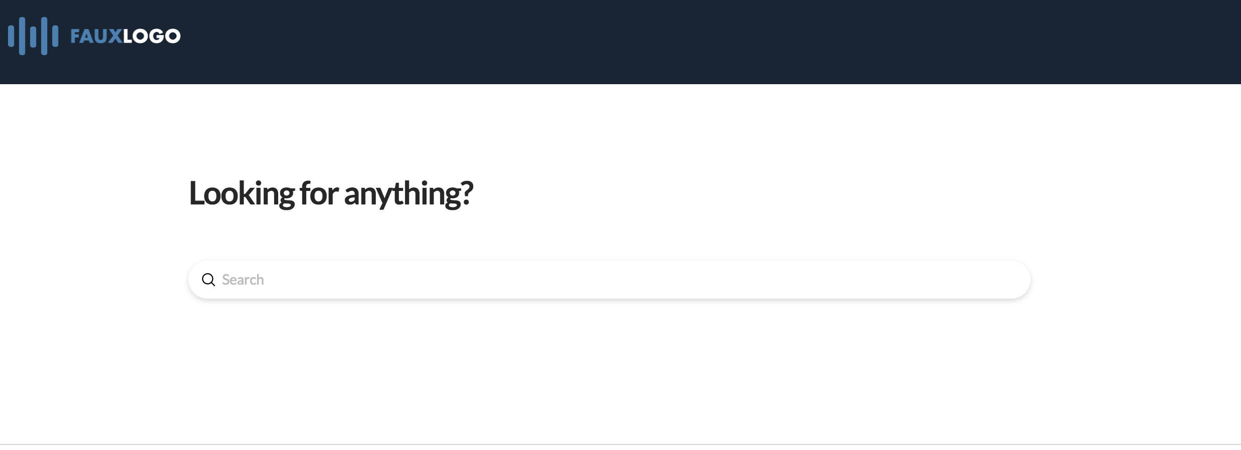
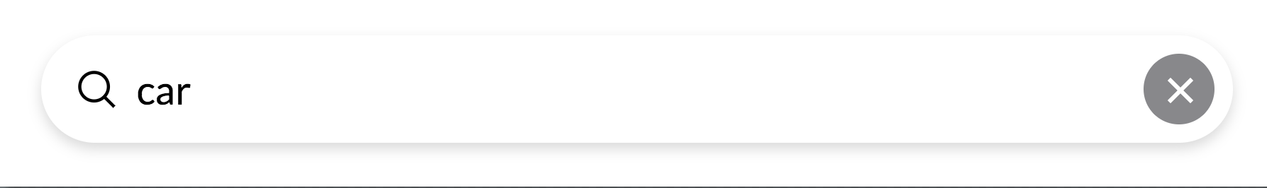
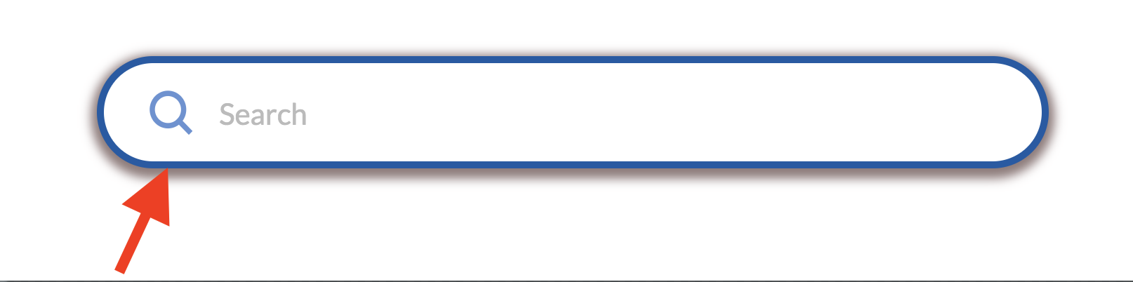
See the image below to see how the Search Inline looks:
To add this Element, simply search "Search" and select Search Inline.
Search Setup
The basic setup of settings of the Search Inline field includes the Setup and Content field groups.
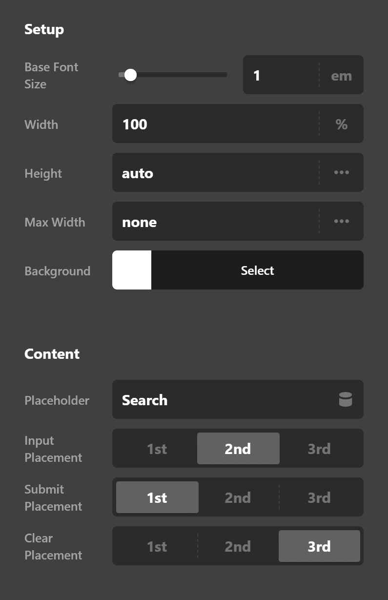
Setup
Setup includes the following fields:
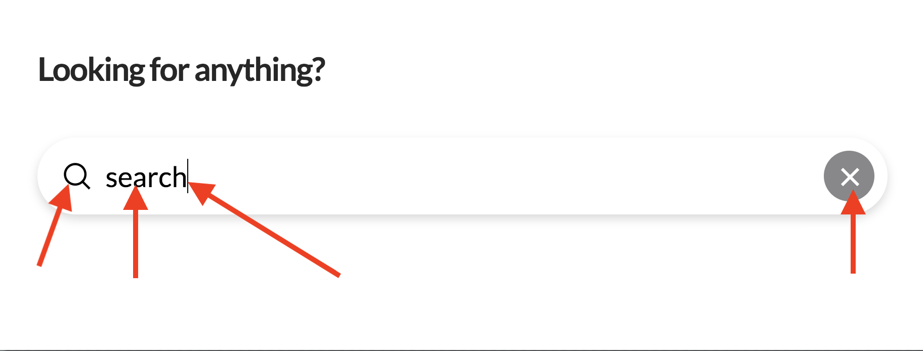
- Base Font Size - This is the basis of the font size. Changing this will change the size of the * Submit (the magnifying glass icon), the Input text, and the Clear icon. As an example, I changed the value for this field to 2EM and you'll see everything changed.
- Width - Obviously dictates how wide the search form will be. You can set it by pixel, percentage, REM and EM.
- Height - This is where you set how tall the form will be.
- Max Width - The maximum width of the form. This is useful for responsiveness.
- Background - There are two color pickers here. First, on the left, is the default color called * Base. This is the default background color. The second, the Interaction color is the background color of the form when the cursor is in it.
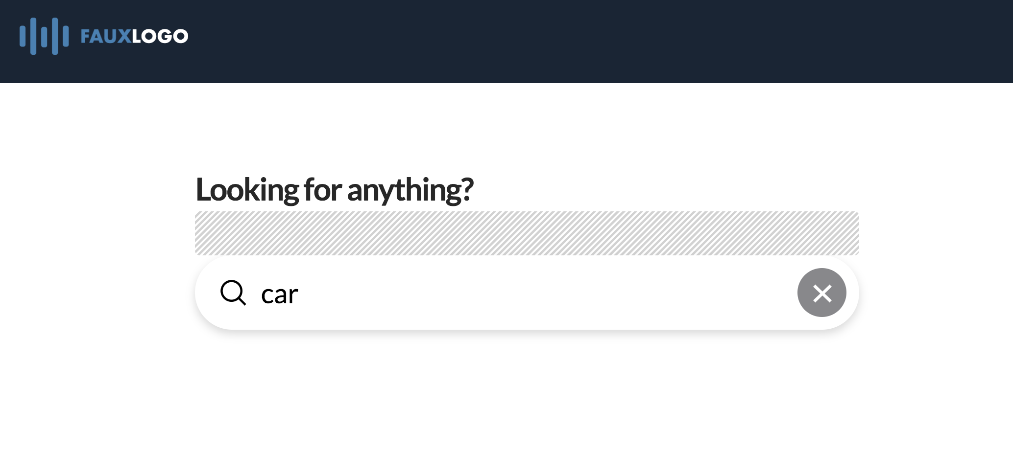
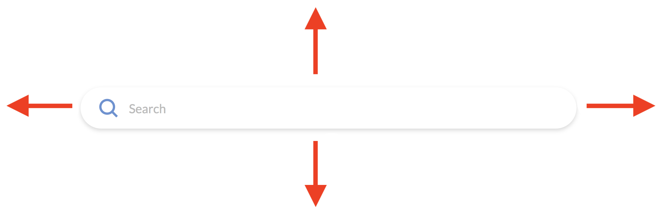
NOTE: When I use the term "form" I'm referring to this:
Content
- Placeholder
- Input Placement
- Submit Placement
- Clear Placement
Search Design Settings
Margin
Border

Border Radius
Box Shadow
Search Input Settings
Input Margin, Input Text Format and Input Style all allow you to configure the input textbox.
Want to make the text all caps? You can change it using the Text Decoration setting under Input Text Style. Want to change the Font Family and Font size? That's easy, just go to Input Text Format and make the changes there. Possibilities are virtually endless.
Search Submit Settings
Want to change the size, color and margins of the Submit button? Something like this one below?
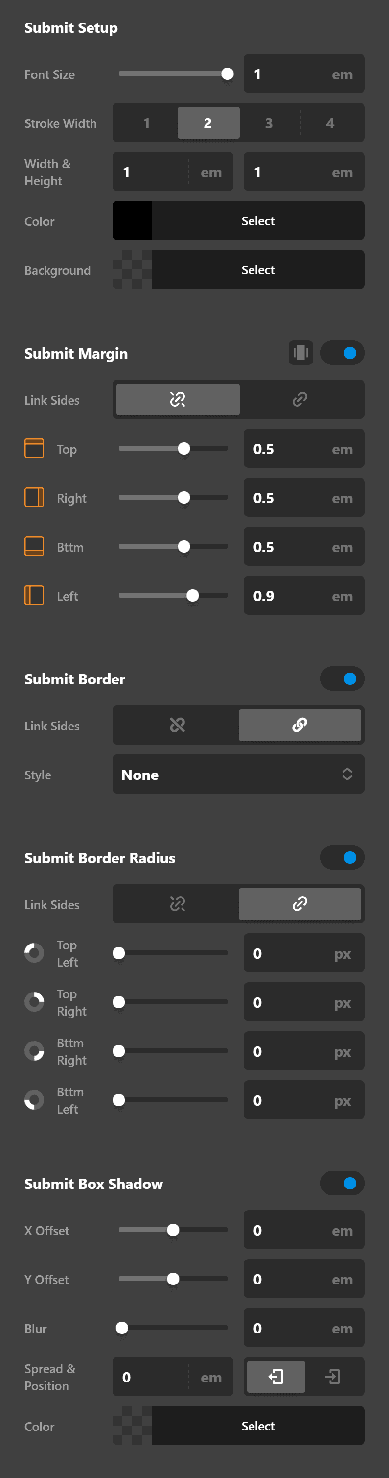
Then the settings such as Submit Setup, Submit Margin, Submit Border, Submit Border Radius and Submit Box Shadow are available to you.
Search Clear Icon Settings
Just as you can configure the design of both the search form, submit button and search input textbox, you can also configure the Clear Icon.
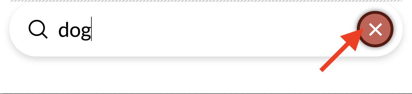
Here's an example of a configured Clear Icon:
The settings available are the following: Setup (where you set the size, color, background color etc), Margin, Border, Border Radius and Box Shadow.
Customize
The Customize pane consists of various features that allow you to take further control over your Element's styling and functionality:
- ID – Sets an HTML ID on the Element.
- Class – Sets an HTML Class on the Element.
- Element CSS – Use this feature for increased stylistic control of your Element, especially over nested markup. Click here for more detailed information on this feature, such as using
$elto dynamically target the base tag, et cetera. - Hide During Breakpoints – Hides the Element at different screen sizes when design alterations are needed. Click here for more information.
- Conditions – Adds / removes Elements from the page when certain criteria are met (e.g. “If a featured image is set...”). Click here for more information.
- Custom Attributes – Use this option to add custom HTML attributes to the root tag of the Element (e.g.
data-info="123"). This can be particularly helpful when integrating with various scripts and libraries.
Demo
To see a live demo of the Search Inline Element click here.
Summary
Now you know how to use the Search Inline Element and how to configure its options to achieve your intended look.
See something inaccurate? Let us know