Terms
In this article, we're going to discuss the various Terms Elements and their settings. The Terms Elements can be used as a quick starting point to output styled terms for post meta information, sidebars, and more.
There are common situations in the website building process where you might find it necessary to output a list of terms associated with a taxonomy. In the world of WordPress, a taxonomy is a grouping of individual terms, which can be applied to an asset to help organize its content. For example, below are some common examples of various taxonomies found in WordPress:
| Categories | Hierarchical taxonomy for Posts |
| Tags | Single-level taxonomy for Posts |
| Product Categories | Hierarchical taxonomy for Products |
| Product Tags | Single-level taxonomy for Products |
| Taxonomy | Context |
|---|
Any term applied to a taxonomy grouping like the list above can be referenced later to help label posts or custom post types with meta information so that users can find relevant information quicker. Additionally, each individual term will produce its own unique archive, which can be linked to as a permanent resource to find all content organized to that particular item.
Commonalities
The Builders come with three Terms Element variations that serve as great starting points for many different types of situations in your builds. Those variations include:
- Cloud
- Column
- Minimal
Each Terms Element is a “prefab,” meaning it is built up using a selection of our core Standard Elements in the Element Library. The markup and styling of each variation will differ slightly based on the desired outcome of the Element. That being said, there are a few commonalities shared between all the Terms Elements that are nice to be aware of:
- Each Terms Element is built using a Row Element as its base. The flexibility of using a Row allows us to achieve a lot of different results, or easily alter the style of a particular variation if desired.
- The Row in each Terms Element is setup to use a
<ul>tag, while its Columns use an<li>tag, setting these variations up as HTML lists. If not have your terms placed into an HTML list, make sure that you update these tags accordingly. - For each Terms Element, the “List Item” within the topmost Element has both a Looper Provider and Looper Consumer enabled on the same level. This is done merely to demonstrate a pattern of using both sides of the Looper at the same Element level, as well as making it easier to update the Looper setup from one place if needed.
- For each Terms Element, the Looper Provider is set to All Terms by default with the Taxonomy set to Categories, which will retrieve all categories found universally throughout your site site (because this is the only guaranteed taxonomy we can leverage as WordPress requires at least the Uncategorized category). However, this provider type can easily be changed to Current Post Terms if your desire is to only access the terms assigned to a particular post or custom post type.
Cloud
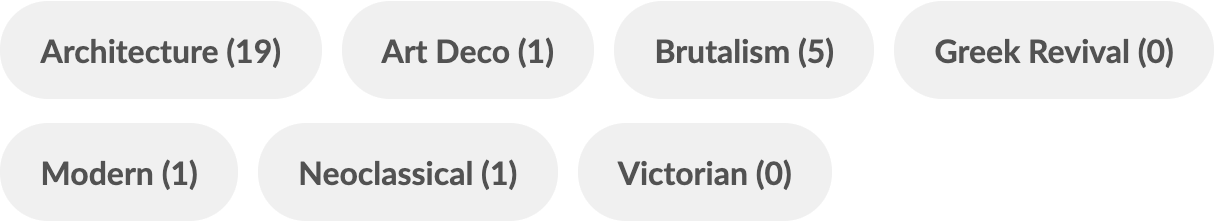
The Cloud variation of our Terms Elements features pill-shaped Buttons that are laid out in a horizontal configuration, which will wrap to a new line when needed:
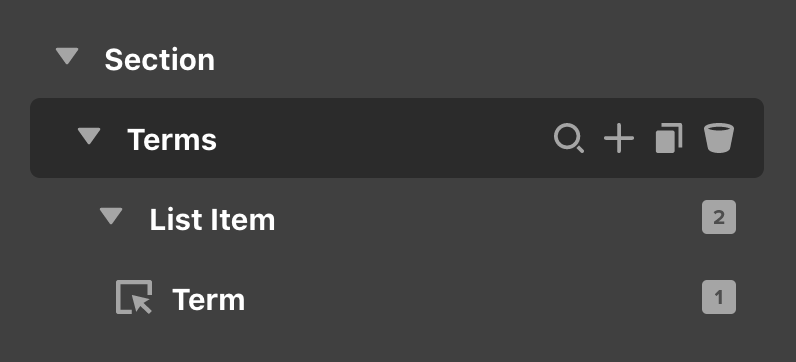
The Element structure of this variation is very straightforward with only a Button inside our “List Item,” which is where the pill styling comes into play:
The layout assigned to the Row of this Element (i.e. the “Terms” Element) is using one of the auto-responsive layout tricks outlined on our YouTube channel, where essentially each breakpoint receives a custom value of auto instead of a percentage based layout. This will allow the terms in our list to layout in a horizontal line, but wrap to a new line anytime they run out of space. The spacing between each term can be adjusted using the Row's Gap controls.
As for the Button itself, its content is output using two Dynamic Content strings within the same Primary Text control like so:
{{dc:term:title}} ({{dc:term:count}})This is what gives us the title of each term as we loop through our data, followed by the total count of how many times that term has been applied to a piece of content (the parenthesis are just for styling and can be removed or altered if desired, or the entire count can be removed to make things more streamlined).
Additionally, the URL of each term is set using {{dc:term:url}}, which gets us the dynamically generated link that term's archive page, which will list out all pieces of content that have that term applied. These same Dynamic Content strings are used in various combinations for the other variants discussed throughout this article.
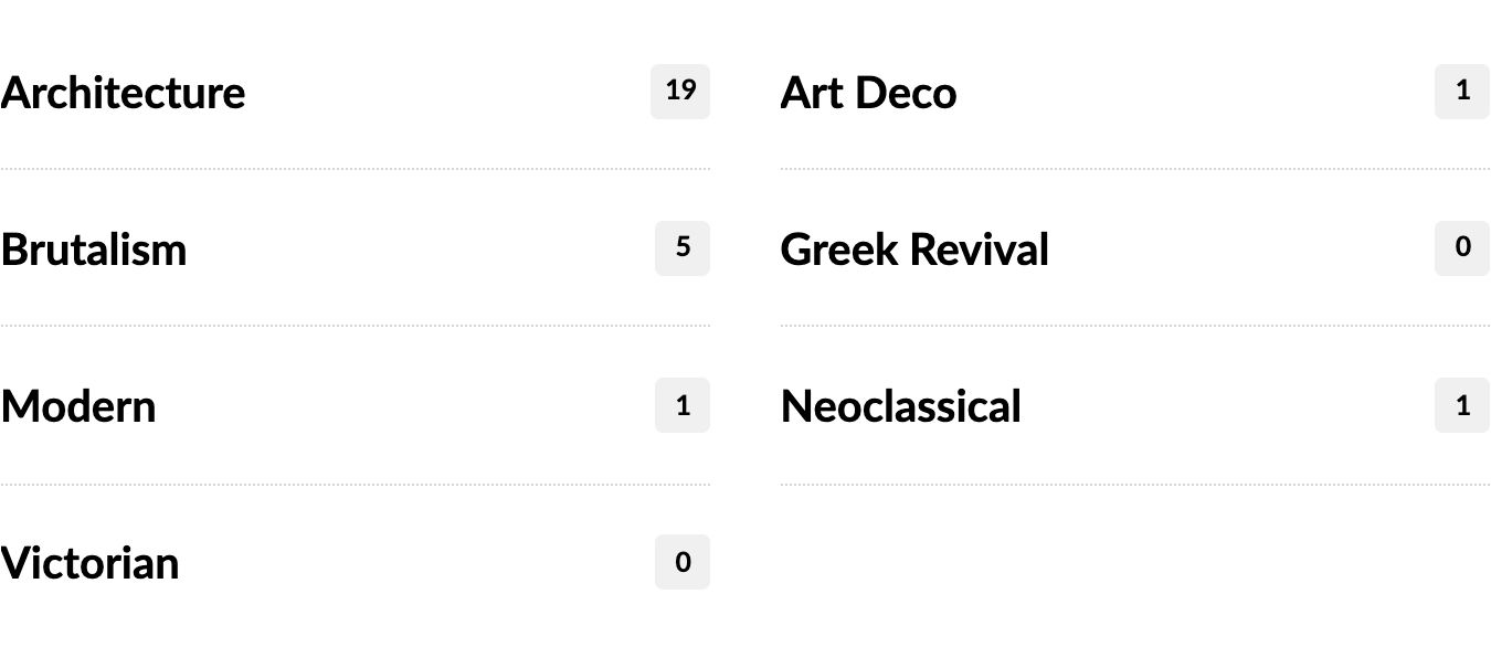
Column
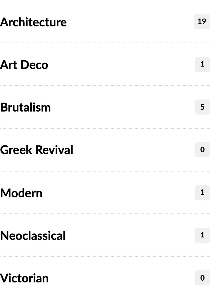
The Column variation of our Terms Elements is laid out in a single-column configuration by default, and is designed with smaller width sections in mind (i.e. sidebars, footer columns, et cetera):
Its markup is slightly more involved due to the desired outcome of the design, but it is still very manageable and straightforward:
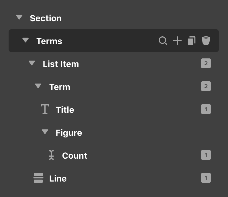
Inside the “List Item” we have our “Term,” which in this variation is powered by a Div Element so that we can leverage its internal Flexbox layout without needing to use another Row / Column setup and add unnecessary markup. Within that is our “Title” output using a Headline and a “Figure” setup with a Div that contains the “Count,” which is output using a Text Element.
By default, the Headline outputting the term's title is set with its Overflow control enabled in case a term is particularly lengthy:
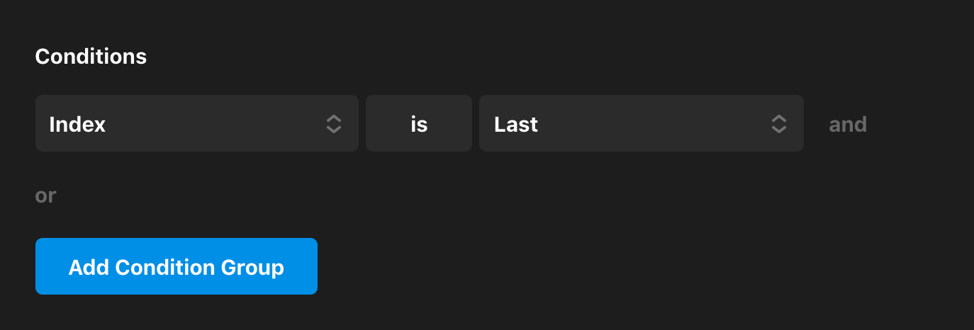
This can easily be disabled though within the Headline's controls if desired. Another thing to be aware of is the Line Element inside each “List Item”, which is output after the “Term” and serves as a divider between each successive item. This Line Element has an Element Condition applied so under its Customize control tab that states it should only be output if the Looper is not on the last item of the list:

If you would like for the Line to always show after each Term, simply remove this Element Condition to do so.
Keep in mind that the Column variant is designed with small spaces in mind and by default will stretch to fill all available space within its parent container. However, this can either be brought in using the Max Width control on the Element, or another approach to take is to adjust its responsive Layout control on the Row to break it up into multiple columns on larger viewports. Doing so can yield some very helpful patterns such as:
One final thing to explore would be instead of setting specific percentage widths for each breakpoint, you may wish to look into an alternate auto-responsive layout technique explored on our YouTube channel that can be particularly helpful for situations like this.
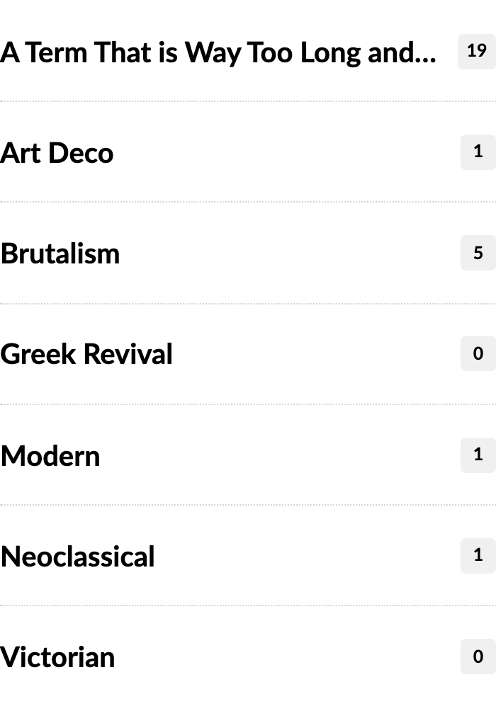
Minimal
The Minimal variation of our Terms Elements features a text-based style that wraps to a new line when necessary. Each Term is separated by a divider to help create some space between individual Terms:

Its markup is relatively straightforward, with a slight nuance related to the dividers used in this design due to how it is styled:
This variant utilizes the same auto-responsive layout technique as mentioned earlier for the “Cloud” style by implementing auto as a custom value at every breakpoint in the responsive layout control, which helps the terms to wrap more like traditional text.
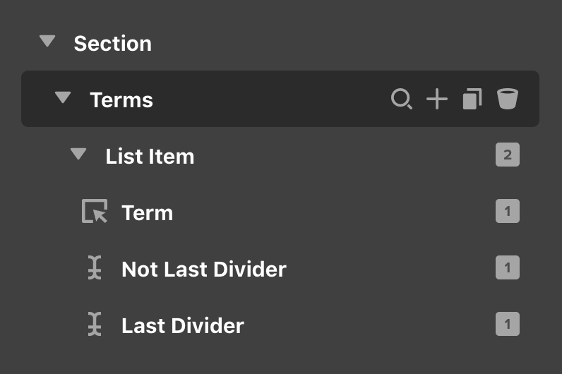
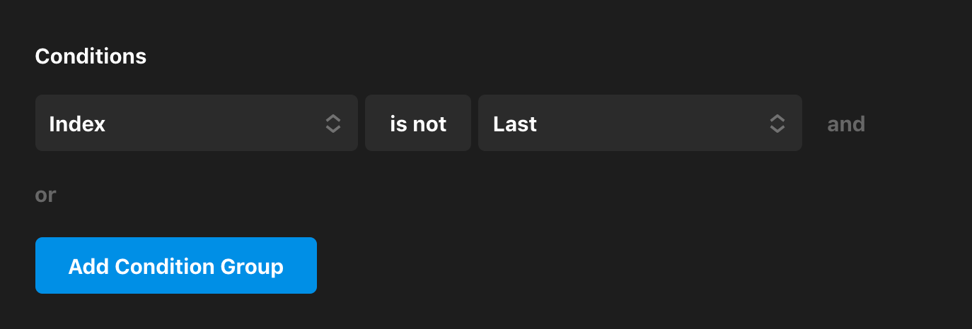
The one primary nuance to be aware of with this variant is the presence of the “Not Last Divider” / “Last Divider” Elements in the outline. Both of these Elements are text Elements styled the exact same way with the same content of /, serving as a line of demarcation between each term. The difference between these two Elements is their Conditions that are applied and an Effect style applied to each. The “Not Last Divider” Element has the following Condition:
Conversely, the “Last Divider” Element has the following Condition applied along with a static Effect where its Opacity is set to 0:
Essentially, we have the same divider styled exactly the same way twice, but we're outputting a visible one to every “List Item” except the last one and an invisible one only in the last “List Item.” The reason for this is due to the fact that the actual Button Element inside the Term is smaller than the divider, and if we just got rid of that last divider completely with an Element Condition, the lack of the larger divider could cause a collapsing of vertical spacing in some instances. So we are still outputting the divider to help maintain our proper vertical spacing and just visually hiding it to keep things cleaner.
The main thing to keep in mind here is to be sure that any adjustment you make to one divider, you make to the other. Remember: you can easily preview Elements that would normally otherwise be hidden by utilizing the Preview Manager.
Demo
To see live demos of the Terms Element variations, see below:
See something inaccurate? Let us know