Hide or Show Content by Device Size
In this article, we're going to explain how to achieve a responsive website using the hide/show element feature of the X and Pro themes.
Responsive design is a necessity in the world of web design these days and presenting the best version of your site across numerous devices can be a big challenge. While many parts of X and Pro are responsive out of the box, you may come across situations where you cannot achieve a particular design change by simply adjusting a Row or Grid's general layout on a different device.
The Hide During Breakpoints Control
The builders have an option to hide and show Elements based on the user's screen size. These controls afford you the opportunity to hide Elements that don't fit well or that you might need to replace entirely on certain screen sizes. This control can be found as follows:
- Inspect any Element by clicking on it, or clicking the magnifying glass icon on that Element in the Outline Pane.
- In the Control Navigation, click Customize.
- Scroll down to find the Hide During Breakpoints control.
- Select the screen sizes at which you wish to hide your Element.
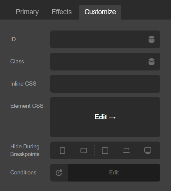
The above screenshot shows the Hide During Breakpoints control. The default sizes represented in this control are as follows. These can be changed in Theme Options since Pro 6.3.0 and Cornerstone 7.3.0.
- XL: (1200px and up)
- LG: (979px to 1199px)
- MD: (767px and 978px)
- SM: (480px and 766px)
- XS: (below 480px)
Note: While this functionality is available on the majority of Elements, there are exceptions. For example, Raw Content does not have a wrapping div, so there is no way to attach a breakpoint control. See the section below for instructions on using helper classes to utilize this functionality in places not powered by our Elements or where it is otherwise unavailable.
Previewing at Different Sizes
In the toolbar, click the mobile device icon to toggle the preview switcher. You will see the following switcher appear over the live preview:

Clicking any of these device icons will adjust the live preview canvas to the minimum width of that breakpoint. For instance, if you selected the MD breakpoint, the live preview canvas' width would be set to 767px.
Note: It is possible to have the XL breakpoint selected, but in actuality be seeing the LG (or smaller) breakpoint because your screen width is under 1200px. To avoid this, try increasing the size of your browser using your zoom setting or switching to a bigger display.
Example: Using different navigation Elements in a Pro Header
One case where this feature is useful would be using an inline navigation on desktop and a toggleable menu on mobile. You can do this by following these instructions:
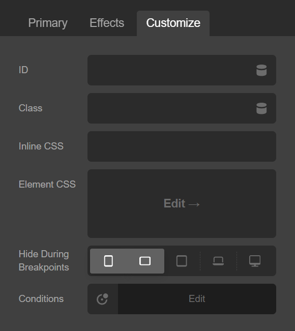
In your Header, add a new Bar and add two Containers to the Bar. Double click the Container title to rename the Elements for convenience. We will call them "Mobile Container" and "Desktop Container." Add a the following Elements in their respective containers:
- Navigation Inline → Desktop Container
- Navigation Collapsed → Mobile Container
Inspect the "Mobile Container" and navigate to the Customize controls. Click the first three breakpoint icons for the Hide During Breakpoints control:
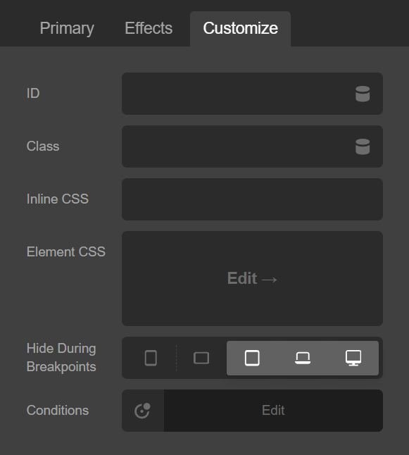
You will notice that the Inline Navigation since its respective Container is being hidden. Next, inspect the "Desktop Container" and navigate to the Customize controls. Click the last two breakpoint icons to hide the Container at those sizes:
At this point you will only see one of the Containers at any given screen size and output an appropriate navigation pattern for each device.
Breakpoint Helper Classes
X and Pro also include include helper classes you can use in any HTML markup. The five classes are respective of the five different breakpoint sizes:
x-hide-xlx-hide-lgx-hide-mdx-hide-smx-hide-xs
Here is an example of using this to hide a custom div on the XL and LG breakpoints:
<div class="x-hide-xl x-hide-lg">
  <!-- Custom HTML -->
</div>
See something inaccurate? Let us know