Table
In this article, we're going to discuss the Table Element and its child Table Section, Table Row, and Table Cell Elements, which together let you build fully styled, semantic HTML tables in Cornerstone.
Overview
The Table Element is a Layout Element in Cornerstone that outputs a genuine, semantic HTML <table> — not a grid of Divs pretending to be one. Because of this, everything you build reads correctly to browsers, screen readers, and search engines while still giving you the full range of Cornerstone's design controls. Data Tables takes this even further and provides you with native searching, sorting, filtering, pagination, AJAX, fixed headers, mobile card layouts, and more. See the docs.
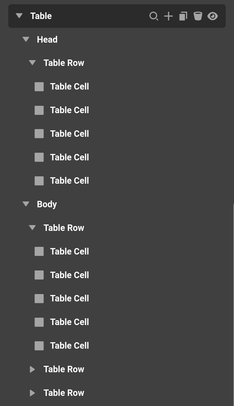
Simply put, a Table is made up of four nested Elements, each mapping directly to a standard HTML table tag.
- Table – The parent
<table>container. This is where you set table-wide behavior (layout algorithm, border collapsing, sticky headers) and the default styling that every row and cell inherits. - Table Section – A
<thead>,<tbody>, or<tfoot>grouping. Sections tell browsers and assistive technology which rows are headers, body content, or footers. - Table Row – A single
<tr>row within a section. - Table Cell – An individual
<td>(data) or<th>(header) cell. Cells hold your content and, like most Elements, can contain other Elements.
The nesting is strict, which keeps your markup valid: a Table may only contain Table Sections, a Section may only contain Rows, and a Row may only contain Cells. A Cell, however, can contain any Element you like — text, images, buttons, icons, and so on.
Adding a Table
When you first drag a Table Element onto the canvas, it doesn't drop in with a pile of empty rows. Instead you'll see the Table Starter, which lets you choose how many rows and columns you want by dragging across a grid — much like inserting a table in Google Docs or a word processor. Once you pick your dimensions, Cornerstone scaffolds the full structure (Section, Rows, and Cells) for you.
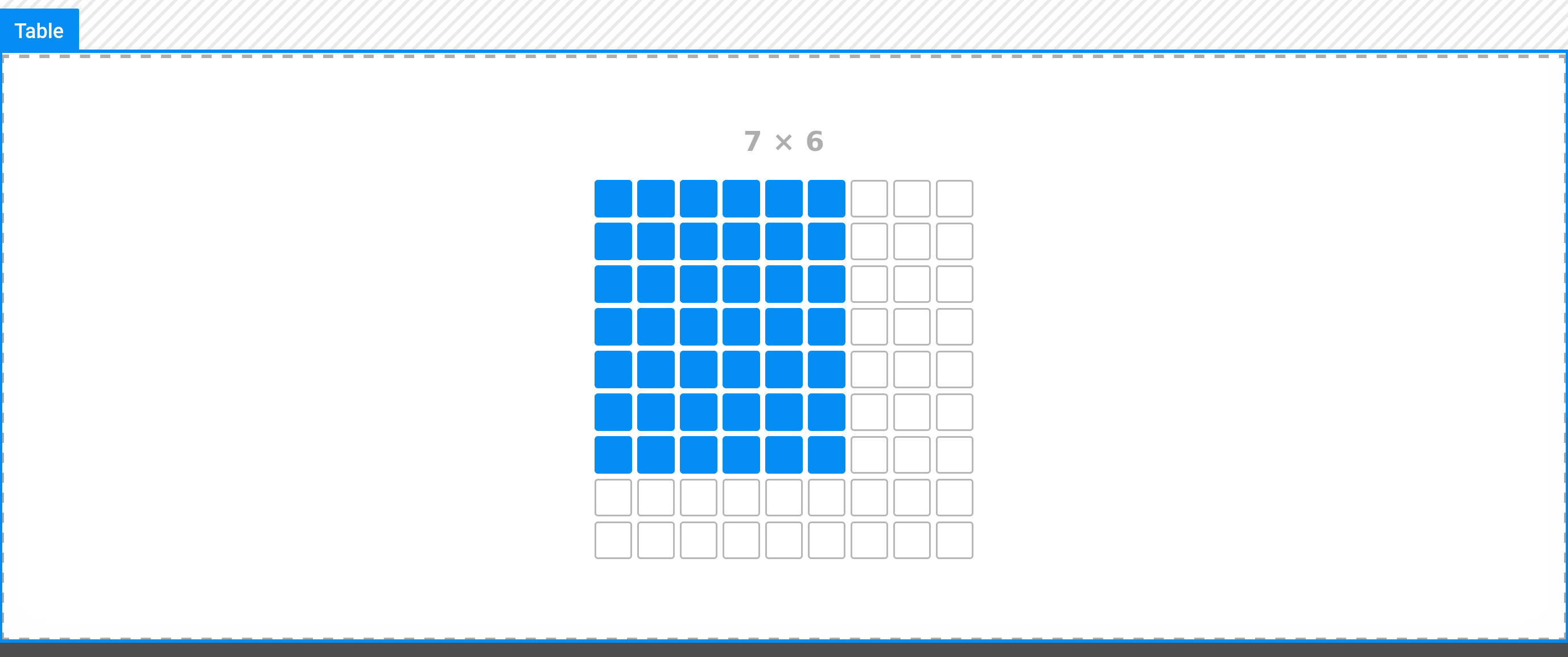
Table Element
Selecting the parent Table Element gives you the widest set of controls. Anything you set here acts as the default for the whole table, and individual sections, rows, and cells can override it as needed.
Setup
The Setup group covers the basic presentation of the table as a whole:
- Base Font Size – Sets the root
font-sizefor the table, which cell text can inherit from. - Z-Index – Controls stacking order relative to surrounding Elements.
- Background – A base and interaction background color for the entire table.
Size
The Size group controls the dimensions of the table. Width defaults to 100%, but you'll find the full complement of controls here: Width, Min Width, Max Width, Height, Min Height, Max Height, Aspect Ratio, and a Flex control for when the Table lives inside a flexbox parent.
For more on the Aspect Ratio control, see our dedicated doc here.
Table
The Table control group is where the behavior unique to tables lives:
- Table Layout – Choose between
AutoandFixed. Auto sizes columns to fit their content, which is flexible but slower to render on very large tables. Fixed locks column widths based on the first row and skips re-measuring, making it faster and more predictable. - Border Collapse – Collapse merges adjacent cell borders into a single shared line for a clean, traditional look. Separate keeps each cell's border independent and allows space between cells.
- Border Spacing – The gap between cells. Only available when Border Collapse is set to Separate.
- Empty Cells – Whether empty cells still show their borders and background. Only available when Border Collapse is set to Separate.
- Freeze First Column – Pins the first column in place while the rest of the table scrolls horizontally. Ideal for wide tables where the first column is a row label.
- Sticky Header – Pins the header row to the top while the body scrolls vertically. Ideal for tall tables where the column labels should stay visible.
Card Layout
Enabling Card Layout transforms the table on smaller screens (and in general) into a stack of "cards" — each cell becomes its own spaced-out flex row rather than sitting in a rigid grid. This is a compact, mobile-friendly presentation where each cell's content is pushed to opposite ends of its row.
When Card Layout is on, each body cell can display its column header as a small label before the content, so a reader still knows what each value represents even without the header row visible. Cornerstone maps the header text onto each cell automatically in both the live preview and on the front end.
Card Label Format
When Card Layout is enabled, the Card Label Format group gives you full typography control over that column-name label — font family, weight, size, line height, letter spacing, style, alignment, decoration, transform, and color. By default it renders as a small, uppercase, semi-transparent label.
Table Row (defaults)
The Table Row group on the parent Table sets the default coloring for rows across the whole table, broken out by section:
- Head Background / Head Text Color – Applied to rows inside a
<thead>section. - Body Background – The background for
<tbody>rows. The Base swatch colors every row; the Even swatch sets an alternating "striped" color. - Stripe Direction – Whether the alternating Even color stripes horizontally across Rows or vertically down Columns.
- Body Text Color – Text color for body cells.
- Foot Background / Foot Text Color – Applied to rows inside a
<tfoot>section.
Table Cell (defaults)
The Table Cell group sets the default styling every cell inherits, so you can format the whole table at once instead of editing cells one by one. It includes a full Text Format control, plus Border, Border Radius, and Padding. Individual Table Cell Elements can override any of these.
Design
Like most Elements, the Table also exposes a secondary Design tab with Margin, Border, and Box Shadow controls for the table container itself, along with the standard Effects, Custom Attributes, and Looper (provider and consumer) options.
Table Section Element
Each Table Section renders as a <thead>, <tbody>, or <tfoot> and is the direct child of the Table. Sections are what give your table its semantic structure — they tell browsers and screen readers which rows are headers, which hold the main data, and which are footers.
Its controls are intentionally minimal:
- HTML Tag – Choose
thead,tbody, ortfootto define the section's role. This is a structural setting and is preserved even when you paste or reset styles. - Background – A base and alternate background color for the entire section. Individual rows and cells can override this.
A single Table can contain multiple sections — commonly one thead, one tbody, and optionally a tfoot.
Table Row Element
Each Table Row renders as a <tr> and lives inside a Table Section. Rows are where you can apply per-row styling that overrides the table-wide defaults.
- Background – A base and interaction background for this specific row. It defaults to transparent so the Table's row-background settings show through; set a real color here to override just this row.
- Design – Border, Border Radius, and Box Shadow controls scoped to the row.
Rows also support the standard Effects, Custom Attributes, and Looper options — making a single Row an excellent target for a Looper so you can generate table rows dynamically from a data source.
Table Cell Element
The Table Cell is where your content actually lives. It renders as either a <td> or <th> and, unlike the other table Elements, can contain any Element — so a cell isn't limited to plain text. It ships with editable text content ("Cell Content") that you can edit inline directly in the preview.
Cell
- HTML Tag – Choose
tdfor a standard data cell orthfor a header cell. Header cells are bold and centered by default and help screen readers understand the table's structure. - Vertical Align – Where the cell's content sits vertically within the row:
Baseline,Top,Middle, orBottom. - White Space – Controls how the cell's text wraps (for example, forcing content onto a single line with
nowrap).
Span
Cells can stretch across multiple columns or rows, just like in a spreadsheet:
- Col Span – Stretches the cell across multiple columns. A value of
2makes the cell occupy the space of two side-by-side columns. - Row Span – Stretches the cell down across multiple rows. A value of
2makes the cell occupy the height of two stacked rows.
Both accept values from 1 to 12, and only emit the colspan / rowspan attributes when set above 1.
Text & Content
Because a Cell holds a standard Text Format control, you get font, color, alignment, and decoration options for its text content. And since a Cell accepts any child Element, you can drag in images, buttons, icons, or entire nested layouts when a plain value isn't enough.
Cell Content and Child Elements Are Not Exclusive
A Cell has two independent sources of output, and it renders both: first any child Elements, then the Cell's own Content field. They don't replace one another, so if you drop an Element into a Cell while the Content field still holds text (including the default "Cell Content", or a Dynamic Content string like {{dc:term:title}}), the Cell outputs the Element and the raw text after it.
That most often shows up as a value that looks duplicated or "un-styled," and it's especially confusing when the child Element adds a link: the Element renders its linked value, then the Cell's plain Content text prints alongside it, so it reads as though the Cell overrode the Element's link.
Whenever you build a Cell out of child Elements, clear the Cell's Content field. Move the Dynamic Content that was in the Content field onto the child Element instead — for example into a Headline's text — and leave the Cell's own Content empty.
Putting It All Together
A typical Table's structure ends up looking like this:
Table
└─ Table Section (thead)
   └─ Table Row
      ├─ Table Cell (th)
      └─ Table Cell (th)
└─ Table Section (tbody)
   ├─ Table Row
   │  ├─ Table Cell (td)
   │  └─ Table Cell (td)
   └─ Table Row
      ├─ Table Cell (td)
      └─ Table Cell (td)
Set your global look-and-feel on the Table Element, use Sections to establish header/body/footer semantics, reach for individual Rows and Cells only when you need to override the defaults, and lean on Loopers on the Row or Section when your data should be generated dynamically.
See something inaccurate? Let us know