Toggleable
In this article, we're going talk about shared states and actions for Elements like Off-Canvas, Dropdowns and more.
Toggleables offer the ability to display content on your pages dynamically through interactions or through code. They encompass Modals, Tabs, Dropdowns, and Off-Canvas Elements with a shared set of features we will go over here.
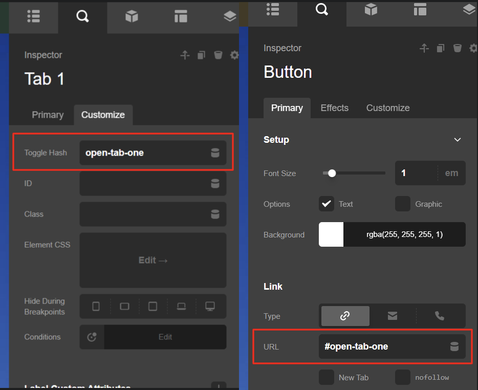
Toggle Hash
Toggle hash is the ability to open a toggleable from the URL hash or the # in a URL. They can be added on the page you are on or from another page linked out to this toggleable.
In this example we are setting a Tabs Toggle Hash to open-tab-one and using a button from the same page, we set the URL to #open-tab-one and thus when we click this button it opens this tab via the Toggle Hash.
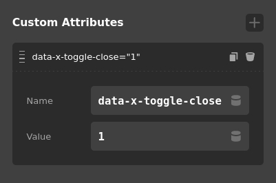
Closing the toggleable
data-x-toggle-close
Using Custom Attributes you can control all toggleable elements using Custom Attribute data-x-toggle-close=1 on another element. This can be useful if you have an element inside the element that needs to close the element as well as do something else. Internally the close button uses this.
Opening the Toggleable
data-x-toggle
First off the attribute you need is data-x-toggle. This tells the toggleable library to treat this as an open request. There are different types of opening in our theme.
data-x-toggle=1default and direct open. Most of the time this is all you need.data-x-toggle=collapsedefault same as 1.data-x-toggle=layeredsame as 1, but opens inner toggles and has layer effects. Disabling scroll is a layer effect.data-x-toggle=collapse-bFor use in X / Pro built in headers for collapsing.data-x-toggle=tabIf trying to open a specific tab
data-x-toggleable
The next you need is the ID of the toggleable you are trying to open. This can be set as well from a custom attribute. Internally this is the Style ID plus the Element ID (EX e356-e9). So in your custom element you would place something like data-x-toggleable=YOUR_TOGGLE.
Dynamic Rendering
Most of the Toggleable elements will have a toggle called "Dynamic Rendering". When an element has this turned on, all content in the toggleable area will be removed from the webpage when the toggleable is not active. When the element is toggled on, for example a Modal is opened, then the content you have created is finally added into the elements area. This is useful if you have an auto playing video that you want to be stopped when the modal is closed.
Programmatically
We offer a couple of functions to control the state of a toggleable.
/**
 * Returns state by toggle id
 *
 * @param {String} id
 * @return {Boolean}
 */
window.xToggleGetState("my-toggleable");


/**
 * Returns state by DOM Element
 *
 * @param {HTMLElement} domElement
 * @return {Boolean}
 */
window.xToggleGetStateFromNode(domElement);

/**
 * Update toggle state to true or false
 *
 * @param {String} id
 * @param {Boolean} state
 *
 */
window.xToggleUpdate(id, state);

/**
 * Remove toggle from being updated by the toggleable library
 *
 * @param {String} id
 *
 */
window.xToggleDelete(id);
This will allow you to hide the default mobile menu by nav touch.
// Find each mobile link
$('.x-navbar .x-nav-wrap.mobile a').each(function() {
  // On Click
  $(this).on('touchend click', function(){

    // Timeout
    setTimeout(function() {
      // Toggle mobile menu to off
      window.xToggleUpdate('x-nav-wrap-mobile', false)
    }, 1000);

  });
});
See something inaccurate? Let us know