Statbar
In this article, we're going to explain how to use the Statbar Element.
The Statbar Element is available across all three builders. The Content Builder, the Header Builder and the Footer Builder. The purpose of the element is to be used as a way to display statistical information in an engaging way.
Element Breakdown
The Statbar Element is made up of many sub Elements that work towards achieving its desired effect. The breakdown of how this markup works is as follows:
Container (
.x-statbar)Bar (
.x-statbar-bar)Label (
.x-statbar-label)
Available Controls
In this section we will walk through each control grouping and pay special attention to any unique controls or things of note.
Statbar
In the initial Statbar control grouping, the
Setup and Size box is notable for a few of its custom controls:

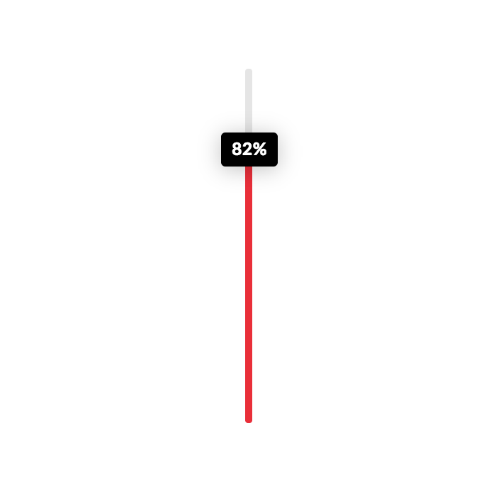
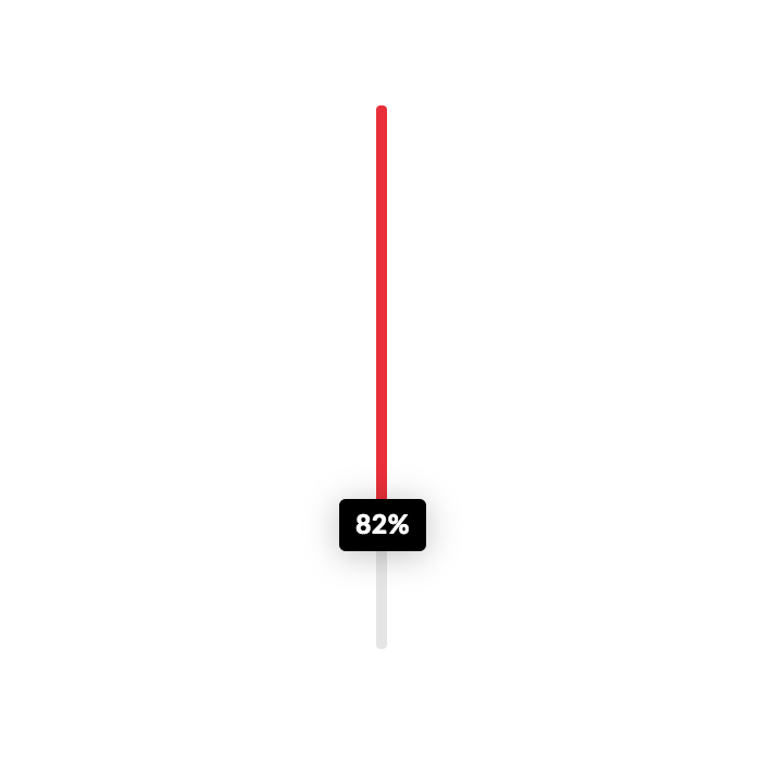
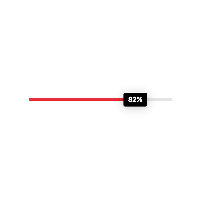
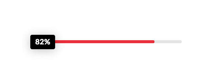
The Direction select control has four options, "Up," "Down," "Left," and "Right," which specifies the way the bar should expand when active. Below is a representation of how each of those settings would work in their respective order mentioned above:

Additionally, the Offset Trigger control is another custom control that is important to take note of as it determines how far down the screen a user should scroll when the bar becomes active and animates in. For example, if you set it to "90%," when the bar is 90% from the top of the screen in your browser window the bar will be triggered. If it was set to "10%," it would trigger when it was 10% from the top of the browser window. So keep in mind that larger percentages will trigger the active state sooner, while smaller numbers will take longer to get towards the top of the viewport.
After that, you will find the traditional controls for things such as basic setup, margin, padding, borders, shadows, et cetera.
Margin
Use this option to set the margin of the Statbar. You can change the settings for all the sides of the Statbar or modify them individually.
Padding
Use this option to set the padding of the Statbar. You can change the settings for all the sides of the Statbar or modify them individually.
Border
Use this option to set the border of the Statbar. You can set the style, width and color of the border on all sides or each side individually.
Border Radius
Use this option to set a border radius for the Statbar. You can set the curve on all sides or set them individually.
Box Shadow
You can set a shadow over the Statbar using the box-shadow control group.
- X-Offset - Use this option to set the X offset of the shadow in the Statbar.
- Y-Offset - Use this option to set the Y offset of the shadow in the Statbar.
- Blur - Use this option to set the intensity of the blur effect in the Statbar.
- Spread & Position - Use this option to set the spread amount of the items section shadow and decide if you want the shadow to sit inside or outside of the Statbar.
- Color - Use this option to set the color of the Statbar shadow.
Bar
For this section, the only custom control to take note of would be the Length control in the Bar Setup box at the beginning of the control grouping. This will determine how long the bar inside the outer wrapper should be. This is also where you can set the background color for this inner bar.
After that, you will find border radius and box shadow control to style this inner bar appropriately. For instance, you might wish to have the bar's border radius match the outer container's border radius, or be offset a bit if the container has a border. You can also use the box shadow control to create more depth.
Border Radius
Use this option to set a border radius for the bar. You can set the curve on all sides or set them individually.
Box Shadow
You can set a shadow over the bar using the box-shadow control group.
- X-Offset - Use this option to set the X offset of the shadow in the bar.
- Y-Offset - Use this option to set the Y offset of the shadow in the bar.
- Blur - Use this option to set the intensity of the blur effect in the bar.
- Spread & Position - Use this option to set the spread amount of the items section shadow and decide if you want the shadow to sit inside or outside of the bar.
- Color - Use this option to set the color of the bar shadow.
Label
For the Label control grouping, the Label Setup box has a few controls for us to take note of, which allow us to configure our Statbar quite significantly:

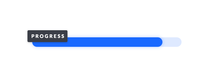
First, we can choose to turn the label completely off if desired. This can be a great way to use the animated bar effect as a decorative flourish instead.
Next, we can choose to use Custom Text, which will replace the percentage of the bar length that shows up inside the label by default. Clicking this checkbox will reveal an input where you can place your custom label.
We can also select Always Show if we want the label to be always visible. By default, the label is hidden and it will fade in to match the bar animation when you scroll down the screen; however, you may wish for it to be present at all times. If that is the case, you can select this option to ensure that it doesn't animate in.
The next control is our Justify choose, which positions the label relative to the bar within the Statbar. The options here are Start, Center, and End. Below are some screenshots representing these settings:

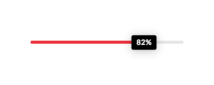
Again, take note that the label is positioned relatively to the bar inside the Statbar Element, not the Statbar itself. Also, keep in mind that these positions will all be output a little differently depending on the base direction the Statbar is going in.
Also, you can set a fixed width or height if desired for your label (for instance, if you have a bar that is 100px tall and you want the label to fill up the same space, you might give your label a 100px width and height). We can also use the Translate controls to offset our label a bit from it's position in the bar. For example, if you wanted to have your label appear to "float" just above the bar and be centered horizontally over the end of the bar, you could do 50% for Translate X Axis and -100% for Translate Y Axis, which would result in the following look:
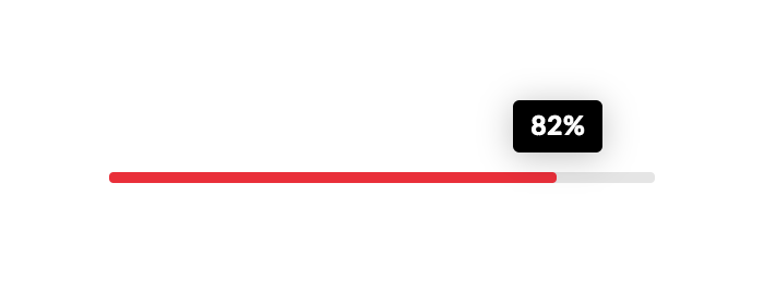
Percentage values will always be relative to the size of the label since we're using translate, so that is why moving it 50% to the right centers it over the end of the bar. We can also use values such as px or em, and even mix with % values to get creative approaches. For example, we could set the label to the "Start" of the bar, and then offset it -0.5em on the X axis and -50% on the Y axis to create a slight offset look at the beginning of the bar. Pair this with turning on the "Always Visible" option and you have a way to create a cool offset label that is always positioned perfectly as it is relative to the size and position of the bar itself:
Play around with these values to see what you can come up with, there are tons of possibilities! After that, you will find the traditional controls for things such as padding, borders, shadows, text, et cetera.
Padding
Use this option to set the padding of the label. You can change the settings for all the sides of the label or modify them individually.
Border
Use this option to set the border of the label. You can set the style, width and color of the border on all sides or each side individually.
Border Radius
Use this option to set a border radius for the label. You can set the curve on all sides or set them individually.
Box Shadow
You can set a shadow over the label using the box-shadow control group.
- X-Offset - Use this option to set the X offset of the shadow in the label.
- Y-Offset - Use this option to set the Y offset of the shadow in the label.
- Blur - Use this option to set the intensity of the blur effect in the label.
- Spread & Position - Use this option to set the spread amount of the items section shadow and decide if you want the shadow to sit inside or outside of the label.
- Color - Use this option to set the color of the label shadow.
Text Format
You can use this control group to set the format of the text of the label.
- Font Family - Use this option to set the font of the label text.
- Font Weight - Use this option to set the weight or thickness of the font. The values may differ depending on the selection of the font and if the select font supports weights or not.
- Font Size - Use this option to set the size of the font.
- Letter Spacing - Use this option to set the spacing between letters.
- Line Height - Use this option to set the spacing between each line.
Text Style
You can use this control group to set the style of the text of the label.
- Font Style - Use this option to decide if you want to have a normal or italic style.
- Text Align - Use this option to set the alignment of the text. Possible values are left, center, right, and justify.
- Text Decoration - Use this option to force an underline or linethrough style.
- Text Transform - Use this option to set the case of the text. Available options are uppercase, camel case, and lowercase.
- Text Color - Use this option to set the color of the text.
Text Shadow
The text shadow control group contains settings to set a text shadow for the label text.
- X-Offset - Use this option to set the X offset of the text shadow.
- Y-Offset - Use this option to set the Y offset of the text shadow.
- Blur - Use this option to set the intensity of the blur effect in the text shadow.
- Color - Use this option to set the color of the text shadow.
Customize
The Customize pane consists of various features that allow you to take further control over your Element's styling and functionality:
- ID – Sets an HTML ID on the Element.
- Class – Sets an HTML Class on the Element.
- Element CSS – Use this feature for increased stylistic control of your Element, especially over nested markup. Click here for more detailed information on this feature, such as using
$elto dynamically target the base tag, et cetera. - Hide During Breakpoints – Hides the Element at different screen sizes when design alterations are needed. Click here for more information.
- Conditions – Adds / removes Elements from the page when certain criteria are met (e.g. “If a featured image is set...”). Click here for more information.
- Custom Attributes – Use this option to add custom HTML attributes to the root tag of the Element (e.g.
data-info="123"). This can be particularly helpful when integrating with various scripts and libraries.
Demo
To see a live demo of the Statbar Element click here.
Summary
You've now learned about the Statbar Element and how to use it throughout your design.
See something inaccurate? Let us know