How to Set up Navigation
In this article, we're going to explain how to set up navigation on your website using the Header & Footer Builder (part of the Layout Builder).
Overview
Adding Navigation to the Header Builder in Cornerstone consists of two steps:
- Adding the navigation menu in WordPress.
- Adding a Navigation Element into the Header Builder.
How to add a Navigation Menu in WordPress
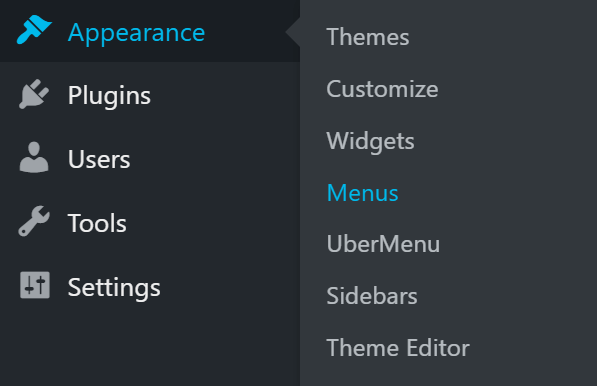
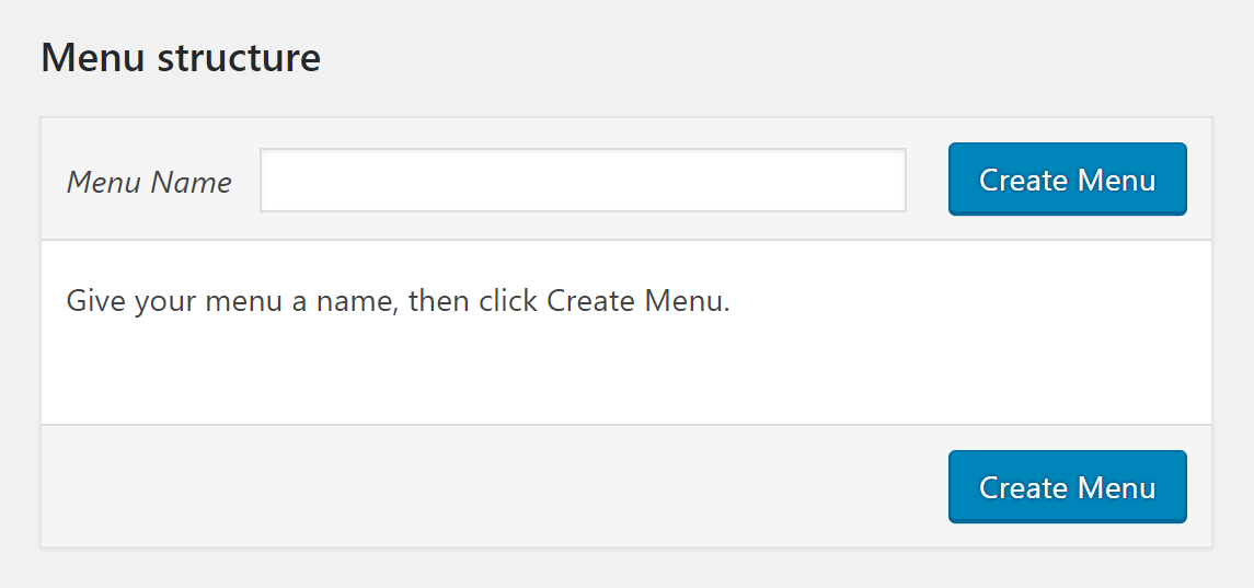
To add a navigation menu on WordPress, follow the steps below:
- Go to WordPress Dashboard > Appearance > Menus.
- Click Create a new menu link.

- Enter a name for the menu and click Create Menu button.
- Use the left pane to add pages, posts or custom links to the menu.
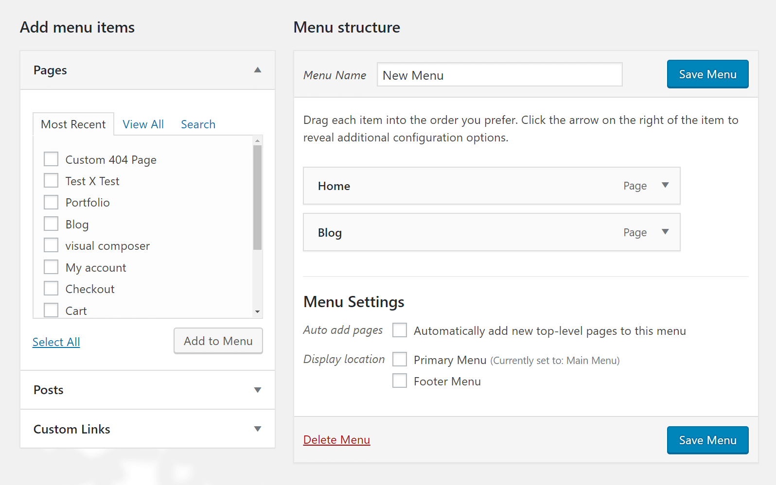
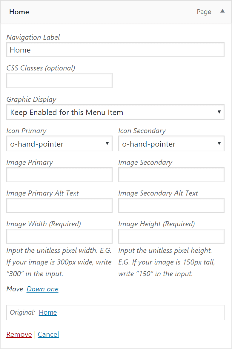
- Click each menu item to change the characteristics of that menu item.
How the Navigation Works
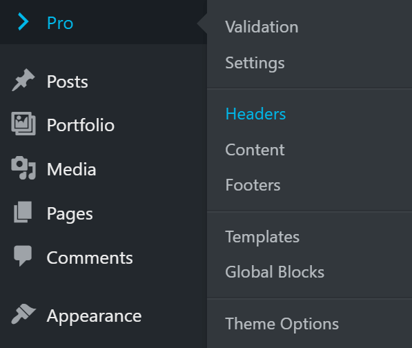
The second step to add a navigation to your website is to go to Cornerstone and select the Header in question. Learn more about the Header Builder. Once in the Header Builder, you can use the navigation-specific Elements to add a menu there.
Which Elements to Use for the Navigation
There are navigation-specific Elements available in Cornerstone that you can use to add a menu to your website. Here is the list of the Elements that you can use:
- Navigation Inline
- Navigation Collapse
- Navigation Dropdown
- Navigation Layered
- Navigation Modal
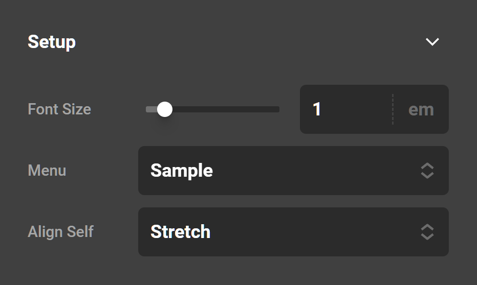
Each of those Elements has different controls depending on how the Element is used. For example, the Navigation Inline Element has controls for the main menu items and sub menu items, but the Navigation Collapse Element has controls for the toggle icon (primarily used on mobile devices to open the menu).
There is a common control among all the navigation-related Elements, and that is to select the menu which you have created before using the WordPress Dashboard > Appearance > Menus menu. You can add unlimited Elements, thus menus into the Header Builder.
How to Set Mobile Menu
The typical Element which you can use to add a menu is the Navigation Inline Element. The Navigation Inline Element is more suitable for the desktop or laptop screens sizes. The smaller screen size devices such as tablets and mobiles are better to use other Elements such as the Navigation Collapsed or Modal Elements.
You need to add both the Navigation Inline and Navigation Collapse Elements and use the hide content by device size feature of those Elements to hide one for the desktop view and the other for the desktop views. This is a great fine-tuning option as it allows you to tailor the experience to any device or screen size.
You can use the same Navigation Elements in the Footer Builder as well. The only exception is the Navigation Inline Element which can show only linear menus and not the submenus.
Summary
We've talked about setting up the navigation in Cornerstone with the combination of the built-in WordPress navigation menu and the navigation specific Elements in Cornerstone's Header and Footer Builder. Finally, we've discussed the trick you can use to cater to mobile devices when it comes to laying out the navigation menu.
See something inaccurate? Let us know