Element CSS
In this article, we're going to explain how to use our Element CSS feature.
All About Element CSS
Element CSS is our answer to the shortcomings of simply offering an “inline CSS” input on an element as many builders do. While inline CSS can work as a decent way to give users quick access to customize the styling of singular Elements—such as a Section or Column—its limitations become quickly apparent the more you work with it:
- There is no way to target nested markup within a parent Element using inline CSS
- There is no way to style interactive states for an Element such as
:hover,:active, et cetera - There is no way to create and style pseudo elements to enhance the look and feel of an Element
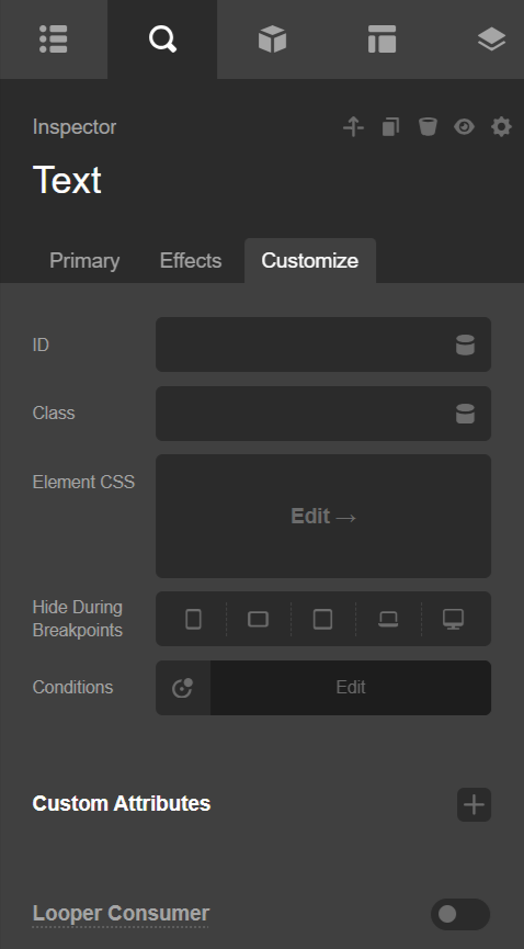
Enter Element CSS, which we will briefly demonstrate using the Text Element. To get to the Element CSS input, go to the Customize control grouping on any element, and you will find the input labeled as Element CSS:

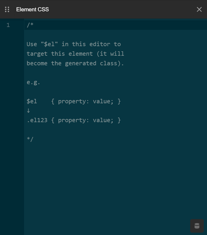
Clicking into that input will reveal a code editor that slides in from the edge of the screen:

As noted in the placeholder text of the code editor, this editor can receive the special $el selector, which will tap into our dynamic CSS system and have its dynamic class swapped out upon save. These dynamic classes are generated procedurally as each element is rendered on the screen, meaning that if this Text Element was the 12th Element placed on the page, its generated class would be .el12, which is then used to target and style it.
It is because of this procedural class generation that you couldn't previously target an element using its generated class, as this class would update as you add or remove other elements to the page (you can always add a custom class to any element and style using that, but the Element CSS system allows you to introduce custom styling within the system without needing to setup any sort of external stylesheet or global CSS).
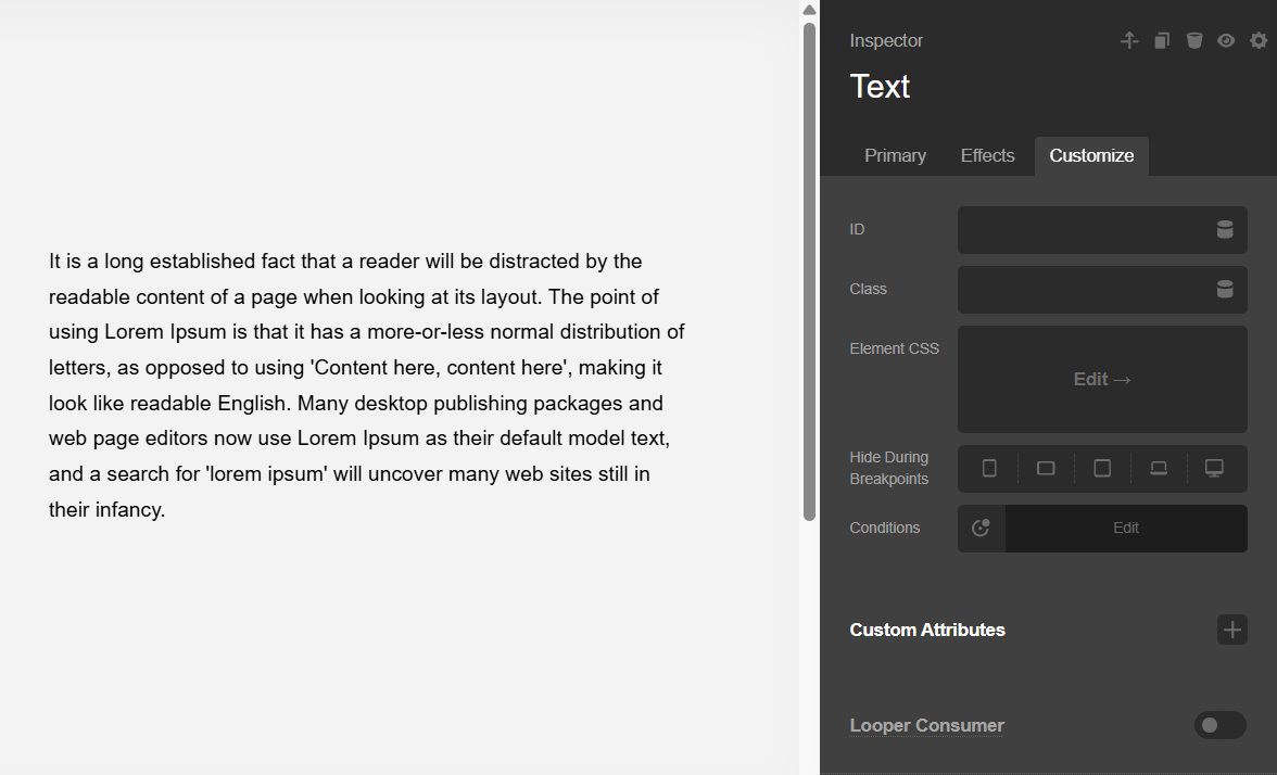
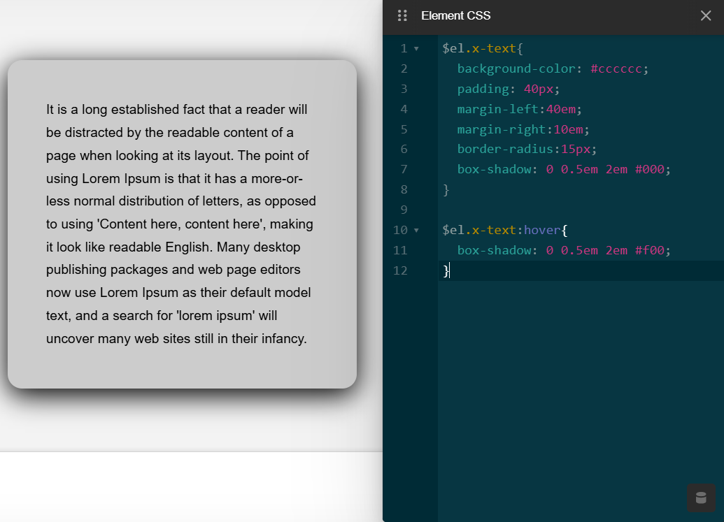
So let's see this in action. In the following screenshot, some of the styles used can be added using Element controls such as the border-radius and box-shadow, but we placed them here to see everything live. Additionally, the Text Element does not feature a control for adding a background image directly, so if you wanted to do this you would need custom CSS (background images can of course be added to Sections, Columns, et cetera, which is where this typically might go in the builders, but this example shows off you how you could add it directly to an Element):

Notice that we're using $el.x-text to target the Text Element, which is sometimes necessary to ensure proper specificity so that your customizations will take effect. Next, we'll show how we can target nested markup using the Element CSS system to introduce a pseudo element into the Headline:

Here we're applying a pseudo element style within the Text Element. Again, things like pseudo elements or interactive styles (e.g., :hover, :active, etc.) would not be styleable via inline CSS alone on a parent Element. For example, we added a :hover style to change the box-shadow color, which requires using Element CSS.
Hopefully the power of this system is becoming apparent when paired with the Template Manager. One thing you could do is add Element CSS on a parent Section and target anything within it (Rows, Columns, and Elements) and style it to be a completely isolated, fully deliverable block of content that can work across any project.
For instance, if you wanted to make a custom portfolio of content and have the columns break at special breakpoints and then setup the content in a unique way, you could add all the Elements to that Section and style everything using Element CSS on the Section to keep things completely self-contained without needing external global styles. This means that a whole block of content could be moved from one project to the other immediately, no setup needed.
Summary
You've just learned how to use the Element CSS feature which replaces using inline css.
See something inaccurate? Let us know