Tabs
In this article, we're going to explain how to create great content using the Tabs element.
Tabs Setup
The purpose of the Tabs Element is to output multiple groupings of content within a traditional "tabbed" style component, which can be toggled to reveal one panel at a time.
Element Breakdown
The Tabs Element is made up of many sub Elements that work towards achieving its desired effect. The breakdown of how this markup works is as follows:
- Tabs (
.x-tabs) - Tab List (
.x-tabs-list) - Contains a standard
ulcomprised ofliElements withbuttonchildren as the toggles for each panel. - Tab Panels (
.x-tabs-panels) - Tab Panel (
.x-tabs-panel)
What we can see from the representative diagram above is that every Tabs Element is made up of one or more (typically at least 2) "tabs." A full "tab" is made up of its panel of content and a corresponding tab up in the .x-tabs-list Element, which can be toggled to reveal different panels. Below we will walk through the various controls available for each section of the Tabs Element and how you might use them to achieve certain looks.
Available Controls
In this section we will walk through each control grouping and pay special attention to any unique controls or things of note.
Tabs
The base level control grouping is labeled Tabs, which styles the containing Element that holds all child Element. This is also where you will add your individual tabs, which can be inspected to adjust content as needed.
The first thing you will find in this control grouping is the Add Items control box:
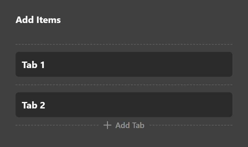
Here you can add as many items as you need to your Tabs Element, as well as inspect, duplicate, and delete tabs as you wish. You can quick edit the label for each tab by double-clicking the title on each item, or you can click the "inspect" button (the magnifying glass), to go into that specific item:
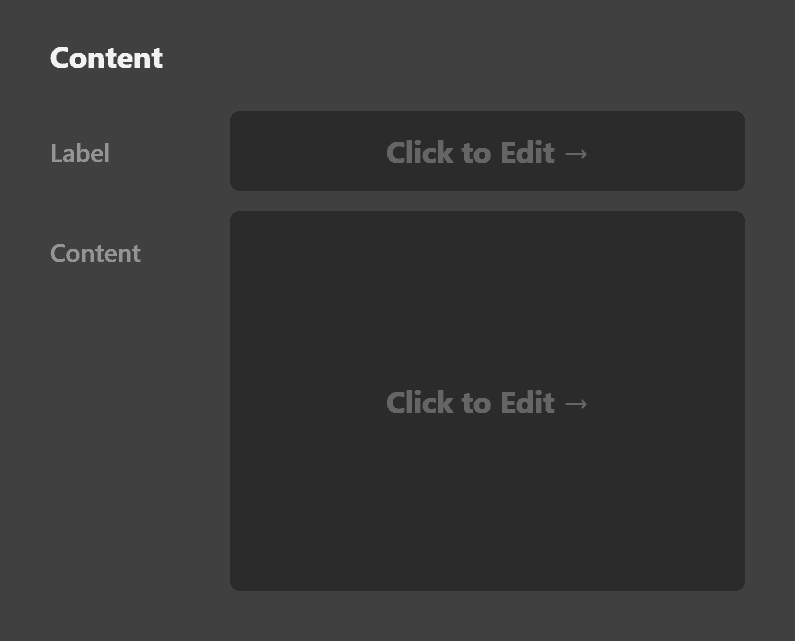
In this screen, you can edit the tab label that appears at the top of the Element as well as the content for that tab, which will appear in the "panels" down below.
Going back up to our base level Tabs control grouping, the next box you will see is labeled, Setup:
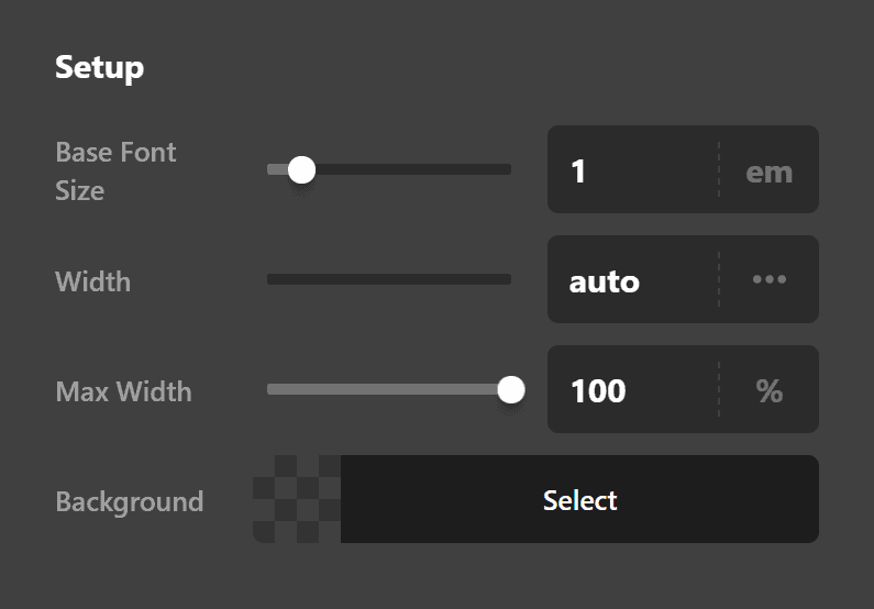
Here you can perform many of the basic functions you see across other Elements such as setting a base font size, background color, and width/max width values. After that, you will find the traditional controls for things such as margin, padding, borders, shadows, et cetera.
Margin
Use this option to set the margin of the tab. You can change the settings for all the sides of the tab or modify them individually.
Padding
Use this option to set the padding of the tab. You can change the settings for all the sides of the tab or modify them individually.
Border
Use this option to set the border of the tab. You can set the style, width and color of the border on all sides or each side individually.
Border Radius
Use this option to set a border radius for the tab. You can set the curve on all sides or set them individually.
Box Shadow
You can set a shadow over the tab using the box-shadow control group.
- X-Offset - Use this option to set the X offset of the shadow in the tab.
- Y-Offset - Use this option to set the Y offset of the shadow in the tab.
- Blur - Use this option to set the intensity of the blur effect in the tab.
- Spread & Position - Use this option to set the spread amount of the items section shadow and decide if you want the shadow to sit inside or outside of the tab.
- Color - Use this option to set the color of the tab shadow.
Tab List
The Tab List control grouping is primarily comprised of the traditional controls for things such as margin, padding, borders, shadows, et cetera.
Individual Tabs
The most important set of controls to note for the Individual Tabs control grouping is the Setup box:
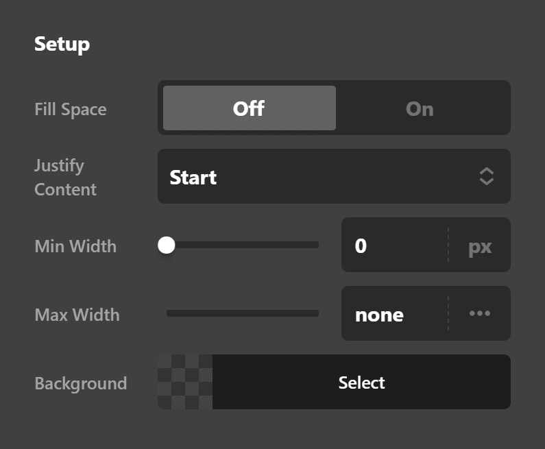
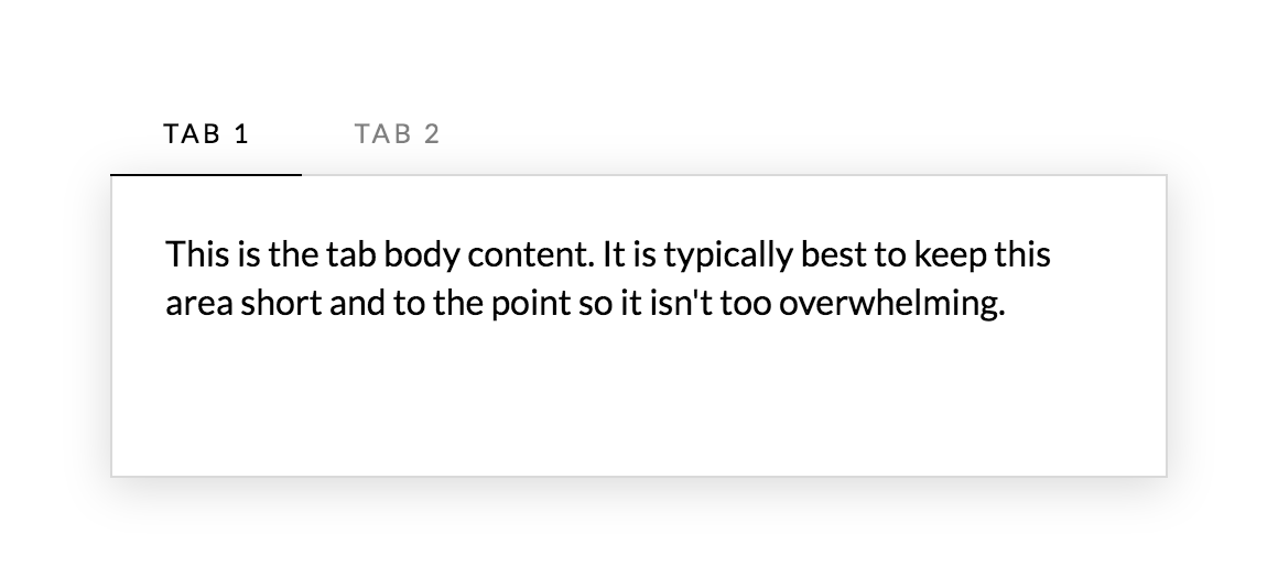
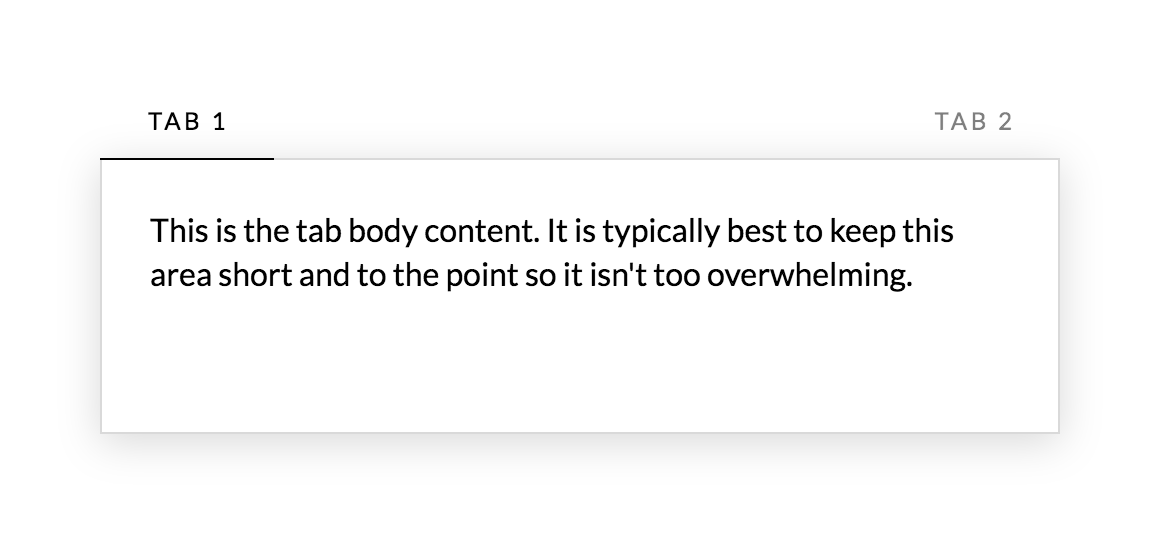
In addition to being able to specify a base and interaction background color across all of your tabs as well as a minimum and maximum width for each individual tab, a couple controls of note are the "Fill Space" control and the "Justify Content" control. "Fill Space" will always force tabs to equally fill all available space. This will only visually appear to make a difference if the number of tabs and their overall width is smaller than that of their container. For example, here is a standard setup for the Tabs Element without this control turned on:
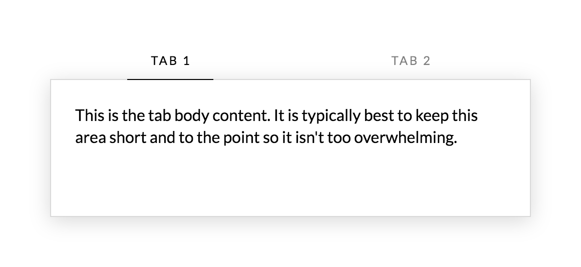
And here is how the tabs appear when "Fill Space" is turned on:
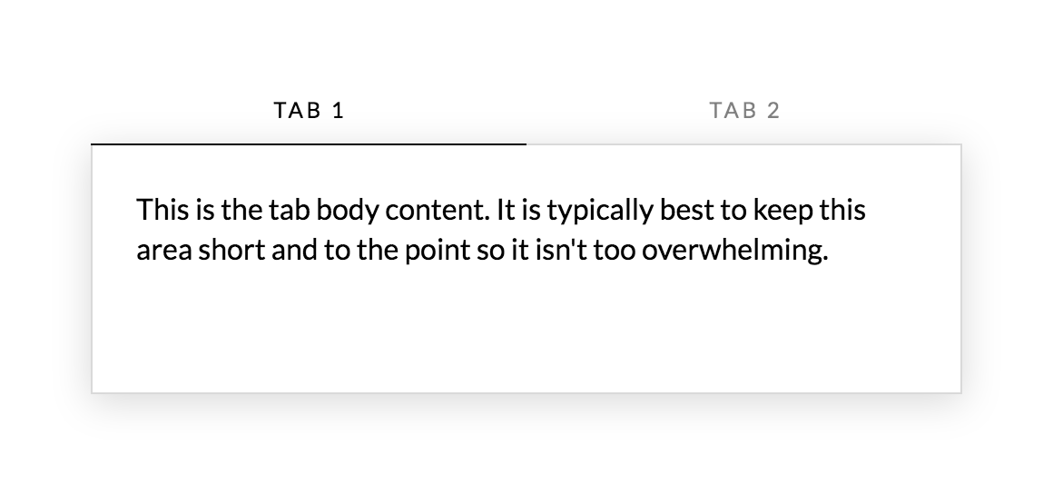
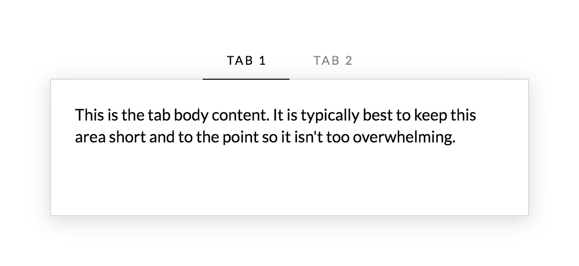
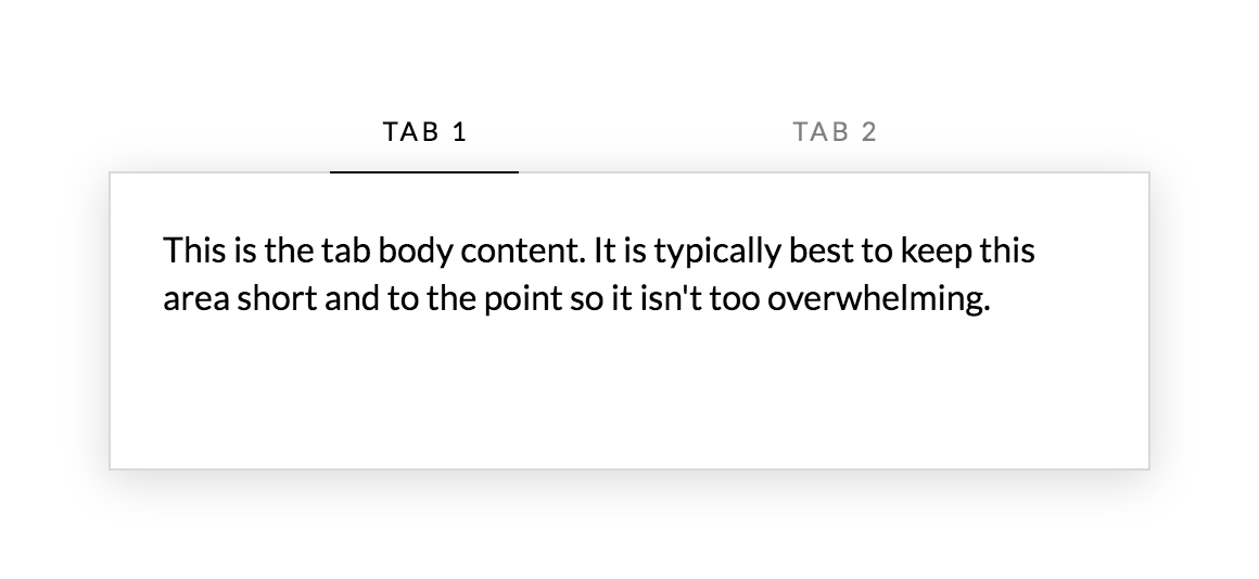
Note how the tabs are now evenly filling out all space available to them. If "Fill Space" is turned on then the "Justify Content" control will be hidden, as it will have no effect. With "Fill Space" turned off, you can adjust the "Justify Content" control to change how the tabs appear within your Element. The first image above displays the "Start" configuration. Here is what the "Center" configuration would look like:
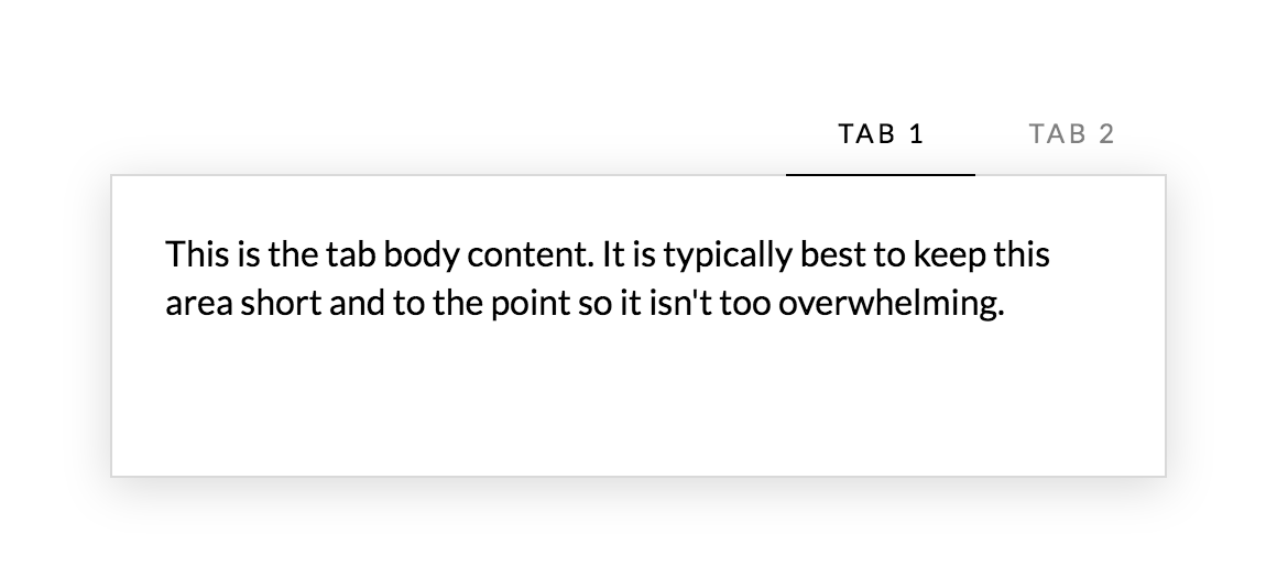
Here is what the "End" configuration would look like:
Here is what the "Space Between" configuration would look like:
Here is what the "Space Around" configuration would look like:
Here is what the "Space Evenly" configuration would look like:
Remember that these will visually only appear to alter the layout of the tabs if their overall dimensions are less than that of the container. Also, the way that the tab list works is it follows a similar convention now seen with many large-scale websites such as Google and Medium, and is even being used in modern, popular boilerplate frameworks like Bulma. The tab list container has an overflow-x: auto; style applied to it, which will only display a scrollbar when the amount of tabs and their dimensions are larger than that of their container. They can then be horizontally scrolled through, which also effectively allows for an "infinite" amount of tabs as this pattern is completely responsive at all screen sizes no matter how much content you throw at it.
One final important note for individual tabs is that when adding side margins, any margin-left values for the first tab or margin-right values for the last tab will be set to 0px !important, which comes from the static styles present within the theme. This is so that you can place spacing in between your tabs if desired without any extra spacing on one side or the other of the tab list container. If additional spacing is needed on the sides of the tab list container, you can use side padding values to achieve this.
Panels
The most important set of controls to note for the Panels control grouping is the Setup box:
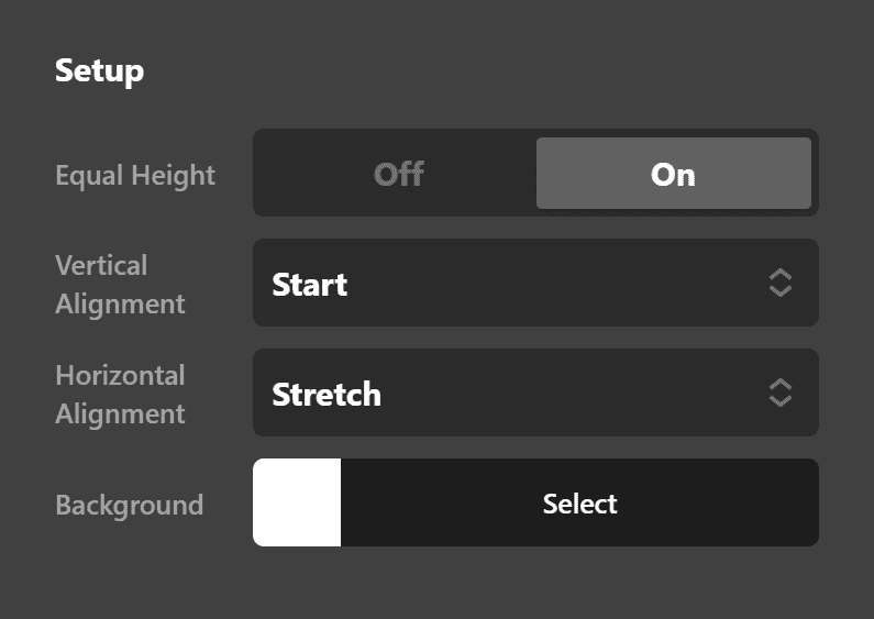
Here you can set the background color for each individual panel, but you can also configure a few additional appearance options as well. By default, the "Equal Height" control is set to off (which will also hide the alignment controls below). If turned on, all panels will be set to the same height as the tallest panel within a grouping of tabs. If enabled, each panel is setup using display: flex; with a flex-flow: column nowrap; layout, which is what allows us to introduce the "Vertical Alignment" and "Horizontal Alignment" controls. These can be used to move content around within the tabs in special ways if desired. For instance, if you wanted your panels with less content to be vertically centered, you could select "Center" from the "Vertical Alignment" control, et cetera. Keep in mind that the "Vertical Alignment" control will appear to have no effect on your tallest panel as that is the panel that all other panel heights are based on.
After that, you will find the traditional controls for things such as margin, padding, borders, shadows, et cetera.
Customize
The Customize pane consists of various features that allow you to take further control over your Element's styling and functionality:
- ID – Sets an HTML ID on the Element.
- Class – Sets an HTML Class on the Element.
- Element CSS – Use this feature for increased stylistic control of your Element, especially over nested markup. Click here for more detailed information on this feature, such as using
$elto dynamically target the base tag, et cetera. - Hide During Breakpoints – Hides the Element at different screen sizes when design alterations are needed. Click here for more information.
- Conditions – Adds / removes Elements from the page when certain criteria are met (e.g. “If a featured image is set...”). Click here for more information.
- Custom Attributes – Use this option to add custom HTML attributes to the root tag of the Element (e.g.
data-info="123"). This can be particularly helpful when integrating with various scripts and libraries.
Demo
To see a live demo of the Tabs Element click here.
Summary
You're now all set to use Tabs Element in the most efficient way.
See something inaccurate? Let us know