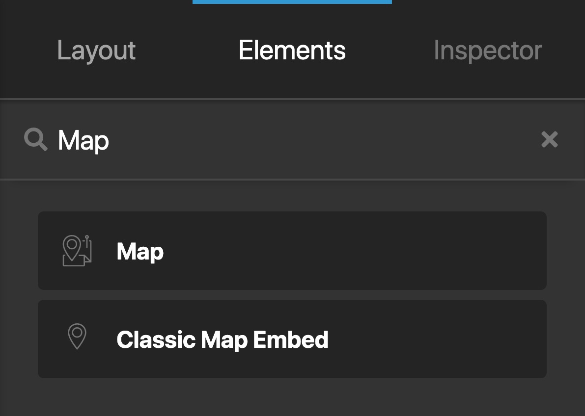
Map
In this article, we're going to explain the Map Element and how to use it.
The Map Element is available across all three builders. The Content Builder, the Header Builder, and the Footer Builder. The purpose of the Element is to output a map, and this map can be configured in multiple different ways allowing you to show a map of your location to the end user (or any location you want).
To add the Map Element, search for "Map" and drag "Map" to the canvas.
Available Controls
Like the other Elements, controls are broken down into multiple parts, including:
- Map
- Frame
- Customize
The main controls you need to pay attention to are the Map controls and the Frame controls.
The Map controls
While reasonably self-explanatory, it's important to note if you use the Google option rather than the Embed option you'll need to actually input a Google API key registered to your domain to allow the functionality to work. Click here to get a Google Map API key.
Otherwise, you'll see errors in your map displaying at all.
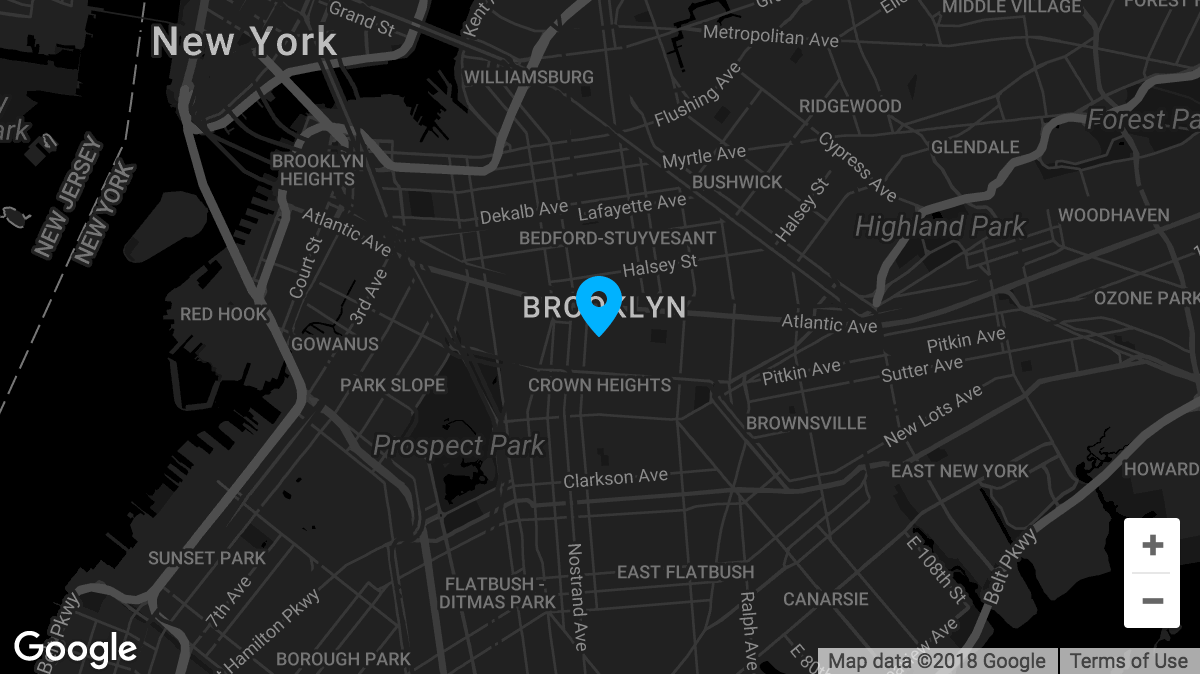
You'll notice as well if you choose the Google option that there's another option called Google Map Styles, this is a great piece of functionality that allows you to easily change the entire style of your map by copying and pasting the JSON map styles available directly from Google.
Frame Styles
The Frame Styles effectively allows you to modify how the frame around the Google Map itself looks; this enables you to set things like font size, height, and width, margins, paddings, and more.
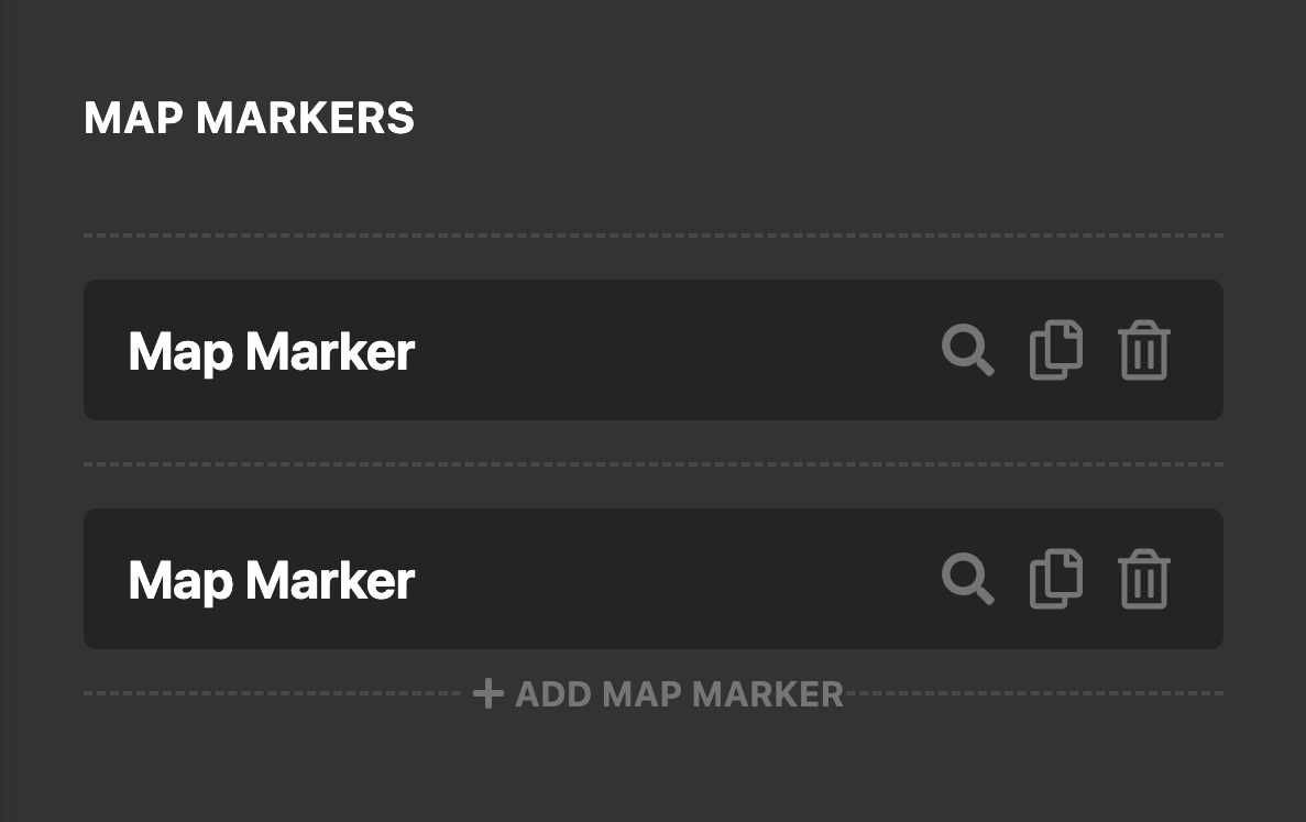
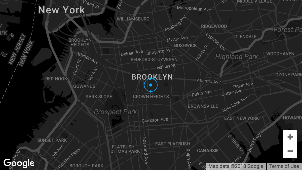
Map Markers
The Map Element features map markers for any Google Maps setup! The map markers can be added via the sortable control located at the beginning of the Element:
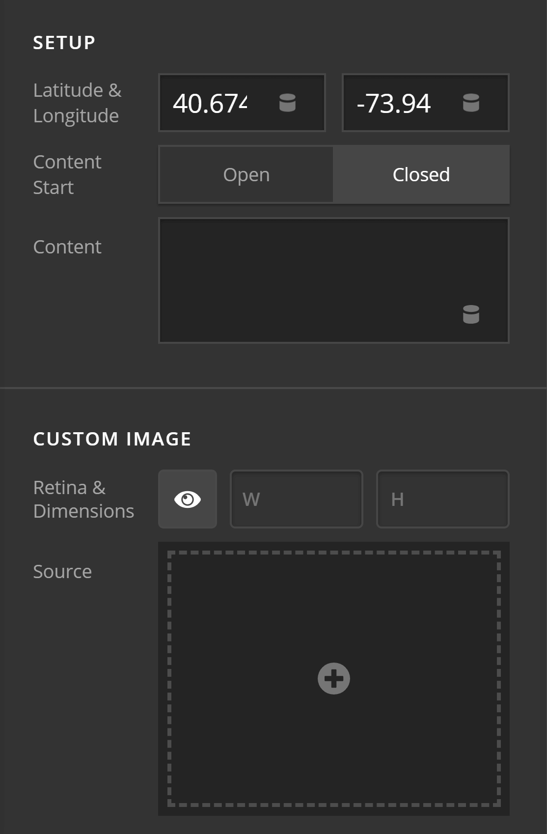
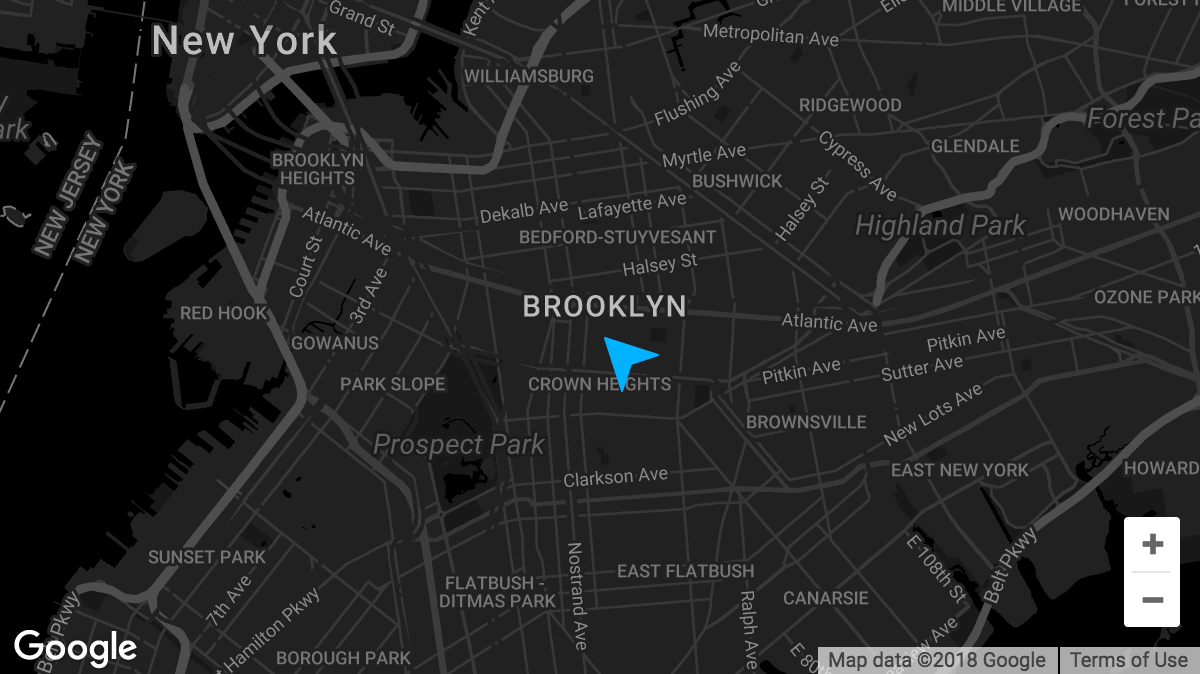
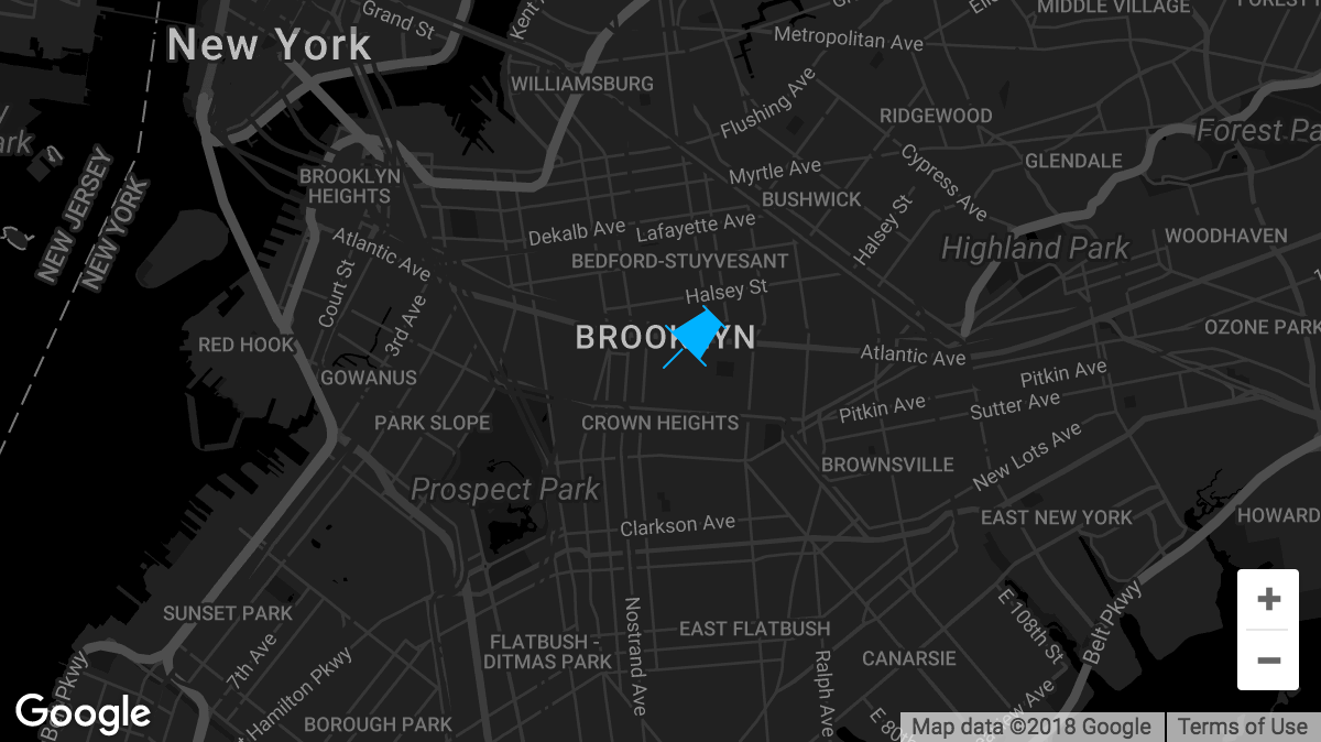
If you inspect each marker, you can specify the latitude and longitude of each one as well as include optional content for that marker that will show up in a popup. Furthermore, custom map marker images can be implemented for a more custom look:
When a custom map marker image is used, two "Image Offset" controls will appear, which allow you to move the marker around if needed. This is necessary for certain situations where the point of the marker is located in different positions. For example, utilizing the screenshot above, you can see that we've offset the marker on the Y axis by -50% of the marker image's height. This moves the marker into its proper position to ensure that the point at the bottom of the image is in the correct location on the map:
In other situations you may not need to move the marker at all and can simply leave the X and Y axis at 0% as seen below:
For the following image we've translated its position 50% on the X-axis and -50% on the Y-axis due to where the point on the graphic falls:
And sometimes you may need to use different numbers, such as this graphic that required a 50% translation on the X-axis and a 40% translation on the Y-axis due to its uneven shape:
The most important thing to keep in mind when translating custom map markers is that the movement of the graphic is always relative to its own dimensions. So for a 100px square image, moving it 50% on the X-axis and -100% on the Y axis means you're moving it 50px to the right and 100px up. If you ever find yourself in doubt, you can simply move the sliders to find the appropriate positioning for any custom graphics you might be using as their location will be updated in real time in the builders.
Customize
The Customize pane consists of various features that allow you to take further control over your Element's styling and functionality:
- ID – Sets an HTML ID on the Element.
- Class – Sets an HTML Class on the Element.
- Element CSS – Use this feature for increased stylistic control of your Element, especially over nested markup. Click here for more detailed information on this feature, such as using
$elto dynamically target the base tag, et cetera. - Hide During Breakpoints – Hides the Element at different screen sizes when design alterations are needed. Click here for more information.
- Conditions – Adds / removes Elements from the page when certain criteria are met (e.g. “If a featured image is set...”). Click here for more information.
- Custom Attributes – Use this option to add custom HTML attributes to the root tag of the Element (e.g.
data-info="123"). This can be particularly helpful when integrating with various scripts and libraries.
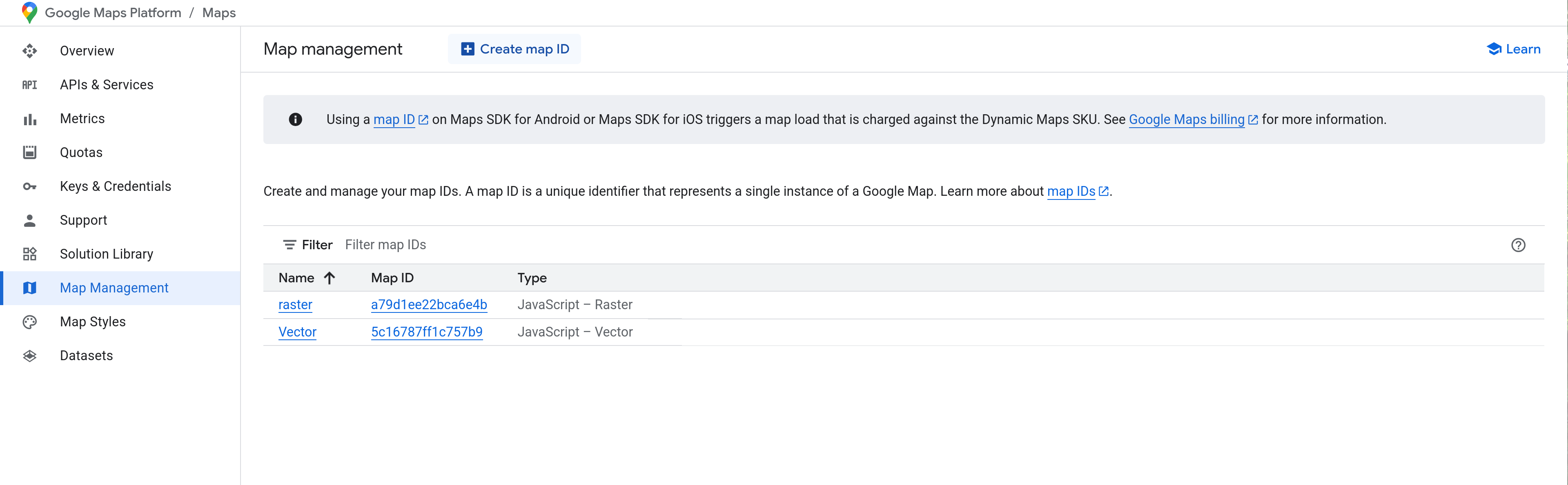
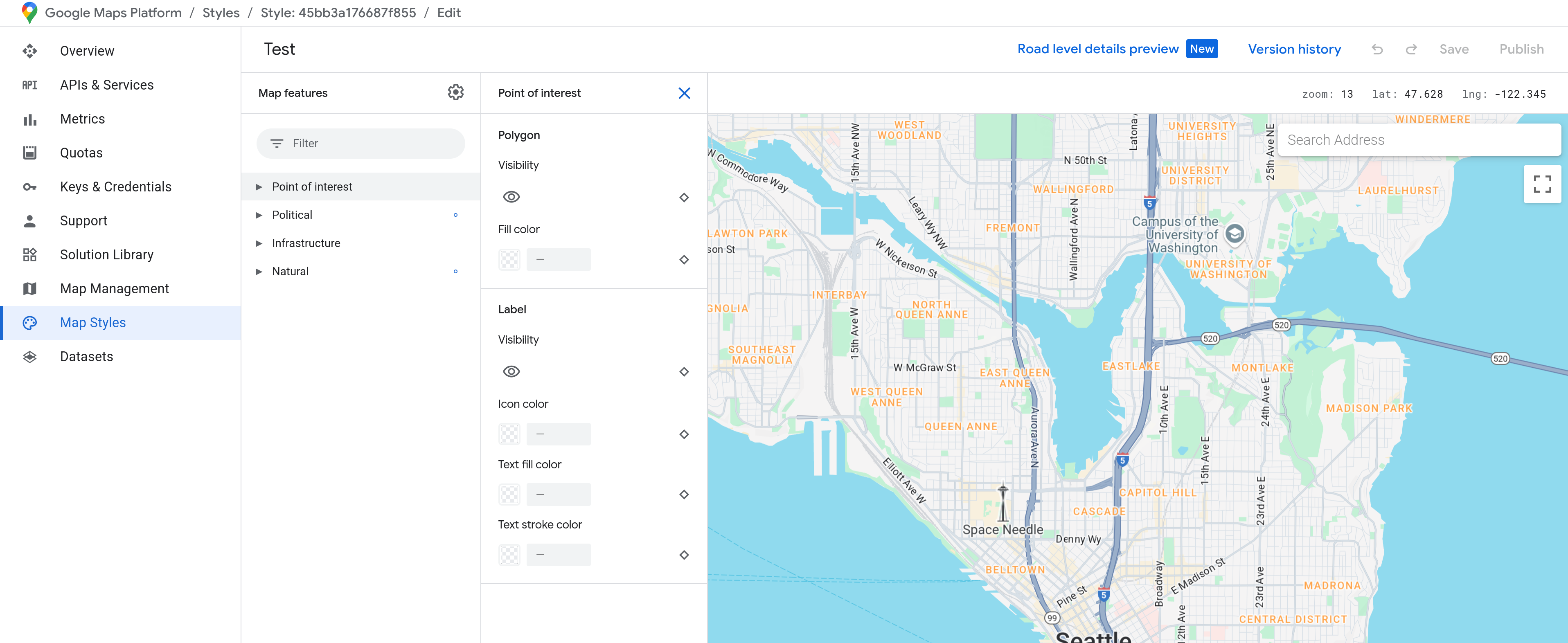
Map ID
Map ID's introduced in Cornerstone 7.7.0, allow you to change your Map styles all in the Google Console. To obtain this Map ID follow these instructions.
Enter the Google Map Console from here.
Look for the Map Management button and navigate to this page.
From here you can create a new Map. In the map management area you can also grab the Map ID needed to apply the styles in Cornerstone.
In this editor you can click Change Style to change your map style. There is section in the Console called Map Styles where you can manage all your map styles. Clicking the Customize button here will let you control certain map colors and what is shown on the map. Make sure you press Save and Publish when you are done.
Demo
To see a live demo of the Map Element click here.
Troubleshooting
Google Maps not working in the Cornerstone Preview
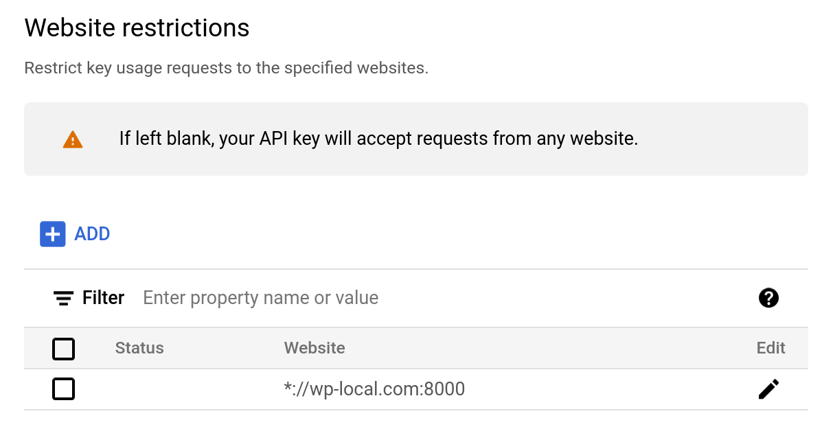
If you are using Website restrictions in your Google API settings, you will need to add *:// as your protocol to get your map to show up in Cornerstone properly. In Cornerstone the preview will run in an iFrame and recently doing this has been a requirement of Google.
Summary
You've now got a good working knowledge of how the Map Element works and how to use it.
See something inaccurate? Let us know