Line
Want to separate a headline from its body using a horizontal line? This is just one of the uses of the Line Element. In this article we'll dive in on how to add and configure this Element to your liking.
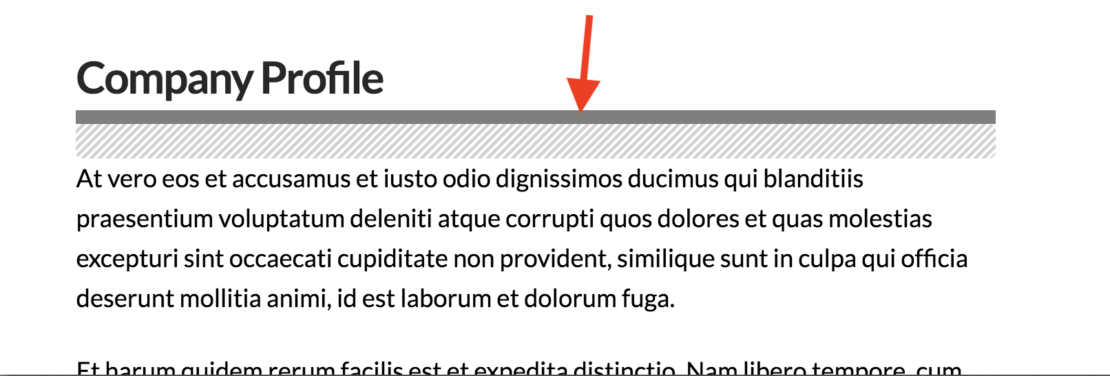
You can think of many ways to use lines into your website. However, one of the most common uses of it is to separate texts from each other. One example of such use is separating a headline from its body as shown below.

To add the Line Element, simply search "line" and select Line.

Scroll Progress
If you've noticed in the screenshot above, there is a Scroll Progress element which is a pre-fabricated (also known as Pre-Fab) Line element which fills the line with color based on where you are in the page or scroll depth. This element works best in the Sticky Header. Check out the video below to see how it works.
https://youtu.be/hgBDPMXuRZk?si=Df8-rHpHym-eAbxD
Line Setup
Back to the default Line element. When you inspect a Line Element, you'll see the following settings: Direction, Base Font, Width & Max Width, Size and Color & Style.
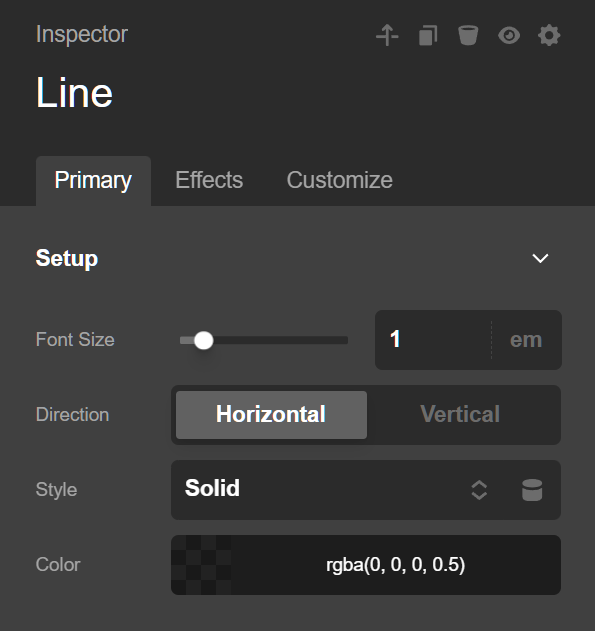
Direction
Horizontal is the default value. If this is the selected option, the Line Element will be positioned, well, horizontally.
If you select Vertical, then the line will be standing up. It's seldom that you will be using Vertical in Cornerstone / Content Builder, though it's good to point out that this option is available to you. The usual and practical usage of the vertical option is in Pro's Header and Footer Builders.

Base Font Size
If you will be using the EM unit for the Size field, then the value you will be setting for the Base Font Size field will influence how the Size field will calculate the value. Let me explain with an example:
If you set the value of 2 EM for the Base Font Size and set Size to 2 EM also, that Line Element will be thicker than if the value of the Base Font Size is just 1 EM. If the Base Font Size is 20 PX and the Size is 1 EM, that would be thicker than if the value of Base Font Size is just 10 PX.
If you use either PX or REM for the Size field, then the value you set for Base Font Size will be ignored.
Width & Max Width
Width is the actual width of the Line Element. The width cannot go beyond the Max Width. Max Width is useful for handling responsiveness of an Element.
Size
This sets the thickness of the Line Element.
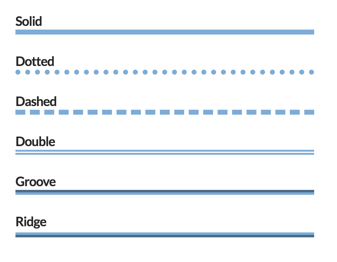
Color & Style
You can set the color of the Line and its style. Styles can be:
Design
You can set the margin, border radius and box shadow of the Line Element. Let's see how each setting relates to the Line Element.
Margin
Use this option to set the margin of the line. You can change the settings for all the sides of the line or modify them individually.

Border Radius
Use this option to set a border radius for the line. You can set the curve on all sides or set them individually.

Box Shadow
You can set a shadow over the linen using the box-shadow control group.
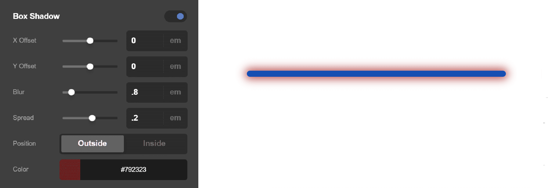
- X-Offset - Use this option to set the X offset of the shadow in the line.
- Y-Offset - Use this option to set the Y offset of the shadow in the line.
- Blur - Use this option to set the intensity of the blur effect in the line.
- Spread & Position - Use this option to set the spread amount of the items section shadow and decide if you want the shadow to sit inside or outside of the line.
- Color - Use this option to set the color of the line shadow.
Customize
The Customize pane consists of various features that allow you to take further control over your Element's styling and functionality:
- ID – Sets an HTML ID on the Element.
- Class – Sets an HTML Class on the Element.
- Element CSS – Use this feature for increased stylistic control of your Element, especially over nested markup. Click here for more detailed information on this feature, such as using
$elto dynamically target the base tag, et cetera. - Hide During Breakpoints – Hides the Element at different screen sizes when design alterations are needed. Click here for more information.
- Conditions – Adds / removes Elements from the page when certain criteria are met (e.g. “If a featured image is set...”). Click here for more information.
- Custom Attributes – Use this option to add custom HTML attributes to the root tag of the Element (e.g.
data-info="123"). This can be particularly helpful when integrating with various scripts and libraries.
Demo
To see a live demo of the Line Element click here.
Summary
There you have it! Now you know how to add and design vertical and horizontal lines in Cornerstone.
See something inaccurate? Let us know