Image
In this article, we're going to discuss the Image Element. We'll learn how to add this Element, how to set it up, how to make it a link, and how to adjust its margin, padding and border.
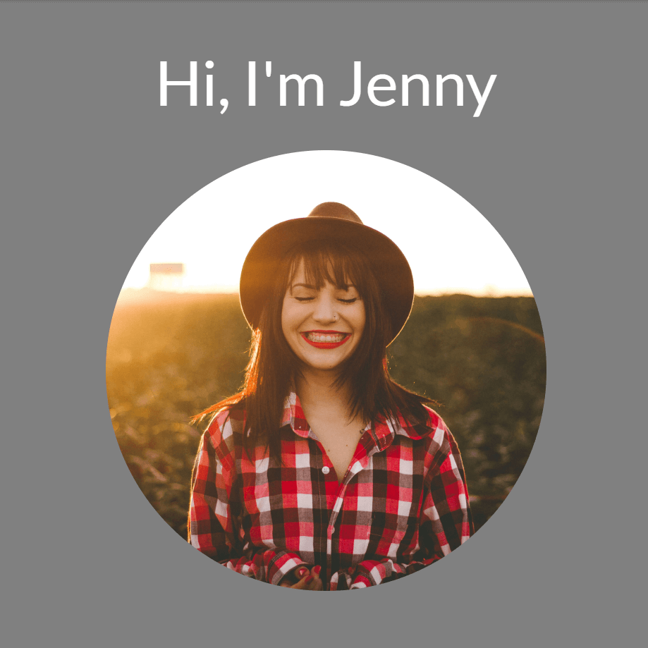
Let's learn how to add an image like this using the Image Element.
To add the Image Element, simply search for "image" and drag "Image" to the canvas.
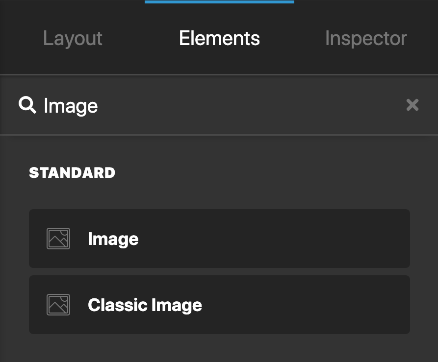
Image Setup
The Setup controls have the following:
- Width - The width of the image.
- Max Width - The maximum width of the image. Useful if you want your image to never exceed a specific width.
- Background - Offers two options: Base and Interaction. Base is the background color of the image at all times apart from on hover. Interaction is the background color of the image on hover and when it is interacted with.
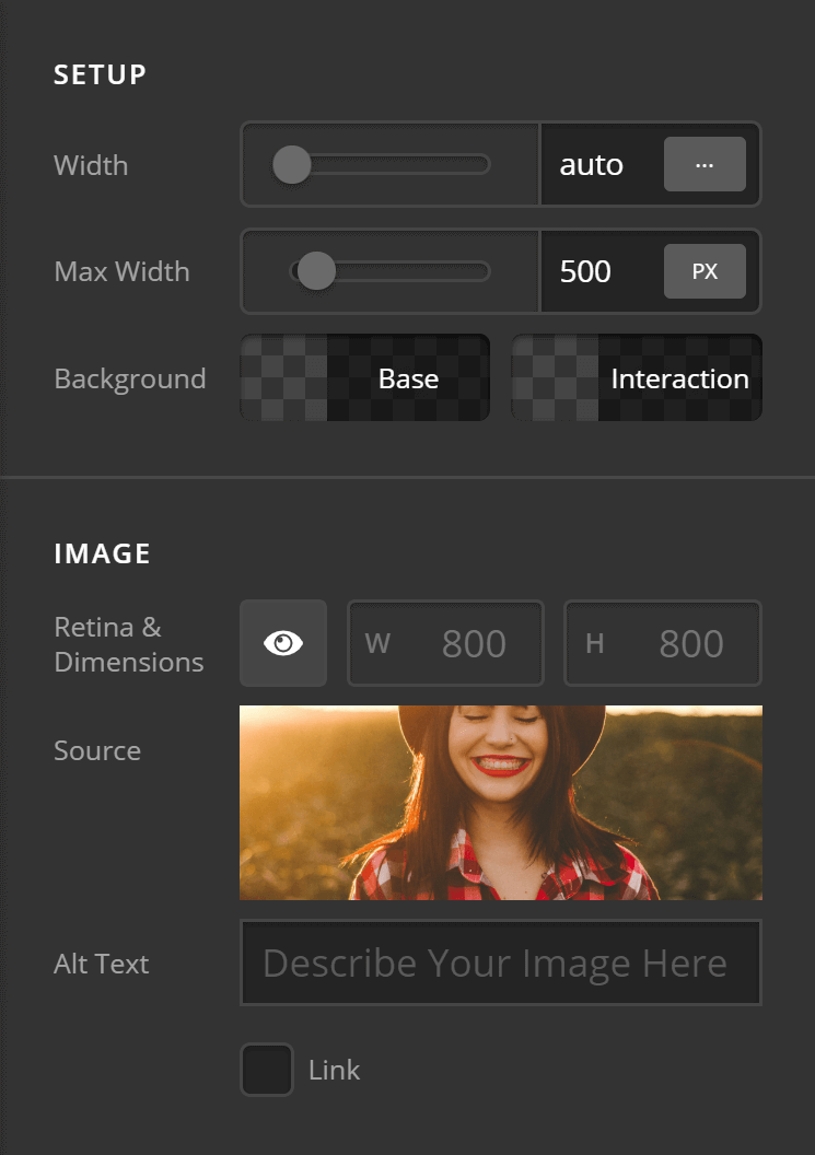
The Image controls consist of:
- Type - Standard or scaling. This effects which options display.If you select the standard option you'll see all controls and modifications. If you select scaling you'll see less options but your image would then be responsive. Depending on the specific use case you may want to have a standard image, hide that on mobiles and then use a scaling image for example.
- Retina & Dimensions - Retina support is enabled out the box. Click the Eye to disable the Retina support. Also supports options to set the width and height of the image.
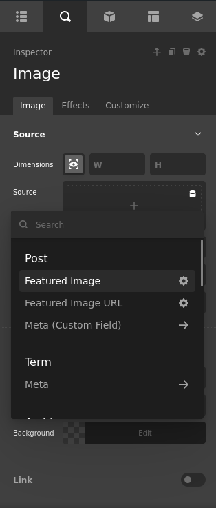
- Source - The image to be used. Click to select an image from the WordPress media library or upload a new one.
- Link - When checked you'll see an additional set of controls called Link to setup your link options. We'll discuss this under the "Image Link Settings" heading below.
- Alt Text - The alternative text for your image. Make sure to set this for screen readers!
Image Design Settings
Let's go through the image design settings step by step...
Margin
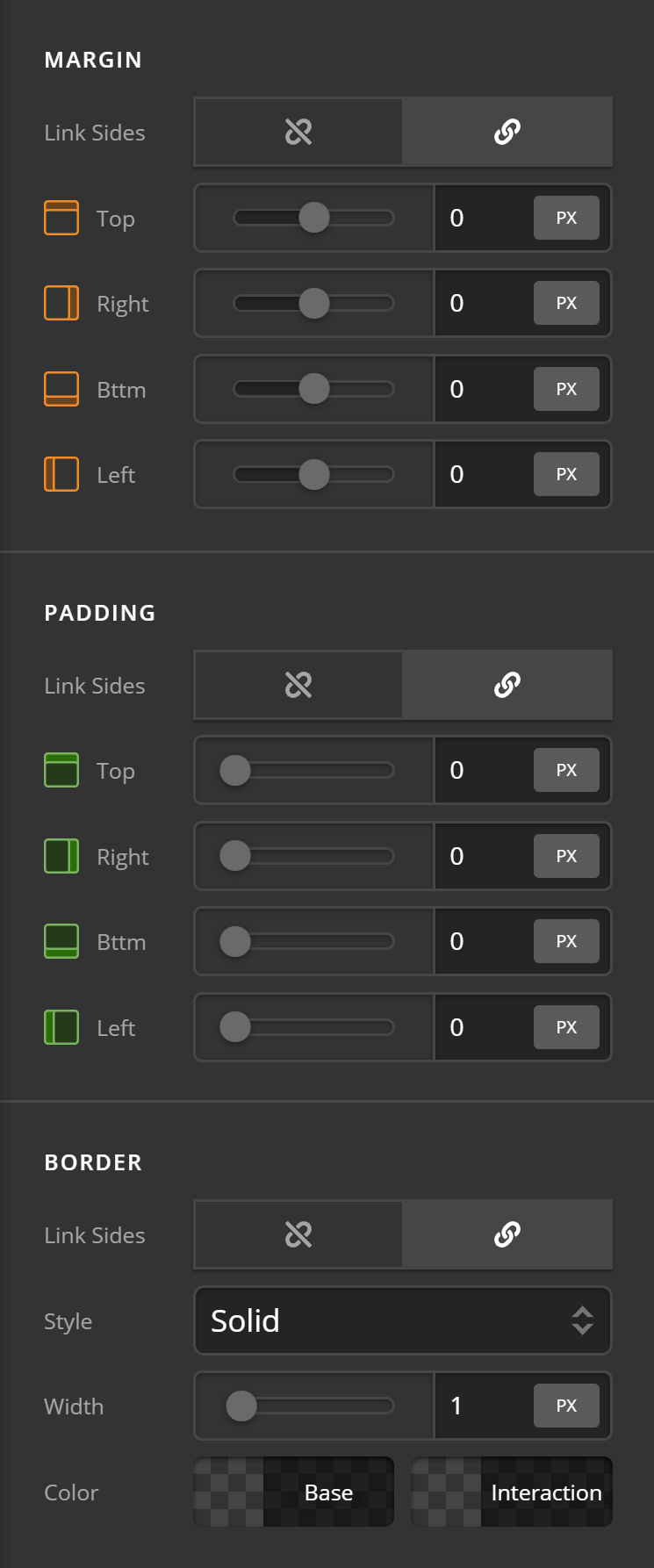
The Margin layout controls consist of:
- Link Sides - Link sides allows you to link up every option within the margin controls so when you change one value all values change. Or you can unlink sides and set each margin option individually.
- Top - Sets the top margin.
- Right - Sets the right hand side margin.
- Bttm - Sets the bottom margin
- Left - Sets the left hand side margin.
Padding
The Padding controls consist of:
- Link Sides - Link sides allows you to link up every option within the padding controls so when you change one value all values change. Or you can unlink sides and set each padding option individually.
- Top - Sets the top margin.
- Right - Sets the right margin.
- Bttm - Sets the bottom margin.
- Left - Sets the Left margin.
Border
The Border controls consist of:
- Link Sides - Allows you to link up the border control for all sides or unlink sides to control each border side individually.
- Style - Sets the style of the border such as dashed, dotted etc.
- Width - Sets the width of the border in pixels by default. Or click on PX to change the value to the units you'd like to use (EM, REM)
- Color - Sets the color of the border.
Outer Border Radius
The Outer Border Radius controls consist of:
- Link Sides - Link all sides of the border to control all border radius options at the same time, rather than configuring each value individually. If you unlink sides. You can set the border radius controls individually.
- Top Left - Set the top left radius of the border.
- Top Right - Set the top right radius of the border.
- Bttm Right - Set the bottom right radius of the border.
- Bttm Left - Set the bottom left radius of the border.
Note: You won't see any effect by changing the Outer Border Radius values unless you have already set your Border controls.
Inner Border Radius
The Inner Border Radius controls consist of:
- Link Sides - Link all sides of the border to control all border radius options at the same time, rather than configuring each value individually. If you unlink sides. You can set the border radius controls individually.
- Top Left - Set the top left radius of the border.
- Top Right - Set the top right radius of the border.
- Bttm Right - Set the bottom right radius of the border.
- Bttm Left - Set the bottom left radius of the border.
Do note that you won't see any effect by changing the Inner Border Radius values unless you have already set your Border controls.
Background
The Background controls consist of:
- Color Base - Sets the base color when the Element isn't being interacted with.
- Color Interaction - Sets the interaction color when the Element is being interacted with (on hover etc).
Box Shadow
The Box Shadow controls consist of:
- X-Offset - Set the offset of the border shadow for the X axis.
- Y-Offset - Set the offset of the border shadow for the Y axis.
- Blur - Set the blur of the box shadow.
- Spread & Position - Set the spread and position of the box shadow.
- Color - Sets the color of the box shadow.
Aspect Ratio
See our dedicated doc on Aspect Ratio here.
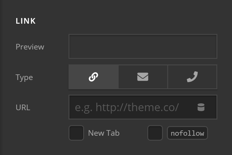
Image Link Settings
The Link controls consist of:
- Preview - Takes the value of the link provided in the URL input so you can see exactly what the link will look like within the image.
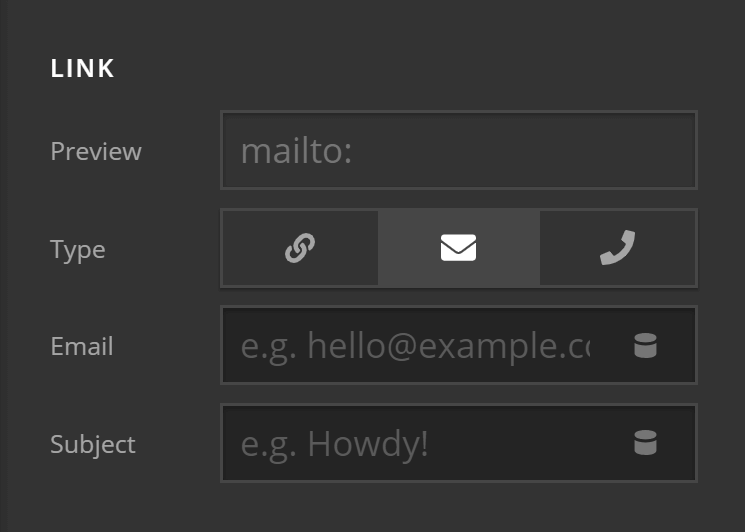
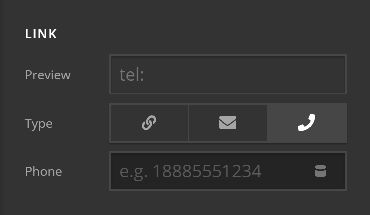
- Type - The type of link. It could either be a traditional link, a mailto link or a phone number link.
Here is a traditional link:
Here is a mailto link:
Here is a phone link:
- URL - The URL of the link that the image should point to.
- New Tab - Whether you want the link to open in a new tab.
- Nofollow - Whether the image should be a nofollow or not. Setting a nofollow means that the site you link to won't be considered by Google to be endorsed by you. It's normally advisable to check this if linking to an external site.
Customize
The Customize pane consists of various features that allow you to take further control over your Element's styling and functionality:
- ID – Sets an HTML ID on the Element.
- Class – Sets an HTML Class on the Element.
- Element CSS – Use this feature for increased stylistic control of your Element, especially over nested markup. Click here for more detailed information on this feature, such as using
$elto dynamically target the base tag, et cetera. - Hide During Breakpoints – Hides the Element at different screen sizes when design alterations are needed. Click here for more information.
- Conditions – Adds / removes Elements from the page when certain criteria are met (e.g. “If a featured image is set...”). Click here for more information.
- Custom Attributes – Use this option to add custom HTML attributes to the root tag of the Element (e.g.
data-info="123"). This can be particularly helpful when integrating with various scripts and libraries.
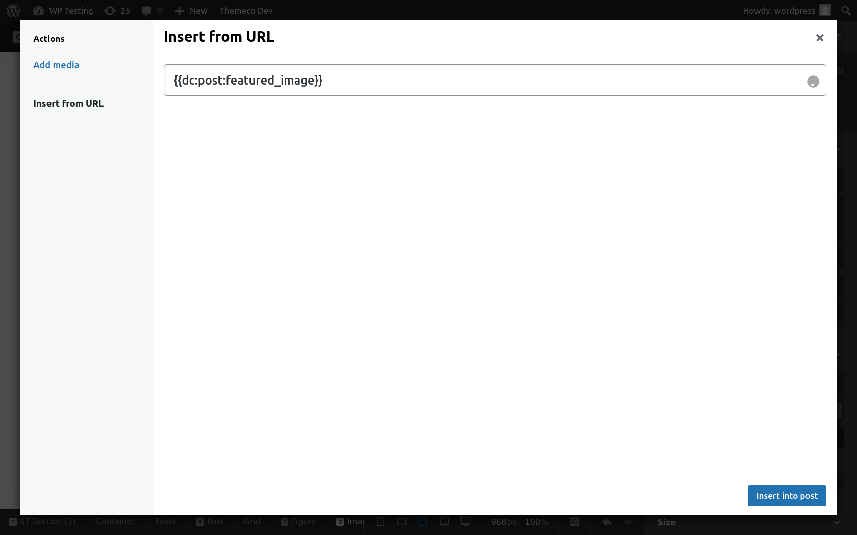
With Dynamic Content
To insert an image URL with dynamic content. You can either open the the WordPress media editor and add your dynamic content in the section that says "Insert From URL" and then press "Insert into Post" button (See the image). Or with Dynamic Content enabled use the dropdown on the top right.
Demo
To see a live demo of the Image Element click here.
Placeholder Images
Not only can you build out beautiful images in WordPress thanks to Cornerstone, we even have a way to create custom placeholder images without having to leave the builder and with no plugins needed!
Summary
Let's do a recap:
- First, we've learned how to add the Image Element.
- Then we discussed its basic setup which includes it's width and max width.
- Thirdly, we discussed the design settings including margin, padding, border, border radius and box shadow.
- And lastly, we discussed how to make the image linkable and the different types of links available.
See something inaccurate? Let us know