Icon
In this article, we're going to discuss the Icon Element and its settings.
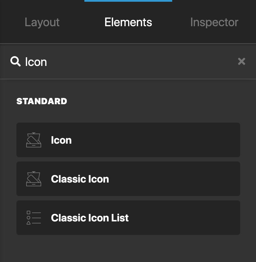
The Icon Element adds an icon on the page. To add the Icon Element, simply search for "Icon" and drag "Icon" to the canvas.
Setup
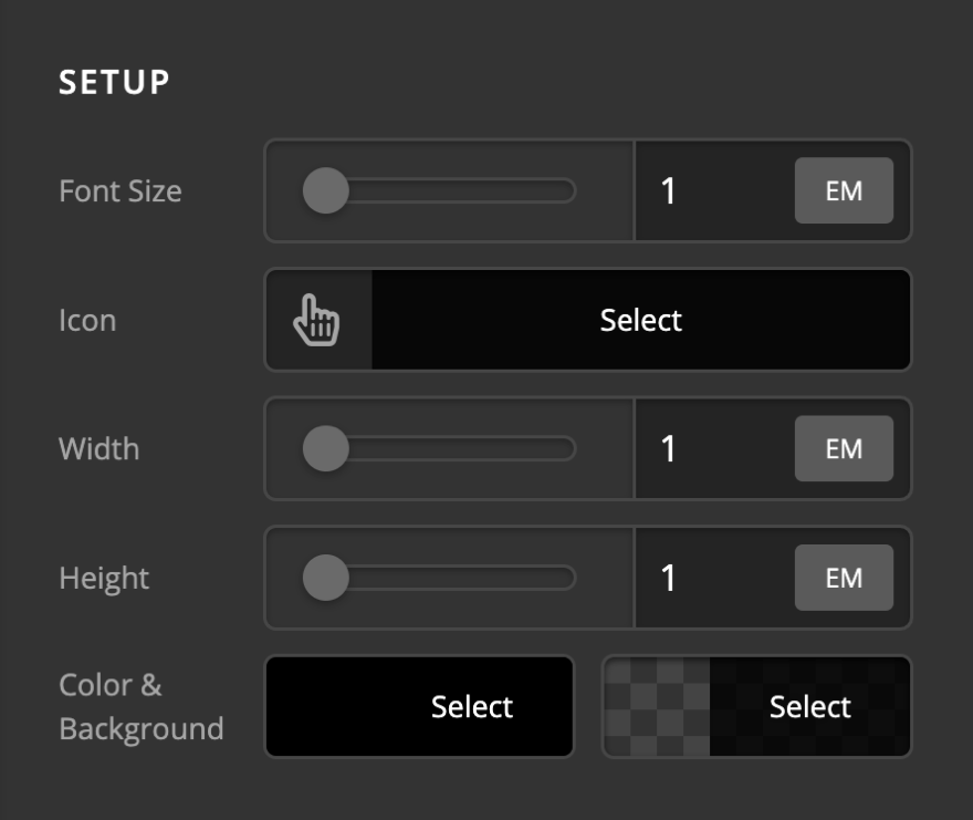
The Setup section contains controls for the initial setup of the icon.
- Font Size - Use this option to set the base font of the icon.
- Source - Choose between Font Awesome, Raw, or Media as the icon source. Selecting Raw replaces the icon picker with an SVG textarea, allowing you to paste custom SVG markup directly. Selecting Media lets you pick an SVG from the WordPress Media Library.
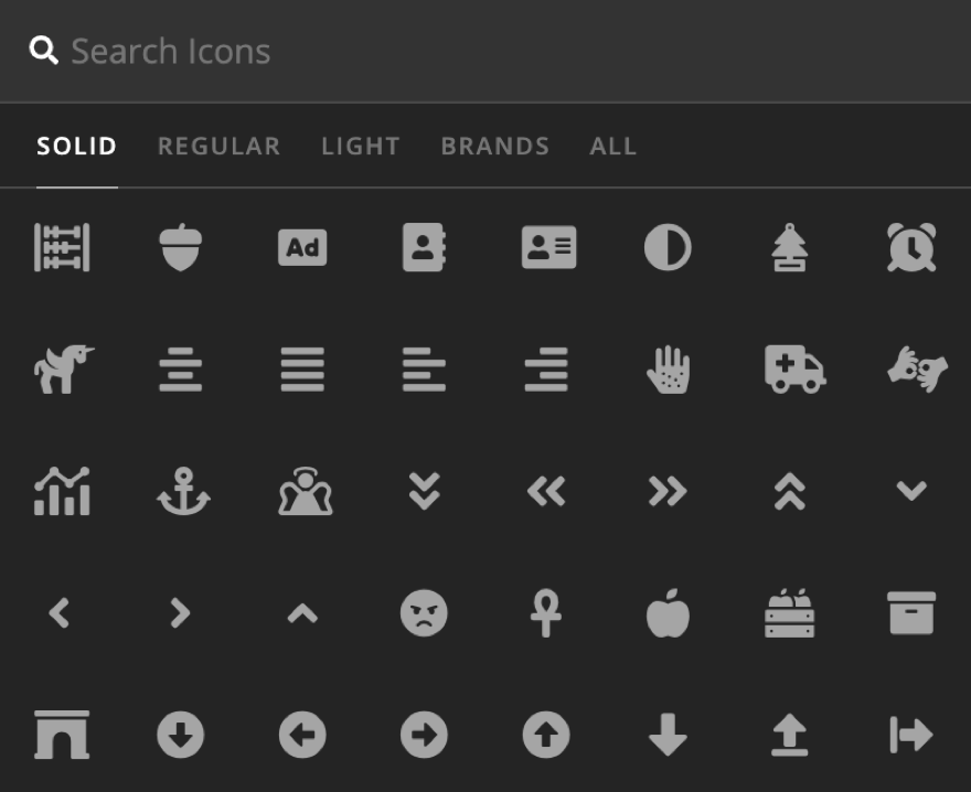
- Icon - (Font Awesome source only) Use this option to select the icon. Clicking this option will open up the icon selection dialog.
- SVG - (Raw source only) Paste your SVG markup here to render a custom SVG icon.
- SVG - (Media source only) Select an SVG file from the WordPress Media Library. The media picker is filtered to
.svgfiles, and the file's markup is inlined into the page so it inherits the same color, sizing, and Design Options as any other icon. Note that WordPress does not allow SVG uploads by default, so your site must already permit SVGs in the Media Library for the file to be available here. - Width - Use this options to set the width of the icon.
- Height - Use this options to set the height of the icon.
- Color & Background - Use this option to set the main icon color and background of the icon.
- Type -
@since CS 7.4.0(Font Awesome source only) Use SVG or Webfont Icon load type.
Design Options
Under the Design settings, you have options to set the margin, border, box-shadow, border-radius, text-shadow of the Icon.
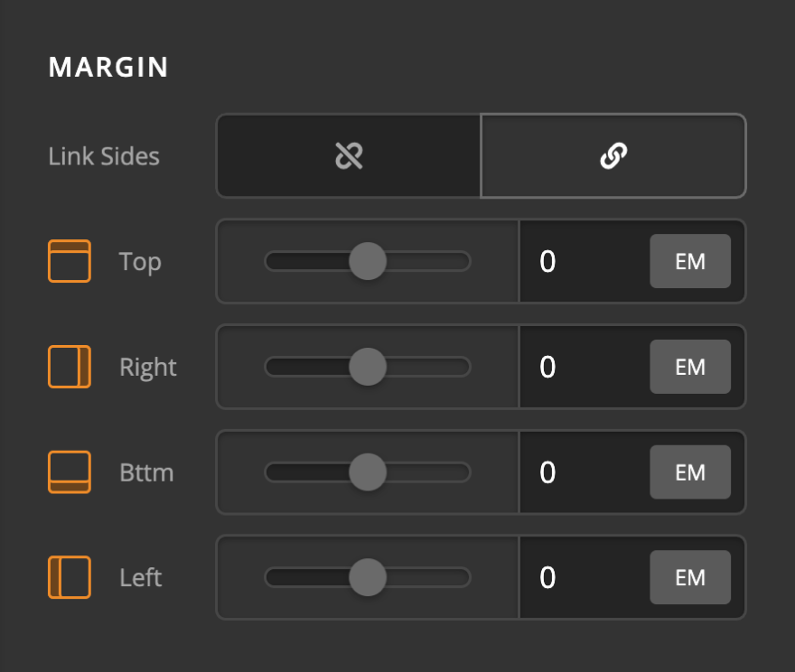
Margin
Use this option to set the margin of the Icon. You can change the settings for all the sides of the Icon or modify them individually.
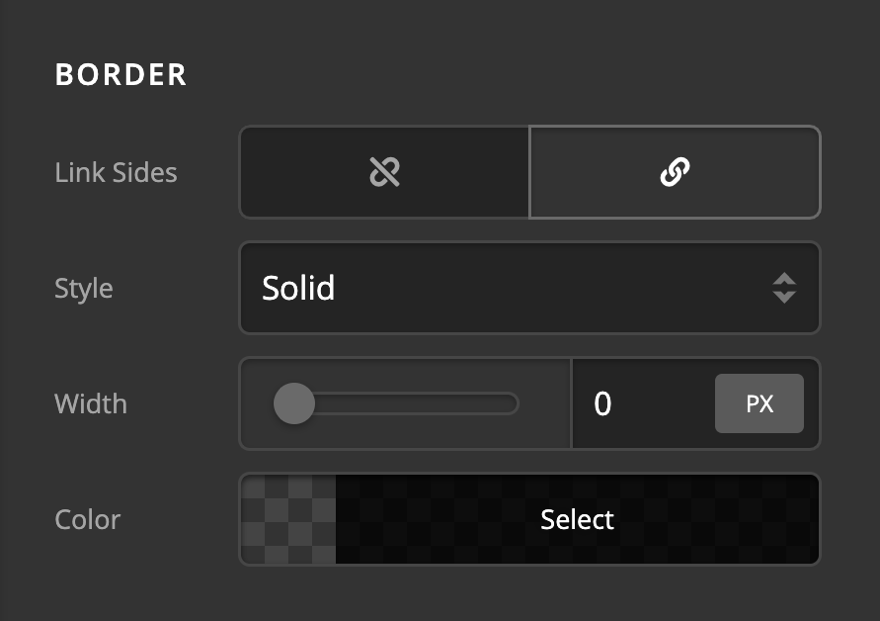
Border
Use this option to set the border of the Icon. You can set the style, width and color of the border on all sides or each side individually.
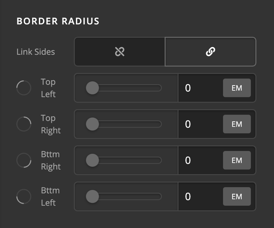
Border Radius
Use this option to set a border-radius for the Icon. You can set the curve on all sides or set them individually.
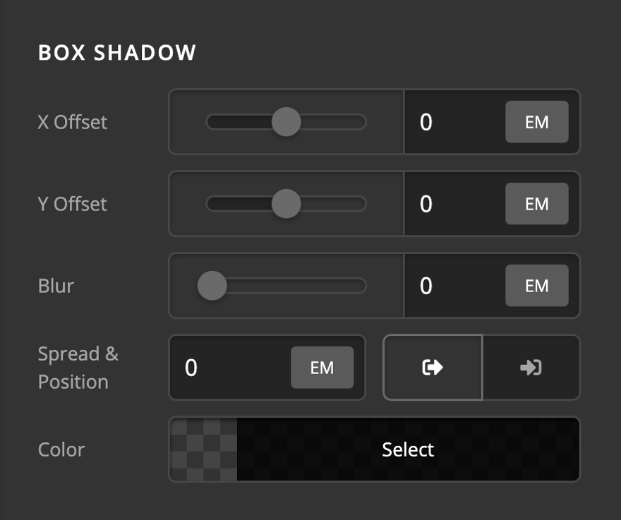
Box Shadow
You can set a shadow over the Icon using the box-shadow control group.
- X-Offset - Use this option to set the X offset of the shadow in the Icon.
- Y-Offset - Use this option to set the Y offset of the shadow in the Icon.
- Blur - Use this option to set the intensity of the blur effect in the Icon.
- Spread & Position - Use this option to set the spread amount of the items section shadow and decide if you want the shadow to sit inside or outside of the Icon.
- Color - Use this option to set the color of the Icon shadow.
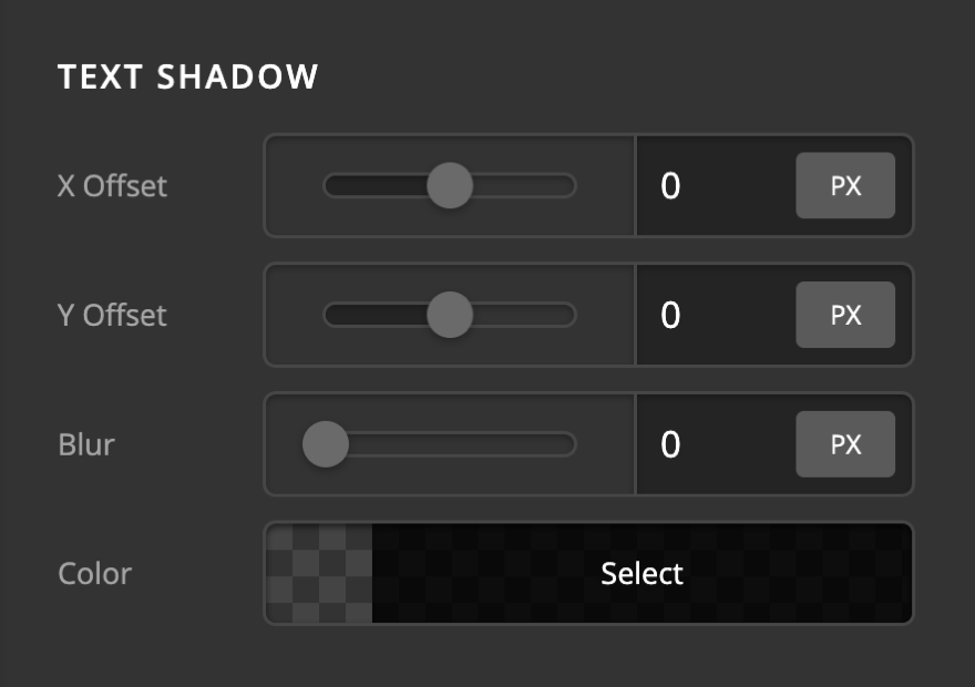
Text Shadow
The text-shadow control group contains settings to set a text-shadow for the Icon text.
- X-Offset - Use this option to set the X offset of the text-shadow.
- Y-Offset - Use this option to set the Y offset of the text-shadow.
- Blur - Use this option to set the intensity of the blur effect in the text-shadow.
- Color - Use this option to set the color of the text-shadow.
Customize
The Customize pane consists of various features that allow you to take further control over your Element's styling and functionality:
- ID – Sets an HTML ID on the Element.
- Class – Sets an HTML Class on the Element.
- Element CSS – Use this feature for increased stylistic control of your Element, especially over nested markup. Click here for more detailed information on this feature, such as using
$elto dynamically target the base tag, et cetera. - Hide During Breakpoints – Hides the Element at different screen sizes when design alterations are needed. Click here for more information.
- Conditions – Adds / removes Elements from the page when certain criteria are met (e.g. “If a featured image is set...”). Click here for more information.
- Custom Attributes – Use this option to add custom HTML attributes to the root tag of the Element (e.g.
data-info="123"). This can be particularly helpful when integrating with various scripts and libraries.
Demo
To see a live demo of the Icon Element click here.
Summary
To sum up, we've discussed the Icon Element. We've discussed that an Icon Element is an easy tool for adding icons on a page and we've learned how to change it's content and design and delved into details of the Icon Element settings.
See something inaccurate? Let us know