Headline
In this article, we're going show you how to add and configure the Headline Element. Headlines are essential parts of a web-page. They're the first points of entry for grabbing attention of visitors, so let's get started!

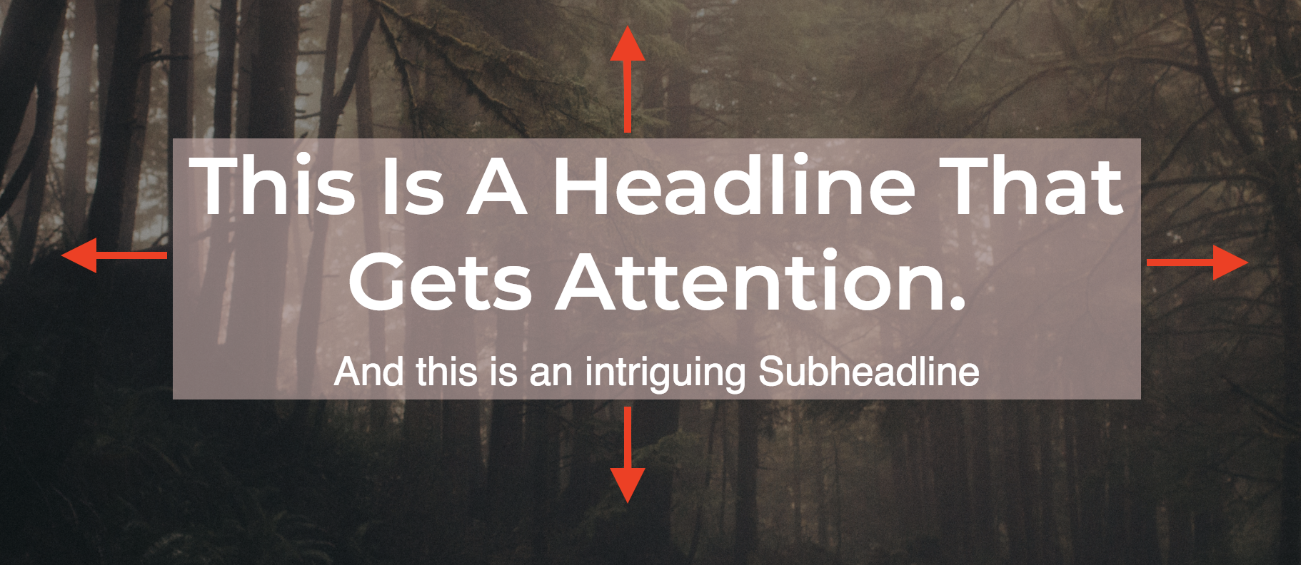
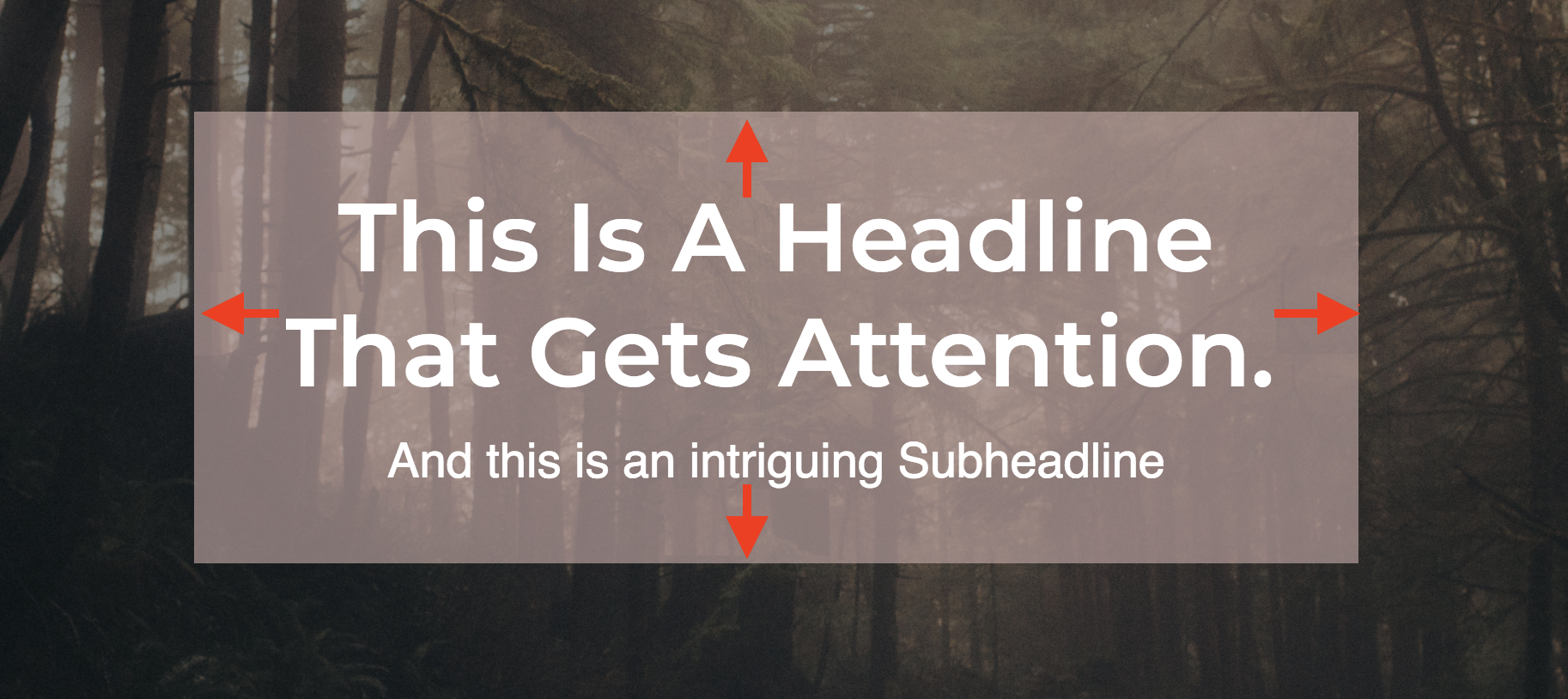
Take a look at the screenshot above. It shows a typical look for a homepage. Other than the beautiful background image, the Element that gets the attention of the visitors are both the headline and sub-headlines.
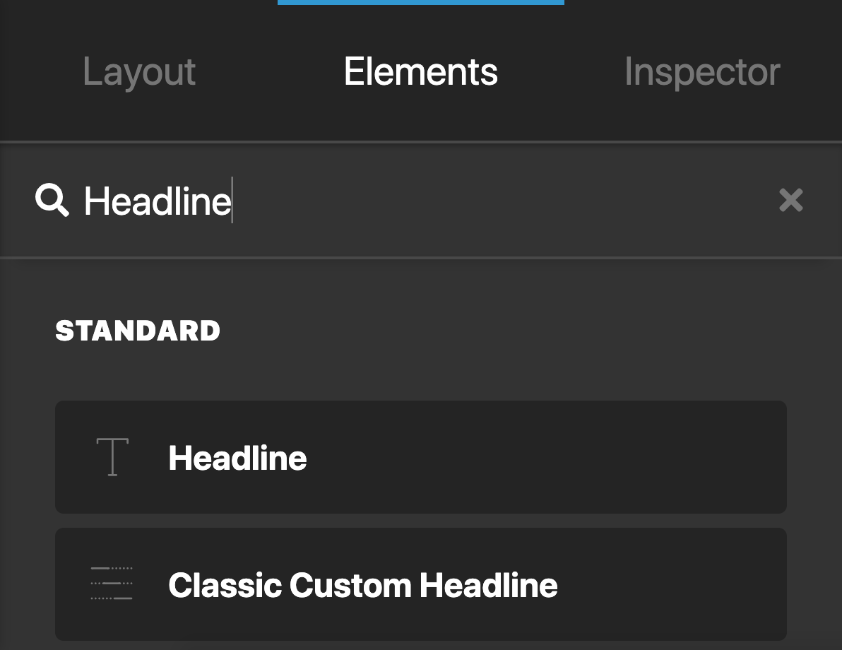
Using the Headline Element, you can easily add the headline and sub-headlines and designing both according to how you want them to look. To add the Headline Element, search for "headline" and drag "Headline" to the canvas.
Headline Setup
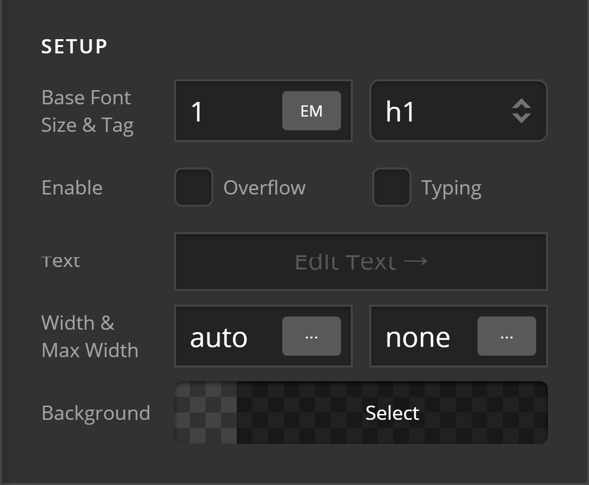
- Base Font Size & Tag - Base Font Size is the size of the headline and Tag is the HTML tag given to the heading.
H1is usually the main heading of the page and then subsequent sections use others based on their importance, usingH2,H3and so on. Enable
- Overflow - If checked, whenever the headline goes beyond the width of the width of the screen, instead of moving it to the next line, it will add cut the text and add ellipsis at the end. Leaving it unchecked automatically moves the extra texts of the headline to the next line.
- Typing - If checked, it will add a typing effect to the headline. More on this later on the Text Typing Content Settings and Text Typing Setup sections.
Text is where you put the actual text for your headline.
- Width & Max Width - Lets you set the width and the maximum width of the headline.
- Background is where you set the background color of the headline if you want it to have one.
Text Typing Content Settings
If you have checked the Typing checkbox on the Enable option, this additional setting will appear right below the Setup control group. Let's go over each setting.
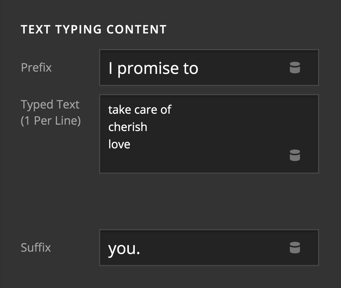
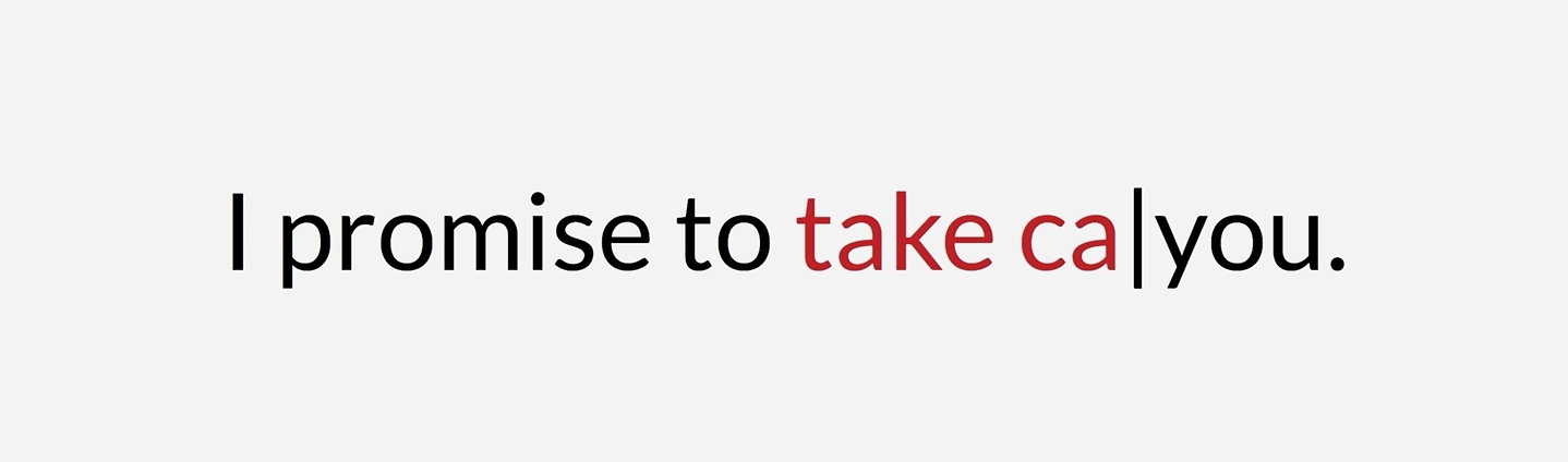
- Prefix - This part of the headline doesn't change. This appears before the changing text.
- Typed Text - This is where you enter the words that will change.
- Suffix - The text that appears after the changing words. This, like the prefix, also does not change.
Text Typing Setup
Just like the Text Typing Content control group, this one also appears when the Typing option is enabled.
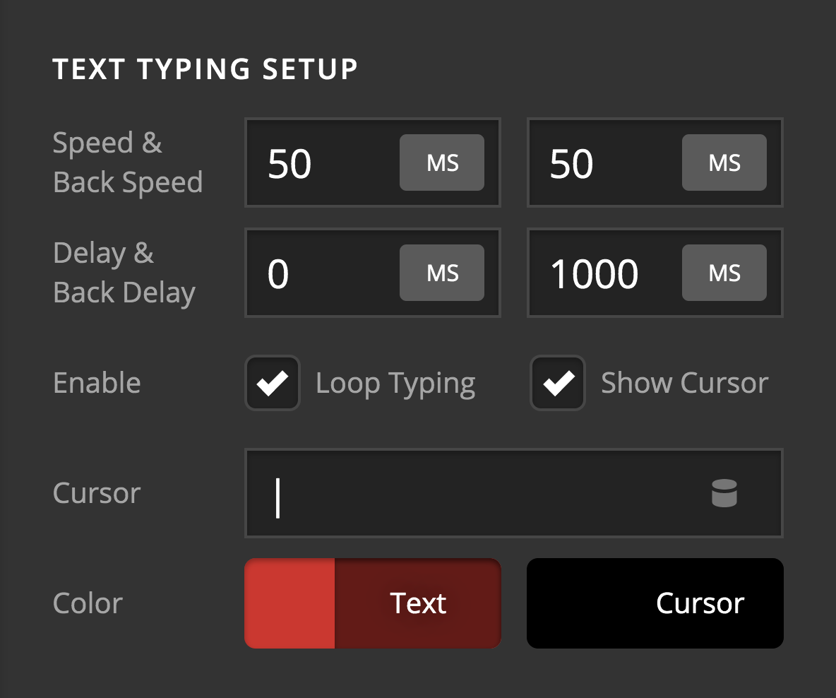
- Speed & Back Speed - Speed refers to the speed at which each character is typed into the screen. Back Speed refers to the speed at which each character is deleted.
- Delay & Back Delay - Delay refers to the time gap before the first character gets typed. Back Delay refers to the time gap before the last character gets deleted.
- Enable
- Loop Typing - If you enable this option, the typing will replay virtually non-stop after it is finished with the last word.
- Show Cursor - If enabled, a blinking cursor will be displayed.
- Cursor - This option only appears if Show Cursor is enabled. This option allows you to type what character you want to display as the cursor.
- Color - This is where you set the color of the changing (typing) texts.
Headline Design Settings
The design options include control groups to fine-tune the spacing and border of the headline.
Text Content Flex
You can use the Flex Layout principals to change the position and layout of the Headline Element text.

- Layout - This option defines the direction of the children meaning they can either be positioned side by side or under each other.
- Row
- Column
- Reverse Layout - If you want to reverse the order of the children then make sure to check this option. Basically, imagine this like using a mirror.
- Wrap Children - By default Flexbox will try to keep the Elements on a row or column so wrapping children is a good way if you want to prevent this from happening.
- Horizontal - Depending on your Layout settings you can define how the children are orientated.
- Start - Positions the boxes in the beginning.
- Center - Positions the boxes centered.
- End - Positions the boxes at the end.
- Space Between - Adds space between the boxes.
- Space Around - Adds space around the boxes.
- Vertical
- Start - Positions the boxes in the beginning.
- Center - Positions the boxes centered.
- End - Positions the boxes at the end.
- Stretch - Stretched the boxes out evenly.
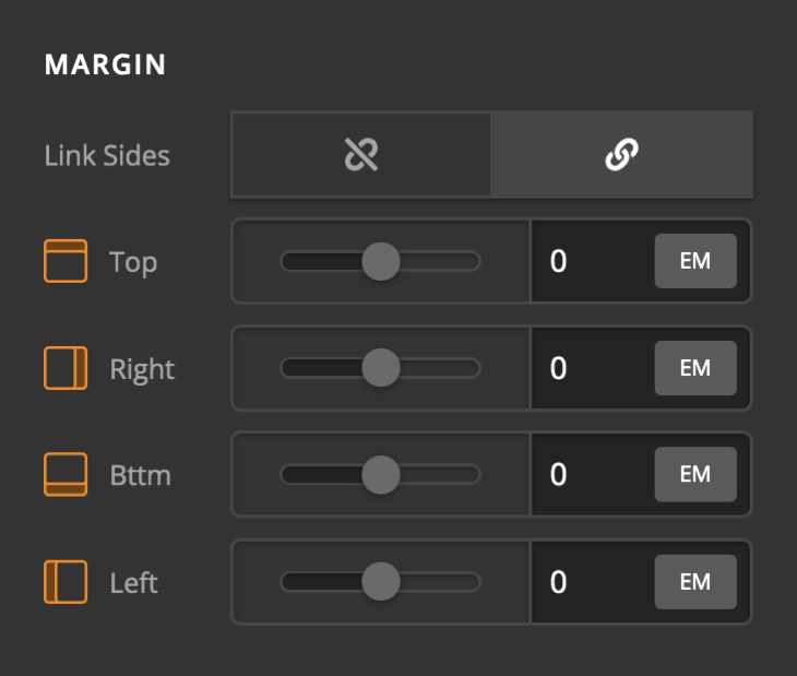
Margin
Sets the margin of the Headline Element. Margins are used to create space around Elements, outside of any defined borders.
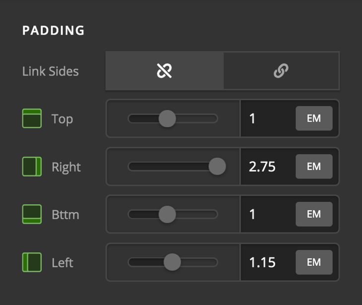
Padding
Paddings are used to create space around an Element's content, inside of any defined borders.
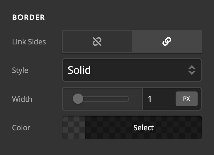
Border
Allows you to set the style, width, and color of the border of the headline.
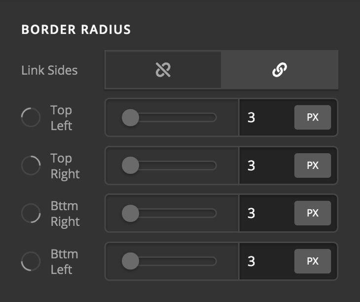
Border Radius
Sets the radius / curves of the Element's corners. You won't see any effect by changing the Border Radius values unless you have already set your Border controls.
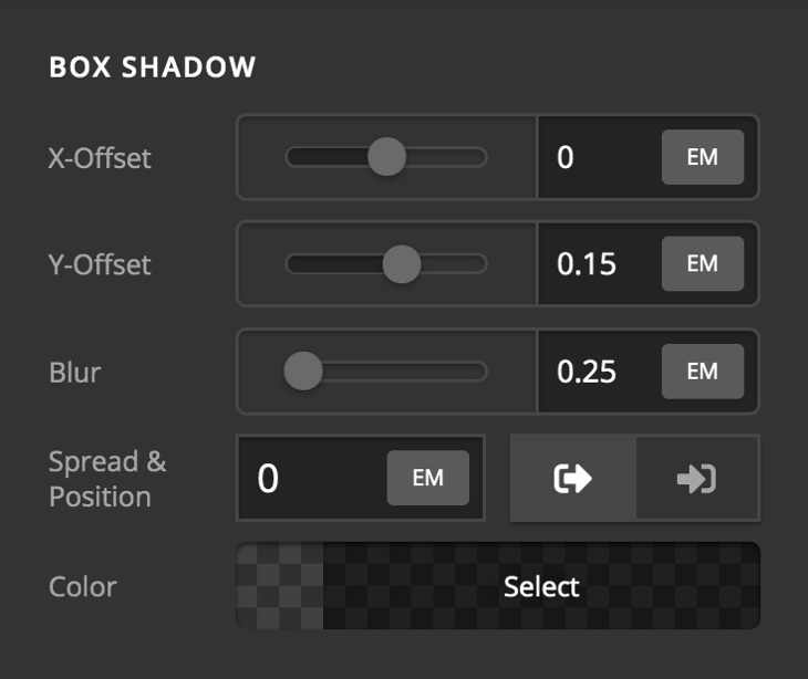
Box Shadow
Is used to add shadow effects around the Headline Element's frame.
Headline Text Settings
The Text Settings allow you to set your headline's distance, font family, font weight, size, style, add shadows and so much more. Do note that these only affect the Headline and doesn't apply to the subheadline. The latter has its own set of options which we'll discuss later.
Text Content Margin
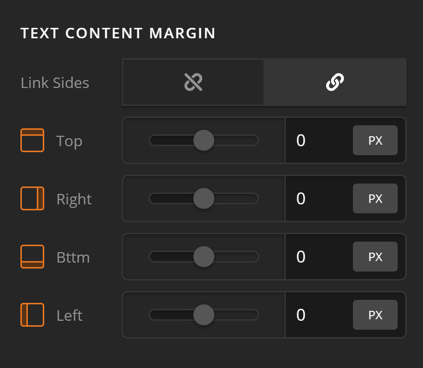
In the screenshot above, you'll notice that it says Text Content Margin. It is different from Margin. To illustrate the difference between the two, I'll add a background to our Headline Element to show a box.
Margin is applied outside the box. The entire box is the entire Headline Element.
While Text Content Margin is the margin from the actual texts relative to the box.
In some sense, Text Content Margin behaves similarly to Padding in this case.
Text Format
You can use this control group to set the format of the text in the headline.
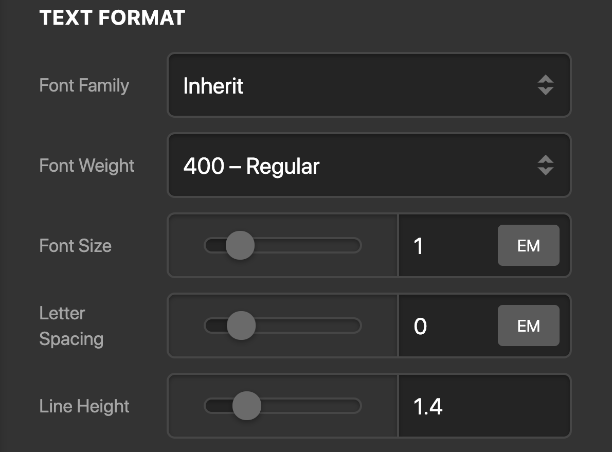
- Font Family - Use this option to set the font of the headline content.
- Font Weight - Use this option to set the weight or thickness of the font. The values may differ depending on the selection of the font and if the select font supports weights or not.
- Font Size - Use this option to set the size of the font.
- Letter Spacing - Use this option to set the spacing between letters.
- Line Height - Use this option to set the spacing between each line.
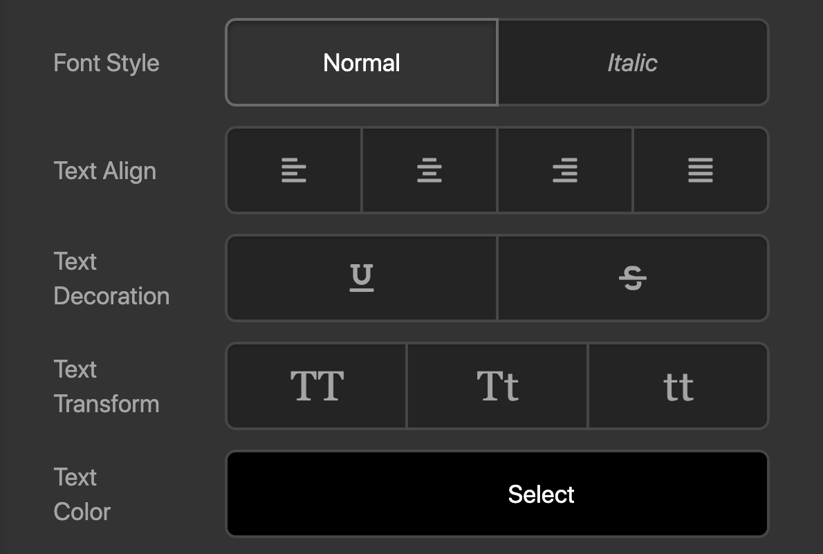
- Font Style - Use this option to decide if you want to have a normal or italic style.
- Text Align - Use this option to set the alignment of the text. Possible values are left, center, right, and justify.
- Text Decoration - Use this option to force an underline or linethrough style.
- Text Transform - Use this option to set the case of the text. Available options are uppercase, camel case, and lowercase.
- Text Color - Use this option to set the color of the text.
Text Shadow
The text-shadow control group contains settings to set a text shadow for the headline content.
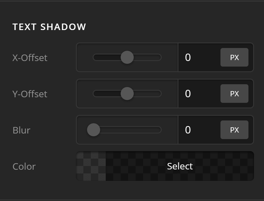
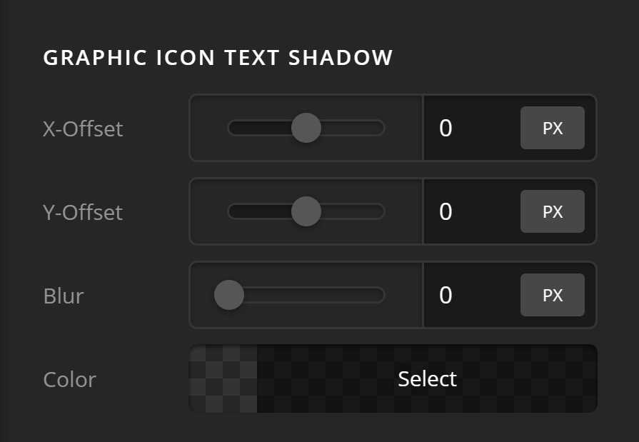
- X-Offset - Use this option to set the X offset of the text shadow.
- Y-Offset - Use this option to set the Y offset of the text shadow.
- Blur - Use this option to set the intensity of the blur effect in the text shadow.
- Color - Use this option to set the color of the text shadow.
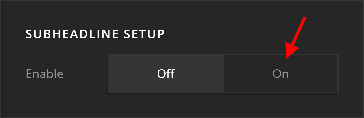
Subheadline Settings
Adding a Subheadline is optional. If you want to add a subheadline, simply select On for the Enable option.
Once you enable that, an additional set of text settings will display similar to the text settings for the headline. However, this time, it's for the Sub-headline.
Subheadline Setup
When subheadline is enabled, you'll see these additional options.
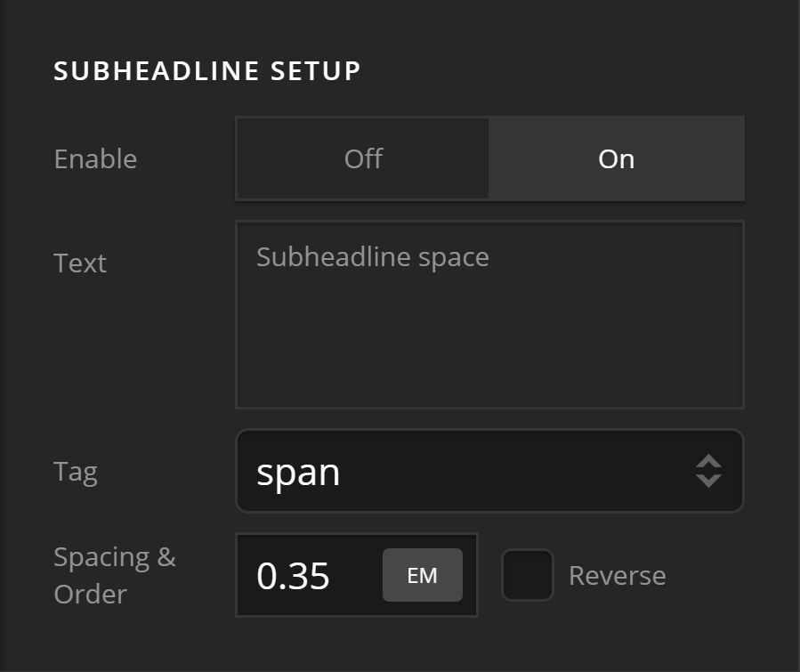
- Text - The actual content of the subheadline.
- Tag - Choose what HTML tag you'll want to use for the subheadline.
- Spacing & Order - Spacing refers to the space between the headline and subheadline. As for Order you can choose to check the Reverse checkbox. Doing so reverses the order of the headline and subheadline. Usually, it means the subheadline will show first before the headline.
Subheadline Text Format
You can use this control group to set the format of the text in the subheadline.
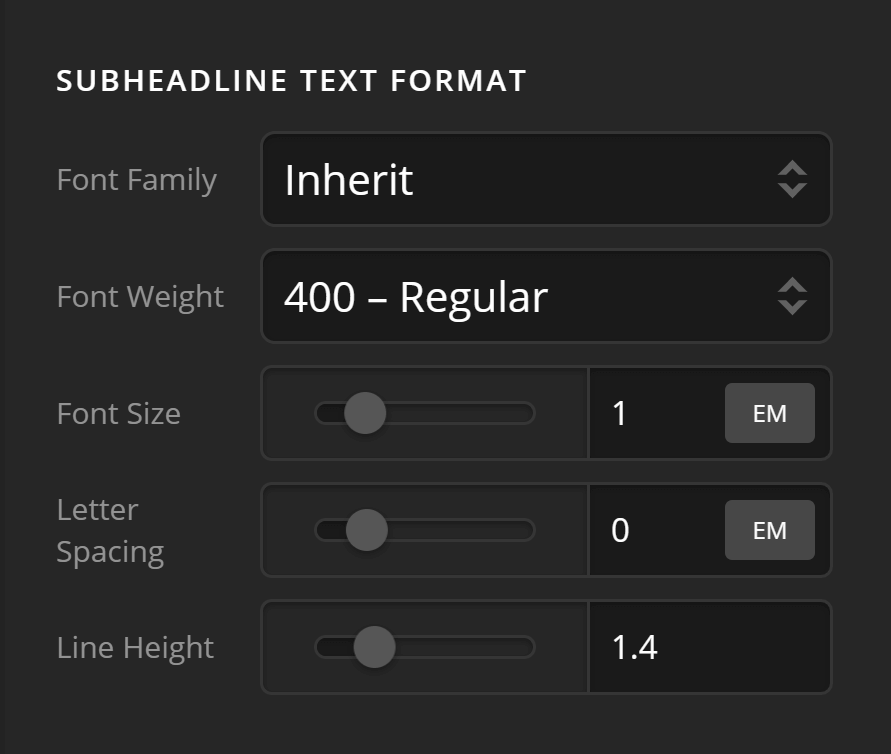
- Font Family - Use this option to set the font of the subheadline content.
- Font Weight - Use this option to set the weight or thickness of the font. The values may differ depending on the selection of the font and if the select font supports weights or not.
- Font Size - Use this option to set the size of the font.
- Letter Spacing - Use this option to set the spacing between letters.
- Line Height - Use this option to set the spacing between each line.
Subheadline Text Style
You can use this control group to set the style of the text in the subheadline.
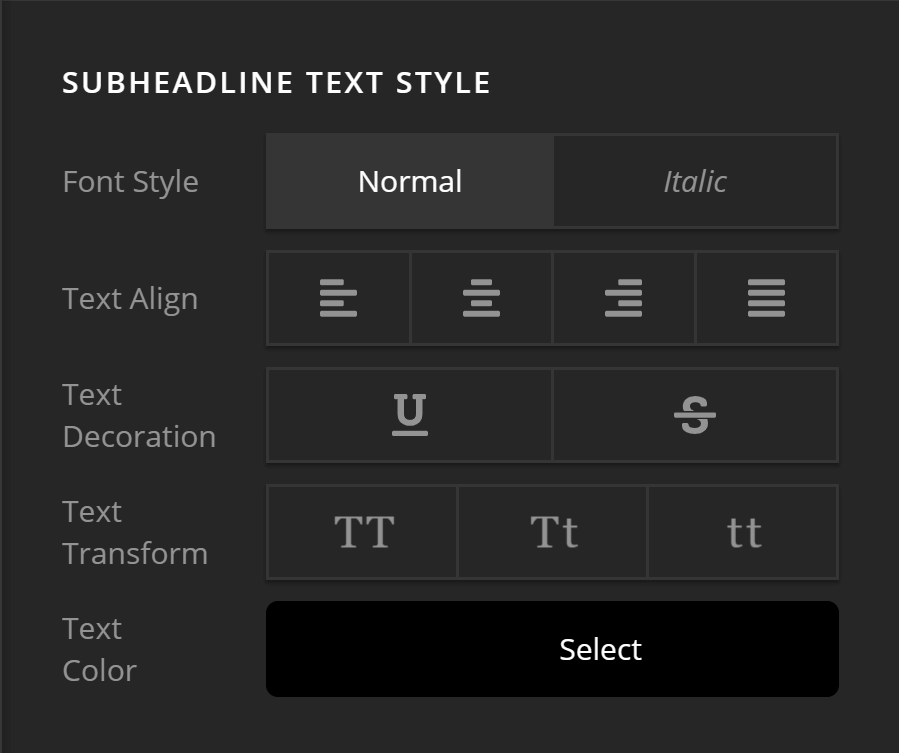
- Font Style - Use this option to decide if you want to have a normal or italic style.
- Text Align - Use this option to set the alignment of the text. Possible values are left, center, right, and justify.
- Text Decoration - Use this option to force an underline or linethrough style.
- Text Transform - Use this option to set the case of the text. Available options are uppercase, camel case, and lowercase.
- Text Color - Use this option to set the color of the text.
Subheadline Text Shadow
The text-shadow control group contains settings to set a text shadow for the subheadline content.
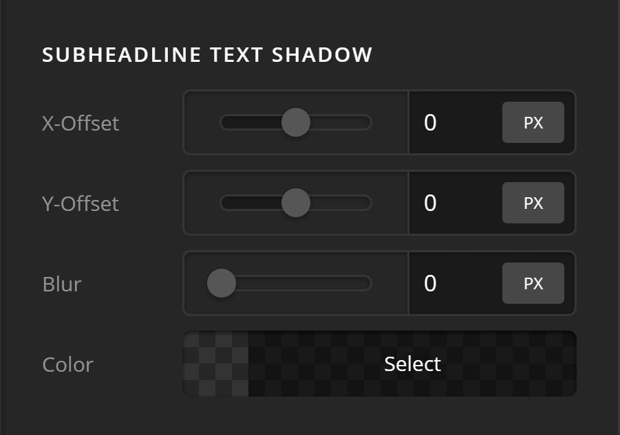
- X-Offset - Use this option to set the X offset of the text shadow.
- Y-Offset - Use this option to set the Y offset of the text shadow.
- Blur - Use this option to set the intensity of the blur effect in the text shadow.
- Color - Use this option to set the color of the text shadow.
Headline Graphics Settings
You can add a graphic like this to your headline.

To add that, make sure to enable the graphic option.
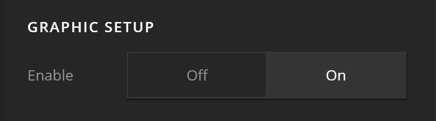
Graphic Setup
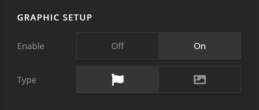
- Enable - already discussed earlier, you have the option to turn it On or Off. .
- Type - You can choose either an Icon (the default) or an Image.
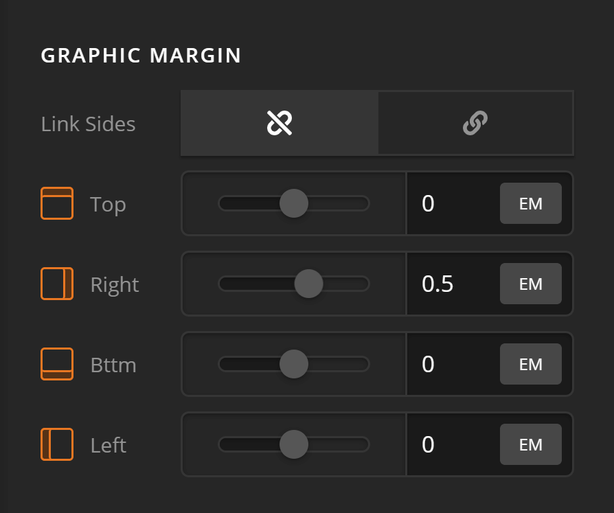
Graphic Margin
Sets the margin of the graphic of the Headline Element. Graphic Margins are used to create space around Elements, outside of any defined borders.
Graphic Icon
If you've selected Icon as the Type under Graphic Setup, the Graphic Icon settings will be displayed. It has the following controls:
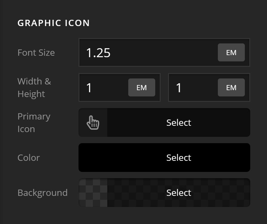
- Font Size - As the name suggests, lets you set the size of the font of the icon.
- Width & Height - sets the dimensions of the icon.
- Primary Icon - The icon to be displayed.
- Color - The color of the icon.
- Background - The background color of the icon.
Now, when you're using the Icon type, there are other options available that let you design your icon further. They are the following:
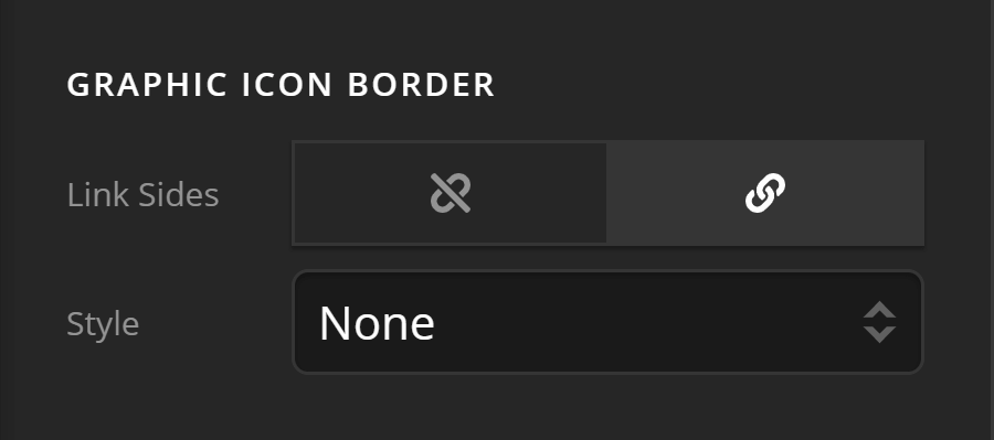
Graphic Icon Border
Lets you set the border of the icon.
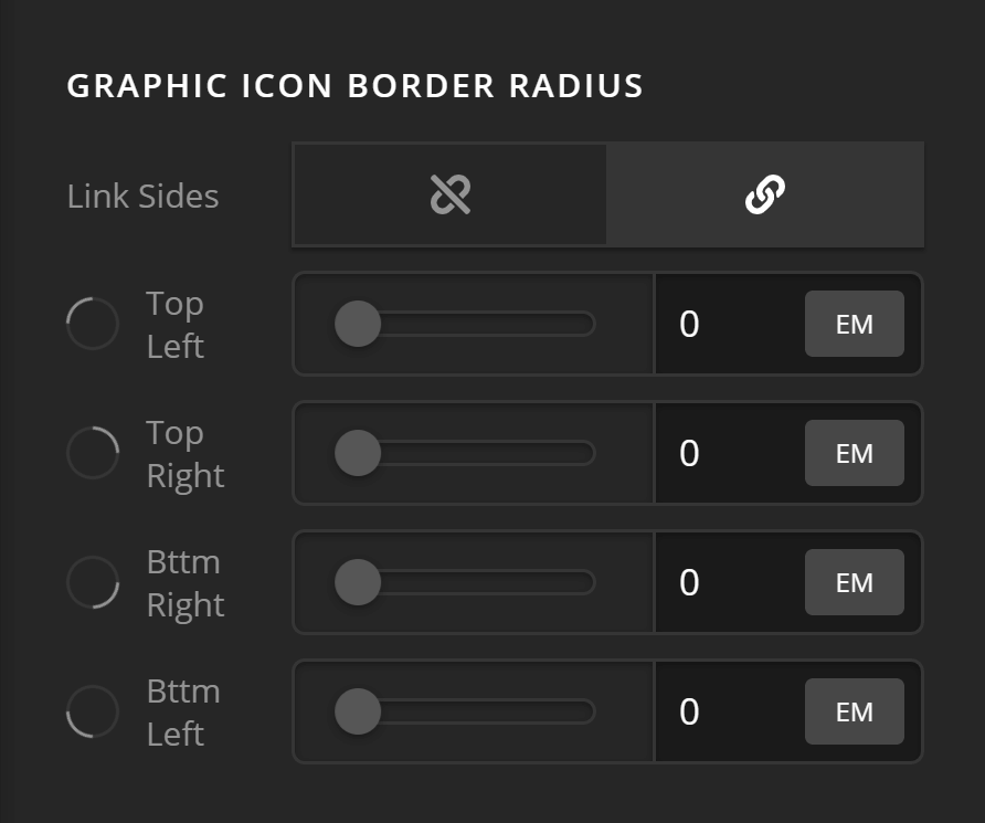
Graphic Icon Border Radius
Lets you set the border radius (the curve on the for angles) of the icon.
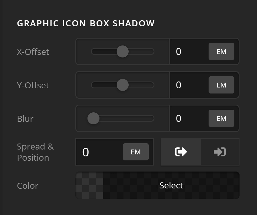
Graphic Icon Box Shadow
Lets you set the shadow of the box that contains the actual icon.
Graphic Icon Text Shadow
Lets you set the shadow of the icon itself.
When Image is the selected type, you'll be able to see the following settings:
Graphic Image
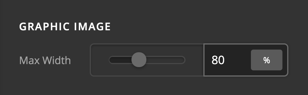
- Max Width - Allows you to set the maximum width of the image.
Primary Graphic Image
Under Primary Graphic Image, you have the following controls:
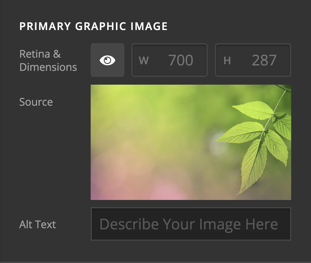
- Retina & Dimensions - Retina support is enabled out the box. Click the Eye to disable the Retina support. Also supports options to set the width and height of the image.
- Source - The image to be used. Click to select an image from the WordPress media library or upload a new one.
- Alt Text - This is the value that will appear on the alt HTML attribute of the image Element.
Customize
The Customize pane consists of various features that allow you to take further control over your Element's styling and functionality:
- ID – Sets an HTML ID on the Element.
- Class – Sets an HTML Class on the Element.
- Element CSS – Use this feature for increased stylistic control of your Element, especially over nested markup. Click here for more detailed information on this feature, such as using
$elto dynamically target the base tag, et cetera. - Hide During Breakpoints – Hides the Element at different screen sizes when design alterations are needed. Click here for more information.
- Conditions – Adds / removes Elements from the page when certain criteria are met (e.g. “If a featured image is set...”). Click here for more information.
- Custom Attributes – Use this option to add custom HTML attributes to the root tag of the Element (e.g.
data-info="123"). This can be particularly helpful when integrating with various scripts and libraries.
Demo
To see a live demo of the Headline Element click here.
Summary
Let's do a recap of what we've discussed in this article:
- First, we discussed how to add the Headline Element.
- Then we discussed its basic settings under the Setup controls that includes setting up the heading to use, the text content of the headline, width and optional background.
- Next we discussed its design settings that including padding, margin, box shadow and borders.
- After that we went over to configuring the headline's text settings that include the site of the font, its color, its thickness, style and various spacings.
- We also discussed how to add graphics to our headlines.
- Lastly, we learned how to add and configure a subheadline below our headline.
With all these, now you can confidently create beautiful headlines throughout your website.
See something inaccurate? Let us know