Creative CTA
In this article, we're going to discuss the Creative CTA Element — great for calls to action across your website.
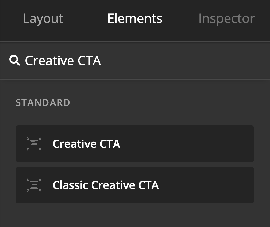
The Creative CTA Element adds a call to action on the page. To add the Creative CTA Element, simply search for "Creative CTA" and drag "Creative CTA" to the canvas.
CTA stands for Call to Action.

Setup
The setup control group contains the option to set up the Creative CTA Element initially.
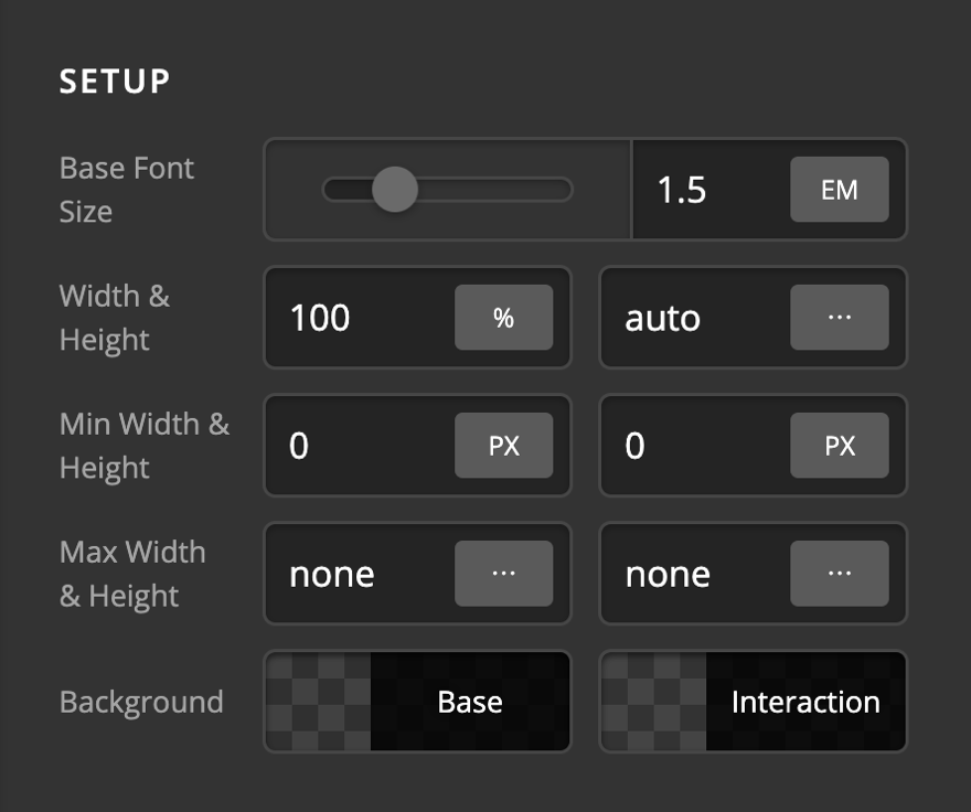
- Base Font Size - Use this option to set the base font of the Element.
- Width & Height - Use these options to set the width and height of the Element.
- Min Width & Height - Use these options to set the minimum width and height of the Element.
- Background - Use this option to set the background of the Element in normal and hover mode.
Link
The Link Setup consists of necessary controls to have an anchor on the Creative CTA Element. There are three kinds of anchor links possible to setup:
- URL: Use this anchor type to link to a website or another page of the current website.
- Email: Use this anchor type to open up the mail client of the user and set the proper email and subject.
- Phone: Use this anchor type to add a phone number. If the device that the visitor uses has the call capability, the phone screen with the phone number already added will open up.
URL
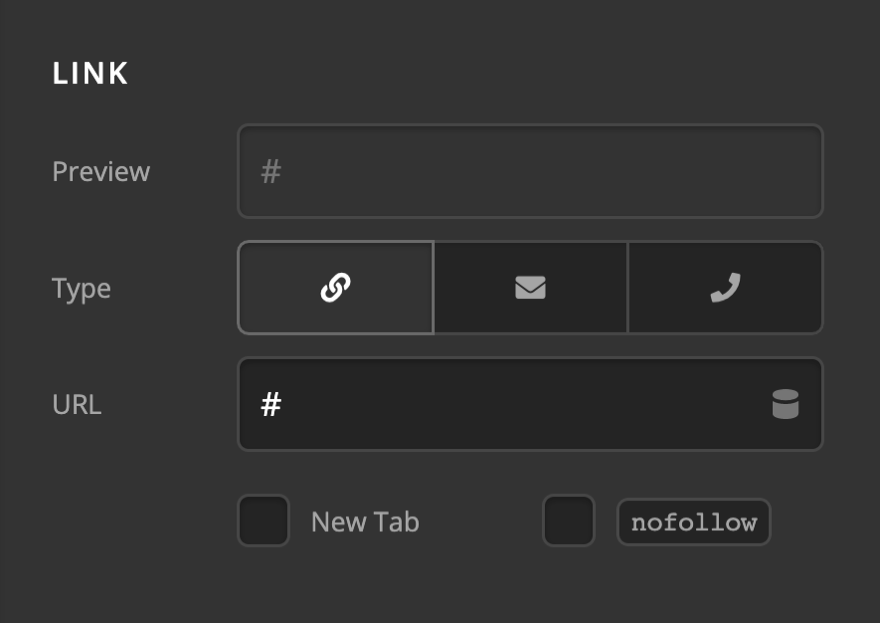
Enabling the URL mode of a link setup is done by clicking the anchor link icon. You will be presented with the URL input which you can add the URL of the website which you want to link to. The Preview input will show how it will be added in the actual HTML code. Check the New Tab checkbox if you want to have the link opened in a new browser tab. Check the nofollow checkbox if you don't want the search engines to sniff the link. The nofollow is used when we link to an external website usually.
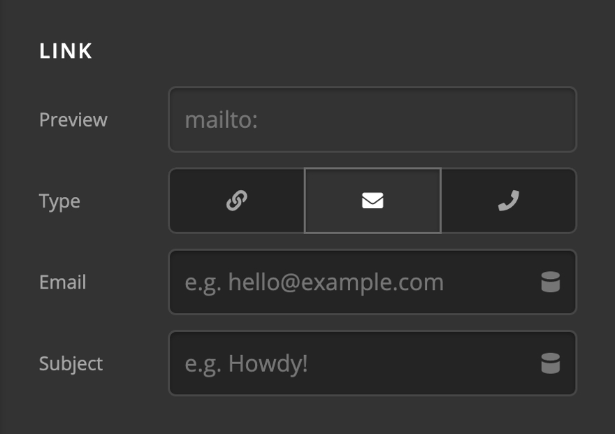
Enabling the Email mode of a link setup is done by clicking the envelope icon. Add the Email Address into the Email input and the subject of the email into the Subject input. The preview input shows how the link will be added in HTML. Clicking the link with an email setup will open up the Email Client software of the visitor and will fill in the recipient Email Address and Subject of the email.
Phone
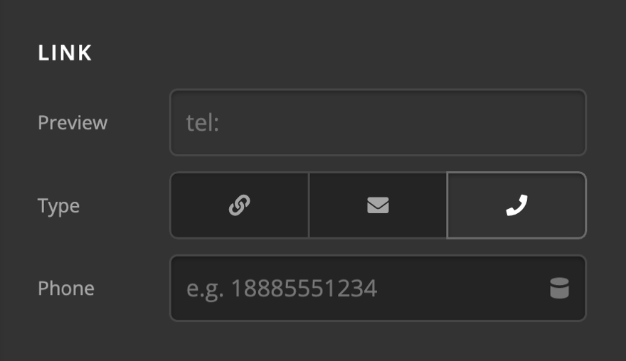
Enabling the Phone mode of a link setup is done by clicking the phone icon. Add the Phone Number into the Phone input. The preview input shows how the link will be added in HTML. Clicking the link with a phone setup will open up the phone dialer screen of the user's device if the user owns a device that has that capability.
Flexbox
The Flexbox section contains controls to set the positioning of the Creative CTA using the CSS Flexbox display.
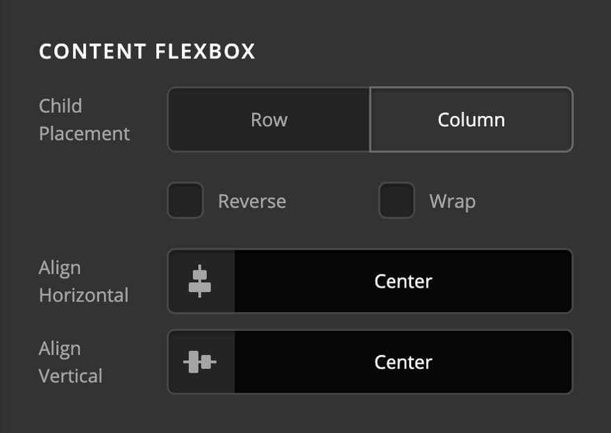
- Child Placement: Use this option to decide if the items of the Creative CTA Element should be laid out vertically (Column) or horizontally (Row).
- Reverse: Enabling this option will cause the Creative CTA Element to be laid in a reverse manner.
- Wrap: Enable this option to wrap the Creative CTA Element when there is not enough space in smaller devices.
- Align Horizontal: Use this option to layout the Creative CTA Element horizontally.
- Align Vertical: Use this option to layout the Creative CTA Element vertically.
Click here for more information about the Flexbox display.
Design Settings
The design settings in Creative CTA Element consists of the control group to fine-tune the Element design-wise.
Margin
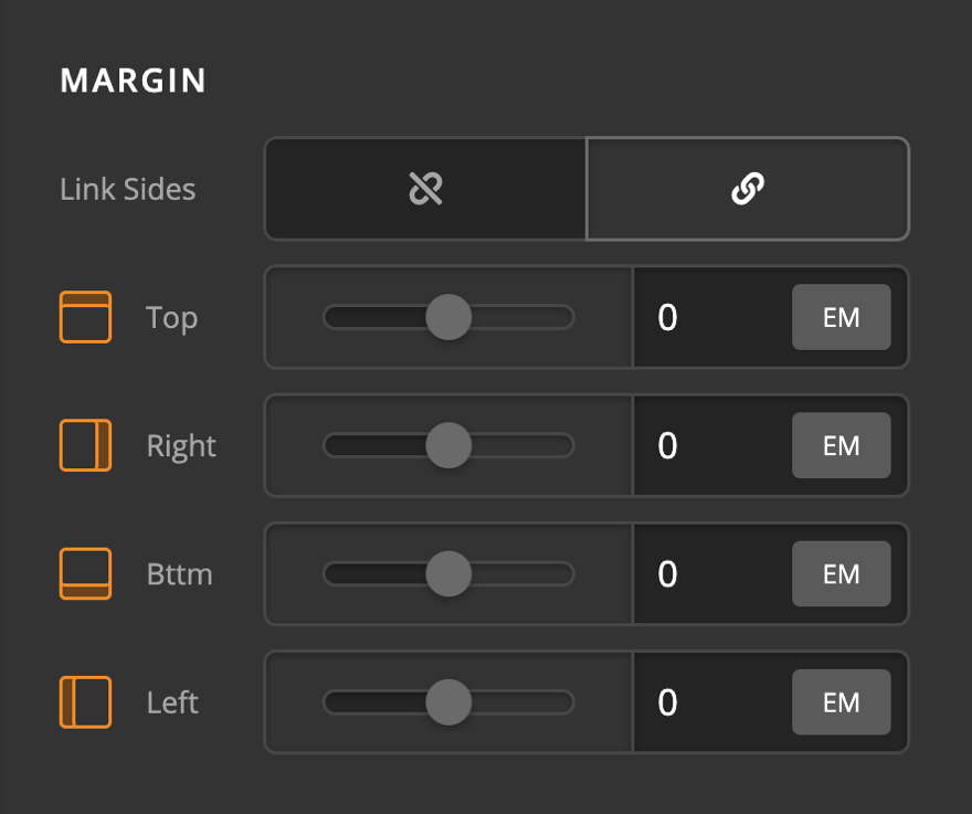
Use this option to set the margin of the Creative CTA. You can change the settings for all the sides of the Creative CTA or modify them individually.
Padding
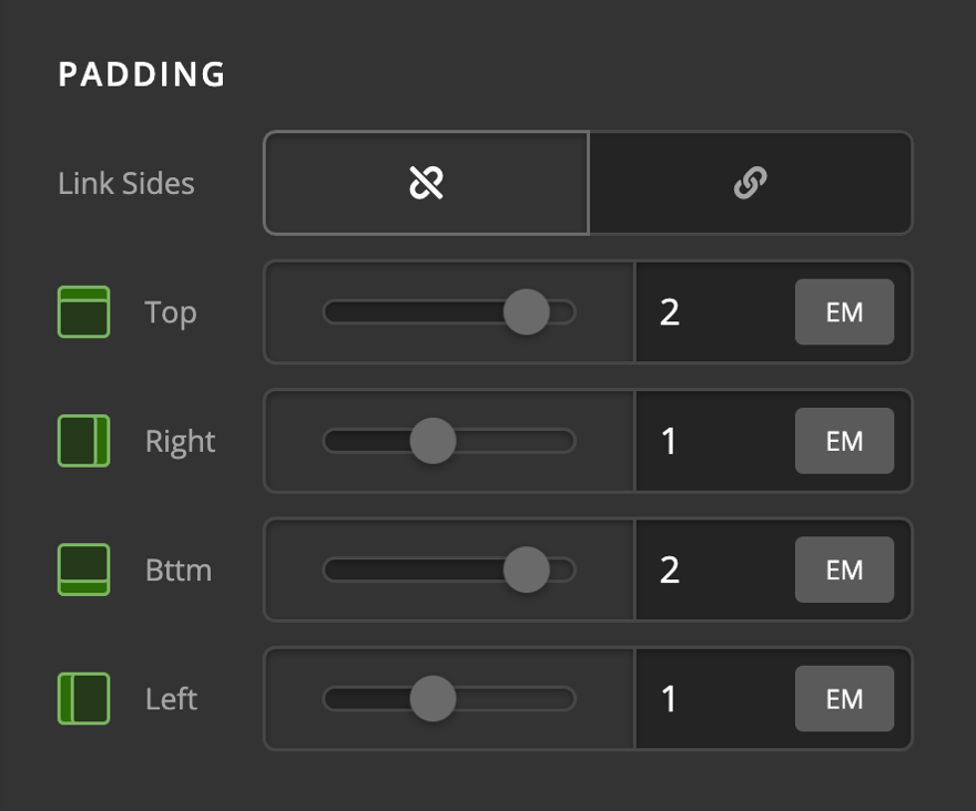
Use this option to set the padding of the Creative CTA. You can change the settings for all the sides of the Creative CTA or modify them individually.
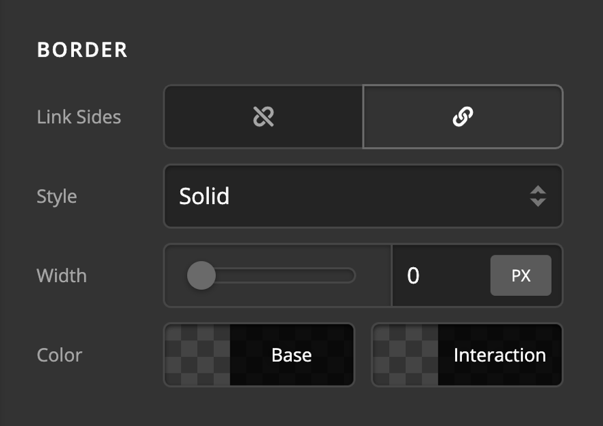
Border
Use this option to set the border of the Creative CTA. You can set the style, width and color of the border on all sides or each side individually.
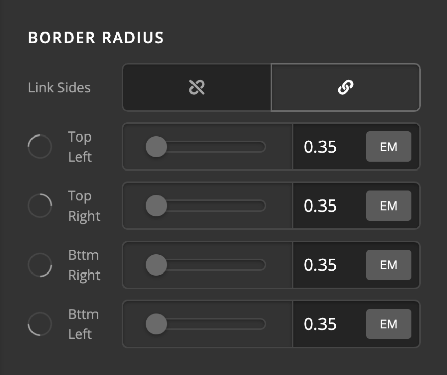
Border Radius
Use this option to set a border-radius for the Creative CTA. You can set the curve on all sides or set them individually.
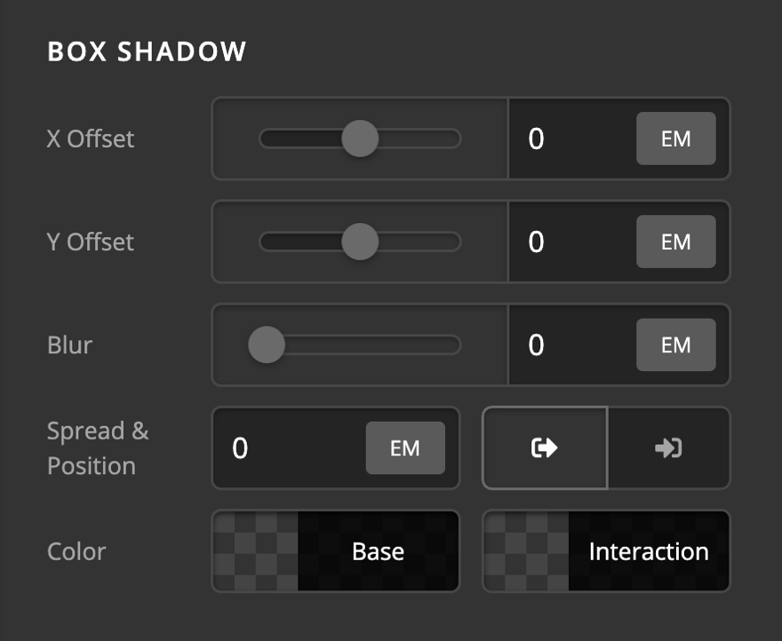
Box Shadow
You can set a shadow over the Creative CTA using the box-shadow control group.
- X-Offset - Use this option to set the X offset of the shadow in the Creative CTA.
- Y-Offset - Use this option to set the Y offset of the shadow in the Creative CTA.
- Blur - Use this option to set the intensity of the blur effect in the Creative CTA.
- Spread & Position - Use this option to set the spread amount of the items section shadow and decide if you want the shadow to sit inside or outside of the Creative CTA.
- Color - Use this option to set the color of the Creative CTA shadow.
Text Setup
You can have text next to the icon inside the Creative CTA Element by enabling the Text Setup option.
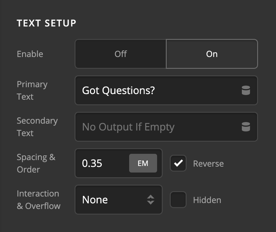
- Enable - Use this option to enable or disable the text section of the Creative CTA Element.
- Primary Text - Use this option to add the primary text of the Creative CTA Element which shows with a larger font.
- Secondary Text - Use this option to add the secondary text of the Creative CTA Element which shows with a smaller font.
- Spacing & Order - Use this option to set the spacing between the primary and secondary text. In the standard mode, primary text is above the secondary text, but if you check the Reverse checkbox the order will be reversed, and secondary text will sit above the primary text.
- Interaction - Use this option to set an animation while hovering over the Creative CTA Element. The animation options are:
- None
- Slide Top
- Slide Left
- Slide Right
- Slide Bottom
- Scale Up
- Scale Down
- Flip X
- Flip Y
- Overflow - Check the Hidden checkbox if you want to hide the text if it goes beyond the limits of the Creative CTA Element.
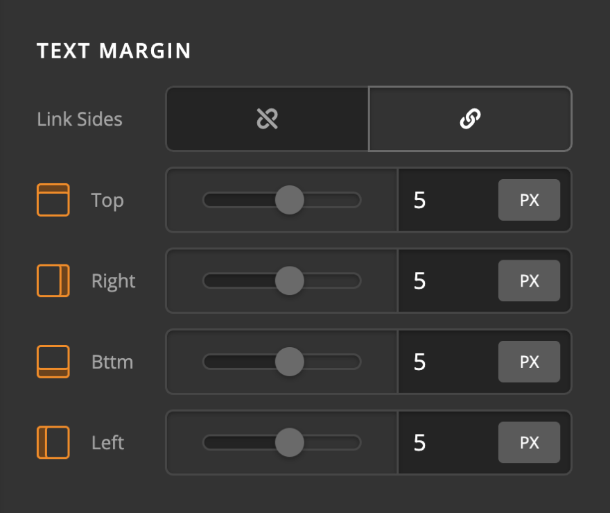
Text Margin
Use this option to set the margin of the Creative CTA Element text area. You can change the settings for all the sides of the Creative CTA Element or modify them individually.
Primary Text Format
You can use this control group to set the format of the primary text in the Creative CTA Element.
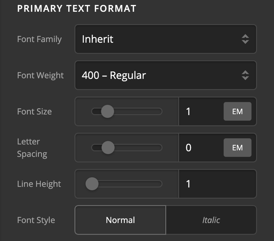
- Font Family - Use this option to set the font of the Creative CTA Element primary text.
- Font Weight - Use this option to set the weight or thickness of the font. The values may differ depending on the selection of the font and if the select font supports weights or not.
- Font Size - Use this option to set the size of the font.
- Letter Spacing - Use this option to set the spacing between letters.
- Line Height - Use this option to set the spacing between each line.
- Font Style - Use this option to decide if you want to have a normal or italic style.
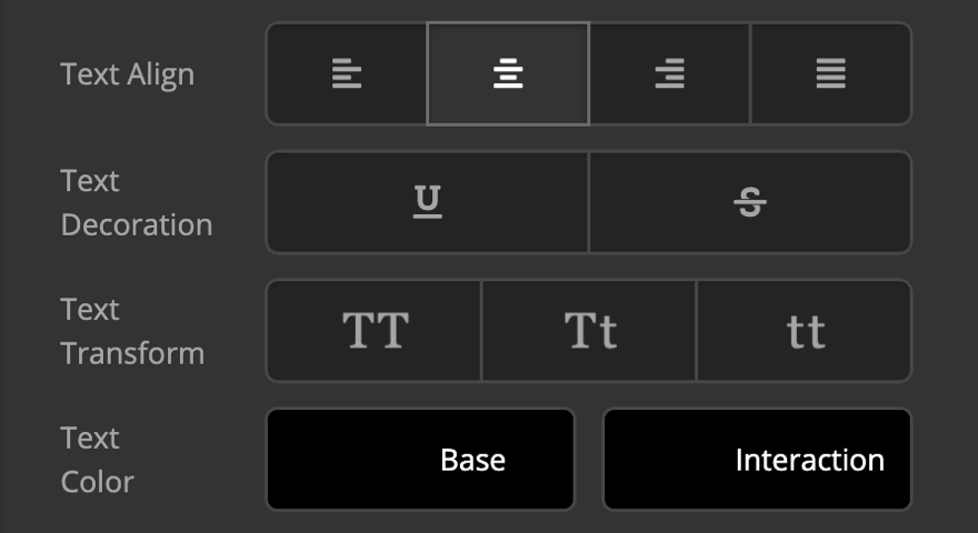
- Text Align - Use this option to set the alignment of the text. Possible values are left, center, right, and justify.
- Text Decoration - Use this option to force an underline or linethrough style.
- Text Transform - Use this option to set the case of the text. Available options are uppercase, camel case, and lowercase.
- Text Color - Use this option to set the color of the text.
Primary Text Shadow
The primary text-shadow control group contains settings to set a text-shadow for the Creative CTA Element primary text.
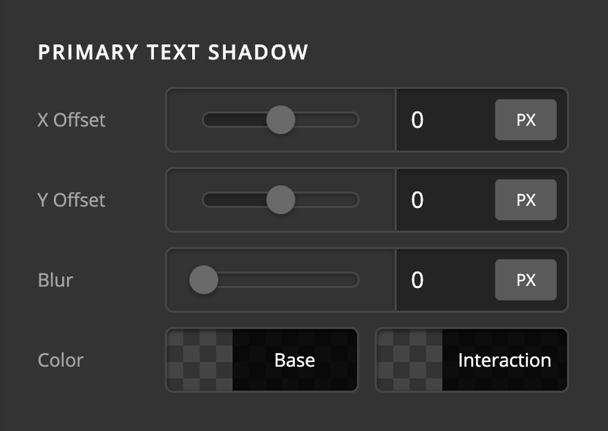
- X-Offset - Use this option to set the X offset of the text-shadow.
- Y-Offset - Use this option to set the Y offset of the text-shadow.
- Blur - Use this option to set the intensity of the blur effect in the text-shadow.
- Color - Use this option to set the color of the text-shadow.
Secondary Text Format
You can use this control group to set the format of the secondary text in the Creative CTA Element.
- Font Family - Use this option to set the font of the Creative CTA Element secondary text.
- Font Weight - Use this option to set the weight or thickness of the font. The values may differ depending on the selection of the font and if the select font supports weights or not.
- Font Size - Use this option to set the size of the font.
- Letter Spacing - Use this option to set the spacing between letters.
- Line Height - Use this option to set the spacing between each line.
- Font Style - Use this option to decide if you want to have a normal or italic style.
- Text Align - Use this option to set the alignment of the text. Possible values are left, center, right, and justify.
- Text Decoration - Use this option to force an underline or linethrough style.
- Text Transform - Use this option to set the case of the text. Available options are uppercase, camel case, and lowercase.
- Text Color - Use this option to set the color of the text.
Secondary Text Shadow
The secondary text-shadow control group contains settings to set a text-shadow for the Creative CTA Element secondary text.
- X-Offset - Use this option to set the X offset of the text-shadow.
- Y-Offset - Use this option to set the Y offset of the text-shadow.
- Blur - Use this option to set the intensity of the blur effect in the text-shadow.
- Color - Use this option to set the color of the text-shadow.
Graphic Setup
The graphics setup control group gives you options to enable and set up the graphic icon of the Creative CTA Element.
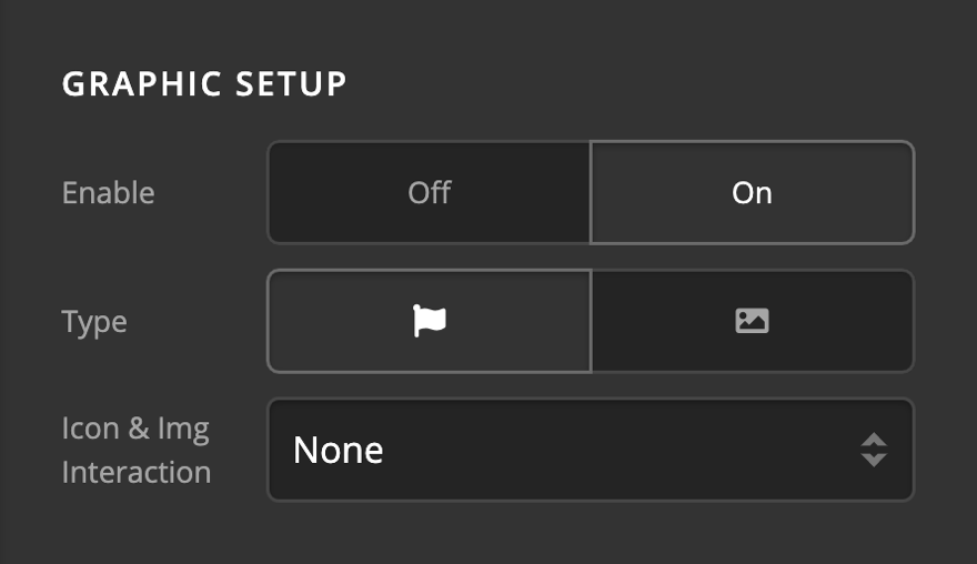
- Enable - Use this option to enable or disable the icon of the Creative CTA Element.
- Type - Use this option to decide if the Creative CTA Element graphic type should be Icon, Image, or Burger. There will be different control groups depending on the graphic type selection.
- Icon & Img Interaction - Use this option to set up an animation for the Creative CTA Element graphic on mouse hover. Available options are:
- None
- Scale Up
- Scale Down
- Flip X
- Flip Y
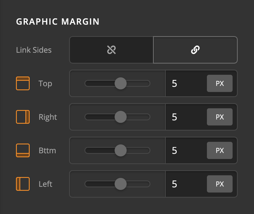
Graphic Margin
Use this option to set the margin of the Creative CTA Element graphic. You can change the settings for all the sides of the Creative CTA Element graphic or modify them individually.
Graphic Icon
Use this option to fine-tune the graphics icon of the Creative CTA Element. This option will show if you set the graphics type of the Creative CTA Element to the icon.
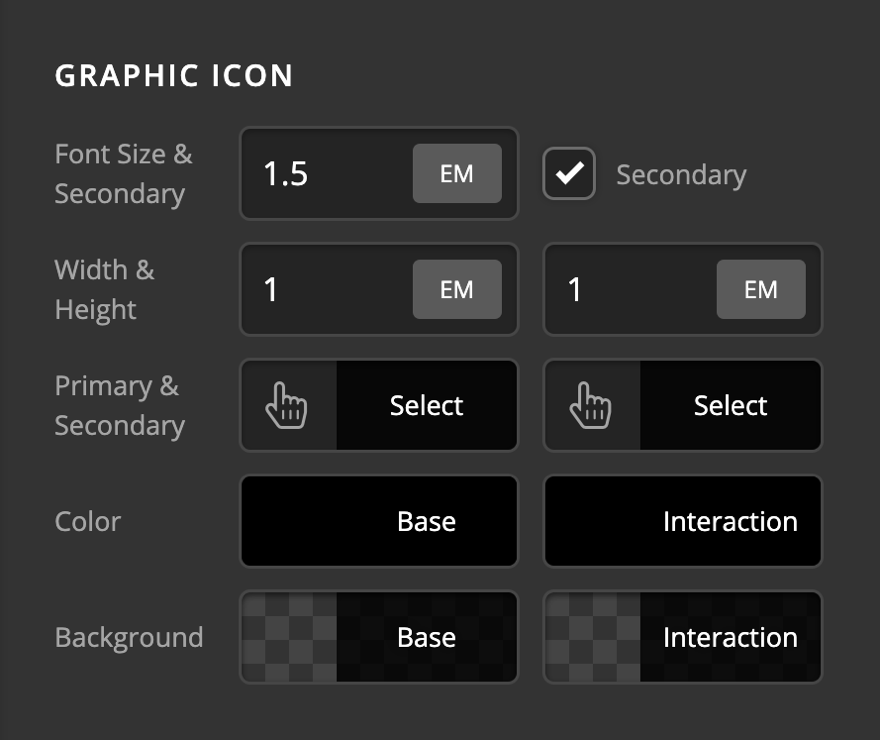
- Font Size & Secondary - Use this option to set the base font for the graphic icon of the Creative CTA Element, and check the Secondary checkbox if you want to change the icon to another one while hovering the mouse over the Creative CTA Element.
- Width & Height - Use these options to set the width and height of the Creative CTA Element graphic icon.
- Primary & Secondary - Use this option to select the primary and secondary icon of the Creative CTA Element graphic. The secondary option will be available if you check the secondary checkbox in the Font Size & Secondary option.
- Color - Use this option to set the color of the Creative CTA Element icon in normal and hover mode.
- Background - Use this option to set the background of the Creative CTA Element icon in normal and hover mode.
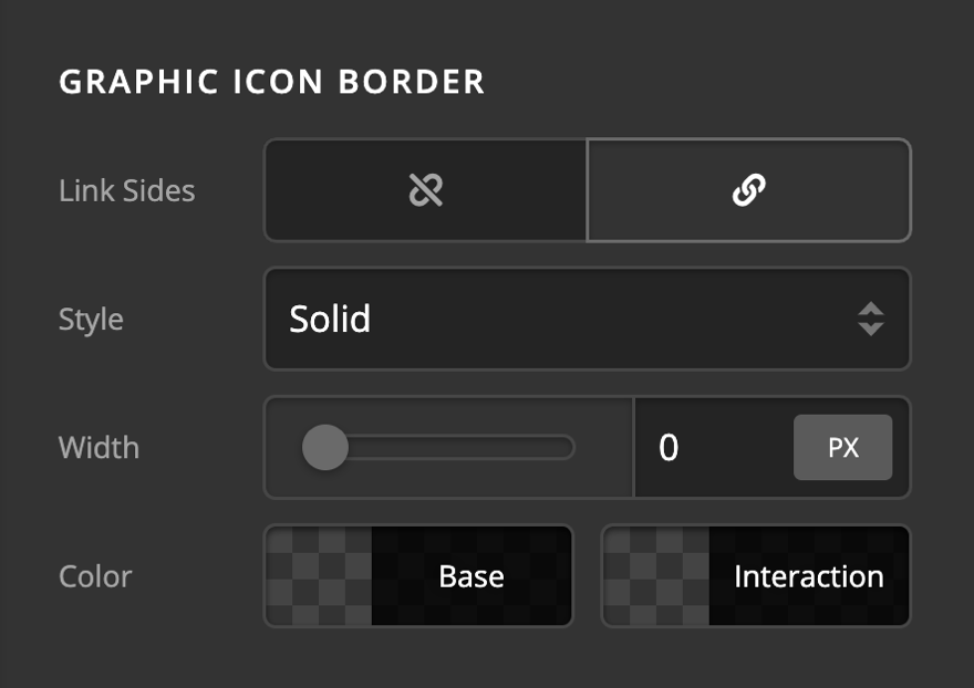
Graphic Icon Border
Use this option to set the border of the Creative CTA Element graphic icon. You can set the style, width and color of the border on all sides or each side individually.
Graphic Icon Border Radius
Use this option to set a border-radius for the Creative CTA Element graphic icon. You can set the curve on all sides or set them individually.
Graphic Icon Box Shadow
You can set a shadow over the Creative CTA Element graphic icon using the box-shadow control group.
- X-Offset - Use this option to set the X offset of the shadow in the Creative CTA Element.
- Y-Offset - Use this option to set the Y offset of the shadow in the Creative CTA Element.
- Blur - Use this option to set the intensity of the blur effect in the Creative CTA Element.
- Spread & Position - Use this option to set the spread amount of the items section shadow and decide if you want the shadow to sit inside or outside of the Creative CTA Element.
- Color - Use this option to set the color of the Creative CTA Element shadow.
Graphic Icon Text Shadow
The primary text-shadow control group contains settings to set a text-shadow for the Creative CTA Element graphic icon.
- X-Offset - Use this option to set the X offset of the text-shadow.
- Y-Offset - Use this option to set the Y offset of the text-shadow.
- Blur - Use this option to set the intensity of the blur effect in the text-shadow.
- Color - Use this option to set the color of the text-shadow.
Graphic Image
This option will appear if you select the image as the graphic type.
- Max Width - Use this option to set the maximum width of the Creative CTA Element graphic image.
Primary Graphic Image
The Primary Graphic Image control group is to set the image for the Creative CTA Element graphic.
- Retina & Dimensions - Retina support is enabled out the box. Click the Eye to disable the Retina support. Also supports options to set the width and height of the image.
- Source - The image to be used. Click to select an image from the WordPress media library or upload a new one.
- Alt Text - The alternative text for your image. Make sure to set this for screen readers!
Secondary Graphic Image
The Secondary Graphic Image control group is to set the image for the Creative CTA Element graphic on hover. The control group has the same options as the Primary Graphic Image except the enable/ or disable checkbox.
Interactive Content Setup
The Creative CTA Element changes it's content and the graphic while the use hovers over the element. The following options are to fine-tune the element in the hovered mode.
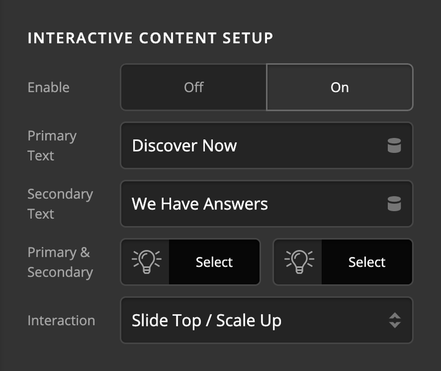
- Enable - Use this option to enable or disable the interactive text section of the Creative CTA Element.
- Primary Text - Use this option to add the interactive primary text of the Creative CTA Element which shows with a larger font.
- Secondary Text - Use this option to add the interactive secondary text of the Creative CTA Element which shows with a smaller font.
- Spacing & Order - Use this option to set the spacing between the interactive primary and interactive secondary text. In the standard mode, interactive primary text is above the interactive secondary text, but if you check the Reverse checkbox the order will be reversed, and interactive secondary text will sit above the interactive primary text.
- Interaction - Use this option to set an animation while hovering over the Creative CTA Element.
Interactive Primary Graphic Image
The Interactive Primary Graphic Image control group is to set the image for the Creative CTA Element graphic on hover.
- Retina & Dimensions - Retina support is enabled out the box. Click the Eye to disable the Retina support. Also supports options to set the width and height of the image.
- Source - The image to be used. Click to select an image from the WordPress media library or upload a new one.
- Alt Text - The alternative text for your image. Make sure to set this for screen readers!
Interactive Secondary Graphic Image
The Secondary Graphic Image control group is to set the image for the Creative CTA Element graphic on hover. The control group has the same options as the Primary Graphic Image except the enable/ or disable checkbox.
Particle Setup
Particle setup group contains the controls to the initial setup of the interaction effects. Following is the detailed information for each setting:
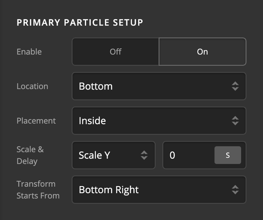
- Enable - Use this option to enable the interaction particle.
- Location - Use this option to set the position of the particle in respect with the Element that it is applied to. Available options are:
- Center
- Top
- Left
- Right
- Bottom
- Top Left
- Top Right
- Bottom Left
- Bottom Right
- Placement - Use this option to decide if you want to have the particles overlap with the Element or limited inside the Element.
- Scale - The scale option will determine how the particle will expand or shrink in transition. The available options are:
- None - Use this option if you do not want the particle to scale in transition.
- Scale All - Use this option to scale the particle both vertically and horizontally in transition.
- Scale X - Use this option to scale the particle horizontally in transition.
- Scale Y - Use this option to scale the particle vertically in transition.
- Delay - The delay option will determine how long will it take the transition to complete. The value of this option in seconds or milliseconds depends on the selection of the value unit.
- Transform Starts From - Use this option to set where the transition of the particle should start. Available options are:
- Center
- Top
- Left
- Right
- Bottom
- Top Left
- Top Right
- Bottom Left
- Bottom Right
Particle Style
Particle style group contains the controls to fine-tune the interaction effects. Following is the detailed information for each setting:
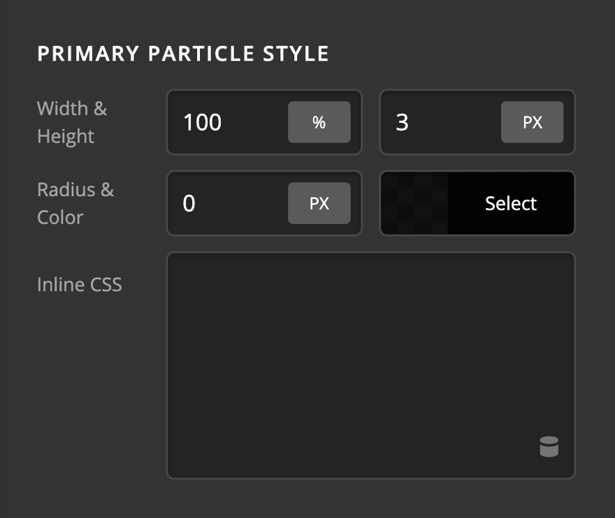
- Width & Height - Use this option to set the width and the height of the particle. The value unit can be Calc, PX, REM, EM, and %.
- Radius - Use this option to set the radius of the particle. The same units can be used for this option values as the width/height options.
- Color - Use this option to set the color of the particle.
- Inline CSS - Use this option to add custom CSS which will be applied to the article. This option is for the advanced users that want an extra layer of customization which they can not find in the styling options of the particles.
Primary and Secondary Particles
The same setup and style options which we described are available for primary and secondary particles. You basically have two sets of particle options to get innovative and create stylish interactions.
Customize
The Customize pane consists of various features that allow you to take further control over your Element's styling and functionality:
- ID – Sets an HTML ID on the Element.
- Class – Sets an HTML Class on the Element.
- Element CSS – Use this feature for increased stylistic control of your Element, especially over nested markup. Click here for more detailed information on this feature, such as using
$elto dynamically target the base tag, et cetera. - Hide During Breakpoints – Hides the Element at different screen sizes when design alterations are needed. Click here for more information.
- Conditions – Adds / removes Elements from the page when certain criteria are met (e.g. “If a featured image is set...”). Click here for more information.
- Custom Attributes – Use this option to add custom HTML attributes to the root tag of the Element (e.g.
data-info="123"). This can be particularly helpful when integrating with various scripts and libraries.
Demo
To see a live demo of the Creative CTA Element click here.
Summary
To sum up, we've discussed the Creative CTA Element. We've discussed that a Creative CTA Element is an easy tool for adding a call to action on a page and we've learned how to change it's content and design and delved into details of the Creative CTA Element settings.
See something inaccurate? Let us know