Card
In this article, we're going to discuss the Card Element and its settings. The Card Element can be used to add a flipping card in pages, so let's dive in!
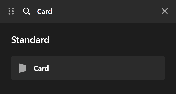
The Card Element adds a flipping card on the page. To add the Card Element, simply search for "Card" and drag "Card" to the canvas.
Card
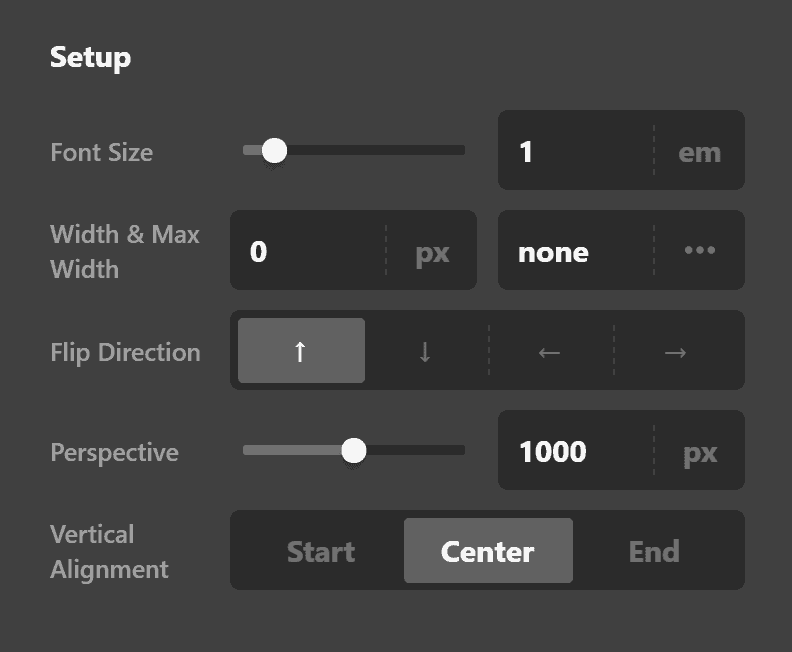
The Card Setup tab contains control groups to fine-tune the basic setup of the Card regardless of the front or back of the Card.
- Font Size - Use this option to set the base font of the Card.
- Width & Max Width - Use these options to set the width and Maximum Width of the Card.
- Interaction & Duration - Use this option to set the flipping animation when there is an interaction with the Card Element and the duration of the animation. Available flip options are:
- Flip Up
- Flip Down
- Flip Left
- Flip Right
- Perspective - The perspective property defines how far the Card is away from the user while the flipping animation is happening. So, a lower value will result in a more intensive 3D effect than a higher value. Click here for more information about 3D animation perspective property.
- Vertical Alignment - Use this option to set the vertical alignment of the card content inside the boundaries of the Element. The Card Element uses the Flex layout to handle the vertical alignment. Available options are:
- Start
- Center
- End
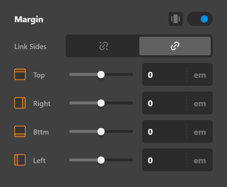
Margin
Use this option to set the margin of the Card Element itself. You can change the settings for all the sides of the Card or modify them individually.
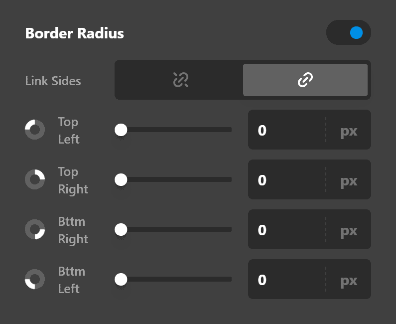
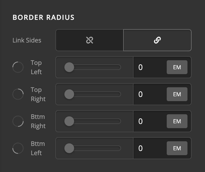
Border Radius
Use this option to set a border-radius for the Card Element itself. You can set the curve on all sides of the Card or set them individually.
Front Setup
The Front tab contains a series of control groups to fine-tune the Card Element in a normal state which shows the front of the Card.
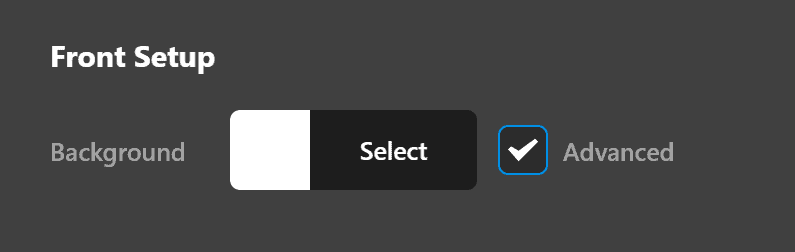
- Front Background - Use this option to set the background color of the Card Element itself. If you check the Advanced checkbox, more options will show to be able to add more complex backgrounds to the Card Element.
Front Background Lower Layer
The Front Background Lower Layer Control group contains options to set up more complex backgrounds to have a solid color, image, or video as the background of the Element. You can have two layers of backgrounds in the Card Element, and this control group is for the lower layer.
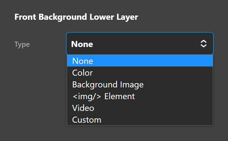
To set the type of background use the Select Type control.
Solid Color Background
To have a solid background click the Eye Dropper icon. The solid color background has the Color control to set the proper color of the background.
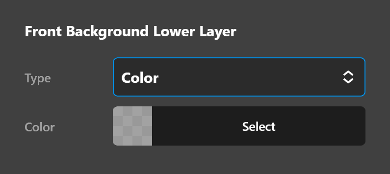
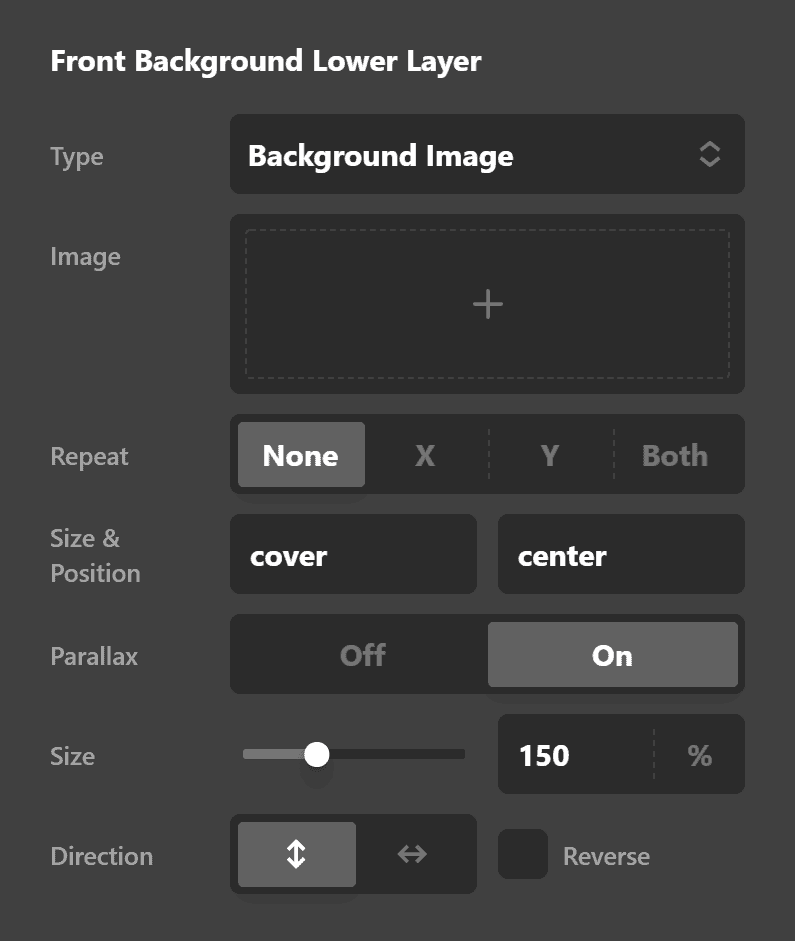
Image Background
To have an image background click the Image icon. The image background has the control group containing the options below:
- Image: Click the plus icon to show the standard WordPress Media Dialog to choose an image as the background.
- Repeat: You can choose how you want the background image repeated in the background. Available options are:
- None: The background image will not be repeated.
- X-Axis: The background image will be repeated horizontally.
- Y-Axis: The background image will be repeated vertically.
- Both: The background image will be repeated both horizontally and vertically.
- Size: You can set the size of the background image. This option will set the
background-sizeCSS property. Click here for further reading. - Position: You can set the position of the background image. This option will set the
background-positionCSS property. Click here for further reading.
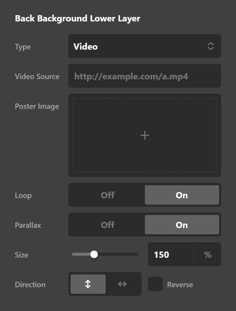
Video Background
To have a video background click the Video icon. The video background has the control group containing the options below:
- Video Source: Use this option to add the URL of the background video. If the video is in an external source, paste the external URL. If you want to self host the video file you need to go to WordPress Dashboard > Media > Add New and upload the video. Then, click the video to see the properties of the video at the right-hand side where the URL of the video shows that you can copy and paste it to this option.
- Poster Image: Use this option to select an image as the poster image of the video background. This option is used to load an alternative image on mobile devices as the video background feature is not available for mobile devices.
Front Background Upper Layer
The Front Background Upper Layer Control group contains options to set up more complex backgrounds to have a solid color, image, or video as the background of the Element. You can have two layers of backgrounds in the Card Element, and this control group is for the upper layer.
The options of the Upper Layer background control group is similar to the lower layer.
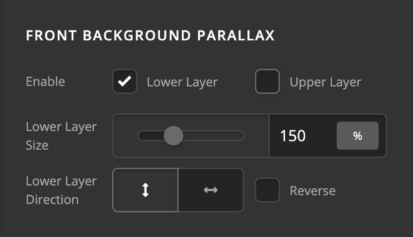
Front Background Parallax
The Parallax effect is where the background image scrolls with a different speed than the browser scroll speed, and it makes an aesthetic effect. To enable the Parallax feature, go to the Background Parallax control group and check the enable checkbox for the background layer that you want to have the feature. The Parallax feature has the options below:
- Lower/Upper Layer Size: The layer size determines the size of the background in percentage. The larger percentage value is the parallax effect will be more prominent.
- Lower/Upper Layer Direction: Use this option to set the parallax effect to show vertically, horizontally or in reverse order. If you enable the reverse order, scrolling down will cause the scroll up Parallax effect.
- Reverse: Enable this option if you want the parallax effect to work in a reverse fashion.
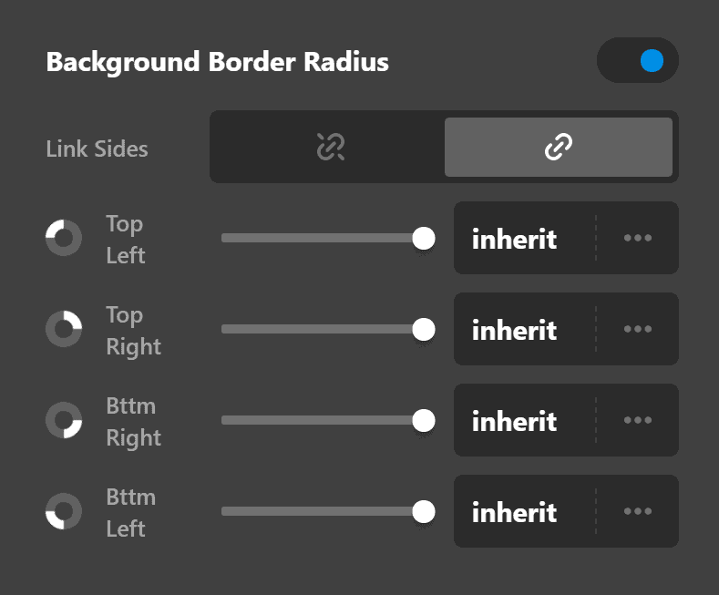
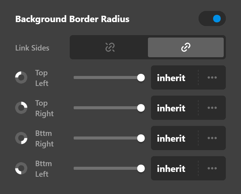
Background Border Radius
You can apply a border-radius to the background using the Background Border Radius control group. It gives the option to set a radius on all four corners, or each corner individually. You have the option to select from multiple units to determine which radius works best for your design.
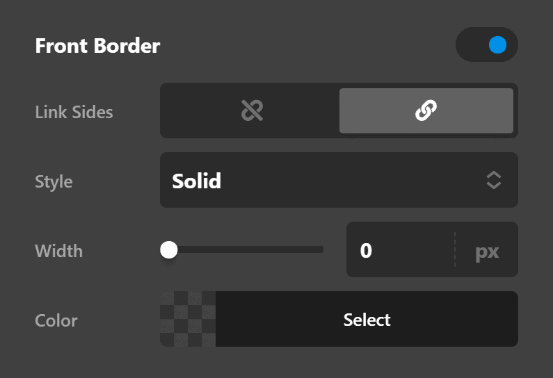
Front Border
Use this option to set the border of the card front. You can set the style, width and color of the border on all sides or each side individually.
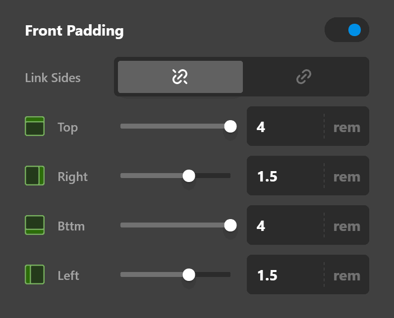
Front Padding
Use this option to set the padding of the card front. You can change the settings for all the sides of the Card or modify them individually.
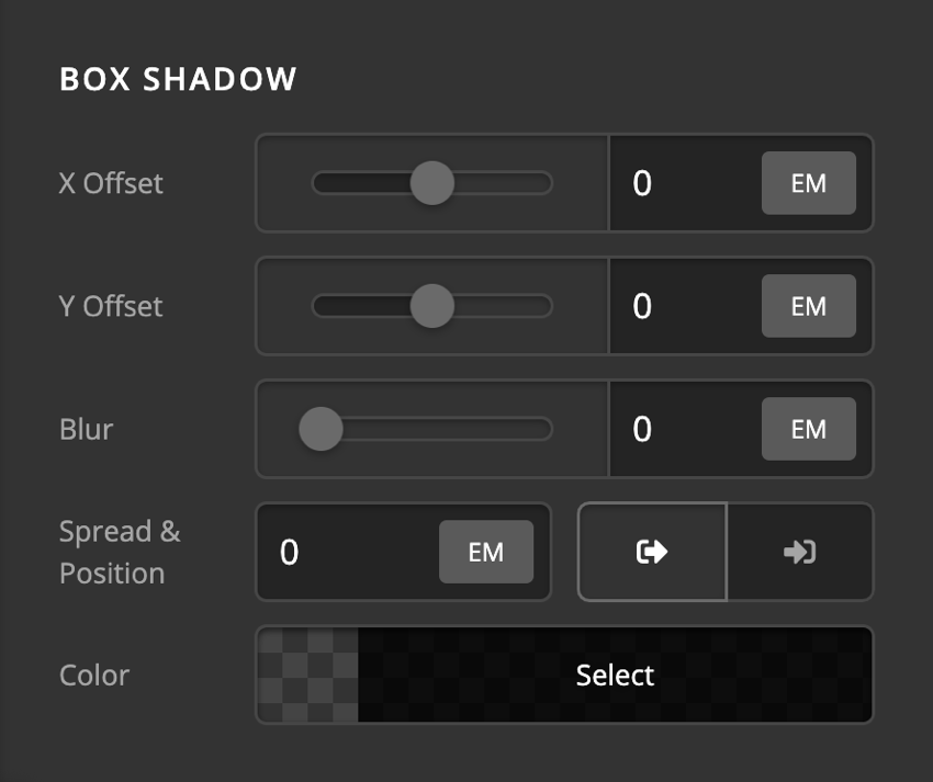
Front Box Shadow
You can set a shadow over the card front using the box-shadow control group.
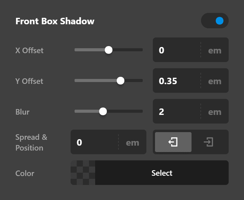
- X-Offset - Use this option to set the X offset of the shadow in the card front
- Y-Offset - Use this option to set the Y offset of the shadow in the card front.
- Blur - Use this option to set the intensity of the blur effect in the card front.
- Spread & Position - Use this option to set the spread amount of the items section shadow and decide if you want the shadow to sit inside or outside of the Card.
- Color - Use this option to set the color of the Card.
Back Setup
The Back tab contains a series of control groups to fine-tune the Card Element in a hovered state which shows the back of the Card.
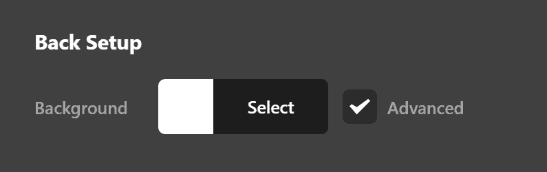
- Back Background - Use this option to set the background color of the Card Element itself in a hovered state. If you check the Advanced checkbox, more options will show to be able to add more complex backgrounds to the Card Element.
Back Background Lower Layer
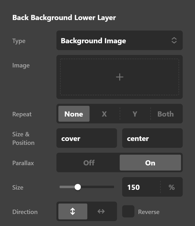
The Back Background Lower Layer Control group contains options to set up more complex backgrounds to have a solid color, image, or video as the background of the Element in a hovered state. You can have two layers of backgrounds in the Card Element, and this control group is for the lower layer.
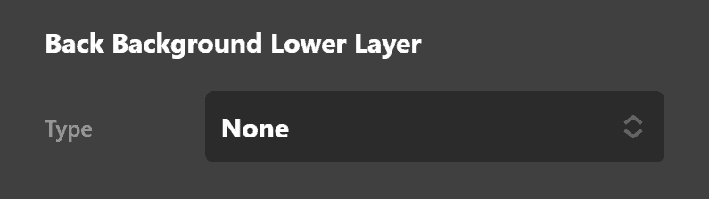
To set the type of background use the Select Type control.
Solid Color Background
To have a solid background click the Eye Dropper icon. The solid color background has the Color control to set the proper color of the background in a hovered state of the Card.
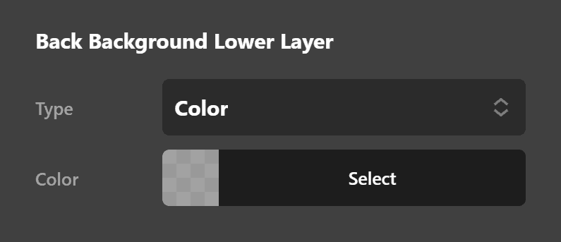
Image Background
To have an image background click the Image icon. The image background has the control group containing the options below:
- Image: Click the plus icon to show the standard WordPress Media Dialog to choose an image as the background.
- Repeat: You can choose how you want the background image repeated in the background. Available options are:
- None: The background image will not be repeated.
- X-Axis: The background image will be repeated horizontally.
- Y-Axis: The background image will be repeated vertically.
- Both: The background image will be repeated both horizontally and vertically.
- Size: You can set the size of the background image. This option will set the
background-sizeCSS property. Click here for further reading. - Position: You can set the position of the background image. This option will set the
background-positionCSS property. Click here for further reading.
Video Background
To have a video background click the Video icon. The video background has the control group containing the options below:
- Video Source: Use this option to add the URL of the background video. If the video is in an external source, paste the external URL. If you want to self host the video file you need to go to WordPress Dashboard > Media > Add New and upload the video. Then, click the video to see the properties of the video at the right-hand side where the URL of the video shows that you can copy and paste it to this option.
- Poster Image: Use this option to select an image as the poster image of the video background. This option is used to load an alternative image on mobile devices as the video background feature is not available for mobile devices.
Back Background Upper Layer
The Back Background Upper Layer Control group contains options to set up more complex backgrounds to have a solid color, image, or video as the background of the Element in a hovered state. You can have two layers of backgrounds in the Card Element, and this control group is for the upper layer.
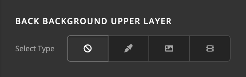
The options of the Upper Layer background control group is similar to the lower layer.
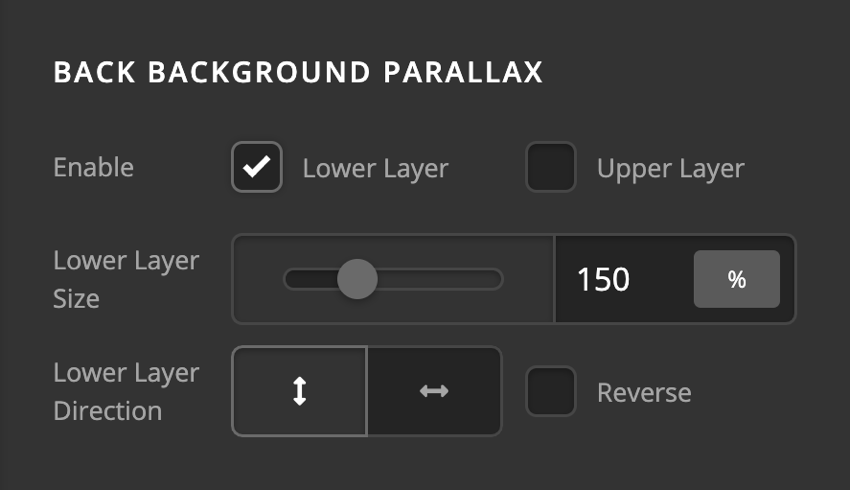
Back Background Parallax
The Parallax effect is where the background image scrolls with a different speed than the browser scroll speed, and it makes an aesthetic effect. To enable the Parallax feature, go to the Background Parallax control group and check the enable checkbox for the background layer that you want to have the feature. The Parallax feature has the options below:
- Lower/Upper Layer Size: The layer size determines the size of the background in percentage. The larger percentage value is the parallax effect will be more prominent.
- Lower/Upper Layer Direction: Use this option to set the parallax effect to show vertically, horizontally or in reverse order. If you enable the reverse order, scrolling down will cause the scroll up Parallax effect.
- Reverse: Enable this option if you want the parallax effect to work in a reverse fashion.
Background Border Radius
You can apply a border-radius to the background using the Background Border Radius control group. It gives the option to set a radius on all four corners, or each corner individually. You have the option to select from multiple units to determine which radius works best for your design.
Back Border
Use this option to set the border of the Card in a hovered state. You can set the style, width and color of the border on all sides or each side individually.

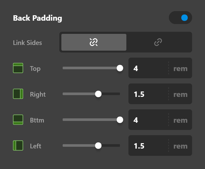
Back Padding
Use this option to set the padding of the Card in a hovered state. You can change the settings for all the sides of the Card or modify them individually.
Back Box Shadow
You can set a shadow over the Card in a hovered state using the box-shadow control group.
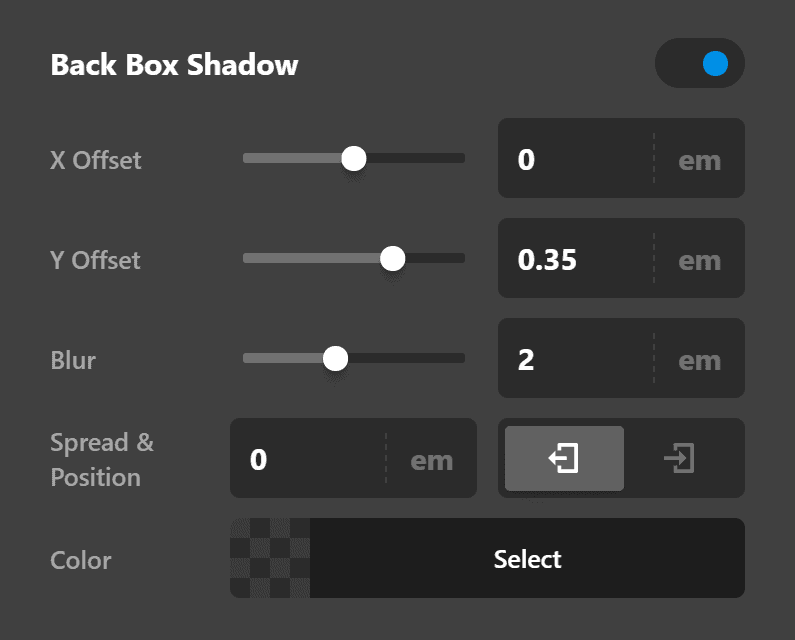
- X-Offset - Use this option to set the X offset of the shadow in the back of the Card.
- Y-Offset - Use this option to set the Y offset of the shadow in the back of the Card.
- Blur - Use this option to set the intensity of the blur effect in the back of the Card.
- Spread & Position - Use this option to set the spread amount of the items section shadow and decide if you want the shadow to sit inside or outside of the Card in a hovered state.
- Color - Use this option to set the color of the Card in a hovered state.
Front Content Setup
The Front Content tab contains control groups to set up and fine-tune the content of the card front in a normal state.
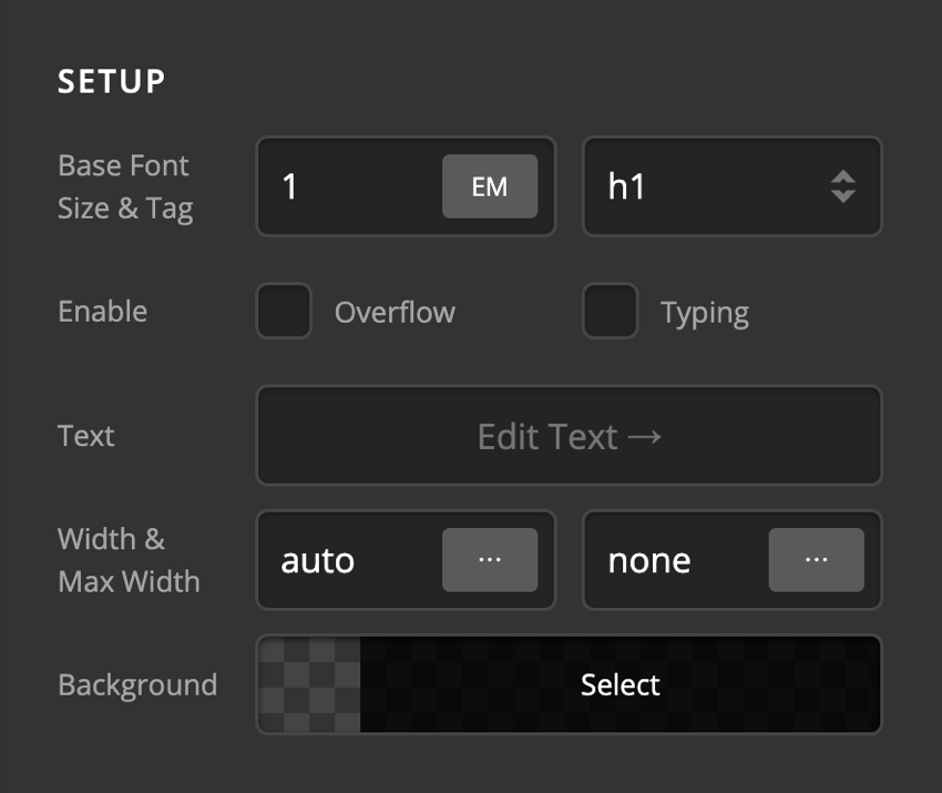
- Base Font Size - Use this option to set the base font of the card front content.
- Tag - Use this option to decide which HTML tag to use to wrap the content of the card front. Available options are:
- p
- h1
- h2
- h3
- h4
- h5
- h6
- div
- span
- Overflow - Use this option to force the card front content to respect the boundaries of the Card or not.
- Typing - Enable this option is you want to have the card front content to have the typing animation. Enabling this option will show the Typing control group to fine-tune the effect.
- Text - Use this option to add the actual text of the card front.
- Width & Max Width - Use these options to set the width and Maximum Width of the card front content.
- Background - Use this option to set the background color of the content portion in the card front.
Typing Setup
If you enable the Typing option of the card front content setup control group, these set of options will show to fine-tune the effect.
- Prefix - This part of the text doesn't change. This appears before the changing text.
- Typed Text - This is where you enter the words that will change.
- Suffix - The text that appears after the changing words. This, like the prefix, also does not change.
- Speed & Back Speed - Speed refers to the speed at which each character is typed into the screen. Back Speed refers to the speed at which each character is deleted.
- Delay & Back Delay - Delay refers to the time gap before the first character gets typed. Back Delay refers to the time gap before the last character gets deleted.
- Enable
- Loop Typing - If you enable this option, the typing will replay virtually non-stop after it is finished with the last word.
- Show Cursor - If enabled, a blinking cursor will be displayed.
- Cursor - This option only appears if Show Cursor is enabled. This option allows you to type what character you want to display as the cursor.
- Color
- Text - This is where you set the color of the changing (typing) texts.
- Cursor - This is where you set the color of the cursor if you enabled the Show Cursor option.
Text Content Flexbox
The Text Content Flexbox section contains controls to set the positioning of the content using the CSS Flexbox display in the card front.
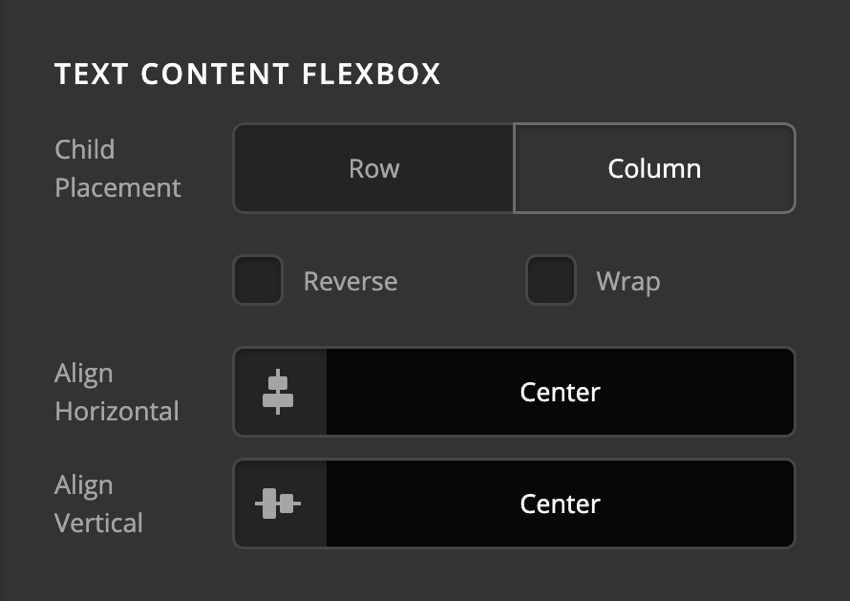
- Child Placement: Use this option to decide if the content of the card front should be laid out vertically (Column) or horizontally (Row).
- Reverse: Enabling this option will cause the card front content to be laid in a reverse manner.
- Wrap: Enable this option to wrap the card front content when there is not enough space in smaller devices.
- Align Horizontal: Use this option to layout the card front content horizontally.
- Align Vertical: Use this option to layout the card front content vertically.
Click here for more information about the Flexbox display.
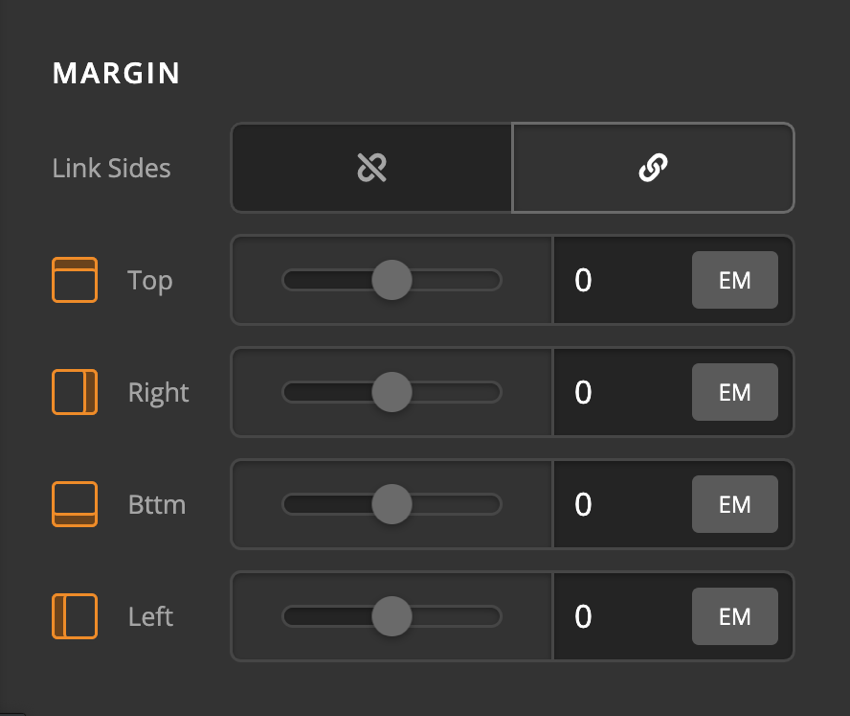
Margin
Use this option to set the margin of the card front content. You can change the settings for all the sides of the card front content or modify them individually.
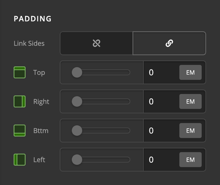
Padding
Use this option to set the padding of the card front content. You can change the settings for all the sides of the card front content or modify them individually.
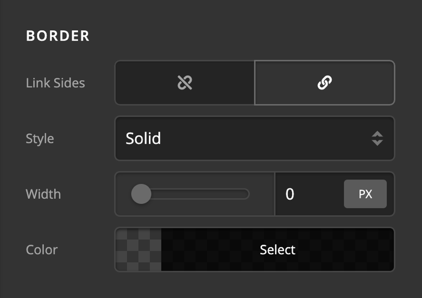
Border
Use this option to set the border of the card front content. You can set the style, width and color of the border on all sides or each side individually.
Border Radius
Use this option to set a border-radius for the card front content. You can set the curve on all sides or set them individually.
Box Shadow
You can set a shadow over the card front content using the box-shadow control group.
- X-Offset - Use this option to set the X offset of the shadow in the card front content.
- Y-Offset - Use this option to set the Y offset of the shadow in the card front content.
- Blur - Use this option to set the intensity of the blur effect in the card front content.
- Spread & Position - Use this option to set the spread amount of the items section shadow and decide if you want the shadow to sit inside or outside of the card front content.
- Color - Use this option to set the color of the card front content shadow.
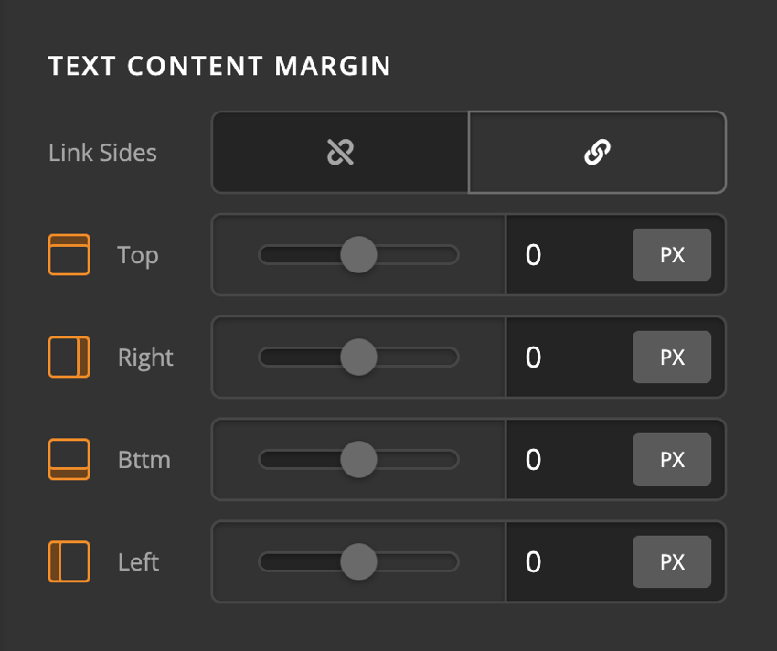
Text Content Margin
Use this option to set the margin of the card front text. You can change the settings for all the sides of the card front text or modify them individually.
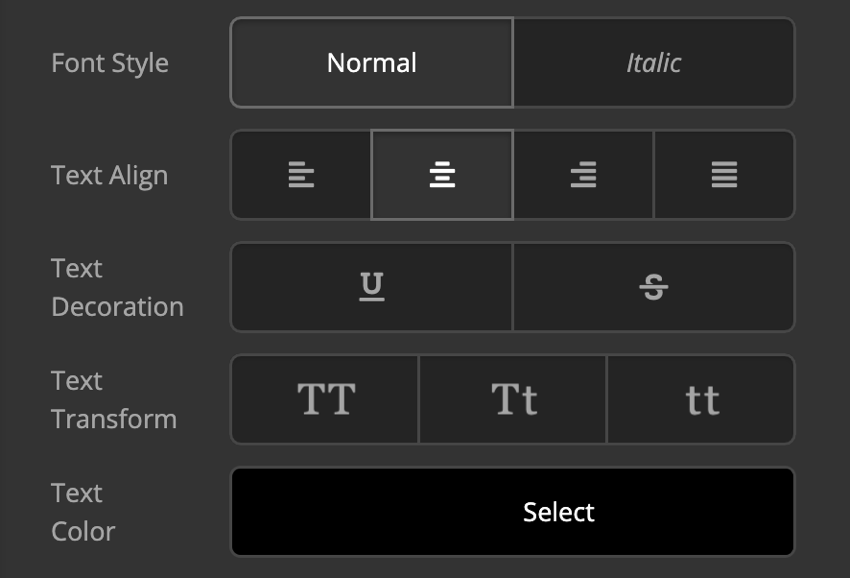
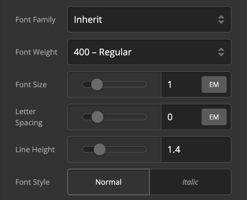
Text Format
You can use this control group to set the format of the text in the card front content.
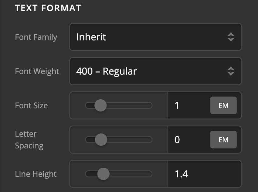
- Font Family - Use this option to set the font of the card front content text.
- Font Weight - Use this option to set the weight or thickness of the font. The values may differ depending on the selection of the font and if the select font supports weights or not.
- Font Size - Use this option to set the size of the font.
- Letter Spacing - Use this option to set the spacing between letters.
- Line Height - Use this option to set the spacing between each line.
- Font Style - Use this option to decide if you want to have a normal or italic style.
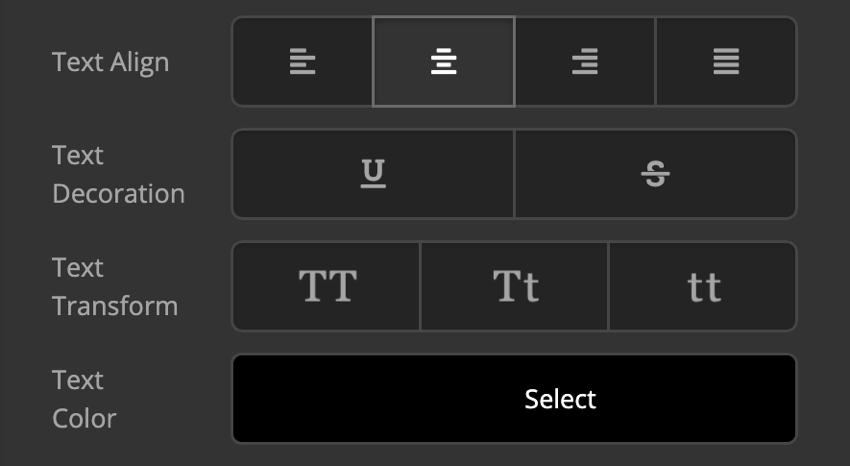
- Text Align - Use this option to set the alignment of the text. Possible values are left, center, right, and justify.
- Text Decoration - Use this option to force an underline or linethrough style.
- Text Transform - Use this option to set the case of the text. Available options are uppercase, camel case, and lowercase.
- Text Color - Use this option to set the color of the text.
Text Shadow
The text-shadow control group contains settings to set a text-shadow for the card front content text.
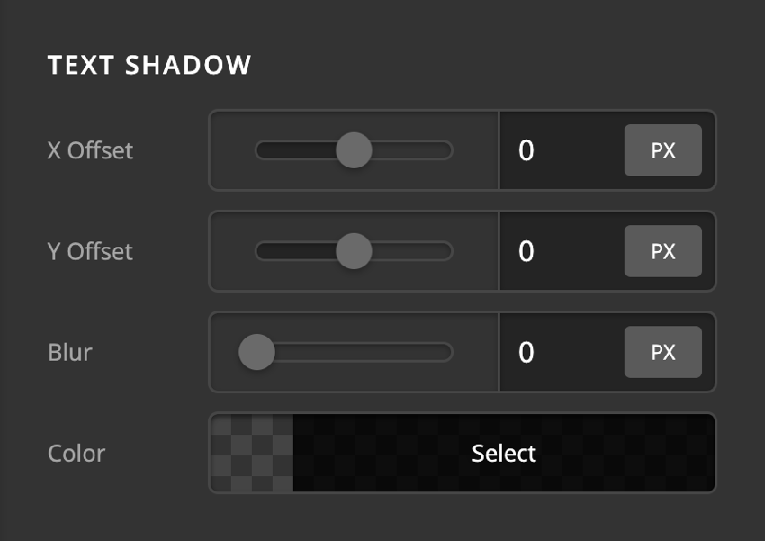
- X-Offset - Use this option to set the X offset of the text-shadow.
- Y-Offset - Use this option to set the Y offset of the text-shadow.
- Blur - Use this option to set the intensity of the blur effect in the text-shadow.
- Color - Use this option to set the color of the text-shadow.
Subheadline Setup
The Subheadline Setup section contains control groups to enable and fine-tune a sub-headline section after the main content of the Card Element front.
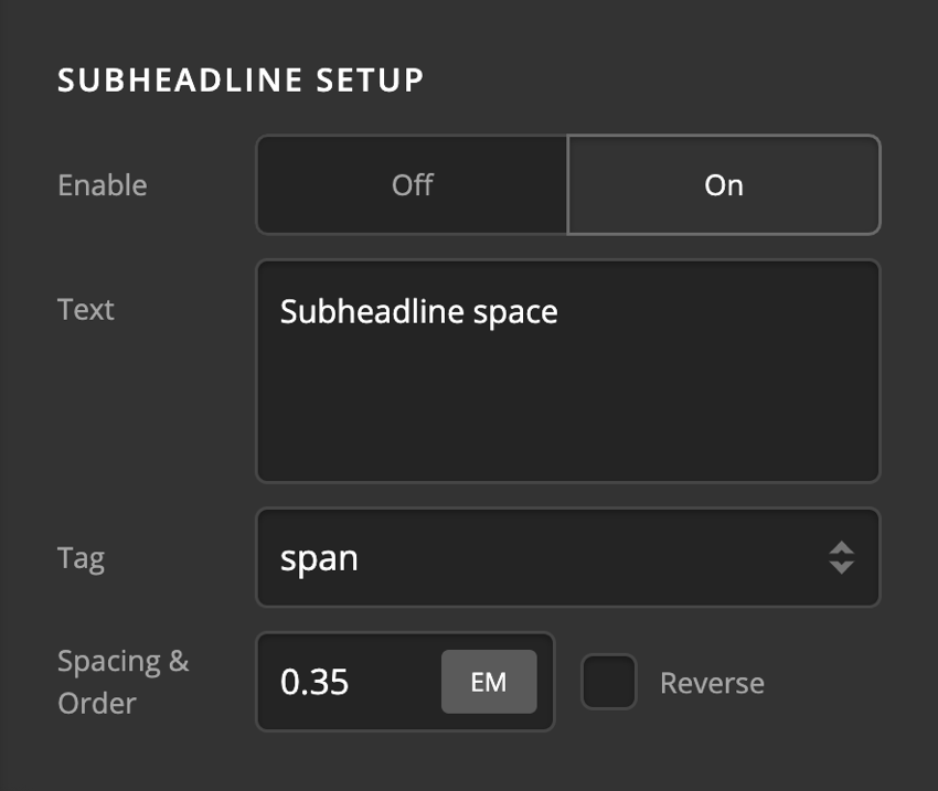
- Enable - Use this option to enable the subheadline portion of the card front content.
- Text - Use this option to add the text of the subheadline.
- Tag - Use this option to decide which HTML tag to be used for the subheadline. Available options are:
- p
- h1
- h2
- h3
- h4
- h5
- h6
- div
- span
- Spacing - Use this option to set the spacing between the subheadline and main content of the card front.
- Order - If you enable the Reverse option, the subheadline will show before the main content of the card front.
Subheadline Text Format
You can use this control group to set the format of the subheadline in the card front content.
- Font Family - Use this option to set the font of the card front content subheadline.
- Font Weight - Use this option to set the weight or thickness of the font. The values may differ depending on the selection of the font and if the select font supports weights or not.
- Font Size - Use this option to set the size of the font.
- Letter Spacing - Use this option to set the spacing between letters.
- Line Height - Use this option to set the spacing between each line.
- Font Style - Use this option to decide if you want to have a normal or italic style.
- Text Align - Use this option to set the alignment of the text. Possible values are left, center, right, and justify.
- Text Decoration - Use this option to force an underline or linethrough style.
- Text Transform - Use this option to set the case of the text. Available options are uppercase, camel case, and lowercase.
- Text Color - Use this option to set the color of the text.
Subheadline Text Shadow
The text-shadow control group contains settings to set a text-shadow for the card front subheadline text.

- X-Offset - Use this option to set the X offset of the text-shadow.
- Y-Offset - Use this option to set the Y offset of the text-shadow.
- Blur - Use this option to set the intensity of the blur effect in the text-shadow.
- Color - Use this option to set the color of the text-shadow.
Graphic Setup
The graphics setup control group gives you options to enable and set up the graphic icon at the top of the card front content.
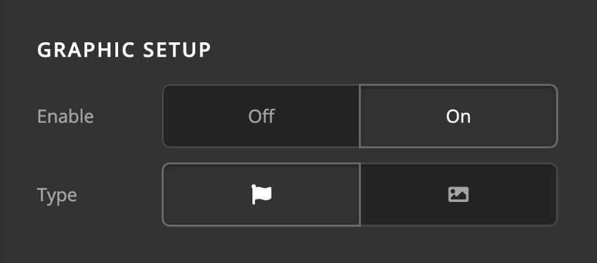
- Enable - Use this option to enable or disable the icon of the card front content.
- Type - Use this option to decide if the card front content graphic type should be Icon, or Image. There will be different control groups depending on the graphic type selection.
Graphic Margin
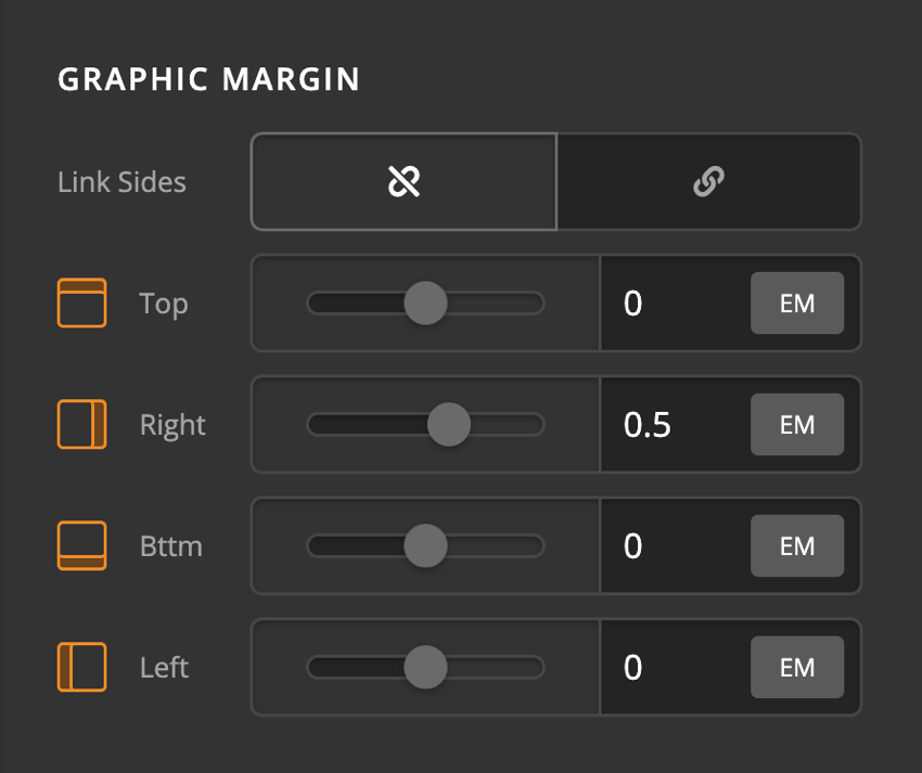
Use this option to set the margin of the card front content graphic. You can change the settings for all the sides of the card front content graphic or modify them individually.
Graphic Icon
Use this option to fine-tune the graphics icon of the card front content. This option will show if you set the graphics type of the card front content to the icon.
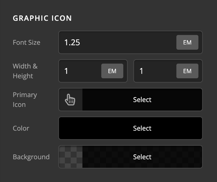
- Font Size - Use this option to set the base font for the graphic icon of the card front content.
- Width & Height - Use these options to set the width and height of the card front content graphic icon.
- Primary Icon - Use this option to select the primary icon of the card front content graphic.
- Color - Use this option to set the color of the card front content graphic icon.
- Background - Use this option to set the background of the card front content graphic icon.
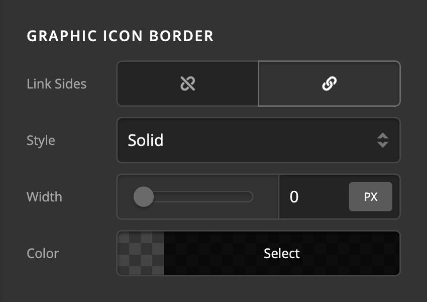
Graphic Icon Border
Use this option to set the border of the card front content graphic icon. You can set the style, width and color of the border on all sides or each side individually.
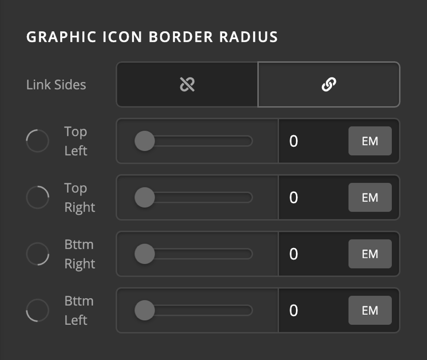
Graphic Icon Border Radius
Use this option to set a border-radius for the card front content graphic icon. You can set the curve on all sides or set them individually.
Graphic Icon Box Shadow
You can set a shadow over the card front content graphic icon using the box-shadow control group.
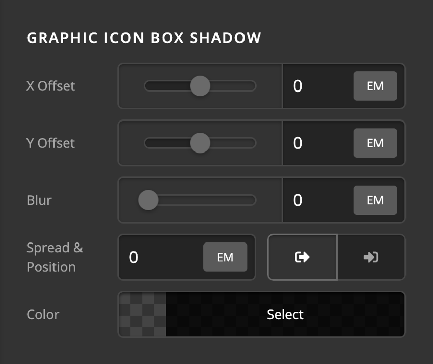
- X-Offset - Use this option to set the X offset of the shadow in the card front content.
- Y-Offset - Use this option to set the Y offset of the shadow in the card front content.
- Blur - Use this option to set the intensity of the blur effect in the card front content.
- Spread & Position - Use this option to set the spread amount of the items section shadow and decide if you want the shadow to sit inside or outside of the card front content.
- Color - Use this option to set the color of the card front content shadow.
Graphic Icon Text Shadow
The primary text-shadow control group contains settings to set a text-shadow for the card front content graphic icon.
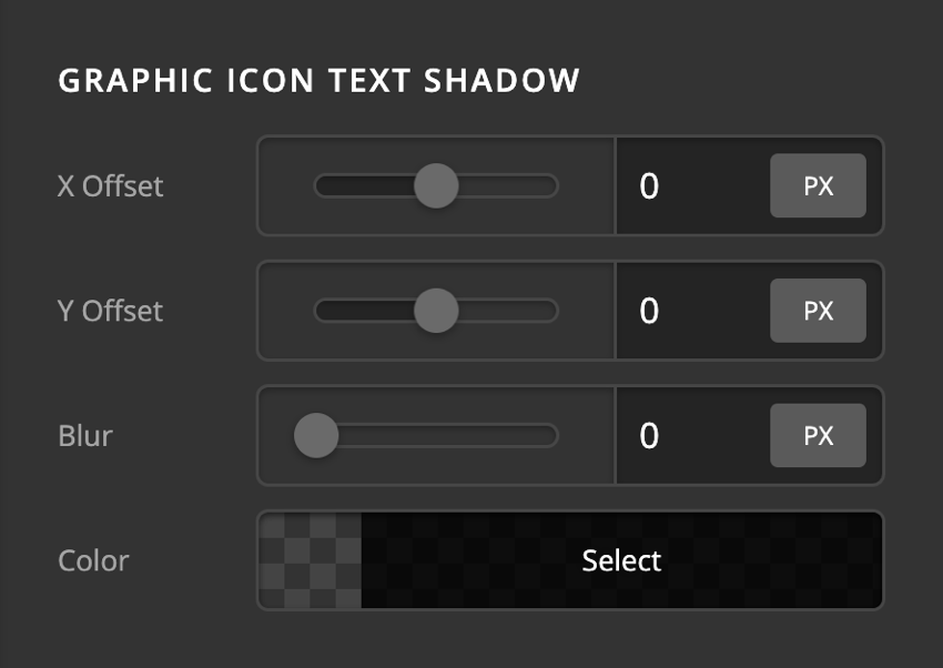
- X-Offset - Use this option to set the X offset of the text-shadow.
- Y-Offset - Use this option to set the Y offset of the text-shadow.
- Blur - Use this option to set the intensity of the blur effect in the text-shadow.
- Color - Use this option to set the color of the text-shadow.
Graphic Image
This option will appear if you select the image as the graphic type.
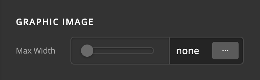
- Max Width - Use this option to set the maximum width of the card front content graphic image.
Primary Graphic Image
The Graphic Image control group is to set the image for the card front content graphic.
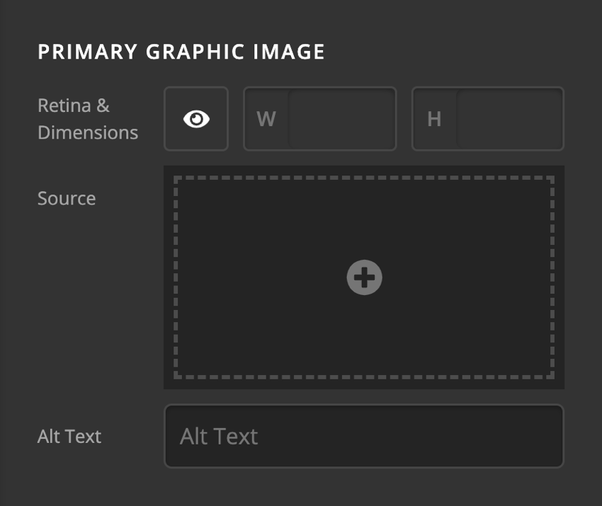
- Retina & Dimensions - Retina support is enabled out the box. Click the Eye to disable the Retina support. Also supports options to set the width and height of the image.
- Source - The image to be used. Click to select an image from the WordPress media library or upload a new one.
- Alt Text - The alternative text for your image. Make sure to set this for screen readers!
Back Content Setup
The back Content tab contains control groups to set up and fine-tune the content of the Card back in a hovered state.
- Base Font Size - Use this option to set the base font of the card back content.
- Tag - Use this option to decide which HTML tag to use to wrap the content of the Card back. Available options are:
- p
- h1
- h2
- h3
- h4
- h5
- h6
- div
- span
- Overflow - Use this option to force the card back content to respect the boundaries of the Card or not.
- Typing - Enable this option is you want to have the card back content to have the typing animation. Enabling this option will show the Typing control group to fine tune the effect.
- Text - Use this option to add the actual text of the Card back.
- Width & Max Width - Use these options to set the width and Maximum Width of the card back content.
- Background - Use this option to set the background color of the content portion in the card back.
Typing Setup
If you enable the Typing option of the Card back content setup control group, these set of options will show to fine-tune the effect.
- Prefix - This part of the text doesn't change. This appears before the changing text.
- Typed Text - This is where you enter the words that will change.
- Suffix - The text that appears after the changing words. This, like the prefix, also does not change.
- Speed & Back Speed - Speed refers to the speed at which each character is typed into the screen. Back Speed refers to the speed at which each character is deleted.
- Delay & Back Delay - Delay refers to the time gap before the first character gets typed. Back Delay refers to the time gap before the last character gets deleted.
- Enable
- Loop Typing - If you enable this option, the typing will replay virtually non-stop after it is finished with the last word.
- Show Cursor - If enabled, a blinking cursor will be displayed.
- Cursor - This option only appears if Show Cursor is enabled. This option allows you to type what character you want to display as the cursor.
- Color
- Text - This is where you set the color of the changing (typing) texts.
- Cursor - This is where you set the color of the cursor if you enabled the Show Cursor option.
Text Content Flexbox
The Text Content Flexbox section contains controls to set the positioning of the content using the CSS Flexbox display in the Card back.
- Child Placement: Use this option to decide if the content of the card back should be laid out vertically (Column) or horizontally (Row).
- Reverse: Enabling this option will cause the card back content to be laid in a reverse manner.
- Wrap: Enable this option to wrap the card back content when there is not enough space in smaller devices.
- Align Horizontal: Use this option to layout the Card back content horizontally.
- Align Vertical: Use this option to layout the Card back content vertically.
Click here for more information about the Flexbox display.
Margin
Use this option to set the margin of the card back content. You can change the settings for all the sides of the card back content or modify them individually.
Padding
Use this option to set the padding of the card back content. You can change the settings for all the sides of the card back content or modify them individually.
Border
Use this option to set the border of the card back content. You can set the style, width and color of the border on all sides or each side individually.
Border Radius
Use this option to set a border-radius for the card back content. You can set the curve on all sides or set them individually.
Box Shadow
You can set a shadow over the card back content using the box-shadow control group.
- X-Offset - Use this option to set the X offset of the shadow in the card back content.
- Y-Offset - Use this option to set the Y offset of the shadow in the card back content.
- Blur - Use this option to set the intensity of the blur effect in the card back content.
- Spread & Position - Use this option to set the spread amount of the items section shadow and decide if you want the shadow to sit inside or outside of the card back content.
- Color - Use this option to set the color of the card back content shadow.
Text Content Margin
Use this option to set the margin of the card back text. You can change the settings for all the sides of the card back text or modify them individually.
Text Format
You can use this control group to set the format of the text in the card back content.
- Font Family - Use this option to set the font of the card back content text.
- Font Weight - Use this option to set the weight or thickness of the font. The values may differ depending on the selection of the font and if the select font supports weights or not.
- Font Size - Use this option to set the size of the font.
- Letter Spacing - Use this option to set the spacing between letters.
- Line Height - Use this option to set the spacing between each line.
- Font Style - Use this option to decide if you want to have a normal or italic style.
- Text Align - Use this option to set the alignment of the text. Possible values are left, center, right, and justify.
- Text Decoration - Use this option to force an underline or linethrough style.
- Text Transform - Use this option to set the case of the text. Available options are uppercase, camel case, and lowercase.
- Text Color - Use this option to set the color of the text.
Text Shadow
The text-shadow control group contains settings to set a text-shadow for the card back content text.
- X-Offset - Use this option to set the X offset of the text-shadow.
- Y-Offset - Use this option to set the Y offset of the text-shadow.
- Blur - Use this option to set the intensity of the blur effect in the text-shadow.
- Color - Use this option to set the color of the text-shadow.
Subheadline Setup
The Subheadline Setup section contains control groups to enable and fine-tune a sub-headline section after the main content of the Card Element back.
- Enable - Use this option to enable the subheadline portion of the card back content.
- Text - Use this option to add the text of the subheadline.
- Tag - Use this option to decide which HTML tag to be used for the subheadline. Available options are:
- p
- h1
- h2
- h3
- h4
- h5
- h6
- div
- span
- Spacing - Use this option to set the spacing between the subheadline and main content of the Card back.
- Order - If you enable the Reverse option, the subheadline will show before the main content of the Card back.
Subheadline Text Format
You can use this control group to set the format of the subheadline in the card back content.
- Font Family - Use this option to set the font of the card back content subheadline.
- Font Weight - Use this option to set the weight or thickness of the font. The values may differ depending on the selection of the font and if the select font supports weights or not.
- Font Size - Use this option to set the size of the font.
- Letter Spacing - Use this option to set the spacing between letters.
- Line Height - Use this option to set the spacing between each line.
- Font Style - Use this option to decide if you want to have a normal or italic style.
- Text Align - Use this option to set the alignment of the text. Possible values are left, center, right, and justify.
- Text Decoration - Use this option to force an underline or linethrough style.
- Text Transform - Use this option to set the case of the text. Available options are uppercase, camel case, and lowercase.
- Text Color - Use this option to set the color of the text.
Subheadline Text Shadow
The text-shadow control group contains settings to set a text-shadow for the card back subheadline text.
- X-Offset - Use this option to set the X offset of the text-shadow.
- Y-Offset - Use this option to set the Y offset of the text-shadow.
- Blur - Use this option to set the intensity of the blur effect in the text-shadow.
- Color - Use this option to set the color of the text-shadow.
Graphic Setup
The graphics setup control group gives you options to enable and set up the graphic icon at the top of the card back content.
- Enable - Use this option to enable or disable the icon of the card back content.
- Type - Use this option to decide if the card back content graphic type should be Icon, or Image. There will be different control groups depending on the graphic type selection.
Graphic Margin
Use this option to set the margin of the card back content graphic. You can change the settings for all the sides of the card back content graphic or modify them individually.
Graphic Icon
Use this option to fine-tune the graphics icon of the card back content. This option will show if you set the graphics type of the card back content to the icon.
- Font Size - Use this option to set the base font for the graphic icon of the card back content.
- Width & Height - Use these options to set the width and height of the Card back content, graphic icon.
- Primary Icon - Use this option to select the primary icon of the card back content graphic.
- Color - Use this option to set the color of the Card back content, graphic icon.
- Background - Use this option to set the background of the Card back content, graphic icon.
Graphic Icon Border
Use this option to set the border of the Card back content, graphic icon. You can set the style, width and color of the border on all sides or each side individually.
Graphic Icon Border Radius
Use this option to set a border-radius for the Card back content, graphic icon. You can set the curve on all sides or set them individually.
Graphic Icon Box Shadow
You can set a shadow over the Card back content, graphic icon using the box-shadow control group.
- X-Offset - Use this option to set the X offset of the shadow in the card back content.
- Y-Offset - Use this option to set the Y offset of the shadow in the card back content.
- Blur - Use this option to set the intensity of the blur effect in the card back content.
- Spread & Position - Use this option to set the spread amount of the items section shadow and decide if you want the shadow to sit inside or outside of the card back content.
- Color - Use this option to set the color of the card back content shadow.
Graphic Icon Text Shadow
The primary text-shadow control group contains settings to set a text-shadow for the Card back content, graphic icon.
- X-Offset - Use this option to set the X offset of the text-shadow.
- Y-Offset - Use this option to set the Y offset of the text-shadow.
- Blur - Use this option to set the intensity of the blur effect in the text-shadow.
- Color - Use this option to set the color of the text-shadow.
Graphic Image
This option will appear if you select the image as the graphic type.
- Max Width - Use this option to set the maximum width of the Card back content, graphic image.
Primary Graphic Image
The Graphic Image control group is to set the image for the card back content graphic.
- Retina & Dimensions - Retina support is enabled out the box. Click the Eye to disable the Retina support. Also supports options to set the width and height of the image.
- Source - The image to be used. Click to select an image from the WordPress media library or upload a new one.
- Alt Text - The alternative text for your image. Make sure to set this for screen readers!
Back Button Setup
The Card Element has an additional button on the backside in a hovered state. The Back Button Setup control groups are the place to fine-tune the back button style.
=======
Front Content
The Front Content control group is essentially a nested Headline Element within the Card, so you can review the settings for that Element in detail on its own documentation page.
Back Content
The Back Content control group is essentially a nested Headline Element within the Card, so you can review the settings for that Element in detail on its own documentation page.
Back Button
The Back Button control group is essentially a nested Button Element within the Card, so you can review the settings for that Element in detail on its own documentation page.
Customize
The Customize pane consists of various features that allow you to take further control over your Element's styling and functionality:
- ID – Sets an HTML ID on the Element.
- Class – Sets an HTML Class on the Element.
- Element CSS – Use this feature for increased stylistic control of your Element, especially over nested markup. Click here for more detailed information on this feature, such as using
$elto dynamically target the base tag, et cetera. - Hide During Breakpoints – Hides the Element at different screen sizes when design alterations are needed. Click here for more information.
- Conditions – Adds / removes Elements from the page when certain criteria are met (e.g. “If a featured image is set...”). Click here for more information.
- Custom Attributes – Use this option to add custom HTML attributes to the root tag of the Element (e.g.
data-info="123"). This can be particularly helpful when integrating with various scripts and libraries.
Demo
To see a live demo of the Card Element click here.
Summary
To sum up, we've discussed the Card Element. We've discussed that a Card Element is an easy tool for adding cards on a page and we've learned how to change it's content and design. Finally, we delved into details of the Card Element settings.
See something inaccurate? Let us know