Accordion
In this article we're going to explain how to use the Accordion Element and the various ways it can be customized.
The Accordion Element allows you to output multiple groupings of content within a traditional "accordion" style component, which can be expanded or collapsed to reveal various sets of information.
Element Breakdown
The Accordion Element is made up of many sub Elements that work towards achieving its desired effect. The breakdown of how this markup works is as follows:
- Accordion (
.x-acc) - Accordion Item (
.x-acc-item) - Header (
.x-acc-header) - Content (
.x-collapsed- Contains.x-acc-content)
What we can see from the representative diagram above is that every Accordion Element is made up of one or more (typically at least 2) Accordion Items, and each accordion item contains its own header and content areas. The header of the Accordion Item serves as the toggle that users can click to reveal the collapsible content area. Below we will walk through the various controls available for each section and how you might use them to achieve certain looks.
Available Controls
In this section we will walk through each control grouping and pay special attention to any unique controls or things of note.
Accordion
The base level control grouping is labeled Accordion, which styles the containing Element that holds all accordion children. This is also where you will add your Accordion Children, which can be inspected to adjust content as needed. The first thing you will find in this control grouping is the Children control box:
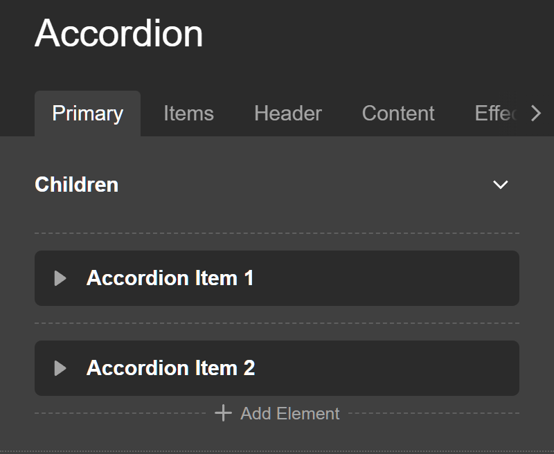
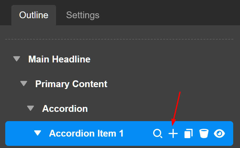
Here you can add as many children as you need to your Accordion, as well as inspect, duplicate, and delete these items as you wish. You can quick edit the title content of each Accordion children by double-clicking the title on each item, or you can click the "inspect" button (the magnifying glass), to go into that specific item:
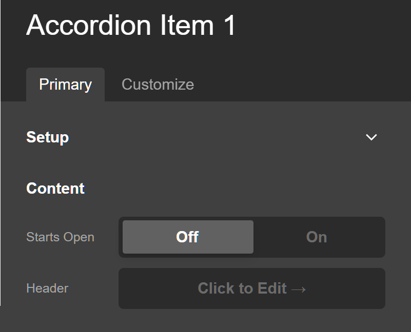
In this screen, you can choose whether or not the Accordion child should start "open" (with the content area expanded), and edit the header and main content.
Going back up to our base level accordion control grouping, you can add content to the Accordion Children by clicking on the + (plus) icon.
The next box you will see is labeled, Setup:
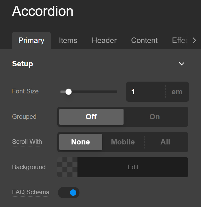
Here you can perform many of the basic functions you see across other Elements such as setting a base font size, background color, and width/max width values.
One control of note here is the Enable Grouping Toggle, which if enabled only allow one Accordion Item to be open at a time, which can be helpful for certain situations. Selecting this control to be on will also reveal a text input labeled Custom Group. Leaving this input blank by default will only allow one Accordion Item to be open in that Accordion at a time. If you place the same group name into this input across multiple Accordions though, it will only allow one Accordion Item to be open across all of those grouped accordions.
For example, if you had 3 different Accordions in use throughout your page and you only wanted one item to ever be open across all of them, you could give each of them a custom group name of "Group 1," which would ensure that this effect took place. Again, this is helpful for certain situations, but not always necessary.
The Scroll With option will scroll the page making the accordion stick to the top of the screen.
The FAQ Schema option adds FAQ structured data markup to the page to boost your SEO. To see the FAQ Schema setup in action, please watch the video below.
After that, you will find the traditional controls for things such as margin, padding, borders, shadows, et cetera.
Items
The most important set of controls to note for the "Items" control grouping is the Items Setup box:
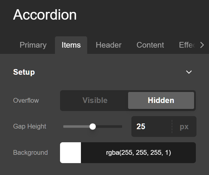
In addition to being able to specify a background color across all of your Accordion Items (which again, is the container holding the "Header" and "Content" areas), you can choose to disable the default content overflow of the containing Element. This is helpful in achieving certain stylistic approaches for your Accordion Items, but keep in mind that this means things like box shadows on the Header or Content area inside your Accordion Items will not be able to flow out of the Accordion Item container.
Additionally, you can also set the Spacing control, which dictates how much spacing should be placed vertically between each Accordion Item. One thing to keep in mind here is that you can also use negative margins if you wish, which can help to create a more tightly "grouped" feeling. For example, if you placed an outer border on each item of 1px, you could experiment with placing a -1px spacing for each item, effectively placing them directly on top of one another and giving them a linked appearance.
After that, you will find the traditional controls for things such as padding, borders, shadows, et cetera.
Header
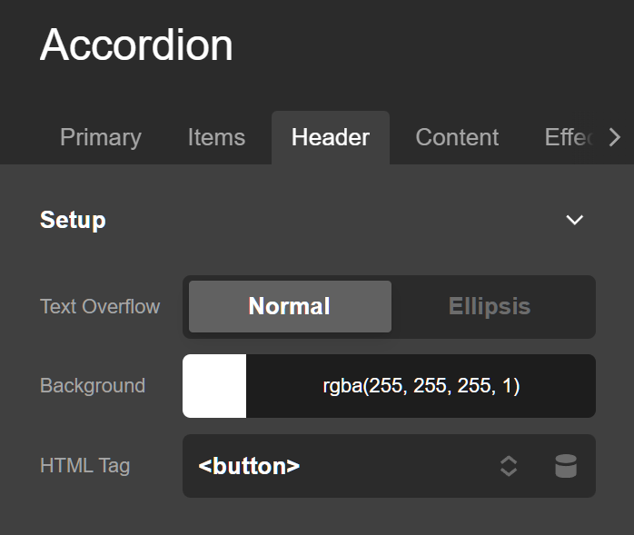
The Setup box for the "Header" control group contains a few notable controls. The first one you will notice is a toggle labeled Overflow:
If that toggle is enabled, it will ensure that Headers with very long content will utilize a text overflow technique that will represent overflowing text with an ellipsis instead of wrapping, like so:
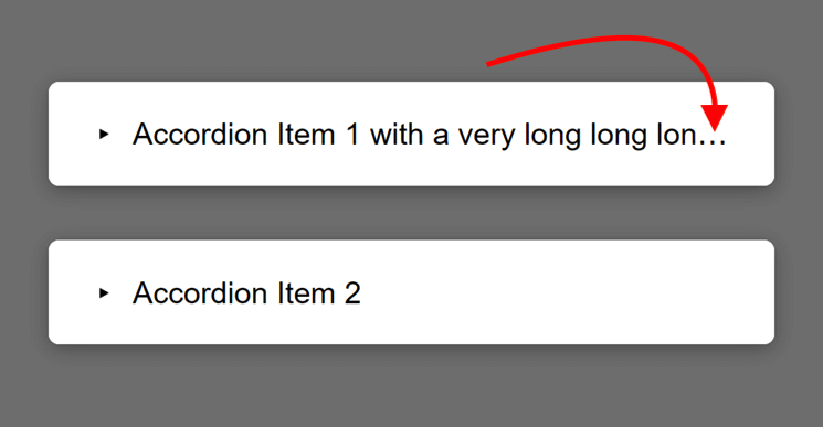
This is simply a matter of preference as your design might work well with text wrapping to another line and you could leave it off, or you simply might prefer to ensure that all of your Headers remain the same height at all times even as your website sizes down responsively.
Next, we have the indicator control, which if turned on will display a styleable status indicator for each Accordion Item in the Header (as seen by the caret in the screenshot). If you select the Reversed checkbox, it will place that indicator at the far side of the Accordion Item Header.
If you have the Indicator toggle enabled, the next box you'll see for this control grouping will be labeled Header Indicator Setup:
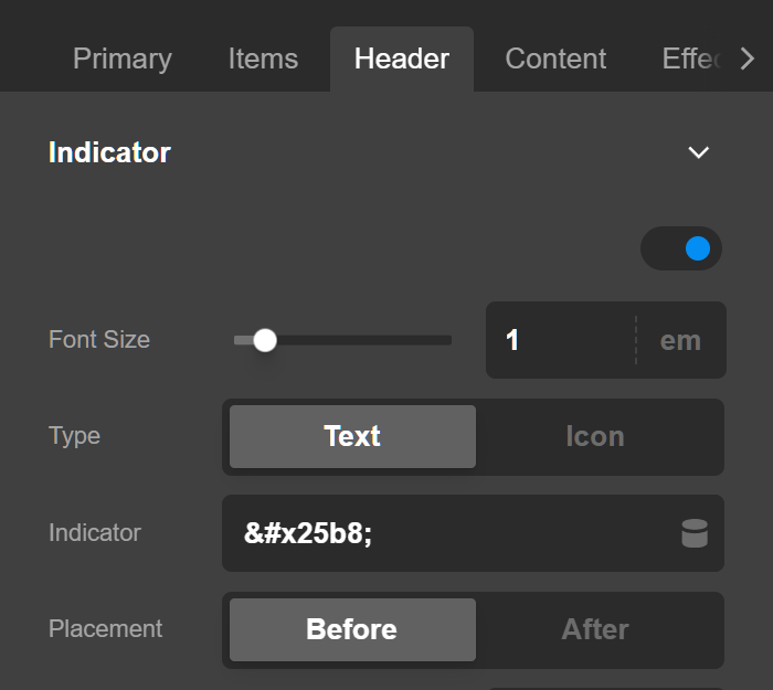
Here, you will setup a few basic styles to give you Accordion Item Indicator the styling you want. You can choose between using "Text" or an "Icon" for your indicator (in the screenshot above we're using "Text" with a unicode caret character for our design), as well as specifying the base size for your Indicator.
Next, you can specify a height and width if desired, which can be useful depending on what type of setup you're using. After that, you'll see the Start & End Rotation inputs, which is where you will specify a degree rotation for your Indicator for each state of your item (e.g. open and closed). For this example, our item is starting out with no rotation, but when the item is opened, the Indicator is animated to rotate 90deg, pointing downwards. This helps to give slight stylistic flourish, and can be used creatively with indicators such as a plus sign, which can be rotated 45deg to represent an "X." And finally we have the color of the indicator for when the Item is open and closed.
After that, you will find the traditional controls for things such as margin, padding, borders, shadows, text, et cetera.
Content
The Content control grouping is pretty straightforward, including background color as well as all of the traditional margin, padding, border, and shadow controls that you will be accustomed to seeing across all Elements.
Customize
The Customize pane consists of various features that allow you to take further control over your Element's styling and functionality:
- Toggle Hash – Available under Accordion Item's Customize settings, this allows the Accordion Item to be opened using a link (e.g. Type
readin the Toggle Hash field then type#readin the href in your anchor or URL in the Button element. - ID – Sets an HTML ID on the Element.
- Class – Sets an HTML Class on the Element.
- Element CSS – Use this feature for increased stylistic control of your Element, especially over nested markup. Click here for more detailed information on this feature, such as using
$elto dynamically target the base tag, et cetera. - Hide During Breakpoints – Hides the Element at different screen sizes when design alterations are needed. Click here for more information.
- Conditions – Adds / removes Elements from the page when certain criteria are met (e.g. “If a featured image is set...”). Click here for more information.
- Custom Attributes – Use this option to add custom HTML attributes to the root tag of the Element (e.g.
data-info="123"). This can be particularly helpful when integrating with various scripts and libraries.
Demo
To see a live demo of the Accordion Element click here.
Rich Text Schema
We strip schema html by default, but valid FAQ schema tags can be enabled with the following filter in your child theme.
add_filter('cs_faq_answer_rich_text', '__return_true');Summary
You now know everything about the Accordion Element and how to use it. This is a wonderful Element for organizing groupings of data like frequently asked questions, steps in a process, or sections of content.
See something inaccurate? Let us know