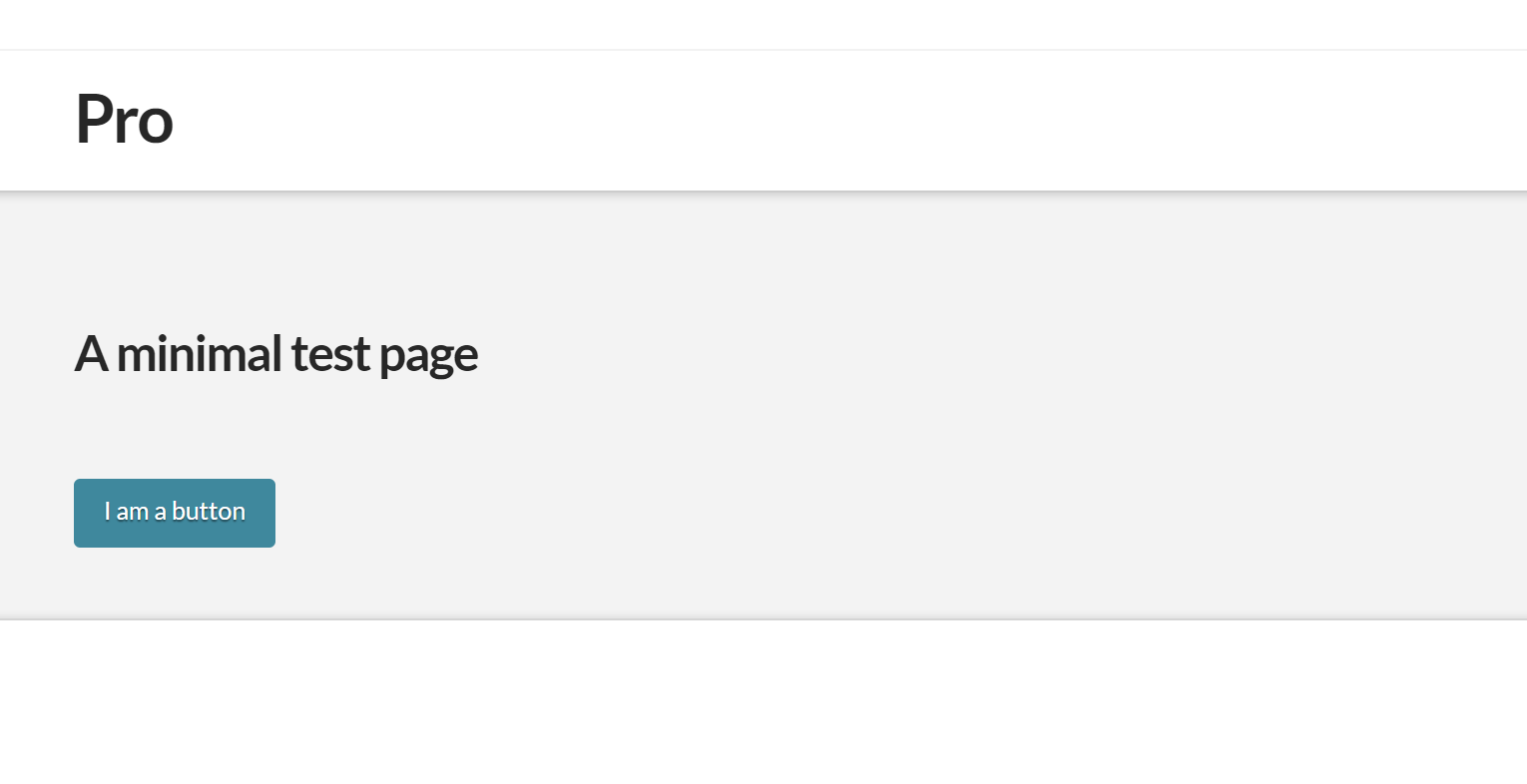
Buttons
In this article, we're going to show you how to set a Button style that will be applied to the entire website using Button Settings under Theme Options.
Difference between Buttons Settings and Button Element
Usually, a website makes use of more than one button styles. You may use one style for your call-to-action buttons, another one for the “Read more” buttons on your blog pages and “Add to Cart” on your Shop Page.
However, there is usually a button style that is common across different areas of your site—a style that is more commonly used than the others. You may call it a “default” style. And as a matter of efficiency, you would want the ability to set that default button style in one place and apply it to multiple places. That's where “Button Settings” come in.
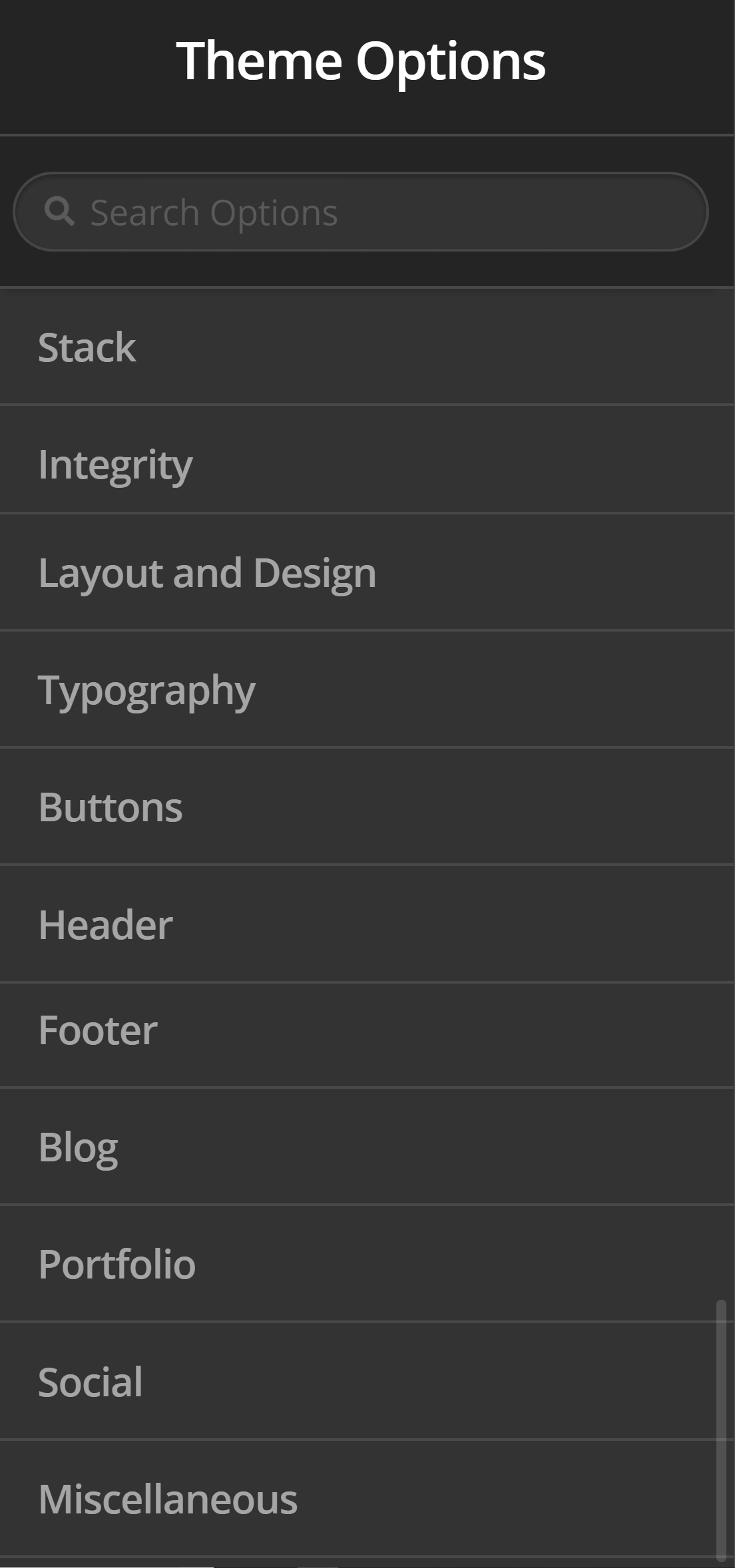
To access Button settings, go to Theme Options > Buttons.
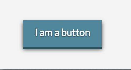
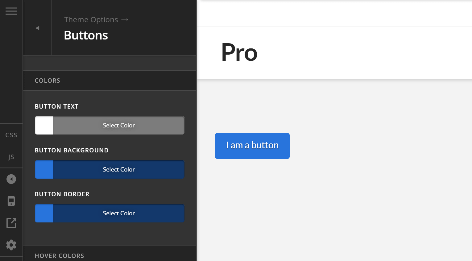
Now, let's say you have these settings below (and I'll explain each setting later) and clicked “Save.”
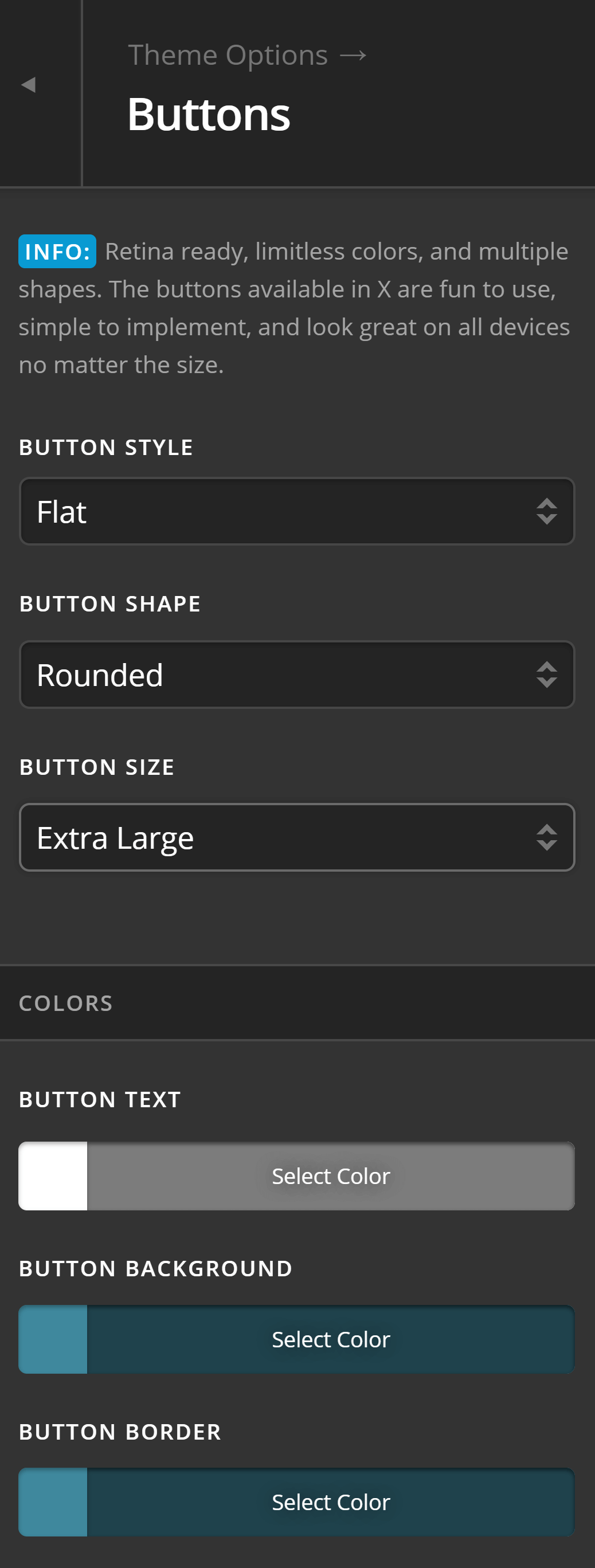
And those settings result to a button like below (except for the text of course).

Whenever you add a new Classic Button Element on the Content Builder in Pro, Cornerstone in X or with the use of shortcodes in your WordPress template files (e.g. single.php), it will automatically use the global settings you've set on Theme Options > Buttons.
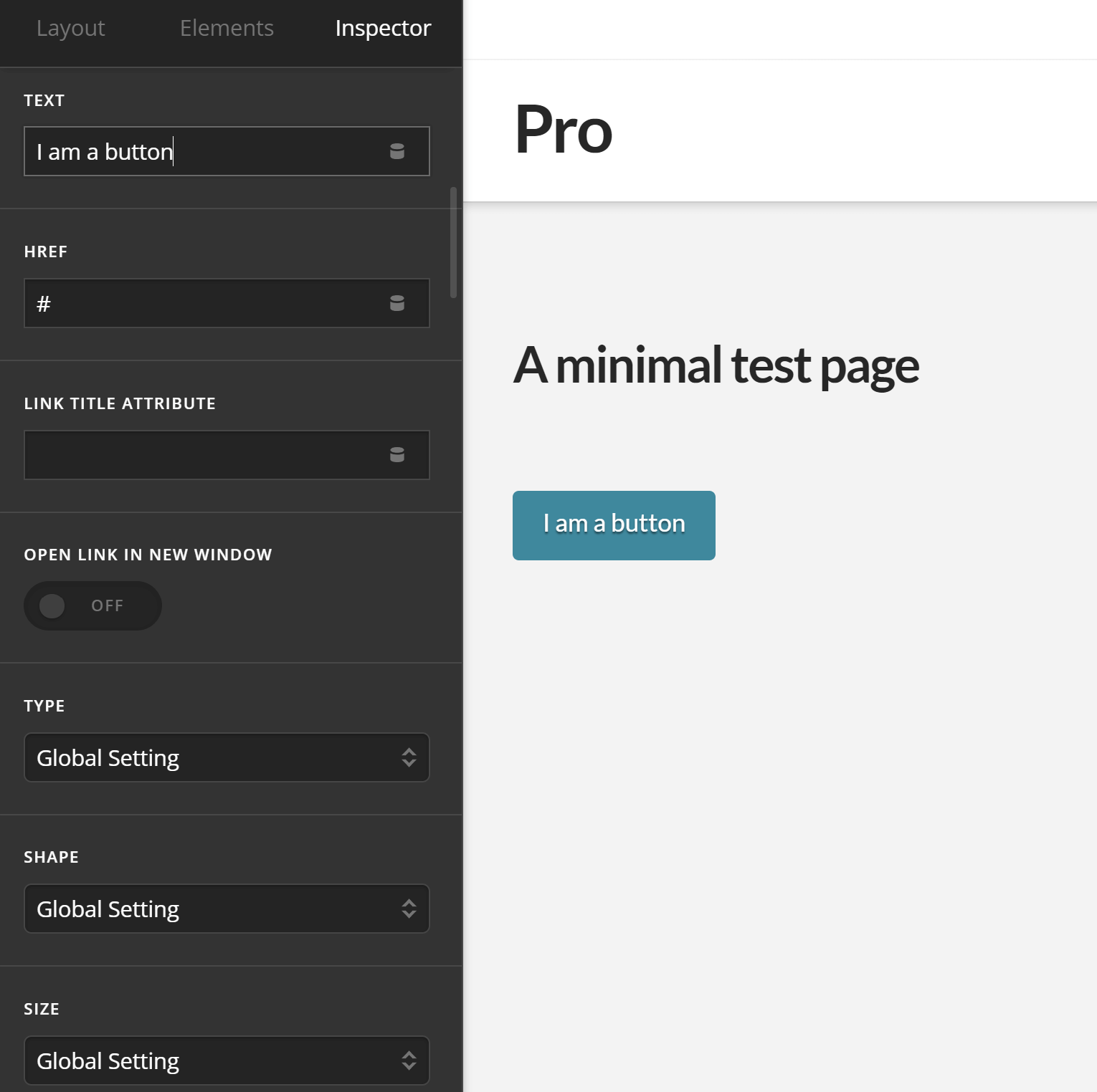
Without touching any other setting except for the Text and href, you'll end up with a button that looks like the one we've set globally. This makes it super easy to retain a consistent look.
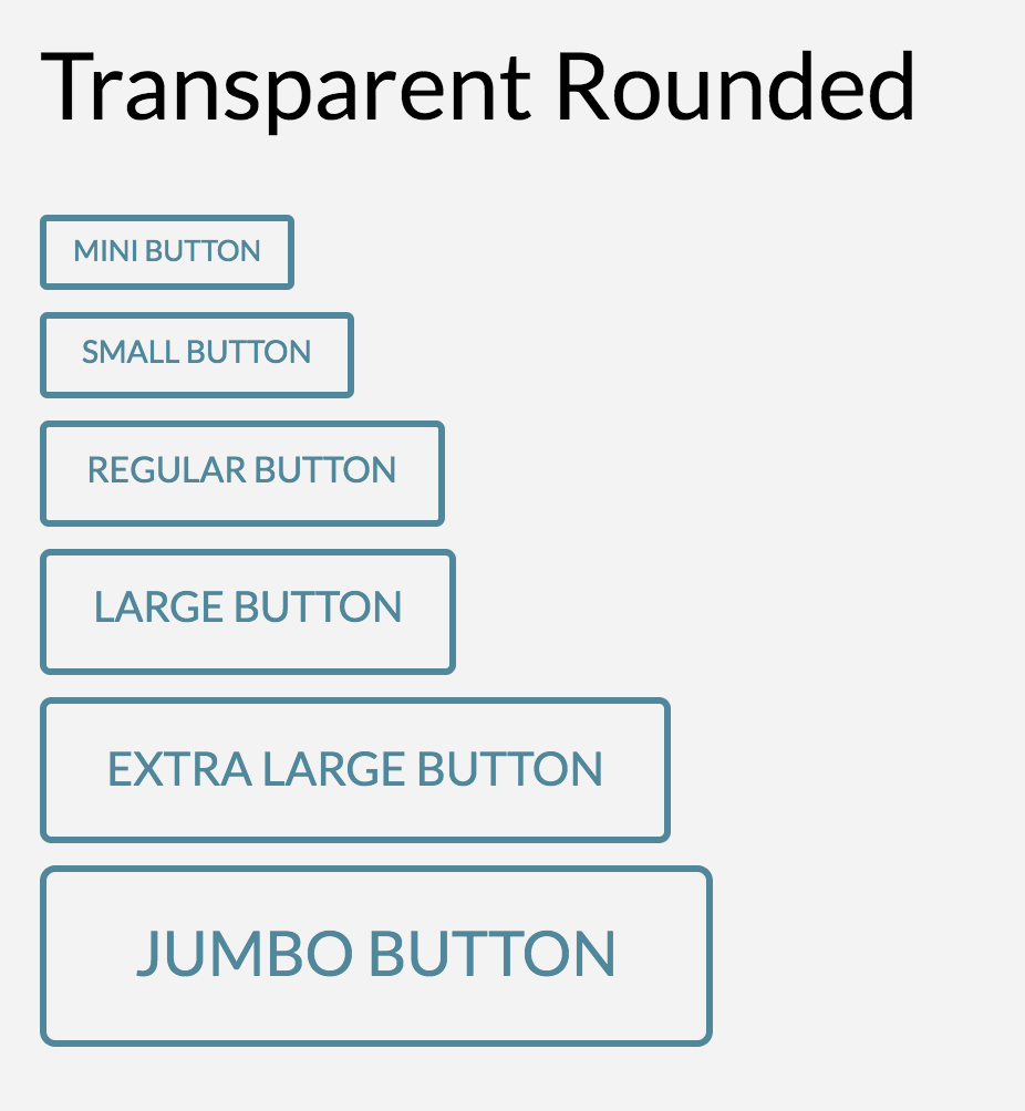
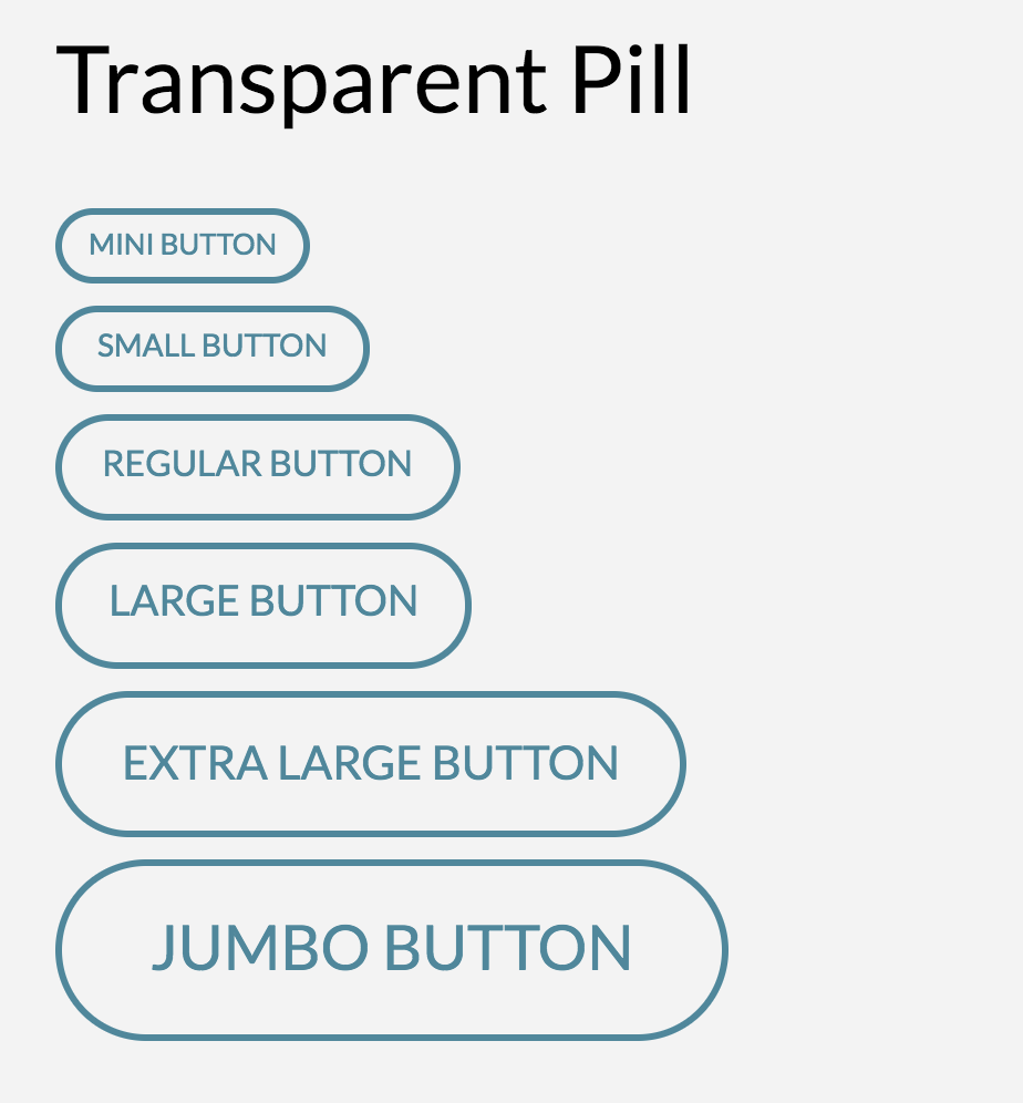
Now, let's say you've already added that button to many pages and decided (or your client has decided) he doesn't want the rounded kind of button but wants something that looks like a pill. You don't have to change each one manually. Simply go back to Theme Options > Buttons and change the Button Shape to “Pill” as shown below.
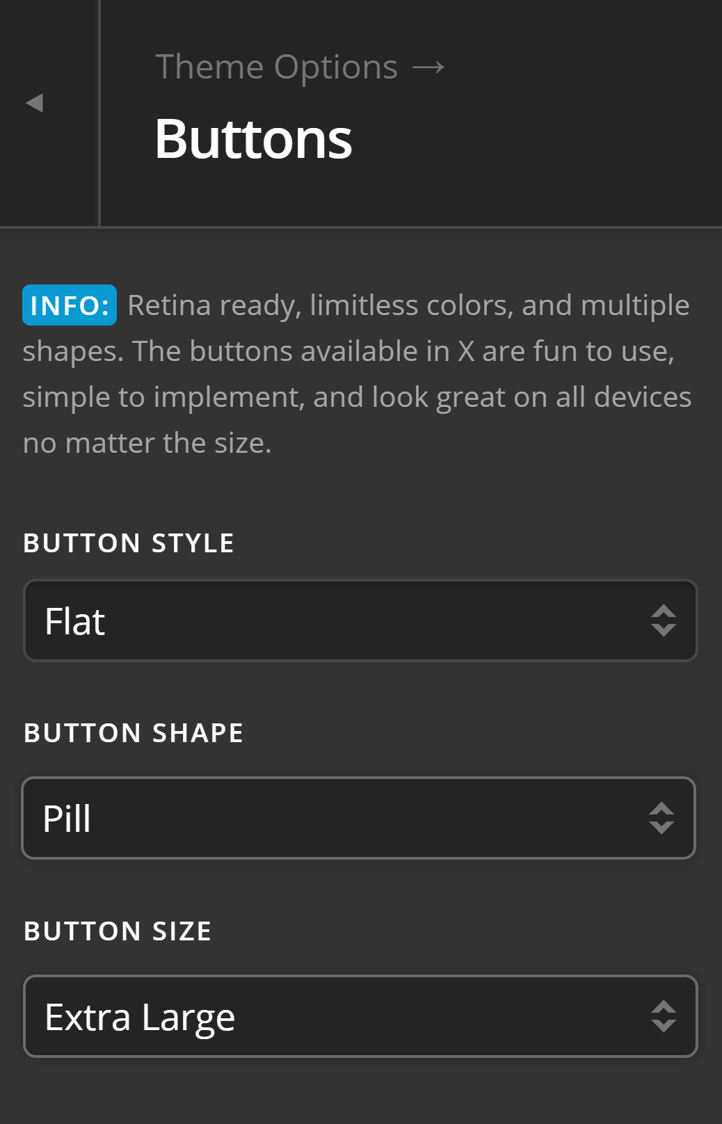
After you click “Save” all Classic Buttons on your website that follows the global settings will be changed.
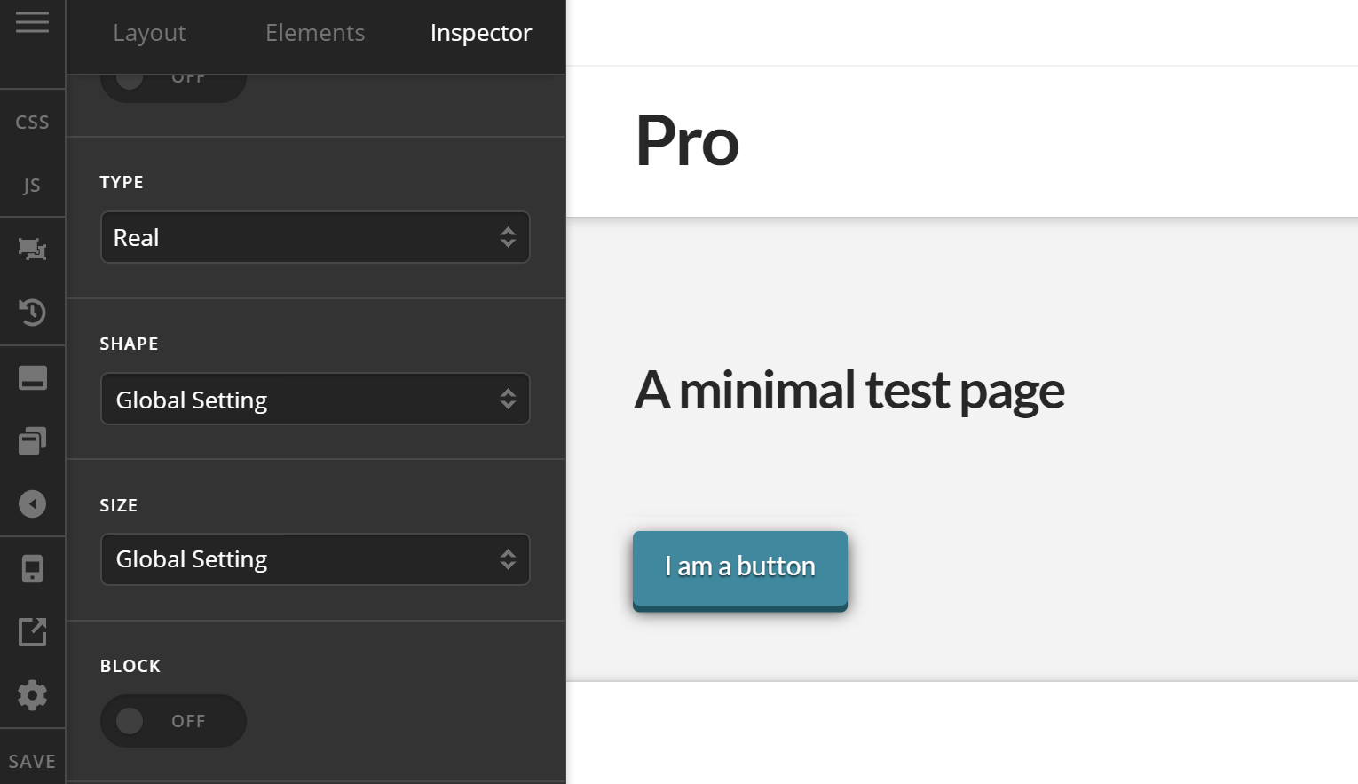
Now, let's say you wanted to create different kind of button—one that is small, squared-shape, has outer shadows and has a border in the bottom. One that looks like this.
All you need to do is to select different options for the following fields in the Classic Button Element.
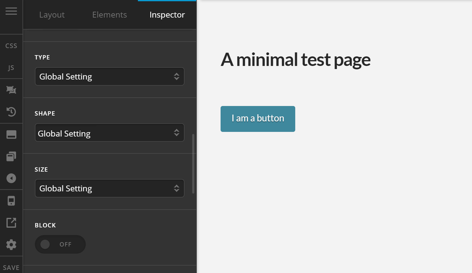
You can see that by default they all have the option “Global Setting” selected. That means they all follow whatever is set in the Button Settings. You can override the global setting by selecting different options.
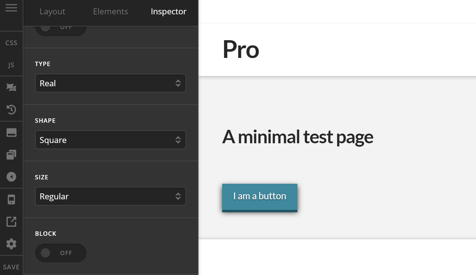
You'll see above that I've selected different options for all 3 fields to achieve our desired button look described earlier. Now, you don't have to change all of them. If you have to change only the Type and retain the Shape and Size, you may do so. Below is an example.
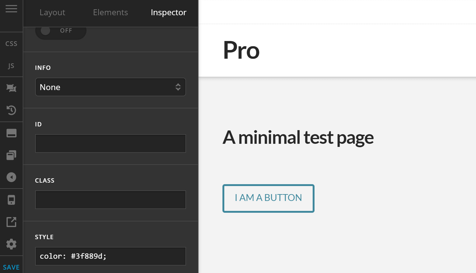
You'll see above that both Shape and Size retained the global setup by selecting the “Global Setting” option while only Type uses a different option other than what has been set globally.
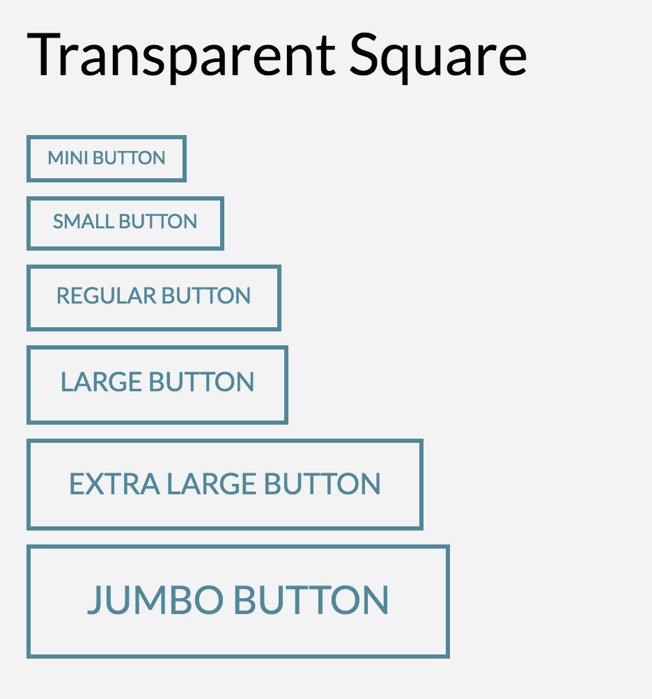
Want to create a transparent version of our button? Simply choose the “Transparent” option for Type. And since in this case, we've set the color white as the Text color in our Button Settings and there is no the Pro Content Builder and Cornerstone for changing the color of a Classic Button Element, you will have to use CSS to change the text color.
Buttons Settings Explained
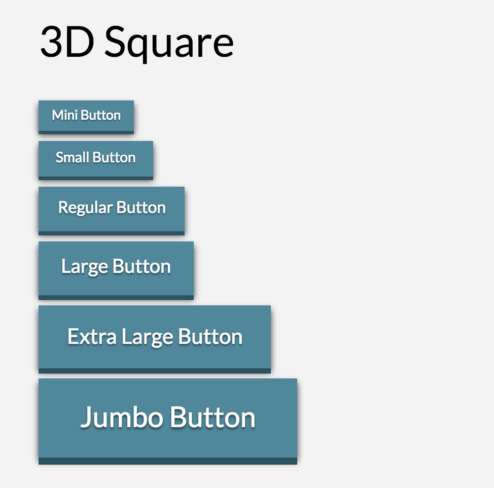
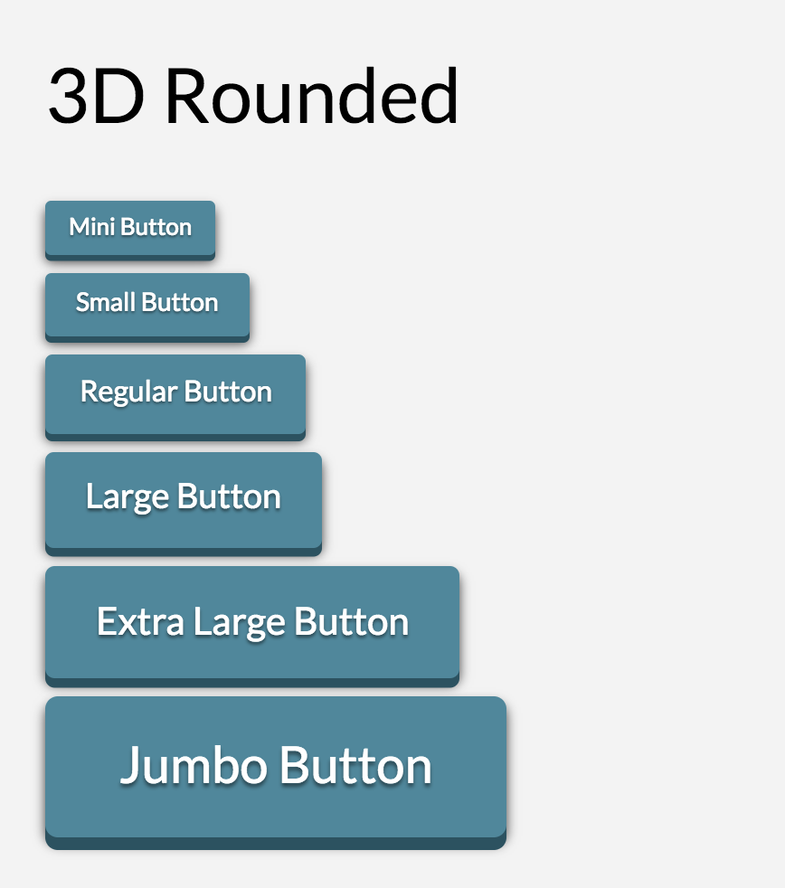
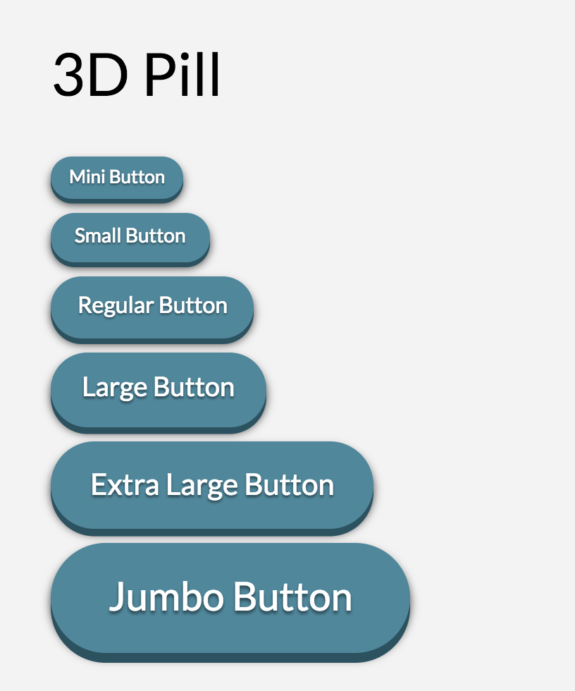
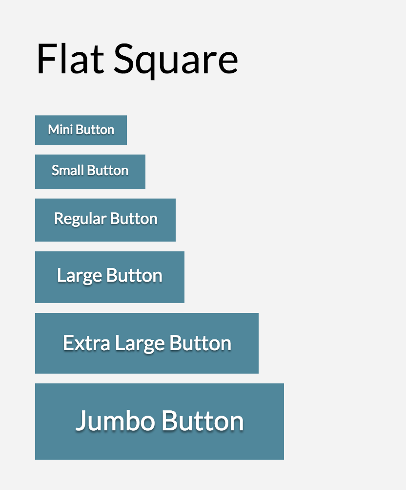
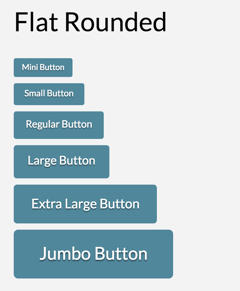
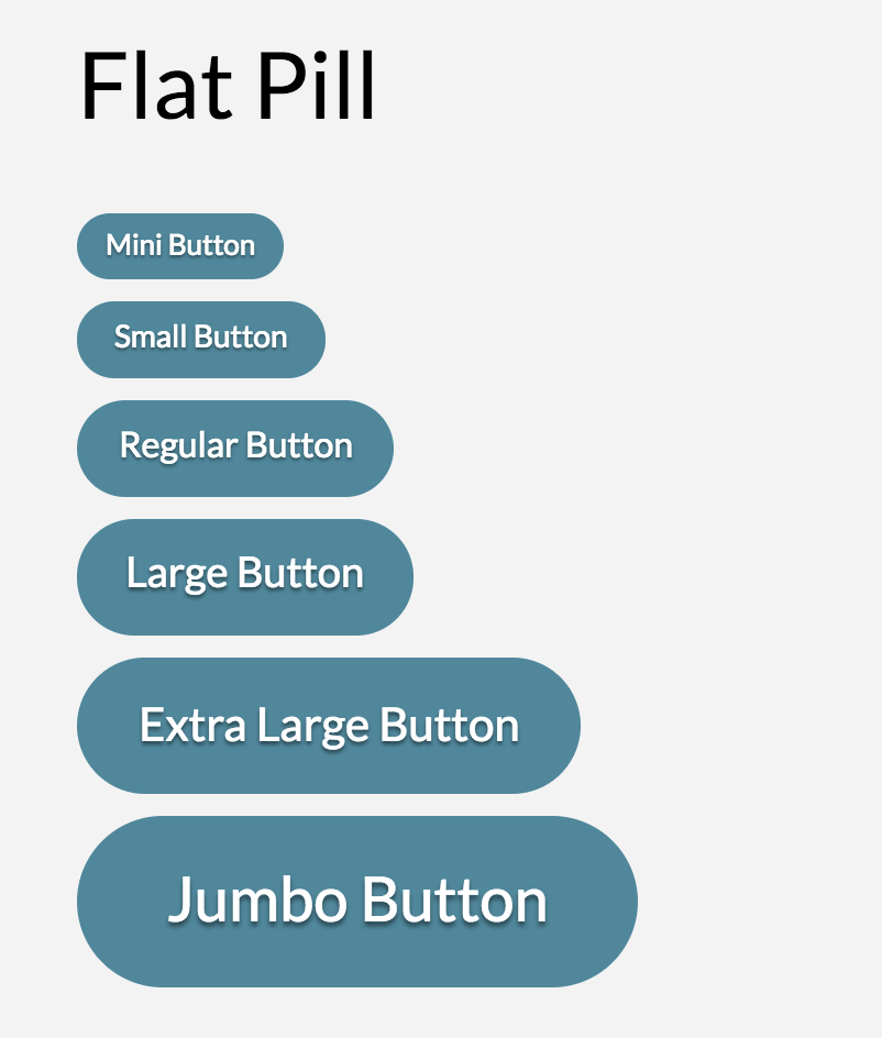
Now let's dive in to the different button settings available starting with the Button Style, Button Shape and Button Size. But rather than explaining them to you, I'd rather show you how they look.
Color Settings
Let's now dive in to the button color settings. Basically there are two color settings under Button Settings: Colors and Hover Colors.
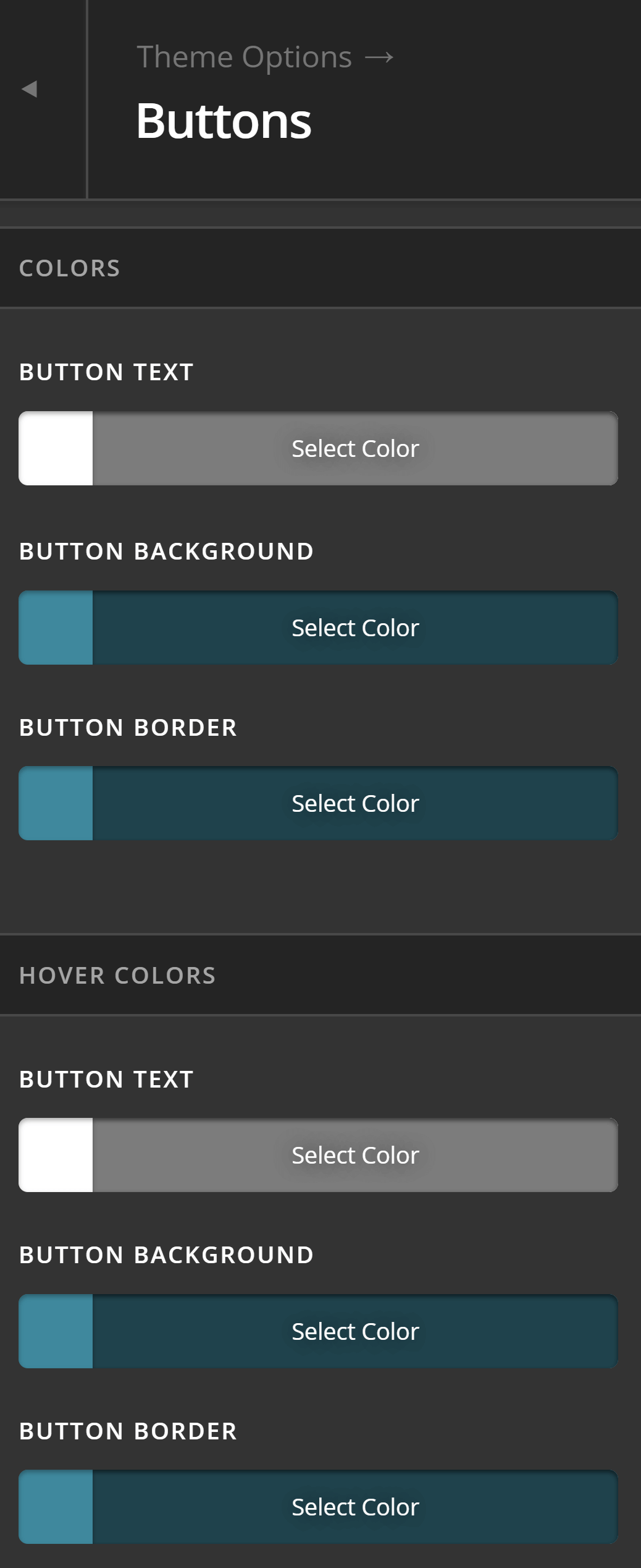
Colors is where you set the colors of a button when the mouse is not interacting with it. You may say that it contains the color settings of a button when it is at rest. Let's say you want a blue-colored button and have these colors set on Colors.
Hover Colors, on the other hand, is where you set the colors of a button when the mouse is pointing at it. For the sake of demonstration, let's make the background color orange when the mouse is hovered.
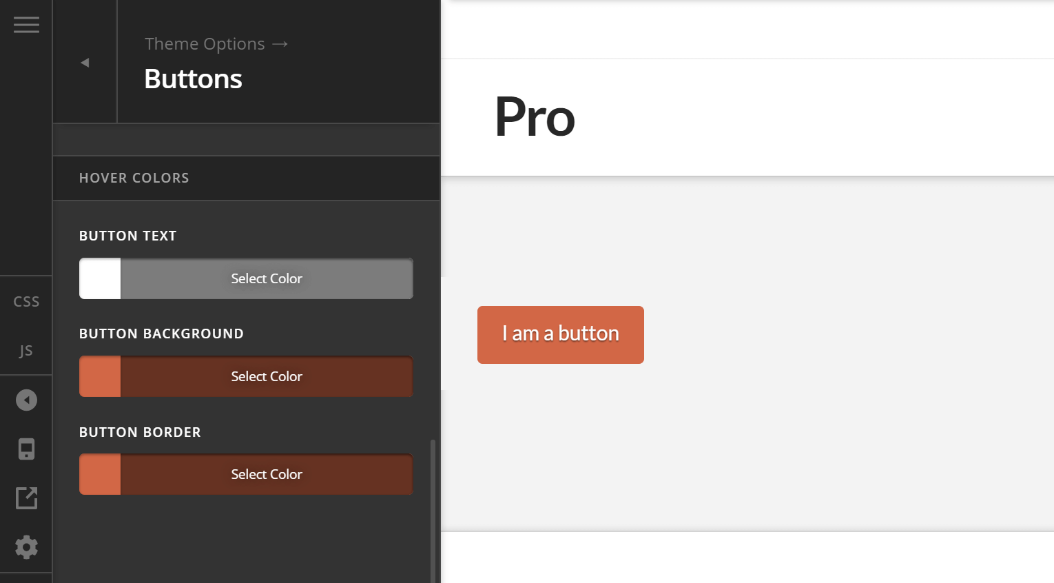
It is usually a good practice in web design to change the color of a button when a user points a mouse to it because the additional feedback reinforces to the user's mind that the element that he is pointing his mouse on is indeed a button, that it's clickable and that something will happen when it is clicked.
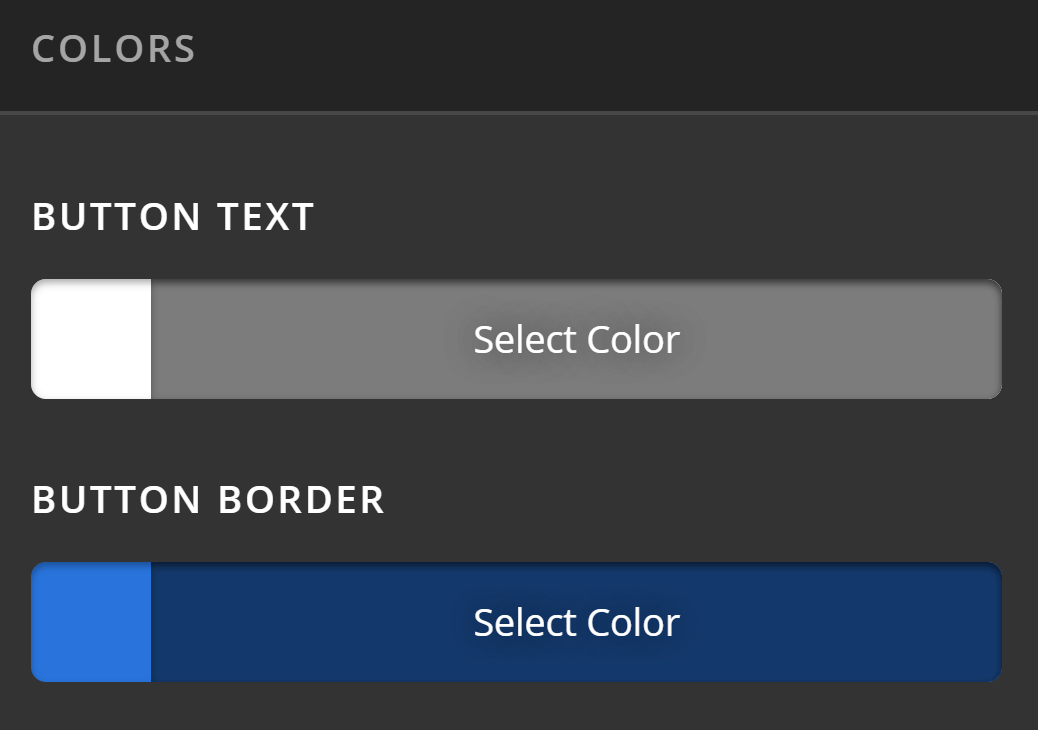
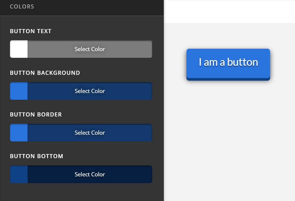
There are 4 different color settings that appear on both Colors and Hover Colors. They are the following:
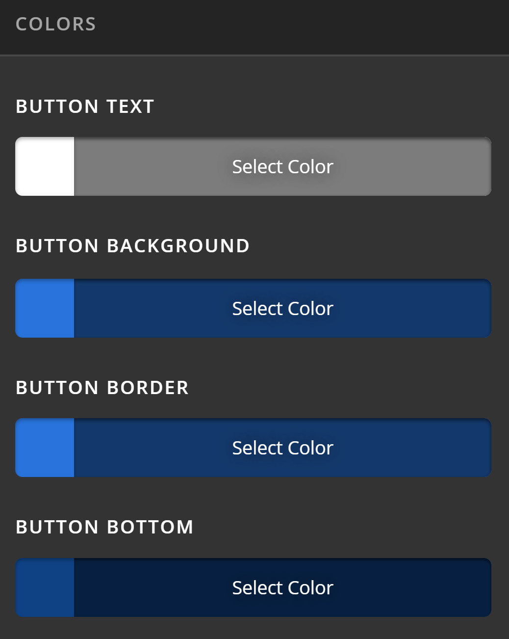
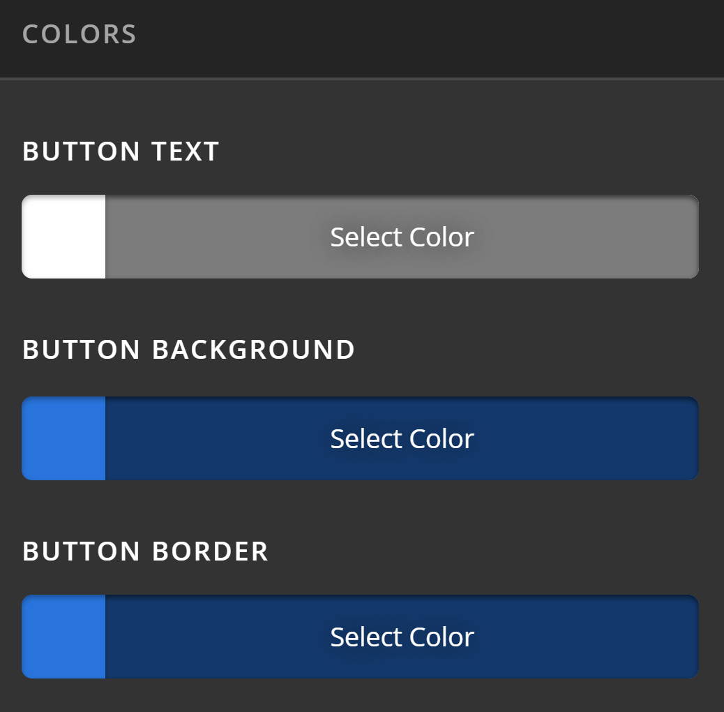
Now depending on the the Button Type, you will see either all, three or just two of these settings. If you choose the 3D Button Type, you'll have all options shown in the previous image. If you choose Flat, you'll have three:
If you choose Transparent, you'll only see two:
The image below shows where each color setting is applied to the button.
Summary
That's it! Now you know how to globally set a button's style, type, colors and size using the Button Settings in Theme Options. You also know how to override those Global Settings for Buttons that you want to look different from the one you've set globally.
See something inaccurate? Let us know