Preferences
In this article, we will go over everything you can adjust in the Preferences panel.
How do preferences work
Some things to keep in mind when managing preferences.
- Preferences only effect your user account. If you want to enforce changes site wide, you will want to use the permissions system. Learn more by reading Configure User Permissions.
- Some preferences have a different default value depending on if you are using X or Pro.
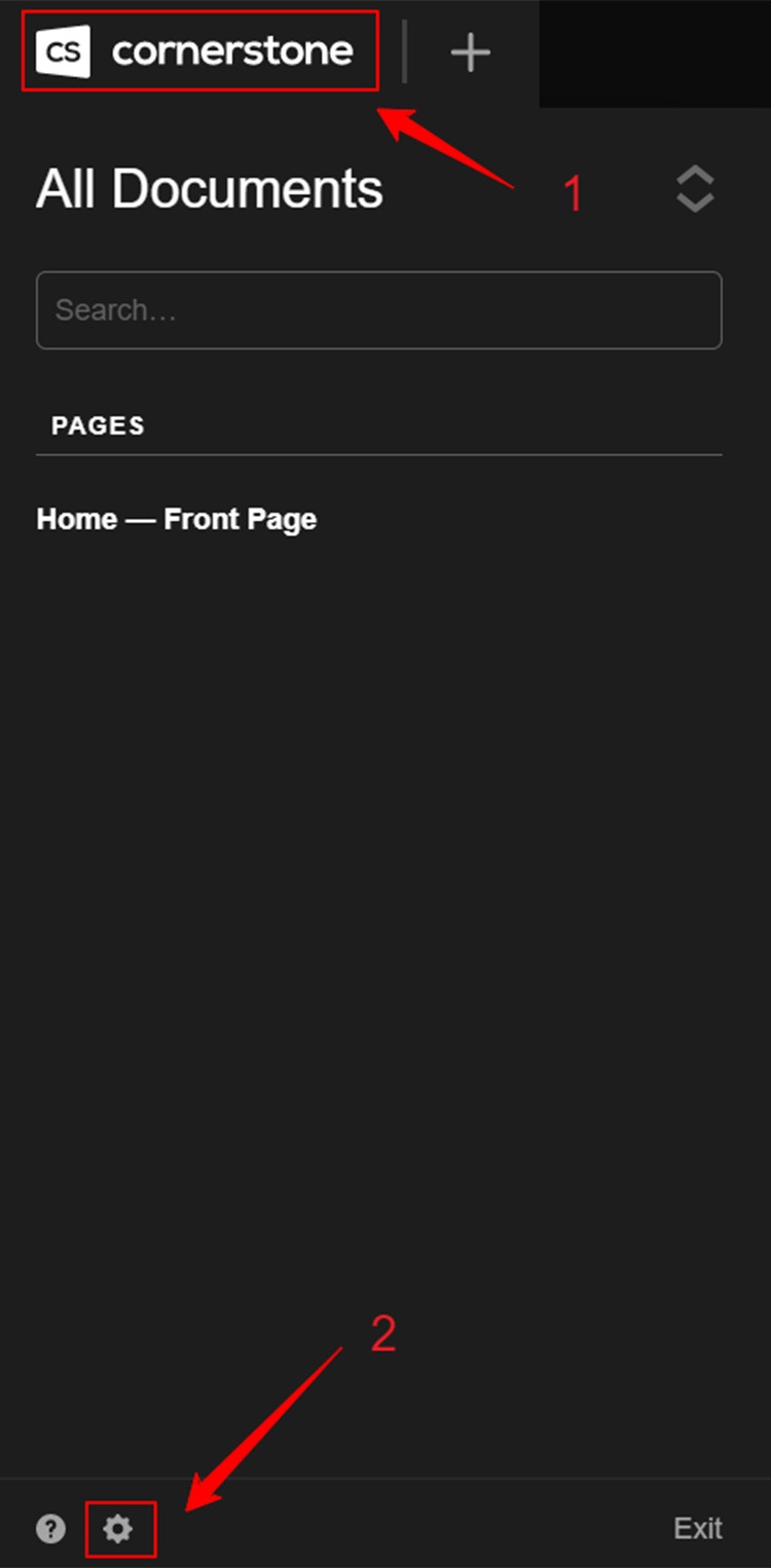
How to Access Preferences
- Go to Cornerstone page
- Click the Cornerstone icon at the upper left corner
- Click the gear icon at the bottom left
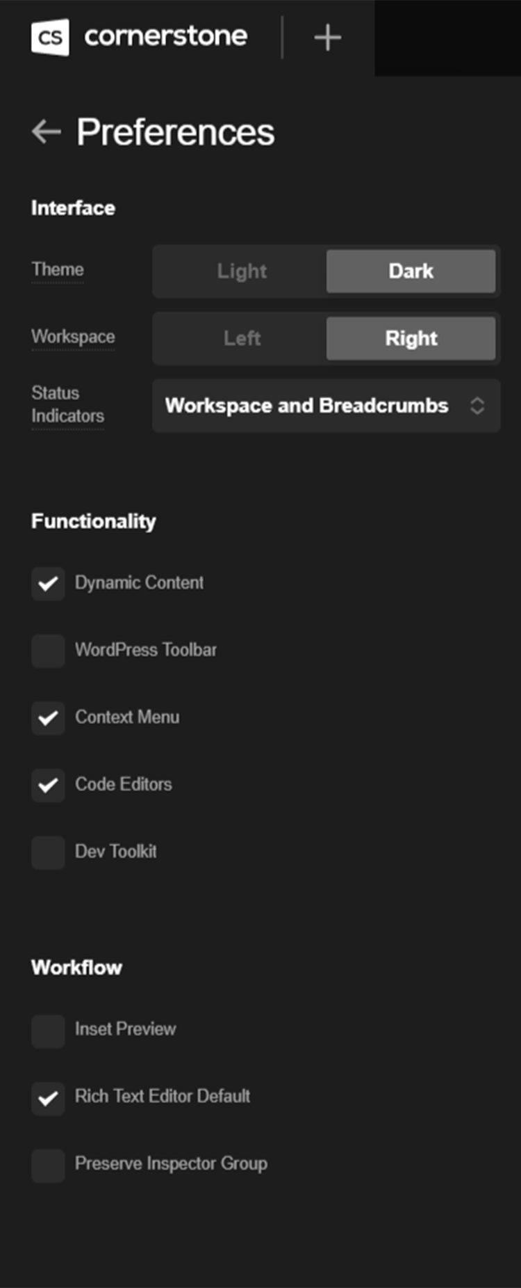
Once you have made this selection, you will see the following dropdown appear:
Content Layout Element
New Sections added to a page will start with a default child element like a Row or Grid. You can determine which layout element to use by adjusting this preference.
- Row - The default option. A versatile element powered by flexbox.
- Grid - A more advanced layout element that leverages the CSS Grid spec and is only available to Pro users.
- Classic Row - A previous generation layout element that is built on the original CSS float system. This is supported for backwards compatibility, but we recommend using the new Row element moving forward.
Dynamic Content
When enabled, it will show the Dynamic content icon in supported controls like text inputs. Learn more about this by reading our article on Dynamic Content. Defaults to Off with X or standalone Cornerstone and On with Pro.
WordPress Toolbar
While using the application, determine if the WordPress toolbar appears across the top of the screen. If you adjust this setting you will need to refresh your browser after saving the preferences. This because the WordPress toolbar is not part of our dynamically rendered application.
Help Text
This was used more prominently in older versions of X and Pro, but isn't as frequent in more recent versions. When enabled, it allows Help Text to appear in the app. Most use cases of this setting have been removed in favor of more natural, less intrusive UX patterns.
Rich Text Editor Default
When you inspect an element that uses a Rich Text control (Text, Headline, etc.) this will determine which editing mode is shown first. If enabled, it will start in Rich Text mode.
Context Menu
Enables the ability to alt-click throughout the application to use a context menu. This does override the browsers ability to display a context menu. You can alt-click in the following contexts:
- Elements in the live preview
- Elements in the Layout pane
- Element names in the Inspector breadcrumbs
- Breakpoint controls in the Grid and Cell elements.
UI Theme
Currently Light and Dark are the two available UI themes. Use this option to toggle between them.
Dev Console
When enabled, a new icon will appear in the primary bar that exposes several low-level features often used in our development processes. This includes:
- A stripped down and quickly searchable index of all available control values for Elements, Settings, and Theme Options.
- The "Tools" tab, which can be used to specify Elements or groups of controls that should be auto-inspected on load.
- Our "UI CSS" code editor, allowing you to quickly add custom styles that only affect the app UI for customization or experimentation purposes.
Auto Close Elements
As of Pro 4, X 8, and Cornerstone 5, the Elements library is set in a floating pane that hovers over the workspace and live preview. If this setting is enabled, the pane will be closed as soon as an Element from the library is dragged into the live preview. To keep this pane permanently available until closed out, leave this setting disabled.
Preserve Inspector Group
Enable this option if you would like to maintain the same control group you are currently viewing across like Elements. For example, if you are working in the "Effects" module and want to focus on this workflow throughout your page, you could enable this setting and as you click from one Element to the next, you will stay within that Element's "Effects" control group instead of it being reset to the top level controls each time.
Autosave
@since Cornerstone 7.8.0
Autosave will automatically save your Document and Theme Options whenever a change is made. You'll notice the Save button will go from the warning color back to green when the Autosave has taken place.
Navigation Bar
Allows you to select between a number of layout options for the live preview breadcrumbs and inspector control groups in the navigation bar. You may wish to update these based on general preference, or for a particular workflow. The available options are as follows:
- Breadcrumbs + Control Groups (Left)
- Breadcrumbs + Control Groups (Right)
- Breadcrumbs + Control Groups (Spaced)
- Control Groups + Breadcrumbs (Left)
- Control Groups + Breadcrumbs (Right)
- Control Groups + Breadcrumbs (Spaced)
See something inaccurate? Let us know