Header
Learn how to set up your Header and the differences between Header Settings in Theme Options and the dedicated Header Builder in Pro.
The standard Header Settings in Theme Options are available in both X and Pro, however in Pro you'll have access to a powerful Header Builder that allows you to custom build (and manage) a limitless number of Headers. If you are using X, the Header Settings in Theme Options are where you will manage everything.
Go to X > Theme Options > Header in X and Pro > Theme Options > Header in the Pro to access the Header Settings in the Theme Options.
Header Navbar Settings
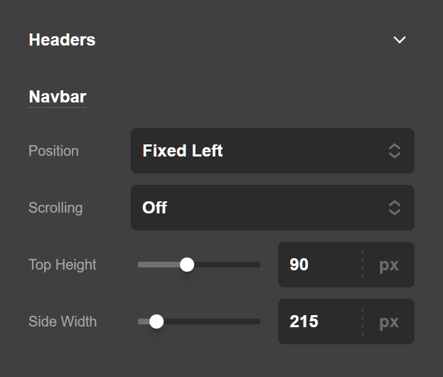
The Header Navbar Settings are for setting up the height and position of the navbar in the Header. Navbar Position is used to set the position of the navbar in the Header. The possible options are:
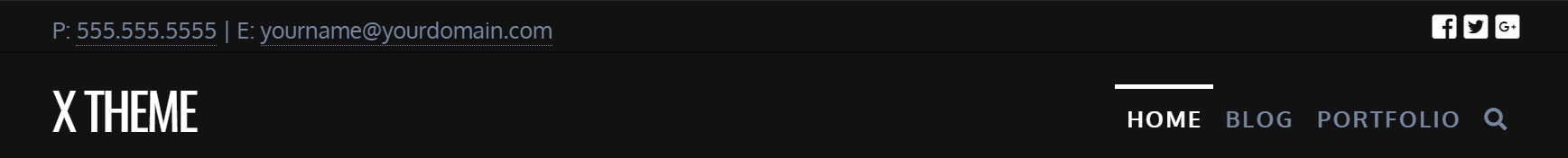
- Static Top: If this option is selected the Header will be at the top of the page and will go out of the fold upon scrolling.
- Fixed Top: If this option is selected the Header will be at the top of the page and it will stick to the top upon scrolling.
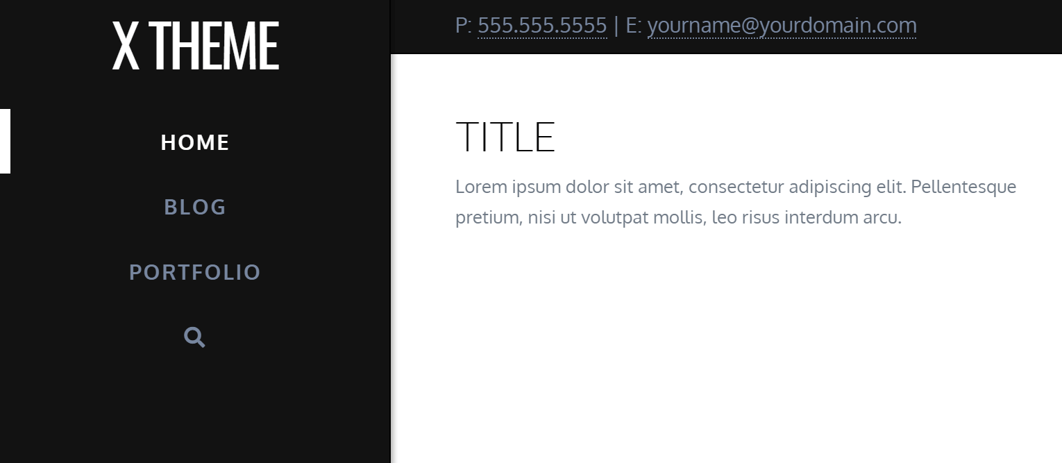
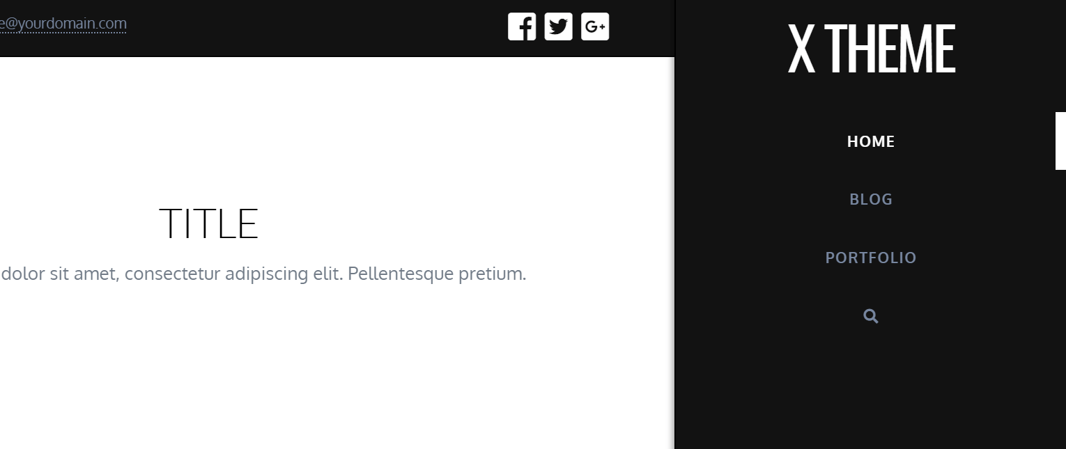
- Fixed Left: If this option is selected the Header will stick at the left section of the browser window.
- Fixed Right: If this option is selected the Header will stick at the right section of the browser window.
- Navbar Top Height (px): If a Fixed Top or Static top position is selected you can use this option to set the height of the navbar section in the Header.
- Navbar Scrolling: If a Fixed left or Fixed Right position is selected you can use this option to determine if you want the menus to be scrolled if they go beyond the fold or not. If you enable this option you will not be able to have submenus and your menu should be linear flat one.
- Navbar Side Width (px): If a Fixed left or Fixed Right position is selected you can use this option to set the width of the sidebar Header.
Navbar Top Height (px) option must still be set even when using Fixed Left or Fixed Right positioning because on tablet and mobile devices, the menu is pushed to the top.
Header Logo Settings
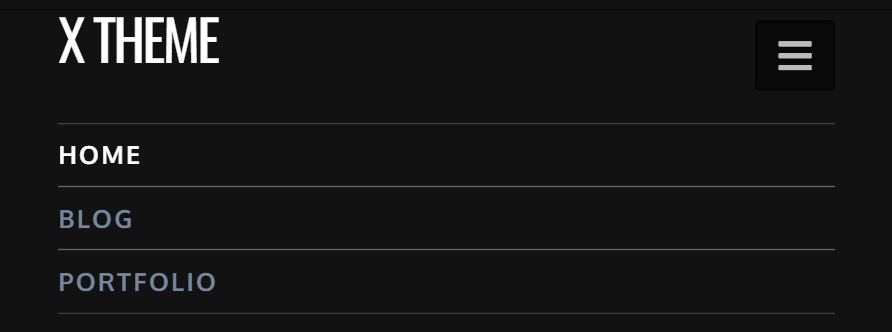
The layout option for the logo to determine the position of the logo compared to the navigation. There are two options available for the layout setting:
- Inline
- Stacked
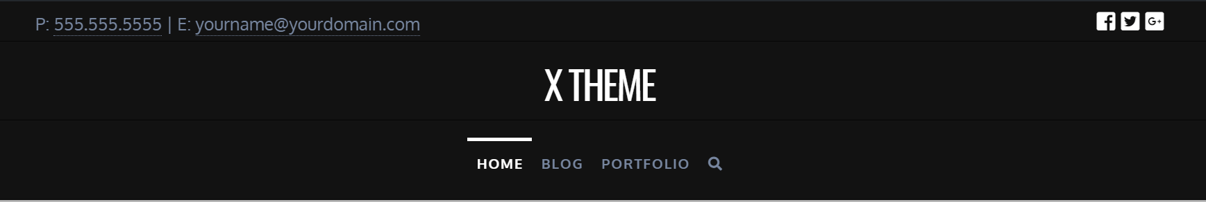
Selecting Inline for your logo and navigation layout will place them both in the navbar. Selecting Stacked will place the logo in a separate section above the navbar called Logobar. Here is a screenshot of an Inline logo:
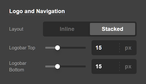
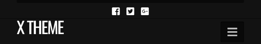
And here is a screenshot of a Stacked logo:
- Logobar Top Spacing (px): Use this option to configure the top spacing of the logobar if the stacked logo mode is selected.
- Logobar Bottom Spacing (px): Use this option to configure the bottom spacing of the logobar if the stacked logo mode is selected.
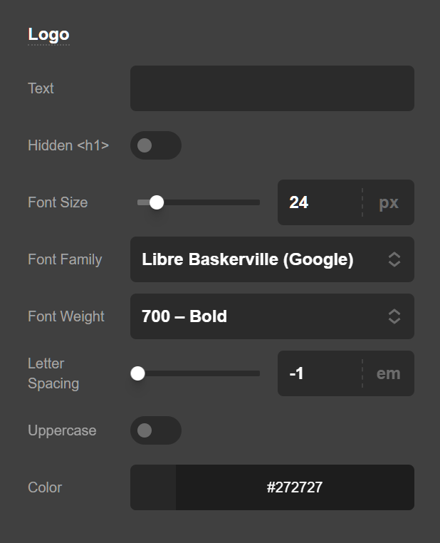
Logo - Text
Your logo will show up as text by default. Alternately, if you would like to use an image, upload it under the Logo – Image section, which will automatically switch over. Logo alignment can also be adjusted under the Logo – Alignment section.
- Logo Text: This is where you can enter the text you want to appear in place of your site logo.
- Logo Font: Use this option to set the font of the text logo of your website. You have the option of using the Google Fonts or system fonts.
- Logo Font Color: Use this option to set the text color of the text logo on your website.
- Logo Font Size (px): Use this option to set the font size of the text logo. The font size is in pixels.
- Logo Letter Spacing (em): Use this option to set the space between each letter of the text logo. The space unit is in
ems. Click here for more information about theemunit. - Logo Font Weight: Use this option to set the text logo font weight. Depending on the font that you select for the text logo, the options of this setting may differ as some fonts support limited font weights.
- Uppercase: Enable this option if you want the text logo of your website to be uppercase.
- Output Logo Text in Hidden
<h1>: Select this option if you want the contents of the Logo Text field to appear as ah1heading in your site's code but not be displayed on screen.
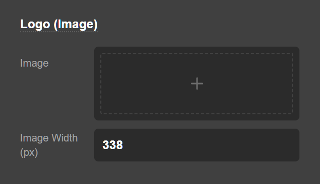
Logo - Image
The logo image section is used to upload an image and it will be used instead of the text logo on your website. To make your logo retina ready, enter in the width of your uploaded image in the Logo Width (px) field and we'll take care of all the calculations for you. If you want your logo to stay the original size that was uploaded, leave the field blank.
Use the Source option to upload the image or use a currently uploaded image for your logo. Clicking the plus button (+) will open up the standard WordPress media selection modal which you can use to select or upload the image for the logo of your website.
The Dimensions Preview section shows the actual size of the image that you uploaded.
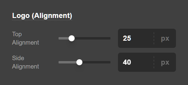
Logo - Alignment
The controls available in the Logo Alignment section is used to vertically align your logo as desired. Make sure to adjust your top alignment even if your navbar is fixed to a side as it will reformat to the top on smaller screens (this control will be hidden if you do not have a side navigation position selected).
- Navbar Top Logo Alignment (px): Use this option to set the top alignment of the logo.
- Navbar Side Logo Alignment (px): Use this option to set the side alignment of the logo.
Header Links Settings
Using the Header link Settings you can alter the appearance of the top-level navbar links and their alignment and spacing for your website.
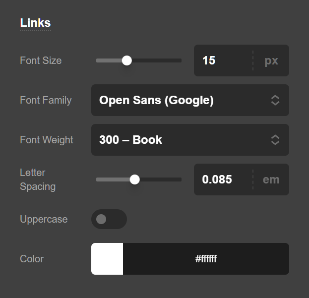
- Navbar Font: Use this option to set the font of the navbar menu items. You have the option of using the Google Fonts or system fonts.
- Navbar Links: Use this option to set the color of the navbar menu item links.
- Navbar Links Hover: Use this option to set the hover color of the navbar menu item links.
- Navbar Font Size (px): Use this option to set the font size of the navbar menu item links. The font size is in pixels.
- Navbar Font Weight: Use this option to set the navbar menu item links font weight. Depending on the font that you select for the links, the options of this setting may differ as some fonts support limited font weights.
- Navbar Letter Spacing (em): Use this option to set the space between each letter of the navbar menu item links. The space unit is in
ems. Click here for more information about theemunit. - Uppercase: Enable this option if you want the navbar menu item links of your website to be uppercase.
Links - Alignment
Customize the vertical alignment of your links for both top and side navbar positions as well as alter the vertical spacing between links for top navbar positions with the Navbar Top Link Spacing (px) control available in this section.
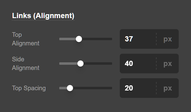
- Navbar Top Link Alignment: Use this option to set the alignment of the links.
- Navbar Topo Links Spacing: Use this option to set the spacing of the links.
- Navbar Side Link Alignments: Use this option to set the alignment of links when the navbar is in fixed left or right position.
Search
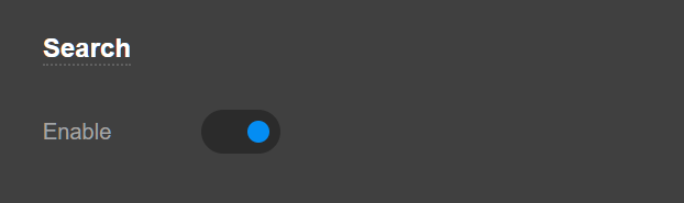
If the Navbar Search is enabled it activates search functionality for the navbar. If activated, an icon will appear that when clicked will activate the search modal.
Mobile Button Settings
The Mobile Button appears in smaller screens and it replaces the inline navigation menu. Upon taping the mobile menu the dropdown shows which contains the menu items:
Use the controls available in this section to adjust the vertical alignment and size of the mobile button that appears on smaller screen sizes in your navbar.
- Mobile Navbar Button Size (px): Set the button size of the mobile menu using this option. The size is in pixels.
- Mobile Navbar Button Alignment (px): Set the alignment of the mobile menu button using this option. The size is in pixels.
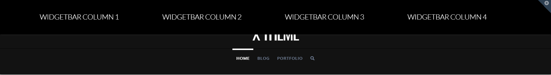
Widgetbar Settings
The Widgetbar is a collapsible section that can be opened by clicking on the Widgetbar toggle icon at the top of the Header of the website and you can use the WordPress widgets to add content to the Widgetbar. The idea is somewhat like the standard footers which you can learn more about here.
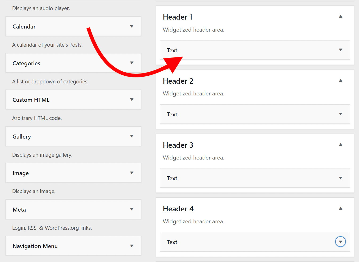
The way you can add content to the Widgetbar for your website is to assign widgets to one of the Header Widget Areas. Go to Appearance > Widgets and drag whatever widget that you want to one of the header widget areas:
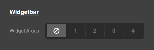
You can set how many columns you want to have in the widgetbar by going to X/Pro > Theme Options > Header > Widgetbar and set the Header Widget Areas options, you have the options below:
- None (Disabled): Selecting this will disable the Header widget areas section completely.
- One: The Header widget area will have one column and the Header 1 widget area will show in the Header.
- Two: The Header widget area will have two columns and the Header 1 and Header 2 widget areas will show in the Header.
- Three: The Header widget area will have three columns and the Header 1, Header 2 and Header 3 widget areas will show in the Header.
- Four: The Header widget area will have four columns and the Header 1, Header 2, Header 3 and Header 4 widget areas will show in the Header.
You also have additional options available to fine-tune the widgetbar toggle icon:
- Widgetbar Button Background: Use this option to set the background color of the widgetbar toggle icon.
- Widgetbar Button Background hover: Use this option to set the background hover color of the widgetbar toggle icon.
Topbar Settings
The topbar is a narrow section at the very top of the Header which you can add custom HTML code:
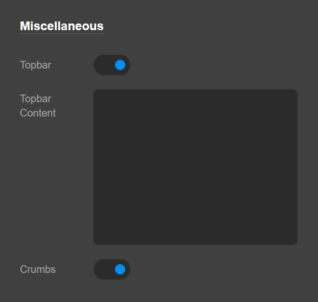
- Topbar: Enabling this option will make the topbar visible on the top of the Header and shows a text area to add your custom HTML code.
- Topbar Content: This is the place that you can add your custom HTML content which will show in the topbar.
The Breadcrumbs are a hierarchy guide which shows the place of the current page in the website hierarchy and provides links to go high up the hierarchy of your website. Enable this option to have a breadcrumb on your website. The breadcrumb will show in the inner pages of your website and not the homepage.
Summary
We've learned about the Header Settings of Theme Options and how we can setup the Header using the available controls. We also learned about the difference between the Header Settings in Theme Options and the Header Builder available in Pro. The next step is to learn more about Footer Settings.
See something inaccurate? Let us know