Widget Area
In this article, we're going to show you how to use the Widget Area Element for things like sidebars.
How to Add Sidebars in X or Pro
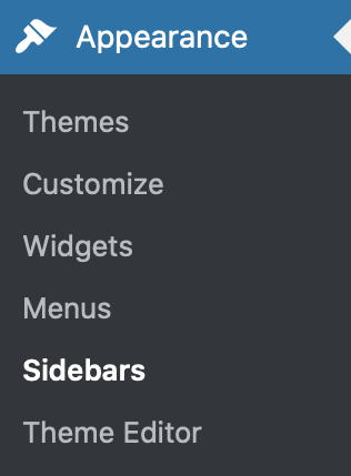
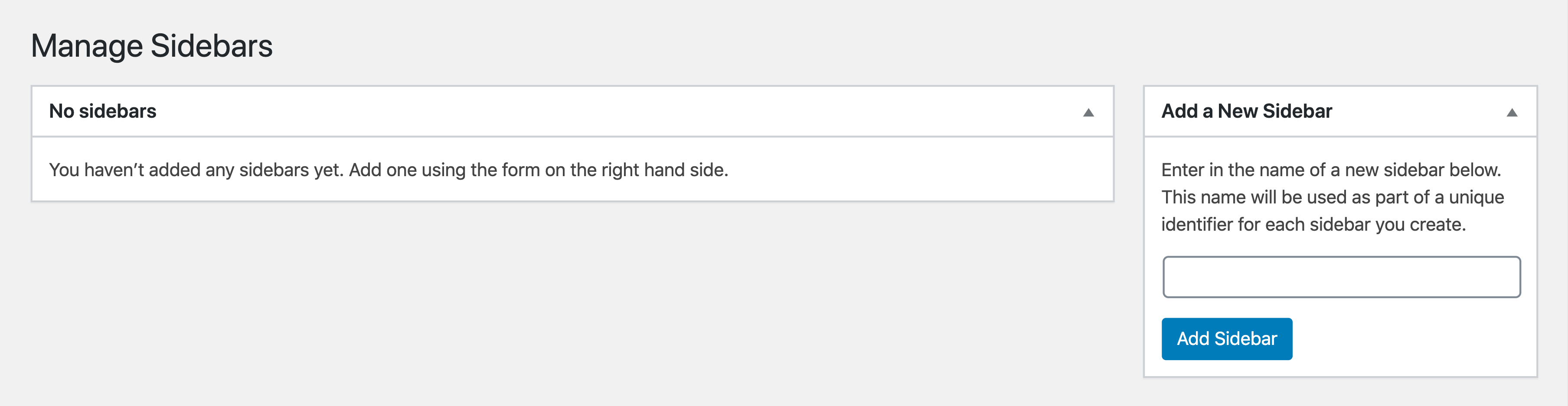
To add sidebars, first go to Appearance > Sidebars.
Enter the name of the sidebar on Add New Sidebar then click the Add Sidebar button.
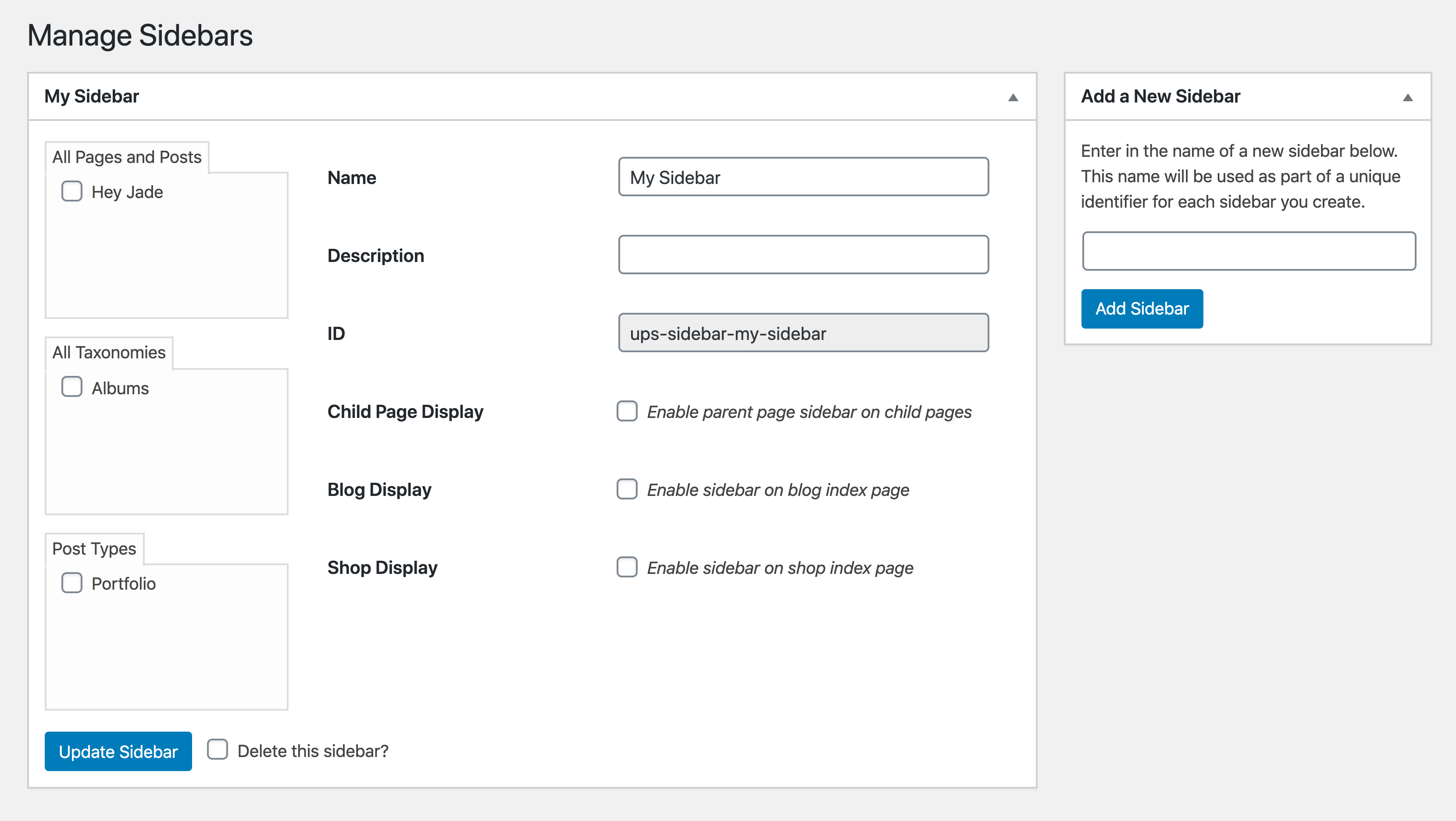
After you've successfully added a sidebar, you'll see options available to you. You don't need to touch any of them but if you do, make sure to click the Update Sidebar button.
How to Assign Widgets to Sidebars
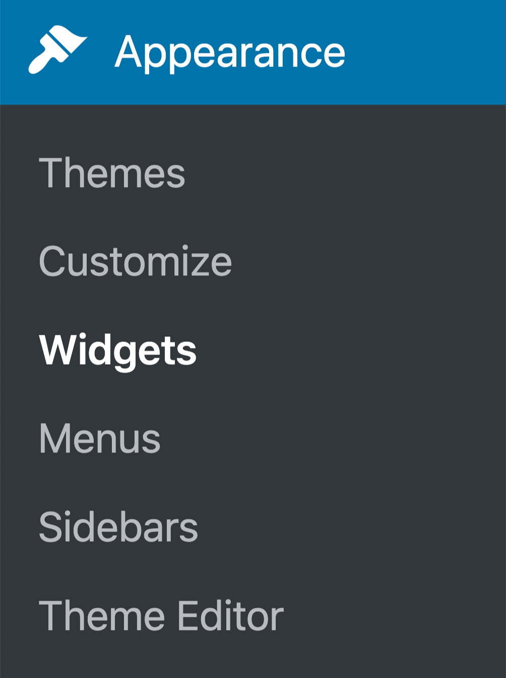
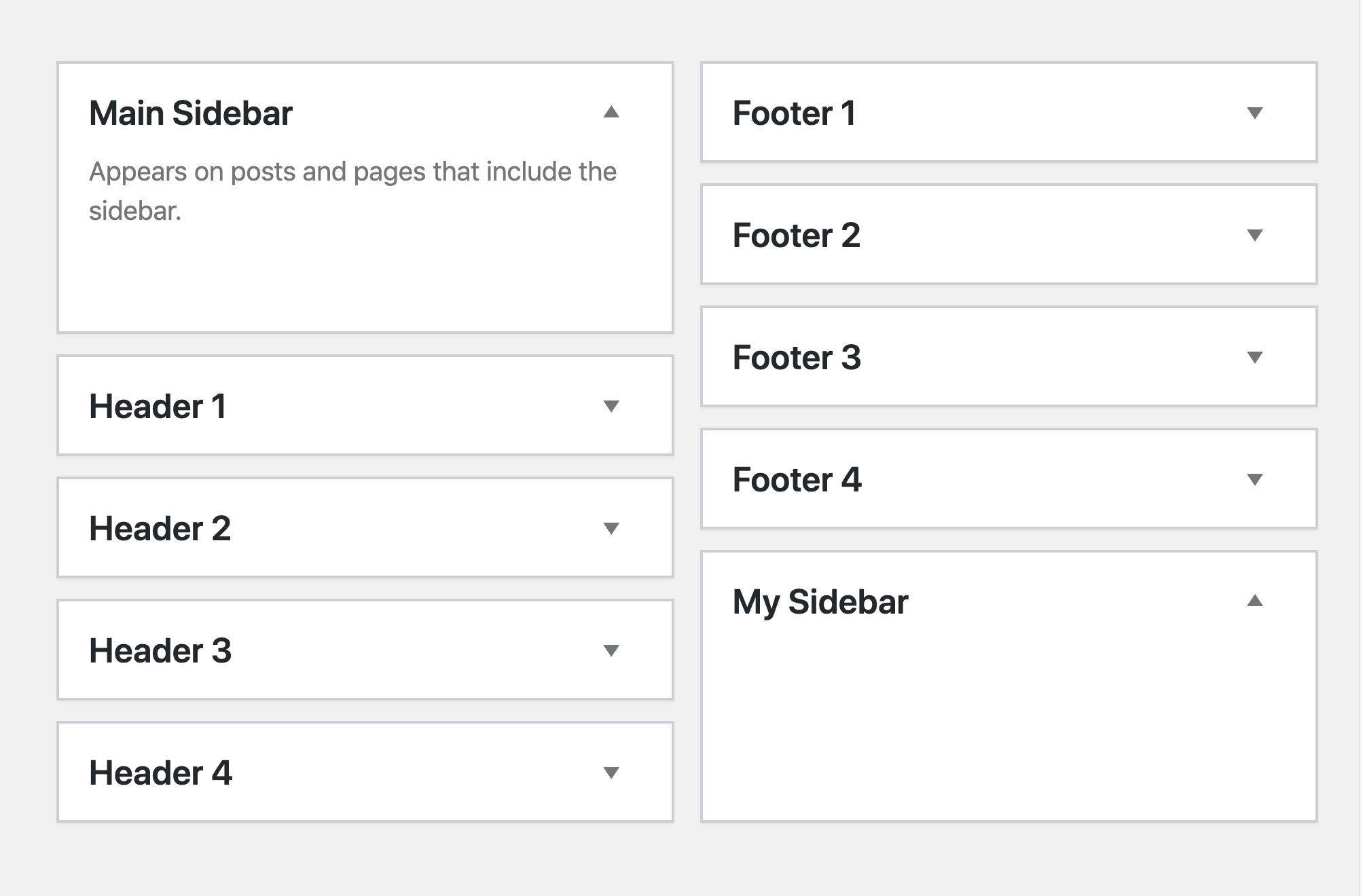
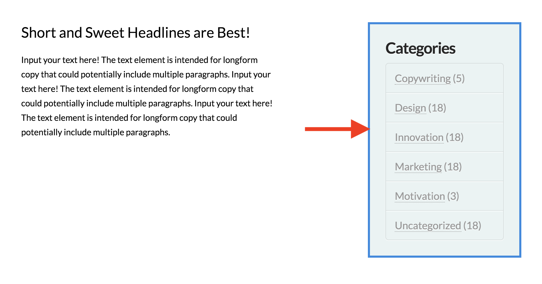
To add widgets to your sidebar, simply go to Appearance > Widgets.
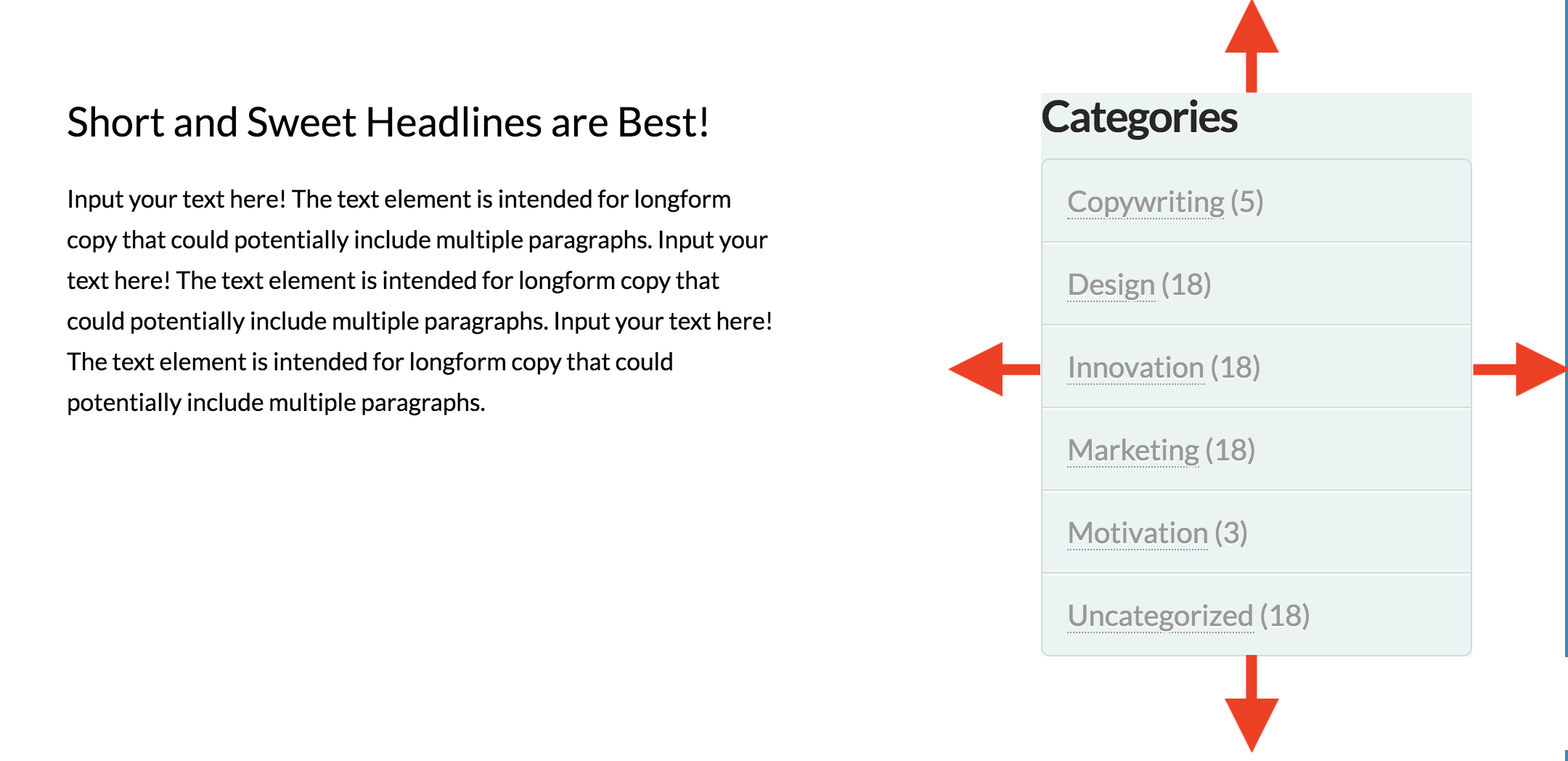
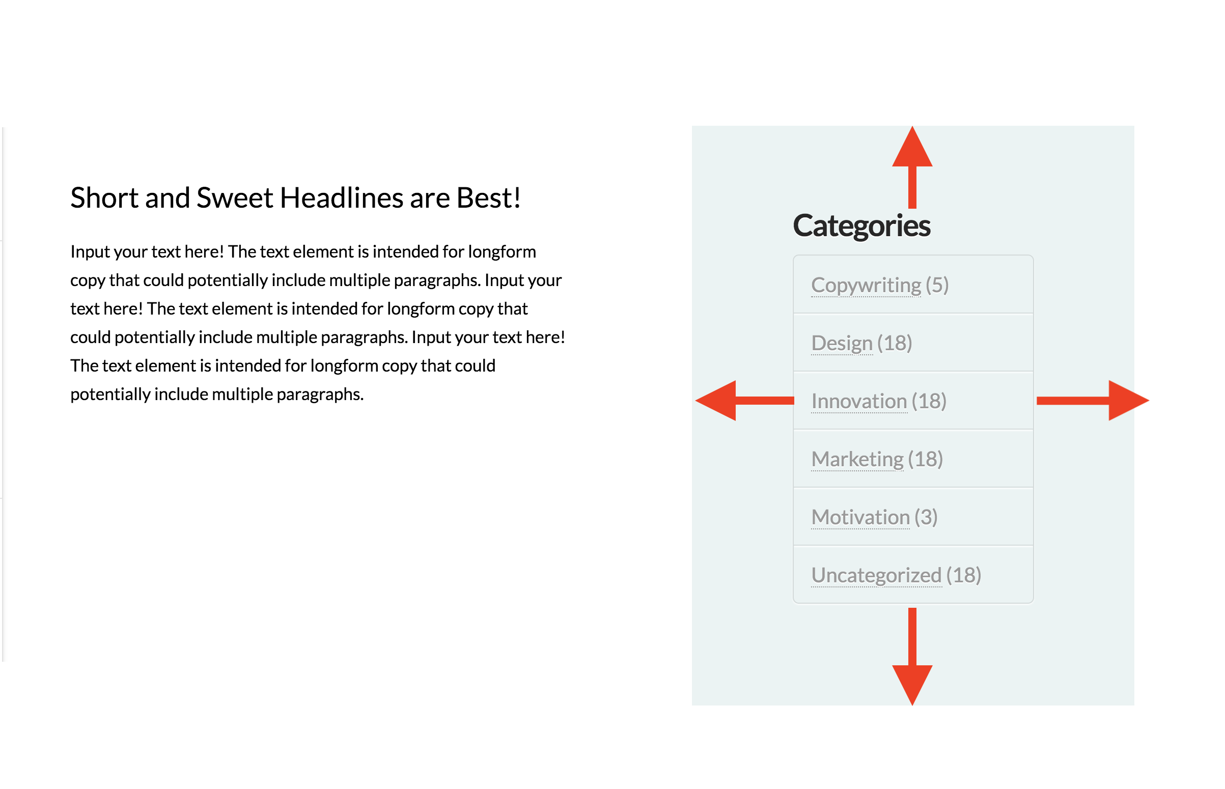
On the Widgets page, you'll see the sidebar you have created.
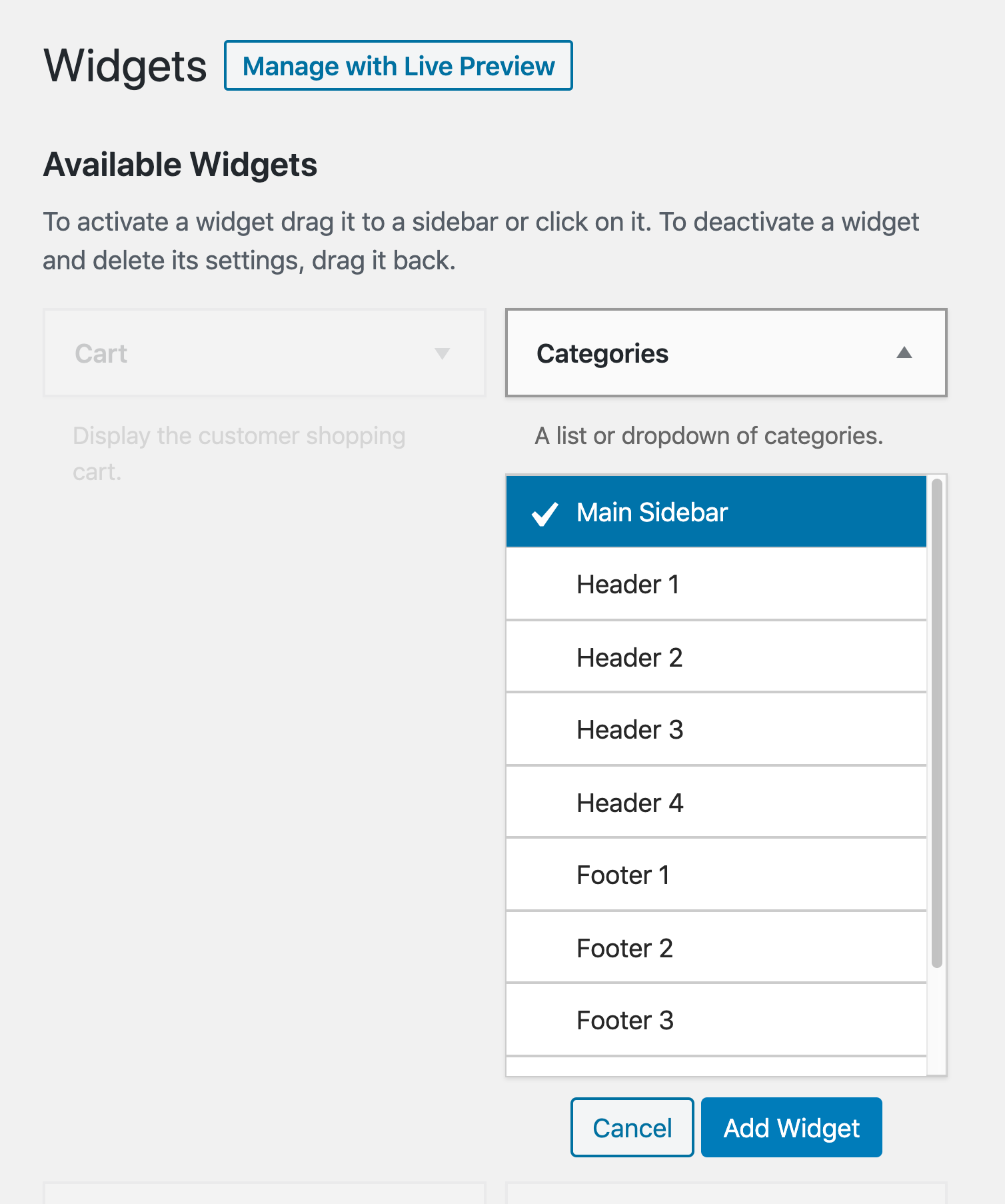
On the left side of the page, you'll see Available Widgets. To add a widget to the sidebar you created or to any sidebar for that matter, you have two ways:
- Drag the widget and drop it to the sidebar
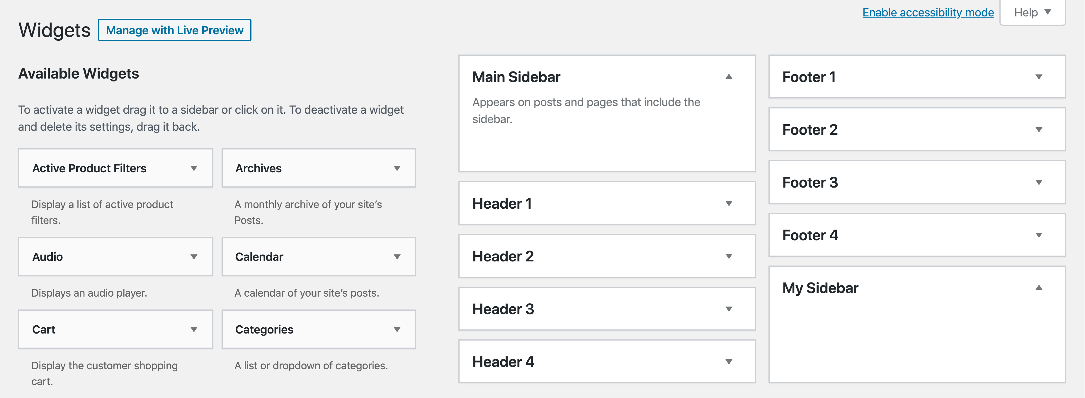
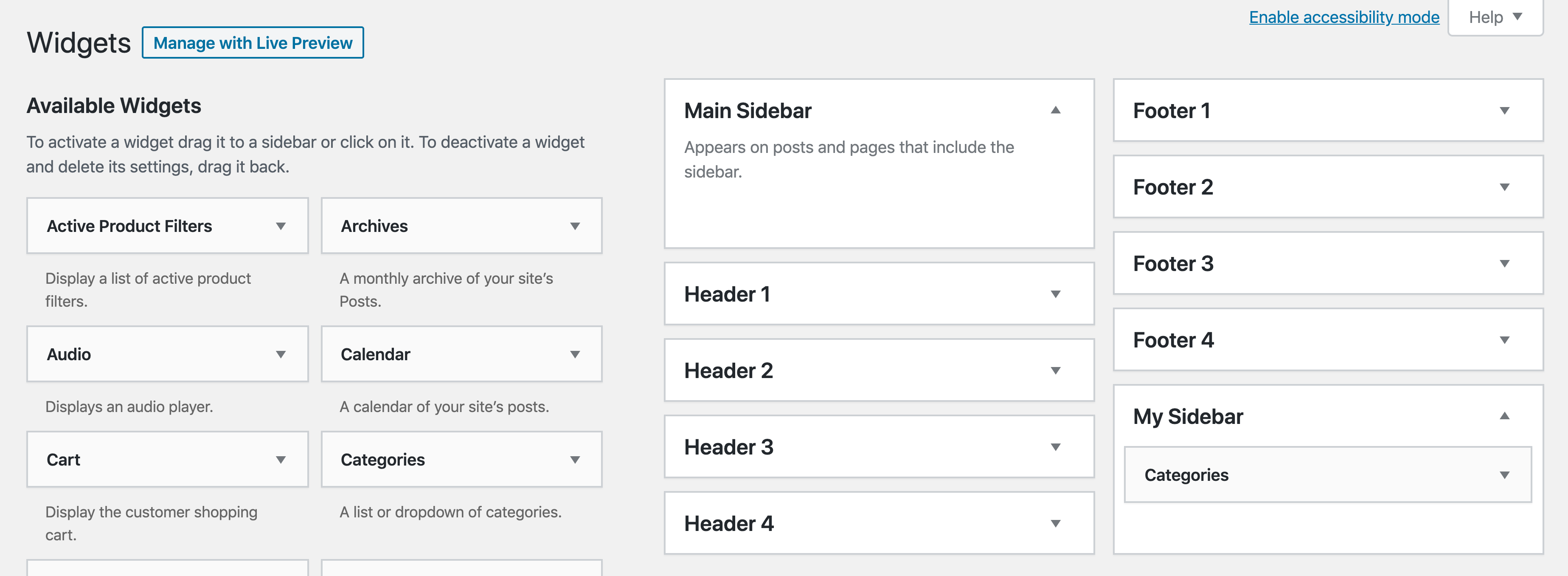
- Click the widget. You'll see a list of sidebars. Click the sidebar from the list, then click Add Widget.
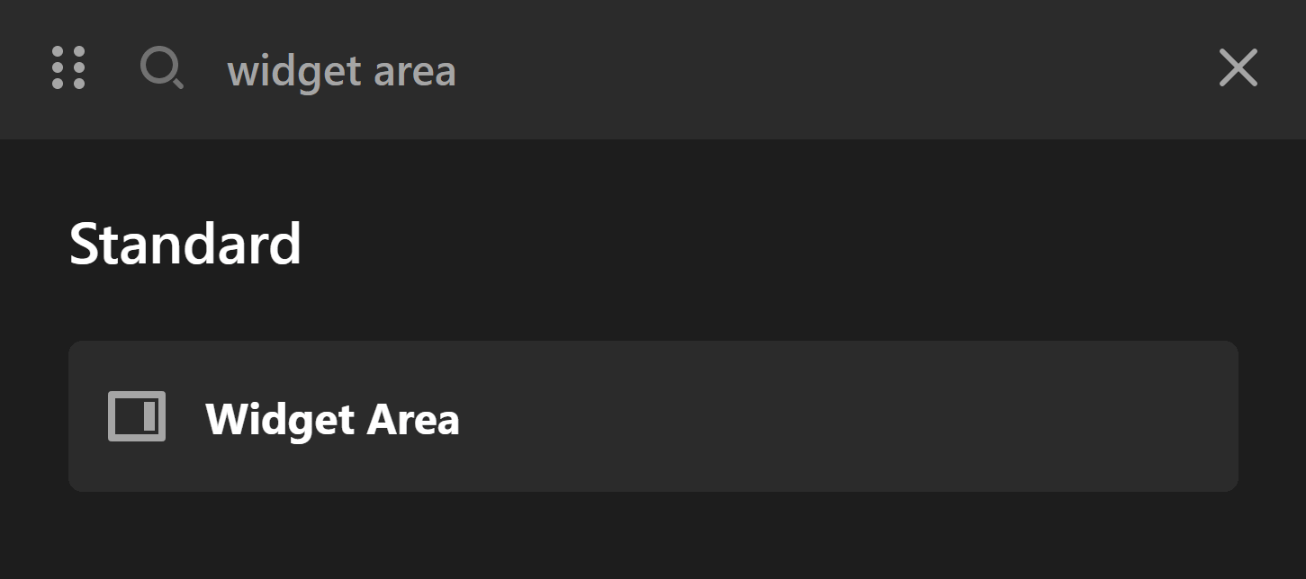
Now, to add the Widget Area element in Cornerstone and Pro Builders, search for "widget" and drag "Widget Area" to the canvas.
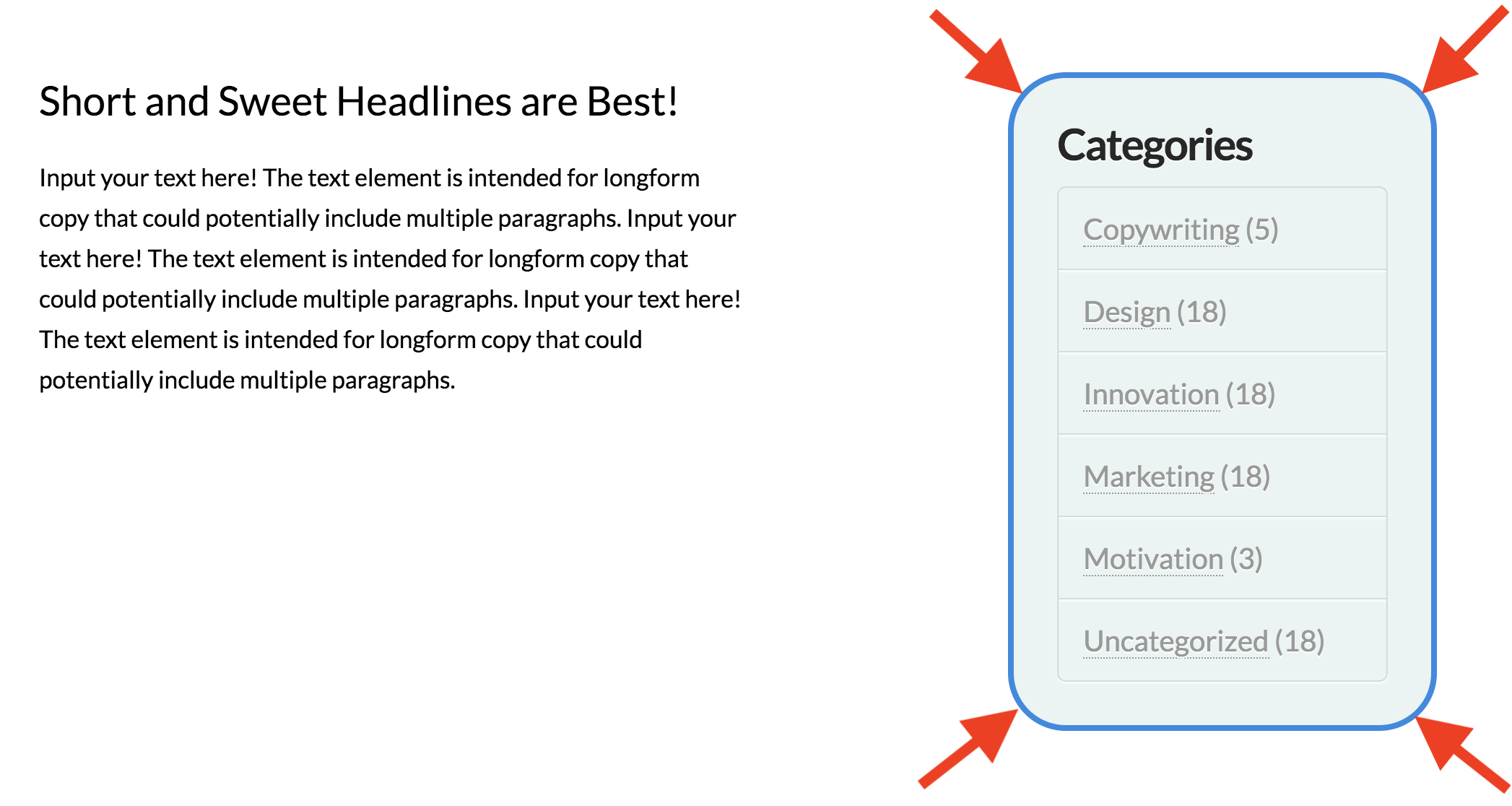
Widget Area Setup
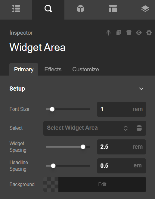
On the Sidebar dropdown, select the sidebar you want to display. You can change the base font size of the texts in the widget as well as change the background color of the entire widget as well.
Widget Area Design Settings
You can customize how the sidebar looks.
Margin
Use this option to set the margin of the sidebar. You can change the settings for all the sides of the sidebar or modify them individually.
Padding
Use this option to set the padding of the sidebar. You can change the settings for all the sides of the sidebar or modify them individually.
Border
Use this option to set the border of the sidebar. You can set the style, width and color of the border on all sides or each side individually.
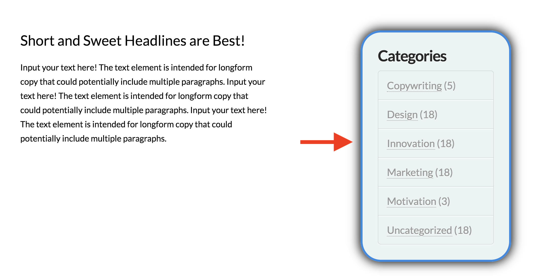
Border Radius
Use this option to set a border radius for the sidebar. You can set the curve on all sides or set them individually.
Box Shadow
You can set a shadow over the sidebar using the box-shadow control group.
- X-Offset - Use this option to set the X offset of the shadow in the sidebar.
- Y-Offset - Use this option to set the Y offset of the shadow in the sidebar.
- Blur - Use this option to set the intensity of the blur effect in the sidebar.
- Spread & Position - Use this option to set the spread amount of the items section shadow and decide if you want the shadow to sit inside or outside of the sidebar.
- Color - Use this option to set the color of the sidebar shadow.
Customize
The Customize pane consists of various features that allow you to take further control over your Element's styling and functionality:
- ID – Sets an HTML ID on the Element.
- Class – Sets an HTML Class on the Element.
- Element CSS – Use this feature for increased stylistic control of your Element, especially over nested markup. Click here for more detailed information on this feature, such as using
$elto dynamically target the base tag, et cetera. - Hide During Breakpoints – Hides the Element at different screen sizes when design alterations are needed. Click here for more information.
- Conditions – Adds / removes Elements from the page when certain criteria are met (e.g. “If a featured image is set...”). Click here for more information.
- Custom Attributes – Use this option to add custom HTML attributes to the root tag of the Element (e.g.
data-info="123"). This can be particularly helpful when integrating with various scripts and libraries. - Looper Providers & Consumers – Use these controls to access information in your WordPress installation and output it on the frontend of your website using Elements from across our Builders. Click here for more information.
Demo
To see a live demo of the Widget Area Element click here.
Summary
Now you know how to add widgets to a sidebar and add how to use the Widget Area Element in Cornerstone.
See something inaccurate? Let us know