Navigation Dropdown
In this article, we're going to show you how to add and configure the Navigation Dropdown Element.
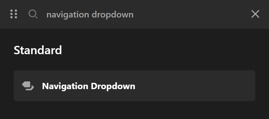
To add the Navigation Dropdown Element, simply search "navigation" and drag "Navigation Dropdown" to the canvas.
Navigation Setup

Setup
The only option under Setup is:
Assign Menu - Pick the menu to be used for the Navigation.
Active Links Setup
The only setting under Setup is:
- Assign Menu - Pick the menu to be used for the Navigation which you have set before in WordPress Dashboard > Appearance > Menus.
Active Links Setup
- Current Link - Enable this option to make the current page link active. The active link style can be different by color or underline defined as particles.
- Ancestor Link - Enable this option to make the parent of the current link active. It will show if the current link is a child of another link.
- Graphic - Enable this option to show the graphics of each link. Go to WordPress Dashboard > Appearance > Menus and expand each of the links in the menu and you will be able to select the graphic for the link.
- Primary/Secondary Particle - Use the particles to have distinct style for the active links. You can enable the particles using these options, but to actually fine tune the particles you need to use the top breadcrumb of the Navigation Collapse Element to access the Menu > Links > Particles.
Toggle Settings
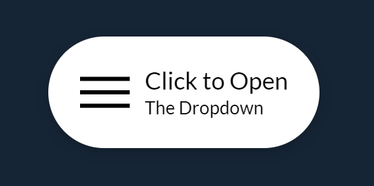
The button that triggers the showing of the dropdown is called the Toggle button. This button can be configured to your liking.
Clicking the Toggle tab, as shown below, will show you the settings available at your disposal.
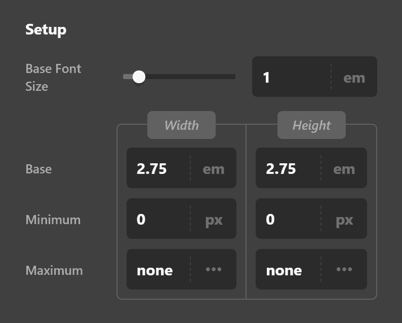
In the Setup field group shown above, you'll be able to set the actual height and width of the toggle button, it's minimum and maximum dimensions, its background color when not hovered upon and when it is. The Base Font Size field dictates the size of the toggle button. If you increase it, the entire button will increase in size.
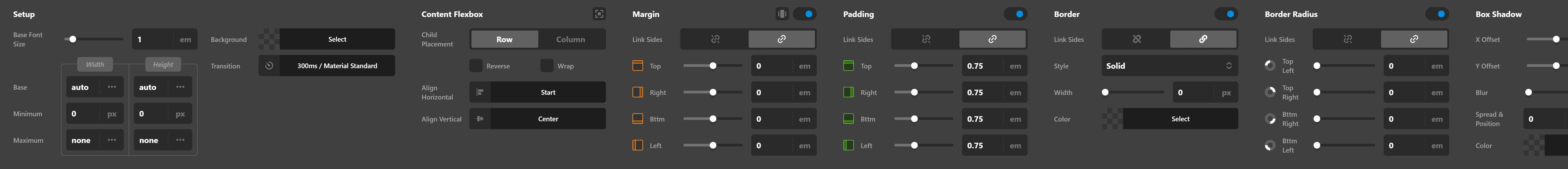
The Content Flex Layout field group allows you to configure the flexbox settings of the toggle button. If you're not familiar with Flexbox, this guide will help you.
The Margin, Padding, Border, Border Radius and Box Shadow field groups are common across majority of the Elements that I won't expound them here.
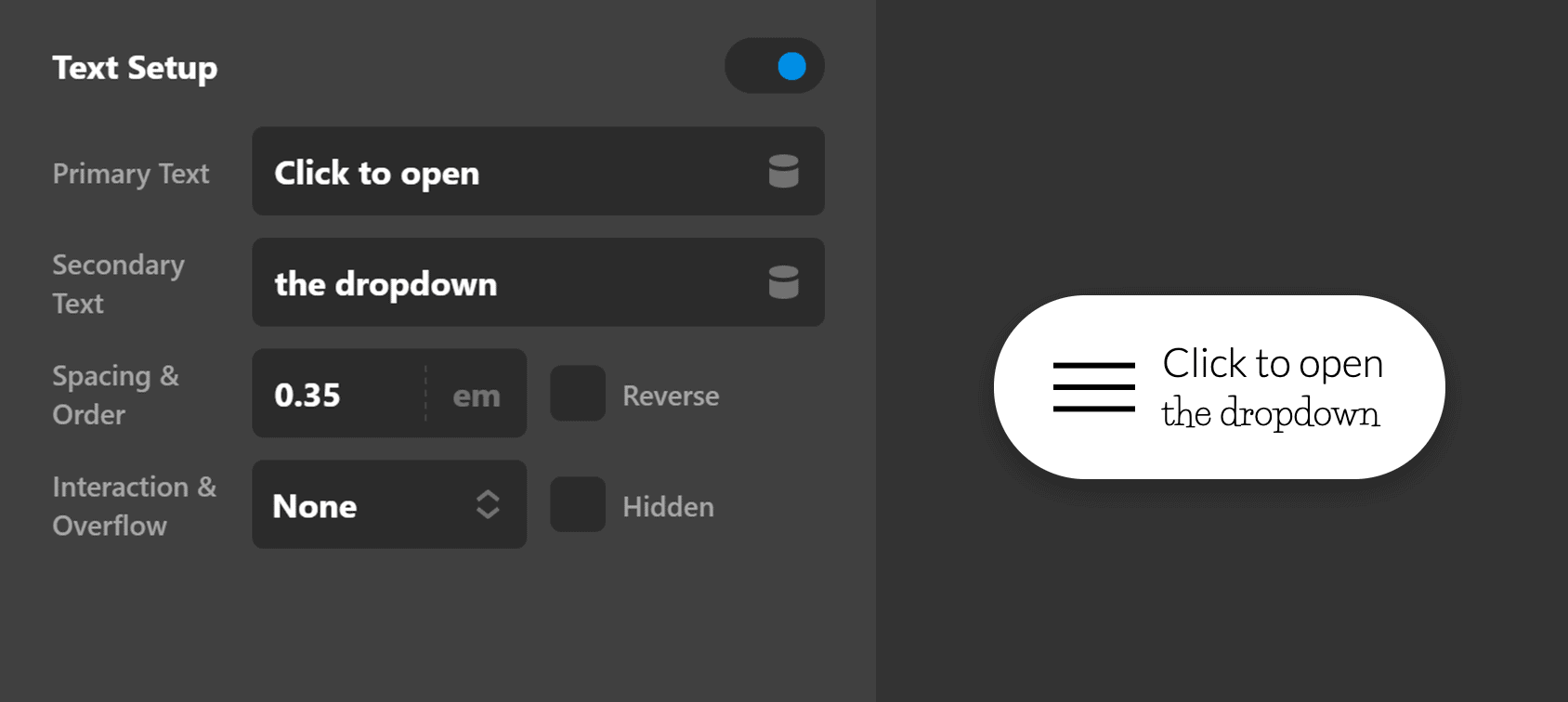
Now by default, the toggle button has a "hamburger" graphic inside it. You have the option to remove the icon and use text instead. To do that, you need to turn On the Text Setup and turn Off the Graphic Setup.

When you turn On the Text Setup, other fields/settings will appear which will allow you to set the primary text, secondary text, the spacing & order as well as how to handle interactions and overflows.
You'll also notice that several groups of options now become available to you as well such as:
- Text Margin
- Primary Text Format
- Primary Text Style
- Primary Text Shadow
- Secondary Text Format
- Secondary Text Style
- Secondary Text Shadow
All of these allow you to customize how the texts, both primary and secondary, will look like.
Text Margin
The Text Margin controls consist of:
- Link Sides - Link sides allows you to link up every option within the margin controls so when you change one value all values change. Or you can unlink sides and set each margin option individually.
- Top - Sets the top margin.
- Right - Sets the right hand side margin.
- Bttm - Sets the bottom margin
- Left - Sets the left hand side margin.
Primary Text Format
The Primary Text Setup controls consist of:
- Font Family - A font selector for the primary text. Default is inherit or you can select a font that's setup within the Font Manager.
- Font Weight - The font weight for the primary font selected. Available weights depend on the font family selected.
- Font Size
- Letter Spacing
- Line Height
Primary Text Style
The Primary Text Style controls consist of:
- Font Style - Normal or Italic
- Text Align - Left, Center, Right, Justify.
- Text Decoration - Underlined or Strikethrough.
- Text Transform - Uppercase (force all text to be uppercase), Capitalize (forces the first letter in each word to be a capital), Lowercase (forces all text to be lowercase).
- Text Color - offers two options. 1: Base, sets the base color of the text. 2: Interaction. Sets the text color when interacted with (on hover) etc.
Primary Text Shadow
The Primary Text Shadow controls consist of:
- X-Offset - Set the offset of the text shadow for the X axis.
- Y-Offset - Set the offset of the text shadow for the Y axis.
- Blur - Set the blur of the text shadow.
- Spread & Position - Set the spread and position of the text shadow.
- Color - Sets the color of the text shadow.
What if you want to have both the icon and the text? Is it possible? A resounding YES! Simply enable (or turn On) both the Text Setup and Graphic Setup and you'll have both of them appear on the toggle button.
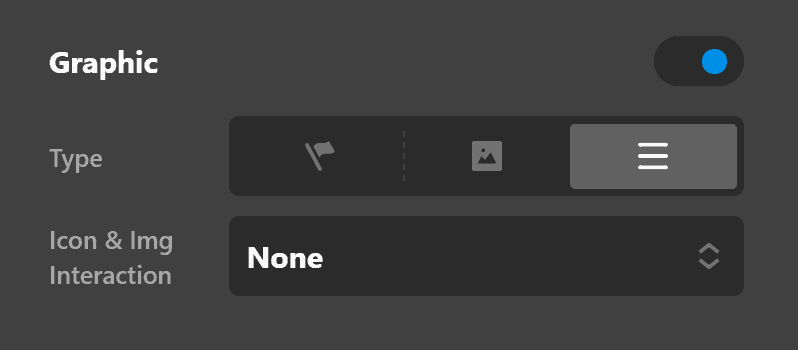
Want to change the "hamburger" graphic? That's easy and you have multiple ways to do it.
- Go to Graphic Toggle select from the Type dropdown.

- If none of the Graphic Toggle types fit your need, go back to Graphic Setup, then click on the flag icon on the Type field.

Then go to Graphic Icon and choose an icon on the Primary & Secondary field.
- Lastly, you may want to use your own image. To do that, go back to Graphic Setup and click on the middle button on Type.

Then go to Primary Graphic Image then click the box on Source.
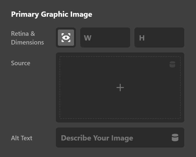
Then select the image you want to use.
Dropdown Settings
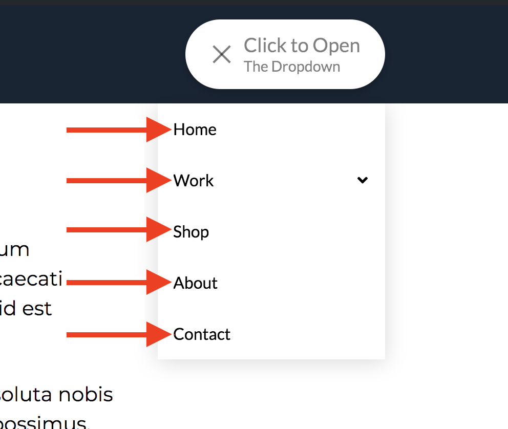
This is what is being referred to as Dropdown:
First, click on the Dropdown tab to view the settings. Then you'll find these options:
The Dropdown options are a set of control groups used to fine-tune the dropdown feature of the Navigation Dropdown Element. We are going to delve into details and explain each option's functionality.
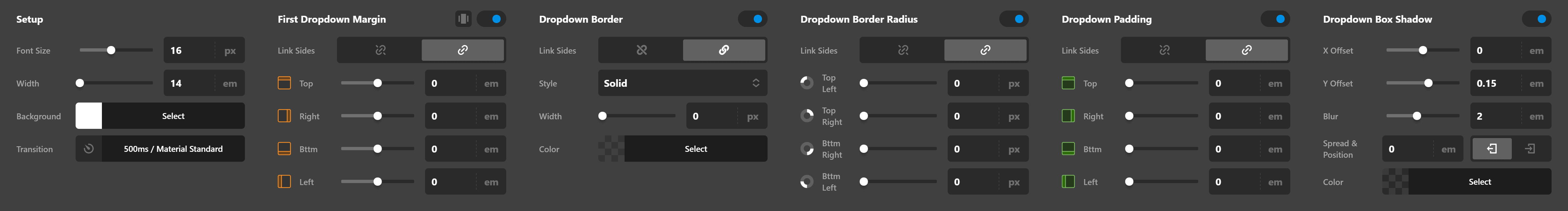
Setup
- Font Size - Use this option to set the base font size for the dropdown.
- Width - Use this option to set the width of the dropdown.
- Background - Use this option to set the background color of the dropdown.
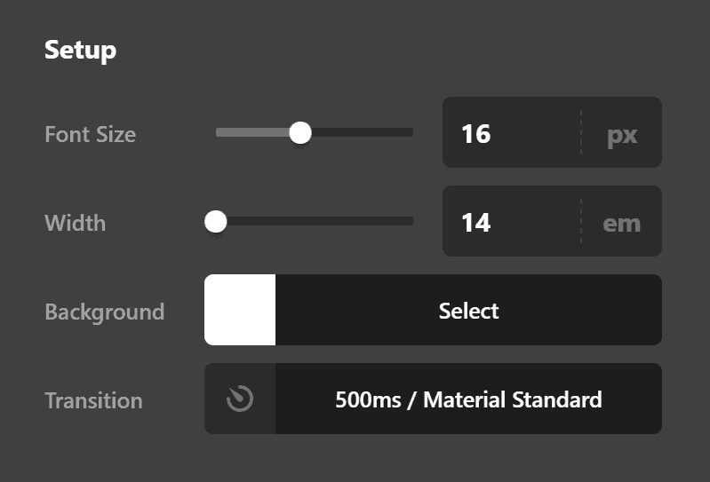
First Dropdown Margin
Use this option to set the margin of the dropdown. You can change the settings for all the sides of the dropdown or modify them individually.
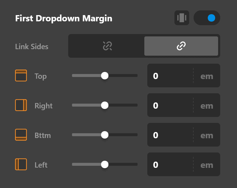
Dropdown Border
Use this option to set the border of the dropdown. You can set the style, width and color of the border on all sides or each side individually.
Dropdown Border Radius
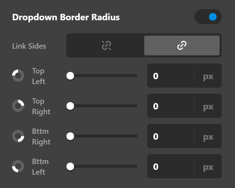
Use this option to set a border radius for the dropdown. You can set the curve on all sides of the dropdown or set them individually.
Dropdown Padding
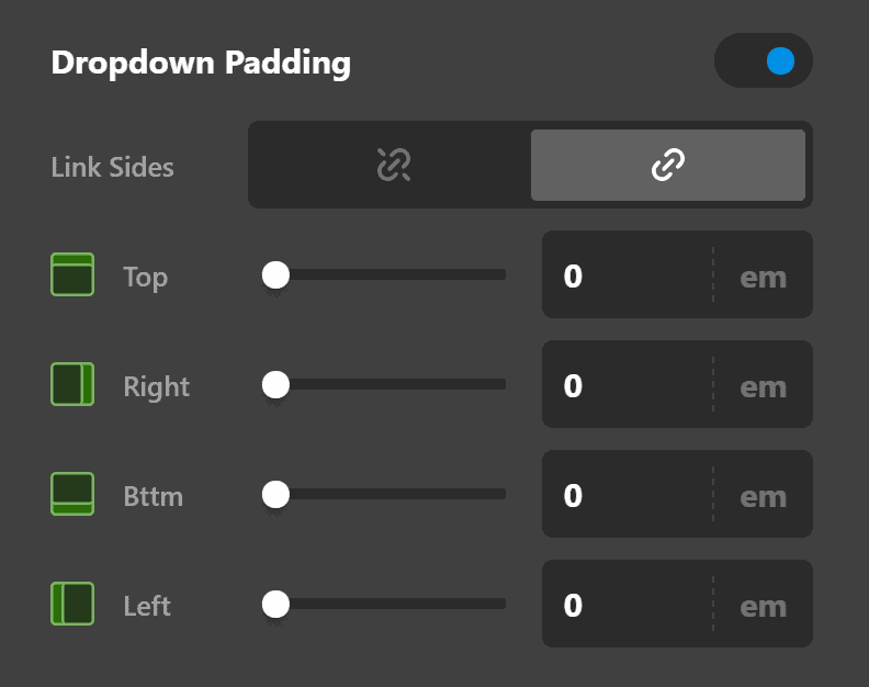
Use this option to set the padding of the dropdown. You can change the settings for all the sides of the dropdown or modify them individually.
Dropdown Box Shadow
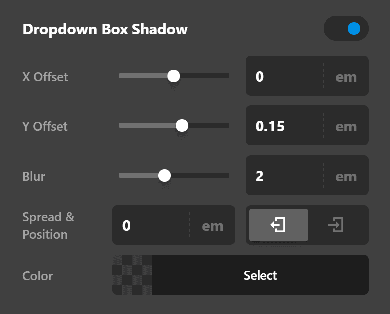
- X-Offset - Use this option to set the X offset of the shadow in the dropdown.
- Y-Offset - Use this option to set the Y offset of the shadow in the dropdown.
- Blur - Use this option to set the intensity of the blur effect in the dropdown shadow.
- Spread & Position - Use this option to set the spread amount of the dropdown shadow and decide if you want the shadow to sit inside or outside of the box.
- Color - Use this option to set the color of the dropdown shadow.
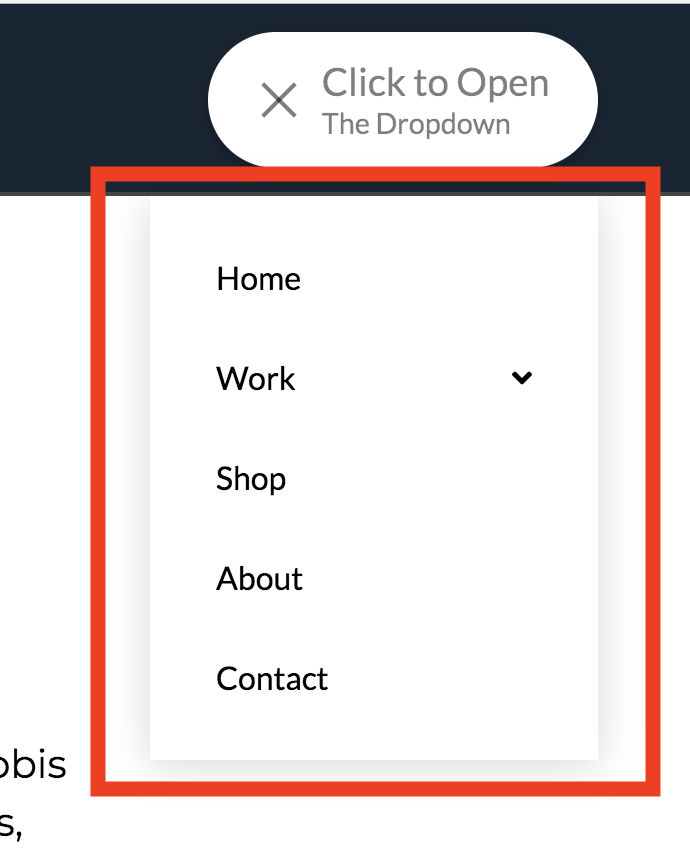
Links Settings
Now let's discuss Links. Links are the main menu items as shown below:
To configure them, click on the Links tab. Below are the field groups available for Links:
Setup
The setup controls consist of:
- Base Font Size - The font size used for the top links.
- Width & Height - The width and height of the links Can be changed to any required value.
- Min Width & Height - The minimum width and height the links should be.
- Max Width & Height - The maximum width and height of the links.
- Background - Offers two options one called Base base is the background color of the links at all times apart from on hover. And the second option called Interaction interaction is the background color of the links on hover and when the links are interacted with.
Content Flex Layout
The Content Flex Layout controls consist of:
- Layout - Either set to Row or Column
- Reverse Layout
- Wrap Children
- Horizontal
- Vertical
Margin
The Margin layout controls consist of:
- Link Sides - Link sides allows you to link up every option within the margin controls so when you change one value all values change. Or you can unlink sides and set each margin option individually.
- Top - Sets the top margin.
- Right - Sets the right hand side margin.
- Bottom - Sets the bottom margin
- Left - Sets the left hand side margin.
Padding
The Padding controls consist of:
- Link Sides - Link sides allows you to link up every option within the padding controls so when you change one value all values change. Or you can unlink sides and set each padding option individually.
- Top - Sets the top margin.
- Right - Sets the right margin.
- Bottom - Sets the bottom margin.
- Left - Sets the Left margin.
Border
The Border controls consist of:
- Link Sides - Allows you to link up the border control for all sides or unlink sides to control each border side individually.
- Style - Sets the style of the border such as dashed, dotted etc.
- Width - Sets the width of the border in pixels by default. Or click on PX to change the value to the units you'd like to use (EM, REM)
- Color - Sets the color of the border.
Border Radius
The Border Radius controls consist of:
- Link Sides - Link all sides of the border to control all border radius options at the same time, rather than configuring each value individually. If you unlink sides. You can set the border radius controls individually.
- Top Left - Set the top left radius of the border.
- Top Right - Set the top right radius of the border.
- Bttm Right - Set the bottom right radius of the border.
- Bttm Left - Set the bottom left radius of the border. Note: You won't see any effect by changing the Border Radius values unless you have already set your Border controls.
Box Shadow
The Box Shadow controls consist of:
- X-Offset - Set the offset of the border shadow for the X axis.
- Y-Offset - Set the offset of the border shadow for the Y axis.
- Blur - Set the blur of the box shadow.
- Spread & Position - Set the spread and position of the box shadow.
- Color - Sets the color of the box shadow.
Text Setup
The Text Setup controls consist of:
- Enable - A simple on or off option set this to Off if you want icon only links
- Text Overflow - Set text overflow to enable.
- Primary Text - The main text of the link.
- Secondary Text - Add secondary text under the primary text. Default is empty (no output).
Text Margin
The Text Margin controls consist of:
- Link Sides - Link sides allows you to link up every option within the margin controls so when you change one value all values change. Or you can unlink sides and set each margin option individually.
- Top - Sets the top margin.
- Right - Sets the right hand side margin.
- Bttm - Sets the bottom margin
- Left - Sets the left hand side margin.
Primary Text Format
The Primary Text Setup controls consist of:
- Font Family - A font selector for the primary text. Default is inherit or you can select a font that's setup within the Font Manager.
- Font Weight - The font weight for the primary font selected. Available weights depend on the font family selected.
- Font Size
- Letter Spacing
- Line Height
Primary Text Style
The Primary Text Style controls consist of:
- Font Style - Normal or Italic
- Text Align - Left, Center, Right, Justify.
- Text Decoration - Underlined or Strikethrough.
- Text Transform - Uppercase (force all text to be uppercase), Capitalize (forces the first letter in each word to be a capital), Lowercase (forces all text to be lowercase).
- Text Color - offers two options. 1: Base, sets the base color of the text. 2: Interaction. Sets the text color when interacted with (on hover) etc.
Primary Text Shadow
The Primary Text Shadow controls consist of:
- X-Offset - Set the offset of the text shadow for the X axis.
- Y-Offset - Set the offset of the text shadow for the Y axis.
- Blur - Set the blur of the text shadow.
- Spread & Position - Set the spread and position of the text shadow.
- Color - Sets the color of the text shadow.
Graphic Setup
The Graphic Setup controls consist of:
- Enable - Enable or Disable the output of a graphic. When Graphic setup is set to On you'll see another option within the Graphic Setup controls and another two set of controls called Graphic Margin and Graphic Icon.
- Type - Select what type of graphic you want to use either a Icon, Image Or Toggle. Only shows if Enable is set to On.
Graphic Margin
The Graphic Margin controls consist of:
- Link Sides - Link sides allows you to link up every option within the margin controls so when you change one value all values change. Or you can unlink sides and set each margin option individually.
- Top - Sets the top margin.
- Right - Sets the right hand side margin.
- Bttm - Sets the bottom margin
- Left - Sets the left hand side margin.
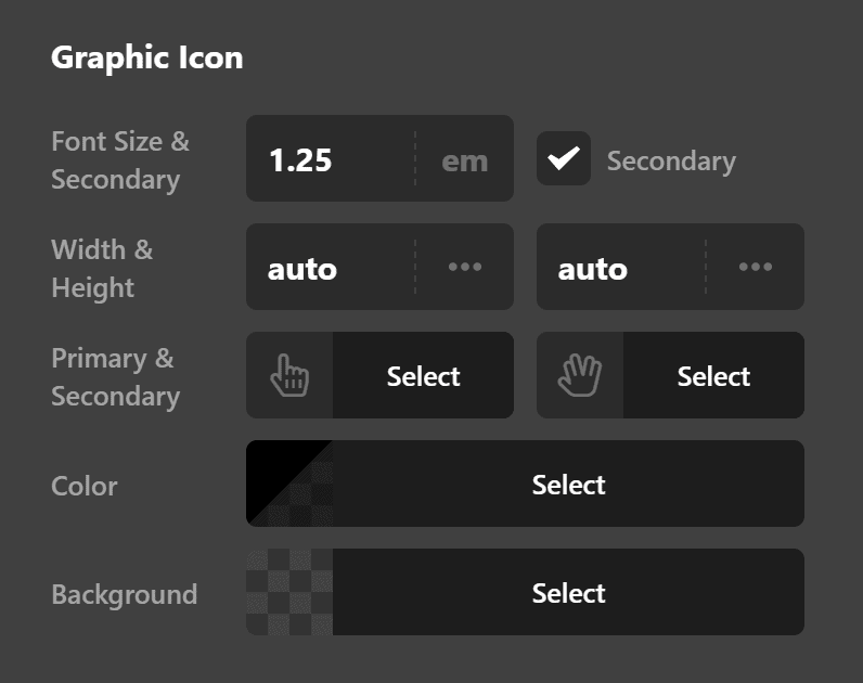
Graphic Icon
The Graphic Icon controls only show if you selected the icon option in the Graphic Setup control and the controls consist of:
- Font Size & Secondary - If you check the Secondary box you'll see a new option called Secondary Icon.
- Width & Height - The width and height of the icon
- Color - offers two options. 1: Base, sets the base color of the icon. 2: Interaction. Sets the icon color when interacted with (on hover) etc. Icons for navigation menus are setup within the WordPress Admin > Appearance > Menus.
Sub Indicator Setup
The Sub Indicator Setup controls consist of:
- Enable - Either output a sub indicator (on) or don't output a sub indicator (off) the sub indicator is for sub navigation links and shows if you have child links of a parent link.
- Font Size - The Font Size used for the sub indicator.
- Width & Height - The Width and Height of the sub indicator defaults to auto.
- Icon - Icon Picker to select an icon for use as the sub indicator.
- Color Base - The base color for the sub indicator when not being interacted with.
- Color Interaction - The color used for the sub indicator when being interacted with (on click, on hover etc).
Sub Indicator Margin
The Sub Indicator Margin layout controls only shows if Sub Indicator Setup is set to On and consist of:
- Link Sides - Link sides allows you to link up every option within the margin controls so when you change one value all values change. Or you can unlink sides and set each margin option individually.
- Top - Sets the top margin.
- Right - Sets the right hand side margin.
- Bttm - Sets the bottom margin
- Left - Sets the left hand side margin.
Interactions Setup
The Interactions Setup controls consist of:
- Text - The text interaction, how the text changes on hover. Available options include: None, Slide Top, Slide Left, Slide Right, Slide Bottom, Scale Up, Scale Down, Flip X, Flip Y.
- Graphic - The graphic interaction, how the graphic changes on hover. Available options include: None, Scale Up, Scale Down, Flip X, Flip Y.
- Particles - When you enable Primary Or Secondary particles you'll see new controls and options for the particle setups. This allows you to add particle effects on hover, great to make your menu stand out!
Primary Particle Setup
The Primary Particle Setup controls consist of:
- Location - Where the Primary Particle effect will display.
- Placement - Where the Primary Particle effect will display relative to the Toggle.
- Scale & Delay - Whether to Scale X, Scale Y or Scale all along with the delay in seconds of the effect.
- Transform starts from - Where the transform of the effect takes place.
Primary Particle Style
The Primary Particle Style controls consist of:
- Width & Height - The width and height of the particle.
- Radius & Color - The radius of the particle effect along with it's primary color.
- Inline CSS - Any inline CSS you wish to apply to the particle effect.
Secondary Particle Setup
The Secondary Particle Setup controls consist of:
- Location - Where the Secondary Particle effect will display.
- Placement - Where the Secondary Particle effect will display relative to the Toggle.
- Scale & Delay - Whether to Scale X, Scale Y or Scale all along with the delay in seconds of the effect.
- Transform starts from - Where the transform of the effect takes place.
Secondary Particle Style
The Secondary Particle Style controls consist of:
- Width & Height - The width and height of the particle.
- Radius & Color - The radius of the particle effect along with it's secondary color (for interactions).
- Inline CSS - Any inline CSS you wish to apply to the particle effect.
Customize
The Customize pane consists of various features that allow you to take further control over your Element's styling and functionality:
- ID – Sets an HTML ID on the Element.
- Class – Sets an HTML Class on the Element.
- Element CSS – Use this feature for increased stylistic control of your Element, especially over nested markup. Click here for more detailed information on this feature, such as using
$elto dynamically target the base tag, et cetera. - Hide During Breakpoints – Hides the Element at different screen sizes when design alterations are needed. Click here for more information.
- Conditions – Adds / removes Elements from the page when certain criteria are met (e.g. “If a featured image is set...”). Click here for more information.
- Custom Attributes – Use this option to add custom HTML attributes to the root tag of the Element (e.g.
data-info="123"). This can be particularly helpful when integrating with various scripts and libraries.
Demo
To see a live demo of the Navigation Dropdown Element click here.
Summary
Now you know how to add a dropdown navigation using the Navigation Dropdown Element and you've learned the various settings available to you so you can customize it to fit your preferences.
See something inaccurate? Let us know