Button
In this article we're going to discuss the Button Element, how to add it to your site, and then explain the various settings.
It's hard to image a website without a button as most websites "calls-to-action" usually have buttons. In light of this, let's discuss the important Button Element and how you can use it in Cornerstone to maximum effect!
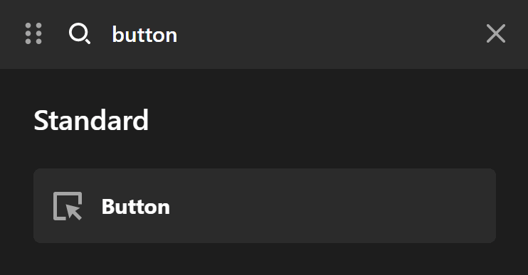
To add this Element, just search "button" and drag "Button" to the canvas.
Button Setup
We'll take a walk through each section step by step.
Setup
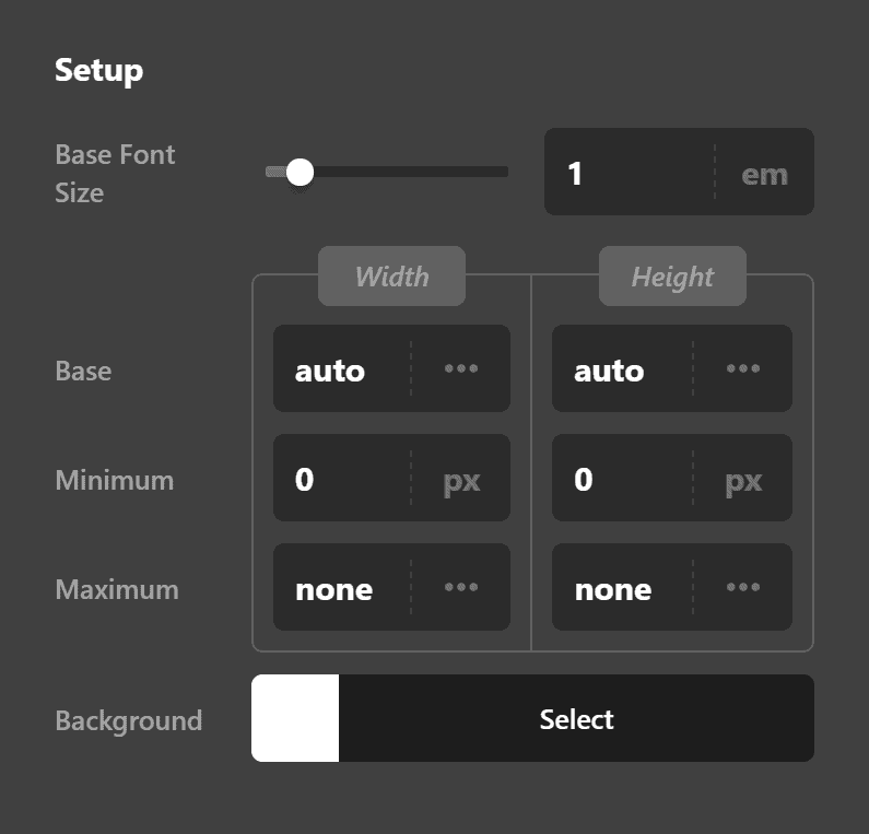
The Setup controls consist of:
- Base Font Size - The font size of the button text.
- Width & Height - The width and height of the button set to auto by default. Can be changed to any required value.
- Min Width & Height - The minimum width and height the button should be. Useful if you want your button to always be say 50px wide.
- Max Width & Height - The maximum width and height of the button at any time. Useful if you want your button to never exceed a specific size.
- Background - Offers two options: Base and Interaction. Base is the background color of the button at all times apart from on hover. Interaction is the background color of the button on hover and when the button is interacted with.
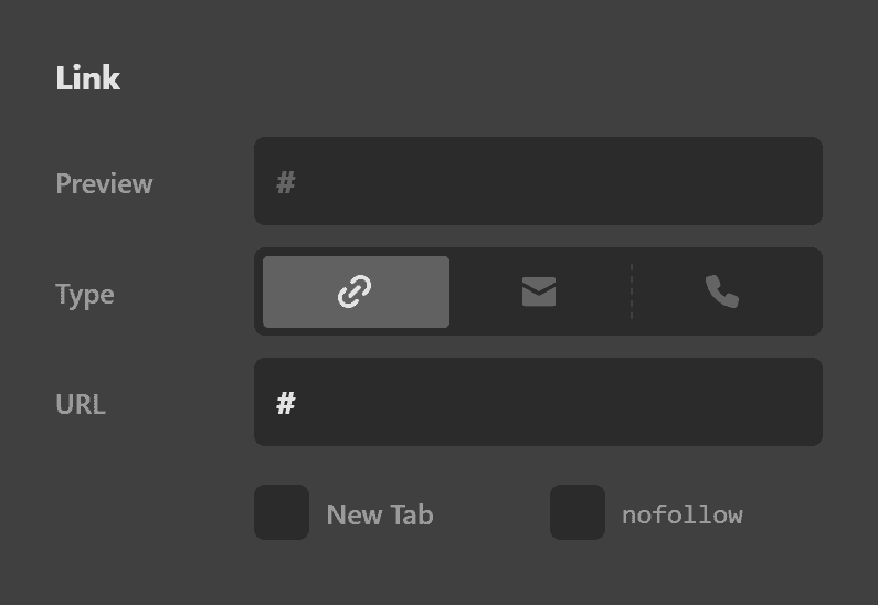
Link
The Link controls consist of:
- Preview - Takes the value of the link provided in the URL input so you can see exactly what the link will look like within the button.
- Type - The type of link. It could either be a traditional link, a mailto link or a phone number link.
Traditional Link
Enabling the Traditional Link mode of a link setup is done by clicking the anchor link icon. You will be presented with the URL input which you can add the URL of the website which you want to link to. The Preview input will show how it will be added in the actual HTML code. Check the New Tab checkbox if you want to have the link opened on a new browser tab. Check the nofollow checkbox if you don't want the search engines to sniff the link. The nofollow is used when we link to an external website usually.
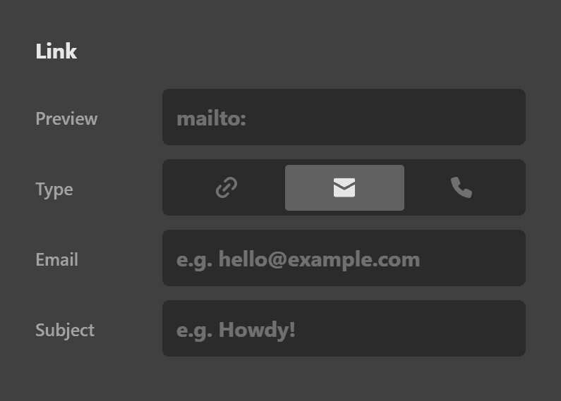
Mailto Link
Enabling the Mailto Link mode of a link setup is done by clicking the envelope icon. Add the Email Address into the Email input and the subject of the email into the Subject input. The preview input shows how the link will be added in HTML. Clicking the link with an email setup will open up the Email Client software of the visitor and will fill in the recipient Email Address and Subject of the email.
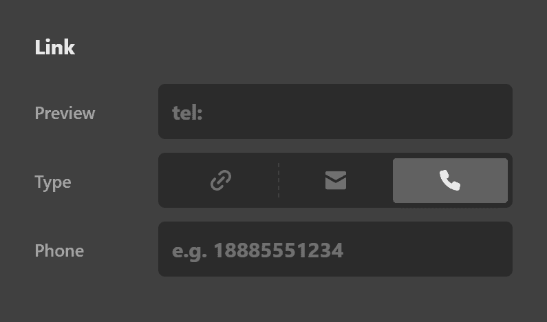
Phone Link
Enabling the Phone Link mode of a link setup is done by clicking the phone icon. Add the Phone Number into the Phone input. The preview input shows how the link will be added in HTML. Clicking the link with a phone setup will open up the phone dialer screen of the user's device if the user owns a device that has that capability.
- URL - The URL of the link that the button should point to.
- New Tab - Wether you want the link to open in a new tab.
- Nofollow - Whether the button should be a nofollow or not. Setting a nofollow means that the site you link to won't be considered by Google to be endorsed by you. It's normally advisable to check this if linking to an external site.
Button Design Settings
The following are the Button Design settings.
Content Flex Layout
The Content Flex Layout controls consist of:
- Layout - Either set to Row or Column
- Reverse Layout
- Wrap Children
- Horizontal
- Vertical
The Content Flex Layout controls allow you to configure the flexbox settings of the Button Element. If you're not familiar with flex, this guide will help you.
Margin
The Margin layout controls consist of:
- Link Sides - Link sides allows you to link up every option within the margin controls so when you change one value all values change. Or you can unlink sides and set each margin option individually.
- Top - Sets the top margin.
- Right - Sets the right hand side margin.
- Bttm - Sets the bottom margin
- Left - Sets the left hand side margin.
Padding
The Padding controls consist of:
- Link Sides - Link sides allows you to link up every option within the padding controls so when you change one value all values change. Or you can unlink sides and set each padding option individually.
- Top - Sets the top padding.
- Right - Sets the right padding.
- Bttm - Sets the bottom padding.
- Left - Sets the Left padding.
Border
The Border controls consist of:
- Link Sides - Allows you to link up the border control for all sides or unlink sides to control each border side individually.
- Style - Sets the style of the border such as dashed, dotted etc.
- Width - Sets the width of the border in pixels by default. Or click on PX to change the value to the units you'd like to use (EM, REM).
- Color - Sets the color of the border.
Border Radius
The Border Radius controls consist of:
- Link Sides - Link all sides of the border to control all border radius options at the same time, rather than configuring each value individually. If you unlink sides. You can set the border radius controls individually.
- Top Left - Set the top left radius of the border.
- Top Right - Set the top right radius of the border.
- Bttm Right - Set the bottom right radius of the border.
- Bttm Left - Set the bottom left radius of the border. Note: You won't see any effect by changing the Border Radius values unless you have already set your Border controls.
Box Shadow
The Box Shadow controls consist of:
- X-Offset - Set the offset of the border shadow for the X axis.
- Y-Offset - Set the offset of the border shadow for the Y axis.
- Blur - Set the blur of the box shadow.
- Spread & Position - Set the spread and position of the box shadow.
- Color - Sets the color of the box shadow.
Graphic Setup
Let's look at some of the button graphics settings.
You'll notice you can either enable or disable it. Button and Element graphic setup is disabled by default.
These are the controls under Graphic Setup:
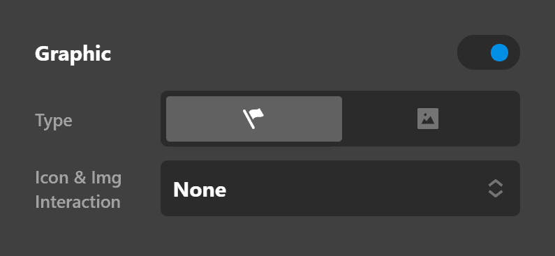
- Enable - Already discussed earlier, you have the option to turn it On or Off. When turned On, all other options/settings become visible such as Graphic Icon, Graphic Image, Graphic Layout and Text Settings, which will be discussed in the following sub-headings.
- Type - You can choose either an Icon (the default) or an Image.
- Icon & Image Interaction - Sets how the icon will behave when you hover the mouse on the Element.
Graphic Icon Settings
If you've selected Icon as the Type under Graphic Setup, the Graphic Icon settings will be displayed. It has the following controls:

- Font Size & Secondary - There are two fields here. One is the Font Size, which, as the name suggests, lets you set the size of the font of the icon. The checkbox beside it is the option to either use a secondary icon or not. If you want the icon to be different when users hover their mouses on it, you need to check that checkbox and choose a different icon.

- Width & Height - sets the dimensions of the icon.
- Primary & Secondary - If no Secondary icon is used, whether you hover on the mouse or not, it will use the Primary icon. If Secondary is used, then the Primary icon is the icon displayed when the mouse is not hovering on the Element and Secondary is displayed when the mouse is over the Element.
- Color - Has two sub-options: Base - The color of the icon when the mouse is not hovered on it; Interaction - the color of the icon when the mouse is hovering on the Element.
- Background - Has two sub-options: Base - The background color of the icon when the mouse is not hovered on it; Interaction - the background color of the icon when the mouse is hovering on the Element.
Now, when you're using the Icon type, there are other options available that let you design your icon further. They are the following:
- Graphic Icon Border
- Graphic Icon Border Radius
- Graphic Icon Box Shadow
- Graphic Icon Text Shadow

Graphic Image Settings
If you choose the Image Type under Graphic Setup...

... you will be able to choose your own graphic and not be limited to what's available only in the icons.
When Image is the selected type, you'll be able to see the following settings:

Under Graphic Image, you only have one control:
- Max Width - Let's you set the maximum width of the image.
Under Primary Graphic Image, you have the following controls:
- Retina & Dimensions - Retina support is enabled out the box. Click the Eye to disable the Retina support. Also supports options to set the width and height of the image.
- Source - The image to be used. Click to select an image from the WordPress media library or upload a new one.
Button Text Settings
Now let's look at the button text settings.
Text Setup
The Text Setup controls consist of:
- Enable - A simple On or Off option. Set this to On if you want the button to have text or set to Off if you want an icon only button.
- Text Overflow - Set text overflow to enable.
- Primary Text - The main text within the button defaults to "Learn More."
- Secondary Text - Add secondary text under the primary text. Default is empty (no output).
Primary Text Format
The Primary Text Setup controls consist of:
- Font Family - A font selector for the primary button font. Default is inherit or you can select a font that's setup within the Font Manager.
- Font Weight - The font weight for the primary font selected. Available weights depend on the font family selected.
- Font Size
- Letter Spacing
- Line Height
Primary Text Style
The Primary Text Style controls consist of:
- Font Style - Normal or Italic
- Text Align - Left, Center, Right, Justify.
- Text Decoration - Underlined or Strikethrough.
- Text Transform - Uppercase (force all text to be uppercase), Capitalize (forces the first letter in each word to be a capital), Lowercase (forces all text to be lowercase).
- Text Color - Offers two options: 1. Base, which sets the color of the text when the mouse is not hovering on the button. 2. Interaction, which sets the text color of the button when interacted with (on hover) etc.
Primary Text Shadow
The Primary Text Shadow controls consist of:
- X-Offset - Set the offset of the text shadow for the X axis.
- Y-Offset - Set the offset of the text shadow for the Y axis.
- Blur - Set the blur of the text shadow.
- Spread & Position - Set the spread and position of the text shadow.
- Color - Sets the color of the text shadow.
Button Particles Settings
Primary Particle Setup
Particle setup group contains the controls to the initial setup of the interaction effects. Following is the detailed information for each setting:
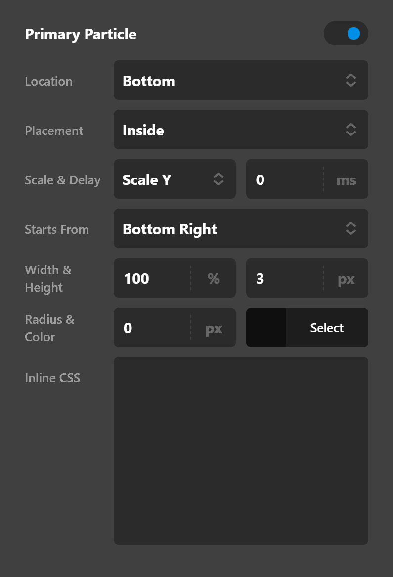
- Enable - Use this option to enable the interaction particle.
- Location - Use this option to set the position of the particle in respect with the Element that it is applied to. Available options are:
- Center
- Top
- Left
- Right
- Bottom
- Top Left
- Top Right
- Bottom Left
- Bottom Right
- Placement - Use this option to decide if you want to have the particles overlap with the Element or limited inside the Element.
- Scale - The scale option will determine how the particle will expand or shrink in transition. The available options are:
- None - Use this option if you do not want the particle to scale in transition.
- Scale All - Use this option to scale the particle both vertically and horizontally in transition.
- Scale X - Use this option to scale the particle horizontally in transition.
- Scale Y - Use this option to scale the particle vertically in transition.
- Delay - The delay option will determine how long will it take the transition to complete. The value of this option in seconds or milliseconds depends on the selection of the value unit.
- Transform Starts From - Use this option to set where the transition of the particle should start. Available options are:
- Center
- Top
- Left
- Right
- Bottom
- Top Left
- Top Right
- Bottom Left
- Bottom Right
- Width & Height - Use this option to set the width and the height of the particle. The value unit can be Calc, PX, REM, EM, and %.
- Radius - Use this option to set the radius of the particle. The same units can be used for this option values as the width/height options.
- Color - Use this option to set the color of the particle.
- Inline CSS - Use this option to add custom CSS which will be applied to the article. This option is for the advanced users that want an extra layer of customization which they can not find in the styling options of the particles.
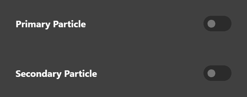
Primary and Secondary Particles
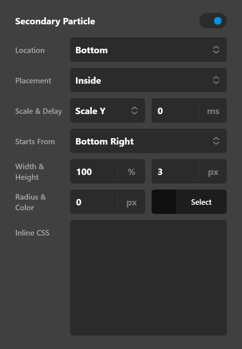
The same setup and style options which we described are available for primary and secondary particles. You basically have two sets of particle options to get innovative and create stylish interactions.
Customize
The Customize pane consists of various features that allow you to take further control over your Element's styling and functionality:
- ID – Sets an HTML ID on the Element.
- Class – Sets an HTML Class on the Element.
- Element CSS – Use this feature for increased stylistic control of your Element, especially over nested markup. Click here for more detailed information on this feature, such as using
$elto dynamically target the base tag, et cetera. - Hide During Breakpoints – Hides the Element at different screen sizes when design alterations are needed. Click here for more information.
- Conditions – Adds / removes Elements from the page when certain criteria are met (e.g. “If a featured image is set...”). Click here for more information.
- Custom Attributes – Use this option to add custom HTML attributes to the root tag of the Element (e.g.
data-info="123"). This can be particularly helpful when integrating with various scripts and libraries.
Demo
To see a live demo of the Button Element click here.
Summary
Let's recap, shall we? We've discussed how to add the Button Element to a page. Then we've gone through its basic settings, design, graphic, text and particles settings to make it look exactly the way you want.
See something inaccurate? Let us know