Alert
In this article, we're going to discuss the Alert Element and how to use it.
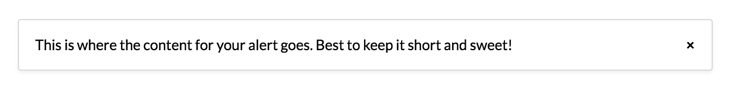
The purpose of the Alert Element is to output an Alert in a styled box with the text of your choice.
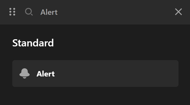
To add this Element, just search Alert and drag it to the canvas.
Alert Setup
The alert setup control group is for the initial setup of the Alert Element.
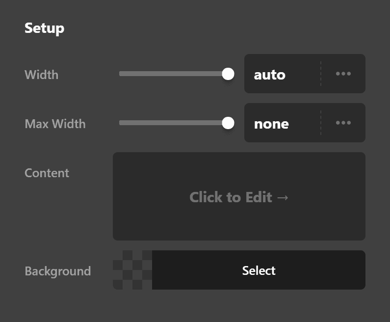
- Close - Use this option to enable or disable the close icon in the Alert Element.
- Width & Max Width - Use this option to set the width and the maximum width of the Element.
- Content - Add the content of the Alert inside this option.
- Background - Use this option to set the background of the Alert.
Close Setup
The close setup control group is to fine-tune the close icon of the Alert Element.
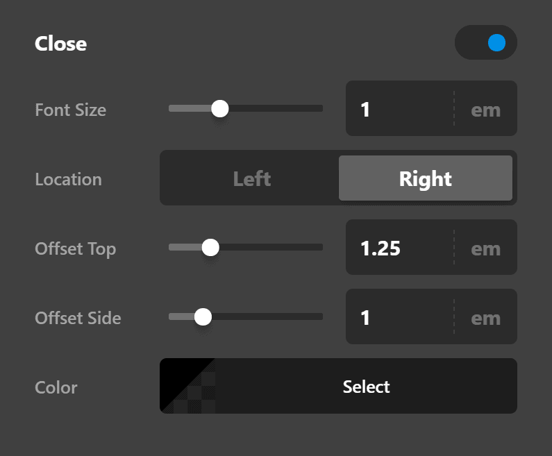
- Font Size - Use this option to set the size of the font icon which is used as the icon for the close button.
- Location - Decide if you want to show the close icon at the left or right-hand side of the Alert.
- Offset Top - Fine-tune the vertical spacing between the top of the alert box and the close icon.
- Offset Side - Fine-tune the horizontal spacing between the left or right edge of the alert box and the close icon.
- Color - Use this option to set the color of the close icon in the normal and hovered mode.
Design Settings
The design options include control groups to fine-tune the spacing and border of the alert box.
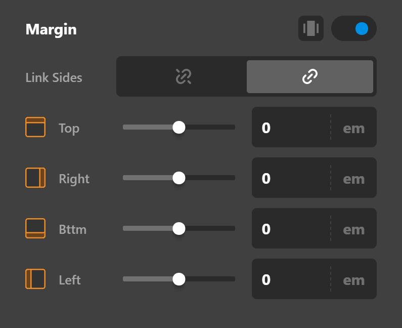
Margin
Use this option to set the margin of the alert box. You can change the settings for all the sides of the alert box or modify them individually.
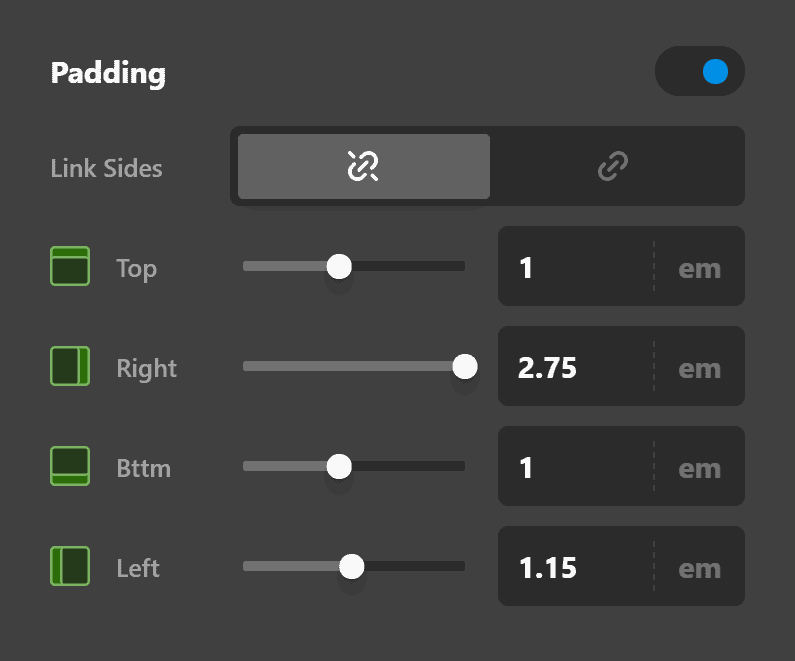
Padding
Use this option to set the padding of the alert box. You can change the settings for all the sides of the alert box or modify them individually.
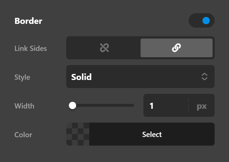
Border
Use this option to set the border of the alert box. You can set the style, width and color of the border on all sides or each side individually.
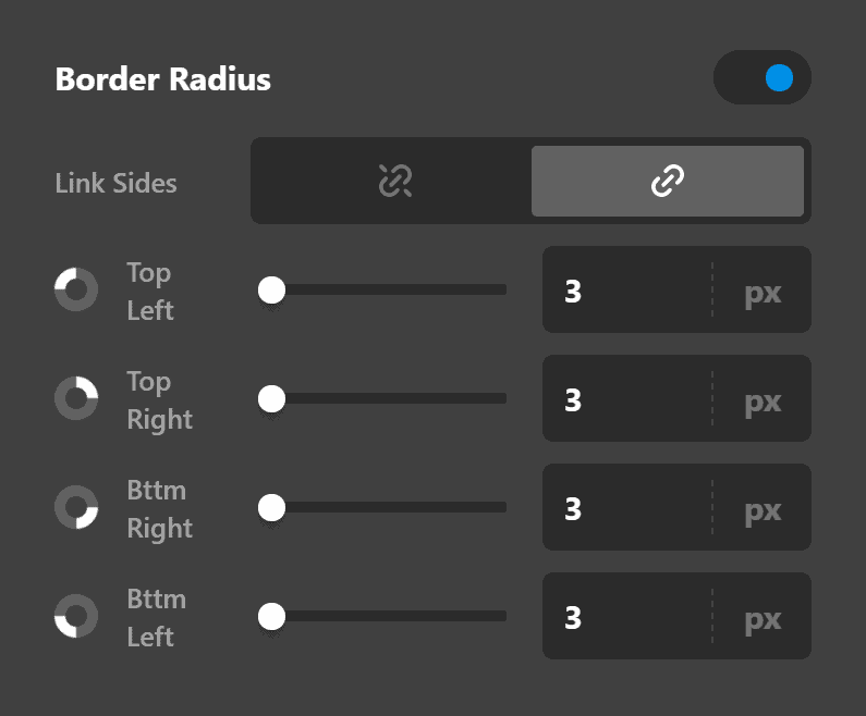
Border Radius
Use this option to set a border radius for the alert box. You can set the curve on all sides or set them individually.
Box Shadow
You can set a shadow over the alert box using the box-shadow control group.
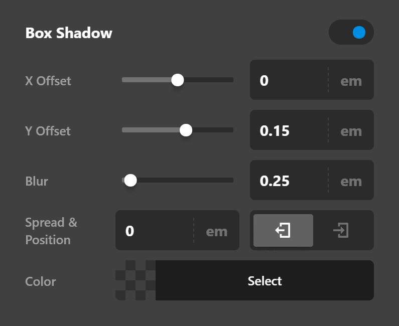
- X-Offset - Use this option to set the X offset of the shadow in the alert box.
- Y-Offset - Use this option to set the Y offset of the shadow in the alert box.
- Blur - Use this option to set the intensity of the blur effect in the alert box.
- Spread & Position - Use this option to set the spread amount of the items section shadow and decide if you want the shadow to sit inside or outside of the alert box.
- Color - Use this option to set the color of the alert box shadow.
Text Settings
The text options include control groups to fine-tune the text size and format of the alert box content.
Text Format
You can use this control group to set the format of the text in the alert box.
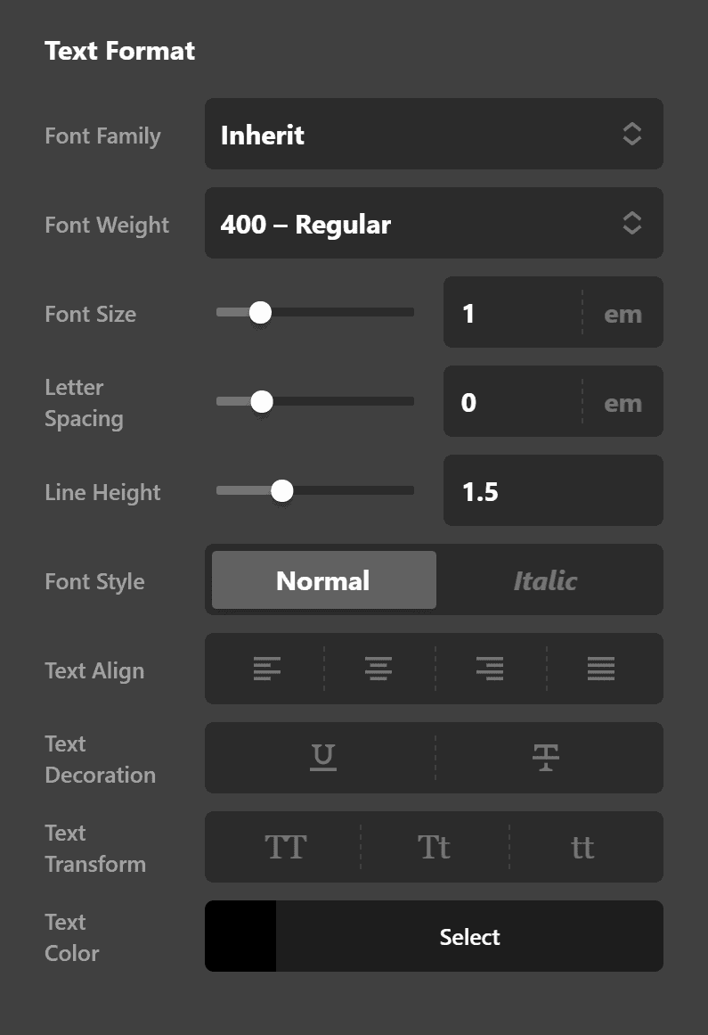
- Font Family - Use this option to set the font of the alert box content.
- Font Weight - Use this option to set the weight or thickness of the font. The values may differ depending on the selection of the font and if the select font supports weights or not.
- Font Size - Use this option to set the size of the font.
- Letter Spacing - Use this option to set the spacing between letters.
- Line Height - Use this option to set the spacing between each line.
Text Style
You can use this control group to set the style of the text in the alert box.
- Font Style - Use this option to decide if you want to have a normal or italic style.
- Text Align - Use this option to set the alignment of the text. Possible valuse are left, center, right, and justify.
- Text Decoration - Use this option to force an underline or linethrough style.
- Text Transform - Use this option to set the case of the text. Available options are uppercase, camel case, and lowercase.
- Text Color - Use this option to set the color of the text.
Text Shadow
The text-shadow control group contains settings to set a text shadow for the alert box content.
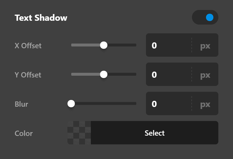
- X-Offset - Use this option to set the X offset of the text shadow.
- Y-Offset - Use this option to set the Y offset of the text shadow.
- Blur - Use this option to set the intensity of the blur effect in the text shadow.
- Color - Use this option to set the color of the text shadow.
Customize
The Customize pane consists of various features that allow you to take further control over your Element's styling and functionality:
- ID – Sets an HTML ID on the Element.
- Class – Sets an HTML Class on the Element.
- Element CSS – Use this feature for increased stylistic control of your Element, especially over nested markup. Click here for more detailed information on this feature, such as using
$elto dynamically target the base tag, et cetera. - Hide During Breakpoints – Hides the Element at different screen sizes when design alterations are needed. Click here for more information.
- Conditions – Adds / removes Elements from the page when certain criteria are met (e.g. “If a featured image is set...”). Click here for more information.
- Custom Attributes – Use this option to add custom HTML attributes to the root tag of the Element (e.g.
data-info="123"). This can be particularly helpful when integrating with various scripts and libraries.
Demo
To see a live demo of the Alert Element click here.
Summary
Let's recap. We've discussed how to add the Alert Element. Then we've gone through its setup, design, text, and customize settings to make it look the way you want it to look.
See something inaccurate? Let us know