Release
Notes
September 23, 2019
3.0.4
7.0.4
4.0.4
Howdy, Themeco customers! It's another day and another major release cycle for all products in the ol' corral. We've got lots to get to including updated interfaces throughout the tool, numerous workflow enhancements, multiple new Elements, and plenty of other improvements. Lets jump right on in and see what's new.
P.S. We've recently started uploading content to our YouTube channel focusing on frequently asked questions and important topics (with more cool content planned for down the road). Check it out if you have a moment and make sure to subscribe to the channel so you don't miss any future videos!
Interface Updates Pro, Cornerstone
As you start navigating the builders you see that there are a few notable changes throughout, namely the Layout and Elements Panes. We've taken some time to review these workflows and where we want to take the tool as a whole moving forward and have introduced these updates to better align with those goals.
Starting with the Layout Pane, you will see that it now features the nested, filesystem-esque structure that was introduced into Skeleton Mode in a previous release:
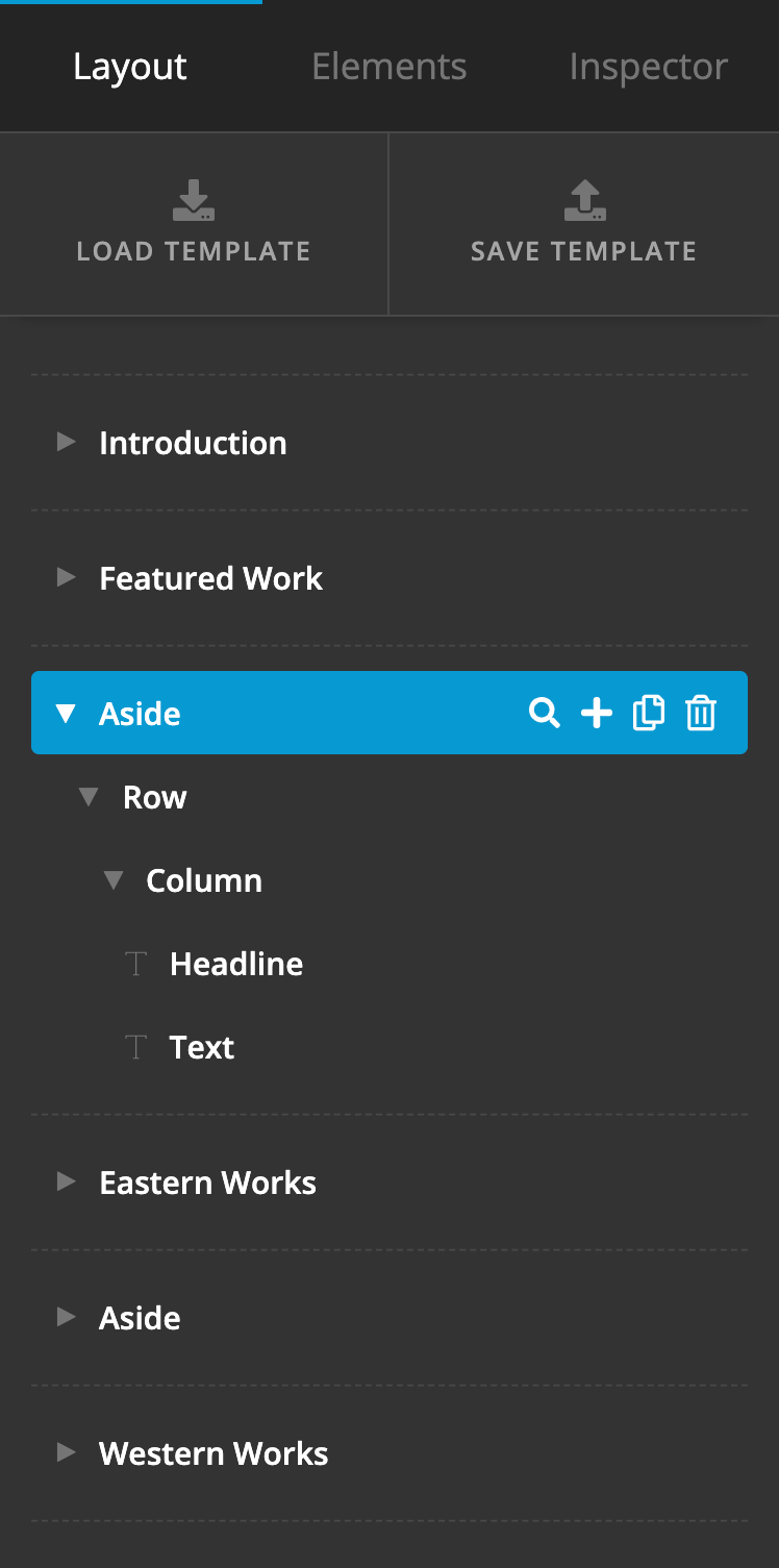
The main catalyst for updating the Layout Pane came out of the desire to allow for nested Row and Column layouts. Our previous Layout Pane was designed specifically to make the creation of single-layer layouts as effortless as possible (i.e. Section → Row → Column → Elements). While it served this desired outcome well, over the years it became apparent that an increasing number of users wished to create more intricate layouts that required multiple rows inside of a parent row.
Switching the Layout Pane to this nested view allows our users to infinitely nest content as they see fit for their designs. Additionally, it has opened up various movements that were not previously available in the Layout Pane (such as dragging a column from one Row to another). The simplified and condensed interface also gives users the ability to more easily move content throughout a design.
One final update to this Pane is the ability to add any direct children to an Element using the + button when available:
The presence of this action will mean different things at different levels:
- Section – Adds a new primary layout Element to the section (i.e. either a Row or a Grid, whichever is selected in your preferences…more on this later, including the new Grid Element).
- Row / Grid – Adds a new Column or Cell Element respectively.
- Column / Cell – Adds a new Element from the Element Library (which now includes Rows and Grids, allowing you to nest content).
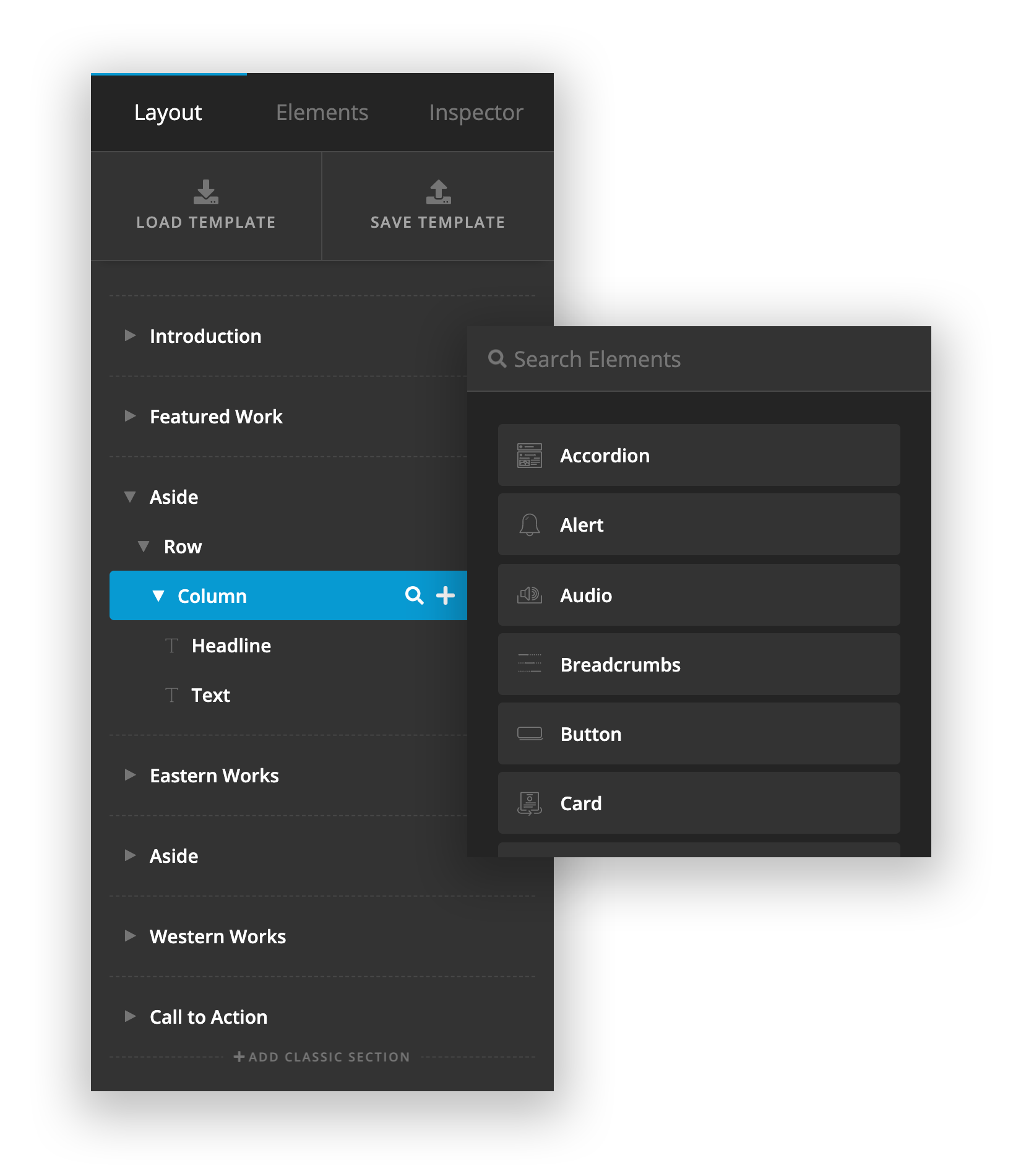
Moving on to the Elements Pane, you will see that it has also been updated:
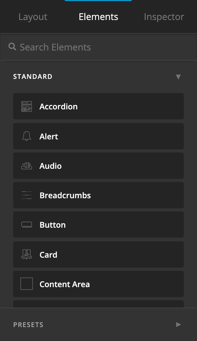
Elements and their presets are now classified into different groups, which can be collapsed or expanded to make for easier manual navigation. All Elements and their presets are still searchable from the input at the top of the Pane, allowing for quick location of a particular Element.
Beyond that, the most notable update here besides the condensed display of all Elements is the presence of Presets as a group. You can now directly drag in Presets from the Elements Pane, which bypasses the need to first locate the Element you need, then inspect it, then find the preset and apply it. Dragging in a preset will automatically apply that Element with its appropriate preset. This greatly expands the usability of the Elements pane and visually helps to depict just how many “Elements” are available to a user with their additional presets. Many of our Elements can take on dramatically different looks depending on how you set them up, and now those can all be easily saved and recalled directly from the Elements Pane.
Finally, we've introduced a seemingly small change to how controls are mapped throughout the interface that will continue to yield big dividends moving forward as we find better ways to implement it throughout the tool. Essentially, up until this release control groupings were limited to five rows of controls due to them needing to be displayed in both a vertical and horizontal context:
While this worked fine, it often meant that related groupings of controls needed to be arbitrarily broken up, leading to unnecessary dividing lines and labels:
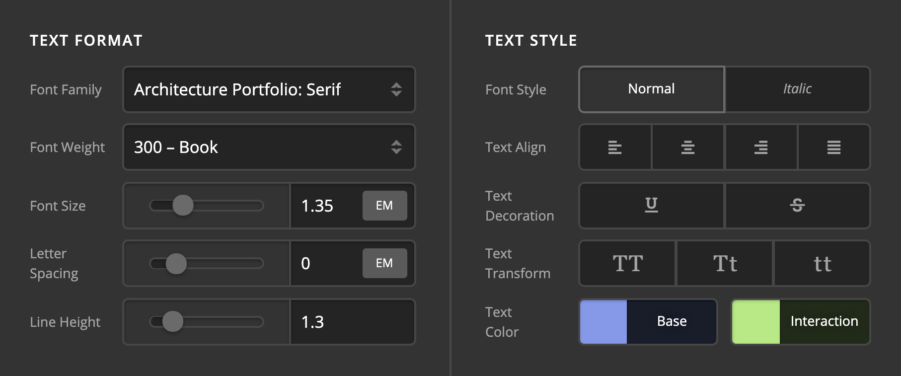
After some creative problem-solving, we were able to find a responsive solution that allowed us to list an unlimited number of controls to a group, giving us the ability to turn situations like the image above into:
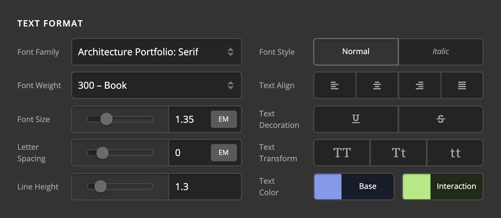
We've already been looking for situations like this throughout the Elements that we can streamline, such as the Typing group of controls in the Headline Element:
We will continue to find more ways we can employ this mapping to make things clearer and less overwhelming for as users as they navigate the tool.
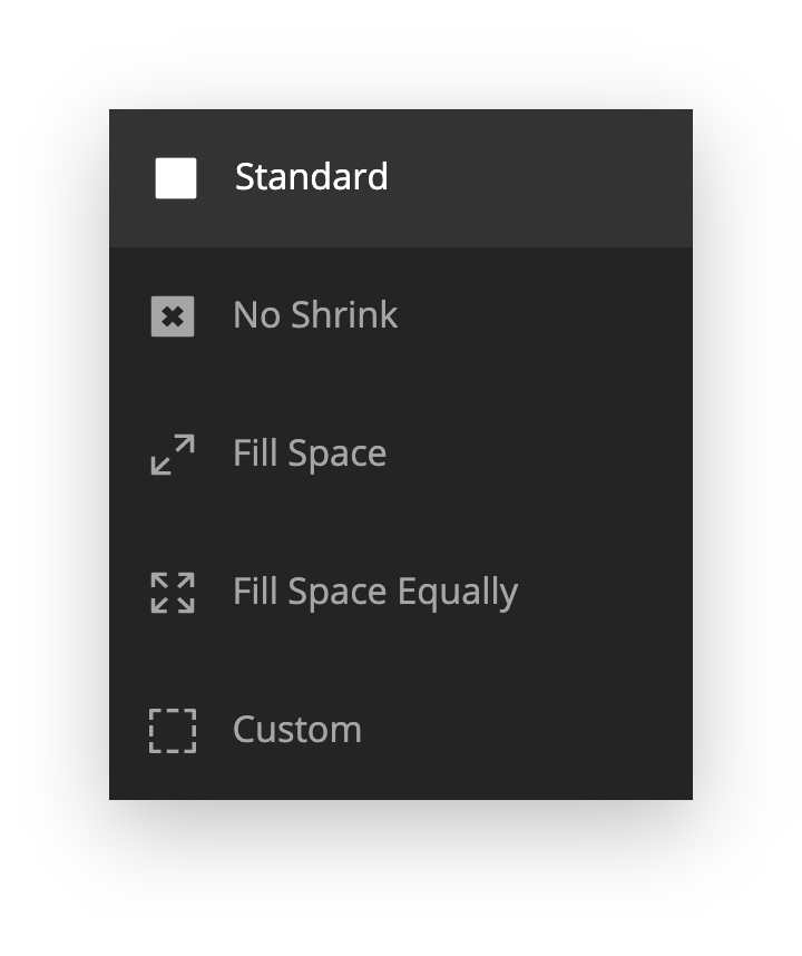
Furthermore, we've managed to find a way to consolidate the Self Flex controls that used to take up an entire grouping into a single picker control. The only place you will see this employed for the time being is on Elements that previously utilized the “Self Flex” options as part of their control set such as Navigation Inline, Containers for the Header and Footer Builders, et cetera:
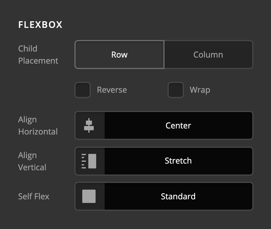
Clicking on this control will reveal the standard picker modal you're used to for things like colors and icons, but with a list of “self flex” options instead:
If “Custom” is selected, the individual flex controls are revealed, allowing you to have full control over these parameters:
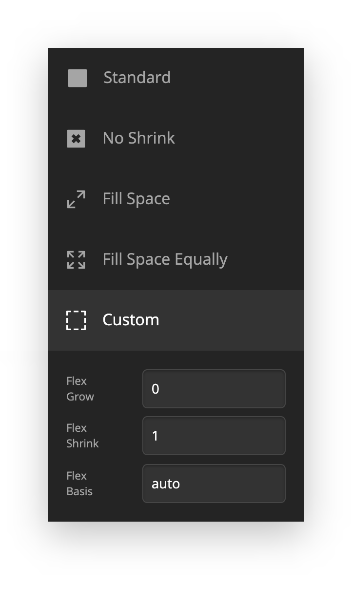
Our goal with this change was to help make the preset values more visual to match the alignment controls already used throughout the tool, while abstracting away some of the complexity of the individual controls that not all users need due to the fact that the preset values tend to cover most use cases for many users.
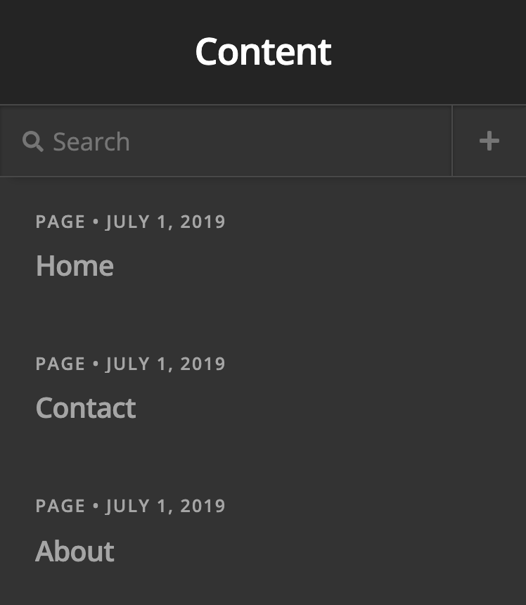
Finally, we've streamlined the index listing interfaces utilized for the Content Builder and Global Blocks. They are both exactly the same now offering the ability to both search all items in the index as well as add new items directly from the interface. For Global Blocks, this means that you can now quickly find anything you're looking for using the new fuzzy search. As for the Content Builder, new posts for any allowed post type can be added without needing to exit to the WordPress admin:
Workflow Enhancements Pro, Cornerstone
In addition to the shiny new interface improvements, we've also included many more keyboard shortcuts in the builders, all aimed at speeding up your workflow or making common actions more readily accessible. Below is a list of these actions, their associated shortcuts, and a short description of how to employ them:
⌘DDuplicate – Creates another version of the currently inspected Element.⌫Delete – Deletes the currently inspected Element from the document.⌘CCopy – Copies all information about the currently inspected Element (styles, content, et cetera). This information can then be selectively applied to similar elements later. For example, if you finished styling a button and wanted to apply it to three others in a section, you can use the Paste Style command to leave the content of those buttons in place, but apply the style to make them match.⌘VPaste – Effectively the same as Duplicate, but you can choose where the Element is placed based on what Element you have currently inspected.⌘⌥VPaste Style – Allows you to apply the copied styles of another like Element to the currently selected Element. Alternately, if you are inspecting a parent that might contain multiple like children, using this command will apply those saved styles to all like children within itself. For example, let's say that you've designed a Headline Element and now wish to apply it to five other Headline Elements in the section. Instead of pasting these styles to each Element individually, inspecting any parent Element that contains all of these Elements and using the Paste Style action will automatically apply it to all other Headline Elements!
Furthermore, all of these actions will be available when appropriate via the Context Menu, an action list that can be accessed by right-clicking anything in the preview:
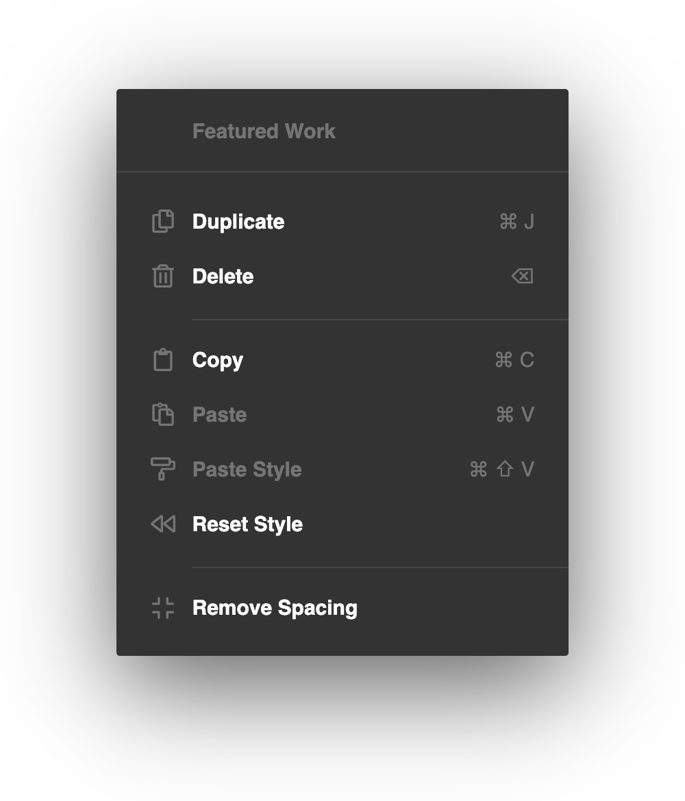
Depending on what you're currently clicking (i.e. a Section vs a Headline Element), you will be presented with different options to take advantage of. These new editing actions available via keyboard shortcut and the Context Menu are sure to be a huge boon to your productivity as you learn to employ them in your workflow!
Element API
The Element API used to power all of our builders has now been made public, allowing developers to extend and create Elements for their own purposes. While much of this functionality already existed within the builders, it has never been open to users and and was not built in a way to make it as accessible as possible. During this release we took a lot of time to comb back through our systems and find cleaner ways to extract helpful bits of code and make them easier to use. For documentation, we have the Element API Primer and Element API Reference.
New Layout Element: RowPro, Cornerstone
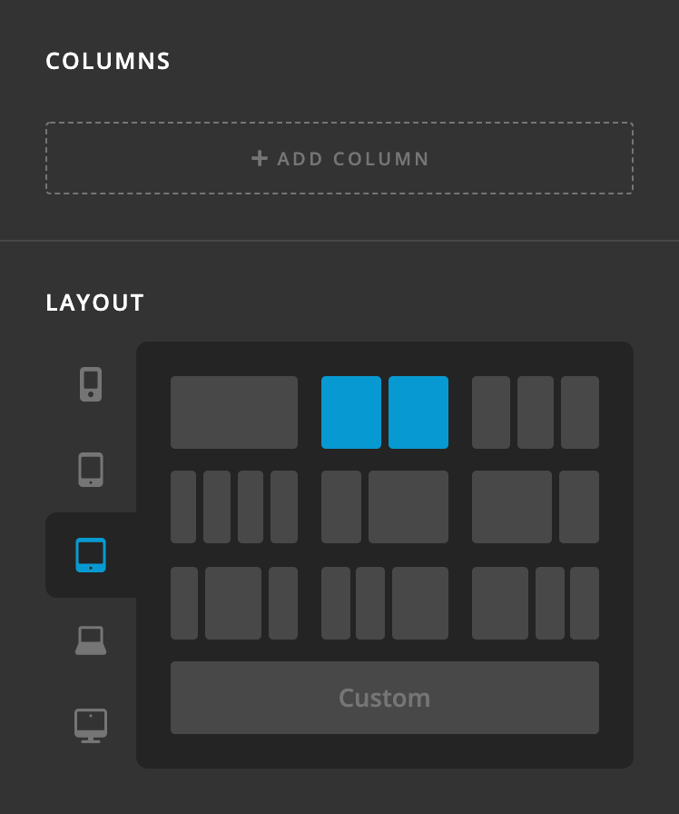
That's right, you're not imagining things…we have a couple of shiny, brand new layout Elements for you all in this latest release! We're talking a completely revamped Row Element powered by flexbox that features adjustable column sizing along with customizable responsive layouts at every breakpoint. This allows users to independently specify their columns and layout all from the first couple control groupings of the Inspector:
An important distinction to make here is the difference between the Column Elements and “column layout” of your Row. “Columns” is where you add as many physical columns that you need in your Row, whereas “Layout” determines the percentage width for each Column in a specific position of the Row's layout. Column count is not limited by the layout of your Row. For example, you may wish to have 6 Column Elements within a Row and to have them laid out equally at 33.33% each. In this scenario, Columns 4-6 would visually appear on a new line but would still be within the same Row.
Let's take that example above and walk through how we would make it happen with the new Row. The first thing you would do is add 6 Columns to the Row:

Next, we would set the layout for the breakpoint we're working currently on (in this example we'll start with the XL breakpoint). There are multiple common preset configurations available to choose from such as 50% / 50%, 33.33% / 66.66%, et cetera. In this scenario, since we want 3 equal columns for our layout, we can choose the option below:

Which would create the following output (the Column Elements have been styled to make visualizing them a little easier):

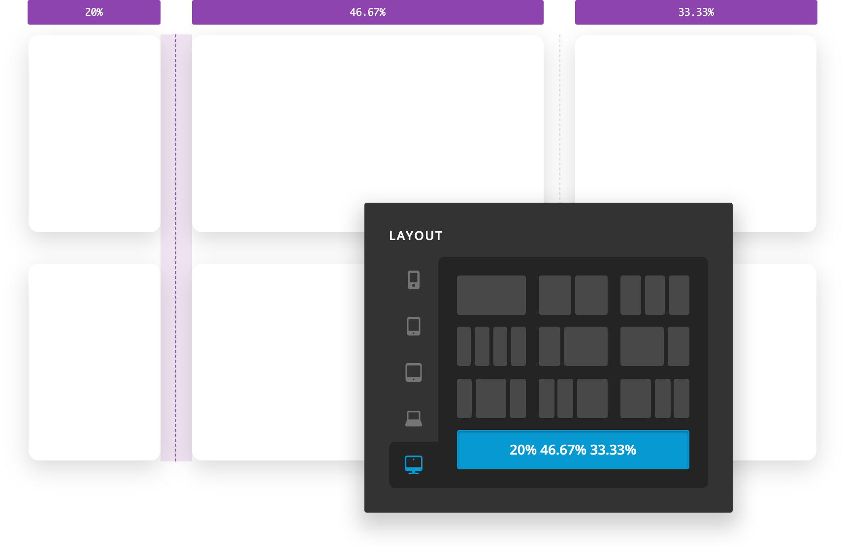
You may have already noticed that there's something a little different to the Row when hovering over it: a faint, dotted line that appears within the vertical gaps of the Row. These are handles that can be grabbed within the live preview to horizontally resize the layout between adjacent Columns. The dotted line is only an indicator that appears on hover, but the entire gap is able to be dragged. Clicking down on any of the vertical gaps will reveal the following feedback:

The active handle that you are currently interacting with will highlight in addition to the tooltips that appear above each Column, revealing their current widths. As you begin dragging the handle, the layout will update in real time and the tooltips will also update accordingly. Additionally, if you hop back over to the Inspector you will find that the previous column layout preset will have changed to a “Custom Layout,” reflecting the changes made by dragging the handles in the preview:
This process can be repeated for each breakpoint using the tabs to the left of the “Layout” controls. Expanding on our example above, we may wish for our 6 Columns to respond down to a 50% / 50% layout on our LG and MD breakpoins, and then go 100% on SM and XS.
A very unique layout hack to keep in mind is that the Column widths are set using flex-basis as the Row is powered by flexbox. Because of this, if you set the same custom fixed value (e.g. 200px, 20rem, et cetera) for every breakpoint then the Columns will respond not by breakpoint, but by ensuring that their own width never goes below that fixed value if possible. This is great for layout situations where you want to define a bunch of Elements that stick to a very specific max-width and just have them wrap as they need to. Again, to do this you would just need to set one fixed value at each breakpoint using the custom layout input like so:

One final interesting bit of information about the “Layout” control is that it will automatically switch the active tab to the breakpoint you're currently viewing in the builder. You can of course switch to any breakpoint you wish to style at any point, but this helps to ensure that you're starting your work on the breakpoint you most likely intend to be updating.
After setting up the general layout of your Row, you will find even more helpful controls in the “Setup” control group:

We can perform many common tasks such as setting the base font-size or a background-color, but you'll also find that there are many helpful improvments to the revamped Row.
Probably most helpful are the gap controls. The previous version of the Row had set horizontal gaps and did not have a way to set vertical gaps at all, often requiring users to resort to Gaps that would be shown/hidden across multiple breakpoints or custom CSS. Now, you can quickly and easily specify these values natively to have the Row space out its own Columns intrinsically. Remember that you will not see any vertical gaps until your Row's layout changes so that Columns are stacked one on top of the other.
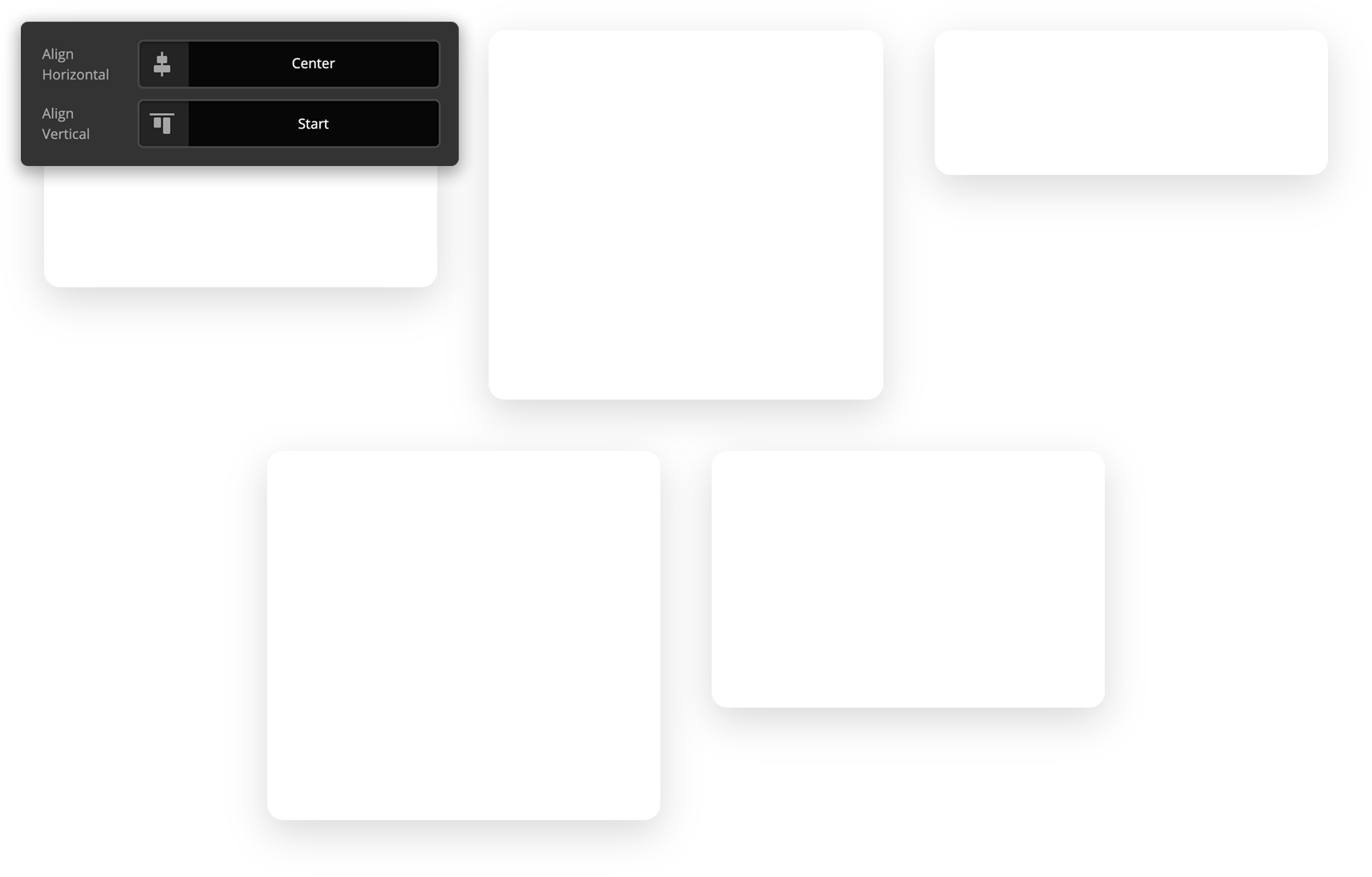
The alignment controls are an incredibly powerful part of laying out the Columns within your Row as we have flexbox potential to tap into. This can allow us to achieve all sorts of unique layouts not possible in traditional builder grid systems. For example, let's take our 33.33% / 33.33% / 33.33% layout from before but remove one Column from it. By default, with the Horizontal Align control set to Start, your layout would appear as such:

Since we have extra horizontal space to distribute our Columns amongst the space our Row is occupying, if we adjust the Align Horizontal control we sill start to see different layout results emerge:


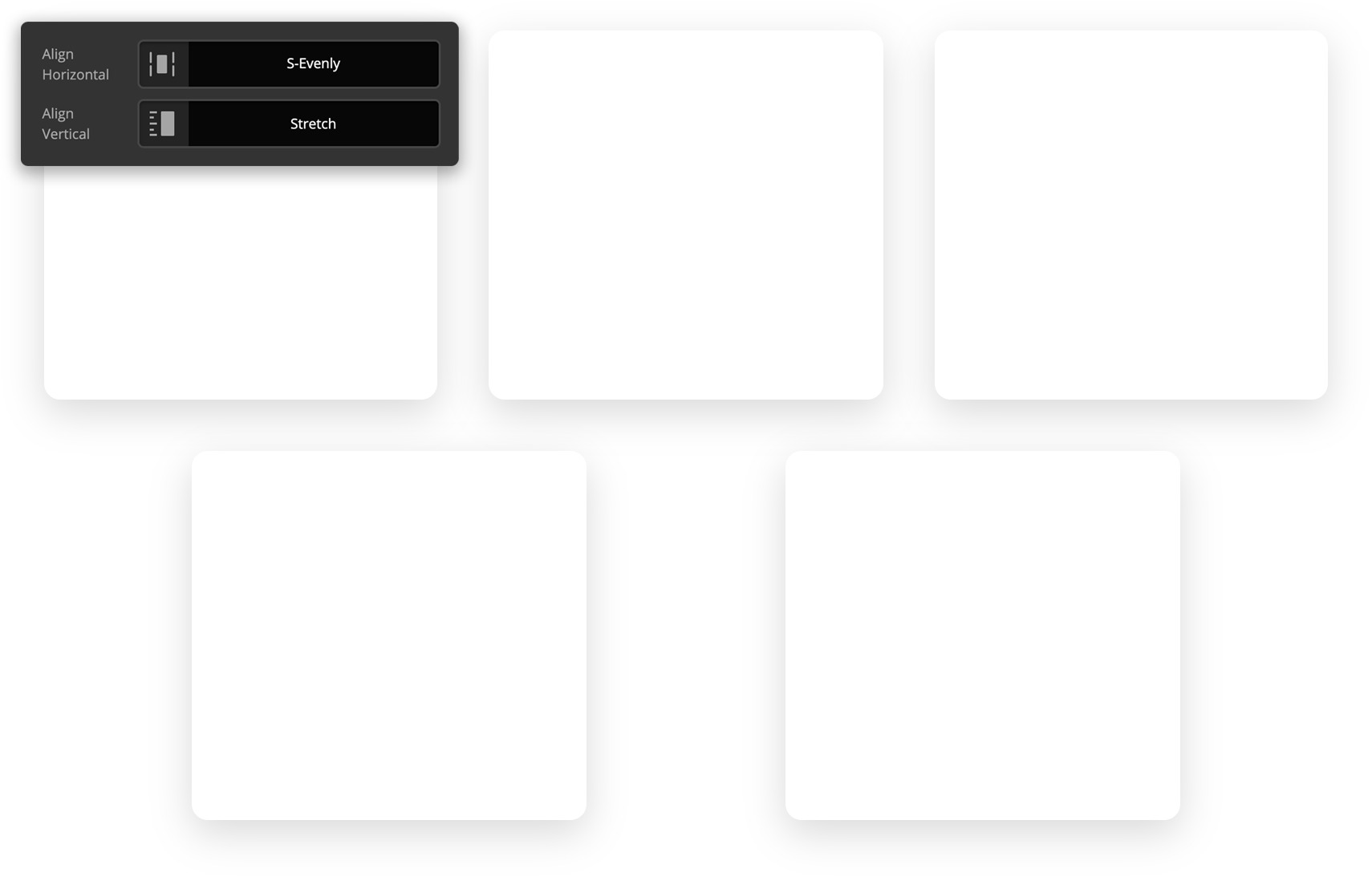
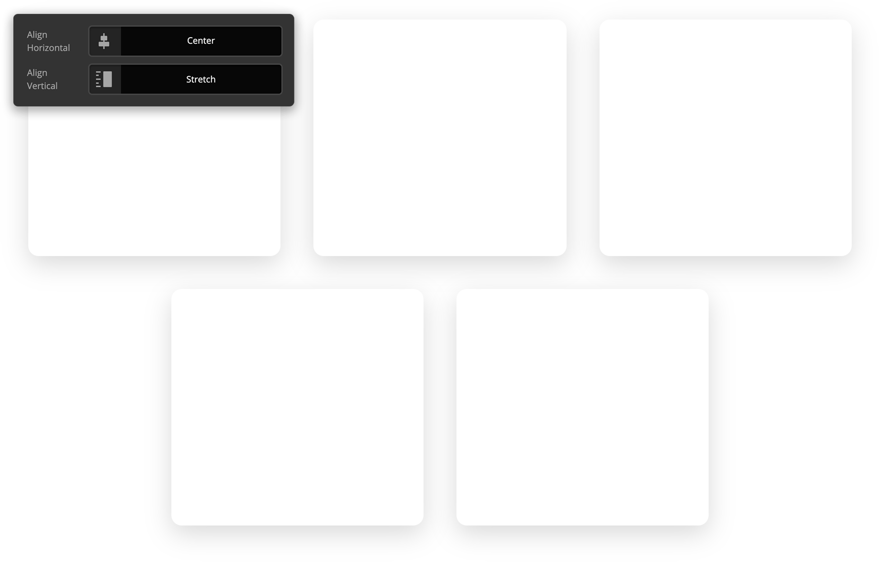
Additionally, if our colums have differing heights, we can use the Align Vertical control to distribute the placement of the columns within their respective row (note that for all of the examples below, we utilized an invisible spacer to achieve the different heights of these columns):


The final specialized controls for the Row that are important to note are the Reverse and Grow checkboxes. Starting with Reverse, let's take a look at the ordered content below:
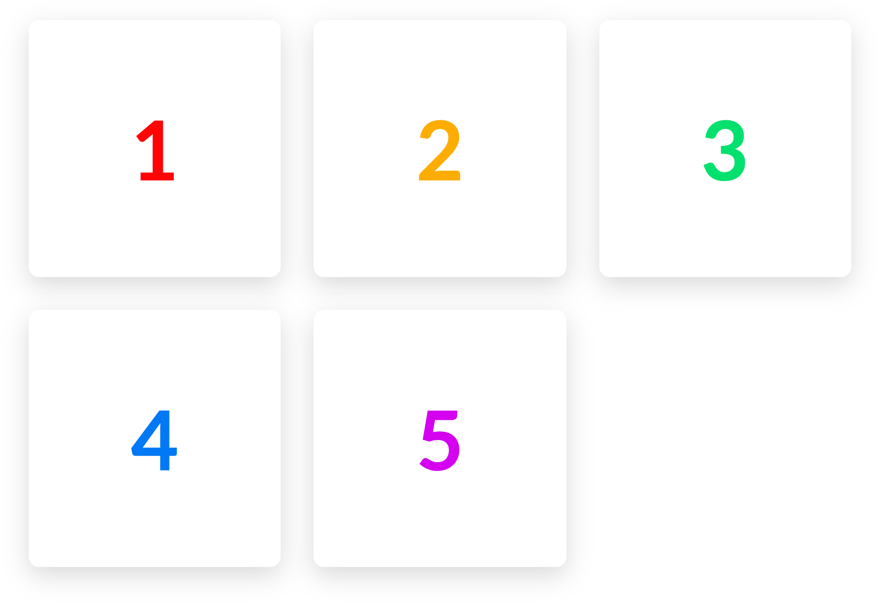
Notice how the numbers appear from left to right as they would on a website utilizing LTR text directionality. If we turn on the Reverse checkbox, that would result in the following:
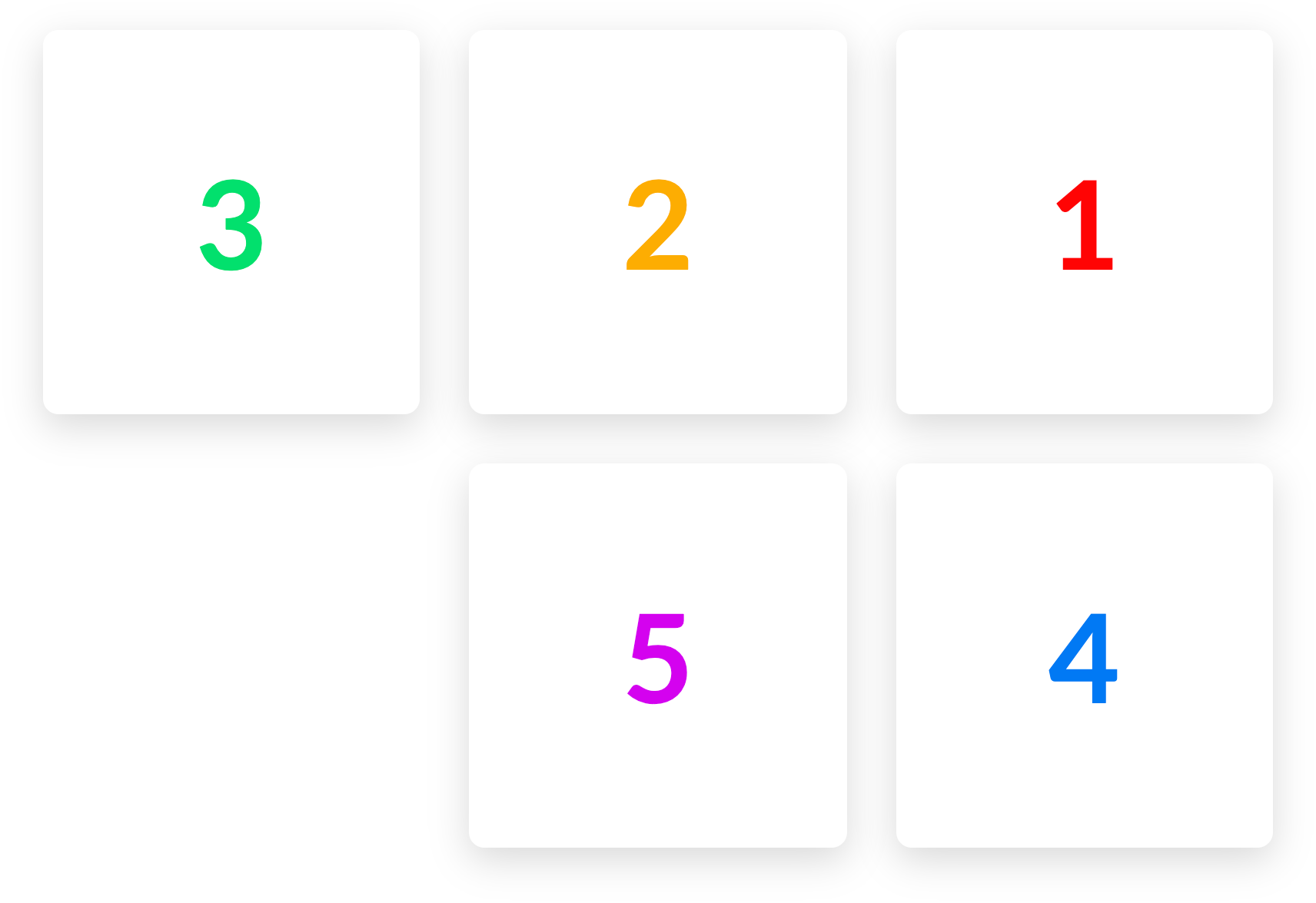
Engaging the reverse functionality effectively mirrors the appearance of your content horizontally. This is important to note as it does not have any actual effect on the order of your Columns (e.g. 5 does not appear in the place of 1, et cetera).
Utilizing this checkbox is most effective for situations where you might have alternating Sections of content on desktop (e.g. Image / Text then Text / Image) but on mobile you want them all to appear with either the text or image on top uniformly. Since Reverse only alters the horizontal appearance of our Rows, you can use Reverse for every other Section with this pattern, and it will automatically respond to the way you want it to appear on mobile. No more hiding / showing multiple Rows and Columns to achieve this particular layout!
Additionally, the Grow checkbox will force any Columns to fill all available space when possible:
This is simpily a stylistic choice and there are some situations where you might wisth to have a squared out Row of content, even if you do not have an even number of Columns available.
The final imporant piece to this puzzle is a small update to how Columns work within the new Row. Let's take a look at the Column Setup group:

Notice that there is an option to layout the contents of the Column using flexbox or not. If turned off, your Columns will behave as they always have and items will be laid out in a standard document flow. If engaged, a flexbox layout control will appear, allowing you to specify how Elements within your Column are aligned. This gives you full creative control to place items within a Column exactly as you see fit. Vertically centered, horizontally stretched, placed at the end of a Column…any layout is now possible utilizing this feature!
New Layout Element: GridPro, Cornerstone
We are currently still working through concepts for the new Grid Element and dialoging with customers before finalizing everything. Stay tuned, because you're not going to want to miss this one. 😊 If you would like to join the discussion about the Grid Element, please take some time to read through this thread in the the Beta Forum and let us know your thoughts (please note, you must be a member of our beta testing team to view this link, otherwise it will return a 404 error)!
New Parity Elements—And a Couple Other Little Things Pro, Cornerstone
While new layout Elements are super rad, you know what else is totally bodacious? Parity Elements! There were a few very popular Classic Elements that many users wished to see brought into the v2 fold, and we've certainly heard those requests. Because of this parity, Classic Elements have been disabled by default for new installations. They can be turned back on from the Permissions manager. Those Elements that we've updated are as follows (along with any additional notes about important changes):
- Card (New) – The new Card Element gives you full styling control over the front and back faces of the Card with the content for each side being powered by our Headline Element, allowing you to create practically any text style imaginable. The back also includes a fully functioning Button Element, making the styling of your call-to-action simple and familiar to what you're already using throughout the tool.
- Countdown (New) – Got a big event coming up or something you're trying to hype up? Our new Countdown Element might be just the ticket you're looking for. We effectively started from scatch on this one, giving complete control over every facet of the Element: styling options are effectively available at every level of the Element from the individual timer digits, to the text, variable label styling and positioning, optional delimiters and complete message, along with so much more. There's a lot to take in here, so take your time (pun intended) and get ready to jump into this Element feet first.
- Creative CTA (New) – Our new version of the Creative CTA Element is effectively the Button Element, but with a new section we've added in called Interactive Content. This essentially allows you to setup your styling like you would for a normal button along with all interaction changes (e.g. colors, particles, et cetera), and then easily pop in the “interactive content” you want to show up on hover. That interactive content will take on the general styling of your text, but includes an additional control that specifies how it should enter on hover.
- Icon (New) – Standalone icons have been a long time coming for our Elements. You can now style individual icons just as you have within Buttons, Navigations, Headlines, and move for some time now.
- Raw Content (New) – The main difference between the current Content Area Element and this new Raw Content Element is that the Raw Content Element has no wrapping
</div>at all, making it a great choice if you need complete control over the output of your content, or simply need a spot within a design to place a third-party embed code or script. - Testimonial (New) – Essentially a simplified Quote Element that does not include the “Marks” controls, along with a few other things that have been streamlined. Additionally, it integrates our new Rating Element as an optional piece to be enabled if desired. Simple, yet still very powerful.
- Rating (New) – The Rating Element came about during our beta testing as a suggestion from a user. It allows you to easily add a scaled rating (i.e. 3.5 out of 5 stars) to your pages, as well as optional schema markup to enhance search engine visibility. A fantastically flexible little Element that is helpful in many different ways.
- Social (Updated) – The Social Element now includes unique linking behavior that allows you to setup your buttons as social sharing links (e.g. prompts for users to paste an article or page to their feed).
Finally, until recently our YouTube channel has remained largely inactive as we have tended to release content via articles in our Knowledge Base through self-hosted video. However, along with this recent release we have decided to put more of a focus into creating content for that channel that is easy to share with others in the community. For the time being we are focusing on very short and concise videos about individual topics and frequently asked questions, but we have some exciting plans in the works down the road. 😊 If you have a moment, we'd love for you to check out the channel over on YouTube and subscribe if you're finding the content enjoyable and get something out of it!
Changelog
- Pro 3.0.4 - October 3, 2019
- Bugfix: Erase button not working on Classic Column.
- Bugfix: Row element BG layers escaping row dimensions.
- Bugfix: Section parallax not always working in IE11.
- X 7.0.4 - October 3, 2019
- Bugfix: Row element BG layers escaping row dimensions.
- Cornerstone 4.0.4 - October 3, 2019
- Bugfix: Erase button not working on Classic Column.
- Bugfix: Row element BG layers escaping row dimensions.
- Bugfix: Section parallax not always working in IE11.
- Pro 3.0.3 - October 1, 2019
- Updated: Replace js library containing regex that would prevent script minifiers from completing.
- Bugfix: Section parallax distorted on mobile.
- Bugfix: Removed undesired space when Column empty is saved with no children Elements.
- Bugfix: Prevent ID attribute from being copied when using paste style.
- Bugfix: Countdown element showing NaN in Safari.
- Bugfix: Dynamic content not working for Rating element content values.
- Bugfix: Ethos content area background color not showing in Firefox.
- X 7.0.3 - October 1, 2019
- Bugfix: Fix Ethos content area background color not showing in Firefox.
- Cornerstone 4.0.3 - October 1, 2019
- Updated: Replace js library containing regex that would prevent script minifiers from completing.
- Bugfix: Section parallax distorted on mobile.
- Bugfix: Removed undesired space when Column empty is saved with no children Elements.
- Bugfix: Prevent ID attribute from being copied when using paste style.
- Bugfix: Countdown element showing NaN in Safari.
- Bugfix: Dynamic content not working for Rating element content values.
- Pro 3.0.2 - September 25, 2019
- Bugfix: Parallax on not working for classic sections.
- Bugfix: Accordion element missing Customize control group.
- Bugfix: Builder errors when an undefined element (inactive plugin) is part of the page.
- Bugfix: Observer getting stuck after closing the context menu.
- Bugfix: Prevent fatal PHP error with outdated versions of Yoast SEO plugin.
- Bugfix: Indexed labels of new elements being inconsistent depending on how they are added.
- Bugfix: drag to resize not working when Row layout is reversed.
- Bugfix: Gravity Forms CSS not being enqueued.
- Bugfix: Legacy shortcode generator not opening.
- Bugfix: Mobile switcher tooltip hidden in Header builder.
- Bugfix: Global Blocks search not working.
- Bugfix: Inability to use link finder when using the rich text editor in the builders.
- Bugfix: Copy/paste feature not allowing pasting an element into a column.
- Bugfix: Loss of text when quickly inspecting an element after typing in a Rich Text editor.
- Bugfix: Presets in elements pane not being sorted alphabetically.
- X 7.0.2 - September 25, 2019
- Bugfix: Gravity Forms CSS not being enqueued.
- Cornerstone 4.0.2 - September 25, 2019
- Bugfix: Parallax on not working for classic sections.
- Bugfix: Accordion element missing Customize control group.
- Bugfix: Builder errors when an undefined element (inactive plugin) is part of the page.
- Bugfix: Observer getting stuck after closing the context menu.
- Bugfix: Prevent fatal PHP error with outdated versions of Yoast SEO plugin.
- Bugfix: Indexed labels of new elements being inconsistent depending on how they are added.
- Bugfix: Drag to resize not working when Row layout is reversed.
- Bugfix: Legacy shortcode generator not opening.
- Bugfix: Global Blocks search not working.
- Bugfix: Inability to use link finder when using the rich text editor in the builders.
- Bugfix: Copy/paste feature not allowing pasting an element into a column.
- Bugfix: Loss of text when quickly inspecting an element after typing in a Rich Text editor.
- Bugfix: Presets in elements pane not being sorted alphabetically.
- Pro 3.0.1 - September 25, 2019
- Bugfix: Hide by breakpoint not working for individual Tab elements.
- Bugfix: Missing icon to clear Element pane search.
- Bugfix: Global colors not being included in exported templates.
- Bugfix: Fatal error in plugins that use cornerstone_remove_element function of the original element API.
- Bugfix: PHP warnings when Revolution Slider shortcode is used.
- Bugfix: Text flickering in builder preview if using Adobe Fonts.
- X 7.0.1 - September 25, 2019
- Updated: Update Cornerstone to latest version.
- Cornerstone 4.0.1 - September 25, 2019
- Bugfix: Hide by breakpoint not working for individual Tab elements.
- Bugfix: Missing icon to clear Element pane search.
- Bugfix: Global colors not being included in exported templates.
- Bugfix: Fatal error in plugins that use cornerstone_remove_element function of the original element API.
- Bugfix: PHP warnings when Revolution Slider shortcode is used.
- Bugfix: Text flickering in builder preview if using Adobe Fonts.
- Pro 3.0.0 - September 24, 2019
- Feature: Public Element API.
- Feature: New Row and Column elements with responsive layout options.
- Feature: Drag to Resize Column widths (new Row element).
- Feature: New Element: Card.
- Feature: New Element: Countdown.
- Feature: New Element: Creative CTA.
- Feature: New Element: Icon.
- Feature: New Element: Raw Content.
- Feature: New Element: Testimonial.
- Feature: New Element: Rating.
- Feature: Redesigned Layout pane.
- Feature: Redesigned Elements pane with ability to drag in element presets.
- Feature: Added ability to create new Pages and Posts from the Content builder index screen.
- Feature: Add Bulk Extension Manager.
- Feature: Add Status page where you can view information about the current environment.
- Feature: Added HubSpot as an integration plugin.
- Updated: Updated Google Fonts.
- Updated: Updated Font Awesome to 5.10.2.
- Updated: Skeleton Mode has been removed in favor of the new Layout pane.
- Updated: Social element now allows sharing behavior as an alternative to a link.
- Updated: Global Blocks can now be searched.
- Updated: Add rel="noopener noreferrer" on target="_blank" links if SSL is not in use.
- Updated: Allow Essential Grid Search to work with V2 elements.
- Updated: Add x_social_global_before/x_social_global_after filters.
- Updated: Remove enquire.js dependency in Icon stack.
- Updated: Saving a preset will now include all descendant elements.
- Updated: Update title filters to add separator via document_title_separator.
- Updated: Update WC integration to allow enqueueing "smallscreen" styles.
- Updated: Change nested spans to divs in buttons, navigation items, and anything using the anchor partial.
- Updated: Fallback to HTML and show notice if plugin conflict prevents TinyMCE from being loaded in the builders.
- Updated: Graphic Partial adjustment so icons and images behave more consistently.
- Updated: Revolution Slider 6.0 compatibility.
- Updated: Add ACF Option Page in Dynamic Content.
- Bugfix: WordPress oEmbed responsive styling.
- Bugfix: Content not being searchable when built with V2 Content Builder elements.
- Bugfix: Inline editing not cleaning text pasted from MS Word.
- Bugfix: Pricing Table Column not allowing custom HTML for all text based fields.
- Bugfix: Inline editing link button not outputting the correct path for relative URLs.
- Bugfix: Incorrect schema markup for individual comments.
- Bugfix: Yoast SEO content analyzer, keyphrase analyzer, and orphan filter, and link analzer (Yoast SEO premium) not working with element content.
- Bugfix: Duplicate search results appearing for text made in the content builder.
- Bugfix: Videos added in Gutenburg not resizing responsively.
- Bugfix: Aria IDs not matching custom ID attribute in Tabs element.
- Bugfix: Video post format displaying iframe of site instead of video.
- Bugfix: Dynamic Content not working with Toolset Types version 3.
- Bugfix: Dynamic Content not working in some classic elements.
- Bugfix: Line element border radius not working in Firefox.
- Bugfix: Switch from wp_title to pre_get_document_title to fix document title not updating.
- Bugfix: Dynamic Content for tag title not working.
- Bugfix: Video embed not working for portfolio.
- Bugfix: Dynamic content not working in a link control for email subjects.
- Bugfix: Draft and private posts not appearing as options for Header and Footer assignments.
- Bugfix: Illegal string offset PHP warning in Classic Icon List element output.
- Bugfix: Recent Posts element links all going to the same destination when WPML is active.
- Bugfix: Element CSS not working for Tab items.
- Bugfix: Show WC credit card icons on screen sizes where they don't overflow.
- Bugfix: Background fade not accepting zero as a value.
- Bugfix: Ethos filterable index not showing posts in All Categories.
- Bugfix: Parallax background images distorted on mobile.
- Bugfix: Search form not being compatible with WPML.
- Bugfix: Give scroll top anchor higher z-index to prevent it being covered by other elements (notably Pro footers).
- Bugfix: RTL styling corrections in dashboard pages.
- Bugfix: icon_only attribute of button shortcode not working.
- Bugfix: WPML and Weglot browser redirect affecting Builder preview.
- Bugfix: Inability to access Soliloquy settings page.
- Bugfix: Builders not working when Polylang is using a directory based URL.
- Bugfix: Media library in builders not allowing size to be selected.
- Bugfix: Gap with percentage size not working in builder preview.
- Bugfix: "Back" label in navigation modals always having the active link style instead of on hover.
- Bugfix: Display and handwriting fonts not working in Theme Options live preview.
- Bugfix: Global Blocks builder not using the correct base font size leading to discrepencies on the front end.
- Bugfix: Theme Options live preview not updating when WooCommerce Geolocation is enabled.
- Bugfix: Google Fonts for logo and navbar still loading when a Pro Header is assigned.
- Bugfix: Inability to use V2 elements on a page assigned to WooCommerce TOS.
- Bugfix: Gravity Forms stylesheets loading even when a form is not present at the current URL.
- Bugfix: Breadcrumb error when using an Icon as the home link.
- Bugfix: Global Blocks not taking on WPML translation of where they are output.
- Bugfix: Parent menu item scrolling to anchor instead of opening submenu.
- Bugfix: Content Builder not loading when BuddyPress is active.
- Bugfix: Ensure x-navbar-fixed-top class is removed when reaching the top of screen with fixed navigation.
- Bugfix: Some icons being slightly off center in elements using the anchor partial.
- Bugfix: Preview frame not scrolling in iOS.
- Bugfix: Fixes for BuddyPress and bbPress compatibility.
- Bugfix: Filter priority so Offload S3 integration runs.
- X 7.0.0 - September 24, 2019
- Feature: Added HubSpot as an integration plugin.
- Updated: Update title filters to add separator via document_title_separator.
- Updated: Update WC integration to allow enqueueing "smallscreen" styles.
- Updated: Revolution Slider 6.0 compatibility.
- Bugfix: Videos added in Gutenburg not resizing responsively.
- Bugfix: Video post format displaying iframe of site instead of video.
- Bugfix: Switch from wp_title to pre_get_document_title to fix document title not updating.
- Bugfix: Show WC credit card icons on screen sizes where they don't overflow.
- Bugfix: Background fade not accepting zero as a value.
- Bugfix: Ethos filterable index not showing posts in All Categories.
- Bugfix: Parallax background images distorted on mobile.
- Bugfix: Search form not being compatible with WPML.
- Bugfix: Give scroll top anchor higher z-index to prevent it being covered by other elements.
- Bugfix: RTL styling corrections in dashboard pages.
- Bugfix: Display and handwriting fonts not working in Theme Options live preview.
- Bugfix: Gravity Forms stylesheets loading even when a form is not present at the current URL.
- Bugfix: Ensure x-navbar-fixed-top class is removed when reaching the top of screen with fixed navigation.
- Bugfix: Fixes for BuddyPress and bbPress compatibility.
- Cornerstone 4.0.0 - September 24, 2019
- Feature: Public Element API.
- Feature: New Row and Column elements with responsive layout options.
- Feature: Drag to Resize Column widths (new Row element).
- Feature: New Element Card.
- Feature: New Element: Countdown.
- Feature: New Element: Creative CTA.
- Feature: New Element: Icon.
- Feature: New Element: Raw Content.
- Feature: New Element: Testimonial.
- Feature: New Element: Rating.
- Feature: Redesigned Layout pane.
- Feature: Redesigned Elements pane with ability to drag in element presets.
- Feature: Added ability to create new Pages and Posts from the Content builder index screen.
- Feature: Add Status page where you can view information about the current environment.
- Updated: Updated Google Fonts.
- Updated: Updated Font Awesome to 5.10.2.
- Updated: Skeleton Mode has been removed in favor of the new Layout pane.
- Updated: Social element now allows sharing behavior as an alternative to a link.
- Updated: Global Blocks can now be searched.
- Updated: Allow Essential Grid Search to work with V2 elements.
- Updated: Saving a preset will now include all descendant elements.
- Updated: Change nested spans to divs in buttons, navigation items, and anything using the anchor partial.
- Updated: Fallback to HTML and show notice if plugin conflict prevents TinyMCE from being loaded in the builders.
- Updated: Graphic Partial adjustment so icons and images behave more consistently.
- Updated: Revolution Slider 6.0 compatibility.
- Updated: Add ACF Option Page in Dynamic Content.
- Bugfix: Duplicate search results appearing for text made in the content builder.
- Bugfix: Aria IDs not matching custom ID attribute in Tabs element.
- Bugfix: Dynamic Content not working with Toolset Types version 3.
- Bugfix: Dynamic Content not working in some classic elements.
- Bugfix: Line element border radius not working in Firefox.
- Bugfix: Dynamic Content for tag title not working.
- Bugfix: Video embed not working for portfolio.
- Bugfix: Dynamic content not working in a link control for email subjects.
- Bugfix: Illegal string offset PHP warning in Classic Icon List element output.
- Bugfix: Recent Posts element links all going to the same destination when WPML is active.
- Bugfix: Element CSS not working for Tab items.
- Bugfix: icon_only attribute of button shortcode not working.
- Bugfix: WPML and Weglot browser redirect affecting Builder preview.
- Bugfix: Inability to access Soliloquy settings page.
- Bugfix: Builders not working when Polylang is using a directory based URL.
- Bugfix: Media library in builders not allowing size to be selected.
- Bugfix: Gap with percentage size not working in builder preview.
- Bugfix: "Back" label in navigation modals always having the active link style instead of on hover.
- Bugfix: Global Blocks builder not using the correct base font size leading to discrepencies on the front end.
- Bugfix: Options live preview not updating when WooCommerce Geolocation is enabled.
- Bugfix: E&P forms shortcode styling not loading when called inside a Global Block.
- Bugfix: Inability to use V2 elements on a page assigned to WooCommerce TOS.
- Bugfix: Breadcrumb error when using an Icon as the home link.
- Bugfix: Global Blocks not taking on WPML translation of where they are output.
- Bugfix: Parent menu item scrolling to anchor instead of opening submenu.
- Bugfix: Content Builder not loading when BuddyPress is active.
- Bugfix: Some icons being slightly off center in elements using the anchor partial.
- Bugfix: Preview frame not scrolling in iOS.
- Bugfix: Fixes for BuddyPress and bbPress compatibility.
- Bugfix: Filter priority so Offload S3 integration runs.
Status
- 10/02: Pro 3.0.4, X 7.0.4, and Cornerstone 4.0.4 available via automatic updates.
- 09/30: Pro 3.0.3, X 7.0.3, and Cornerstone 4.0.3 available via automatic updates.
- 09/26: Pro 3.0.2, X 7.0.2, and Cornerstone 4.0.2 available via automatic updates.
- 09/24: Pro 3.0.1, X 7.0.1, and Cornerstone 4.0.1 available via automatic updates.
- 09/24: Pro 3.0.0, X 7.0.0, and Cornerstone 4.0.0 available via automatic updates.
- 09/23: Pro 3.0.0, X 7.0.0, and Cornerstone 4.0.0 available via manual updates.
The following confirmed issues are specific to this cycle. If listed here we are planning to address it in a subsequent point release. Items will be crossed off as they are corrected and you will see corresponding notes in the changelog above.
Erase button doesn't work on classic columns.(fixed in fourth point release)Row element BG is escaping row div.(fixed in fourth point release)Section parallax not working in IE11 under some cases.(fixed in fourth point release)Classic Section parallax distorted on mobile.(fixed in third point release)Ethos content area BG color not working in Firefox.(fixed in third point release)Countdown element shows NaN instead of numbers in Safari.(fixed in third point release)Conflict with script minification systems like WP Rocket prevents some front end scripts from running.(fixed in third point release)Parallax backgrounds not working for Classic Sections.(fixed in second point release)Accordion element is missing Customize control group.(fixed in second point release)Gravity Forms styles are not being enqueued.(fixed in second point release)Legacy Shortcode generator does not open.(fixed in second point release)While using rich text mode of a text control, it doesn't let you add links with the WordPress link finder.(fixed in second point release)Quickly inspecting another element after typing in a Rich text control could lead to losing the text of that element.(fixed in second point release)Templates exported after updating to Pro 3.0.0 or Cornerstone 4.0.0 do not include Global Colors.(fixed in first point release)PHP notices showing when Revolution Slider is active.(fixed in first point release)If Adobe Fonts are being used, the builder previews will flicker when text is changed.(fixed in first point release)