Release
Notes
August 31, 2021
5.0.8
9.0.8
6.0.8
Howdy, Themeco family! Words can't adequately express how excited we are for this release cycle. It's the first step in setting the stage for a true paradigm shift throughout all of Cornerstone. Let's jump in and talk about responsive styling for Elements!
The Past
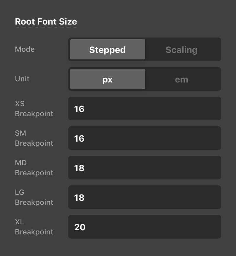
All of our products have featured facets of responsive styling in different ways through the years. For example, X and Pro have an option to adjust the base font-size of the :root HTML element in Theme Options:
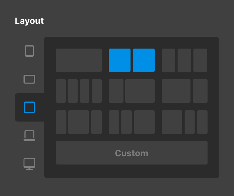
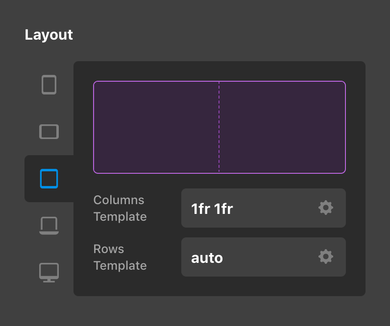
Additionally, specific Elements like the Row and Grid feature responsive controls for their overall layout, allowing users to alter how Columns and Cells are formatted across various screen sizes:
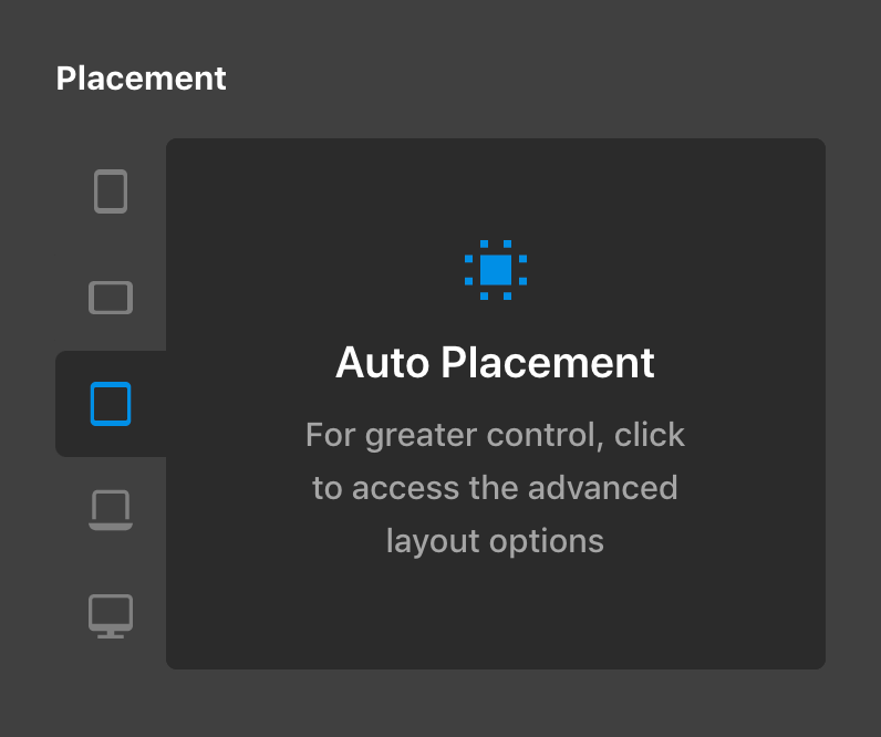
The Grid Element took this further still, by providing independing responsive placement of Cells within their overarching structure:
When setup properly, these particular techniques can take you quite far in achieving a well-balanced, fully responsive web design. That being said, something we've wanted to implement for some time is full responsive styling for all controls found on our Elements (and in a coming release cycle, our global Theme Options). Even with a thoughtful setup of options at all levels, there are still scenarios where you might want to make adjustments to portions of your design, including (but not limited to):
- Adjusting the internal
paddingon a structural Element to better suit different viewports and help content to be situated more appropriately. - Moving
marginfrom one side of Element to another as it shifts in the layout. - Altering the
font-sizeof an Element for different screen sizes so that it can better fit into a space. - Changing the colors of text on top of a background asset that shifts so that it is easier to read.
While we still strongly encourage and believe in well-thought-out defaults from the :root up in addition to techniques like auto-responsive layouts, we understand that the ability to alter individual controls at different breakpoints opens up a world of possibilities that can further enhance your designs in countless ways. Which brings us to…
The Future
As we began to think through how we wanted responsive styling for Elements to work within Cornerstone, there were a couple things we discovered that we didn't want to have in our building environment:
- Blind adjustments – When we talk about “blind adjustments,” we're referencing the ability to change the value of a control at another viewport without helpful feedback. We wanted to carry over some of the paradigms mentioned above, but improve on the way in which we communicate how changes are being made across breakpoints.
- Lack of inheritance – A primary consideration to using responsive styling effectively is leveraging the inherent properties of the cascade whenever possible. For example, while five breakpoints are available to make adjustments as needed, it is not always necessary to use every breakpoint when styling an Element. We wanted our responsive styles to be applied in this way as opposed to requiring explicit overwrites at every breakpoint, which ultimately results in more efficient and maintainable styles.
In addition to that, there were a couple of things we knew we did want to do:
- Mobile-first, desktop-first…you decide! – This is more of a “behind the scenes” technicality, but a mobile-first approach to CSS means that your base styles are applied to mobile devices first and overwrites are only conditionally applied to larger screens as they are needed, cutting down on unnecessary CSS. That being said, if you would prefer to have your styles flow in the desktop-down model, you can do that as well (or anywhere in between).
- Preview scaling – Going in the other direction, a common issue for users building out designs on laptops is the inability to see what is happening on the XL breakpoint (or simply not being able to see the XL breakpoint in Cornerstone due to the workspace cutting into the preview). Something we wanted to empower our users with was the ability to make confident design decisions for all devices—even ones you can't “technically” view on your build machine.
- Lay a foundation for the aforementioned paradigm shift – While not yet available, the changes made during this release cycle are setting the stage for the next era of building in X, Pro, and Cornerstone. We're talking a completely revamped (and fully responsive, of course) Theme Options, the ability to set the number of breakpoints desired (e.g. maybe you can accomplish your design with 3 instead of 5 and keep things simple), the ability to alter breakpoint boundaries (e.g. maybe you want the transition from XS to SM to be at
400pxinstead of480px), and so much more!
Getting Started
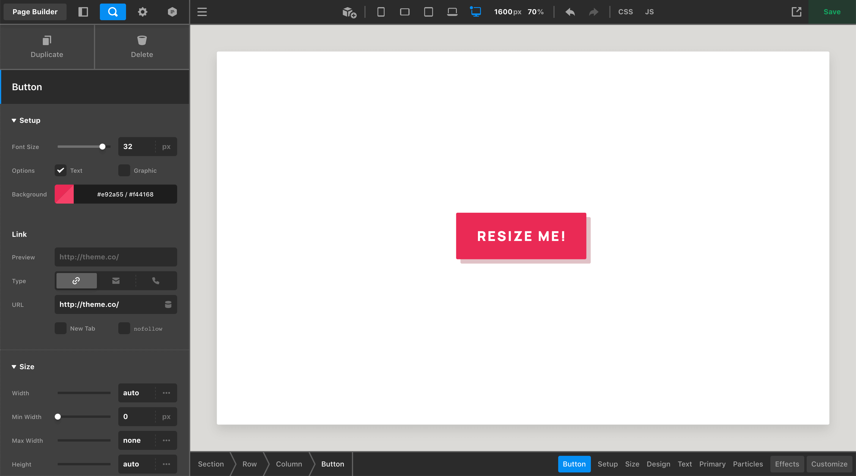
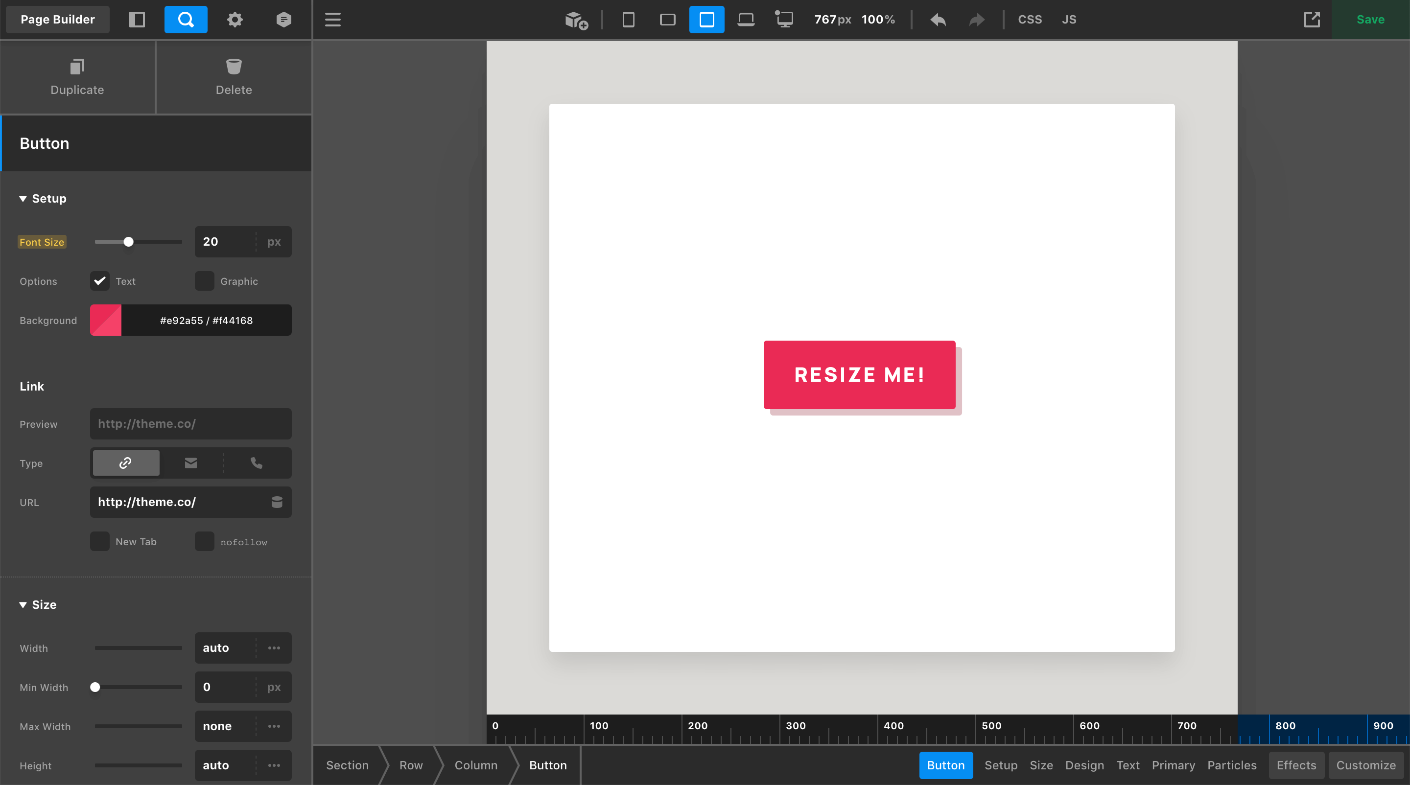
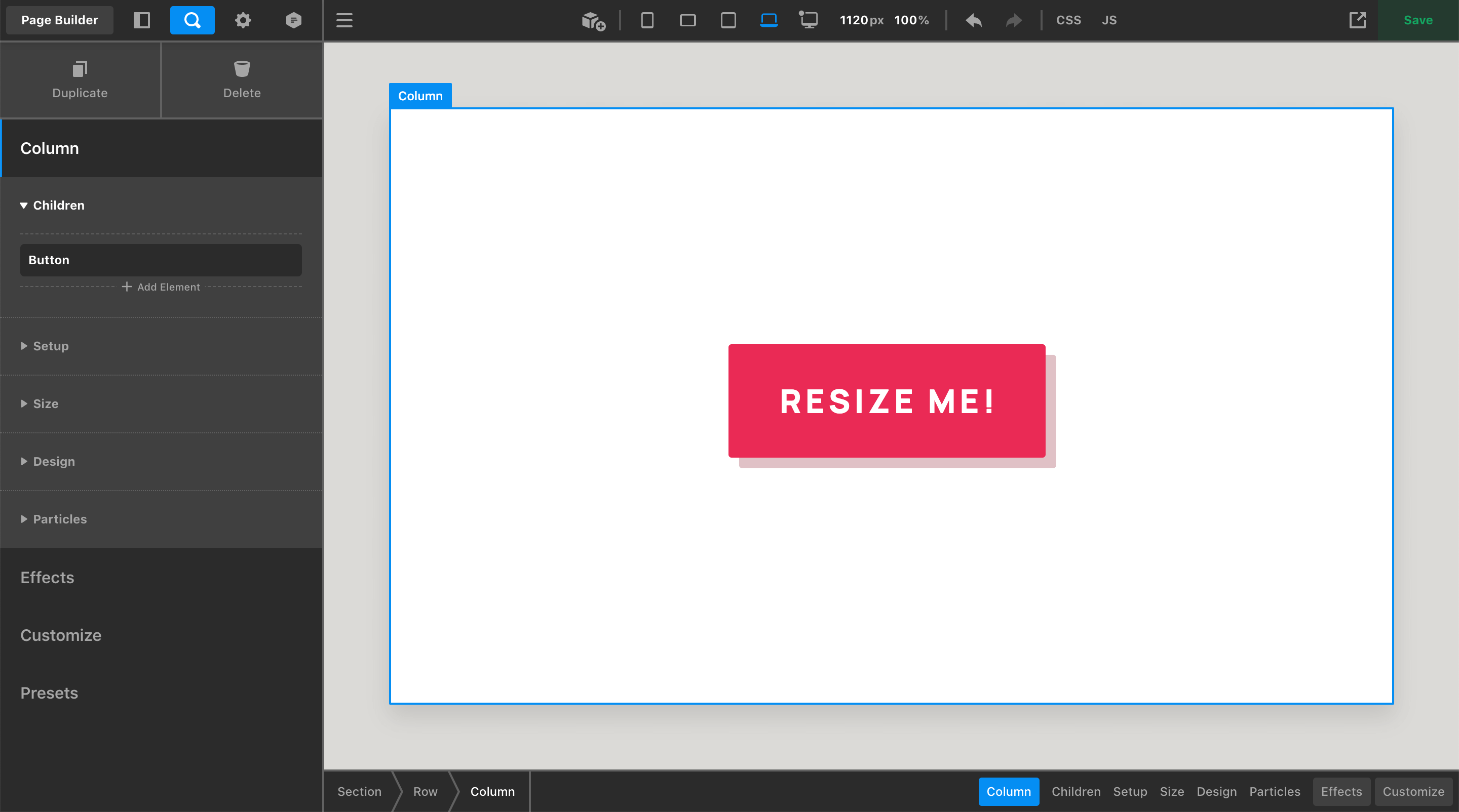
Let's take a closer look at how responsive styling is implemented into the UI. We'll start with a simple example centered around a Button Element:
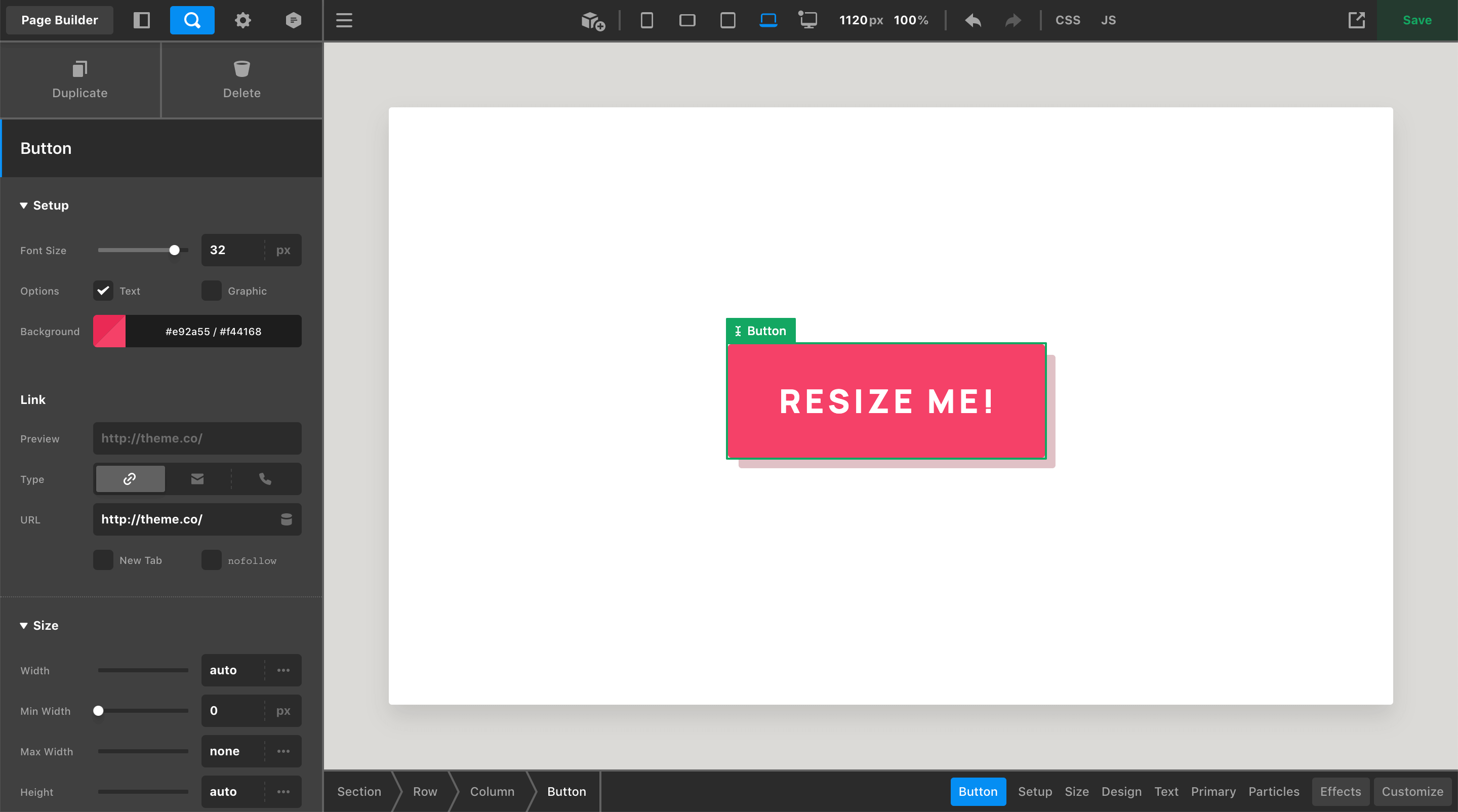
Here we have a Button with a base Font Size of 32px, which you can see in the Workspace to the left-hand side of the screen. In addition to that, you may have already noticed a slight change to the Toolbar—the updated “Preview Resizer,” which has changed in a couple key ways:
- The breakpoint toggles to the left are now permenantly visible in the Toolbar at all times (as opposed to appearing in a popup when a toggle is clicked), allowing for quick updates to the preview area's size at any point during the page building cycle.
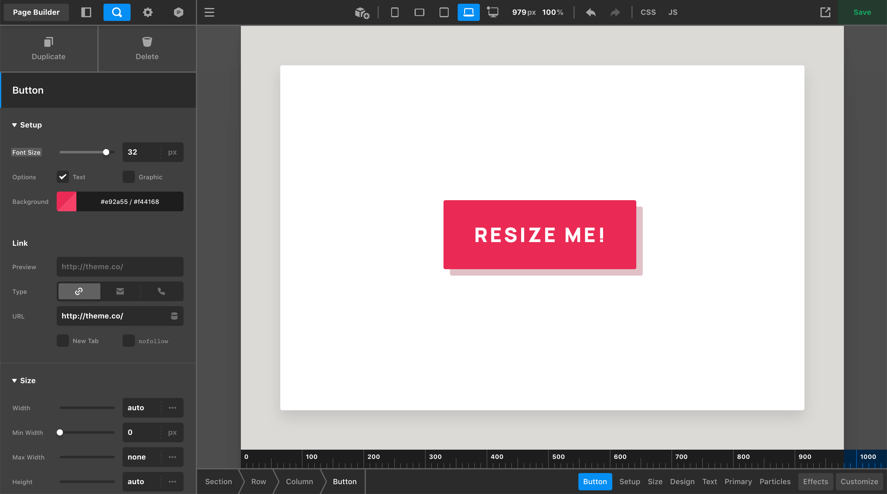
- The
px/%values to the right display realtime information about the live preview area. Currently, this live preview area is sitting at1120pxwide and is scaled to100%(preview scaling is a new feature of this release cycle and is something we will cover in more detail later on). Both of these values are inputs, meaning you can type specific values into either side to resize the live preview to your exact specifications.
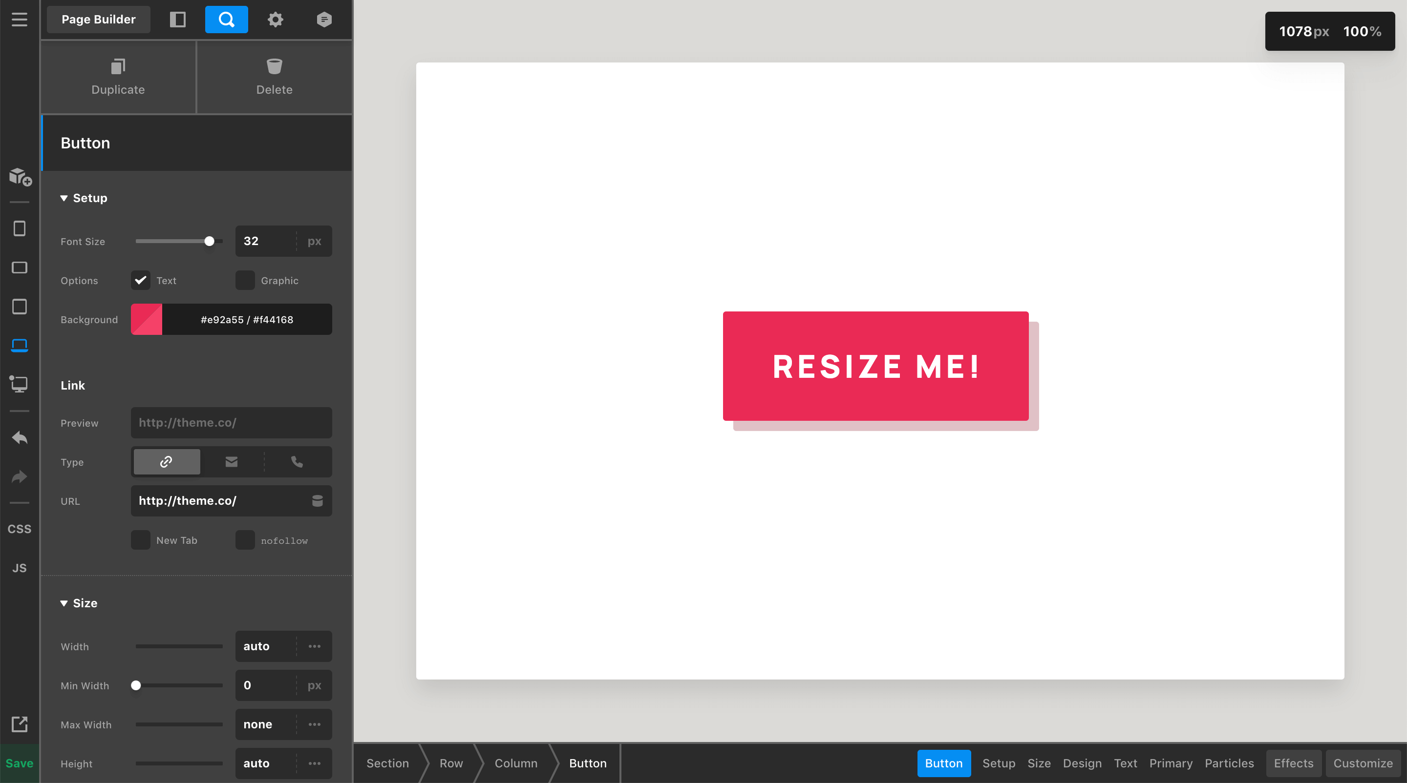
If you prefer to work with your Toolbar on the left or right side of the screen, the breakpoint toggles will remain in the Toolbar while the preview size / scale inputs will display as a small popup in a corner of the live preview (the corner can be specified in your preferences):
Preview Scaling
Before jumping into all of the responsive fun found below, let's take a moment to discuss preview scaling. This update includes the addition of realtime data as it pertains to the live preview:
As your browser is resized (or you drag the handles found at either side of the live preivew) the px value found in this section will update in realtime, giving you instant feedback on the width of your live preview. This is immensely helpful when looking to target a specific width to get a better sense of how things might look on a particular device.
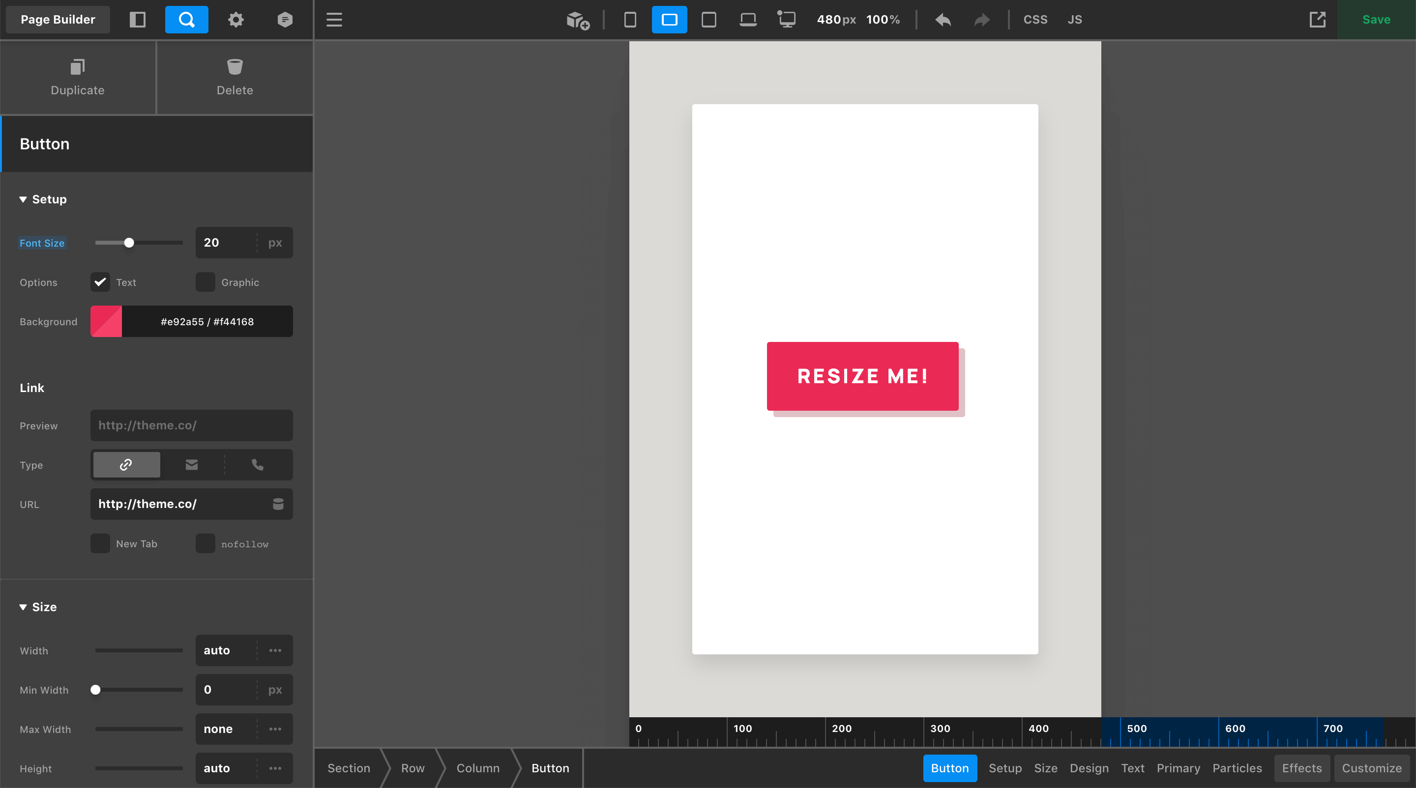
However, depending on how big your device is that you're designing on, you might run into an issue like you see in some of our previous pictures. Even with Cornerstone taking up the entire computer screen, we can only see partly into the LG breakpoint due to the fact that the side workspace is cutting into our live preview. On smaller laptops, it might even be the MD device toggle that appears as your largest viewable breakpoint.
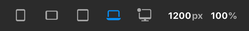
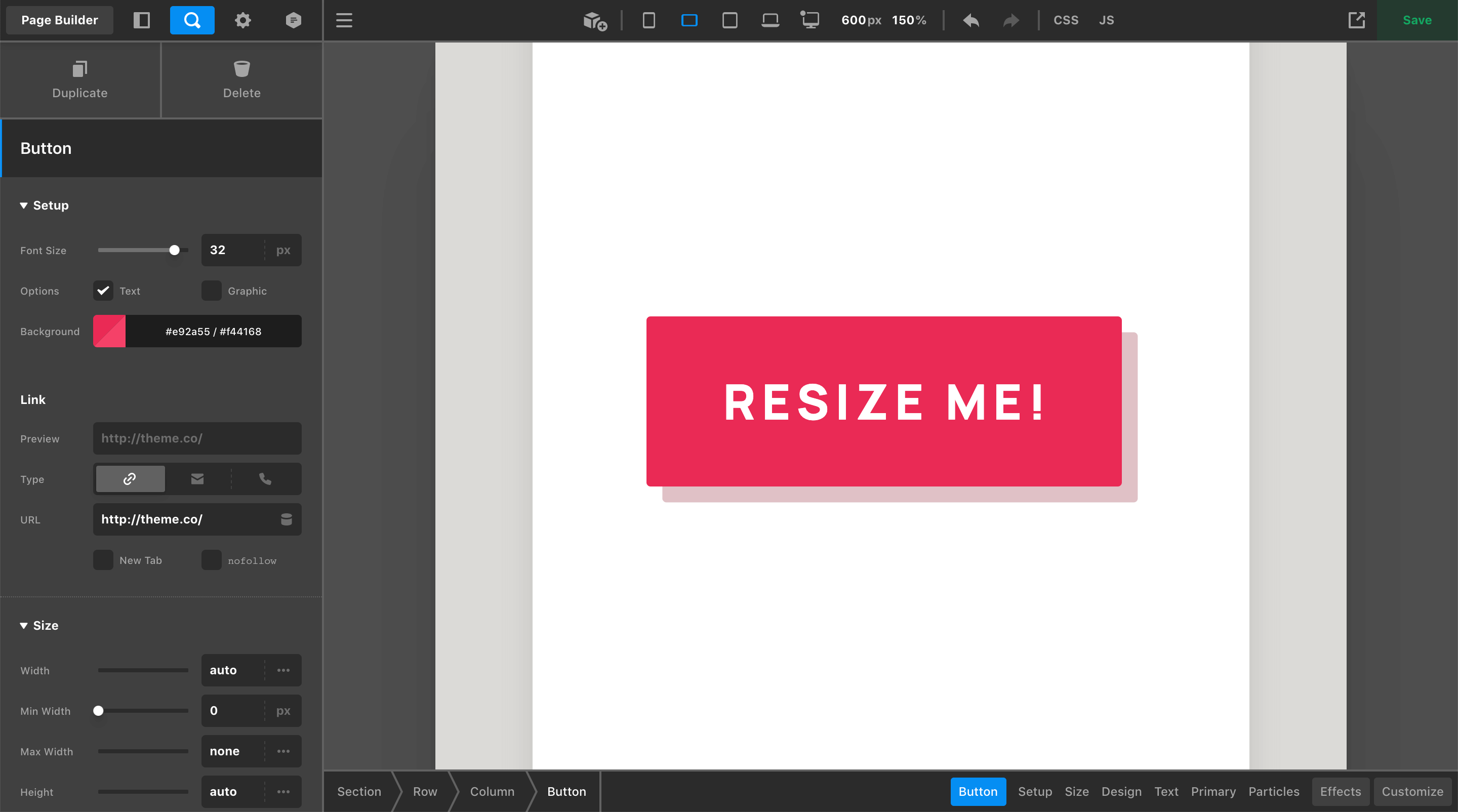
To remedy this, we've made the live preview scalable, allowing users on smaller devices to zoom out to see “extra large” designs on smaller screens. For example, take note of what happens when the XL breakpoint is selected on this device:
You'll see that the live preview has been resized to 1200px wide, which is the minimum value for when that breakpoint starts; however, this device is only capable of seeing 1120px with the Workspace set to the side of the screen as you can see from previous screenshots.
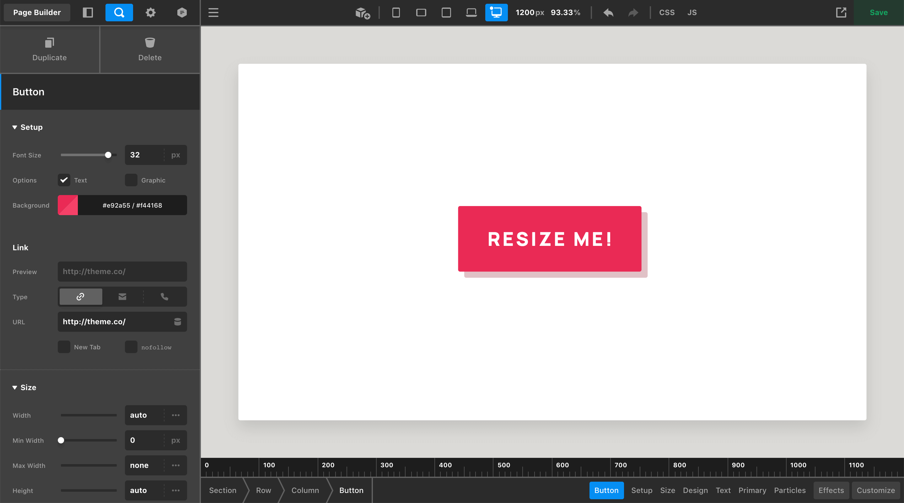
So how is this all working? 🤔 We use some simple calculations to apply a scaling transform to the entire live preview by dividing the “actual” preview area width by the desired width (e.g. 1120px / 1200px in this instance). This gives us a scaling factor of 93.33%, which is automatically applied in this instance, allowing us to see all 1200px within the physical space of 1120px.
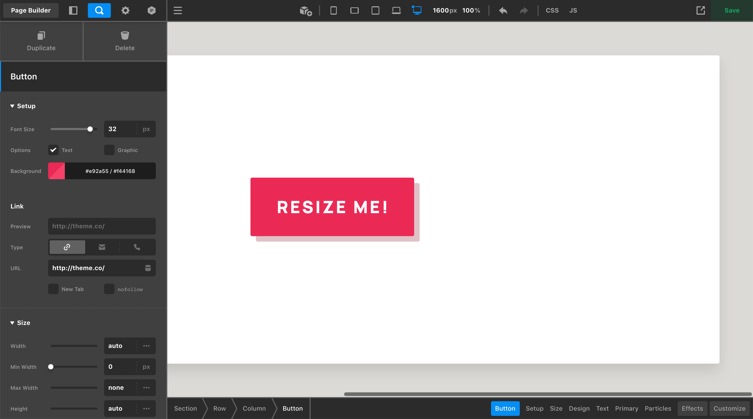
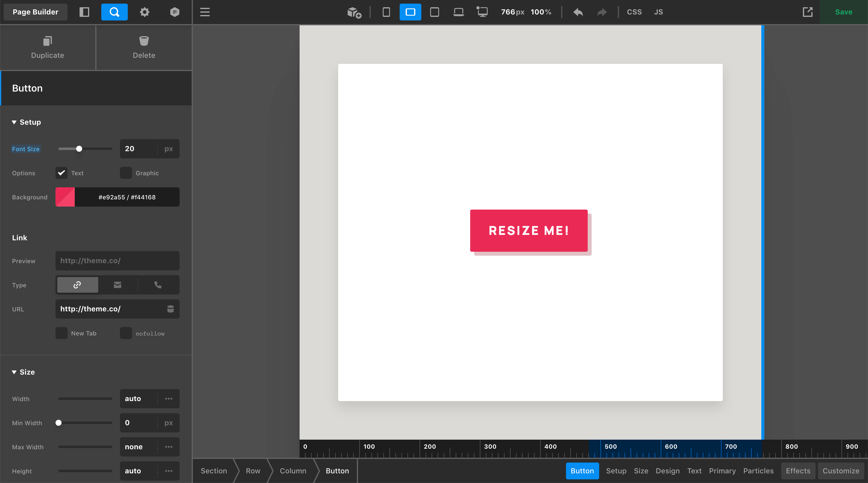
All of this is done automatically for you if you click one of the breakpoint toggles in the Toolbar or if you manually type in a px value in the input itself. For example, if you wanted to see how your site looked at 1600px, simply typing 1600 into the input would automatically apply a scale factor of 70% to ensure that all of this would fit into your viewport:
However, what if you wanted to view 1600px at 100% scale? All you would need to do is reset your scale to 100%, which will now allow you to scroll horizontally within the preview area to see all 1600px at 100% scale:
There are a couple key takeaways from managing the preview scaling feature:
- Any time you manually type in a
pxvalue first, the%scale will be automatically updated so that the entire value you entered can be seen in the live preview. - Once you have entered in a
pxvalue, if you wish to adjust the scale and preserve thepxwidth, updating the%scale will allow you to do this independently.
This can also work in the opposite direction, where perhaps you are doing some detail work and you'd like to be able to see what's going on more clearly. In that case, you can enter a larger scale % to get a closer look at things:
The Base Breakpoint
As you begin working on your content, changes made in the workspace are applied to your Base Breakpoint. The styles applied to your Base Breakpoint will automatically cascade throughout your design unless a responsive overwrite is applied at a later time. The Base Breakpoint is denoted by a dot found in the upper-left corner of any one of the device icons in the Toolbar:
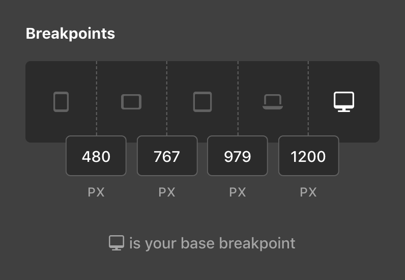
By default, the XL breakpoint is set as the base, but you can alter this if you so choose by going to Theme Options → Layout & Design → Breakpoints:
Depending on the device you work on, you may even wish to set your Base Breakpoint to something in-between. For example, if your primary computer defaults to the LG breakpoint when inside Cornerstone, you may wish to set your Base Breakpoint to LG and have your styles originate from that point.
Going Responsive
You can introduce a responsive overwrite to any valid control by clicking on its side label. The label of any valid control will highlight on hover, indicating that it can be adjusted responsively. As an exercise, let's adjust the Font Size of our example Button, which was set to 32px from our screenshots above:
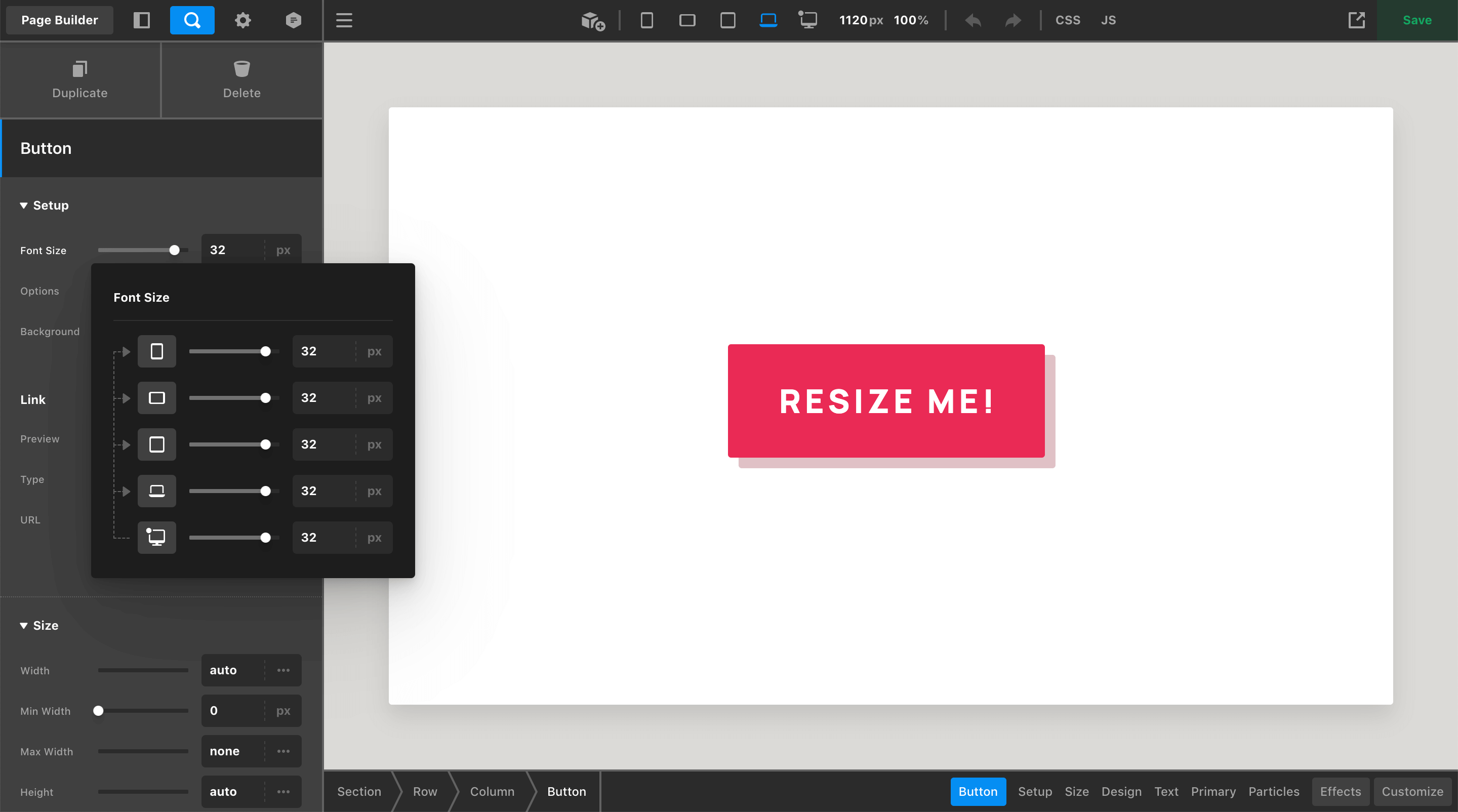
The dropdown that appears when clicking on the label is how responsive styles across breakpoints are managed. It displays a representation of the control you are working on for each breakpoint, in addition to showcasing the flow of inheritance for that control's value:
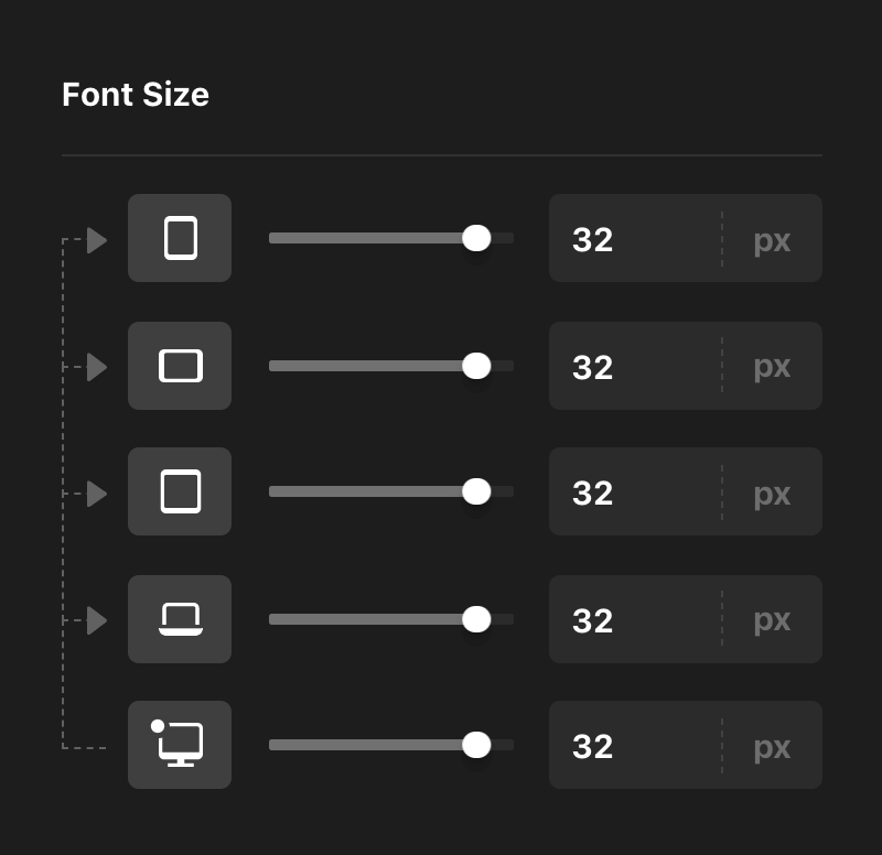
Take note of the arrows, which are used to help illustrate the flow of inheritance for control's values. We can see that the base value of 32px set here is indeed originating from the XL breakpoint. Now, let's say that we wanted to reduce the Font Size of our Button on the MD breakpoint:
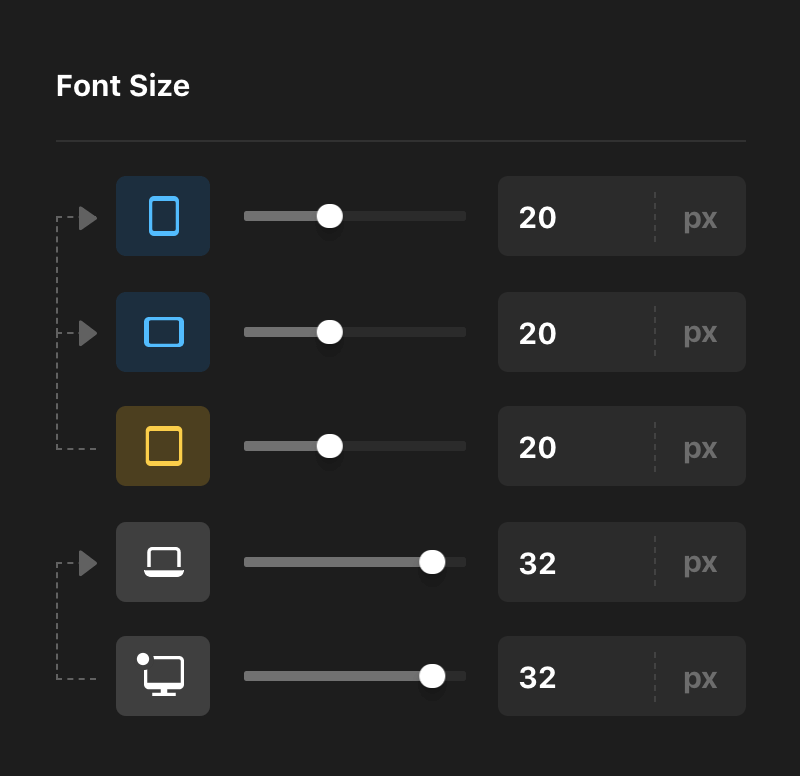
In addition to the fact that we now have two sets of inheritance going on (as demonstrated by our groups of arrows), you will also notice some new colors that have been set on the device icons. These colors help to represent the status of the value present on each breakpoint and where it is originating from:
- Base – Indicates that the breakpoint you are viewing is getting its value from the Base Breakpoint, or is itself the Base Breakpoint value.
- Current – Yellow indicates that the value of the breakpoint you are viewing is currently set on that breakpoint. This means that it is an overwrite of the base value and serves as new base value for any breakpoints after it.
- Inherited – The blue label tells us that this breakpoint's value is being inherited from a breakpoint before it that is not the base value.
These colors are important as they are mirrored on the Workspace labels, providing contextual feedback once a responsive style has been applied. For example, now that we have initiated a responsvie style on the Button's Font Size, viewing the Workspace on the LG or XL breakpoint will show the gray label style:
Viewing the Workspace on the MD breakpoint will display the yellow status along with the updated value inside the input:
And viewing the Workspace on the XS or SM breakpoint will display the blue status along with the inherited value inside the input:
Take note: once a responsive style has been enabled on a control, responsive styling is always active for that control at any breakpoint. This means that you can make responsive edits for any control you see with a highlighted label directly within the workspace. Keep this in mind to ensure that you don't accidentally alter your inheritance structure when working on an Element.
Now let's say you decide that you don't care for the change made on the MD breakpoint and you wanted to reset your value so that it was inheriting from the Base Breakpoint again. One method you can perform is a soft reset from the Workspace or the responsive dropdown by going to the breakpoint where you applied an overwrite and manually match it back to your base.
This can work well for simple values like our Font Size, but for more complex inputs that feature color combinations, intricate layouts, or lengthy strings (e.g. transforms and filters), you may want to explore using the reset action in the responsive dropdown. Any control you've overwritten can be reset to inherit from its next available breakpoint by hovering over the device icon to reveal this action:

When hovering over these breakpoints, you will notice that the device icon has been swapped out for the “reset” icon used throughout Cornerstone in addition to adding back an inheritance arrow, giving you a preview of where your value will come from if you click this action. This can be particularly useful if you have overwritten values at every breakpoint, as you can quickly move through the inheritance structure and clear things out if you so desire.
Non-Responsive Controls
Not all controls found in the Workspace allow responsive overwrites. Some examples include (but are not limited to):
- Any form of “content” such as text inputs, icon pickers, images, et cetera. If you wish to showcase variable content across breakpoints, utilize the Hide During Breakpoints control found under the Customize control module instead.
- Controls that pertain to various JavaScript or PHP functionality.
- Box and Text Shadows. Responsive styling for shadow will be supported in an upcoming cycle when we update the shadow controls to allow multiple shadows instead of just one.
- Inline or speciality styling applied to certain Element partials such as advanced backgrounds, separators, et cetera.
TL;DR if the label highlights when you hover over it, you can click on it and adjust it responsively, otherwise…you can't.
The Ruler
Another UI element added to this release is the ruler, which appears at the bottom edge of the live preview when resizing or when a breakpoint toggle is active. Additionally, when a breakpoint toggle is active, you will see that breakpoint's range represented by a blue highlight within the ruler. For example, if you selected the SM breakpoint, you would see the following highlight on the ruler:
Selecting a breakpoint toggle will resize your live preview to the lower bound of that media query. When resizing the live preview using the handles found to the sides of the iframe, you will be able to quickly move between the lower and upper bounds of that range without moving beyond those points:
The great thing about this mechanic is it allows you to quickly move back and forth between the lower and upper bounds of the current breakpoint, giving you the chance to check your design at both extremes of the breakpoint without having to worry about being super precise while resizing.
Control Remappings
The control label status indicator is a cucial part of working with responsive styling in Cornerstone, which means that every control capable of responsive styling requires its own unique label so that a status indicator can be applied when necessary.
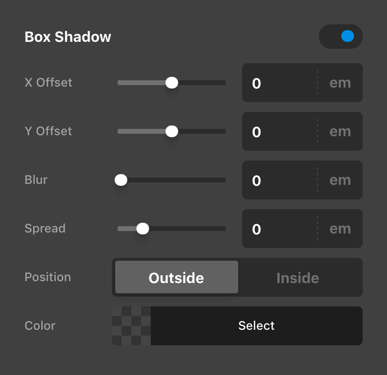
Because of this, all Element control mappings have been shuffled around slightly to give every control their own, individual label. This meant doing away with some of the previous UI conventions like occasionally having two controls to a line. For example, here is a previous iteration of the Box Shadow control:
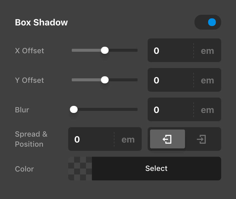
And here is its updated layout with every control on its own line:
In performing these updates, we actually found that in general this helped to make things more clear due to the fact that each label now directly correlates to one control, eliminating the need to process two labels in one space. Additionally, with every control taking up the full width of their container, it gave us room to use more descriptive labels when possible (e.g. “Outside” and “Inside” for the box-shadow position as opposed to an abstract set of icons).
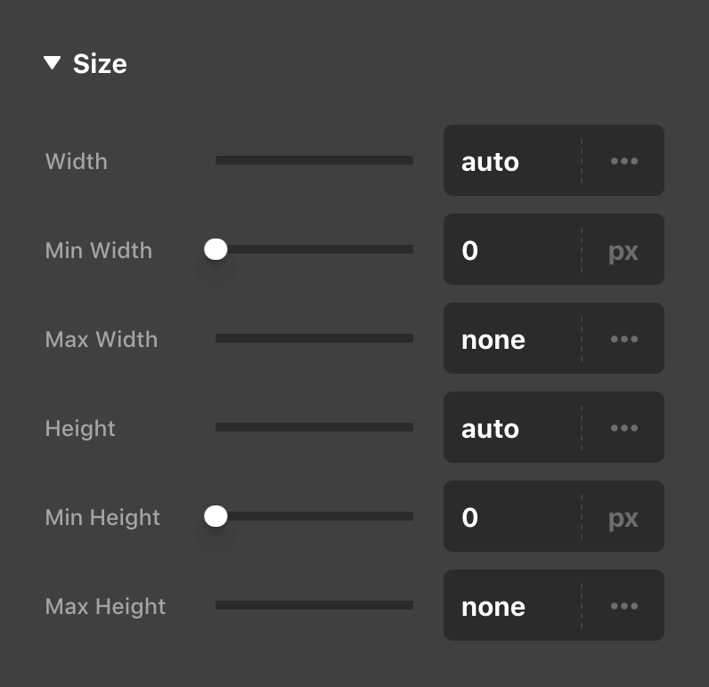
In other instances, remappings were a little more involved. For example, in recent updates the sizing controls for Elements like the Column, Cell, and Div were all bundled up into the “Setup” control group along with many other controls as a 2x2 grid. However, once we broke these controls out into their own lines, the control group felt quite busy with far too many controls going on (we feel there is a somewhat flexible upper-limit based on the context as to how many controls feel manageable within a particular group). Because of this, the sizing controls across all Elements have been broken out into a new Size group, that you will find near the top of most Elements:
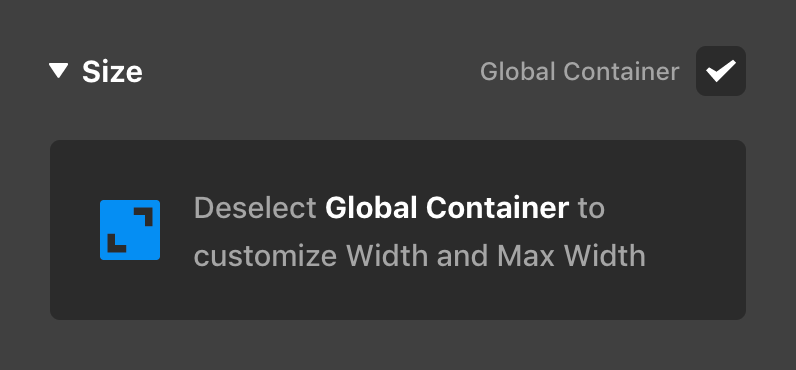
Additionally, for Elements that feature the Global Container option like the Row and Grid, we were able to work that option into this new control group in a way that echos other patterns throughout the tool such as the “Auto Placement” state of the Cell Element. On these Elements, when the Global Container is enabled (the default state), you will see the following informational placeholder below the Size control group:
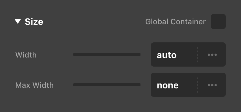
Once you deselect the checkbox found to the upper-right of the control group (or click on the message itself), the prompt will be replaced with the Width and Max Width controls that have always been present on these Elements:
This messaging helps to make things much more clear as to where certain sizing is coming from, rather than all of these controls simply being crammed together into a general “Setup” group.
Finally, we've included collapsible control group headings for top-level and sub-level control groups within the Workspace for the vertical orientation (horizontal mode displays the traditional control groupings). For example, inspecting a Column might look something like the following in your vertical Workspace:
Notice how the top-level headings match the control navigation seen in the lower-right corner of the above screenshot. Previously, the only way to move between control modules was to go to the Navigation Bar and click to a new grouup (i.e. from “Effects” to “Customize”). When you are now in vertical mode, all of these control modules are available within the Workspace itself, enabling you to quickly move to other modules without having to traverse across the screen to do so. This is particularly helpful on more multi-dimensional Elements (e.g. Navigation) that can be made up of many different control modules. Only one control module can be open at any given time, as some of these modules can be quite lengthy in more involved Elements.
Additionally, you'll notice how the sub-groups are also collapsible, allowing you to quickly hide or show entire groups as you need them in your workflow. Multiple sub-groups can be open at a time and you can CMD / Ctrl + click any sub-group heading to quickly expand or collapse all sub-groups at once.
Finally, when viewing a vertical Workspace you will notice that the preset manager has been added to its own section and placed at the end of the list to help reclaim some of the initial real estate of the Workspace when inspecting an Element. With the addition of the control module headings, it is very easy to jump to the end of the list whenever you need these preset management features.
Video
If you're more of a visual learner, we've taken some time to cover everything discussed here in the video below…check it out when you have a moment!
IE11 Compatibility
As mentioned previously, this is our last cycle to support IE11. The new features in this release cycle have not been tested with IE11, and starting with Pro 5.1, X 9.1, and Cornerstone 6.1, we will not be testing with / fixing bugs specific to IE11.
A word about customizations
In this release we did extensive refactoring of template files and how different parts of the theme are loaded. This is in preparation for our Theme Options reboot cycle which will not use the stack code in Integrity, Icon, Renew, or Ethos, but bring a new paradigm where all options are available at once.
These refactoring changes mean there is greater risk when updating X or Pro if you have extensive customizations in a child theme or custom code. We took precautions wherever possible to avoid this, and the beta and release candidate testing stages helped us clear out many potential regressions. If possible, test updates to sites with code alterations in a staging environment beforehand.
Changelog
- Pro 5.0.8 - September 1, 2021
- Bugfix: Fix PHP notice when using Post Navigation element
- Bugfix: Fix video element content height option showing responsive controls
- Bugfix: Fix Row element Grow option not working
- Bugfix: Fix Global Blocks dynamic content regression
- X 9.0.8 - September 1, 2021
- Updated: Update Cornerstone to latest version
- Cornerstone 6.0.8 - September 1, 2021
- Bugfix: Fix PHP notice when using Post Navigation element
- Bugfix: Fix video element content height option showing responsive controls
- Bugfix: Fix Row element Grow option not working
- Bugfix: Fix validation not working
- Bugfix: Fix Global Blocks dynamic content regression
- Pro 5.0.7 - August 29, 2021
- Bugfix: Navigation Collapsed elements in Global Blocks are always rendering with a toggle
- Bugfix: Fix newly added Row elements not setting reasonable width for smaller screen sizes
- Bugfix: Fix element context menu appearing behind modals and other UI elements
- Bugfix: Fix fractional numbers below 1 not working in Row Gap settings
- Bugfix: Fix CSS parser not recognizing colors set as a hex code
- Bugfix: Fix Map element always outputting with 16:9 ratio instead of honor explicit height
- Bugfix: Fix media queries CSS not outputting correctly when PHP locale sets commas to separate decimals
- Bugfix: Fix responsive styling not working if a non base breakpoint resets a value to the original default
- X 9.0.7 - August 29, 2021
- Updated: Update Cornerstone to latest version
- Cornerstone 6.0.7 - August 29, 2021
- Bugfix: Navigation Collapsed elements in Global Blocks are always rendering with a toggle
- Bugfix: Fix newly added Row elements not setting reasonable width for smaller screen sizes
- Bugfix: Fix Admin CSS not loading
- Bugfix: Fix element styles missing when using Cornerstone without X
- Bugfix: Fix element context menu appearing behind modals and other UI elements
- Bugfix: Fix fractional numbers below 1 not working in Row Gap settings
- Bugfix: Fix CSS parser not recognizing colors set as a hex code
- Bugfix: Fix Map element always outputting with 16:9 ratio instead of honor explicit height
- Bugfix: Fix media queries CSS not outputting correctly when PHP locale sets commas to separate decimals
- Bugfix: Fix responsive styling not working if a non base breakpoint resets a value to the original default
- Pro 5.0.6 - August 27, 2021
- Bugfix: Fix timezone conflict with countdown element
- Bugfix: Fix Navigation Off Canvas and Modal prefab elements having additional toggle
- Bugfix: Fix Advanced Background Border Radius control not working
- Bugfix: Fix Alert element padding not being applied
- Bugfix: Fix base background color not outputting when interaction color is transparent
- Bugfix: Fix Term Name Dynamic Content not resolving first category of post
- Bugfix: Fix option to enable search in Header not showing in Theme Options
- Bugfix: Fix detection of active breakpoint occasionally inaccurate in Safari
- X 9.0.6 - August 27, 2021
- Bugfix: Fix option to enable search in Header not showing in Theme Options
- Cornerstone 6.0.6 - August 27, 2021
- Bugfix: Fix timezone conflict with countdown element
- Bugfix: Fix Navigation Off Canvas and Modal prefab elements having additional toggle
- Bugfix: Fix Advanced Background Border Radius control not working
- Bugfix: Fix Alert element padding not being applied
- Bugfix: Fix base background color not outputting when interaction color is transparent
- Bugfix: Fix Term Name Dynamic Content not resolving first category of post
- Bugfix: Fix detection of active breakpoint occasionally inaccurate in Safari
- Pro 5.0.5 - August 25, 2021
- Bugfix: Fix index.php theme template not including content when accessed directly by 3rd party plugins
- Bugfix: Fix duplicate output of global custom javascript.
- Bugfix: New pages created directly from Design Cloud are now set to draft status
- Bugfix: Fix modal elements in the site footer not outputting
- Bugfix: Fix deprecated cart elements missing inner cart styles
- Bugfix: Fix Navigation Inline in left or right Header regions not applying the correct flex direction
- Bugfix: Fix newly added Posts (Tiles) element not showing featured images
- Bugfix: Fix navigation elements current link style not applying
- Bugfix: Fix Inline Editing not closing if the element content was not changed
- Bugfix: Fix Grid Editor changes not always applying to the currently viewed breakpoint
- Bugfix: Fix resizing Row in preview not always applying to the currently viewed breakpoint
- Bugfix: Fix Dynamic Content in CSS not allowing multiple instances of the same statement
- Bugfix: Fix missing site wide background color set in Theme Options applying to Ethos single posts
- Bugfix: Fix deprecated Content Area Dropdown element missing content
- X 9.0.5 - August 25, 2021
- Bugfix: Fix index.php theme template not including content when accessed directly by 3rd party plugins
- Bugfix: Fix duplicate output of global custom javascript.
- Bugfix: Fix modal elements in the site footer not outputting
- Bugfix: Fix missing site wide background color set in Theme Options applying to Ethos single posts
- Cornerstone 6.0.5 - August 25, 2021
- Bugfix: New pages created directly from Design Cloud are now set to draft status
- Bugfix: Fix deprecated cart elements missing inner cart styles
- Bugfix: Fix newly added Posts (Tiles) element not showing featured images
- Bugfix: Fix navigation elements current link style not applying
- Bugfix: Fix Inline Editing not closing if the element content was not changed
- Bugfix: Fix Grid Editor changes not always applying to the currently viewed breakpoint
- Bugfix: Fix resizing Row in preview not always applying to the currently viewed breakpoint
- Bugfix: Fix Dynamic Content in CSS not allowing multiple instances of the same statement
- Bugfix: Fix deprecated Content Area Dropdown element missing content
- Pro 5.0.4 - August 22, 2021
- Bugfix: Fix rule color of text columns feature not allowing global colors
- Bugfix: Fix original stack fonts not loading when font manager is disabled
- X 9.0.4 - August 22, 2021
- Updated: Update Cornerstone to latest version
- Bugfix: Fix original stack fonts not loading when font manager is disabled
- Cornerstone 6.0.4 - August 22, 2021
- Bugfix: Fix rule color of text columns feature not allowing global colors
- Pro 5.0.3 - August 22, 2021
- Bugfix: Fix Theme Options and Inspector not loading if JSON API encounters PHP warnings
- Bugfix: Fix Dynamic Content not working in Map element latitude and longitude fields
- Bugfix: Fix pages with only classic elements from early versions of Cornerstone not outputting on the front end
- Bugfix: Fix Headline subheadline text shadow outputting as box shadow
- Bugfix: Fix bundled version of Envira Gallery showing license overlay
- X 9.0.3 - August 22, 2021
- Updated: Update Cornerstone to latest version
- Cornerstone 6.0.3 - August 22, 2021
- Bugfix: Fix Theme Options and Inspector not loading if JSON API encounters PHP warnings
- Bugfix: Fix Dynamic Content not working in Map element latitude and longitude fields
- Bugfix: Fix pages with only classic elements from early versions of Cornerstone not outputting on the front end
- Bugfix: Fix Headline subheadline text shadow outputting as box shadow
- Bugfix: Fix bundled version of Envira Gallery showing license overlay
- Pro 5.0.2 - August 22, 2021
- Bugfix: Fix Tabs element interaction background color not being applied
- Bugfix: Fix missing section separators
- Bugfix: Fix Card element Back Content styles being replaced with Front Content
- Bugfix: Fix loss of front end output on pages built prior to V2 elements
- X 9.0.2 - August 22, 2021
- Bugfix: Fix missing version number on CSS assets
- Cornerstone 6.0.2 - August 22, 2021
- Bugfix: Fix Tabs element interaction background color not being applied
- Bugfix: Fix missing section separators
- Bugfix: Fix Card element Back Content styles being replaced with Front Content
- Bugfix: Fix loss of front end output on pages built prior to V2 elements
- Pro 5.0.1 - August 21, 2021
- Bugfix: Fix cs_remember/cs_recall PHP warning
- Bugfix: Fix incorrect element previews for Quote element and Classic Elements
- Bugfix: Fix Marks controls not being accessible on Quote element
- Bugfix: Fix live preview of Global Block shortcode inside a tab element missing styles
- Bugfix: Fix some Dynamic elements showing undefined when added from the element library
- X 9.0.1 - August 21, 2021
- Feature: Responsive Styling
- Updated: The original shortcode generator has been removed
- Updated: Refactor template management to prepare for Theme Options reboot cycle
- Bugfix: Fix scroll offset of checkout validation
- Bugfix: Excluded VC tabs from hash scrolling
- Bugfix: Fix menu option's margin in admin
- Bugfix: Fix grid option as default layout
- Cornerstone 6.0.1 - August 21, 2021
- Bugfix: Fix cs_remember/cs_recall PHP warning
- Bugfix: Fix incorrect element previews for Quote element and Classic Elements
- Bugfix: Fix Marks controls not being accessible on Quote element
- Bugfix: Fix live preview of Global Block shortcode inside a tab element missing styles
- Bugfix: Fix some Dynamic elements showing undefined when added from the element library
- Pro 5.0.0 - August 20, 2021
- Feature: Responsive Styling
- Feature: Resize and scale the live preview
- Feature: Improved control organization (replaces Advanced Mode)
- Updated: Refactor template management to prepare for Theme Options reboot cycle
- Updated: The original shortcode generator has been removed
- Updated: Renamed Dev Console to Dev Toolkit to avoid confusion with browser developer tools
- Updated: Builder CSS now loads in a standardized order
- Updated: Base level template refactoring to prepare for Theme Options reboot
- Updated: Dynamic Content can be used in styling controls like color pickers
- Updated: Dynamic Content now supported in CSS code editors
- Updated: Removed The Grid as an Extension
- Bugfix: Fix fatal PHP error specific to EOL PHP 7.0 versions
- Bugfix: Fix preview and assignment options not showing empty categories or tags
- Bugfix: Fix scroll offset of checkout validation
- Bugfix: Fix a file_exists call that could be run without a full pathname causing an open_dir PHP warning
- Bugfix: Excluded VC tabs from hash scrolling
- Bugfix: Fix diamond FA icon being resolved to the gem icon in the solid set
- Bugfix: Fix menu option's margin in admin
- Bugfix: Fix testimonial schema not resolving with image IDs
- Bugfix: Fix Woocommerce's terms and condition conflict with cornerstone
- Bugfix: Fix Woocommerce's stock dynamic content
- Bugfix: Fix comment list element hash linking and structures
- Bugfix: Fix dynamic content term ID
- Bugfix: Fix dynamic content term metas
- Bugfix: Fix modal and off canvas content being duplicated when Yoast SEO is active
- Bugfix: Fix excerpt conflict with other plugins
- Bugfix: Fix Element CSS not being applied to the individual Tab element
- Bugfix: Fix First Page Element Condition causing fatal PHP error
- Bugfix: Toolbar menu is now hidden if the current user does not have permissions for any sub links
- Bugfix: Fix Theme Options edit custom CSS and JS permissions not applying
- Bugfix: Fix Blog condition being inaccurate. Renamed exiting to Front Page and new accurate Blog condition added
- Bugfix: Fix duplicate admin menu items
- Bugfix: Fix grid option as default layout
- Bugfix: Fix Counter element not allowing HTML in prefix/suffix
- Bugfix: Fix Design Cloud Site importer crashing on missing images
- X 9.0.0 - August 20, 2021
- Feature: Responsive Styling
- Updated: The original shortcode generator has been removed
- Updated: Refactor template management to prepare for Theme Options reboot cycle
- Bugfix: Fix scroll offset of checkout validation
- Bugfix: Excluded VC tabs from hash scrolling
- Bugfix: Fix menu option's margin in admin
- Bugfix: Fix grid option as default layout
- Cornerstone 6.0.0 - August 20, 2021
- Feature: Responsive Styling
- Feature: Resize and scale the live preview
- Feature: Improved control organization (replaces Advanced Mode)
- Updated: The original shortcode generator has been removed
- Updated: Renamed Dev Console to Dev Toolkit to avoid confusion with browser developer tools
- Updated: Builder CSS now loads in a standardized order
- Updated: Base level template refactoring to prepare for Theme Options reboot
- Updated: Dynamic Content can be used in styling controls like color pickers
- Updated: Removed The Grid as an Extension
- Bugfix: Fix fatal PHP error specific to EOL PHP 7.0 versions
- Bugfix: Fix preview and assignment options not showing empty categories or tags
- Bugfix: Fix a file_exists call that could be run without a full pathname causing an open_dir PHP warning
- Bugfix: Fix diamond FA icon being resolved to the gem icon in the solid set
- Bugfix: Fix testimonial schema not resolving with image IDs
- Bugfix: Fix woocommerce's terms and condition conflict with cornerstone
- Bugfix: Fix Woocommerce's stock dynamic content
- Bugfix: Fix comment list element hash linking and structures
- Bugfix: Fix dynamic content term ID
- Bugfix: Fix dynamic content term metas
- Bugfix: Fix modal and off canvas content being duplicated when Yoast SEO is active
- Bugfix: Fix excerpt conflict with other plugins
- Bugfix: Fix Element CSS not being applied to the individual Tab element
- Bugfix: Fix First Page Element Condition causing fatal PHP error
- Bugfix: Toolbar menu is now hidden if the current user does not have permissions for any sub links
- Bugfix: Fix Theme Options edit custom CSS and JS permissions not applying
- Bugfix: Fix Blog condition being inaccurate. Renamed exiting to Front Page and new accurate Blog condition added
FAQ
Status
- 08/31: Pro 5.0.8, X 9.0.8, and Cornerstone 6.0.8 available via automatic updates.
- 08/27: Pro 5.0.7, X 9.0.7, and Cornerstone 6.0.7 available via automatic updates.
- 08/25: Pro 5.0.6, X 9.0.6, and Cornerstone 6.0.6 available via automatic updates.
- 08/23: Pro 5.0.5, X 9.0.5, and Cornerstone 6.0.5 available via automatic updates.
- 08/20: Pro 5.0.4, X 9.0.4, and Cornerstone 6.0.4 available via automatic updates.
- 08/20: Pro 5.0.3, X 9.0.3, and Cornerstone 6.0.3 available via automatic updates.
- 08/20: Pro 5.0.2, X 9.0.2, and Cornerstone 6.0.2 available via automatic updates.
- 08/19: Pro 5.0.1, X 9.0.1, and Cornerstone 6.0.1 available via automatic updates.
- 08/18: Pro 5.0.0, X 9.0.0, and Cornerstone 6.0.0 available via manual updates.
The following confirmed issues are specific to this cycle. If listed here we are planning to address it in a subsequent point release. Items will be crossed off as they are corrected and you will see corresponding notes in the changelog above.
PHP Warning "cs_remember/cs_recall used outside of builder context" is shown when using Navigation Modal or Navigation Dropdown elements created prior to Pro 4.3 or Cornerstone 5.3. Until fixed, this can be suppressed by disabling WP_DEBUG or deleting the element and recreating it.Fixed in first point releaseThe live preview for some elements (Quote, and several classic elements) is showing a placeholder state above the actual element.Fixed in first point release.Quote element Marks controls not working.Fixed in first point release.When a Global Block shortcode is inside a Tab, it doesn't appear correctly in the live preview.Fixed in first point release.Adding some Dynamic Elements from the library shows "undefined element" message.Fixed in first point release.X is missing a version number appended to some stylesheet URLs. This makes sites more susceptible to display older cached stylesheets instead of the updated ones. We will restore the version number for the next release. Meanwhile, take extra care to purge any CDN, caching plugins, or browser cache in effect after updating.Fixed in second point release.The interaction (hover/active state) background color of the Tabs element is not being applied.Fixed in second point release.Section separators are not outputting.Fixed in second point release.Card element Back Content styles are replaced with Front Content styles.Fixed in second point release.Pages built with classic elements prior to V2 elements are showing blank on the front end.Fixed in second point release.404 on legacy font awesome classes stylesheet.Fixed in second point release.Another issue has been confirmed causing Classic Elements creating in early versions of Cornerstone to not output on the front end.Fixed in third point release.The Inspector and Theme Options page take a very long time to load on some sites. Try disabling WP_DEBUG if this is happening to you. The next point release will have a remedy for this.Fixed in third point release.Dynamic Content is not working in map element fields.Fixed in third point release.Headline element subheadline text shadow is outputting as a box shadow.Fixed in third point release.When using the Columns feature of the text element, the rule color is not getting applied with set to a global color.Fixed in fourth point release.Fonts from stack settings with the font manager disabled are not loading.Fixed in fourth point release.Using the live preview controls to resizing Row column layouts or (repositioning Grid Cells in Pro) applies change to the base breakpoint instead of the one being viewed.Fixed in fifth point release.Inline Editing doesn't deactivate when you click somewhere else if none of the content was changed.Fixed in fifth point release.Content is not displayed from plugins that create front end routes via calling index.php of the theme.Fixed in fifth point release.Global custom JS is outputting twice.Fixed in fifth point release.Modal elements added to a site footer are not outputting the modal contents.Fixed in fifth point release.Deprecated Cart Elements missing inner cart styles.Fixed in fifth point release.Navigation Inline in left or right Header regions are showing with the wrong flex direction.Fixed in fifth point release.Menu elements missing active link style.Fixed in fifth point release.Deprecated Content Area Dropdown element not outputting contents.Fixed in fifth point release.Newly added Navigation Collapsed and Navigation Modal elements are outputting with an additional toggle. Until corrected in a point release it can be manually repaired with the instructions in this post.Fixed in sixth point release.Advanced Background Border Radius control can not be toggled open.Fixed in sixth point release.Alert element padding is being set from the margin property.Fixed in sixth point release.Element background colors are not outputting when an interaction color is set to transparent.Fixed in sixth point release.Term Name Dynamic Content is not resolving first category of a post.Fixed in sixth point release.Breakpoint detection of live preview isn't always accurate in Safari.Fixed in sixth point release.Option to enable search in header missing from Theme Options.Fixed in sixth point release.Using a Navigation Collapsed element in a Global Block causes it to show a toggle instead of the menu directly.Fixed in seventh point release.Newly created Rows don't automatically set reasonable widths for smaller screen sizes.Fixed in seventh point release.When Cornerstone is used without X, CSS isn't loading for elements or the dashboard.Fixed in seventh point release.Unlinked borders don't accept hex code colors on a single side.Fixed in seventh point release.Responsive styling should allow setting a value to zero on non base breakpoints.Fixed in seventh point release.PHP notice showing when using Post Navigatio element.Fixed in eighth point release.Video element content height option should not allow responsive styling.Fixed in eighth point release.Row element Grow option is inverted, growing when the otion is turned offFixed in eighth point release.