Release
Notes
May 29, 2018
2.1.6
6.1.6
3.1.6
Whew! It's been all hands on deck around Themeco HQ as we've worked through one of our most exhaustive lists of new features, updates, and bugfixes to date. This release centered heavily around usability and bugfixes in an effort to tie up various loose ends and smooth out any rough edges that have come up with our last few cycles of major releases. We've also been able to introduce some long requested features such as a permissions manager for WordPress roles to be granted access or restricted from certain aspects of the builders, advanced/simple mode toggling v2 element controls, and streamlined global settings and tools to clean up parts of the site-building workflow. So let's jump right in and go a little deeper!
Permissions Manager Pro, Cornerstone
For our customers who work with a large team or pass their projects off to clients, one request we've consistently received is to introduce a way to manage access to various parts of the builder by WordPress role. With the brand new Permissions Manager found in the WordPress admin under Settings for Pro and Cornerstone, this is now possible. Below is a screenshot of this new tool:
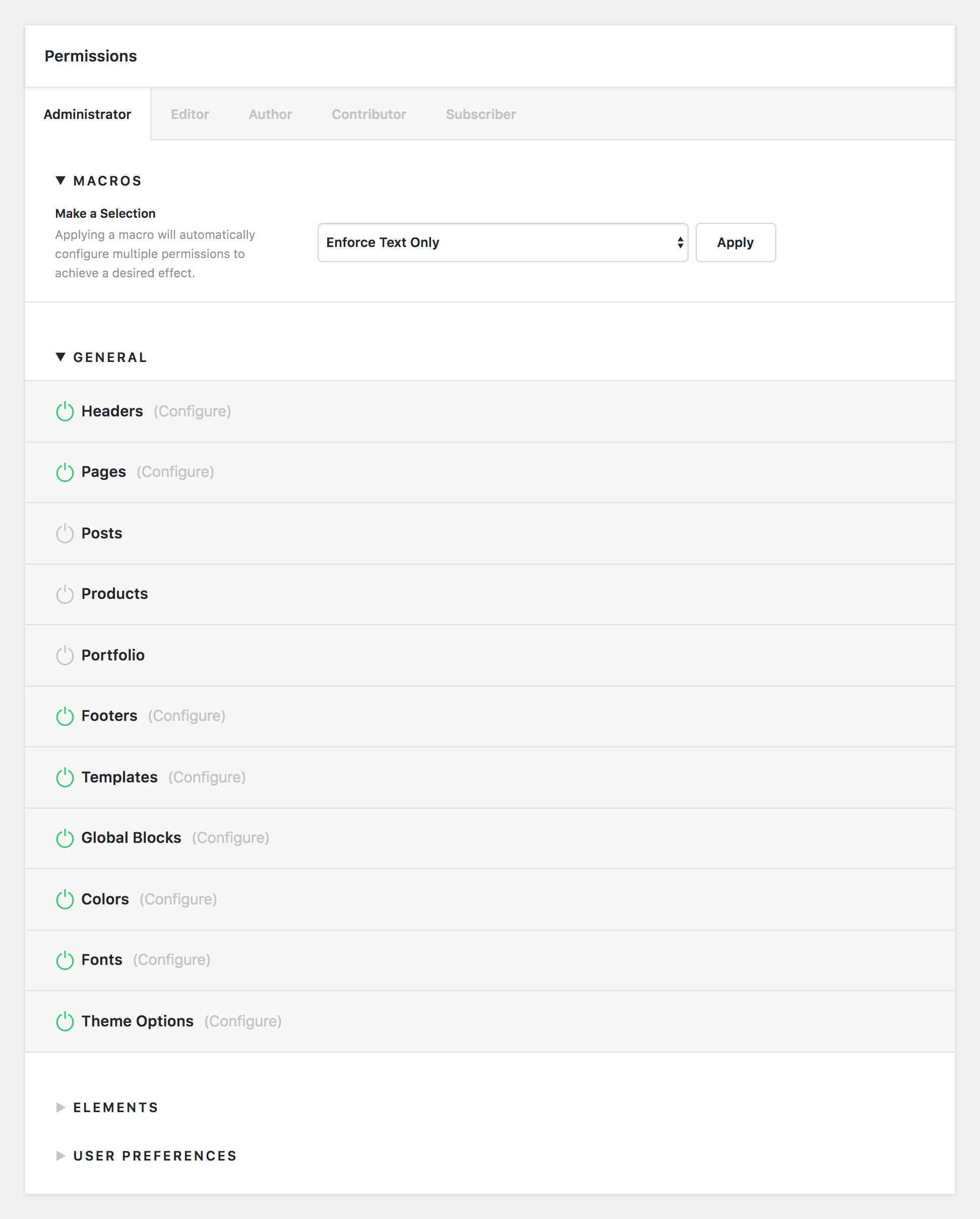
There are four parts to the Permissions Manager:
- Macros – contains a dropdown list of common setups that can quicly configure all permissions for a given role with the click of a button
- General – allows for access and detailed configuration of various parts of the builders
- Elements – allows for access and detailed configuration of all elements found throughout the builders
- User Preferences – allows users to specify how certain features such as advanced controls or displaying the toolbar in the builders should work (i.e. user preference, always on, always off, et cetera).
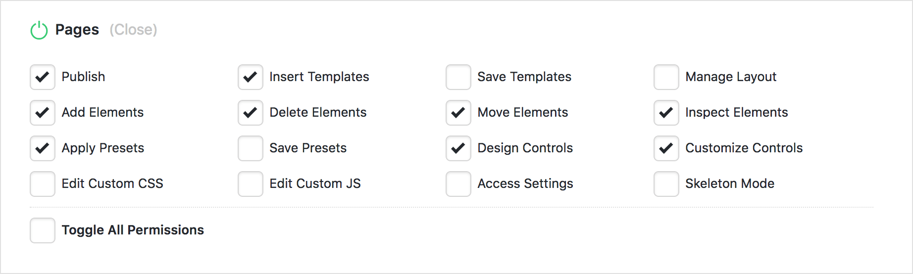
For example, if you wanted to allow for the Content Builder to be available for all pages on your website for a specific role, you can enable it by selecting the power symbol to the left of the label. If enabled, a “Configure” text prompt will appear to the right of the label like so:

Clicking on “Configure” will reveal a host of options that can be enabled or disabled for the Content Builder on pages for that particular role. For example, let's say we want our author role to be able to build out pages using previously designed presets, but we don't want them to be able to save any new presets or include any custom CSS or JavaScript on the page. To achieve that goal, you might do something like the following:
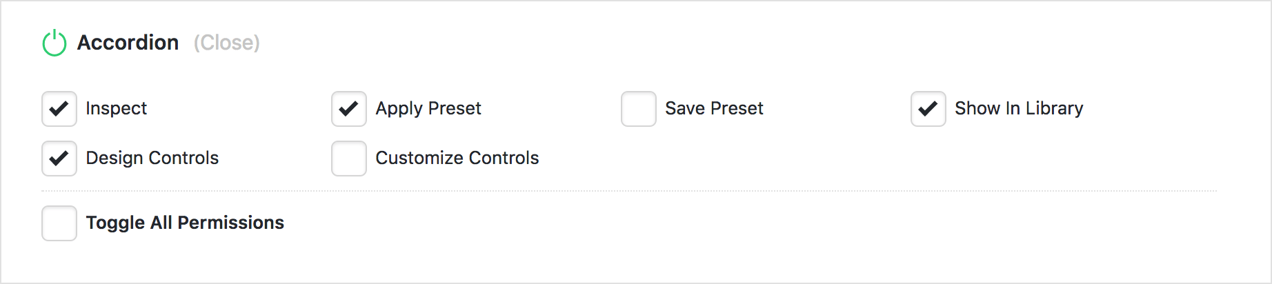
Additionally, access to various elements and element features can be easily configured as well. For instance, you could completely remove access to more complex elements for basic users if you wanted, or you could simply adjust how users interact with specific elements. Let's say we enable the Accordion for a more advanced user:

While we want the Element to be on for them, perhaps you want to keep them from saving new presets on that Element so that they don't fill up your template library with things you haven't personally created. You could achieve that using the following setup:
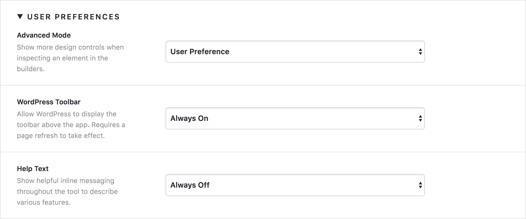
Finally, you can specify how certain features of the tool should be presented to users to help streamline things or make them more flexible for each user in the User Preferences section. You can select for each feature to be set to User Preference, Always On, or Always Off depending on how you want them to function for that role.
As you can see, there is a wealth of new power and flexibility afforded to teams who need increased control over how different user roles access parts of the tool. With the Permissions Manager, you can even do things like enforce a “Text Only” mode for users so that they can inspect elements and update content, but not adjust any design settings. In fact, there is a handy macro for this as well! Check out our Knowledge Base article about the Permissions Manager to learn more.
Simple⇄Advanced Mode for v2 Elements Pro, Cornerstone
When X initially launched with what are now referred to as “Classic Elements,” one request we kept hearing over and over from customers was that they wanted more features and control over various facets of the Element design process. v2 Elements were a direct response to that, effectively giving users an unlimited array of design options to create more involved styles Element styles.
Understandably, a bit of a learning curve can come with all of that power. We have a constituency of users who have wanted to take advantage of v2 Elements in a more simplified manner (akin to “Classic” Elements just with more of the updated options), or want to primarily use a “simple” control set for minor tweaks and content updates but have access to the full “advanced” control list when they need more in-depth styling.
Out of this, we have taken the time to go back to every v2 Element and audit its control listing and set it up so that both a “simple” and “advanced” mode are available so that users can approach these Elements from either angle. For example, take a look at our control listings for the Text Element below. The “advanced” listing is on the left while the simplified listing is on the right:
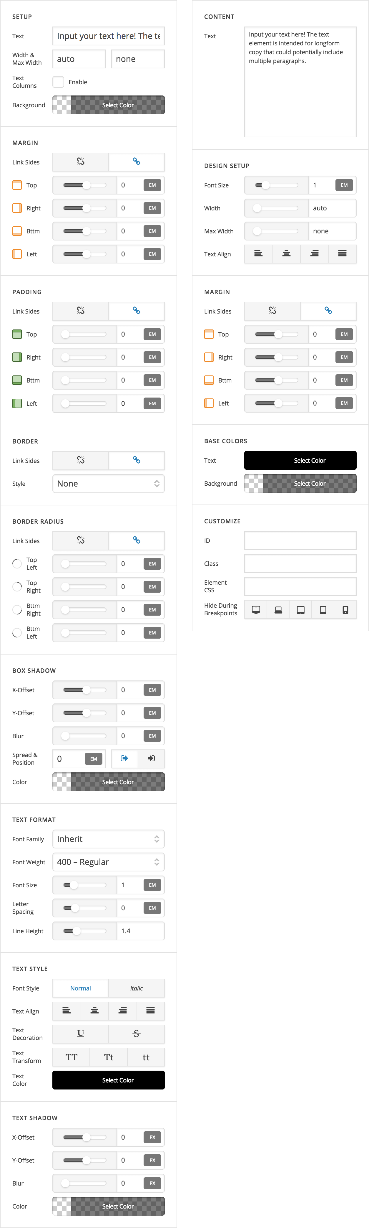
Some of the primary differences that make “simple” mode different from “advanced” mode include:
- All controls are included on the same level. With advanced mode, Elements are sometimes sub-grouped to make navigating the large list of controls easier (e.g. a “Navigation Inline” element will have the “Menu” group, “Top Links” group, “Dropdown” group, et cetera). Since the simplified control listing is far less lengthy, we have opted to keep everything visible on the same level, which means you don't have to drill down into any menus to find something you're looking for.
- Consistent control groupings across Elements. All simplified controls are either grouped as a “Content” control or a “Design” control. Content controls will always appear at the very beginning of the list with design controls coming after. Amongst the design controls, colors will always be grouped towards the end. So while the advanced listings are grouped by which “part” of the element you're working on (i.e. a group of links in a menu or a dropdown), these simplified listings are grouped more by “like controls” (i.e. content, basic spacing controls, colors, et cetera).
 Conditional display of Element controls. With advanced mode, all options and controls are visible at all times so that they can be adjusted as needed. The simplified control listing will only reflect certain controls if they are available or will visually make a difference on the element. For example, if you were working on a button that had a graphic and you had it set to display an icon in advanced mode, in the simplified lising you would only see a control to alter the icon (i.e. you wouldn't be able to change it back to an image in simple mode). Furthermore, colors display conditionaly depending on if they will make a visible difference or not. For example, the simple control listing will only show a text shadow color picker if you set a visible text shadow on your Element in advanced mode.
X and Cornerstone users will see the simplified control mapping out of the box, while Pro users will default to the advanced setup. To toggle between these modes, you can perform one of two actions:
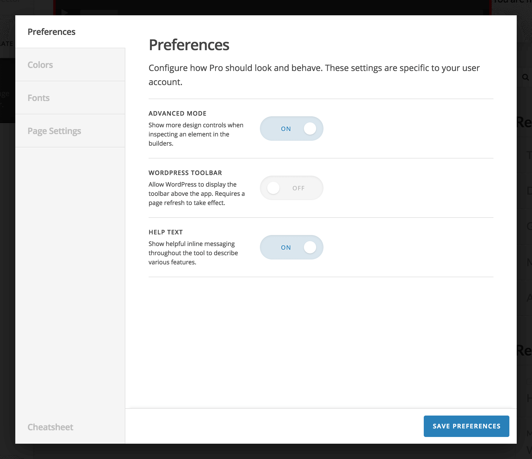
- Click on the cog icon in the bar within the builders to open the settings modal. Navigate to the “Preferences” tab and turn the “Advanced Mode” toggle on or off depending on your desired result.
- Use the keyboard shortcut
Shift+Cmd/Ctrl+Ato toggle between each mode without needing to go into settings modal every time. This is a great way to quickly switch back and forth between contexts depending on your workflow.
Revamped Global Settings Modal Pro, Cornerstone
With our addition of the Permissions Manager mentioned above, we needed a place to store these in-session user settings for things like how the help text or WordPress toolbar should display. We ended up rolling these into the settings modal (accessible via the cog icon in the left bar) as they needed to be readily available at any time:
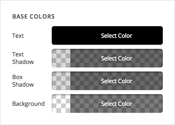
After doing this, we found that it would be helpful to also incorporate some of our other secondary tools such as the Font Manager and the Color Manager into this modal as well. This makes these tools more present and available at all times so that users don't have to leave a piece of content they're working on to go make a simple color adjustment or tweak a font. The revamped Color Manager can be seen below:
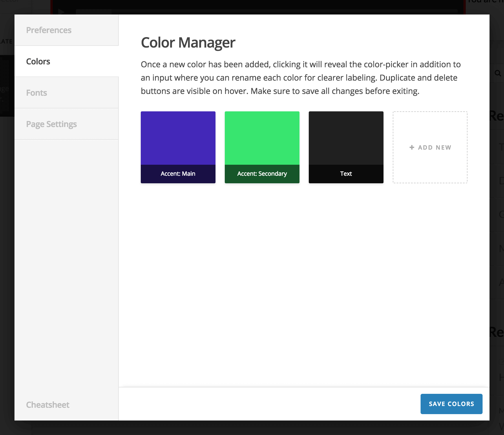
Hovering over each color will reveal a duplicate and delete action, and clicking on the color will reveal the color picker itself. You can also name each color inside the color picker so that it's purpose is clearly defined. Finally, clicking the “Add New” button at the end of the list will allow you to incorporate more colors into your palette as you need them. Check out our Knowledge Base article on the Color Manager to learn more.
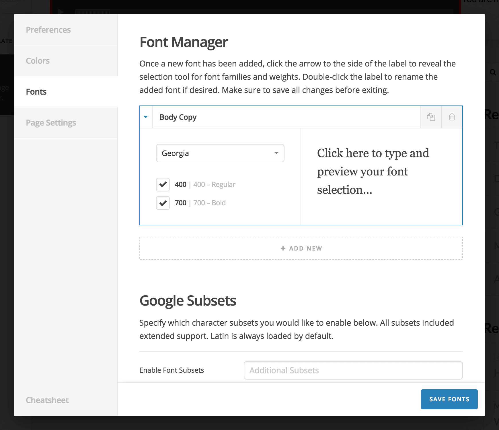
Similarly, the Font Manager and all corresponding options for things like Google Fonts and Typekit can be found under the “Fonts” tab:
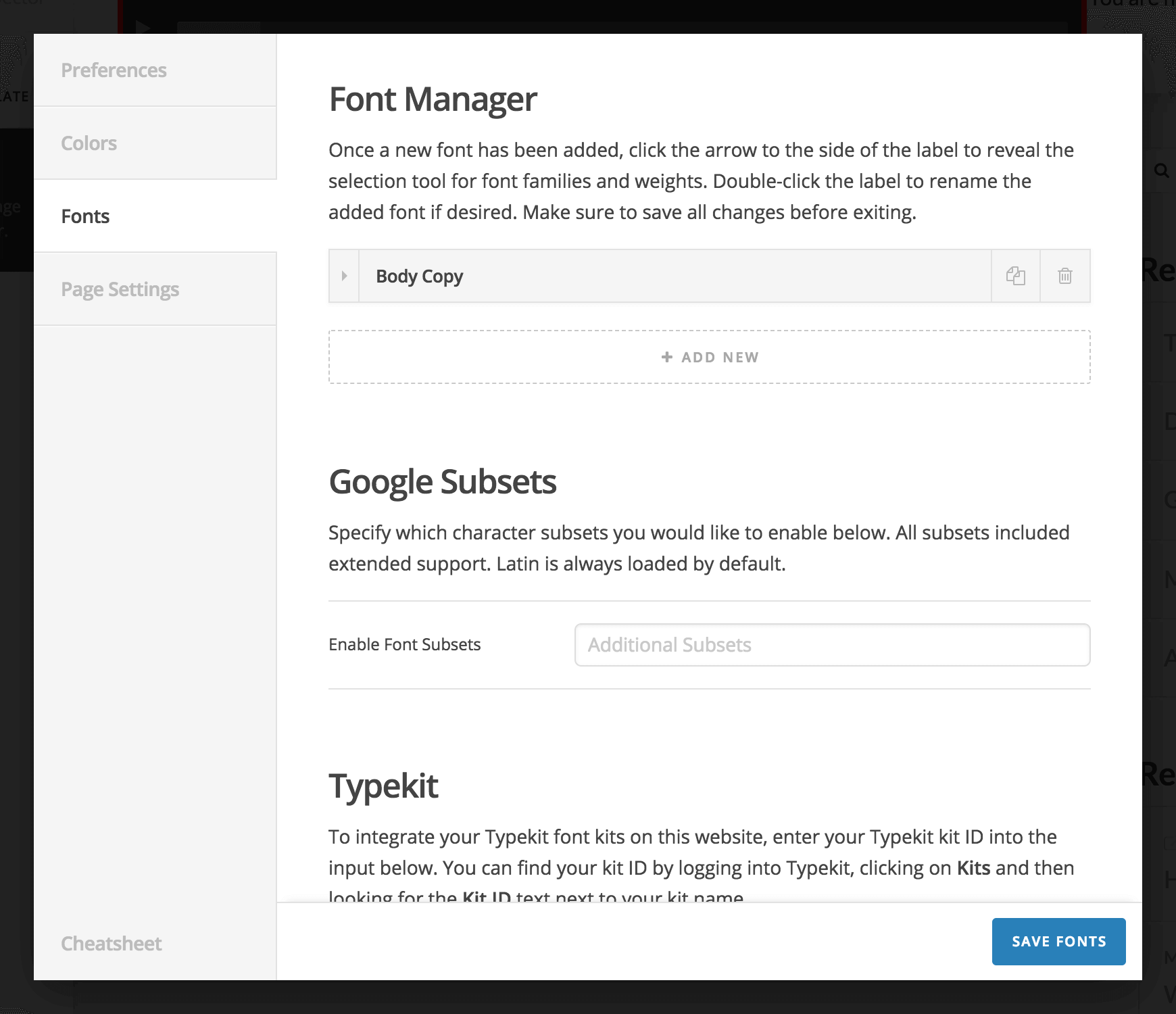
Each item added to the list represents a font just as it did in the old Font Manager. The only difference is that to select and preview your fonts, all you need to do is click the dropdown arrow on the lefthand side of each item to reveal the drawer that displays the options to select your fonts, which you should notice from the old font manager as it is exactly the same:
Check out our Knowledge Base article on the Font Manager to learn more.
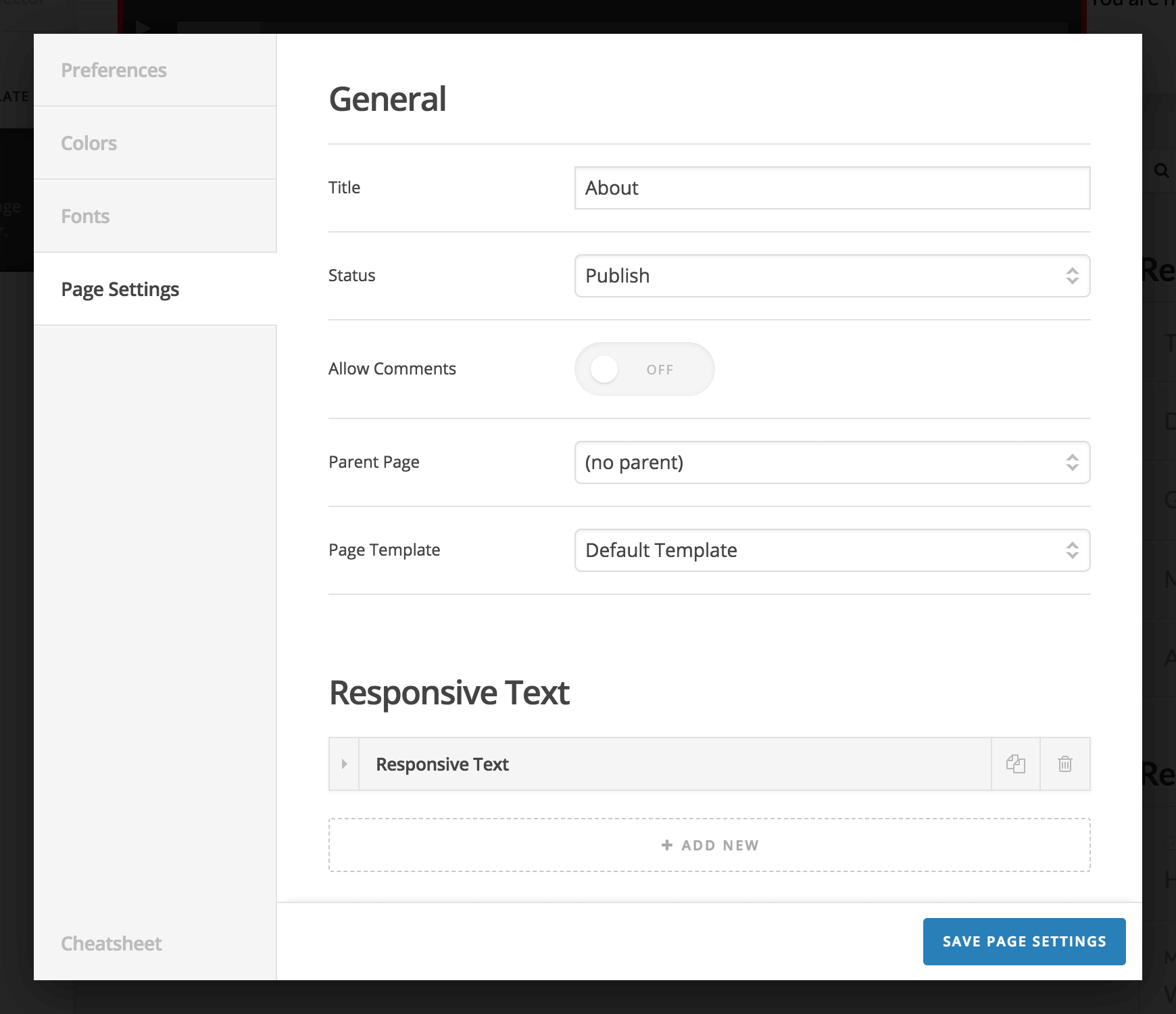
For pages you will recognize the options that were previously available:
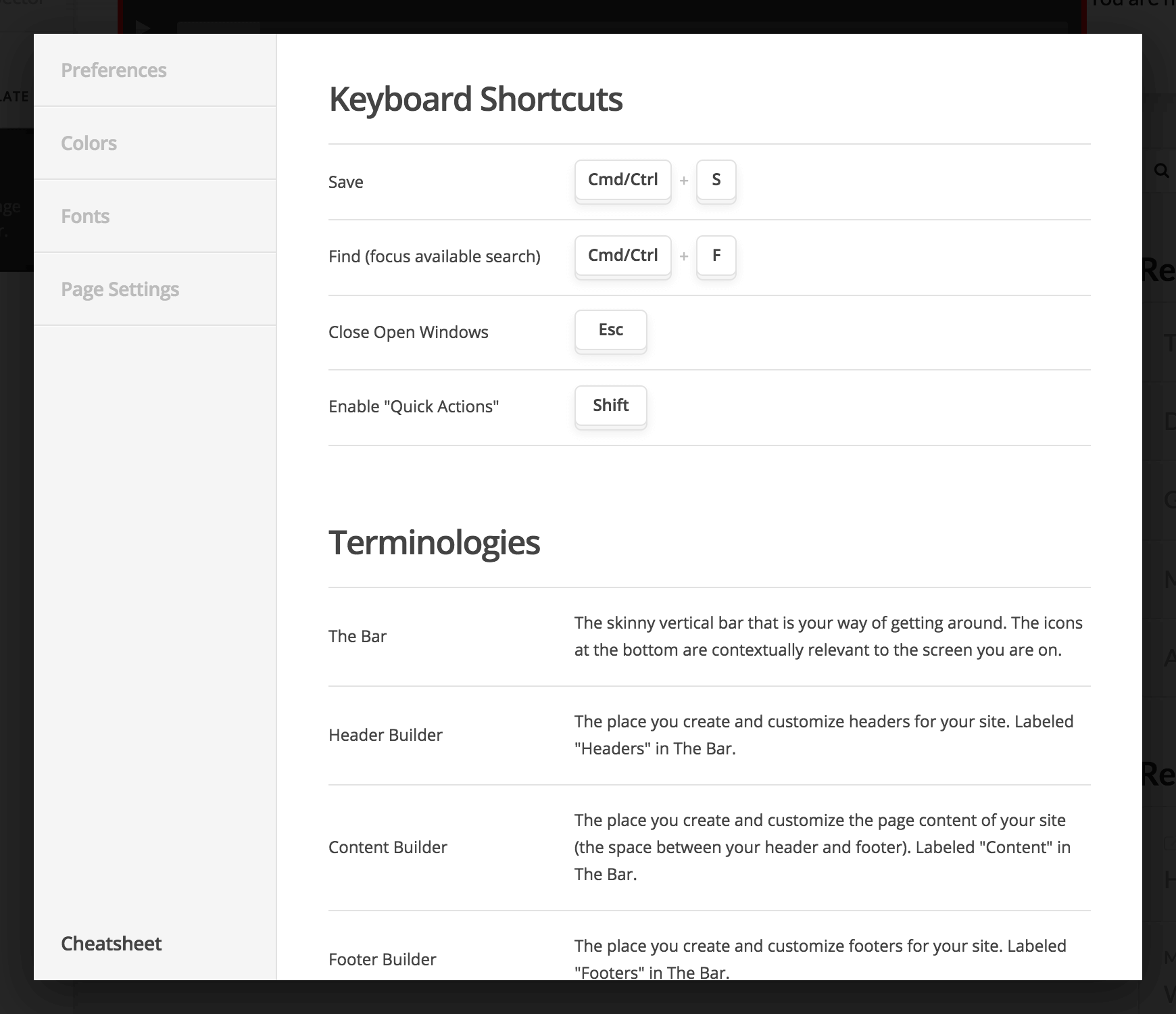
And finally, the cheatsheet of available keyboard shortcuts and terminologies can be found at the very bottom of the lefthand navigation in the modal:
Element Updates Pro, Cornerstone
In addition to all of the incredible updates listed above, we've taken some time to introduce new features for varous v2 Elements as well as a completely revamped v2 Tabs Element in addition to our brand new Navigation Layered Element! The first new set of features we'll take a look at has to do with active link styling for all of our Navigation Elements. Whenever you add a new Navigation Element to your builders, you will find the following control group under the “Menu” section:
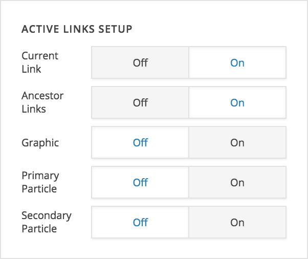
This “Active Links Setup” control group allows you to specify how the active links within a given Navigation Element should function, which includes:
- Current Link – determines whether or not the currently viewed page should display as an active link
- Ancestor Link – determines whether or not any ancestor link of the currently viewed page should display as an active link
- Graphic – determines whether or not the graphic should display its “end state” for any active link specified by the controls above
- Primary Particle – determines whether or not the primary particle should display its “end state” for any active link specified by the controls above
- Secondary Particle – determines whether or not the secondary particle should display its “end state” for any active link specified by the controls above
The biggest thing to keep in mind is that the first two on/off toggles determine which links within a Navigation Element are “active,” and the final three determine how various portions of those active links should function. When you play around with these options, there are many different design variations you can come up with. For example, you may want to have the primary particle always be on for active links, but leave the secondary particle interactive. This can be used to achieve a visible highlight or accented effect on page load for active links, but still use the transition of the secondary particle to give some interactive interest. Additionally, you may not wish to show any “active links” at all in a Navigation Element used in your footer, as traditionally these will only display interactions on hover or focus. There is a lot of flexibility to take advantage of from these simple controls!
Make sure to check out the new addendum video to our “Working with Navigation” article in the Knowledge Base that runs through these controls in more detail in addition to the new Sub Menu Trigger control available on certain navigation Elements (discussed later in this changelog as well).
Another big Element update includes multi-level modal navigation using our new “Layered Navigation” mechanic. In addition to the Navigation Modal Element finally receiving multi-level navigation, we've also added a completely new Element called Navigation Layered, which operates sort of as a middle ground between the Navigation Modal Element and Navigation Collapsed Element in that it features the “layered” mechanic that the modal has, but it is placed within an off canvas area when used in a top or bottom header bar or a footer bar (otherwise it is placed directly into the content).
The way the layered mechanic works is by animating out the current menu level when a sub menu link is clicked and then animating in the sub menu. All sub menu levels have a ← Back button at the top that allows you to traverse up a level (this text can be edited within the navigation Element). Below is a video demonstrating how this plays out within the Navigation Modal Element:
The following demonstrates the same mechanic within the new Navigation Layered Element:
It should also be noted that on our Navigation Collapsed, Navigation Layered, and Navigation Modal Elements that we have introduced a new control under the Menu control grouping called Sub Menu Trigger, which allows you to specify what part of a link will reveal a sub menu when clicked. Below is a screenshot of this control:
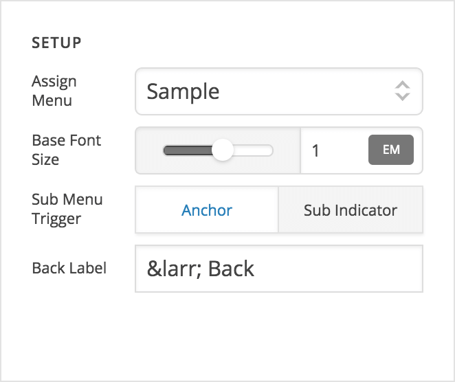
The two options available are Anchor (which means that clicking anywhere within the link will navigate to the sub menu) and Sub Indicator (which means that only clicking on the sub indicator will navigate to the sub menu, while clicking the anchor itself will navigate to the link destination). This affords a great deal of flexibility on these navigation Elements that was not previously available. One thing to keep in mind if moving the trigger to the sub indicator is to make sure that your clickable area is large enough, which you can set by adjusting the width and height.
Furthermore, our v2 Map Element now features map markers for any Google Maps setup! The map markers can be added via the sortable control located at the beginning of the Element:
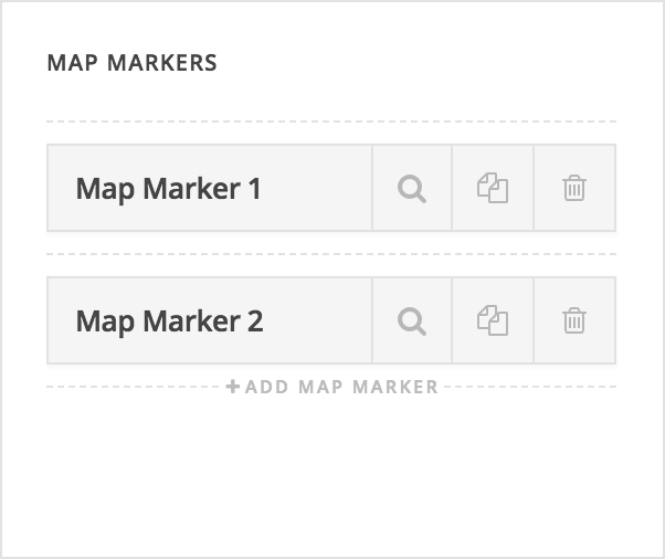
Inspecting each marker will reveal familiar controls from our Classic Google Maps Element. You can specify the latitude and longitude of each map marker as well as include optional content for that marker that will show up in a popup. Furthermore, custom map marker images can be implemented for a more custom look:
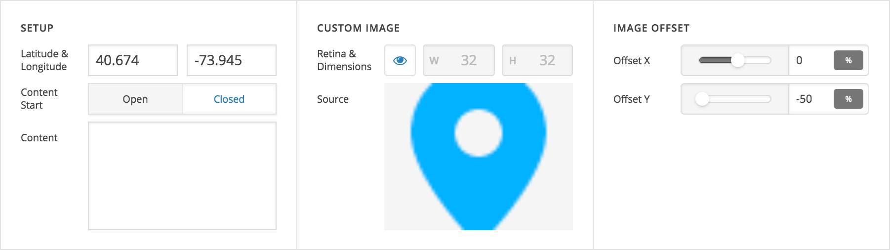
When a custom map marker image is used, two “Image Offset” controls will appear, which allow you to move the marker around if needed. This is necessary for certain situations where the point of the marker is located in different positions. For example, utilizing the screenshot above, you can see that we've offset the marker on the Y axis by -50% of the marker image's height. This moves the marker into its proper position to ensure that the point at the bottom of the image is in the correct location on the map:
In other situations you may not need to move the marker at all and can simply leave the X and Y axis at 0% as seen below:
For the following image we've translated its position 50% on the X axis and -50% on the Y axis due to where the point on the graphic falls:
And sometimes you may need to use different numbers, such as this graphic that required a 50% translation on the X axis and a 40% translation on the Y axis due to it's uneven shape:
The most important thing to keep in mind when translating custom map markers is that the movement of the graphic is always relative to its own dimensions. So for a 100px square image, moving it 50% on the X axis and -100% on the Y axis means you're moving it 50px to the right and 100px up. If you ever find yourself in doubt, you can simply move the sliders to find the appropriate positioning for any custom graphics you might be using as their location will be updated in real time in the builders.
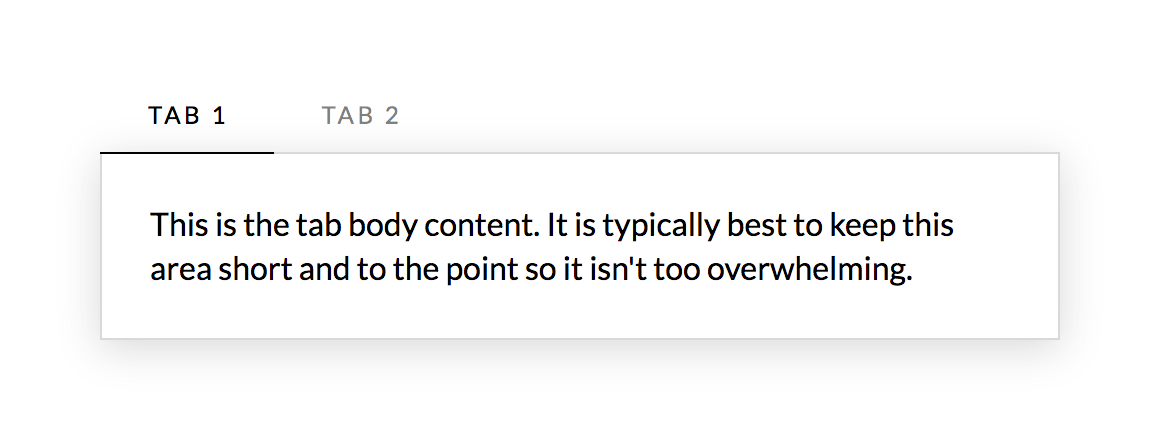
Last but not least, we're excited to finally release v2 Tabs! We've taken some time to review how we can make tabs more responsive, handle more content when needed, and overall be able to achieve more creative design possibilities. Below is a quick screenshot of the default styling for v2 Tabs:
The markup of v2 Tabs is broken down as such:
- Tabs
.x-tabs– the containing element for all child markup- Tab List
.x-tabs-list– the container holding all of the individual tabs to toggle a corresponding panel- The markup inside of the Tab List consists of a
<ul>made up of<li>elements with<button>elements as toggles for each tab
- The markup inside of the Tab List consists of a
- Panels
.x-tabs-panels– the container holding all of the individual panels of content for a corresponding tab- Panel
.x-tabs-panel– the individual panel containing a tab's main content
- Panel
- Tab List
The v2 Tabs Element features a much more common pattern for tabs in general that we are seeing more of across the board these days from big sites such as Google and Medium, and even popular modern boilerplate libraries like Bulma. Essentially, the tab labels are set inside of a container with overflow-x: auto; which effectively allows for infinite tabs and it is completely responsive at all screen dimensions. This also allows us to introduce some more advanced layout options for the tab labels in this horizontal space. For instance, if you click on the “Tabs” control grouping for the Element, you'll see two controls labeled “Fill Space” and “Justify Content.” “Fill Space” will ensure that when the tab labels present are less than the overall width of the container, they will grow to fill all available space for a clean, even look. “Justify Content” can be used to space tabs within that X axis in creative ways.
To learn more about v2 Tabs and what you can accomplish with them, make sure to check out our in-depth Knowledge Base article on the Element.
Numerous Updates & Bugfixes Pro, X, Cornerstone
Beyond everything listed above, one of our biggest goals with this release was to smooth out any rough edges and fix longstanding issues. You can review the individual notes in the sidebar to see what all has been changed for each product.
Regarding GDPR
This release cycle introduces some minor changes to aid you in the process of staying compliant. WordPress v4.9.6 added a new privacy page feature along with a checkbox added to the comment form. We've added styling for this new checkbox and made sure it appears correctly in all stacks.
We've also made some adjustments to provide you more control over the Google Fonts loading process. To fully disable Google Fonts without custom code, you can follow these steps:
- Go to Theme Options → Typography
- Enable use of the Font Manager
- Click the Settings icon in the Bar and navigate to Fonts
- Modify each font to reference a system font instead of a Google font
After these changes are saved, no references will be made to Google Fonts on the front end of your site. Additionally, you can immediately force Google Fonts to not load by adding this code to functions.php of a child theme:
add_filter( 'cs_load_google_fonts', '__return_false' );Finally, a new filter has been added called cs_google_fonts_uri, which can be used for advanced setups that may involve proxying Google Fonts or replicating their API.
Changelog
- Pro 2.1.6 - June 12, 2018
- Updated: Remove call to deprecated create_function when adding dashboard metaboxes.
- Updated: Update slider scroll anchor to use same offset script as anchor scrolling.
- Bugfix: Fix One Page navigation with classic headers not correctly calculating scroll position on mobile.
- Bugfix: Fix classic tabs not respecting "Initial Active Tab" setting.
- Bugfix: Fix Headline elements from Hero Header template rendering as Text elements and missing controls.
- Bugfix: Fix fatal PHP error on BuddyPress member profile.
- Bugfix: Fix scrollspy not working when a target element wraps another target element.
- Bugfix: Fix issue where multiple background videos result in only one playing.
- Bugfix: Fix toggling between HTML/Rich Text mode converting linebreaks to paragraphs in classic elements.
- X 6.1.6 - June 12, 2018
- Updated: Remove call to deprecated create_function when adding dashboard metaboxes.
- Updated: Update slider scroll anchor to use same offset script as anchor scrolling.
- Bugfix: Fix One Page navigation not correctly calculating scroll position on mobile.
- Bugfix: Fix fatal PHP error on BuddyPress member profile.
- Cornerstone 3.1.6 - June 12, 2018
- Bugfix: Fix classic tabs not respecting "Initial Active Tab" setting.
- Bugfix: Fix scrollspy not working when a target element wraps another target element.
- Bugfix: Fix issue where multiple background videos result in only one playing.
- Bugfix: Fix toggling between HTML/Rich Text mode converting linebreaks to paragraphs in classic elements.
- Pro 2.1.5 - June 6, 2018
- Updated: Add cs_query_limit filter.
- Bugfix: MEJS video background using improper dimensions.
- X 6.1.5 - June 6, 2018
- Bugfix: MEJS video background using improper dimensions.
- Cornerstone 3.1.5 - June 6, 2018
- Updated: Add cs_query_limit filter.
- Bugfix: MEJS video background using improper dimensions.
- Pro 2.1.4 - June 5, 2018
- Updated: Suppress scrollspy console output.
- Bugfix: Error in bbPress integration when using older PHP versions.
- Bugfix: Permissions not treating multisite super admin as an admin when not a member of a site.
- Bugfix: Page background setting not working with multiple images.
- Bugfix: <p> and <br> tags appearing when using classic shortcodes.
- Bugfix: MEJS video dimensions.
- Bugfix: <strong> tags not becoming bold with certain Google Fonts.
- Bugfix: An issue where multiple sticky bars after a non-sticky bar may not reappear.
- X 6.1.4 - June 5, 2018
- Bugfix: Error in bbPress integration when using older PHP versions.
- Bugfix: Page background setting not working with multiple images.
- Bugfix: <strong> tags not becoming bold with certain Google Fonts.
- Cornerstone 3.1.4 - June 5, 2018
- Updated: Suppress scrollspy console output.
- Bugfix: Permissions not treating multisite super admin as an admin when not a member of a site.
- Bugfix: <p> and <br> tags appearing when using classic shortcodes.
- Bugfix: MEJS video dimensions.
- Bugfix: <strong> tags not becoming bold with certain Google Fonts.
- Pro 2.1.3 - June 2, 2018
- Bugfix: Clicking anchors in the builder preview sometimes navigates to the link instead of inspecting.
- Bugfix: Duplicate "Apply Coupon" button on WooCommerce checkout.
- Bugfix: Thumbnail not appearing in Recent Posts Element.
- Bugfix: Missing label controls for Statbar element.
- Bugfix: Fix Navbar search not opening.
- Bugfix: Fix desktop menu dropdowns not closing when hovering out.
- Bugfix: Fix PHP error on installs that don't support gzip.
- X 6.1.3 - June 2, 2018
- Bugfix: Duplicate "Apply Coupon" button on WooCommerce checkout.
- Bugfix: Thumbnail not appearing in Recent Posts Element.
- Bugfix: Fix Navbar search not opening.
- Bugfix: Fix desktop menu dropdowns not closing when hovering out.
- Cornerstone 3.1.3 - June 2, 2018
- Bugfix: Clicking anchors in the builder preview sometimes navigates to the link instead of inspecting.
- Bugfix: Missing label controls for Statbar element.
- Bugfix: Fix PHP error on installs that don't support gzip.
- Pro 2.1.2 - June 1, 2018
- Bugfix: Fatal PHP error on outdated versions of PHP.
- X 6.1.2 - June 1, 2018
- Bugfix: Fatal PHP error on outdated versions of PHP.
- Cornerstone 3.1.2 - June 1, 2018
- Bugfix: Fatal PHP error on outdated versions of PHP.
- Pro 2.1.1 - May 31, 2018
- Updated: Alphabetically sort elements in the Permissions Manager.
- Bugfix: Theme Options not loading correctly when using multisite or pretty permalinks are disabled.
- Bugfix: Don't try to initialize the icon sidebar if it is not present on the page.
- Bugfix: Fix calc() inside unit input removing spaces.
- Bugfix: Fix TypeKit ID not loading from previously saved settings.
- Bugfix: Fix text interaction option not working on Elements using the anchor partial.
- Bugfix: Fix iLightBox 404.
- X 6.1.1 - May 31, 2018
- Bugfix: Theme Options not loading correctly when using multisite or pretty permalinks are disabled.
- Bugfix: Don't try to initialize the icon sidebar if it is not present on the page.
- Cornerstone 3.1.1 - May 31, 2018
- Updated: Alphabetically sort elements in the Permissions Manager.
- Bugfix: Fix calc() inside unit input removing spaces.
- Bugfix: Fix TypeKit ID not loading from previously saved settings.
- Bugfix: Fix text interaction option not working on Elements using the anchor partial.
- Bugfix: Fix iLightBox 404.
- Pro 2.1.0 - May 30, 2018
- Feature: Permissions Manager.
- Feature: Global Settings modal with a preferences panel.
- Feature: Advanced Mode (turning this off makes v2 elements simpler to work with).
- Feature: New Tabs Element.
- Feature: New Navigation Layered Element.
- Updated: Make Color and Font Managers accessible from the Global Settings Modal.
- Updated: Allow Yoast to analyze pages and posts made with the content builder.
- Updated: FontAwesome v4.7.0 support.
- Updated: Load CodeMirror from WordPress and remove our bundled library.
- Updated: Update javascript dependencies.
- Updated: Reduce front end javascript to a single file.
- Updated: Optimized how function files are loaded for best front end performance.
- Updated: x_setup_theme, x_get_stack, x_get_option, x_get_site_layout are no longer pluggable.
- Updated: Added <!--nextpage--> support for v2 sections.
- Updated: Prettify HTML when switching from "Text" to "HTML" mode of the editor control.
- Updated: Clicking "Exit to Dashboard" while in the content builder will take you to that post.
- Updated: Close modal, off canvas, or dropdown when navigating to a "one page" link.
- Updated: Multi-level menu support for the Navigation Modal Element.
- Updated: Anchor scrolling now respects the offset from multiple sticky bars.
- Updated: Clicking outside of dropdowns will close them.
- Updated: Hover dropdowns work on hybrid devices that have cursors and touch support.
- Updated: Opening "Theme Options" from the toolbar will preview with the URL you entered from.
- Updated: New controls to define active link styles for current and ancestor menu items in all Navigation Elements.
- Updated: Migrated to native WordPress "Site Icon" settings for cleaner brand management.
- Updated: Included z-index control for Columns to adjust stacking as needed.
- Updated: Clean up generated CSS for Elements.
- Updated: Provide placeholder thumbnail option for WooCommerce products that don't have a featured image.
- Updated: Process oEmbeds in v2 text element.
- Updated: Include drafts and private posts on Content Builder index.
- Updated: Open Graph description now pulls through post excerpts from the content builder.
- Updated: Slider meta boxes hidden when not supported by page template.
- Updated: Added Map Markers to v2 Map element
- Updated: Don't close the responsive preview switcher when toggling Skeleton Mode.
- Updated: Don't show Content Builder edit links for the "Page for Posts" or "Shop Page".
- Updated: When collapsing a builder overlays and transient styling is hidden in the preview.
- Updated: Add compatibility for WordPress v4.9.6 privacy features
- Bugfix: Inability to use multiple sticky bars.
- Bugfix: Occasional lag when scrolling in Theme Options.
- Bugfix: Left/right bars in Header builder overlapping the content when previewed.
- Bugfix: v2 elements not generating an excerpt for posts.
- Bugfix: Detection of direction to flow for first level dropdown menus.
- Bugfix: Gap elements not displaying correct height in preview.
- Bugfix: Custom <body> classes added via meta appearing on archive pages.
- Bugfix: WooCommerce cart for standard headers remaining in Pro headers.
- Bugfix: Added control to correct Section separators if a gap is present.
- Bugfix: Unintentional padding applied to bars when a static height is set.
- Bugfix: Various CSS @keyframe animation conflicts with third parties.
- Bugfix: WooCommerce search widget styling.
- Bugfix: Various iLightBox resources loading from the wrong location.
- Bugfix: Duplicate descriptions present in Theme Options.
- Bugfix: Advanced backgrounds not appearing in IE11.
- Bugfix: Contact Form 7 loader not displaying properly.
- Bugfix: Classic Accordion Items not linking when specified.
- Bugfix: WooCommerce string translations in included templates.
- Bugfix: Portfolio filter display errors.
- Bugfix: v2 Image Element display issues in IE11.
- Bugfix: Vimeo links not working in Video Player Elements.
- Bugfix: Video mute not functioning properly.
- Bugfix: Optimize how custom meta data is pulled through for menu items.
- Bugfix: Scrollbar not always interactive in builder interfaces.
- Bugfix: Modal and off canvas Elements not outputting properly in footers with certain setups.
- Bugfix: BuddyPress activity stream post button disabling incorrectly.
- Bugfix: Various BuddyPress fixes to allow for rtMedia to function properly.
- Bugfix: bbPress cleanup to for link quicktag to function properly.
- Bugfix: Search shortcut not working for Theme Options code editors.
- Bugfix: Dropdown positioning in IE11.
- Bugfix: Hue not working on classic map element.
- Bugfix: Conflict with VC accordions scrolling when opened.
- Bugfix: Quote element Marks missing graphic controls.
- Bugfix: Classic Featured List Item missing alt text for graphic.
- Bugfix: Builders not showing elements correctly in Edge.
- Bugfix: Inability to save content with zero sections.
- Bugfix: Custom CSS not saving if The Grid is used in the content.
- Bugfix: Google Maps preview showing API key error when one is present.
- Bugfix: Poster image not being removed from YouTube videos.
- Bugfix: Theme options manager import mishandling boolean values.
- Bugfix: Unit inputs not accepting calc() values with nested parentheses.
- Bugfix: bbPress and BuddyPress markup being added to navigation elements in the wrong place.
- Bugfix: Dropcap shortcode preventing <p> tag from wrapping content.
- Bugfix: "Edit with" links showing when user role did not permit access.
- Bugfix: Headers and Footers assigned to WooCommerce shop page not applying on front end.
- Bugfix: Empty element indicator appearing if you hide an element by breakpoint then resize the browser.
- Bugfix: Envira Gallery element not displaying available galleries.
- Bugfix: Creating new WPML translations in the builder will always use "Translate Independently".
- X 6.1.0 - May 30, 2018
- Updated: FontAwesome v4.7.0 support.
- Updated: Update javascript dependencies.
- Updated: Reduce front end javascript to a single file.
- Updated: Optimized how function files are loaded for best front end performance.
- Updated: x_setup_theme, x_get_stack, x_get_option, x_get_site_layout are no longer pluggable.
- Updated: Opening "Theme Options" from the toolbar will preview with the URL you entered from.
- Updated: Migrated to native WordPress "Site Icon" settings for cleaner brand management.
- Updated: Included z-index control for Columns to adjust stacking as needed.
- Updated: Provide placeholder thumbnail option for WooCommerce products that don't have a featured image.
- Updated: Open Graph description now pulls through post excerpts from the content builder.
- Updated: Slider meta boxes hidden when not supported by page template.
- Updated: Add compatibility for WordPress v4.9.6 privacy features
- Bugfix: Occasional lag when scrolling in Theme Options.
- Bugfix: Custom <body> classes added via meta appearing on archive pages.
- Bugfix: Added control to correct Section separators if a gap is present.
- Bugfix: Various CSS @keyframe animation conflicts with third parties.
- Bugfix: WooCommerce search widget styling.
- Bugfix: Various iLightBox resources loading from the wrong location.
- Bugfix: Duplicate descriptions present in Theme Options.
- Bugfix: Advanced backgrounds not appearing in IE11.
- Bugfix: Contact Form 7 loader not displaying properly.
- Bugfix: WooCommerce string translations in included templates.
- Bugfix: Portfolio filter display errors.
- Bugfix: Scrollbar not always interactive in builder interfaces.
- Bugfix: BuddyPress activity stream post button disabling incorrectly.
- Bugfix: Various BuddyPress fixes to allow for rtMedia to function properly.
- Bugfix: bbPress cleanup to for link quicktag to function properly.
- Bugfix: Theme options manager import mishandling boolean values.
- Cornerstone 3.1.0 - May 30, 2018
- Feature: Permissions Manager.
- Feature: Global Settings modal with a preferences panel.
- Feature: Advanced Mode (turning this off makes v2 elements simpler to work with).
- Feature: New Tabs Element.
- Feature: New Navigation Layered Element.
- Updated: Make Color and Font Managers accessible from the Global Settings Modal.
- Updated: Allow Yoast to analyze pages and posts made with the content builder.
- Updated: FontAwesome v4.7.0 support.
- Updated: Load CodeMirror from WordPress and remove our bundled library.
- Updated: Added <!--nextpage--> support for v2 sections.
- Updated: Prettify HTML when switching from "Text" to "HTML" mode of the editor control.
- Updated: Clicking "Exit to Dashboard" while in the content builder will take you to that post.
- Updated: Close modal, off canvas, or dropdown when navigating to a "one page" link.
- Updated: Multi-level menu support for the Navigation Modal Element.
- Updated: Clicking outside of dropdowns will close them.
- Updated: Hover dropdowns work on hybrid devices that have cursors and touch support.
- Updated: Included z-index control for Columns to adjust stacking as needed.
- Updated: Clean up generated CSS for Elements.
- Updated: Process oEmbeds in v2 text element.
- Updated: Include drafts and private posts on Content Builder index.
- Updated: Remove no longer used "Visual Enhancements" backend setting.
- Updated: Added Map Markers to v2 Map element
- Updated: Don't close the responsive preview switcher when toggling Skeleton Mode.
- Updated: Don't show Content Builder edit links for the "Page for Posts" or "Shop Page".
- Updated: When collapsing a builder overlays and transient styling is hidden in the preview.
- Updated: Add compatibility for WordPress v4.9.6 privacy features
- Bugfix: Occasional lag when scrolling in Options.
- Bugfix: v2 elements not generating an excerpt for posts.
- Bugfix: Detection of direction to flow for first level dropdown menus.
- Bugfix: v2 section padding not being applied.
- Bugfix: Gap elements not displaying correct height in preview.
- Bugfix: Added control to correct Section separators if a gap is present.
- Bugfix: Various CSS @keyframe animation conflicts with third parties.
- Bugfix: Various iLightBox resources loading from the wrong location.
- Bugfix: Duplicate descriptions present in Theme Options.
- Bugfix: Advanced backgrounds not appearing in IE11.
- Bugfix: Contact Form 7 loader not displaying properly.
- Bugfix: Classic Accordion Items not linking when specified.
- Bugfix: v2 Image Element display issues in IE11.
- Bugfix: Vimeo links not working in Video Player Elements.
- Bugfix: Video mute not functioning properly.
- Bugfix: Scrollbar not always interactive in builder interfaces.
- Bugfix: Search shortcut not working for Theme Options code editors.
- Bugfix: Dropdown positioning in IE11.
- Bugfix: Hue not working on classic map element.
- Bugfix: Conflict with VC accordions scrolling when opened.
- Bugfix: Quote element Marks missing graphic controls.
- Bugfix: Classic Featured List Item missing alt text for graphic.
- Bugfix: Builders not showing elements correctly in Edge.
- Bugfix: Inability to save content with zero sections.
- Bugfix: Custom CSS not saving if The Grid is used in the content.
- Bugfix: Google Maps preview showing API key error when one is present.
- Bugfix: Poster image not being removed from YouTube videos.
- Bugfix: Unit inputs not accepting calc() values with nested parentheses.
- Bugfix: Dropcap shortcode preventing <p> tag from wrapping content.
- Bugfix: "Edit with" links showing when user role did not permit access.
- Bugfix: Empty element indicator appearing if you hide an element by breakpoint then resize the browser.
- Bugfix: Envira Gallery element not displaying available galleries.
- Bugfix: Creating new WPML translations in the builder will always use "Translate Independently".
Status
- 06/12: Pro 2.1.6, X 6.1.6, and Cornerstone 3.1.6 available via automatic updates (final release of this cycle).
- 06/11: Pro 2.1.6, X 6.1.6, and Cornerstone 3.1.6 available via automatic updates.
- 06/05: Pro 2.1.5, X 6.1.5, and Cornerstone 3.1.5 available via automatic updates.
- 06/04: Pro 2.1.4, X 6.1.4, and Cornerstone 3.1.4 available via automatic updates.
- 06/01: Pro 2.1.3, X 6.1.3, and Cornerstone 3.1.3 available via automatic updates.
- 05/31: Pro 2.1.2, X 6.1.2, and Cornerstone 3.1.2 available via automatic updates.
- 05/31: Pro 2.1.1, X 6.1.1, and Cornerstone 3.1.1 available via automatic updates.
- 05/30: Pro 2.1.1, X 6.1.1, and Cornerstone 3.1.1 available via manual updates.
- 05/29: Pro 2.1.0, X 6.1.0, and Cornerstone 3.1.0 available via manual updates.