Release
Notes
January 30, 2023
6.0.7
7.0.7
10.0.7
We've got some incredibly exciting features to talk about here—things that will truly allow you to take your site builds to another level, all while making maintainability and scalability easier than ever. But before we get into that, let's take a moment to review some of the lighter fare.
Let's begin with UI updates. In an effort to make navigating between Builders more straightforward (especially with the addition of our new Component Builder), we have given the interface a fresh new facelift. That being said, major pieces of functionality such as the Outline, Inspector, and Element Library remain just as you remember.
Introducing Documents
To explore the assets you've created that make up your site (i.e. “Documents”), click on the new Cornerstone menu near the top-left corner of the interface. If you do not have any open documents when you go into Cornerstone, this menu will be opened for you:
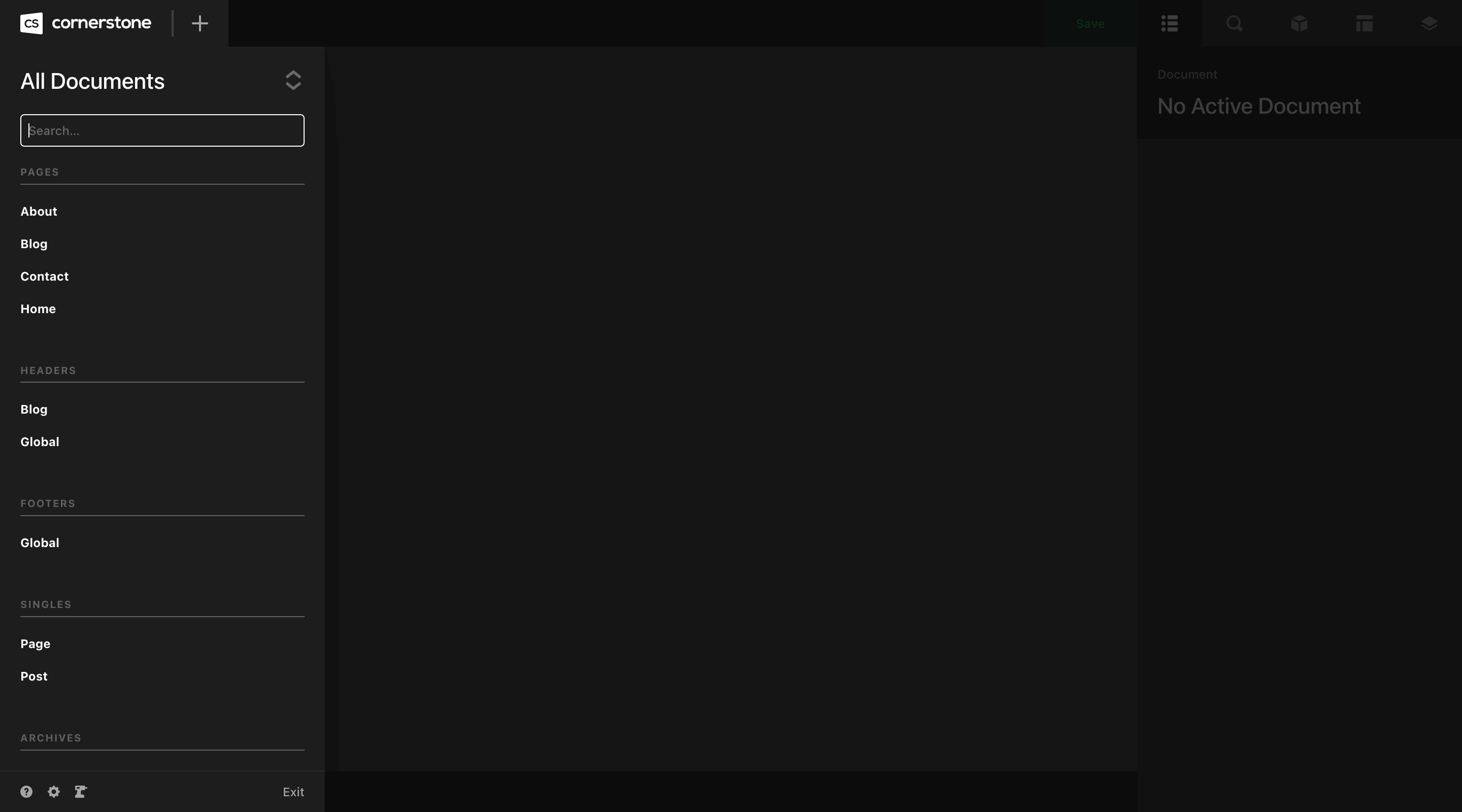
Take note that by default, All Documents is selected in the interface and you will be able to scroll through and see any asset you have created. You can also filter by document type at the top of the list, or search to narrow down your results. Additionally, you can duplicate or delete any documents relating to your site from this interface if you need.
Additionally, this is where certain features such as the help pane, app preferences, and Dev Toolkit can be found. Additionally, you can use the “Exit” action to leave the builder and return to the WordPress admin area.
Create New
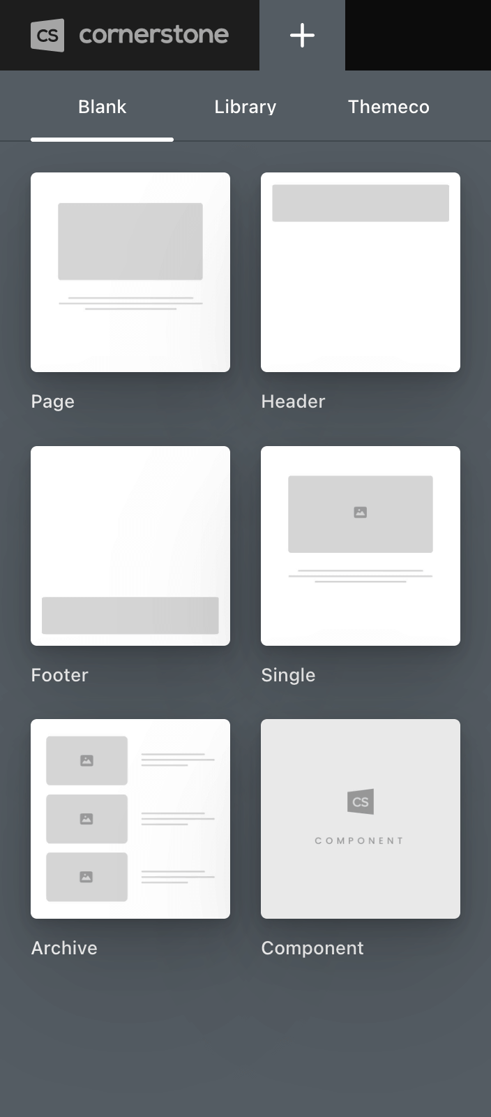
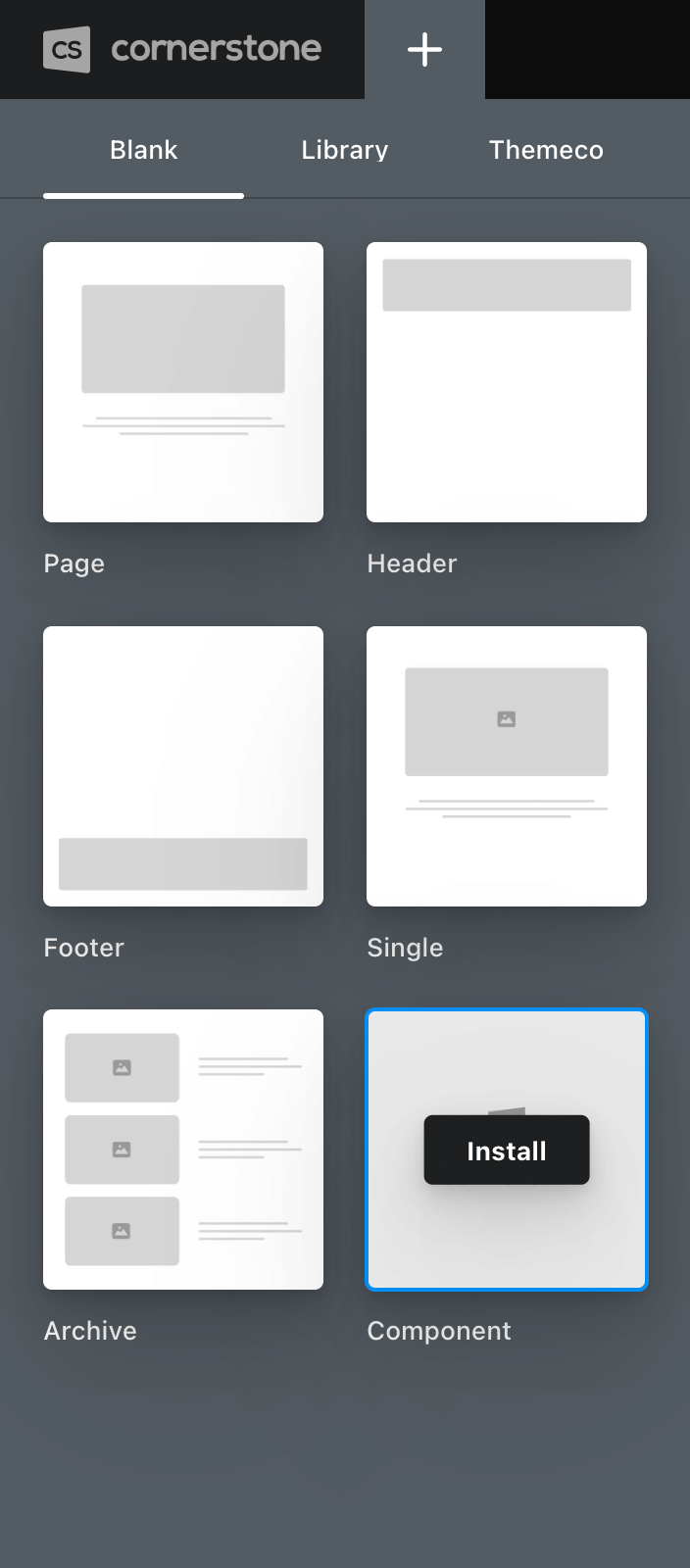
Directly beside the Cornerstone menu is a + sign, which signifies the Create New interface, which is where you will go to create any new document for your site. By default, the interface opens to a Blank tab, which allows you to create a new Document of that specific type without any content pre-populated:
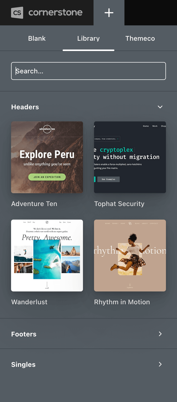
Next, we have the Library tab, which allows you to create a new Document that is pre-populated with any content you have previously saved as a Template. This interface is broken down by Document type. For example, we can see in the screenshot below that this installation has four Header Templates saved, which can be used as a starting point to create a new Header moving forward if desired:
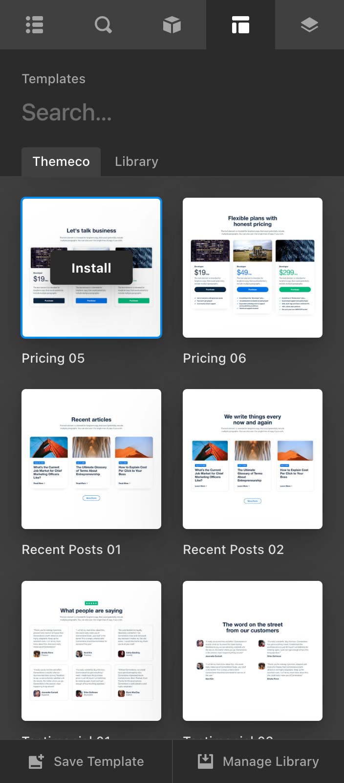
Finally, we have the Themeco tab, which features assets created by our design team at Themeco that are delivered “over the top” into your installation as they are released (no updates required!). These can serve as a great way to get something up and running quickly with almost no effort. Similar to the Library tab, these Documents are broken down by type and can be installed with a single click:
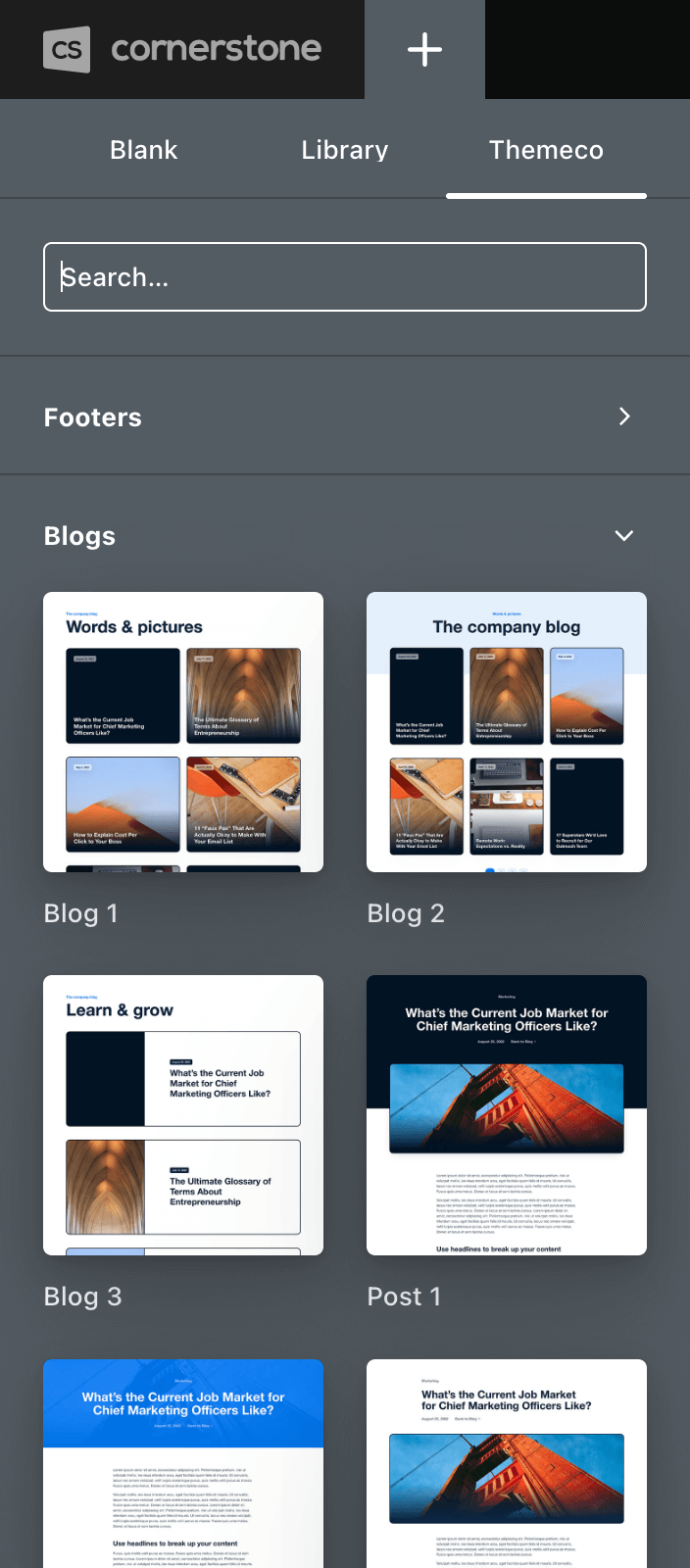
If installing something that is assignable such as a Header, Footer, Archive, or Single Template, the asset you click on will be installed as a new Document but will not be assigned so as not to overwrite your site's frontend.
We've Got Tabs!
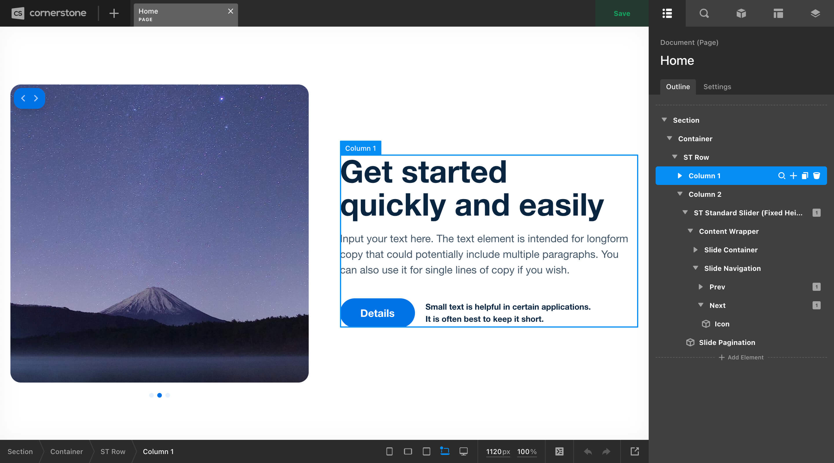
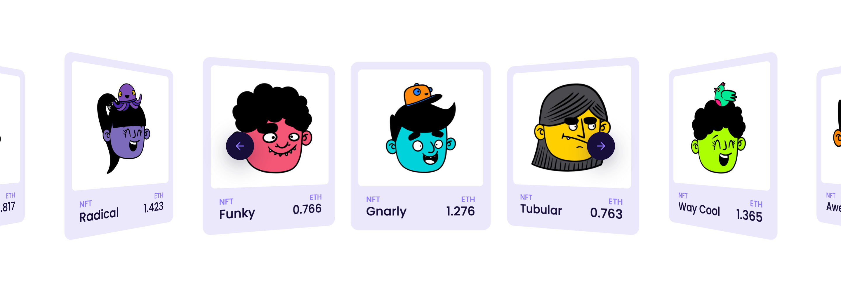
And now for one of the most exciting features we've been working on for quite a while: multi-Document editing! In this latest release, you can now work on multiple documents at once, which will be displayed as tabs across the top of the interface between the Create New and Save buttons:

Each open tab features the name of the Document on the top line in addition to its type below. In the image above, we can see that we have a Page named “Home,” a Header named “Global,” and an Archive template named “Blog” open.
The great thing about having multiple Documents open at once is that you can easily make changes as needed to a global asset like a Header and quickly switch contexts to a specific Page or Post to see how it is affected by those changes. Tabs are re-orderable and you can have as many open as you wish.
By default, when clicking on a Document in the Documents pane, the pane will close and a new tab will be opened with the selected Document in the live preview. If you wish to open multiple Documents at once without the pane closing, simply CMD / Option + click the Documents you wish to open.
The Workspace
As mentioned previously, for the most part the Workspace behaves very similarly to how it operated in previous releases. Take note of the image below with the Workspace on the right side of the screen, and you can see that the Outline of the document we are editing looks as it always has:
First, we can see that the Workspace is divided into five tabs at the top, which correspond to the Outline, Inspector, Element Library, Template Manager, and Globals interfaces in that order.
Each pane is labeled by the first line of text below these tabs as you can see from the image above, and then a contextual title or search field is present below that. For example, since we are on the Outline for our “Home” Page, we can see that reflected in the header at the top.
Next, some panes will feature a sub-navigation of tabs to help organize things more effectively. On the Outline pane we can see that it starts with the “Outline” tab, but there is also a “Settings” tab next to it. When this is selected, the following Document settings are revealed:
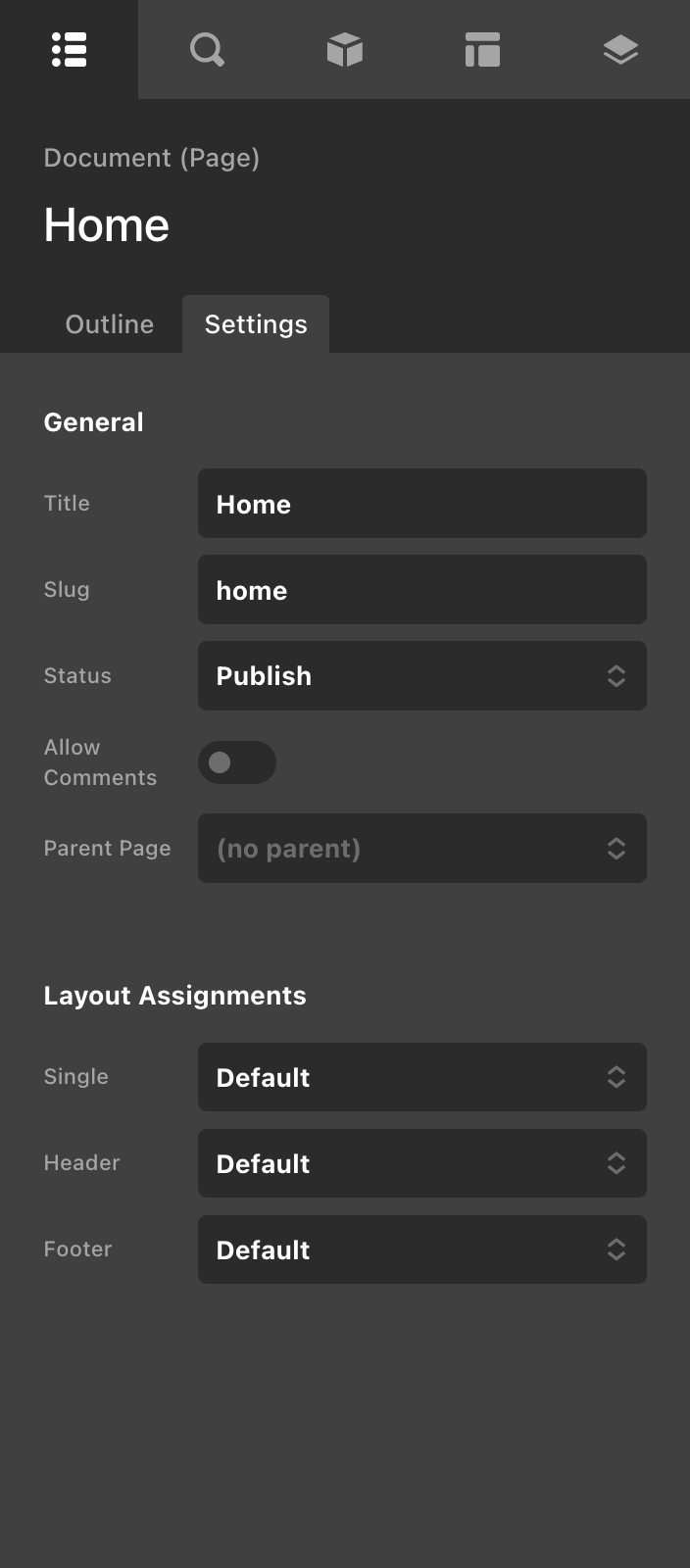
The settings shown here will be slightly different depending on the Document you are working on. For example, you wouldn't see the “Allow Comments” option on a Header Document, as that would not be applicable to that Document type.
Next, we have the Inspector pane, which should look relatively familiar to previous releases:
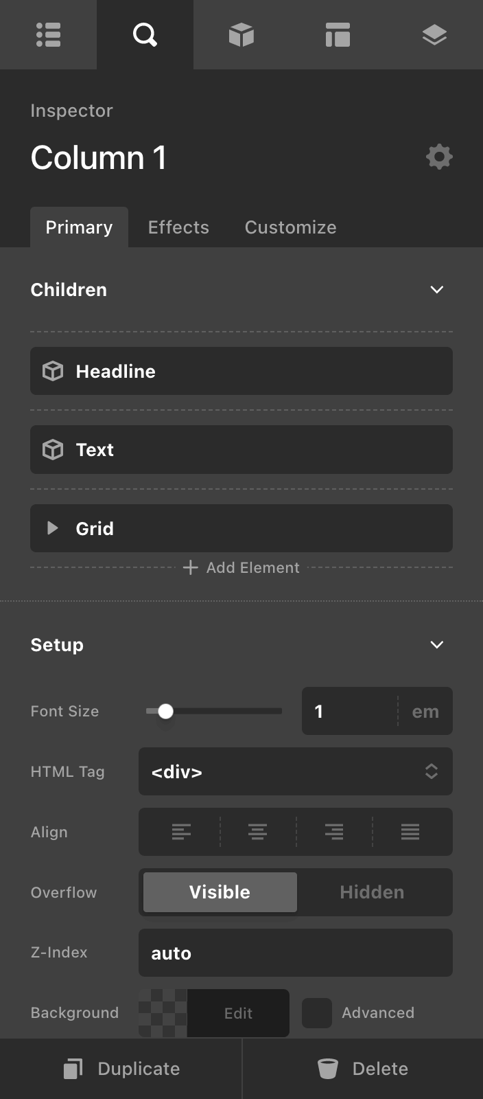
A primary difference here is that the control group navigation has been grouped into the sub-navigation in the header, and you can use this to navigat to other modules like “Effects” or “Customize” as needed. Additionally, the actions to Delete or Duplicate an Element are now found at the bottom of Workspace, which is where you will see common actions amongst other panes.
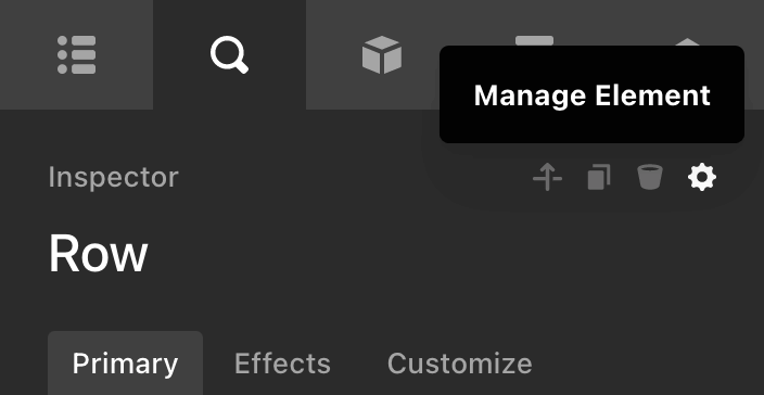
Additionally, the “Children” group has been overhauled to include a full version of our main Outline pane functionality directly on the Element itself. Whereas previously you could only navigate the immediate children of the inspected Element, now you can drill down as far as you need. Also, take note of the cog icon next to the Element's name: this is where you will access the Element Manager, but we'll cover that in more detail later. 😊
Next, we'll take a look at the Element Library pane, which is pretty much the same ol' Element Library you've always known and loved:
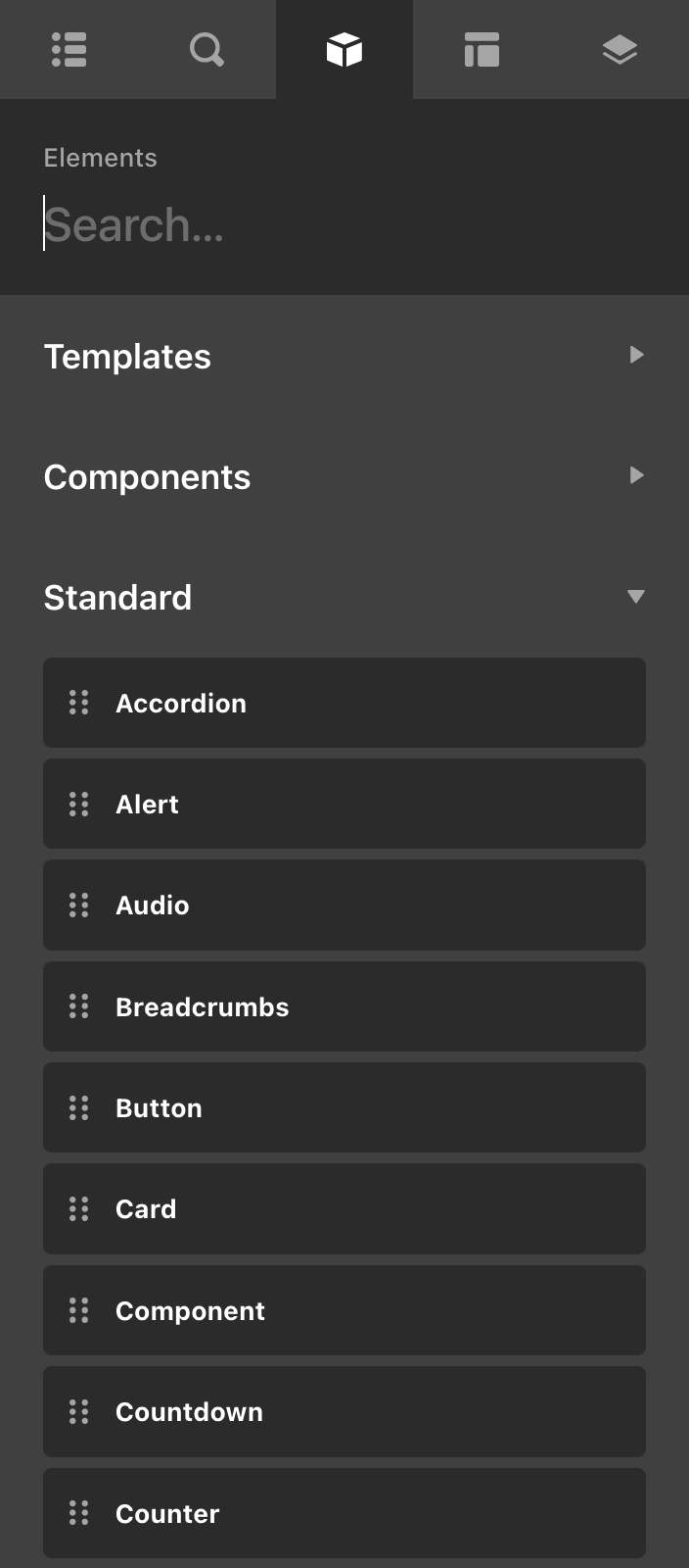
Note that instead of a floating interface like previous releases, this version is situated squarely in the Workspace. We opted to move the Element Library back into the Workspace due to some additional features that were included in this release, which more readily required access to a floating, resizable interface.
Elements in the Library can be dragged into a dropzone in the live preview like always, and you will also see your custom Components here as you create and export them. Next, we have the Templates pane:
The Templates pane is a refreshed interface meant to make the discovery and implementation of assets in your designs much easier. One notable feature of the Templates pane is that it will only display relevant assets to you depending on the Document type you are working on. For example, you will only see Header assets here from your library or Themeco's when you are working on...you guessed it...a Header. The same goes for pages, archives, single templates, et cetera.
The Themeco tab features assets created by our team, while the Library tab features items that you have created. The Save Template action at the bottom of the Workspace allows you to save the entire Document you are working on to your Library, while the Manage Library button will reveal a modal similar to the old library modal, where you can add, delete, and rename your assets.
Finally, we have the Globals pane:
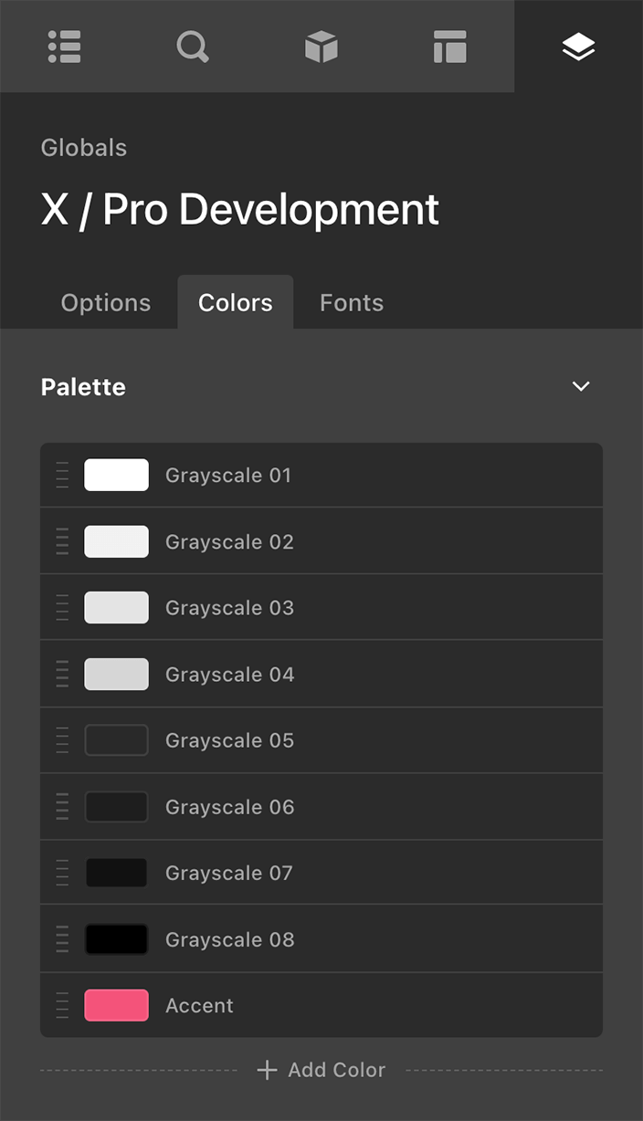
This is where you will find various tools that are related to the global styling of your site including Theme Options, the Color Manager, and the Font Manager. Take note that the Color Manager's palette setup has been refactored to align more closely with other patterns in the tool, and the way in which global colors show up in the color picker has been adjusted to follow suit, but the core mechanic still remains the same.
In addition to the changes mentioned above, the Workspace is now horizontally resizable to leverage the additional space of larger screens, and there is also a setting in your Preferences where you can choose which side of the screen it should reside on.
Breadcrumbs & Toolbar
Finally, we have our revamped Breadcrumbs / Toolbar section found at the bottom of the interface. This is where you can navigate the current Element tree you are in using the breadcrumbs to the left, or manage various aspects of your site such as custom code or preview sizing with the tools on the right.

There isn't too much that is new here, just consolidating various pieces of the UI in accordance with other changes implemented in this release cycle!
Phew...that was a lot! We look forward to the improved editing experience that we feel this interface will bring along with an entirely new set of tools and features. That being said, let's talk about...
Effects Module: Masking
In our ongoing commitment toward making “Photoshop-in-the-browser” a reality, let's talk about the Effects Module's latest addition: masking. You can find this new feature under the Mask control group within the Effects Module, right between Scroll Effects and Specialty Effects:
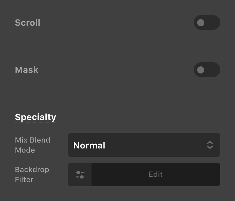
Clicking to enable this feature will reveal a list of different masking options you can choose from to get started:
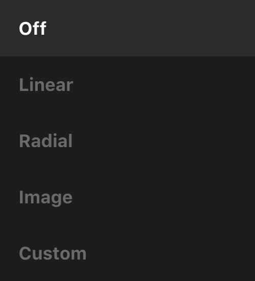
Linear allows you to apply a simple linear-gradient() mask across either the X axis or Y axis of an Element. This can be particularly useful on scrollable areas or sliders where you want to gracefully fade out your content on larger screens, or use the subtle way to indicate that there is more content to scroll to on mobile devices (a common pattern used in these scenarios).
For example, take the Perspective Carousel Slider pattern from our Modern Sliders course on a very large screen:
While the content naturally spreads from one edge of the screen to the other, you may find that having the ability to mask out the edges gives it an intriguing look that appears to gracefully fade in and out on either side:
Another helpful use case for the Linear mask would be creating subtle fades on images that have content on top. In our simple example below, notice how the first instance on the left doesn't have quite enough contrast for some of the words that fall into the lighter areas of the image. The mask on the second example helps to offset this content some and make it more readable, while still maintaining the overall visibility of our background image:
Radial applies a circular or elliptical mask on top of your content, while also allowing you to take advantage of the radial-gradient() CSS function in some unique ways in this context.
Image affords you the opportunity to use any sort of transparent .png as a mask on top of your content, with the opaque areas serving as the “window” for content to be seen through and the alpha transparency areas blocking out content.
One simple way this could be employed is using an intriguing shape (a faux logo in this case) as the mask over an Element with a background image, showcasing only the parts of the image that reside in the same part as the mask:
Custom can be used to write in multiple mask images as well as mix and match types if desired. For instance, you can mix multiple gradient types along with images to create complex masking layers.
Each of these types allow you to set the size, position, and repeat value of the mask as well, unlocking even greater design potential when leveraging this feature in your builds.
This is only a cursory overview of what is possible with the new masking module in Cornerstone. The feature-set included goes very deep and allows for a lot of intriguing possibilities in your designs. For more detailed information, be sure to check out our masking documentation online.
The Element Manager
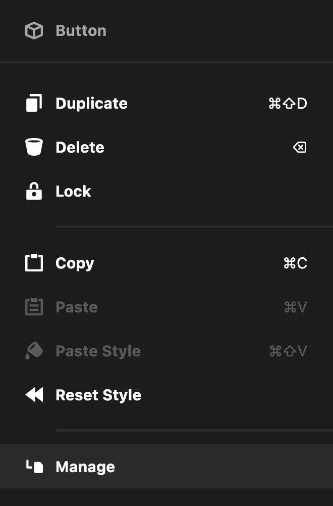
Before diving into Components and Parameters, it is important to understand a little bit about the Element Manager. This new feature can be found on any Element by right-clicking on it in the live preview, breadcrumbs, or outline, and then selecting Manage or by clicking the cog icon next to the label the currently inspected Element:
Performing either of these actions will reveal a floating control set that should look something like the following:
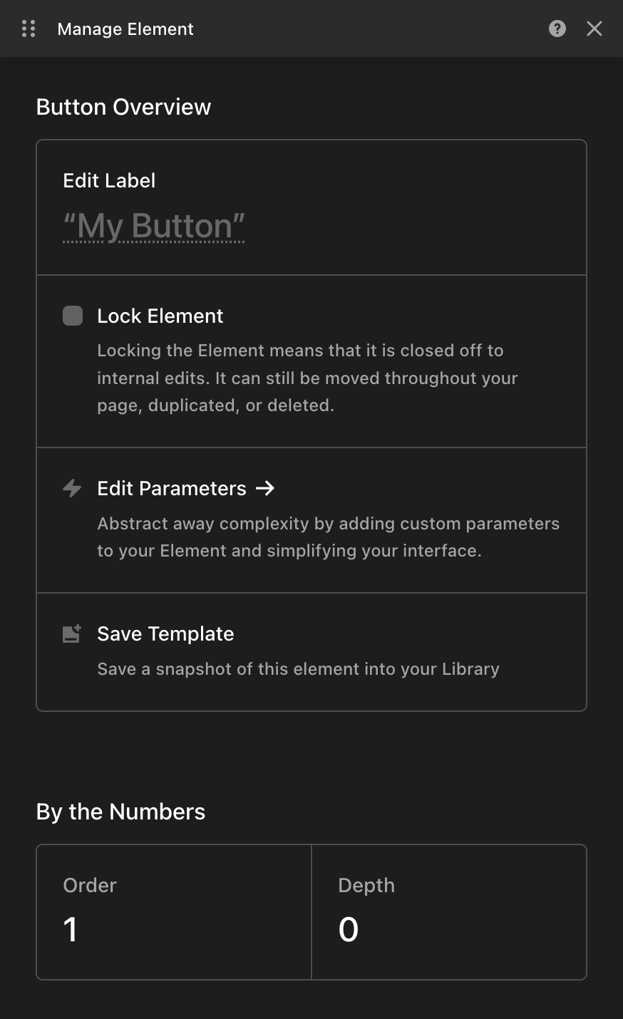
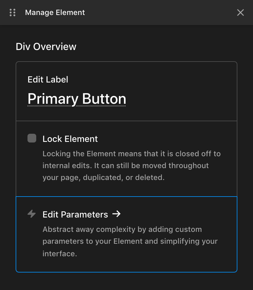
When managing a standard Element, you'll see a few options available in the Overview section up top, in addition to a fun little By the Numbers section below, which will contain various contextual stats about your Element depending on where and how it is used. The controls found in the Overview section are as follows:
- Edit Label: In addition to being able to double-click in the outline pane on an Element to rename it, you can also use this space in the Element Manager.
- Lock Element: Closes down the Element to internal edits, but still allows the Element to be moved, duplicated, or deleted. Enabling this feature will hide all child Elements in the outline pane and display a lock icon to the left of its label. This action can also be carried out from the Element context menu.
- Edit Parameters: Opens a code editor where custom controls can be wired up to make managing your Elements more tailored to your needs, and is particularly powerful when paired with Components. All of this will be covered in more detail later on.
- Save Template: Replaces the “Save as Preset” convention. Saving an Element Template effectively performs the same action, saving a snapshot of your Element at a moment in time for you to reuse at a later time if you wish. Saved templates will show up in your Element Library alongside standard Elements.
If an Element has any notable features applied to it such as a Looper or Element CSS, those will appear in an Active Statuses section within the Element Manager:
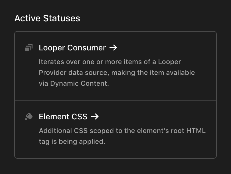
These active status items serve as quicklinks, which will take you directly to the location where that feature is managed. For example, clicking on “Element CSS” above would take you to the Element's Customize control group so that you can easily access this information if needed.
The Component Builder
You can think of Components as Element presets plus Global Blocks...on steroids. Similar to how Global Blocks functioned, Components are living versions of your design patterns that will update in real-time all throughout your site should you ever need to make updates to them in the future. The two main functions of Components are to provide a centralized repository of all your design patterns that is easily maintainable and to abstract away complexity so that the page building process can be streamlined.
For example, imagine you have a button style you wish to use all throughout your site, and you plan on using it in 100+ places. If you first made that button style into a Component and down the road you decided to change every button from red to blue, you could go update the core Component and all 100+ instances of your button would update their color at once!
That being said, there are some notable differences and improvements to how Components function compared to Global Blocks:
- Whereas Global Blocks were always wrapped in a Section Element, Components do not have to be.
- Components are managed in “Sets,” documents that can export one or more individual Components within. This is beneficial in that it allows you to manage multiple Components from one location if desired. For example, you may wish to create a “Buttons” Set that contains every button style present on your site. From this one document you can manage and export dozens of different styles if needed, rather than having to sort through numerous of individual entries when going into the Component Builder.
- Your Component exports will show up directly in the Element Library, effectively allowing you to create custom Elements.
Your First Component Set
Let's run with the example mentioned above and say we wanted to build out a Component Set called “Buttons,” where we planned on managing all of our site's button styles. To get started, go to the + next to the Cornerstone logo and add a Component (depending on your settings, this screen may look slightly different):
For the sake of this example, let's say that we only needed two button styles for our design, a Primary Button and a Secondary Button. In this situation, our Component Set might look something like the following:
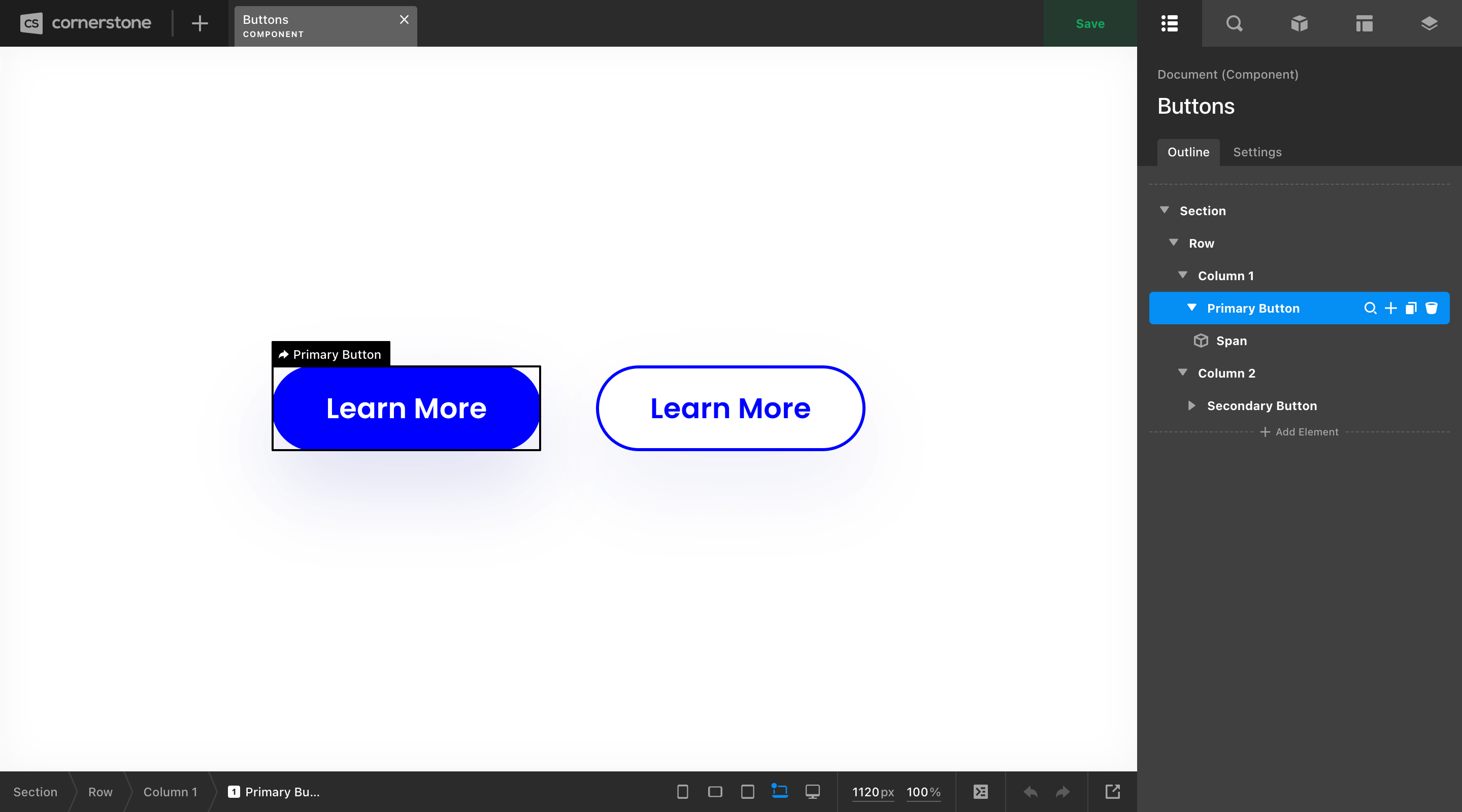
The Section, Row, and Column markup around our buttons are only there for structural purposes, giving us a canvas of sorts to organize our Elements in a clean way. None of this markup will be output with our Components because it has not been flagged for export.
To export any set of markup within this interface as a Component, open the Element Manager and locate the Export Component control and enable it:
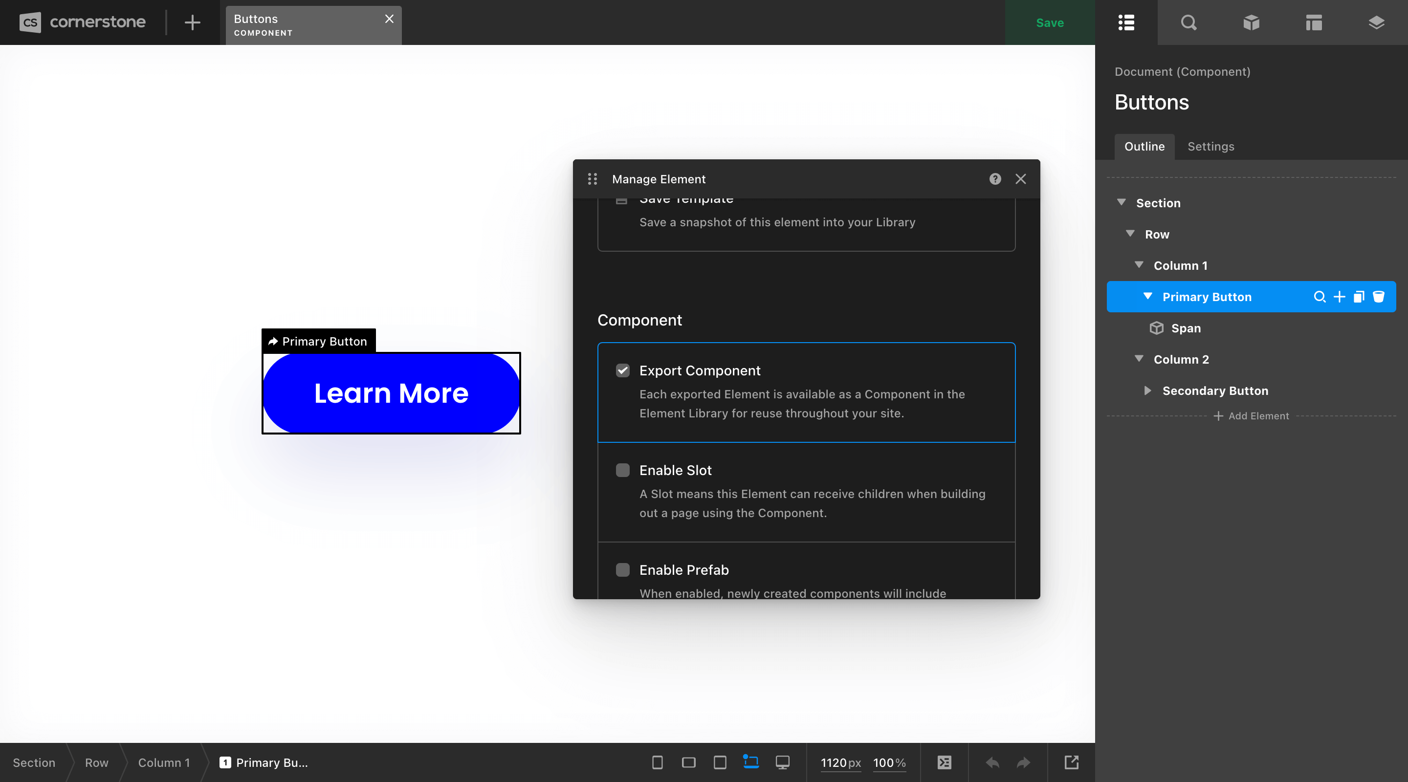
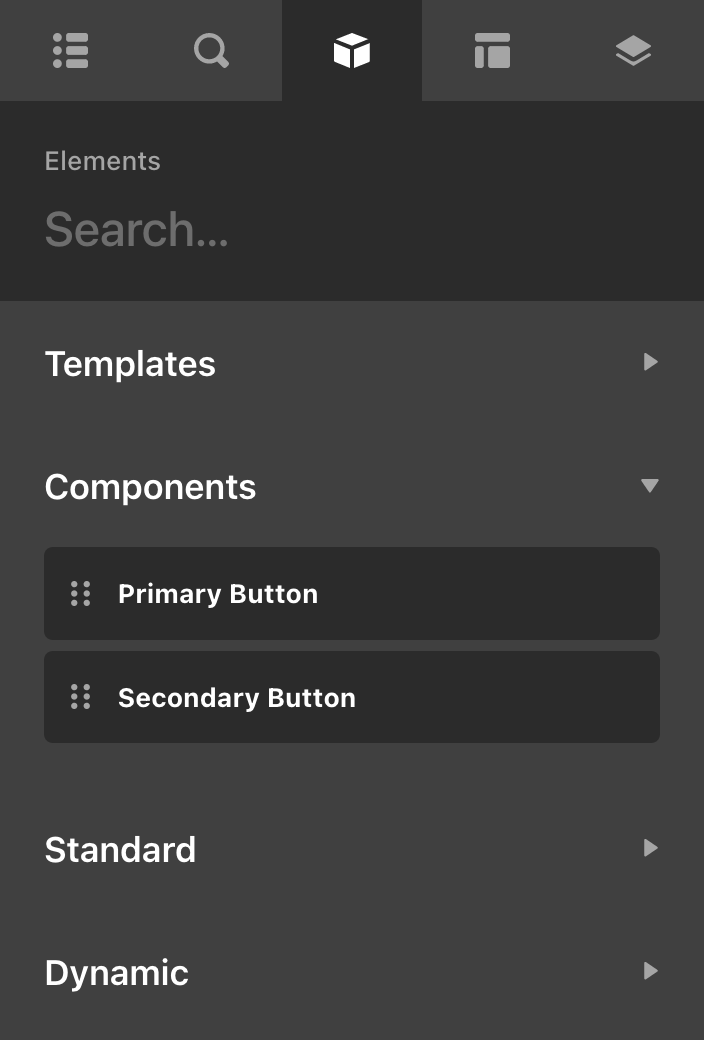
Once this is done, you will see a new status item of Component Export appear on that Element, allowing you to keep track of any individual exports you've made within a Set. As mentioned previously, you can export multiple Components within a particular set, and any exported Component will show up directly in your Element Library for use later on. In the case of this example, we have exported both of our button styles, which will show up in our Element Library like so:
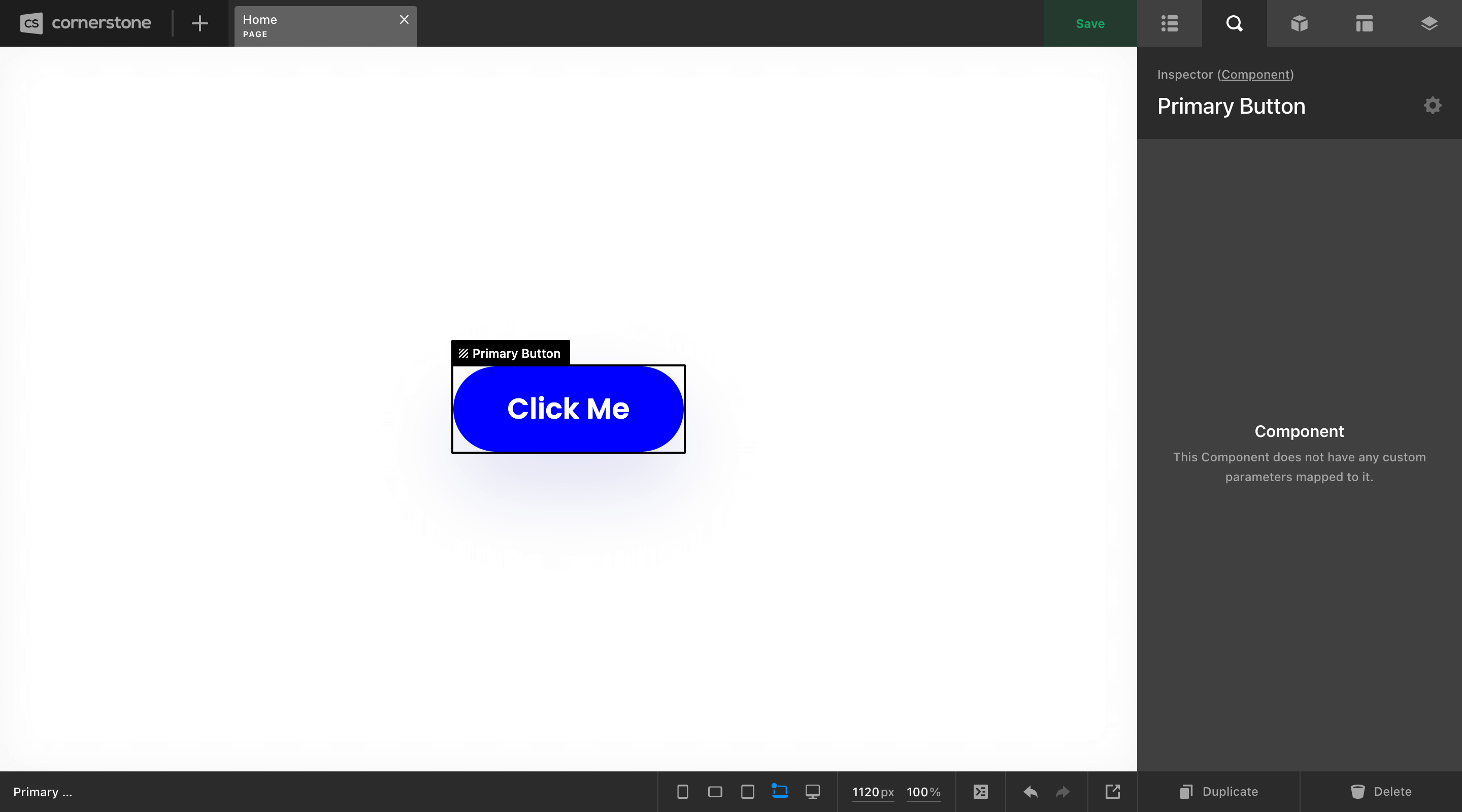
The main difference between using a Component or a standard Element in one of the other Builders is what you'll see in the inspector pane. Whereas a standard Element will be filled with controls allowing you to make adjustments, the Component will keep all of that information tucked away at the Component level, keeping things clean on the page you're working on:
Advanced Component Usage
There are a few features beyond basic Component exports that you will find very helpful for certain situations in your builds. The first of which is enabling an Element within an export as a Slot. You can think of a Slot as a consistent dropzone applied to a specific area of a Component.
For example, say that you wanted to build out a Component called “Picture Grid,” which always featured a large image to one side, and a bit of content to the other. The catch here is that you need to be able to put different content inside this component depending on where you're using it. You could enable any layout Element (i.e. Div, Cell, or Column) inside that Component as a Slot to receive variable content when you use it on the frontend.
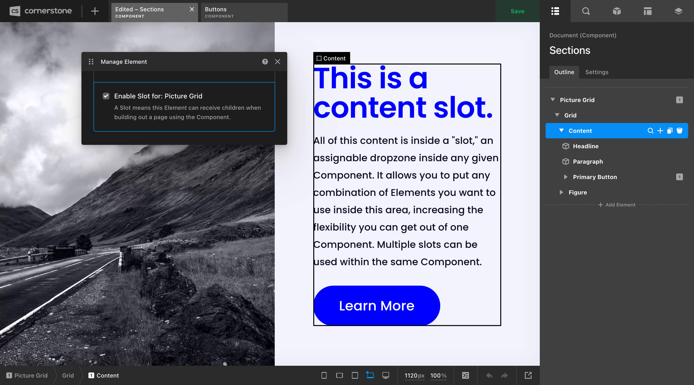
When you use this Component later on in the Page or Layout Builders, the Element you flagged as a Slot will show up as a dropzone inside the Component with a matching label based on what you called it in the Component Builder (in this case, “Content”). Similar to exports, Components can contain multiple Slots, meaning you could craft as many unique dropzones for content as you need inside any pattern you're working on.
Beyond that, there are a couple more options you might find helpful in certain situations:
- Allow Customization: Makes the “Customize” controls accessible when using the Component in other builders.
- Enable Prefab: When enabled, newly created components will include parameter values and children copied from the Component source (e.g. if you make a Component that utilizes multiple other Components as children and alter their settings, when you drag in a prefab all of those children and settings will be preserved as a starting point).
- Hide Children Control: When inspecting an instance of this Component, the Children control will be hidden. This is useful for bringing focus to other top-level content.
- Make Private: Private Components are only available for use in the Component Builder. This can be helpful in creating patterns to organize Sets with multiple exports, crafting internal documentation, et cetera.
- Library Top Level: Useful for layout Elements. These exports will be shown in the Element Library when adding an Element at the top level of the document outline.
While the Slot pattern mentioned previously works great for large blocks of variable content, it doesn't address some of the following scenarios you might have already been thinking to yourself about while working through these examples:
- “What if I want to pick a custom color for my button on a case-by-case basis?”
- “How do I change the text label or
hrefvalue for each instance of my button?” - “Is there a way to change the image and background color of the ‘Picture Grid’ pattern as needed?”
The answer to all of these questions lies with Parameters...
Parameters
Components are a fantastic tool for abstracting away complexity and bringing consistency to your designs by allowing you to create an asset once, and then use it everywhere. However, there are still plenty of situations where we need some variability in our designs, and that is where Parameters come in (sidenote: Parameters can be used on standalone Elements).
Let's take our humble Button. It is likely that if you have made this into a Component, you will want to update some content within it on a case-by-case basis. The two most common pieces of content you may wish to update within the button are its text label and href value. With Parameters, we could easily create custom controls on our button component and wire them up where necessary to expose these data-points and make them editable per instance.
Creating Your First Parameters
To begin this process, open the Element Manager for the Element you wish to work on and click on Edit Parameters,
This will bring up a JSON code editor where you can input some structured notation to achieve your desired result. In this instance, we want to expose an input for a text label and the href value, so let's go with the following:
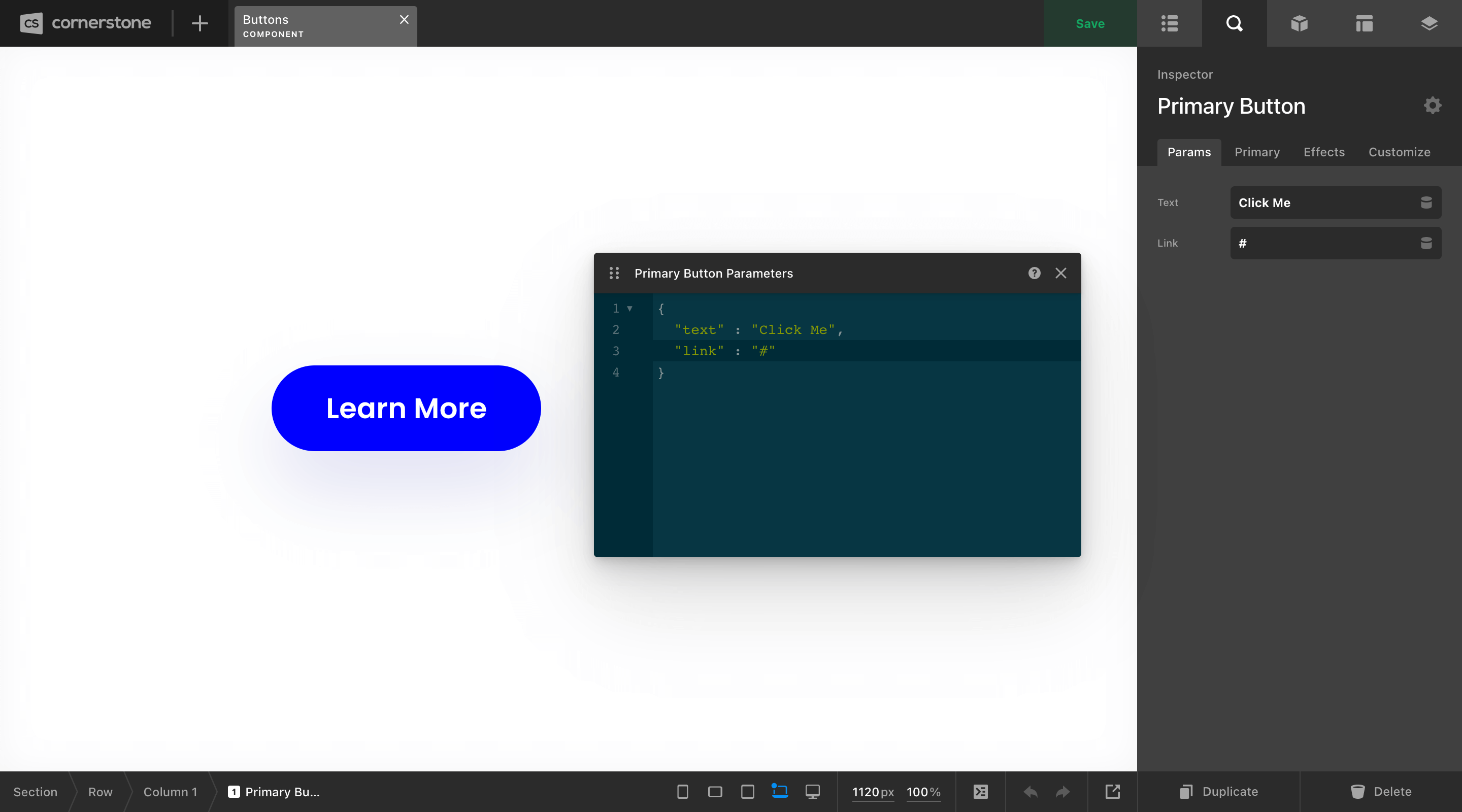
So what's happening here? Well, we have our JSON object in the code editor (e.g. {}), and then inside that we have two lines of key / value pairs, each representing a new Parameter we want to add to our Element. Each Parameter added to our Element will show up in the Params control group seen in the Inspector on the left side of the above screenshot.
The string on the left side of the : for each line is the key, which is the value we will reference in a moment when wiring up our Parameters with Dynamic Content.
The string on the right side of the : is the default value of the Parameter.
Next, we need to wire up our Parameters so that our controls are outputting properly. To do this, we'll be using Dynamic Content in the form of {{dc:p:__key__}}, where __key__ is the value of the string on the left side of the : seen in the image above. This will allow us to output the value of that key wherever we need it to go.
Let's start with our text label. For this example, our button is made up of a Div Element using an <a> as its base tag with a Headline Element inside for the label with its base tag set to <span>. Since our text output is handled by the Headline Element, we'll inspect that and place our Dynamic Content there:
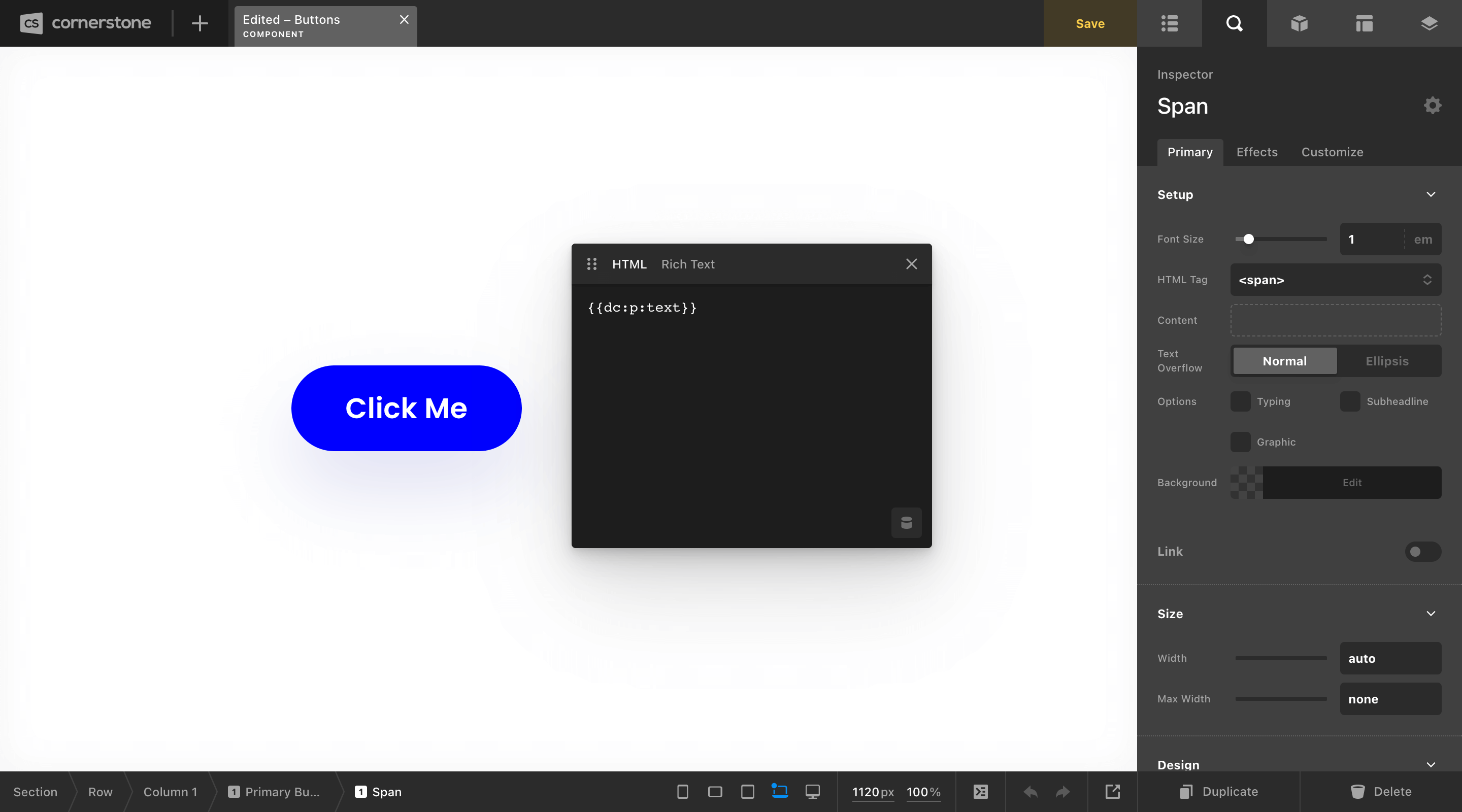
Now that we have the appropriate “plumbing” in place, the default value we set for our button's label is now pulling through. Next, we can do the same thing for our href value by plugging its Dynamic Content value into the appropriate place:
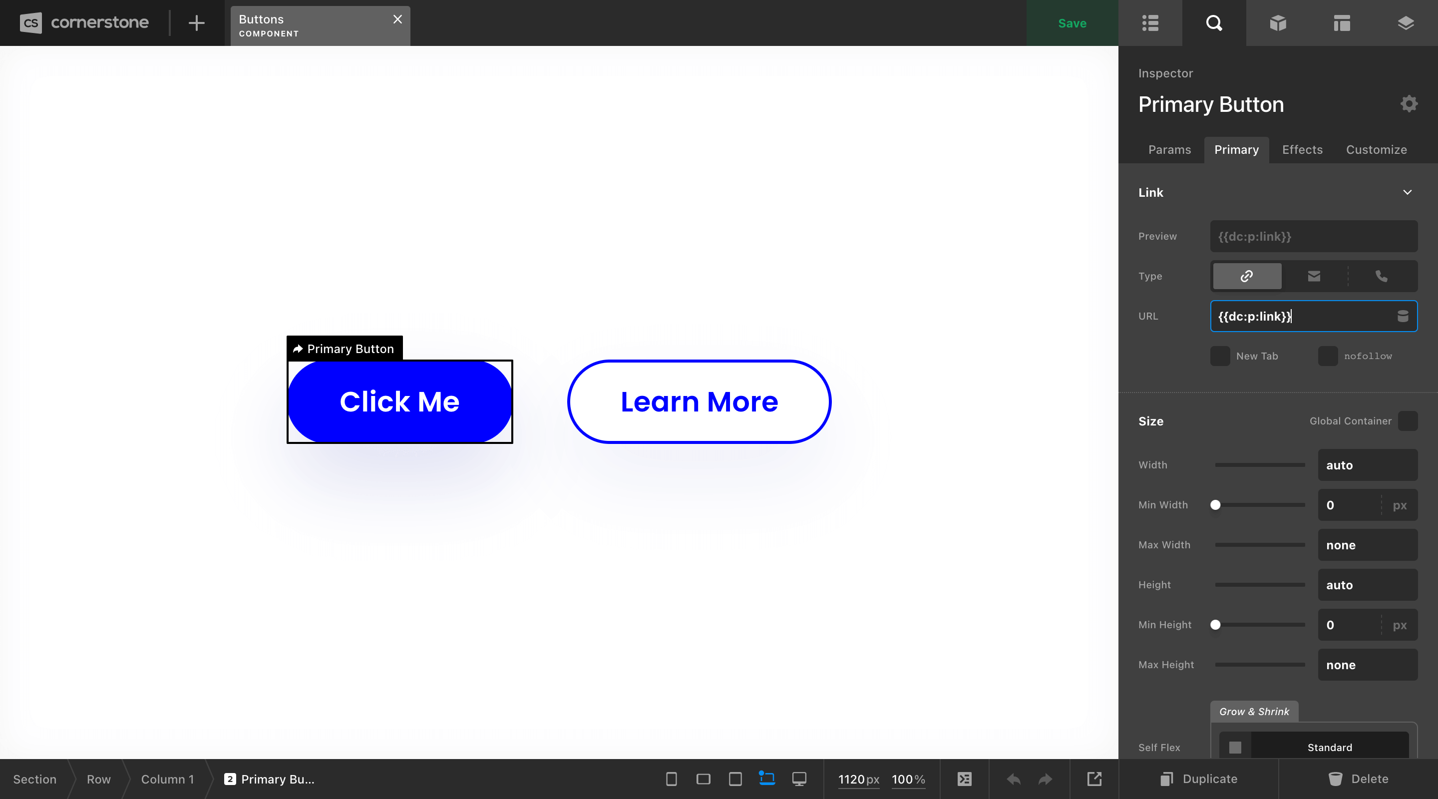
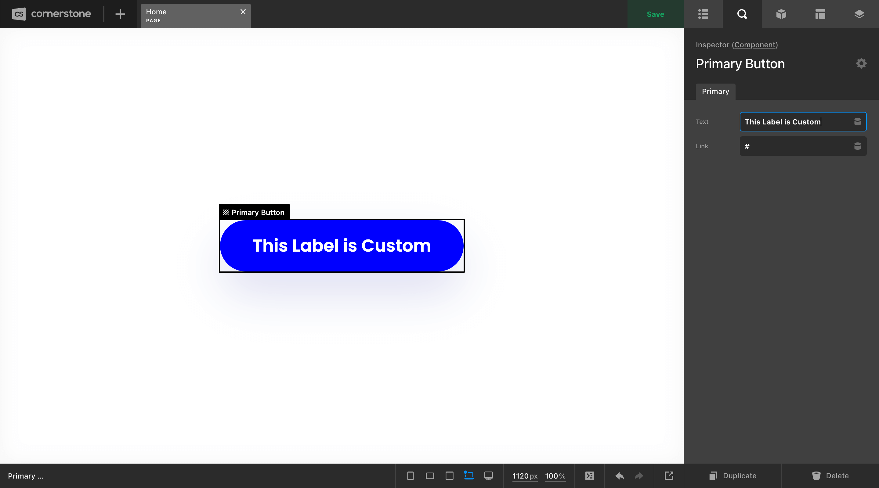
Once all of our Parameters are wired up, they are all that will be exposed in the Inspector whenever we utilize this Component in the Page or Layout Builders:
Of course, we're only beginning to scratch the surface here. 😊 There is a lot more that Parameters are capable of, and if you're interested to dive in deep, we highly recommend you check out our Parameters documentation online.
Goodbye, jQuery
We have refactored our front end javascript so jQuery is no longer a hard dependency. This will help your pages load faster, as there is one less javascript file required. There are a few exceptions when it comes to some older features that heavily utilized jQuery. Under the following cases jQuery will be conditionally enqueued:
- If you use the following Stack functionality: Ethos post carousel, fullscreen background images, masonry blog, or portfolio layouts.
- If you use the following Cornerstone functionality: Classic Slider Element, Classic Element tooltips / popovers, and the legacy ilightbox shortcode.
See It Live
Join us for a tour of the new and improved Cornerstone then learn how your old Global Blocks work with the new Components and Parameters.
Changelog
- Pro 6.0.7 - January 31, 2023
- Bugfix: Hotfix to make sure that old shortcodes are loaded even if classic elements is not turned on
- Cornerstone 7.0.7 - January 31, 2023
- Bugfix: Hotfix to make sure that old shortcodes are loaded even if classic elements is not turned on
- X 10.0.7 - January 31, 2023
- Bugfix: Hotfix to make sure that old shortcodes are loaded even if classic elements is not turned on
- Pro 6.0.6 - January 31, 2023
- Feature: WooCommerce products sold individually displayed a disabled quantity field. This is hidden by default now, use the filter `x_woocommerce_hide_sold_individually` and set to false if you want to display a disabled quantity field
- Feature: WooCommerce Archive and Singles, Post and Components have starter templates in the themeco tab
- Feature: Cross-sell element now has a type selector which will allow you choose "cart" (the default and how this element has always worked) or "product" which is new and will let you display the products cross-sells
- Feature: New filter to disable Cornerstone custom fields map `cs_use_custom_fields_map`
- Updated: Dev toolkit button have been moved to the bottom toolbar
- Bugfix: WPML Rejuvination, Creating new translations works, layouts were not getting assigned properly based on language, language was not changing between tabs if the language was different, some of our post types were not configured to translate in WPML, our WPML integration was running even if WPML was not installed
- Bugfix: grid-auto-flow was being passed an invalid value of "sparse"
- Bugfix: Archives and singles in the preview were not viewable depending on the settings for your frontpage
- Bugfix: Removal of some deprecated WordPress functions like `get_page`
- Bugfix: WooCommerce archives were conflicting with search pages that used `product_type=product`
- Bugfix: The target dropdown for links using the inline-editor was behind the popup window
- Bugfix: Icon picker was not showing a valid tab if you had disabled `solid` font awesome type
- Bugfix: AltGr was unable to be used in a regular text field due to keybindings, AltGr now never affects the key bindings
- Bugfix: Icon picker was not giving a valid default icon depending on your font awesome settings
- Bugfix: When a dropdown menu did not have an href it caused the first item in the dropdown menu to appear active
- Cornerstone 7.0.6 - January 31, 2023
- Feature: Cornerstone Standalone support for classic elements
- Feature: WooCommerce Archive and Singles, Post and Components have starter templates in the themeco tab
- Feature: Cross-sell element now has a type selector which will allow you choose "cart" (the default and how this element has always worked) or "product" which is new and will let you display the products cross-sells
- Feature: New filter to disable Cornerstone custom fields map `cs_use_custom_fields_map`
- Updated: Dev toolkit button have been moved to the bottom toolbar
- Bugfix: WPML Rejuvination, Creating new translations works, layouts were not getting assigned properly based on language, language was not changing between tabs if the language was different, some of our post types were not configured to translate in WPML, our WPML integration was running even if WPML was not installed
- Bugfix: grid-auto-flow was being passed an invalid value of "sparse"
- Bugfix: Archives and singles in the preview were not viewable depending on the settings for your frontpage
- Bugfix: WooCommerce archives were conflicting with search pages that used `product_type=product`
- Bugfix: The target dropdown for links using the inline-editor was behind the popup window
- Bugfix: Icon picker was not showing a valid tab if you had disabled `solid` font awesome type
- Bugfix: AltGr was unable to be used in a regular text field due to keybindings, AltGr now never affects the key bindings
- Bugfix: Icon picker was not giving a valid default icon depending on your font awesome settings
- Bugfix: When a dropdown menu did not have an href it caused the first item in the dropdown menu to appear active
- X 10.0.6 - January 31, 2023
- Feature: WooCommerce products sold individually displayed a disabled quantity field. This is hidden by default now, use the filter `x_woocommerce_hide_sold_individually` and set to false if you want to display a disabled quantity field
- Bugfix: Removal of some deprecated WordPress functions like `get_page`
- Bugfix: When a dropdown menu did not have an href it caused the first item in the dropdown menu to appear active
- Pro 6.0.5 - January 17, 2023
- Bugfix: Hotfix release to revert the background upper layer z-index change. We will be creating a new layer to satisfy the request of having a layer to cover content like a dark seethru color over your entire content
- Cornerstone 7.0.5 - January 17, 2023
- Bugfix: Hotfix release to revert the background upper layer z-index change. We will be creating a new layer to satisfy the request of having a layer to cover content like a dark seethru color over your entire content
- X 10.0.5 - January 17, 2023
- Bugfix: Hotfix release to revert the background upper layer z-index change. We will be creating a new layer to satisfy the request of having a layer to cover content like a dark seethru color over your entire content
- Pro 6.0.4 - January 17, 2023
- Feature: `cs_use_jquery_everywhere` filter added. Set to true by default, but will be eventually be set to false by default
- Feature: Global Colors that are Hex values will work with the alpha slider in color picker
- Feature: Breadcrumbs will display the post title of the archive page and not the post type label
- Feature: Nav Menus created in WordPress will render Dynamic Content, use the filter `cs_use_dynamic_content_in_nav_menu` and set to false if this is conflicting with another plugin
- Feature: Top Level element types like sections were hidden in the element library
- Feature: Element Library added a "Plus" icon to add given element to a new region
- Feature: Error message when trying to export and php-zip is not installed
- Updated: Element Manager popup has been localized
- Bugfix: jQuery was being queued in the wrong spot giving a warning
- Bugfix: Navigating off-canvas was preventing scrolling after
- Bugfix: Classic Feature box animation were not working past the first animation
- Bugfix: One page navigation fixes like auto-closing off-canvas and smooth scrolling to anchored content
- Bugfix: Debug code was output when using strings as an expression IE `(JOIN / SUBSCRIBE)`
- Bugfix: Using the default template for a post was not working in the builder if you were using a WordPress template
- Bugfix: Color picker was reseting it's hue value if you dragged the color outside of it's bounds
- Bugfix: WooCommerce Archives that had a looper in them would not properly change the `post` Dynamic Content variables.
- Bugfix: Trailing slashes added to legacy site import to prevent sites without request redirects
- Bugfix: Background Upper z-index was off requiring you to set content inside the box to have a negative z-index
- Bugfix: Contact Form 7 Spinner / Ajax Loader had a class name change and is changed on our end. Upgrade Contact Form 7 if you lose the loading spinner
- Bugfix: Safari mac Save Document popup was hidden behind the live preview
- Bugfix: z-index of Upper Background layer was too low
- Bugfix: Gutenburg requiring React 18 was crashing Cornerstone
- Bugfix: Templates "Create" permission was not being properly set in the admin permissions page
- Bugfix: Legacy Navigation Collapsed's padding was also controlled by the "Sub Links" padding
- Cornerstone 7.0.4 - January 17, 2023
- Feature: Global Colors that are Hex values will work with the alpha slider in color picker
- Feature: Breadcrumbs will display the post title of the archive page and not the post type label
- Feature: Nav Menus created in WordPress will render Dynamic Content, use the filter `cs_use_dynamic_content_in_nav_menu` and set to false if this is conflicting with another plugin
- Feature: Top Level element types like sections were hidden in the element library
- Feature: Element Library added a "Plus" icon to add given element to a new region
- Feature: Error message when trying to export and php-zip is not installed
- Updated: Element Manager popup has been localized
- Bugfix: jQuery was being queued in the wrong spot giving a warning
- Bugfix: Navigating off-canvas was preventing scrolling after
- Bugfix: Classic Feature box animation were not working past the first animation
- Bugfix: One page navigation fixes like auto-closing off-canvas and smooth scrolling to anchored content
- Bugfix: Debug code was output when using strings as an expression IE `(JOIN / SUBSCRIBE)`
- Bugfix: Using the default template for a post was not working in the builder if you were using a WordPress template
- Bugfix: Color picker was reseting it's hue value if you dragged the color outside of it's bounds
- Bugfix: WooCommerce Archives that had a looper in them would not properly change the `post` Dynamic Content variables.
- Bugfix: Trailing slashes added to legacy site import to prevent sites without request redirects
- Bugfix: Background Upper z-index was off requiring you to set content inside the box to have a negative z-index
- Bugfix: Contact Form 7 Spinner / Ajax Loader had a class name change and is changed on our end. Upgrade Contact Form 7 if you lose the loading spinner
- Bugfix: Safari mac Save Document popup was hidden behind the live preview
- Bugfix: z-index of Upper Background layer was too low
- Bugfix: Gutenburg requiring React 18 was crashing Cornerstone
- Bugfix: Templates "Create" permission was not being properly set in the admin permissions page
- Bugfix: Legacy Navigation Collapsed's padding was also controlled by the "Sub Links" padding
- X 10.0.4 - January 17, 2023
- Feature: Breadcrumbs will display the post title of the archive page and not the post type label
- Bugfix: jQuery was being queued in the wrong spot giving a warning
- Bugfix: Navigating off-canvas was preventing scrolling after
- Bugfix: Classic Feature box animation were not working past the first animation
- Bugfix: One page navigation fixes like auto-closing off-canvas and smooth scrolling to anchored content
- Bugfix: Trailing slashes added to legacy site import to prevent errors on sites without request redirects
- Bugfix: Contact Form 7 Spinner / Ajax Loader had a class name change and is changed on our end. Upgrade Contact Form 7 if you lose the loading spinner
- Bugfix: Legacy Navigation Collapsed's padding was also controlled by the "Sub Links" padding
- Pro 6.0.3 - January 7, 2023
- Feature: Components now have a shortcode `[cs_component id='...']` to access from across wordpress similar to global blocks
- Bugfix: Frontend images were displaying when there was no image src
- Bugfix: Individual tabs were not being hidden by their breakpoints
- Bugfix: Youtube "src is not defined" error removed
- Bugfix: Certain migrations from pro5 were causing a fatal error
- Bugfix: Close button in content dock was not a correct html entity
- Bugfix: Old Navigation Layered was not being hidden by it's breakpoints
- Bugfix: Google Font weights were not loading properly
- Bugfix: jQuery added back in to support older Themeco plugins
- Bugfix: Site import for everything, but the starter site was not importing page data
- Bugfix: Individual tabs were not being hidden by their conditions
- Bugfix: Woo Checkout Editor was having a fatal issue when woocommerce had no country or states data
- Bugfix: Legacy Site Importing was not importing fonts and font weights
- X 10.0.3 - January 7, 2023
- Bugfix: Close button in content dock was not a correct html entity
- Bugfix: Google Font weights were not loading properly
- Bugfix: jQuery added back in to support older Themeco plugins
- Bugfix: Woo Checkout Editor was having a fatal issue when woocommerce had no country or states data
- Bugfix: Youtube "src is not defined" error removed
- Cornerstone 7.0.3 - January 7, 2023
- Feature: Components now have a shortcode `[cs_component id='...']` to access from across wordpress similar to global blocks
- Bugfix: Frontend images were displaying when there was no image src
- Bugfix: Individual tabs were not being hidden by their breakpoints
- Bugfix: Old Navigation Layered was not being hidden by it's breakpoints
- Bugfix: Google Font weights were not loading properly
- Bugfix: Site import for everything, but the starter site was not importing page data
- Bugfix: Individual tabs were not being hidden by their conditions
- Bugfix: Legacy Site Importing was not importing fonts and font weights
- Pro 6.0.2 - December 31, 2022
- Bugfix: Custom Fonts were not falling back to family name when font family stack was not set
- Bugfix: Video lock plugin was redeclaring a function and having a fatal error
- Bugfix: Submenu buttons ons X headers were not working
- Bugfix: Bar content scrolling buttons were being hidden improperly
- Bugfix: Searching by site name in the creator pane was not working, site installs still do not work for post content only colors and settings
- Bugfix: Sticky headers that had hidden view breakpoints were leaving empty space on the page in their empty breakpoints
- Bugfix: WooCommerce Taxonomy archives were getting defined as single layouts and not working as a result
- X 10.0.2 - December 31, 2022
- Bugfix: Custom Fonts were not falling back to family name when font family stack was not set
- Bugfix: Video lock plugin was redeclaring a function and having a fatal error
- Bugfix: Submenu buttons ons X headers were not working
- Bugfix: Searching by site name in the creator pane was not working, site installs still do not work for post content only colors and settings
- Cornerstone 7.0.2 - December 31, 2022
- Bugfix: Custom Fonts were not falling back to family name when font family stack was not set
- Bugfix: Bar content scrolling buttons were being hidden improperly
- Bugfix: Searching by site name in the creator pane was not working, site installs still do not work for post content only colors and settings
- Bugfix: Sticky headers that had hidden view breakpoints were leaving empty space on the page in their empty breakpoints
- Bugfix: WooCommerce Taxonomy archives were getting defined as single layouts and not working as a result
- Pro 6.0.1 - December 28, 2022
- Feature: Filter `cs_use_wordpress_page_template` added to default to Cornerstone template when editing a page created outside of Cornerstone. Default is true set to false to always use Cornerstone default template
- Feature: Dynamic Content `{{dc:url:full_path}}` added which combines site URL and current path
- Feature: Inspector Breakout Mode fully released. Use `ctl+alt+b` to enter this mode in the inspector to display all controls as text fields. Currently not available for checkbox fields
- Updated: Google Fonts list
- Updated: Release notes URL
- Bugfix: Yoast sitemap was doubling featured image number
- Bugfix: Content Dock using invalid CSS feature in older browser versions
- Bugfix: Fatal error when editing page created outside of Cornerstone and page assigned elsewhere
- Bugfix: WooCommerce cart dropdown was having extra margin applied to it on pages not created with Cornerstone
- Bugfix: Under construction plugin would have a fatal error when using a custom page
- Bugfix: Under construction plugin gave undefined index warnings when upgrading
- Bugfix: Duplicated Component Workspaces would not properly export components
- Bugfix: Retina images with odd numbers would give invalid width and heights with decimals
- Bugfix: Typing text would not render properly without suffix or prefix in the preview
- Bugfix: Z index of code editor linter tooltips was too low
- X 10.0.1 - December 28, 2022
- Updated: Google Fonts list
- Updated: Release notes URL
- Bugfix: Yoast sitemap was doubling featured image number
- Bugfix: X was asking for cornerstone validation after you had already validated
- Bugfix: Content Dock using invalid CSS feature in older browser versions
- Bugfix: WooCommerce cart dropdown was having extra margin applied to it on pages not created with Cornerstone
- Bugfix: Under construction plugin would have a fatal error when using a custom page
- Bugfix: Under construction plugin gave undefined index warnings when upgrading
- Bugfix: Retina images with odd numbers would give invalid width and heights with decimals
- Cornerstone 7.0.1 - December 28, 2022
- Feature: Filter `cs_use_wordpress_page_template` added to default to Cornerstone template when editing a page created outside of Cornerstone. Default is true set to false to always use Cornerstone default template
- Feature: Dynamic Content `{{dc:url:full_path}}` added which combines site URL and current path
- Feature: Inspector Breakout Mode fully released. Use `ctl+alt+b` to enter this mode in the inspector to display all controls as text fields. Currently not available for checkbox fields
- Updated: Google Fonts list
- Updated: Release notes URL
- Bugfix: Fatal error when editing page created outside of Cornerstone and page assigned elsewhere
- Bugfix: Under construction plugin would have a fatal error when using a custom page
- Bugfix: Under construction plugin gave undefined index warnings when upgrading
- Bugfix: Duplicated Component Workspaces would not properly export components
- Bugfix: Retina images with odd numbers would give invalid width and heights with decimals
- Bugfix: Typing text would not render properly without suffix or prefix in the preview
- Bugfix: Z index of code editor linter tooltips was too low
- Pro 6.0.0 - December 21, 2022
- Feature: Component Builder
- Feature: Parameters
- Feature: Masking Effects
- Updated: Holding CMD / Ctrl will allow any element to be added top level
- Updated: Sections can now be used in the Header and Footer builders
- Updated: When Inspecting an element, children are presented using a scoped version of the Outline
- Updated: Dynamic Content now works in Element CSS
- Updated: The “Exit” link in the Document Navigation now always goes to the root WordPress admin page—contextual links can be used under Outline → Settings on pages, posts, et cetera using the arrow found across from the “General” label
- Updated: New “Go Up One Level” navigation button in the Inspector Workspace header that allows users to quickly traverse up a tree of Elements (found next to the Element Manager cog)
- Updated: Changed the color used for empty dropzones / “Choose a Layout” / receiving styles in the live preview so that it better works across dark backgrounds
- Updated: Remove hash_scrolling_offset and scrollspy_offset JS hooks and implement single fixed_top_offset hook
- Updated: Added hash_scrolling_config to expose access to duration and easing for hash scrolling
- Updated: Self-hosted videos now have options for object-fit and object-position
- Updated: jQuery is no longer loaded unless using masonry blog/portfolio, the Ethos post carousel, or site wide BG images
- Updated: jQuery is no longer loaded unless using the classic slider element, ilightbox, or classic element tooltips
- Updated: New script for disabled offscreen scrolling to avoid layout shift
- Bugfix: Fixed link active state not updating for final one page navigation items when reaching bottom of page
- Bugfix: Fix no-js class not being replaced with js on load
- Bugfix: Fix Classic Counter and Text Type elements not updating
- Bugfix: Fix Scroll Top anchor not appearing
- Bugfix: Fix Classic Google Maps Hue control
- Bugfix: Fix Column Fill setting always using lowest responsive styling value
- Bugfix: Fix Gravity Forms AJAX setting not working in Form Integration element
- Bugfix: Fix Interaction effect animations only running once
- Bugfix: Fix WooCommerce Add To Card Notification not allowing global colors
- X 10.0.0 - December 21, 2022
- Updated: jQuery is no longer loaded unless using masonry blog/portfolio, the Ethos post carousel, or site wide BG images
- Bugfix: Fix Scroll Top anchor not appearing
- Bugfix: Fix WooCommerce Add To Card Notification not allowing global colors
- Cornerstone 7.0.0 - December 21, 2022
- Feature: Component Builder
- Feature: Parameters
- Feature: Masking Effects
- Updated: Holding CMD / Ctrl will allow any element to be added top level
- Updated: When Inspecting an element, children are presented using a scoped version of the Outline
- Updated: Dynamic Content now works in Element CSS
- Updated: The “Exit” link in the Document Navigation now always goes to the root WordPress admin page—contextual links can be used under Outline → Settings on pages, posts, et cetera using the arrow found across from the “General” label
- Updated: New “Go Up One Level” navigation button in the Inspector Workspace header that allows users to quickly traverse up a tree of Elements (found next to the Element Manager cog)
- Updated: Changed the color used for empty dropzones / “Choose a Layout” / receiving styles in the live preview so that it better works across dark backgrounds
- Updated: Remove hash_scrolling_offset and scrollspy_offset JS hooks and implement single fixed_top_offset hook
- Updated: Added hash_scrolling_config to expose access to duration and easing for hash scrolling
- Updated: Self-hosted videos now have options for object-fit and object-position
- Updated: jQuery is no longer loaded unless using the classic slider element, ilightbox, or classic element tooltips
- Updated: Added cs_disable_wp_extraneous filter to optionally disable Gutenburg and emoji detection output
- Updated: New script for disabled offscreen scrolling to avoid layout shift
- Bugfix: Fixed link active state not updating for final one page navigation items when reaching bottom of page
- Bugfix: Fix no-js class not being replaced with js on load
- Bugfix: Fix Classic Counter and Text Type elements not updating
- Bugfix: Fix Classic Google Maps Hue control
- Bugfix: Fix Column Fill setting always using lowest responsive styling value
- Bugfix: Fix Gravity Forms AJAX setting not working in Form Integration element
- Bugfix: Fix Interaction effect animations only running once
FAQ
Status
- 12/20/22: Pro 6.0.0, X 10.0.0, and Cornerstone 7.0.0 available via manual updates
- 12/27/22: Pro 6.0.1, X 10.0.1, and Cornerstone 7.0.1 available via manual and automatic updates
- 12/30/22: Pro 6.0.2, X 10.0.2, and Cornerstone 7.0.2 available via manual and automatic updates
- 01/06/23: Pro 6.0.3, X 10.0.3, and Cornerstone 7.0.3 available via manual and automatic updates
- 01/16/23: Pro 6.0.4, X 10.0.4, and Cornerstone 7.0.4 available via manual and automatic updates
- 01/16/23: Pro 6.0.5, X 10.0.5, and Cornerstone 7.0.5 available via manual and automatic updates
- 01/30/23: Pro 6.0.6, X 10.0.6, and Cornerstone 7.0.6 available via manual and automatic updates
- 01/30/23: Pro 6.0.7, X 10.0.7, and Cornerstone 7.0.7 available via manual and automatic updates
The following confirmed issues are specific to this cycle. If listed here we are planning to address it in a subsequent point release. Items will be crossed off as they are corrected and you will see corresponding notes in the changelog above.
- Fixed in 6.0.6
creating new WPML content is not working like it should - Fixed in 6.0.4
Top level components like Section and Bar do not show up in the Element Library tab. Hold down CTRL to open the element library in the outline to see your top level components - Fixed in 6.0.3
Installing from a site will not copy page content, just colors and settings - Fixed in 6.0.2
Product taxonomies are unable to assign archives to