Status
Report
October 2, 2020
Hello Everyone,
Happy Fall to our Themeco friends and family! Beta testing is underway for our next development cycle, and we wanted to tell you more about the exciting new features. This is a significant update, and we can't wait to get it into your hands.
New User Interface
First up was a refresh to the builder experience. Much of this was connecting dots and streamlining interactions (and getting rid of Ember). React now powers everything, and in addition to a slick new interface, we were able to reduce overall JavaScript by 30%!
From a customer facing perspective, our main priority was to reduce interruptions and unnecessary clicking. The initial feedback has been phenomenal, and we invite you to take a look at just a few of the key highlights.
- Theme Options in the Builders - Quickly setup and manage global options without leaving the builder. This will be even more helpful when we reboot theme options in a future update.
- Consistent Interface - All control styling has been unified with a helpful on/off toggle for items you may not need. Now you can manage what you see, and more importantly, what you don’t.
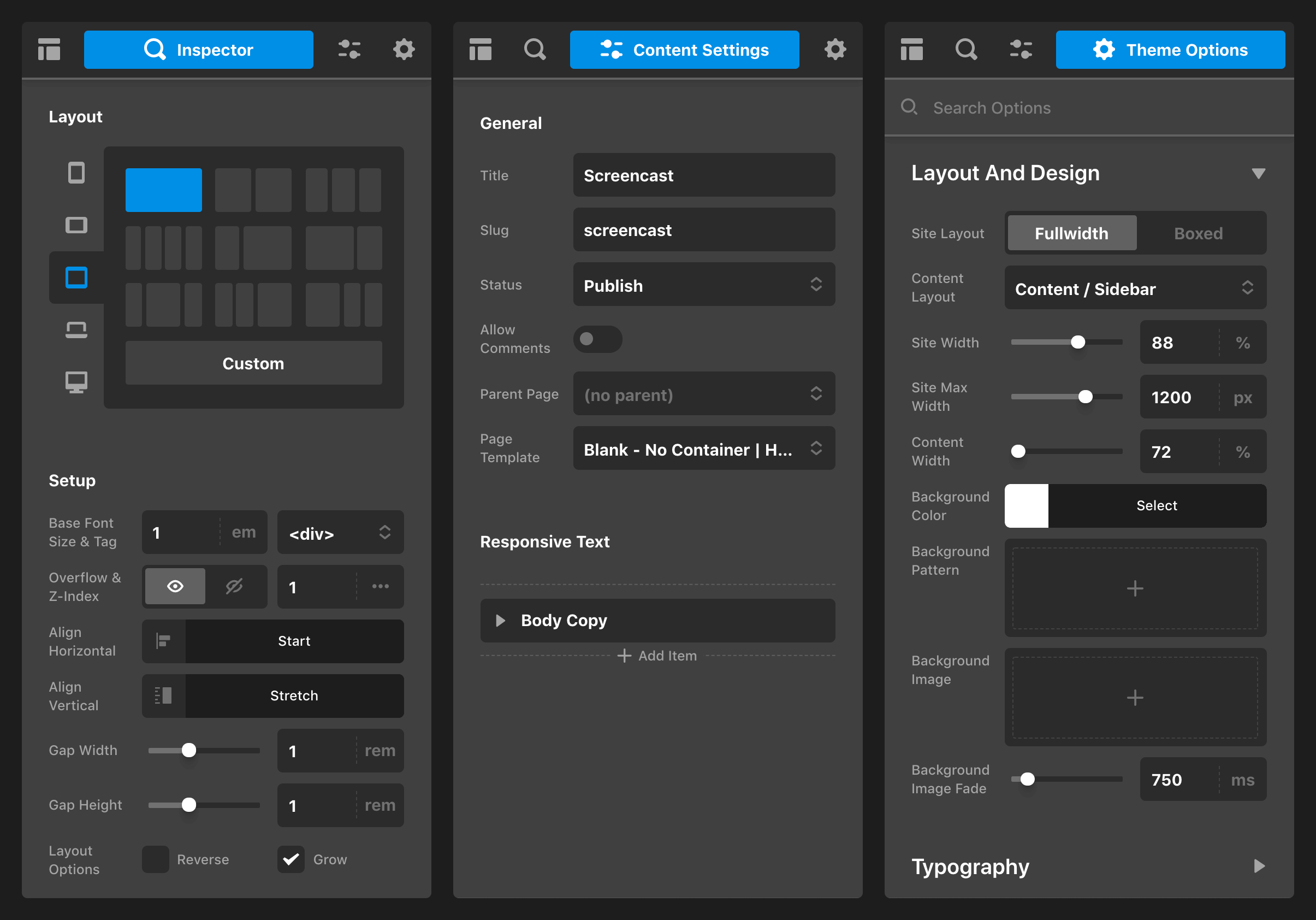
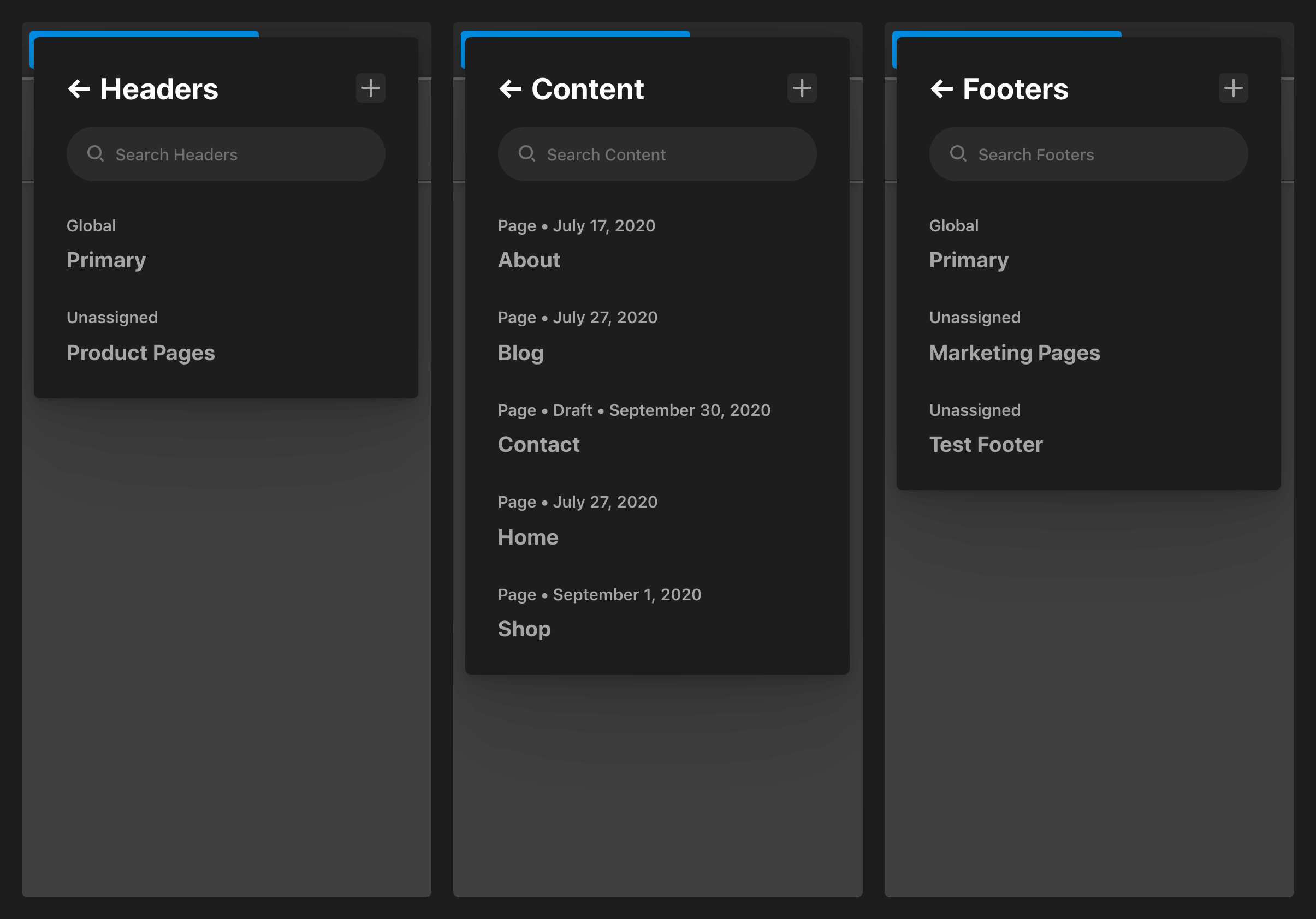
- Consolidation of Patterns - Years of development can bring some nuanced approaches to different parts of the builder. We cleaned all of that up by streamlining a few of the most important conventions across the entire family of builders.
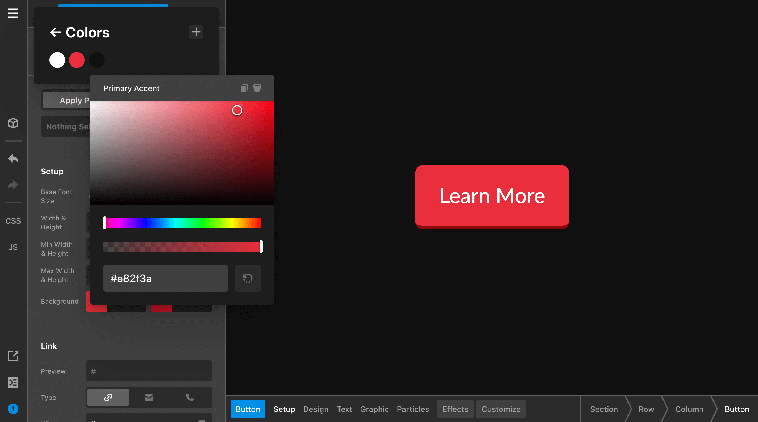
- Fonts/Colors Update - A small but significant tweak, all colors and fonts can be changed in real time in the builder without having to visit another panel. You’ll see the changes take effect on whatever page or post you’re viewing.
- Undo/Redo Everywhere - Bringing visibility to your action history is a helpful way to speed up both building and deconstructing a page.
- Revamped Code Editors - Both global and on-page CSS and JS are now accessible everywhere in the builders. You code jockeys will really love this improvement.
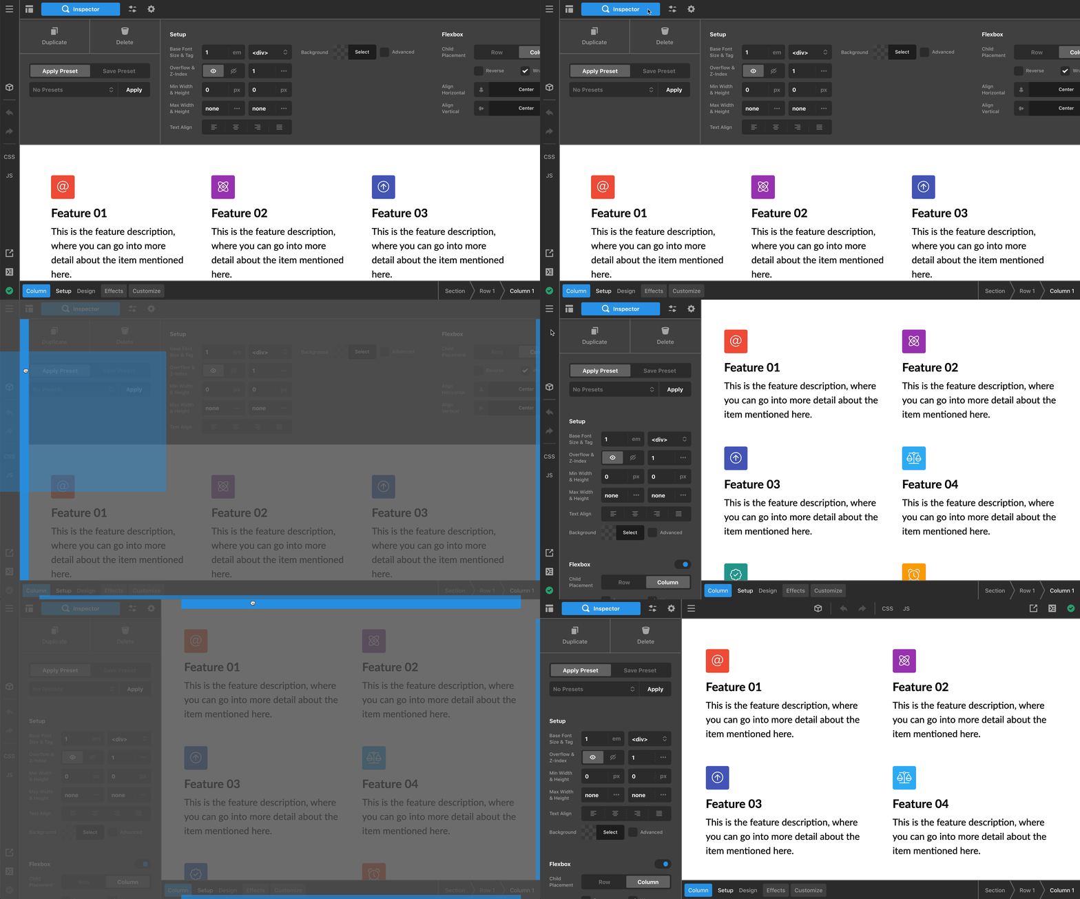
- Customizable Workspace - We all have different preferences and the entire builder interface is now movable, resizable, and snappable to your individual preferences.
Layout Builder
We’ve had our eye on this builder for some time. In many ways, it’s been the missing piece to our powerful family of builders. Now the same experience you know and love is at your disposal for layouts all throughout your site and shop!
- Low Level Power - The layout of a page is its most fundamental building block, and our Layout Builder allows you to think creatively with how you go about designing. And not just for part of your site...all of it including pages, posts, index pages, archives, and more.
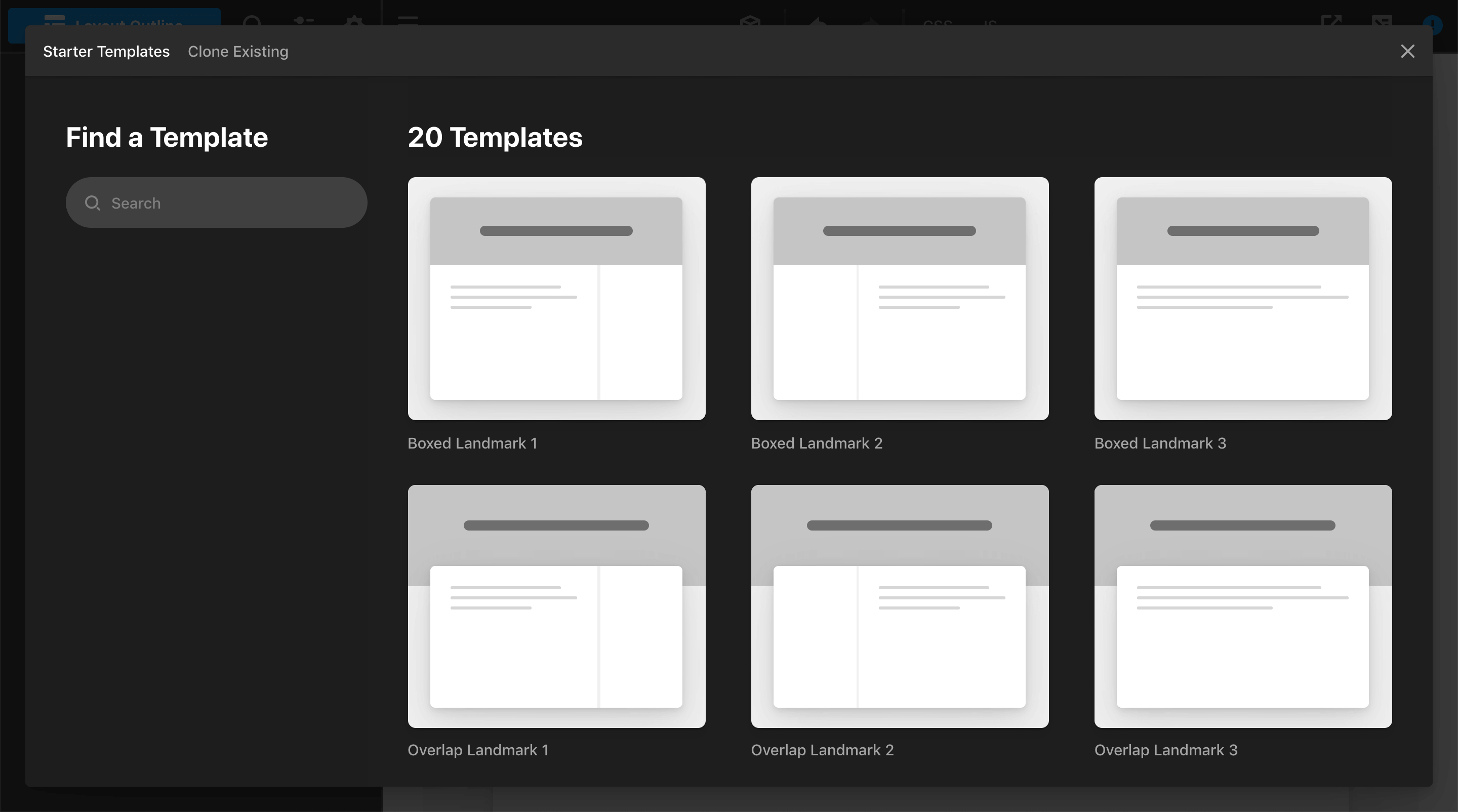
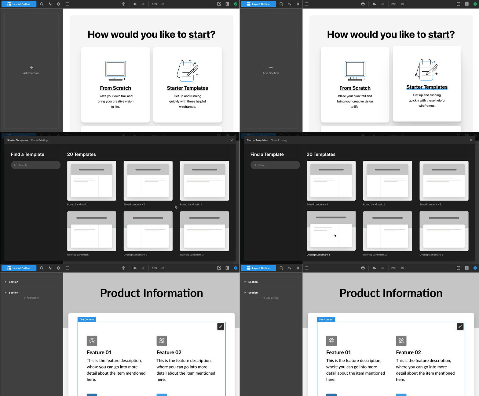
Truly Unlimited Potential - Our team likes to think outside of the box. And doing that means building a tool that allows you to build in ways we haven’t imagined. That requires a deep understanding of the fundamental challenges (and opportunities) in designing modern web layouts then providing you the canvas to create. Much of the power in the Layout Builder is in the way we have layered these aspects together. Looking for a quick starting point? Try one of our new Starter Templates. Want a full design and deconstruct from there? Install an asset from Design Cloud. Have a layout you already like? Clone it and use it as a starting point. Want to build something completely from scratch? Now you can with the latest web tech and specs.
Introducing Dynamic "Pre-Fab" Elements - Our Elements already allow for a high degree of customizability. But when you marry that with a powerful dynamic engine that groups pre-configured Elements, you can really hit the ground running. Now you can design in a familiar experience with full access to a range of dynamic Elements and content. We've also introduced a helpful new Div Element and a native Dev Console that we know you are going to love.
Effects Module
Infusing character into your web designs is so much more than just colors and forms—it's also the additive effect of nuanced layering and introducing "life" and motion where appropriate. We wanted to give our customers an entirely new paradigm for building with these types of details in mind, and that's where the Effects Module comes into play.
The Effects Module is powered by 4 foundational pieces:
- Opacity - Allowing you to specify a value of how transparent a certain element should appear.
- Filters - This relatively brand new property allows users to leverage powerful graphical effects such as blur or color shifting to elements.
- Transforms - Opens up possibilities to rotate, scale, skew, or translate (move) an element.
- Animations - Typically combine one or more of the properties mentioned above into complex functions that cannot be achieved with simple CSS properties. All of the animations utilized in the Effects module are powered by animate.css, which features a wide array of pre-built animations that will have you bouncing, fading, flipping, rolling, rotating, sliding, and zooming in no time!
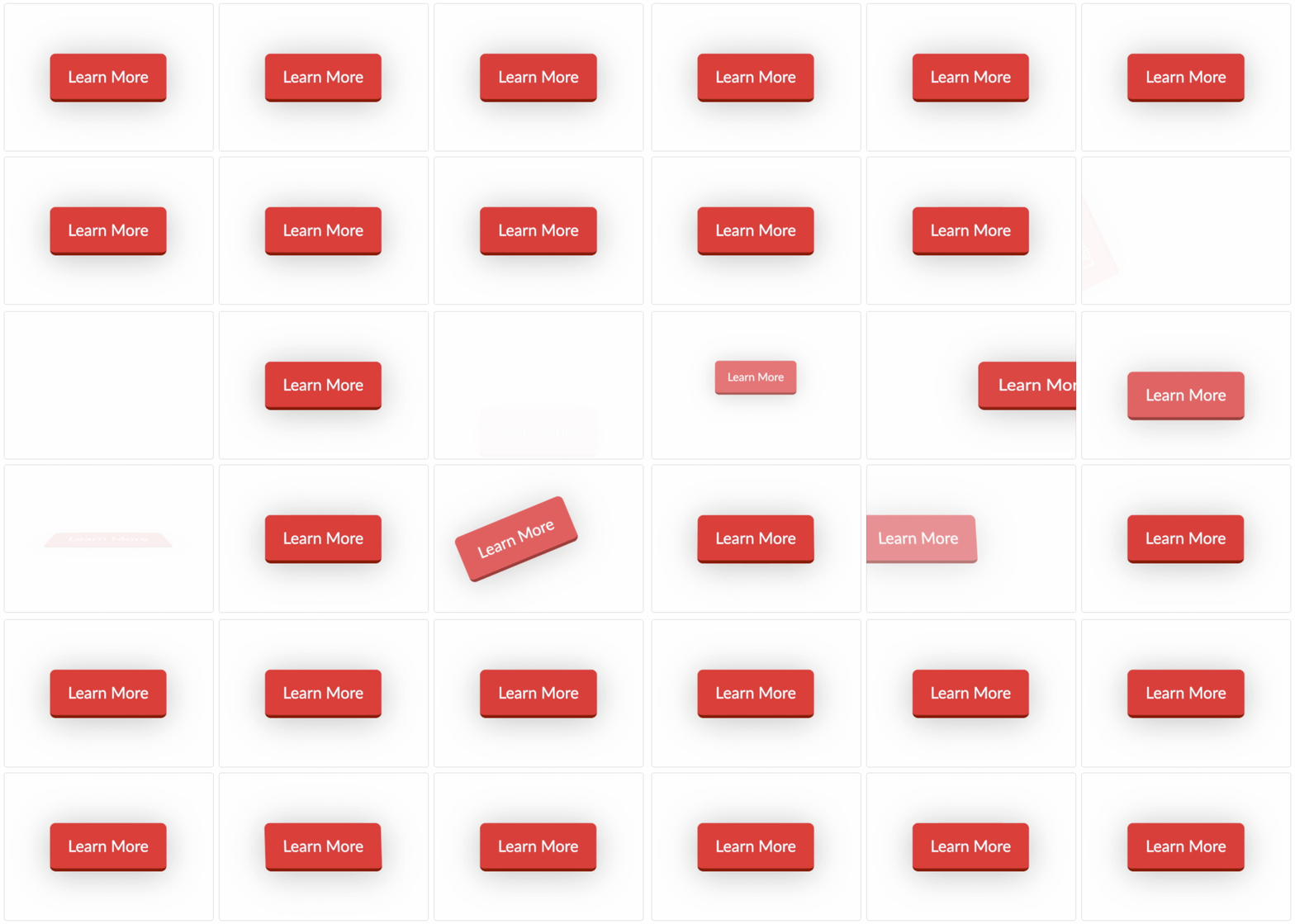
The properties mentioned above can be applied in 3 different ways:
- Statically - Depending on the Element you're styling, you may wish to simply add a permanent bit of transparency via some opacity or skew and rotate and element to give it a faux 3d appearance. This is all now a click away with the Effects Module.
- Interactive -This styling is triggered when a user mouses over or engages with the element in question. So if you want your button to wiggle or your column to translate up when a user hovers over it, interactive styling will be your new best friend.
- Scroll - The Effects Module features a powerful yet simple to operate portion based on scroll handlers, allowing you to trigger animations on any Element as it enters or exits a user's viewport. These animations can be chained across multiple Elements to add complex and engaging motion to your websites.

The three application methods mentioned above are all additive, meaning they can build on top of each other to add even more depth to your designs. For instance, you may wish to have a button slide in on scroll as it enters a user's viewport and then have it jiggle on hover from a user's mouse. This is only the beginning of what is possible using the brand new Effects Module.
Final Thoughts
There is much more to this update including a new "Getting Started" screen in every builder. Now you can start from scratch, use a starter template, or clone an existing part of your site. In conjunction with Design Cloud, this gives you a wide range of options for building the perfect website for you or your client.

In other exciting news, our very own Matt Frost will be speaking this month at the WP Agency Summit about how to scale an agency. If you build sites for clients and want to grow your business, then I encourage you to check out his session. He will be pulling back the curtain on our own recruitment process including how to subcontract successfully. The summit takes place between Oct 12-16, is held virtually, and is free to attend. Learn more and get your ticket.
For the latest on our update schedule throughout the month, be sure to follow us on Facebook and Twitter. We'll let you know as we get through the various phases and when the official release will be launched. Wishing you and yours a safe and healthy October!
All my best,
Kyle