Release
Notes
November 20, 2019
3.1.2
7.1.2
4.1.2
While we're always excited for release day around Themeco HQ, this one is particularly exciting for all of you Pro users out there. Along with the addition of our new Custom Attributes control in the builders and general improvements to all products across the board, Pro users are gaining an incredibly powerful new tool in their layout toolbox: The Grid Element. There's a lot to discuss here, so let's jump right in and see how the CSS Grid spec just might change your life forever. 😁
P.S. We've recently started uploading content to our YouTube channel focusing on frequently asked questions and important topics (with more cool content planned for down the road). Check it out if you have a moment and make sure to subscribe to the channel so you don't miss any future videos!
Grid Element History Pro
Ever since the CSS Grid spec was announced some years ago, our entire team (but mostly Kory) has been incredibly excited about its implications for a couple reasons:
- In addition to flexbox powered layouts, browsers would finally have a couple truly powerful layout engines at their disposal to explore designs and content structures unlike ever before.
- We wanted to see if there was some way for us to take the power of this new layout paradigm and translate it into our builders.
We had to play the waiting game for a bit until the spec itself was finalized and implemented among the major browser vendors, but fast forward to today and here we are—the release of our brand new Grid Element! The Grid Element is a relatively pure abstraction of the CSS Grid spec itself that allows you to:
- Define unique
grid-template-columnandgrid-template-rowlayouts for any breakpoint. - Specify
justify-*andalign-*values on the grid as a whole. - Set
grid-gapvalues across the X and Y axis. - Optionally place each cell in the grid on any grid track for any breakpoint.
- Optionally specify unique
justify-selfandalign-selfvalues for each cell in the grid for any breakpoint.
The Grid Spec has a lot going on with it, so let's take a moment to review some basic terminology before we break it down so that we're all on the same page before reviewing its implementation in the Grid Element:
- Grid – The parent container where the overall layout template defines the structure of the grid tracks where cells can be placed.
- Cell – A direct child of the grid that can be placed anywhere among the grid tracks defined by the layout template.
- Layout Template – Defines the overall structure of the grid and where cells can be placed. Consists of
grid-template-columnsthat creates tracks on the X axis andgrid-template-rowsthat creates tracks on the Y axis. - Tracks – The rows and columns of the layout template.
- Grid Area – Any specific combination of coordinates across the tracks.
- Column Start / End – Grid area coordinates along the X axis.
- Row Start / End – Grid area coordinates along the Y axis.
justify-*– Placement of content along the X axis.align-*– Placement of content along the Y axis.{{justify|align}}-content– All content within the parent element.**{{justify|align}}-items– All content within their associated grid area.**{{justify|align}}-self– The content of one specific grid area.**
Grid Spec vs. Flexbox Pro
The primary difference between Flexbox layouts and CSS Grid layouts is that Flexbox focuses on one dimensional relationships between elements across a particular axis (e.g. having items grow to fill all available space on the main axis), while CSS Grid allows users to create two dimensional relationships among cells across both the X and Y axis. For example, we can use grid-template-rows to define row tracks within our grid that all utilize the same height, keeping a uniform vertical order (the example below is shown with our grid editor overlay for easier visualization of the tracks):
Notice how the grid has an overall template and the cells (colored orange) are placed amongst the layout. This particular example showcases another gigantic feature of CSS Grid that is easy to take advantage of with our Grid Element: source order independence. What this effectively means is that if we want to, we can place our cells anywhere we want in the overall layout template irregardless of their actual placement in the physical markup. This means that for search engine optimization and accessibility reasons we can always ensure our primary content is first, but we can visually place it anywhere amongst our overall layout.
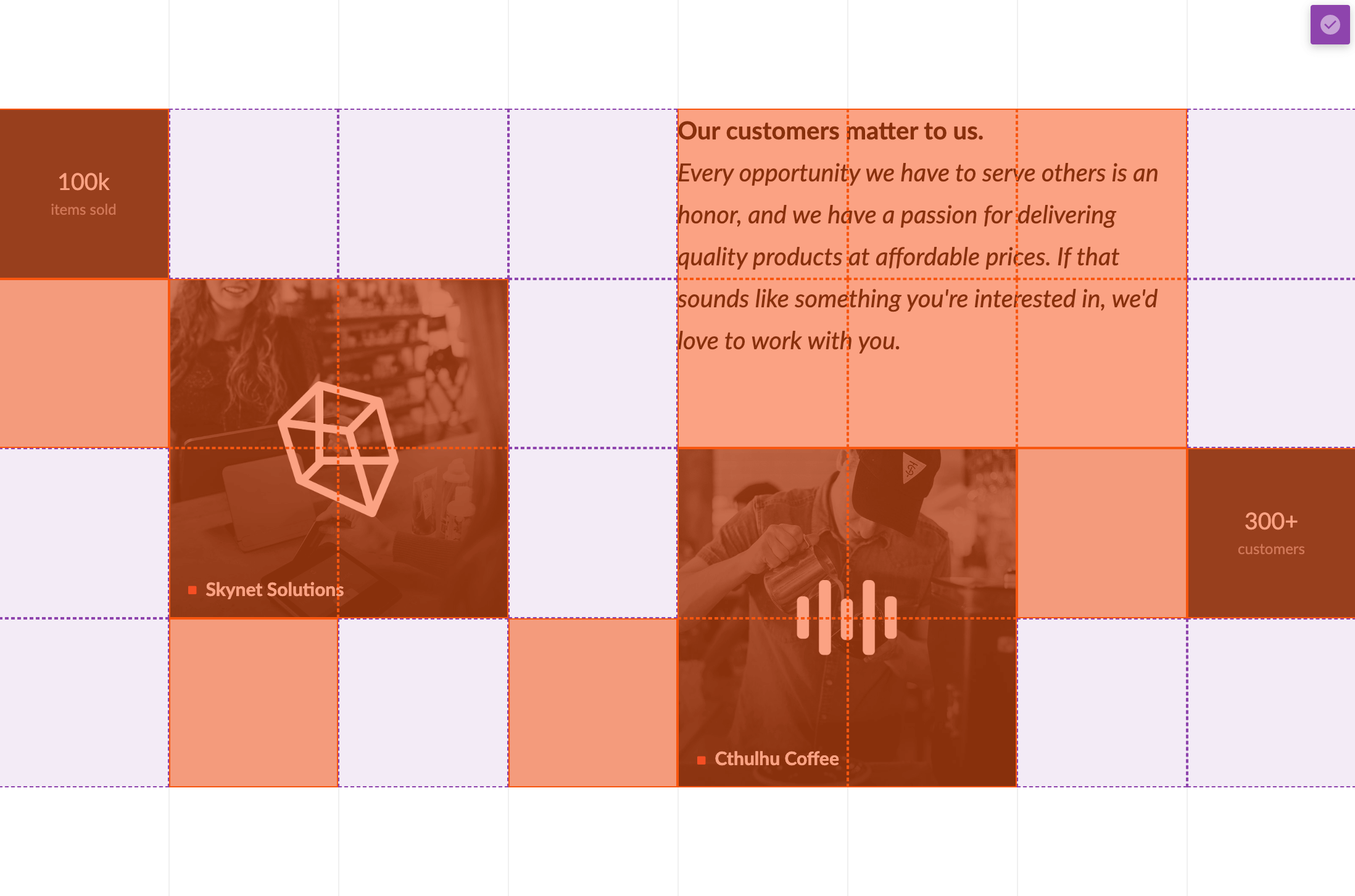
One other advantage that CSS Grid has going for it is being able to have multiple cells occupy overlapping grid areas for easy layering of elements. Notice in the example below how the background design to the right half of the section is placed specifically on the grid behind the main content. This is achieved by adding a blank cell with a background image, which gives us the ability to place this cell anywhere throughout the layout:
Setting Up Your First Grid Layout
A big paradigm shift for CSS Grids is that the overall layout of the cells within the grid is defined on the grid itself as highly declarative CSS properties. For example, if you simply want a grid that has 100% wide cells with each cell appearing below the previous one on a new line, you could use this syntax in the Grid Layout control:
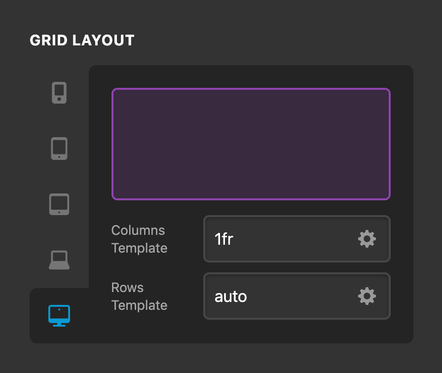
The example above would be output to our dynamic CSS as:
.dynamic-grid-123 {
  grid-template-columns: 1fr;
  grid-template-rows: auto;
}
The 1fr unit is a new value available for the CSS Grid syntax that effectively defines a "fractional" column that will take up as much space as is available. Since we only have a single 1fr value for our grid-template-columns property, this will force all cells to span the entire width of the grid. The auto value for the grid-template-rows property simply allows for any new cells to be added onto a new line.
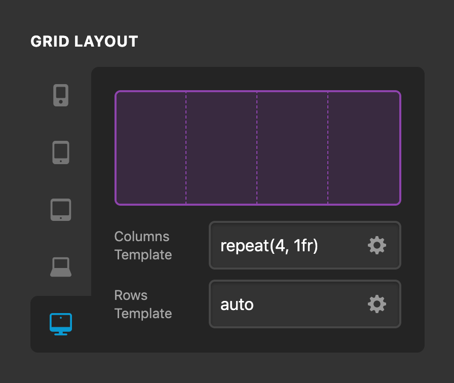
So what if you wanted to add a grid with four columns? Well, all we would need to do is add three more 1fr units into our Columns Template input:
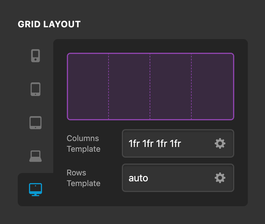
The purple space above shows us an approximation of how the grid layout will behave over in the live preview. Now that we've defined our four column grid, lets say we added eight cells to our Grid Element, they would be output as such:
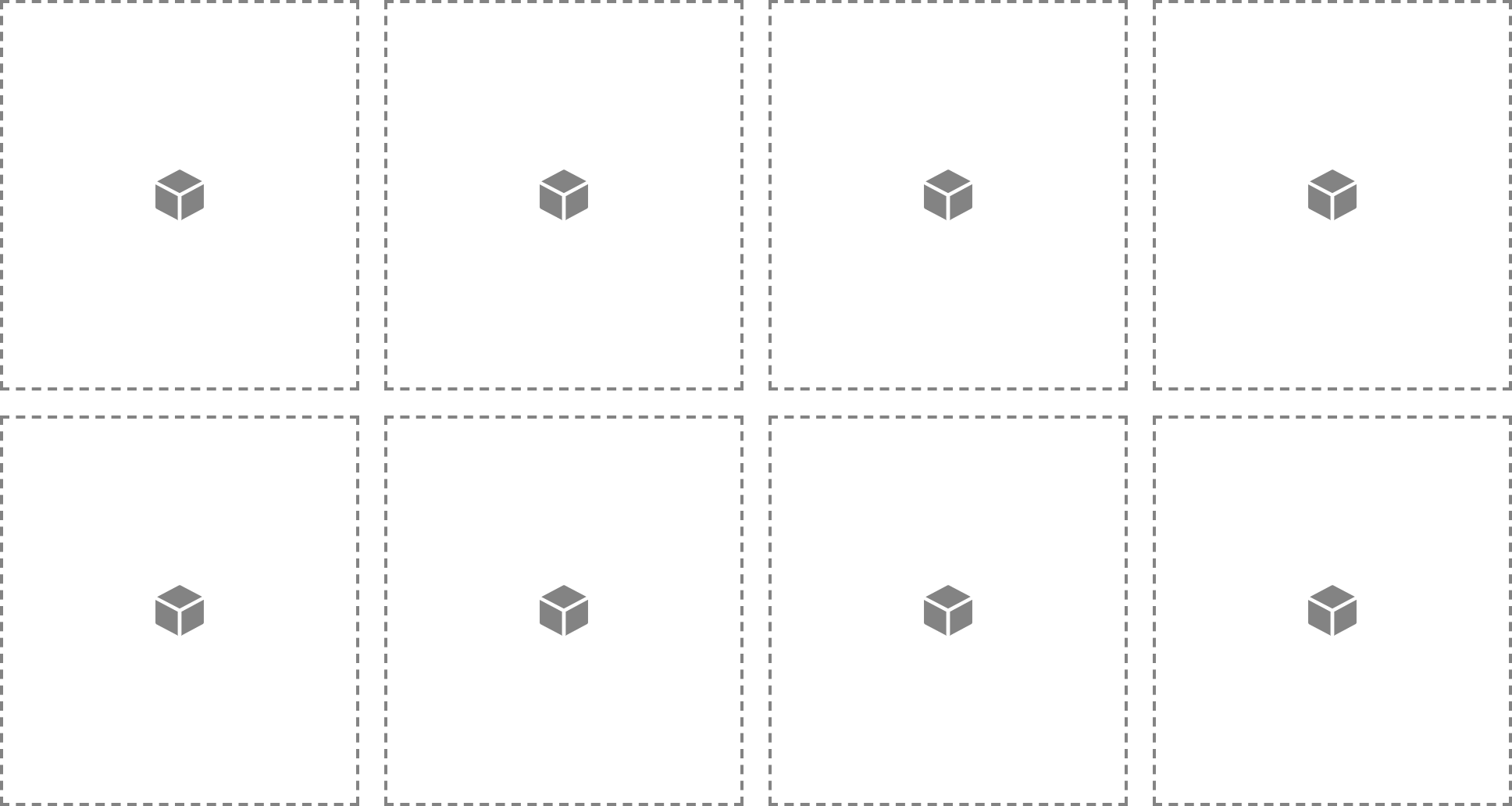
Notice how we get a new line after the fourth cell due to the number of Cells exceeding the Column Layout defined on the Grid. As of right now these Cells are using auto placement, meaning that they will simply appear in the Grid in the order that they were added (similar to how Columns work within Rows). Later on we will explore layouts that utilize explicit placement for Cells on more complex grid templates.
Another handy way to write out the syntax above would be to use the repeat() CSS function, which takes a number as the first parameter to define how many times the values specified in the second parameter should be output. For example, if we wanted to output our 1fr 1fr 1fr 1fr value above, we would use:
This can be particularly helpful for situations where we want to express complex repeated patterns, which we will explore in more detail later on.
Finally, take note that these templates can be defined uniquely for each breakpoint, meaning that your layouts can be completely custom to suit your needs at each specific breakpoint. Now that we've familiarized ourselves with how layouts work for CSS Grid, let's take a look at few additional setup controls on the Grid Element itself.
Grid Setup Controls Pro
In addition to the Grid Layout control group explored previously, you'll find a Grid Setup control group similar to the setup box utilized on many of our other Elements:
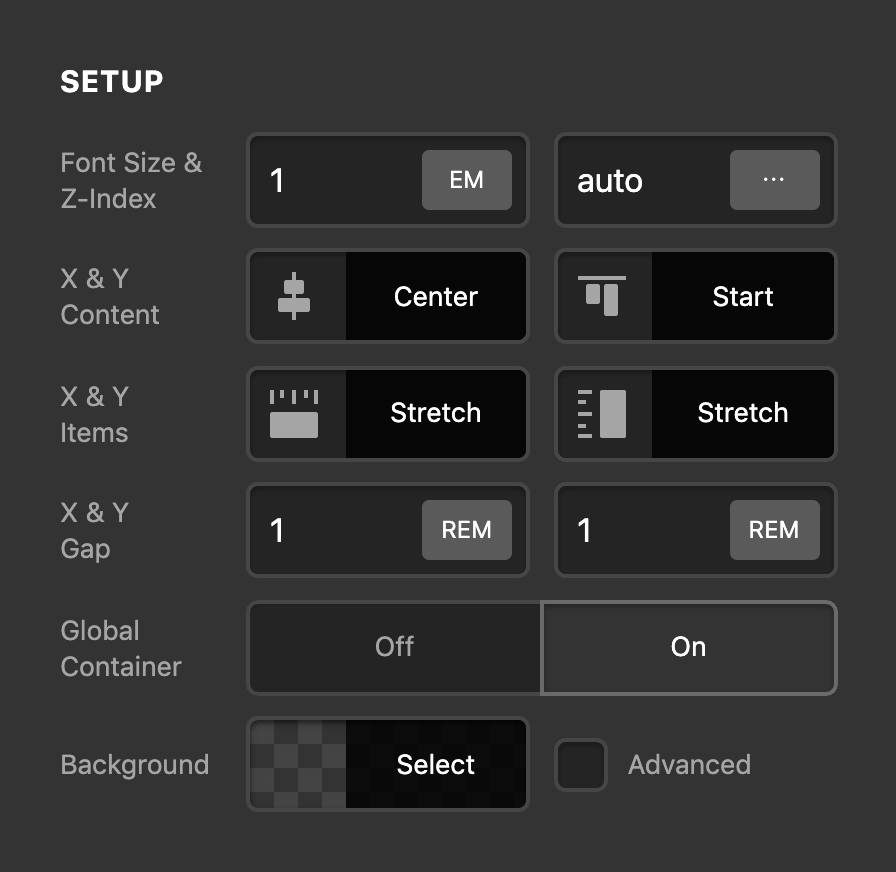
Some of these controls you will already be familiar with such as Font Size, Z-Index, Global Container, and Background found on other layout Elements. In addition to those we have our X & Y Content placement, X & Y Items placement, and X & Y Gap controls.
X & Y Content is output to justify-content and align-content respectively, and they handle the overall placement of all content within your Grid Element as a whole. To learn more about these CSS properties and how they work, it is strongly recommended that you do some reading on them from an official source such as the MDN web docs:
X & Y Items is output to justify-items and align-items respectively, and they handle the overall placement of all content within a Cell. To learn more about these CSS properties and how they work, it is strongly recommended that you do some reading on them from an official source such as the MDN web docs:
X & Y Gap control the amount of spacing between Cells in the grid along their corresponding axis. Adjust these values accordingly depending on the type of design you're going for.
Cell Placement Controls Pro
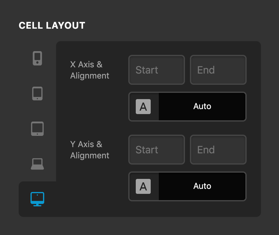
When working with the Grid Element, any new Cells added to the layout will utilize auto placement, which you will see as a notice in the Cell Layout control group for any unplaced Cell:
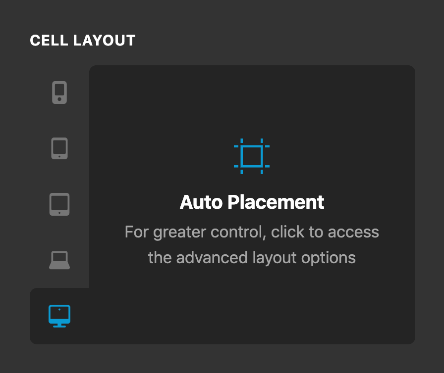
This auto placement behaves similarly to how Columns work within Rows in that each successive Cell will follow the overall structure of the Element that you have defined (i.e. if you have a relatively simple two column Grid and add three Cells to it, the third cell will simply wrap to a new line). This is great and we can use it along with some cool tricks such as auto-fit to take advantage auto-responsive columns, but one of the greatest strenths of CSS Grid is being able to define complex base templates and then place your Cells anywhere throughout that layout. Once you've defined a base template you're happy with, one of the ways you can adjust a Cell's placement on that template is by clicking into this control group, which will reveal the following:
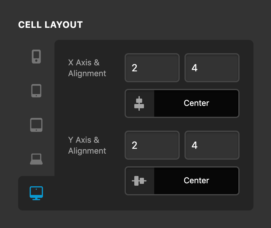
This is where things start getting really fun, because it's these controls that really unleash the true power of CSS Grid layouts. The controls available here correspond to the following CSS properties (it is highly recommended you take some time to read through the official documentation on the MDN web docs linked out here):
- X Axis Start –
grid-column-start - X Axis End –
grid-column-end - X Axis Alignment –
justify-self - Y Axis Start –
grid-row-start - Y Axis End –
grid-row-end - Y Axis Alignment –
align-self
For example, say that you had a grid template with eight defined columns and four defined rows and you wanted a particular Cell to start on the second grid column track and second grid row track. Then, say you wanted it to span two column and row tracks as well horizontally and vertically centering its content within that space. You could do that like so:
As you can see, there is a fair amount of information you have to keep track of when wanting to place Cells throughout a Grid. We have to be mindful of our track counts for both rows and columns, specify multiple values to get our Cell just right, and then for every minor change we want to make we have to keep updating each of those coordinates one at a time. We wanted to help reduce this complexity to make Cell placement much simpler, which is why we introduced our Cell Layout Editor in the preview.
Cell Layout Editor Pro
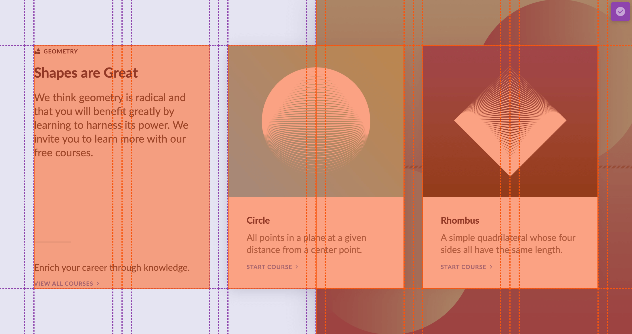
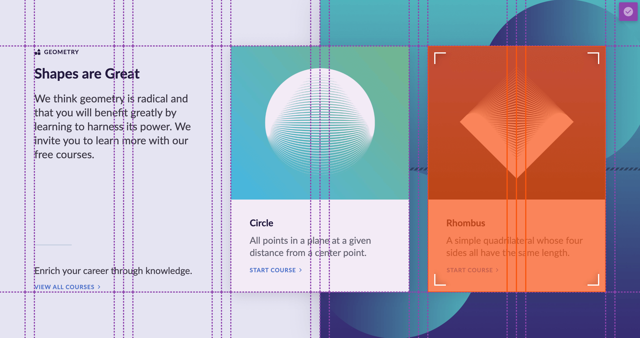
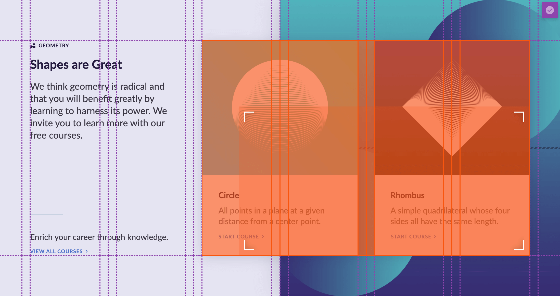
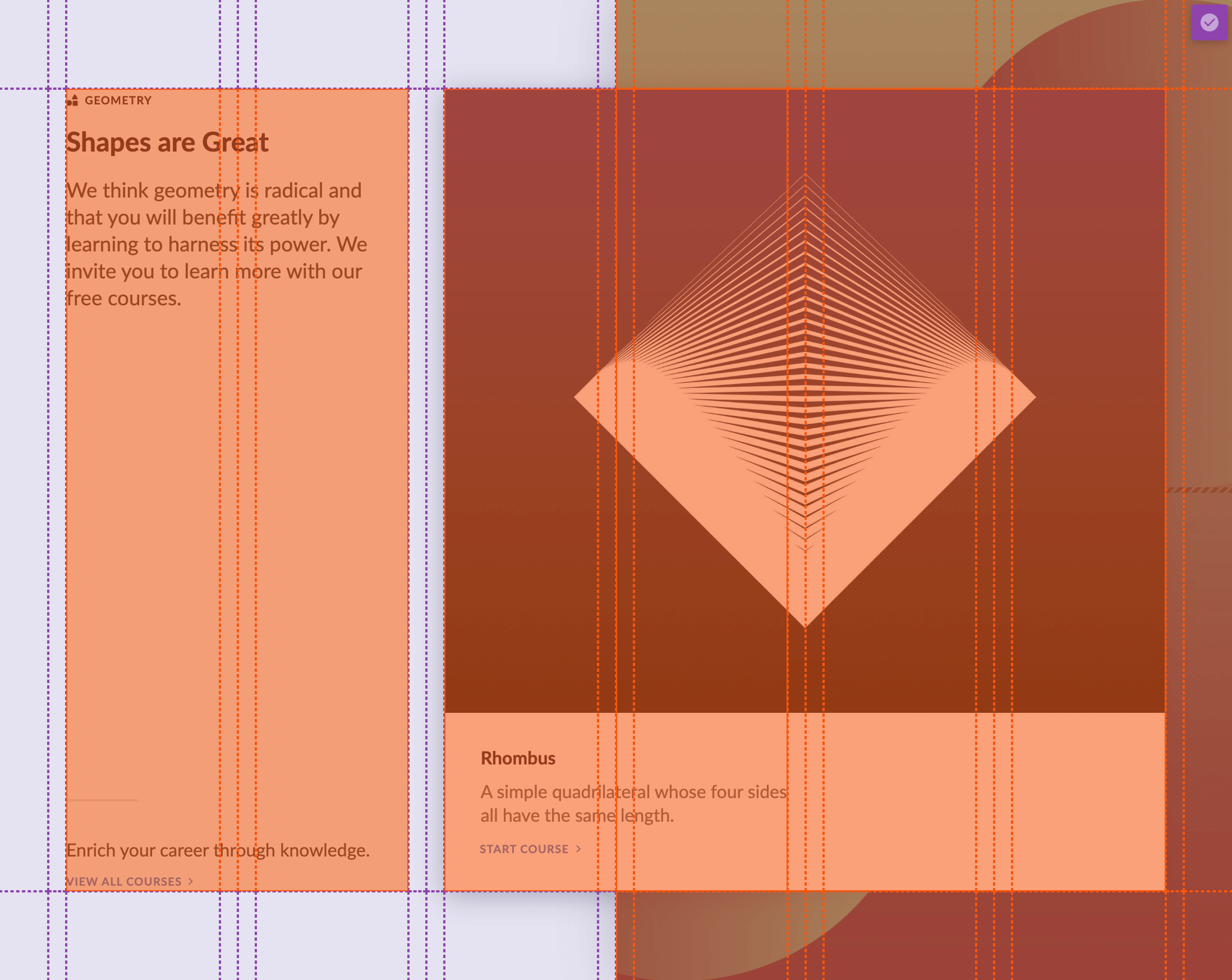
One of the things we're most excited about with our Grid Element is the introduction of the Cell Layout Editor, which is a toggleable interface in the preview that you can jump in and out of to easily adjust your Cell placement throughout the Grid. Let's take our "Shapes are Great" example from before and examine it once again:

The entire layout from this example has been created using the new Grid Element. For any Grid Element present on your page, hovering over it will reveal a small, purple icon in the upper-right corner of the Grid Element. Clicking on that button will enable the Cell Layout Editor:
One thing to take note of for this layout is that we have set all of our grid-gap values to 0px, and are inatead using the template as a whole to create the spacing we want to use between Cells. This is simply another way to explore spacing and layout using the Grid Element.
As you hover over the Cells in this editing mode, you will notice four carets appear in the corners of the Cell you are currently hovering over:

With your mouse over a particular Cell, you can then either click down on the center of the Cell to drag the entire Cell, or you can click down on one of the carets to resize the Cell. Either of these actions will focus the color on the Cell you are currently interacting with:
As mentioned before, one of the actions we could perform is a drag, which will maintain the Cell's overall volume. For example, you will notice in this particular Grid, the Cell being dragged has a 4x1 area, so it will keep that area in tact as you move it around the Grid (note that when doing this, your Cell may grow or shrink depending on the size of the tracks you're moving it to):
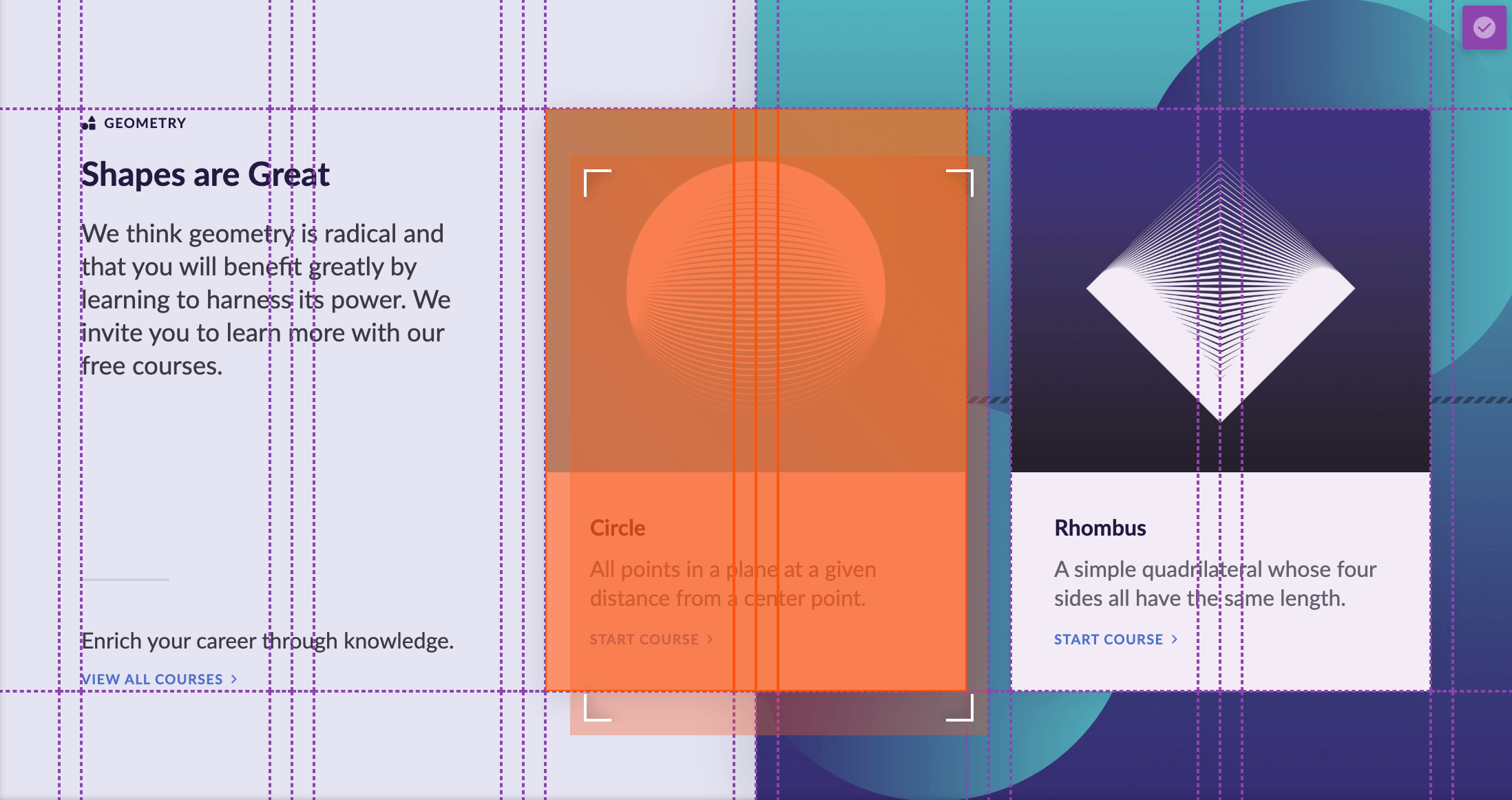
Additionally, you can resize this Cell as well by instead clicking and dragging one of the four carets in the corner of the Cell. Resizing allows you to alter the overall area of the Cell on the Grid:
If we were to drop our Cell into the area highlighted in the example above, we would end up with the following output:

Note how if we turn on our Cell Layout Editor again, you will see that the Cell has simply grown to fill the area specified from before:
Any movement of a Cell while the Cell Layout Editor is turned on will adjust the placement inputs mentioned in the previous section. The great thing about this is that if you drag or resize a Cell while the editor is turned on, not only do you get instant visual feedback in being able to see what works best, but the Editor will automatically take care of all the math in placing that Cell properly for you.
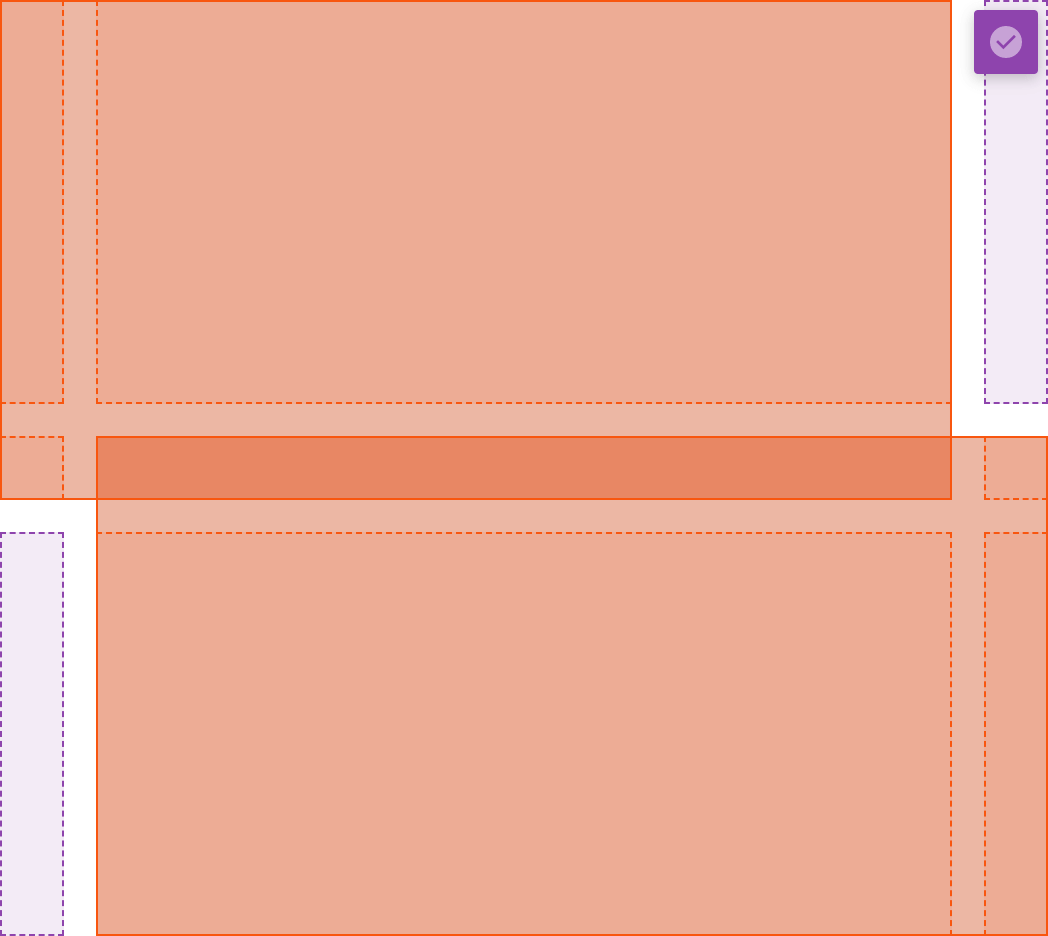
Additionally, you may have noticed the different usage of color and lines throughout this example. These are used as helpful indicators to give you a better sense of how your layout is behaving and represent different aspects of the grid template:
- Dashed Lines – Represent either an unoccupied grid area or the interior of a Cell that spans multiple tracks.
- Solid Lines – Represent the outer boundary of a Cell.
- Purple – Indicates either an unoccuped grid area or an auto placed Cell.
- Orange – Indicates a "placed" Cell on the Grid that is not using auto layout.
Finally, it is important to take note that any movement of a Cell using the Cell Layout Editor will only update that Cell's placement for the particular breakpoint you are currently viewing your site at. If you wish to have specific Cell placement at all breakpoints, you will need to explicitly do so yourself.
Just Couple Layout Ideas... Pro
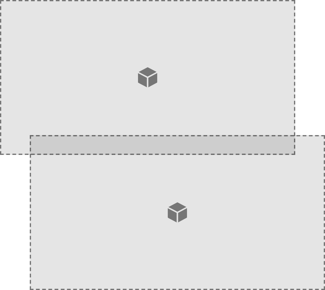
As mentioned previously, one of the greatest things about CSS Grid is its ability to more clearly define the expected behavior of a layout and explicitly place Cells exactly where you want them to go. This can be particularly useful for situations where maybe you want to have two overlapping Cells to give a layered effect (perhaps a large image to one side with some text from the other laying on top of that image). A really neat way to go about this would be using a layout like the following:
If we turn on our Cell Layout Editor, we can see more clearly what's going on here:
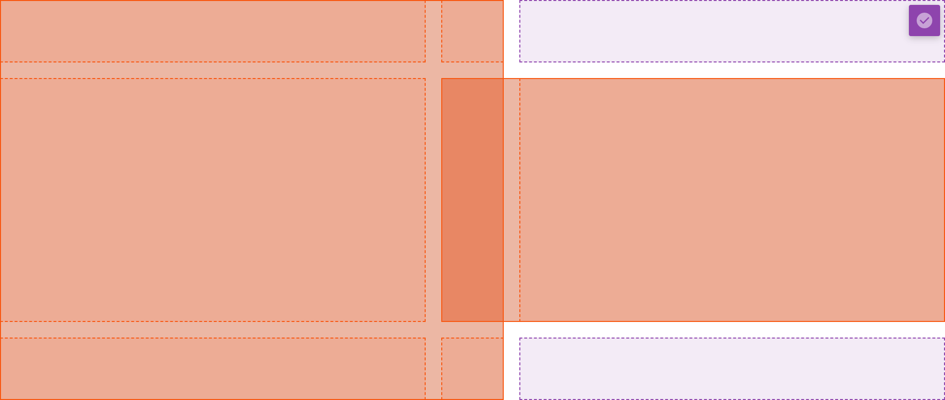
And then if we take a look at our Grid Layout control grouping, we can see even more clearly what's happening:
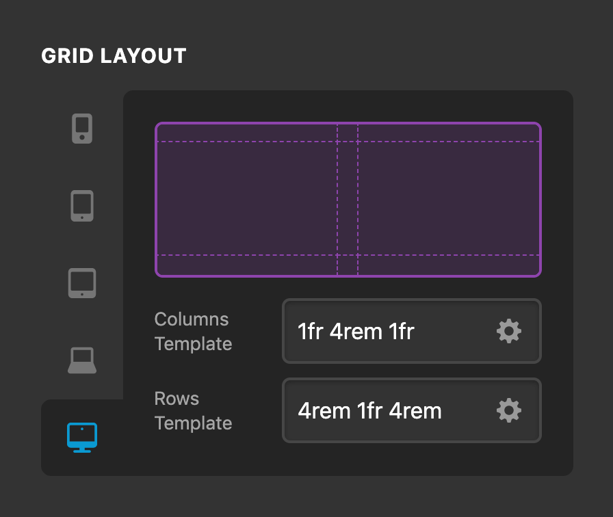
Basically, we're using our Column Template of 1fr 4rem 1fr to define a three column layout with two equal width column tracks to the outside and one fixed width in the middle. That middle value of 4rem is used to specify exactly how much of an overlap we want to have between our two cells. Then, each Cell is simply placed to the edge of the grid and spanning over that middle column track.
Additionally, the Row Template of 4rem 1fr 4rem is used to define our second Cell's top and bottom spacing from the edge of the Grid. The 1fr in the middle allows ensures that both Cells vertically align as they should.
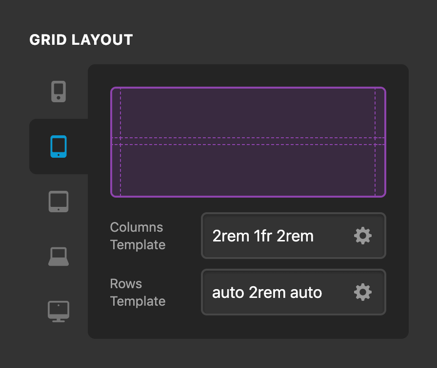
The great thing about all of this is once you set it up, you can go back and adjust your overlap values or gap values from one place on the Grid parent, rather than having to manage it in multiple places across each Cell, greatly simplifying the exploration process of finding the perfect dimensions to use for your design. And of course, it's all fully response, so we might wish to have this layout for our LG and XL breakpoints, but using something completely different for our smaller breakpoints:
Takng this responsive template idea to a completely new level, here's a quick example of just how far we can take our Grid templates and Cell placement within a design across multiple breakpoints:


Take note of how the overall Grid column and row track counts change, in addition to the placement of each Cell for each breakpoint. This is true flexibility unlike anything you've ever seen before with a layout tool. We will be exploring more layout possibilities with you all on our YouTube channel in the coming months, so definitely make sure to subscribe over there if you haven't already to keep up with our latest content!
Grid Context Menus Pro
A shiny new builder wouldn't be complete without some shiny new Context Menu actions, would it? Right-clicking on any Cell in the preview or the Layout Pane will reveal the following Context Menu:
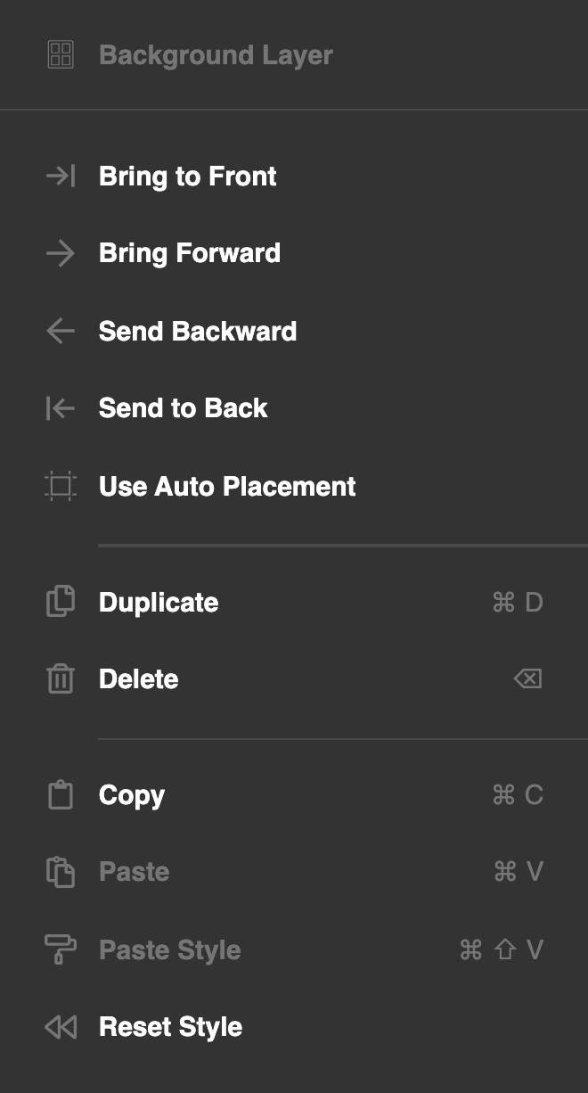
You can use the Bring to Front, Bring Forward, Send Backward, and Send to Back, actions to update the order of the Cell within the Grid. Keep in mind that this only changes the placement of the Cell in the physical markup, but if you have a z-index value set for that Cell instead of auto, that value will always override the general markup order. Additionally, Use Auto Placement will quickly reset a Cell's positioning back to auto placement.
Furthermore, you can right-click on any of the Grid Layout or Cell Layout control boxes to copy a layout at a particular breakpoint and either paste it to a single breakpoint or apply it to all other breakpoints for quick layout changes.
Custom Attributes Pro, Cornerstone
Have you ever had a third party script that required you to place an additional attribute on an Element for it to work as expected, or perhaps you've simply wanted to add a custom data-* attribute of your own as a hook for some custom JavaScript? With our new Custom Attributes control found within the Customize control grouping of all Elements, now you can!
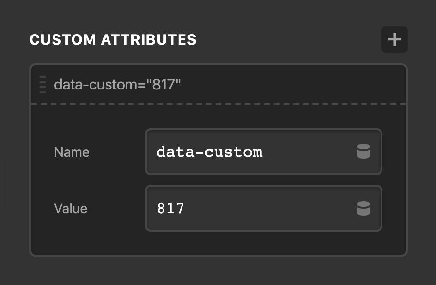
All custom attributes added via this control will be placed on the outer-most piece of markup related to an Element. For Elements with forked markup (such as a Modal which has a button trigger in one location and the actual modal itself output elsewhere), multiple Custom Attributes controls are available to place your attributes on any part of the Element.
Design Cloud Pro, X
Well, if you're still reading this far into the changelog...we commend you! In addition to everything mentioned previously, there are also some exciting new changes in store for demo content as a whole across all of our products. Previously only available in Pro, Design Cloud has been enabled for X as well in this latest update! All validated installs will see the following box in the WordPress admin under the theme dashboard page for quick access to Design Cloud:

Alternately, opening up the builder and clicking on the main navigation menu in the bar will reveal the new "Design Cloud" option:
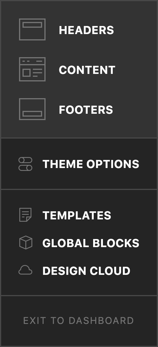
Clicking either of these links will take you straight to the Design Cloud interface. This is now the central hub for demo content distribution across Pro and X. Expanded Demos are now known as Sites within Design Cloud, allowing you to install full site designs featuring multiple pages of custom content. Along with that, X users will also have access to our Content (fully designed sections for the Content Builder) and Preset (individual Element styles) templates. Standard Demos are no longer available as we plan to spend more time creating and delivering fully crafted content via the "Sites" moniker going forward.
Performance Optimizations Pro, X, Cornerstone
- No more
<head>scripts. We've combinedcs-body.jsandcs-head.jsinto a single file calledcs.jsloaded in the site footer. - The builders now use system fonts to avoid loading additional resources, allowing for faster startup times.
- You have the ability to turn off any of the Font Awesome styles.
- New
font-displaysettings under the Typography tab in the Settings Modal.
Changelog
- Pro 3.1.2 - November 30, 2019
- Bugfix: Display issues with classic columns in Safari.
- Bugfix: Portfolio filters not working.
- Bugfix: Anchor scrolling not animating or accounting for header height.
- Bugfix: Ethos post meta line missing a space before the author.
- Bugfix: Status page showing incorrect PHP memory limit.
- X 7.1.2 - November 30, 2019
- Bugfix: Display issues with classic columns in Safari.
- Bugfix: Portfolio filters not working.
- Bugfix: Anchor scrolling not animating or accounting for header height.
- Bugfix: Ethos post meta line missing a space before the author.
- Cornerstone 4.1.2 - November 30, 2019
- Bugfix: Font Awesome icons not showing when using Cornerstone with other themes.
- Bugfix: Status page showing incorrect PHP memory limit.
- Pro 3.1.1 - November 23, 2019
- Bugfix: ReactDOM deprecation warning.
- Bugfix: PHP notice in CSS generation code when running PHP 7.4.
- Bugfix: PHP warning when The Grid plugin is active.
- Bugfix: New Rows added from Section inspector having global container disabled.
- Bugfix: Some use cases of Font Awesome icons not appearing.
- X 7.1.1 - November 23, 2019
- Bugfix: Fix PHP warning when The Grid plugin is active.
- Cornerstone 4.1.1 - November 23, 2019
- Bugfix: ReactDOM deprecation warning.
- Bugfix: PHP notice in CSS generation code when running PHP 7.4.
- Bugfix: New Rows added from Section inspector having global container disabled.
- Bugfix: Some use cases of Font Awesome icons not appearing.
- Pro 3.1.0 - November 21, 2019
- Feature: New Grid Element with Grid Editor.
- Feature: Added Sites to Design Cloud.
- Feature: Added preference allowing custom styles to be applied to the application UI.
- Feature: Added custom attribute control to all supporting Elements.
- Updated: Consolidate cs-head.js and cs-body.js into single script loading in the footer.
- Updated: Add Font Display options (auto, swap, etc.) in font manager.
- Updated: Allow disabling Font Awesome output from Theme Options.
- Updated: Add font-display: block; to Font Awesome @font-face declarations.
- Updated: Use system fonts instead of Open Sans for application UI.
- Updated: Update BuddyPress integration to allow profile cover images.
- Updated: Add x_search_input_atts filter to allow adjusting HTML attributes of the search input.
- Updated: WooCommerce tabs template to support woocommerce_product_after_tabs hook.
- Bugfix: Fix reverse option not working for Classic Slider element.
- Bugfix: Fix card elements not allowing click events to propagate from button.
- Bugfix: Fix inability to inspect Countdown element when WordPress is using some custom date formats.
- Bugfix: Fix HTML in Accordion heading showing up in observer label.
- Bugfix: Fix container being overridden when assigning a default Row preset.
- Bugfix: Fix default presets sometimes showing "none" even though a preset is assigned.
- Bugfix: Fix Custom Fonts not allowing font files to be uploaded.
- Bugfix: Disable context menu while inline editing to allow pasting text.
- Bugfix: Fix box shadow control missing from Dropdown elements and Accordion content.
- X 7.1.0 - November 21, 2019
- Feature: Design Cloud.
- Updated: Moved Expanded demos into Design Cloud as Sites.
- Updated: Removed Standard Demos.
- Updated: Allow disabling Font Awesome output from Theme Options.
- Updated: Add font-display: block; to Font Awesome @font-face declarations.
- Updated: Update BuddyPress integration to allow profile cover images.
- Updated: Add x_search_input_atts filter to allow adjusting HTML attributes of the search input.
- Updated: WooCommerce tabs template to support woocommerce_product_after_tabs hook.
- Bugfix: Add missing 1/5 Layout to legacy Visual Composer integration.
- Cornerstone 4.1.0 - November 21, 2019
- Feature: Added preference allowing custom styles to be applied to the application UI.
- Feature: Added custom attribute control to all supporting Elements.
- Updated: Consolidate cs-head.js and cs-body.js into single script loading in the footer.
- Updated: Add font-display: block; to Font Awesome @font-face declarations.
- Updated: Add Font Display options (auto, swap, etc.) in font manager.
- Updated: Use system fonts instead of Open Sans for application UI.
- Bugfix: Fix reverse option not working for Classic Slider element.
- Bugfix: Fix card elements not allowing click events to propogate from button.
- Bugfix: Fix inability to inspect Countdown element when WordPress is using some custom date formats.
- Bugfix: Fix HTML in Accordion heading showing up in observer label.
- Bugfix: Fix container being overridden when assigning a default Row preset.
- Bugfix: Fix default presets sometimes showing "none" even though a preset is assigned.
- Bugfix: Fix Custom Fonts not allowing font files to be uploaded.
- Bugfix: Disable context menu while inline editing to allow pasting text.
- Bugfix: Fix box shadow control missing from Dropdown elements and Accordion content.
FAQ
Status
- 11/29: Pro 3.1.2, X 7.1.2, and Cornerstone 4.1.2 available via automatic updates.
- 11/22: Pro 3.1.1, X 7.1.1, and Cornerstone 4.1.1 available via automatic updates.
- 11/21: Pro 3.1.0, X 7.1.0, and Cornerstone 4.1.0 available via automatic updates.
- 11/20: Pro 3.1.0, X 7.1.0, and Cornerstone 4.1.0 available via manual updates.
The following confirmed issues are specific to this cycle. If listed here we are planning to address it in a subsequent point release. Items will be crossed off as they are corrected and you will see corresponding notes in the changelog above.
Ethos portfolio filter is not working properly.(fixed in second point release)Fix some use cases of Font Awesome icons not appearing.(fixed in first point release)PHP notice is logged during CSS generation code when using PHP 7.4.(fixed in first point release)New rows added while inspecting a section don't have the global container enabled.(fixed in first point release)When The Grid plugin is active, a PHP warning appears.(fixed in first point release)