Release
Notes
October 2, 2017
1.2.3
2.1.3
5.2.2
Howdy, everybody! It's release day again and you all know what that means: a whole new set of goodies and features to play with! This latest release includes some drastic changes for our Content Builder, and it is also serving as a foundation for where we plan on taking the theme from here. Below we will walk through the new features and functionality in detail, and towards the end of this entry we will also have an FAQ section regarding some plans for future development. Let's cut to the chase, shall we?
The Content Builder: Reconstructed Pro, Cornerstone
Behind the scenes, one of the biggest features of this release is the complete rebuild of the Content Builder to utilize the same technology as the Header and Footer Builders. When we initially developed the Content Builder, we utilized Backbone as our main library since it is a central dependency utilized by WordPress for various features and we wanted to take advantage of that as much as possible. As development moved forward, we quickly realized some of the limitations that came with using Backbone in conjunction with our vision for how these builders should function and where we wanted to take things.
After much careful consideration, we chose Ember as a base for all future development with and we are happy to announce that as of this release the Content Builder has been completely migrated to this new underlying framework. Until now, the Content Builder has operated utilizing Backbone in parallel with the rest of the app using Ember. Completing this migration means that all facets of the Pro workflow from theme options to templating now reside under one roof, which makes maintenance much easier on our end as well as finally being able to bring the power from our Header and Footer builders into the Content Builder.
Now that we've got all that boring ol' technical talk out of the way, let's jump into the fun stuff. 😊
Updated Navigation and Layout Workspace Pro, Cornerstone
One of the first things you'll notice with the latest release is the updated navigation at the top of the workspace:
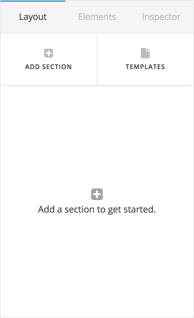
This mirrors the navigation already in use for the Header and Footer builders, and also lends more vertical space to display controls as we've gotten rid of the icons links with labels on a separate lines in lieu of using labels exclusively. Settings has also been moved to the “The Bar” (the skinny global navigation to the left of the screen) to clean up the contextual navigation as it is not accessed as frequently as Layout, Elements, and Inspector.
Upon adding a section, you will see that the Layout interface has also been streamlined:
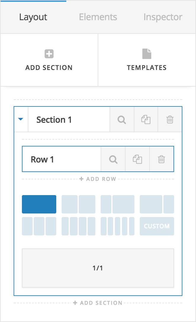
This new styling includes a condensed sortable for easier scanning of large pages and a collapsible panel that displays all relevant layout information for that section inline. Previously all of this information was in a secondary pane that slid in and out of view, which made navigating slightly more cumbersome when wishing to move from one section to the next. With everything inline, you can now easily hop back and forth as needed without the extra clicks.
Each section can be opened or closed utilizing the caret to the left of the label, and the contents within each section are exactly the same as before, it has simply been restyled and condensed down to handle this information more efficiently in a compact space.
Updated Elements Workspace Pro, Cornerstone
In addition to the Layout workspace changes, the Elements workspace has also been redesigned to more closely match our other builders and allow for more elements to be visible at a time:
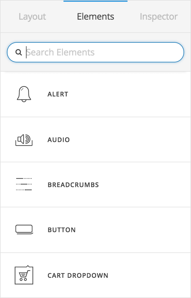
One of the more important things to take note of is the organization between our v2 Elements and Classic Elements within this workspace. The first grouping of elements towards the top of the list (styled with a white background and slightly larger dimensions) are the v2 counterparts to the “Classic” Elements found towards the bottom of the list:
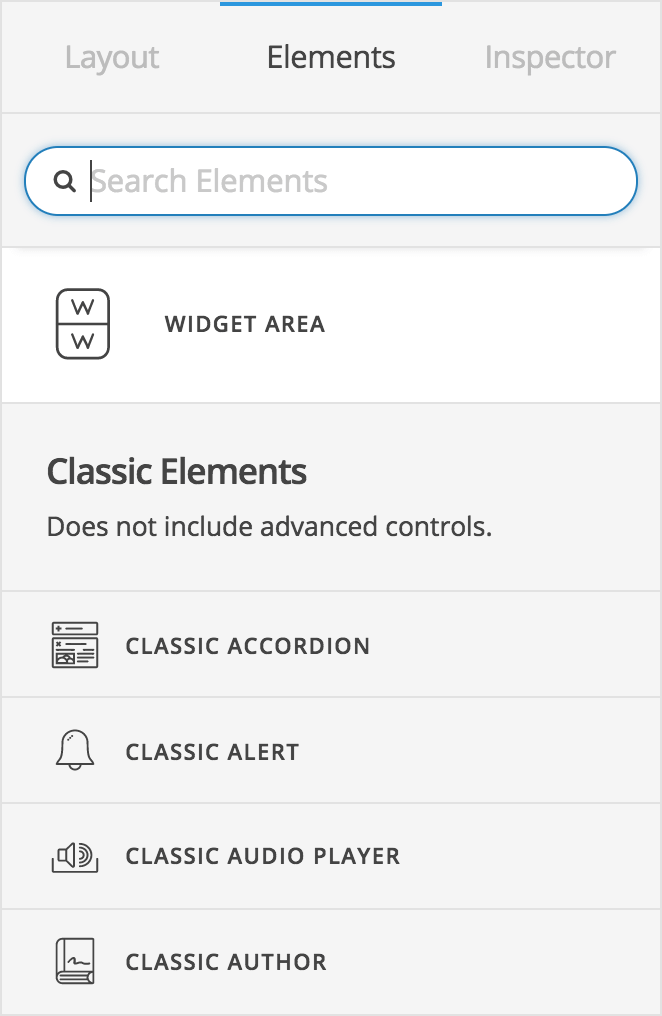
Classic Elements are divided by the text break you see above, and have a gray background and smaller proportions compared to the v2 Elements. Please note: Classic Elements will not have advanced controls included in them and are a great option for users who would prefer to use a more “set it and forget it” approach as opposed to the granular nature of advanced controls. The power of the advanced controls we've built into our v2 Elements is incredibly flexible, but not everyone needs this level of specificity when working to achieve an end goal.
Advanced Controls Pro, Cornerstone
And now for the part you've all been waiting for: advanced controls! All of our v2 Elements feature the same power and flexibility as that of our Header and Footer Builders, providing users with a near limitless array of curated options that you can adjust to your exacting specifications. Take our Text Element for example:
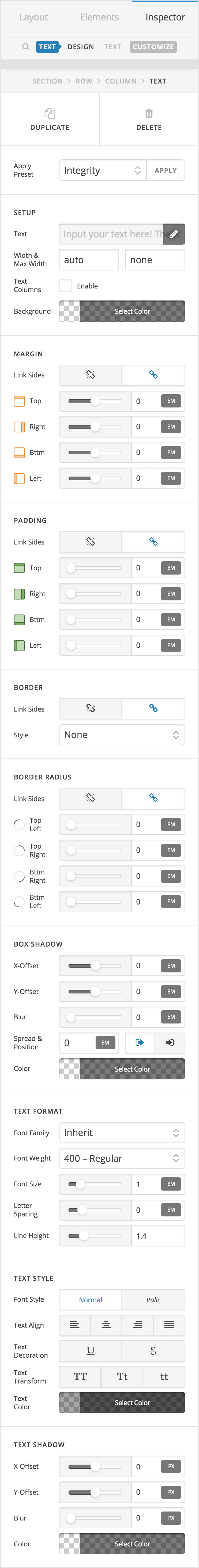
Notice that you have full control over the box model (margin, padding, and border), stylistic details (border-radius, box-shadow, et cetera), and every last typographic detail you might need to adjust—all for a simple Text Element! More involved elements such as navigations or carts feature this same level of detail for each constituent part of the Element itself. For example, our Inline Navigation Element gives you full control over the general layout and feel of the top level links, the styling of those top level links, dropdown styling, as well as control over the sub links that make up the content for the dropdown. You've truly never seen anything like this until now!
As mentioned previously, one thing to keep in mind is that all of these controls are highly curated (meaning we haven't just thrown you into the deep end of the CSS pool and hope you find a way to swim). We've taken time to carefully consider each piece of these elements and how to get the most mileage out of the least amount of controls, which means cleaner and more concise generated output.
New Elements Pro, Cornerstone
This release sees the inclusion of many brand new v2 Elements in addition to the Elements that were previously available:
- Gap – A simple gap for spacing Elements. Works horizontally or vertically.
- Line – Craft styled dividers or faux borders with this Element. Can be oriented horizontally or vertically.
- Alert – Include styled notices for users that can be dismissed if needed.
- Counter – Display statistics in an engaging manner with this animated Element.
- Breadcrumbs – Completely rewritten from the ground up, our brand new Breadcrumbs feature not only all new styling controls, but improved breadcrumb matching of custom post types and hierarchical relationships between posts and taxonomies. For example, if you are on a child category archive for a WooCommerce shop item, the breadcumbs might be displayed as Home → Shop → Clothing → Hoodies, as it will look to see if there are any parent child relatioships between categories, then find the post type relationship, and prepend it with a “Home” link to finish it out. If needed, the labeling or final output of the breadcrumbs can be easily altered via a child theme using our newly included
x_breadcrumbs_dataandx_breadcrumbs_itemsfilters. - Map – Utilize a standard embed code from any serivce or unlock the full styling potential of the Google Maps API with our completely revamped Map Element. Visit the Google Maps Style Wizard to see what is possible, or start with a preset. When you're done, click “Finish” in the lower-left corner and then “Copy JSON” to duplicate your styles and bring back into the Map Element.
- Audio – Input an embed code from any service or use our audio player for self-hosted audio. Self-hosted audio can be completely styled to match the look and feel of your website.
- Video – Input an embed code from any service or use our video player for self-hosted video. Self-hosted video can be completely styled to match the look and feel of your website.
- Sections, Rows, & Columns – Our updated structural Elements for the Content Builder feature a unified interface as well as some welcomed improvements (including our all-new parallax options).
Updated Elements & Features Pro, Cornerstone
In addition to our new Elements listed above, some Elements have received new features or improvements that greatly expand their design possibilities:
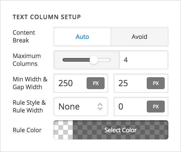 Text – The Text Element now includes an option to enable text columns. This effectively means that the Text Element takes the place of the Classic Element, “Columnize,” while providing much greater stylistic possibilities. When text columns are enabled, you have the ability to set a minimum width for each column, as well as a maximum number of columns. For example, if you set your maximum columns to 4 and their minimum width to 250px, this means that as long as each column can be 250px wide, four columns will be shown at maximum. On progressively smaller screens the column count will drop to three, two, and ultimately one. When only one column remains, the width of that final column can collapse below your minimum width, meaning that you will not have any responsive issues on smaller screens with content being wider than the device. The Content Break option deals with the
 break-insideproperty, so take some time to read up on that and see how it operates as it can open a lot of stylistic doors. Please note: updating this setting will not be reflected immediately in the browser until you resize the browser itself manually. This has to do with the CSS spec itself and how it is rendered in browsers, so keep that in mind if you plan on experimenting with this option.- Headline – The Headline Element now includes an optional graphic and optional subheadline. This effectively means that the Headline Element takes the place of the Classic Element, “Feature Box.” Utilizing the Flex Content Layout setting, you can easily achieve many creative layouts with this Element. In fact, the internal structure of the Headline now very closely resembles the Anchor partial, so you may wish to revisit some of our Knowledge Base resources to see what is possible there.
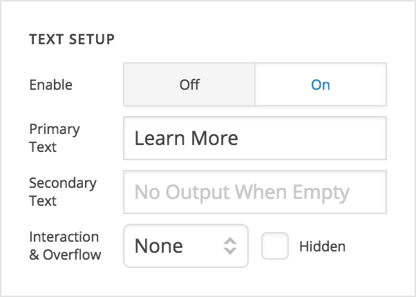 Anchor Partials – In refactoring the Headline Element, we ultimately came up with many new partials that we were able to repurpose and reuse thoughout various Elements. Because of this, the “Anchor” partial is reorganized in a slightly different manner than is documented in its Knowledge Base video, but overall the controls are still the same. The biggest difference is the previous Interactions subgrouping has been done away with and those features have been either bundled into their related controls, or broken out on their own. For instance, if the Text Setup box on an Element using the “Anchor” partial is enabled, at the bottom you will see an “Interaction” control, which will allow you to include optional interactions for your text inline with the text itself. The same is true for graphics inside the “Anchor,” and finally each “Particle” has been broken out into its own group to be enabled or disabled as needed.
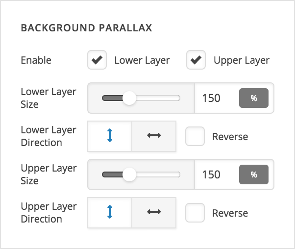 Background Parallax – This one has been a long time coming and we are very excited to finally release our completely revamped background parallax features, now with video support! The updated background parallax options (pictured) are part of the Background Partial, and are present on any element that includes this partial. Parallax can be enabled independently for each background layer and gives you a lot of mileage with a few simple options. The “Layer Size” options are a percentage for how large you want your parallax layer to be relative to its container, which will partially determine its speed. For example, if you have a “Section” you wish to use this on and its height is 500px, making the layer size 150% means that the parallax layer will be 750px tall. This gives you a difference of 250px, which will be traversed for the entire time the Section is visible on your screen. This means that as you scroll past your section, you will witness 250px worth of movement vertically. If you choose to have your parallax move horizontally, the same calculations apply but on the x axis and using the Section's width as a base rather than height. Take some time to experiment with values based on your content to find what is right for your needs, and see how altering the direction (and reversing it) can all lend to unique effects.
FAQs Pro, Cornerstone
Does every Classic Element have a v2 counterpart?
Not every element will have a 1:1 v2 counterpart. As mentioned previously, in looking at how we implemented our v2 Elements, we wanted to make some things more efficient via advanced controls. For example, there is only one v2 “Headline” and no “Accent Headline” or “Feature Headline” like the Classic Elements have. This is because with the controls available in the headline, you can easily recreate the looks of these old Elements (in fact, you can go far beyond what they were originally capable of). Additionally, the new “Headline” Element could also be said to take the place of the Classic “Feature Box” Element with all of the functionality it contains.
Can I use v2 Element styling in other parts of the theme?
For now, all styling via advanced controls is limited exclusively to the Builders and the elements included. For instance, at this time you cannot style your global site buttons utilizing these advanced controls. This means that native buttons for things like WordPress comments, WooCommerce forms, Contact Form 7, et cetera, do not yet take on advanced styles. Ultimately, we have plans to take the ideas currently available in the builders and move that technology into the other more global aspects of the theme (basically, anything in “Theme Options”).
What is next for Pro and its ecosystem of builders?
Now that we have all of our builder environments on the same codebase, the next phase of development involves finishing out and opening up our preset templating system to users. You'll notice an “Apply Preset” control at the beginning of all v2 elements, which currently comes pre-populated with four presets designed by our team for you to quickly see the power and flexibility of these new advanced controls and what is possible with them. Ultimately, individual users will be able to set controls the way they wish and then save that grouping of values as a personalized preset, which can be reused over and over on a website, or exported to be shared with other websites. This will be part of bringing the whole vision of our advanced control system together.
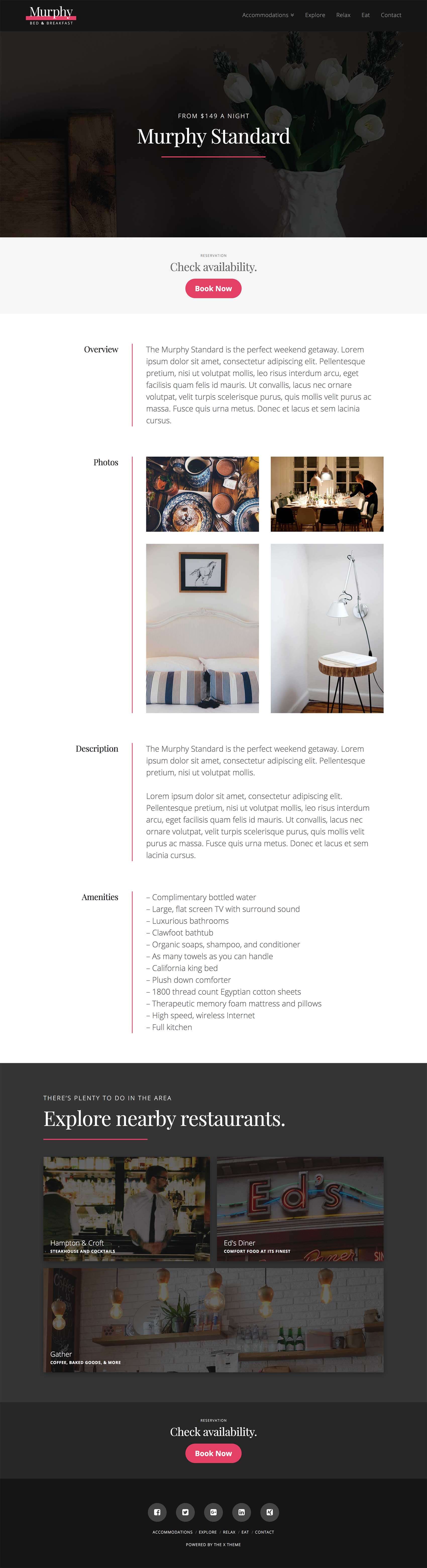
New Expanded Demo: Bed & Breakfast Pro, X
Have you found yourself needing some time off to recharge your batteries lately? Well, if you aren't able to take time off for a vacation at the moment, perhaps you can find some amount of peace and tranquility with our new Expanded Demo: Bed & Breakfast!
Bed & Breakfast is calm, refreshing, and simply beautiful. Clean lines paired with a bold yet streamlined color scheme lend an inviting and approachable aspect to this wonderful Expanded Demo. It comes with many unique layouts and ways to share content in an engaging manner, so definitely make sure to visit all the different pages and see them for yourself. Below is a screenshot of the layout for individual rooms:
New Extension Integration: Modern Events Calendar Pro, X
Modern Events Calendar is one of the most powerful event and ticketing solutions available for WordPress that both developers and site owners are sure to Love! This plugin allows you to create unlimited events, sell tickets, and integrates with both PayPal and Stripe out the box. We're quite thrilled to be able to bring this impressive plugin to all of our X users, and look forward to seeing what you create with it!
Changelog
- Pro 1.2.3 - October 7, 2017
- Bugfix: Fix classic elements being removed when trying to move them between columns
- Cornerstone 2.1.3 - October 7, 2017
- Bugfix: Fix classic elements being removed when trying to move them between columns
- Pro 1.2.2 - October 6, 2017
- Bugfix: Advanced backgrounds not appearing.
- Bugfix: Empty columns not keeping their shape on the front end.
- Bugfix: Breadcrumbs duplicating title if no "Page for Posts" set.
- Bugfix: Inline CSS not appearing in builder preview.
- Bugfix: Gravity Forms element not always appearing in preview.
- Bugfix: Sortable children elements (Accordion, Icon List, et cetera) being reset to default when moved in the content builder.
- X 5.2.2 - October 6, 2017
- Bugfix: Advanced backgrounds not appearing.
- Bugfix: Breadcrumbs duplicating title if no "Page for Posts" set.
- Cornerstone 2.1.2 - October 6, 2017
- Bugfix: Advanced backgrounds not appearing.
- Bugfix: Empty columns not keeping their shape on the front end.
- Bugfix: Breadcrumbs duplicating title if no "Page for Posts" set.
- Bugfix: Inline CSS not appearing in builder preview.
- Bugfix: Gravity Forms element not always appearing in preview.
- Bugfix: Sortable children elements (Accordion, Icon List, et cetera) being reset to default when moved in the content builder.
- Pro 1.2.1 - October 5, 2017
- Bugfix: Correct missing spacing when using fixed bars.
- Bugfix: Inability to set image or icon on featured list item.
- Bugfix: Fatal error in older PHP versions when checking for updates.
- Bugfix: Bug where responsive text with no selector applies to all text elements in content builder preview.
- Bugfix: Revolution Slider and LayerSlider elements not appearing correctly in content builder preview.
- Bugfix: Correct issue where a color palette item sometimes won''t apply.
- Bugfix: Margins being removed from the first and last children of Classic Text Elements.
- Bugfix: Using multiple V2 rows breaking shortcode layout.
- Bugfix: Bottom section separators being hidden.
- X 5.2.1 - October 5, 2017
- Bugfix: Margins being removed from the first and last children of Classic Text Elements.
- Bugfix: Bottom section separators being hidden.
- Cornerstone 2.1.1 - October 5, 2017
- Bugfix: Inability to set image or icon on featured list item.
- Bugfix: Fatal error in older PHP versions when checking for updates.
- Bugfix: Bug where responsive text with no selector applies to all text elements in content builder preview.
- Bugfix: Revolution Slider and LayerSlider elements not appearing correctly in content builder preview.
- Bugfix: Correct issue where a color palette item sometimes won''t apply.
- Bugfix: Margins being removed from the first and last children of Classic Text Elements.
- Bugfix: Using multiple V2 rows breaking shortcode layout.
- Bugfix: Bottom section separators being hidden.
- Pro 1.2.0 - October 3, 2017
- Feature: New and updated v2 elements with advanced controls.
- Updated: Completely rewritten content builder.
- Updated: Improved parallax features added to all elements with advanced backgrounds.
- Updated: Support for WPML in the new content builder.
- X 5.2.0 - October 3, 2017
- Feature: New and updated v2 elements with advanced controls.
- Feature: Bed & Breakfast Expanded Demo released.
- Feature: Modern Events Calendar integration.
- Updated: Completely rewritten content builder with all-new advanced controls.
- Updated: Improved parallax features added to all elements with advanced backgrounds.
- Updated: Support for WPML in the new content builder.
- Cornerstone 2.1.0 - October 3, 2017
- Feature: New and updated v2 elements with advanced controls.
- Updated: Completely rewritten content builder with all-new advanced controls.
- Updated: Improved parallax features added to all elements with advanced backgrounds.
- Updated: Support for WPML in the new content builder.