Release
Notes
May 9, 2017
1.1.1
5.1.1
2.0.6
We're back with a new trick up our sleeve—responsive typography! The implementation currently available in our products serves as a groundwork for future, more granular controls and is intended to be more foundational for the time being.
When visiting the Typography options in Theme Options, you will find a new Root Font Size section. Using these options, you are now able to specify a root font size for your website at each breakpoint. These new root font sizes are applied to the <html> element, which affords much more flexibility in two main ways:
- You now have the option of utilizing a larger root font size for desktops and having it transition down for smaller screens. This works great in a responsive context as it helps to ensure that your fonts do not get too cramped on small devices.
- You can now take full advantage of CSS
remunits.remunits differ fromemunits in that they will always be set relative to thefont-sizeof the document's “root” element (in the case of HTML, this would be our<html>element). This opens up new worlds of styling flexibility and functionality thatemunits do not always afford.
Choose Your Path Forward
There are two methods of responsive typography you can choose from in the theme options—stepped or scaling—which differ slightly, but ultimately work to achieve the same result:
- Stepped – Specifies a root font size at each breakpoint, which changes as soon as that breakpoint is triggered.
- Scaling – Specifies a minimum and maximum root font size to be updated over a viewport range. For example, you may choose to have your min and max font sizes as
12pxand18pxrespectively, which should scale between screens1000pxand500px. What this means is that any screen over1000pxwill always see18pxas the root font size, and any screen under500pxwill always see12pxas the root font size, whereas everything in between is scaled linearly over that distance. Check out this article if you're curious about a more detailed explaination of the technique this is based on.
Please note: the scaling technique is slightly more “experimental” than the stepped approach as it involves utilizing calc() and viewport units to dynamically size content, which does not always work properly in some browsers (most notably Safari on macOS as of the time of writing this article), but it does work in most modern browsers and should once all vendors implement the CSS spec properly. In browsers that don't fully support this method at this time, your font sizes will fallback to the minimum or maximum value, depending on how big the user's screen is. If you need a bulletproof method that works across all browsers, use the stepped mode. However, if you're interested in a more cutting edge approach and your website's visitor data is made up of more modern browsers, you may want to give the scaling approach a try.
For each mode, you can also choose between using px or em as your root font size unit. Whichever you choose is a matter of preference; however, if you're slightly uncertain of how em units may work in this context, we recommend sticking with px. Using em means specifying your font sizes relatively to the browser's default stylesheet (typically 16px), so you will be working in multiples of that size. Also, with the scaling mode, your font sizes and range limits are all set in the same unit value, so if you're using em, keep in mind that your rangers are set using em breakpoints as well.
Wrapping Up Responsive Typography
Here are a few items going over various other tweaks to options in the theme as well as nice bits of information to know about the integration:
- Body Font Size is no longer an option under Typography, as these new responsive typography features take their place. Upon updating the theme, your previous Body Font Size value will be ported over to the root font size settings (e.g. if your setting was
14px, you will see14pxas the base unit for all root font size settings). - The Content Font Size option now uses
remunits to ensure cohesion with these new features. Your Content Font Size value will be updated along with updating the theme (e.g. if your Body Font Size was14pxand your Content Font Size was16px, you will now see Content Font size as1.143remin your settings—remember thatremunits are multipls of the root font size, so you will want to adjust this in much smaller values than you wouldpxvalues). - No other typographic elements feature new options at this time. For example, headings all still maintain their same values from before, but will now be able to dymamically respond to the new root font sizes.
- If you wish to “disable” this feature for whatever reason, simply set all root font size values to the same unit to effectively bypass the system and maintain things as they were previously
And last but not least, as requested by many after WooCommerce v3.0.0 was released, we've introduced support for their new gallery and zoom features in additon to our existing lightbox support! These features are available on your product page featured images if enabled.
What Happened to X Pro?
If you were previously using X Pro, please note that it has been renamed to Pro. To learn more about this, and what it means for your site, please read this article.
New Expanded Demo: Nonprofit
We have a brand new Expanded Demo available for v5.1.1 of X: Nonprofit! Make sure that you use that link to check it out in person, but you can also get a quick preview of it below:
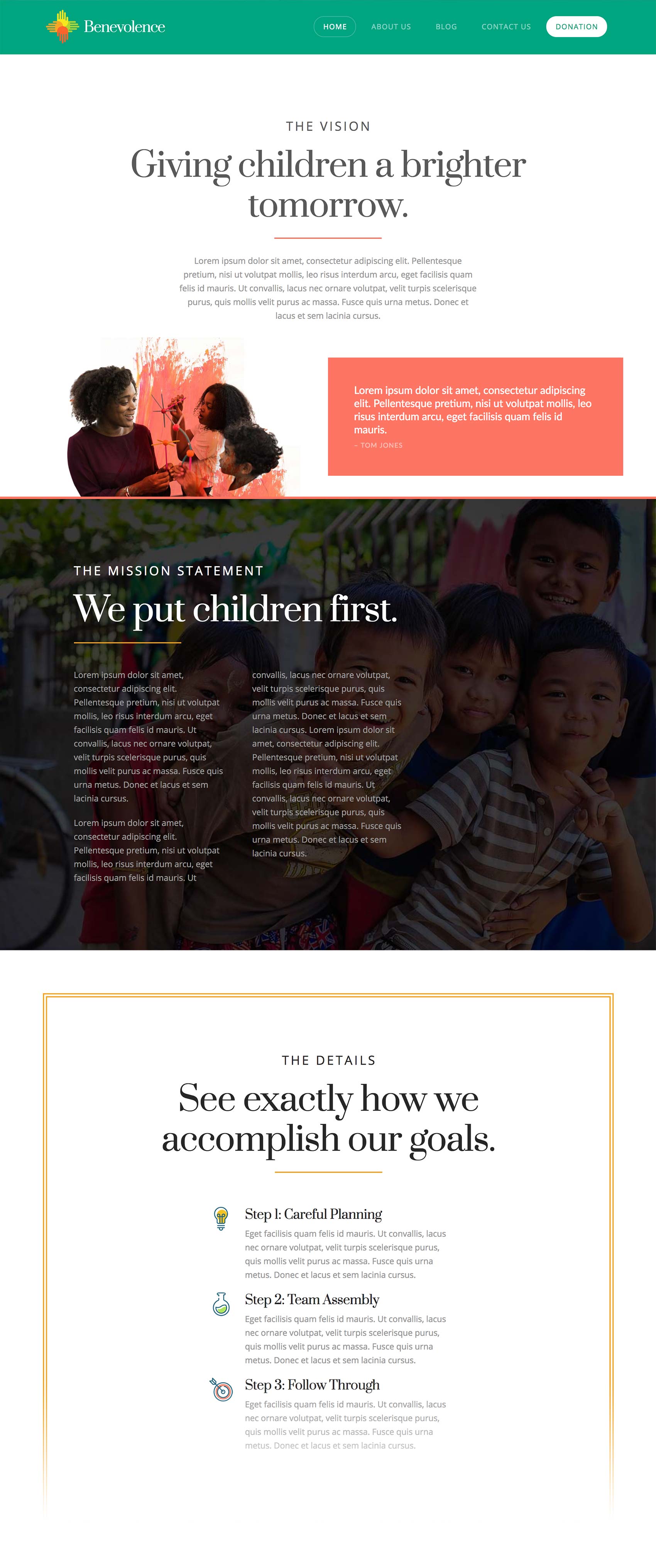
Nonprofit is a lively, colorful take on websites that center around telling a story about an organization's work. It is friendly and engaging while also conveying a strong message that invites visitors to take action either through involvement or financial assistance. The mix of color, illustrated graphics, and rich photographs engage people immediately and is a great addition to the overall stable of current Expanded Demos for X. We look forward to seeing what you do with it!
Changelog
- Pro 1.1.1 - July 20, 2017
- Updated: WooCommerce 3.1.0 compatibility.
- Updated: Update Modernizr library for latest browser detection methods.
- Bugfix: Fix smooth scrolling to hash links not working if you''re using both a Pro header and footer.
- Bugfix: Fix collapse icon not appearing in Firefox when using the header or footer builders.
- Bugfix: Fix Google fonts not loaded when using the font manager.
- Bugfix: Edits in the content builder are now properly stored in WordPress post revisions.
- Bugfix: Fix card element reversed text in IE11 using a CSS fallback.
- Bugfix: Fix "Edit Page" link not working when using plain permalinks.
- Bugfix: Fix bug causing smooth scroll logic to interfere with other plugins targeting hash links.
- Bugfix: Address WooCommerce thumbnail size issues (See full notes).
- Bugfix: Namespace our usage of the Isotope library to avoid plugin conflicts.
- Bugfix: Fix Whatsapp icon.
- Bugfix: Fix Ethos comment schema.
- X 5.1.1 - July 20, 2017
- Feature: Nonprofit Expanded Demo released.
- Updated: WooCommerce 3.1.0 compatibility.
- Bugfix: Fix bug causing smooth scroll logic to interfere with other plugins targeting hash links.
- Bugfix: Address WooCommerce thumbnail size issues (See full notes).
- Bugfix: Namespace our usage of the Isotope library to avoid plugin conflicts.
- Bugfix: Fix Whatsapp icon.
- Bugfix: Fix Ethos comment schema.
- Cornerstone 2.0.6 - July 20, 2017
- Updated: Update Modernizr library for latest browser detection methods.
- Bugfix: Fix Google fonts not loaded when using the font manager.
- Bugfix: Edits in the content builder are now properly stored in WordPress post revisions.
- Bugfix: Fix card element reversed text in IE11 using a CSS fallback.
- Bugfix: Fix "Edit Page" link not working when using plain permalinks.
- Pro 1.1.0 - May 10, 2017
- Feature: Added responsive typography theme options.
- Feature: Added WooCommerce gallery and zoom support.
- Updated: Save headers and footers under a custom post status so they are not considered "drafts."
- Bugfix: Visual Composer integration not loading Font Awesome in the backend editor.
- Bugfix: Theme options not updating some values after first save.
- Bugfix: Theme option select controls with numeric values not showing the correct selection.
- Bugfix: "Trigger Selector" feature of sticky bars not calculating properly.
- Bugfix: Issue where renaming a header or footer didn’t save.
- Bugfix: Navigation flexbox styling issue in IE11.
- Bugfix: Correct issue causing the inspector to unexpectedly jump to the start.
- Bugfix: Inability to scroll through available headers and footers in Safari.
- Bugfix: "Front End Conflict" message when editing a header or footer on a "No Header/Footer" page template.
- X 5.1.0 - May 10, 2017
- Feature: Added responsive typography theme options.
- Feature: Added WooCommerce gallery and zoom support.
- Bugfix: Fix Visual Composer integration not loading Font Awesome in the backend editor.
- Cornerstone 2.0.5 - May 10, 2017
- Bugfix: Options not updating some values after first save.
- Bugfix: Option select controls with numeric values not showing the correct selection.