Release
Notes
April 10, 2017
1.0.4
5.0.3
2.0.4
Alright, alright, alright! Hold on to your hats, because we've got a doozy of a release for you today. Nearly a year in the making and fueled by many (seriously, maaaaany) late nights and cups of caffeinated beverages, this long fabled and much discussed day has finally arrived. Ladies and gentleman, we present to you: Pro! We have a lot of information to cover today, so let's jump right in.
Please note, this is a quite lengthy post, but I guess that's what happens when you have a year's worth of work to write about, eh? If you're not a long-form text kind of person, your executive summary is as follows:
TL;DR Pro's new header and footer builders are the first of an exciting new set of builders and features we plan on moving our development towards. Essentially, we have aimed to provide the user with a highly curated and intuitive, yet incredibly granular experience, allowing fine-tuned control on top of a rock-solid, lean foundation.
The Header & Footer Builders: A New Beginning
That title might sound a bit epic, but it's true: our new header and footer builders mark the beginning of a new chapter for Themeco. Not only do these builders feature unprecedented power and flexibility unlike anything seen in today's website creation space, they also serve as the foundation for further development we have planned down the road (e.g. v2 elements, exapnded theme options, et cetera).
“So what exactly are these new builders and what can I do with them?” I hear you asking. Excellent question, esteemed Internet reader! The answer: practically anything you can dream up.
Alright, so let's get down to brass tacks. The structure of your headers and footers are broken down into three levels (technically four) of markup: the header or the footer as a wrapper, bars, containers, and elements. This isn't too dissimilar from the sections, rows, columns, and elements you've come to know in our page builder. However, as the needs of headers and footers differ somewhat from that of page content, we've crafted a specialized set of lean markup and styling to suit these circumstances. Below is a quick rundown of each piece:
- Header and Footer Wrappers – These are the general purpose elements that will contain all markup you create. For headers we use the semantic
<header>element, and for footers we utilize the<footer>element. The great thing about the way all the markup is structured is that it is always placed in the proper order regardless of its physical appearance on the page. For example, you may have a “fixed bottom” header bar that sticks to the bottom of the screen at all times, but this markup is still structurally the first thing on your website, making it SEO friendly. - Bars – The heavy lifter of the group, bars setup your general layout, design foundation, and functionality.
- Containers – Serve as a way to group similar elements, or structure your layout more intricately as needed.
- Elements – Now we're getting to the fun part—elements are what bring your bars to life! We have a completely brand new set of highly modular elements including off canvas content, infinitely flexible buttons, responsive and accessible modals, multiple unique sets of navigation, styled shopping carts, unique search forms, and so much more!
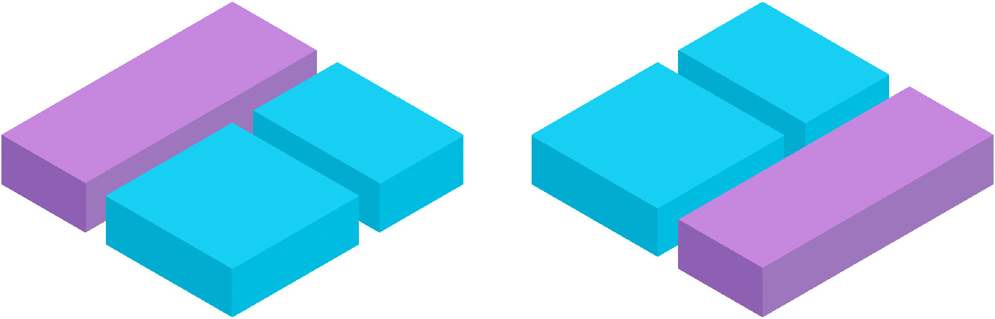
Before going on, let's take a moment to see some examples of what is possible with the new builders:
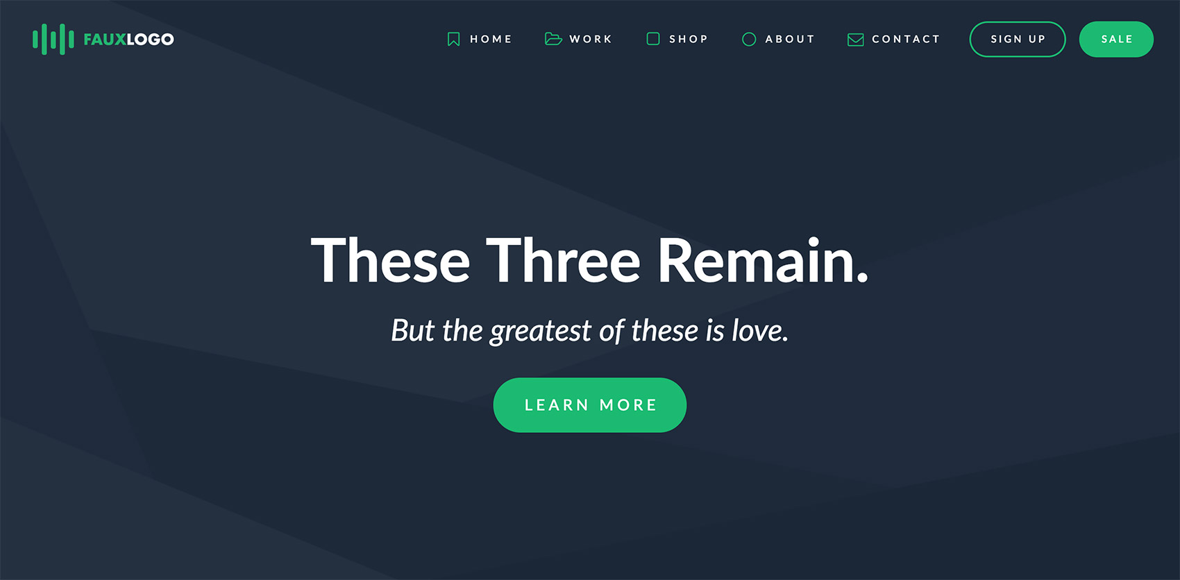
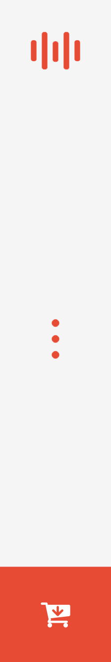

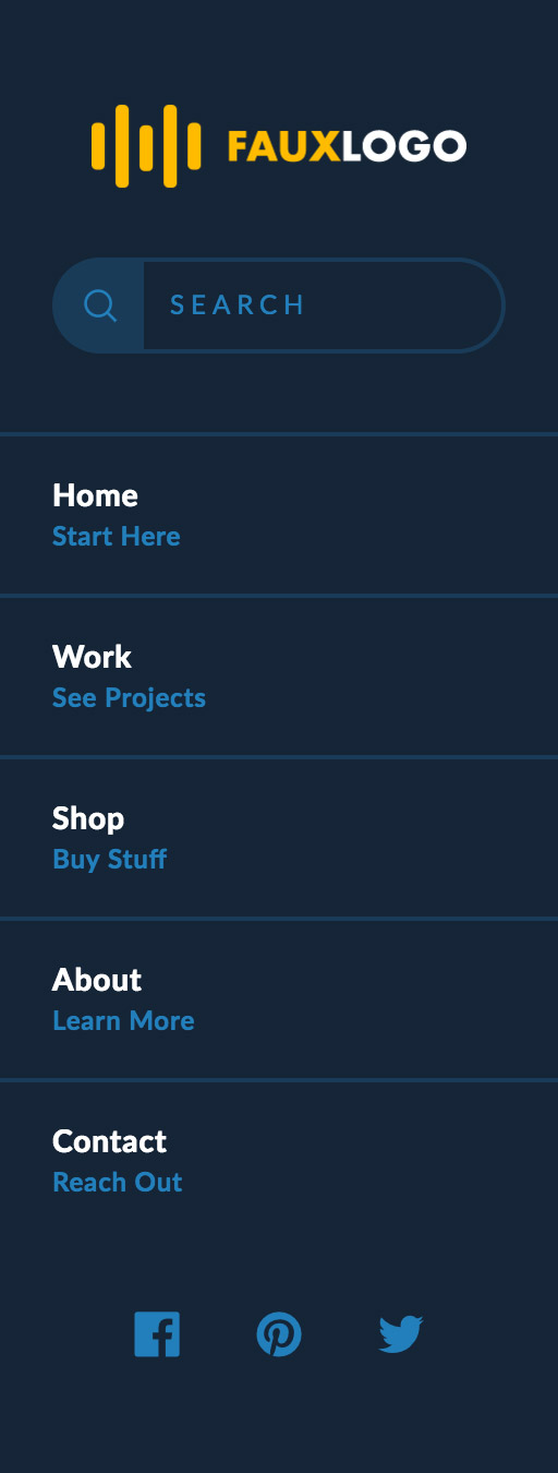

All New Elements Pro, Cornerstone
We'll be getting into some of the more technical foundations of everything in a bit, but first, let's have a little fun! As I'm sure you may have guessed by now, brand new builders mean a brand new set of elements to play around with. This past year has been an amazing time for us to learn from where we've come and do research for the future we want to build to create a truly unique, highly modular, and incredibly lean base of reusable and flexible components that can be mixed and matched almost at will.
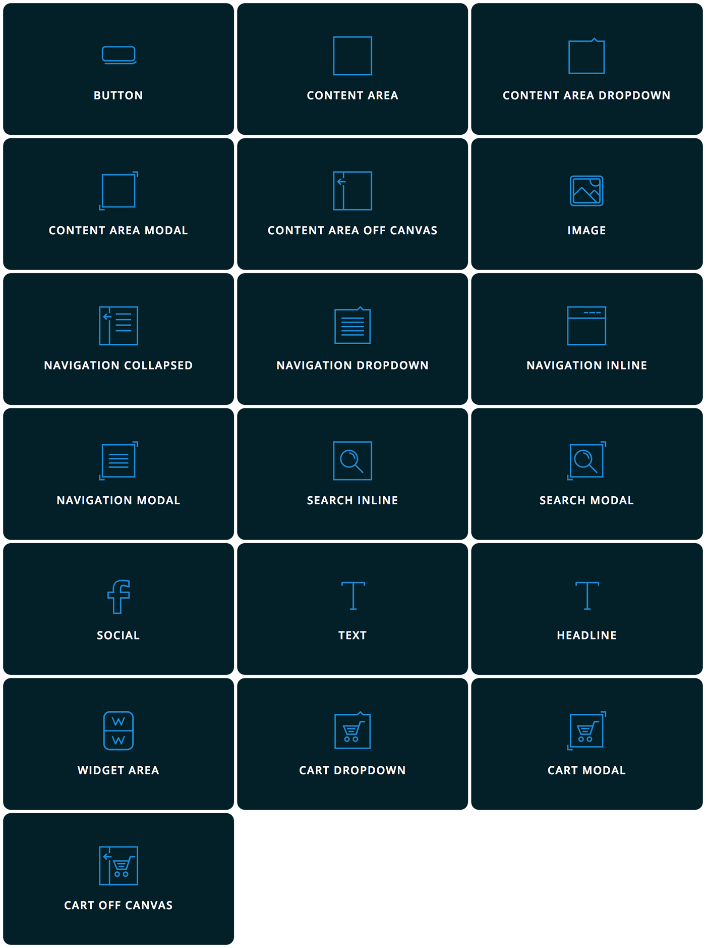
Below is a quick rundown of each element and it's general output and functionality:
- Button – Pretty much what you're expecting—a button. However, our buttons are completely customizable at every level. Colors, dimensions, borders, shadows, graphics, text, interactions, content: you name it, you can adjust it.
- Content Area – Can be thought of as a “blank slate” for you to place whatever content you need into a bar.
- Content Area Dropdown – Another place for custom content, yet your output is put into a dropdown that is triggered open and closed by a toggle.
- Content Area Modal – Another place for custom content, yet your output is put into a modal that is triggered open and closed by a toggle.
- Content Area Off Canvas – Another place for custom content, yet your output is...okay, you get the pattern here. 😊
- Image – An image that can be customized at all levels and is retina ready if desired. Also includes special functionality in certain instances such as scaling proportionately when used in conjunction with sticky, shrinking bars.
- Navigation Collapsed – A navigation that behaves like an accordion, where clicking on a top level link reveals submenus if present. This navigation is output directly into left and right bars, and is output into an off canvas area triggered by a toggle when placed in a top or bottom bar.
- Navigation Dropdown – Your whole navigation placed into dropdowns. The first level is revealed by a toggle, and subsequent levels are revealed on hover.
- Navigation Inline – A traditional navigation style with text directly inside your bar, and submenus revealed within dropdowns.
- Navigation Modal – A navigation style that covers the entire screen. Creates a very dramatic effect visually and is incredibly engaging.
- Search Inline – Our custom search partial placed directly into the bar. All aspects of the form (from the input to associated buttons) can be styled granularly.
- Search Modal – The custom search partial mentioned above, but placed into a fullscreen modal overlay.
- Social – Buttons intended to be used and setup for social networks.
- Text – Intended for longer groups of text (i.e. “multi-line” content with multiple paragrphs, et cetera).
- Headline – Intended for shorter lines of text. The desired HTML tag can be specified (e.g.
<h1>,<h2>,<p>, et cetera), and also has additional styling options such as text overflow support. - Widget Area – Output for an assigned sidebar in the WordPress admin.
- Cart Dropdown – Our cart partial placed within a dropdown, triggered open by a toggle.
- Cart Modal – Another cart, yet in the context of a fullscreen modal, triggered open by a toggle.
- Cart Off Canvas – Another cart—you guessed it—within our off canvas content area.
The Backend Tech Pro, Cornerstone
One thing you might have noticed is that many elements utilize similar pieces, such as the off canvas, modal, or dropdown. These (along with other items such as buttons/links/toggles, carts, images, menus, et cetera) have all been analyzed and reduced down to their smallest reusable parts, making them highly modular and easy to work with from one element to the next. We call these bits of reusable markup, styling, and functionality partials, and they are a fundamental concept to how these new header and footer elements work.
A partial could be a singluar piece of markup, a modular script, a set of styles, or even all of these combined into one. Sometimes partials are even included within other partials and layered to create an element (it's kinda like Inception).
For example, take our Cart Dropdown element, and our Navigation Inline element, two seemingly unrelated items, right? Well, let's see where they overlap. Both are utlilizing our anchor partial, which is essentially used whenever important, styled links come into play (think buttons, menu items, toggles, et cetera). The navigation uses the anchor for its menu items, and the cart uses it for the toggle. Both also utilize our dropdown partial, which can be used to house any type of content (menu links, carts, custom content from you, et cetera).
So what does this all mean for you? Well, it means that our new elements have an incredibly lean static CSS base. We're talking mere kilobytes that handle the bare minimum structural foundation for you to place your “coat of paint” on top of in the header and footer builders and transform into whatever you want, from layout, to functionality, to design.
Due to the fact that we have so many of these incredibly granular pieces, the styling that you generate on top of our foundation in the builders is able to be paired down to its most elemental output utilizing a completely custom rendering engine we've dubbed CSS Coalescence. Essentially, it takes similar styles and reduces them into one output. So in real life, something like this:
.hm1.x-anchor {
  color: #7c09b2;
  background-color: #151515;
}

.hm2.x-anchor {
  color: #7c09b2;
  background-color: #151515;
}
Would be rendered as:
.hm1.x-anchor,
.hm2.x-anchor {
  color: #7c09b2;
  background-color: #151515;
}
Notice that since each of the selectors above had the exact same output, we were able to determine that it could be reduced to be more efficient. That's an over 37% reduction in output with this incredibly simple example alone. You can imagine how much space this will be saving you on more complex layouts that have many shared elements.
The In-App Tech Pro, Cornerstone
But we didn't stop at making super cool and modular backend code. Nay, intrepid developers and designers, we wanted to make your lives in the tool itself much more enjoyable as well, which leads us to our font manager and color manager.
Say it with me now: “Define once, use everywhere.” How many times have you worked on a design only to refer back to a pile of sticky notes or documents on your computer keeping track of all the colors utilized throughout a design? Or maybe you've finished a design and would like to see what everything looked like with all of the fonts on the page swapped out for another in an instant and be able to compare them both?
Well we have answered these questions my friends, and once you experience it, you won't want to go back.
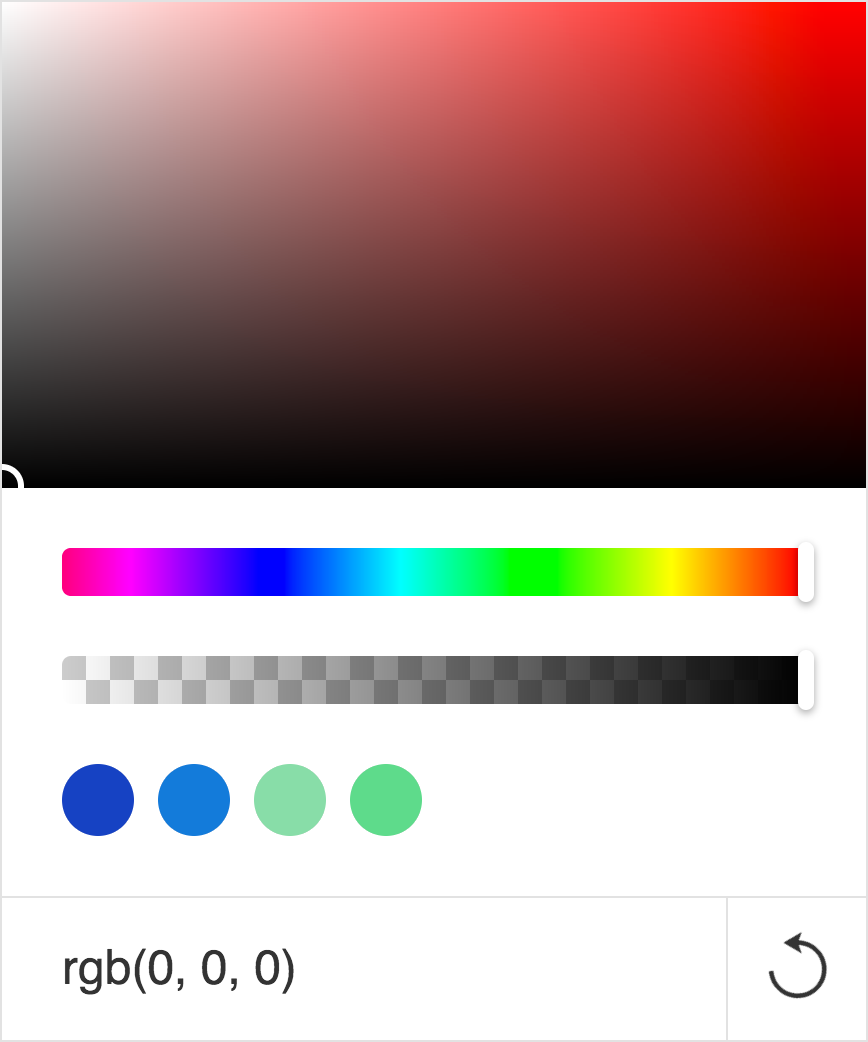
Let's start with the color manager. Upon opening it, you'll be greeted by a simple interface, which is used to define a palette of colors for your website. Pick as few or as many as you need, there's no limit!
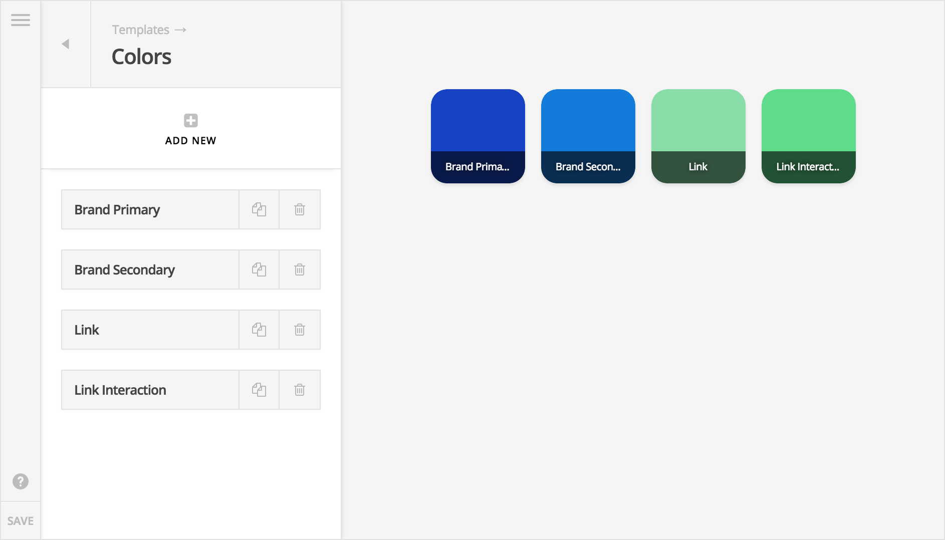
In this example we've defined four colors to be used throughout our site. Now let's imagine we're using another builder that requires the manual input of one color at a time all throughout your design. What if you want to try out a new color? What if you have 25 or more instances of a color on a page? You'd need to go back to each and every one of those assignments and update it one...at...a...time.
Not only is this quite tedious, but there's also no really good way to do a quick compare and contrast if you want to try out a new color. Sure, you could take a screenshot after updating all your colors, but you'd have to update all those colors manually to take each screenshot. Now you can simply pop open your color manager and make the necessary changes.
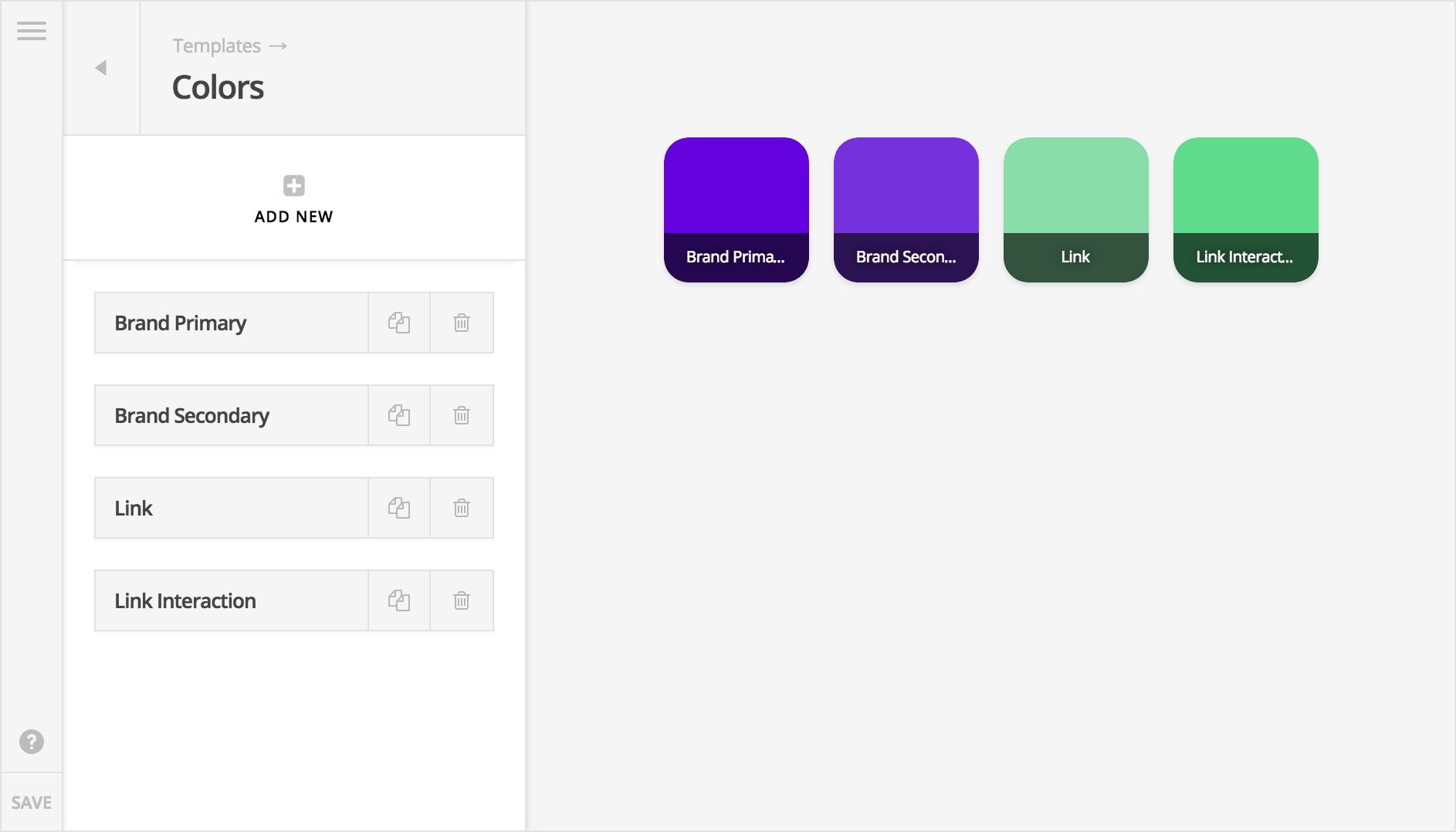
In the example above, all of your previous “brand” colors that were blue would immediately update all across your site everywhere they are assigned. All colors, borders, backgrounds, shadows, et cetera would have this change reflected immediately, allowing for instant feedback and a chance to truly experiment with your design! These colors are accessible via the color picker anywhere throughout the tool.
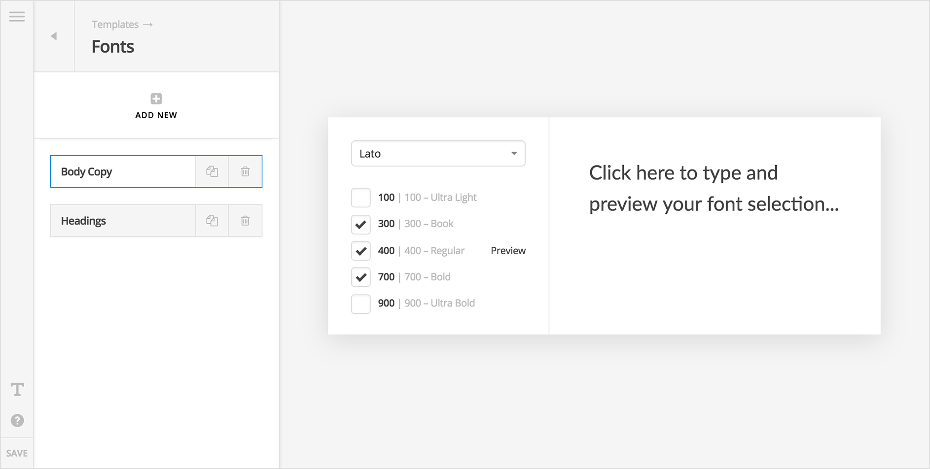
The font manager works in a very similar manner. Font families and their associated weights (which you specify) are assigned from a central place and and then recalled throughout the app as needed.
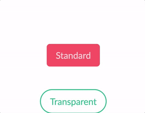
All of this ultimately builds towards the pièce de résistance: presets and templates. Every setting for an individual element (including bars and columns) can be recalled as a preset to be reused time and time again as needed. Imagine the power of being able to setup a library of presets of perfectly styled elements that can be utilized to put layouts together quickly and easily with no inconsistencies. Additionally, imagine using that library of presets to as a quick-start point for any new project that can get you up and running almost immediately, yet still be tweaked as necessary. Below is a quick example of multiple button styles we designed in an afternoon.
Similarly, templates allow you to save collections of elements, which can be recalled as needed. All of the example images at the beginning of this post are included starter templates, which can be assigned, and then adjusted as necessary. Just like presets, amassing a small library of ready to use templates that cover various use cases and layouts you utilize in projects all the time. Whenever you begin work on a new website, a simple click of a mouse could be all you need to be 90% complete.
New Theme Options Panel Pro, X
Once piece to the site building puzzle that we have always wished to improve upon has to do with global theme options. While it is certainly true that these are part of a wholy different process than page building, they are so interconnected that we found it quite frustrating to be constantly jumping out of one tool (the WordPress Customizer) and into another (our builders) as we worked on our websites. We are pleased to announce that theme options are now managed from within the same interface as our builders, greatly enhancing the site-building workflow!
For instance, let's say that you're working on a fancy header in our new builder. If you wanted to make a quick adjustment to a theme option, say the global base font-size for your website, all it takes is 2 clicks and a couple seconds to switch over. First, you'll go up to the global navigation of The Bar (more on that later) and click on the menu icon:
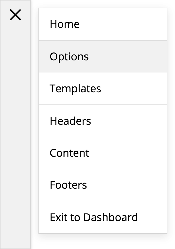
Then click on options and—voilà!—you're ready to go. The beauty of this is that everything is rendered in your browser using JavaScript, so no more server requests, page refreshes, or reloads. Everything happens right in the same window. Also, as you navigate around, pages that you have previously visited are cached, making revisiting them lightning fast.
Not only is the workflow moving between design workspaces much cleaner, but moving within each workspace has been greatly improved as well with a new search focused approach. For example, say you just need to make a quick adjustment to your buttons. Sure you can absolutely still click through each section if that's your preferred method of navigation; however, you could also do this:
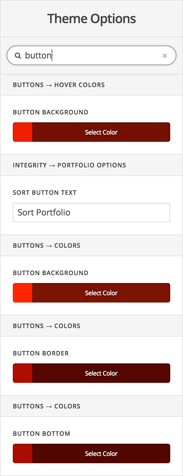
In addition to a more streamlined workflow all around, Pro's integrated theme options panel features real-time CSS updates in the live preview, will serve as the hub for our new v2 content elements as we begin on those, and will also be able to take advantage of features like our color and font managers (the Customizer will not be able to utilize any of these). We strongly encourage all users to begin utilizing the integrated theme options panel into in their workflows. The Customizer will remain as-is for the time being while we ease into this chapter, but our goal is to return it to “stock” eventually as we are simply unable to achieve our desired level of integration.
Little Details Make a Big Difference Pro, Cornerstone
We've spent quite a bit of time walking through the bigger details of this release, but it's oftentimes the smaller pieces—that final 5% or so—which really take a tool into a new playing field or round things out for the user experience. I'd like to take a moment to address some of those items here:
-
The Bar – This has been mentioned a few times thoughout the changelog already, but “The Bar” as it has come to be known around here is the global navigation piece that pulls all of Pro's various workspaces together. It is the little vertical element to the left of the screen at all times while working in the tool. In addition to navigation, it also features contextual controls at the bottom based on the screen you're on. For example, if you're in the “Fonts” manager, you'll find an additional button at the bottom where you can configure things like your Google Fonts options, Typekit integration, et cetera. Whereas venturing into a builder will reveal buttons for custom CSS and JavaScript, as well as actions related to previewing your design.
 Keyboard Shortcuts – Contextual quick actions for the power user! Quickly save, delete, or search among other actions with a few keystrokes. For those who enjoy the time-saving power of this approach, we're sure you'll greatly appreciate this addition to Pro.
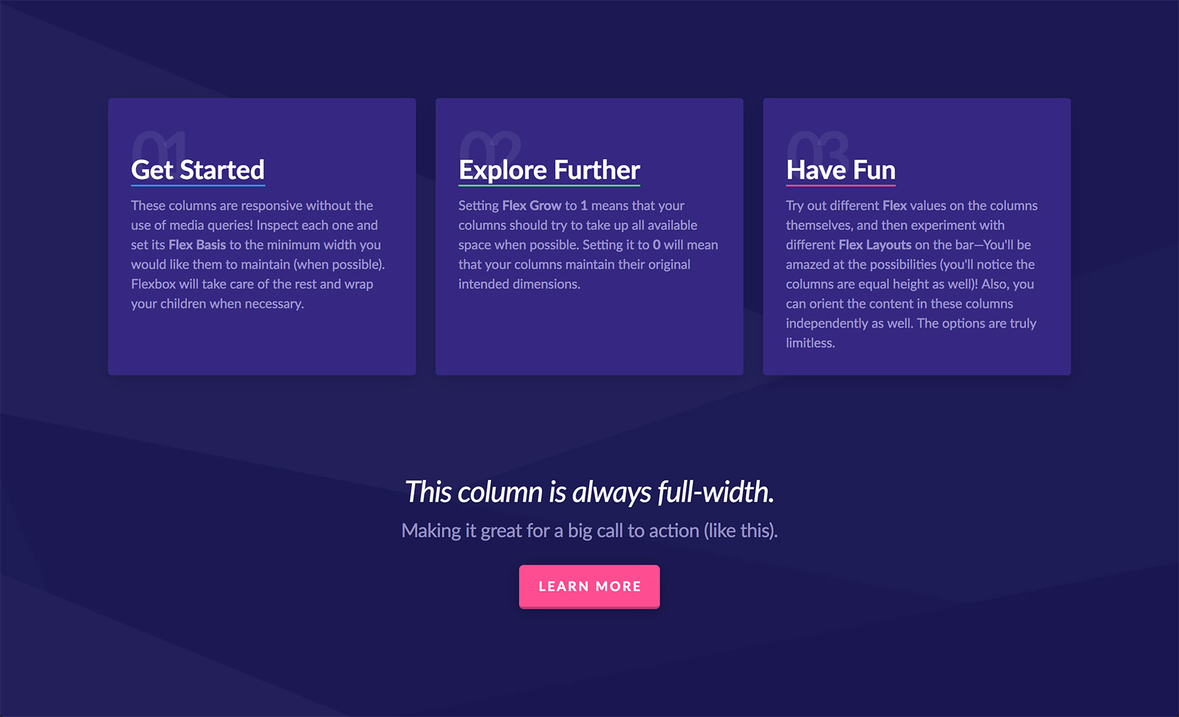
 Flexbox Power – If you're not a web developer (or just a total CSS nerd), you may not be familiar with this new kid on the block. Flexbox is a new layout model for web design that is revolutionizing the way we think about structing and styling content, and Pro's new builders feature it prominently. However, with all of it's power, flexbox can be a bit daunting to learn and work with, which is why we chose to not just throw it at you without first curating the usage of it. We've designed special controls that greatly simply approaching this powerful layout engine, complete with presets to achieve common layout needs, such as equal-width content (without specifying widths), vertical centering, equal-height columns, and so much more. Everything from your bars down to your navigation is based on flexbox in Pro.
- Responsive & Accessible Modals – It seems like it wouldn't be a difficult element to craft, but many modal designs often feature particular flaws that hinder their usability on desktop, mobile, or both. Pro's modals are built to work across all contexts, from the largest of desktops, to the smallest of mobile devices. Exiting the modal is always possible via the carefully laid out close button, content is vertically centered by default, and overflowed content is always able to be scrolled to—especially important on smaller screens.
- “Native” Off Canvas Content – One commonly used pattern for native mobile apps is the use of “off canvas” content areas. This typically features information that is important enough to need access in an instant, but doesn't always need to be front and center. Pro brings this feature to the desktop with flexible and powerful off canvas content areas that feature everything from navigation, shopping carts, and whatever else you want to throw at it. Customize colors, size and positioning all to your liking with each instance.
- Intelligent Dropdowns – Let's just face it guys: developing dropdowns always stinks. From markup considerations to the scripting that handles functionality, it always feels like every project needs a slightly different variation that warrants a whole new version. Well, out of our frustration we developed
Stem, a JavaScript library that aims to solve these issues once and for all. Responsiveness is all handled dynamically in the browser. Dropdowns will alter their direction and positioning when running out of room in the viewport (both vertically and horizontally) at all levels of the markup tree (hence “Stem”). This was imperative when giving our users the granular control that our header and footer builders offer. There is absolutely no way to predict how each and every user will setup their markup, so we needed something that could do the guess work for us. - Modularity at All Levels – This has been mentioned many times throughout the changelog already, but it can't be overstated enough. The level of modularity we've been working towards for the better part of the year has culminated in us crafting a curated group of “building blocks” that are so flexible they can be pieced together in many different combinations...many of which we discovered as these patterns started to emerge. Through this process we have removed a lot of CSS “cruft” and replaced it with a leaner base, developed a handful of small yet powerful JavaScript APIs, created 13 new “partials,” all which serve as building blocks for the 19 new elements you have access to...and we're just getting started.
New Extensions Pro, X
Furthermore, we have three new Extensions that we're releasing into the wild as well: Snippet, Email Forms, and Woo Checkout Editor. You can checkout those links to learn more about each Extension, as well as read through their entries here in the changelog.
Section Dividers Pro, Cornerstone
And finally, to cap it all off, we're pleased to announce the addition of section dividers to our content builder! In this release we have included four variations: Angle Up, Angle Down, Curve Up, and Curve Down.

Section dividers can be added to the top or bottom of any section and will automatically take on the assigned background-color for that section. In the image above, each divider was added to the top of its section. So the first divider you're seeing is the Angle Up design on the red section. The angle designs can also specify a point on a scale from 0 to 100, which determines where along the line from left to right the point should appear. This gives you the ability to create lots of different variations with just the angle designs alone. For instance, a value of 0 for the point on the red section above would result in this appearance:

This effect is very striking when used to overlap the background image of another section. Building on our current example, if we placed a background image on the first section and altered the color of the second to match, you might get something like the following:

I'm sure the various iterations of what is possible are starting to come to mind. You could utilize background video with an overlay, combine overlays to create unique shapes, use small sections with large dividers on both sides to transition your content in unique ways...there really is a lot to play around with for such a simple feature!
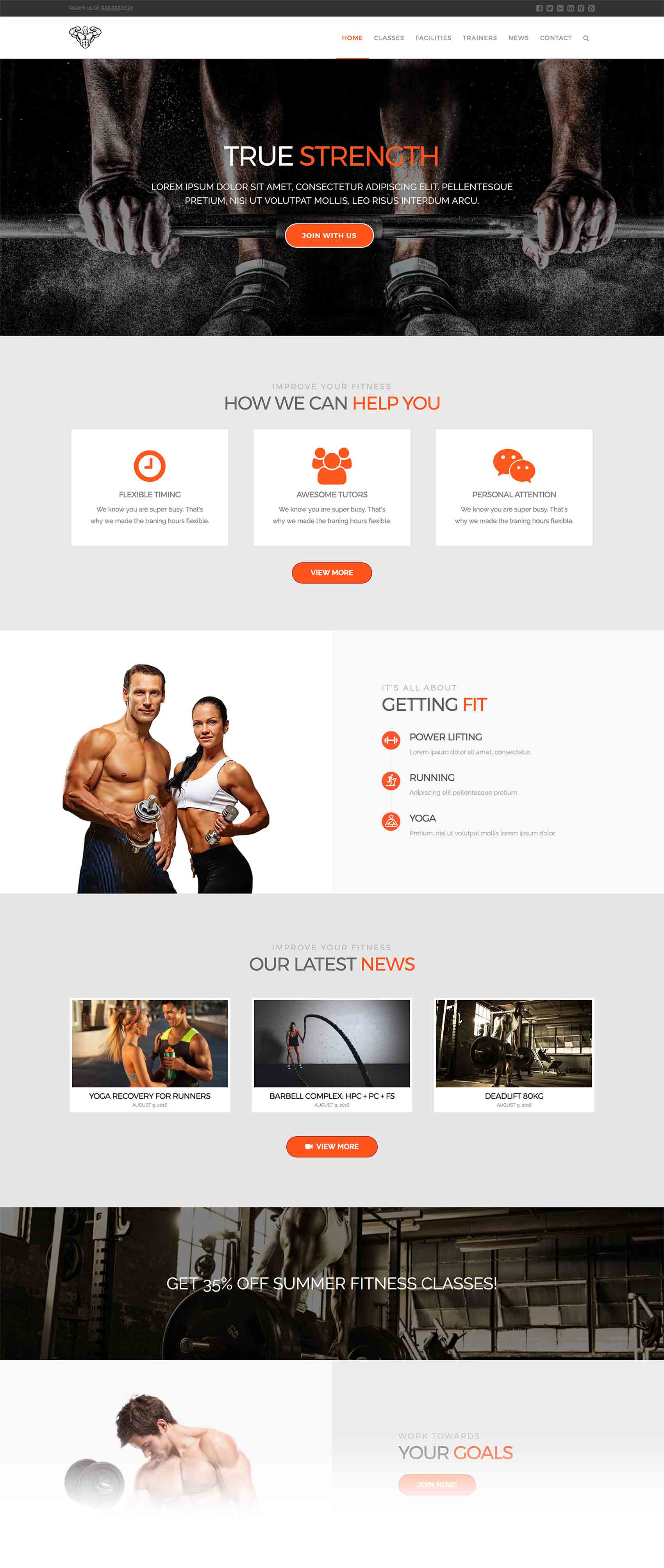
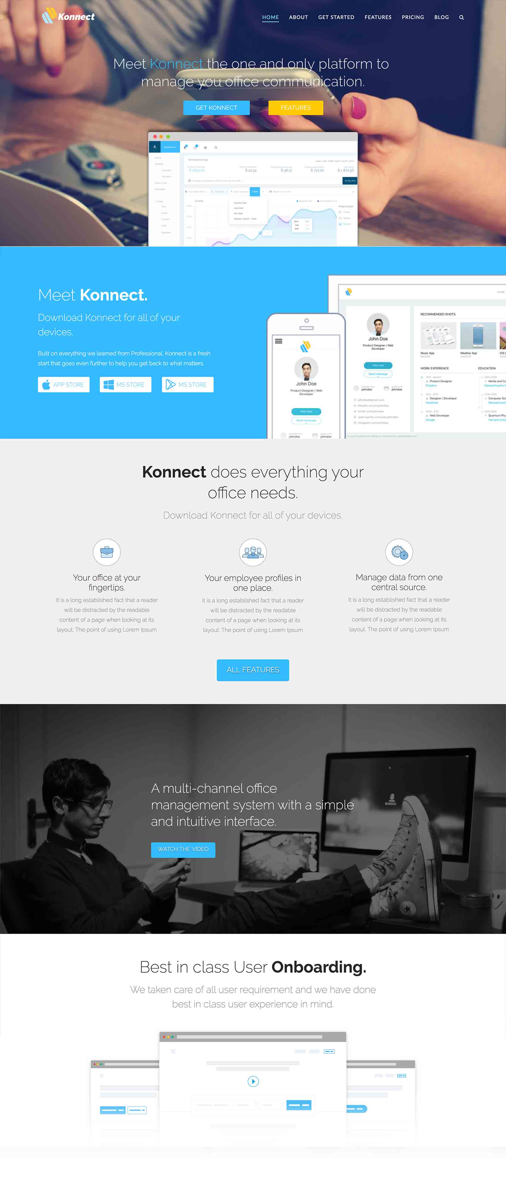
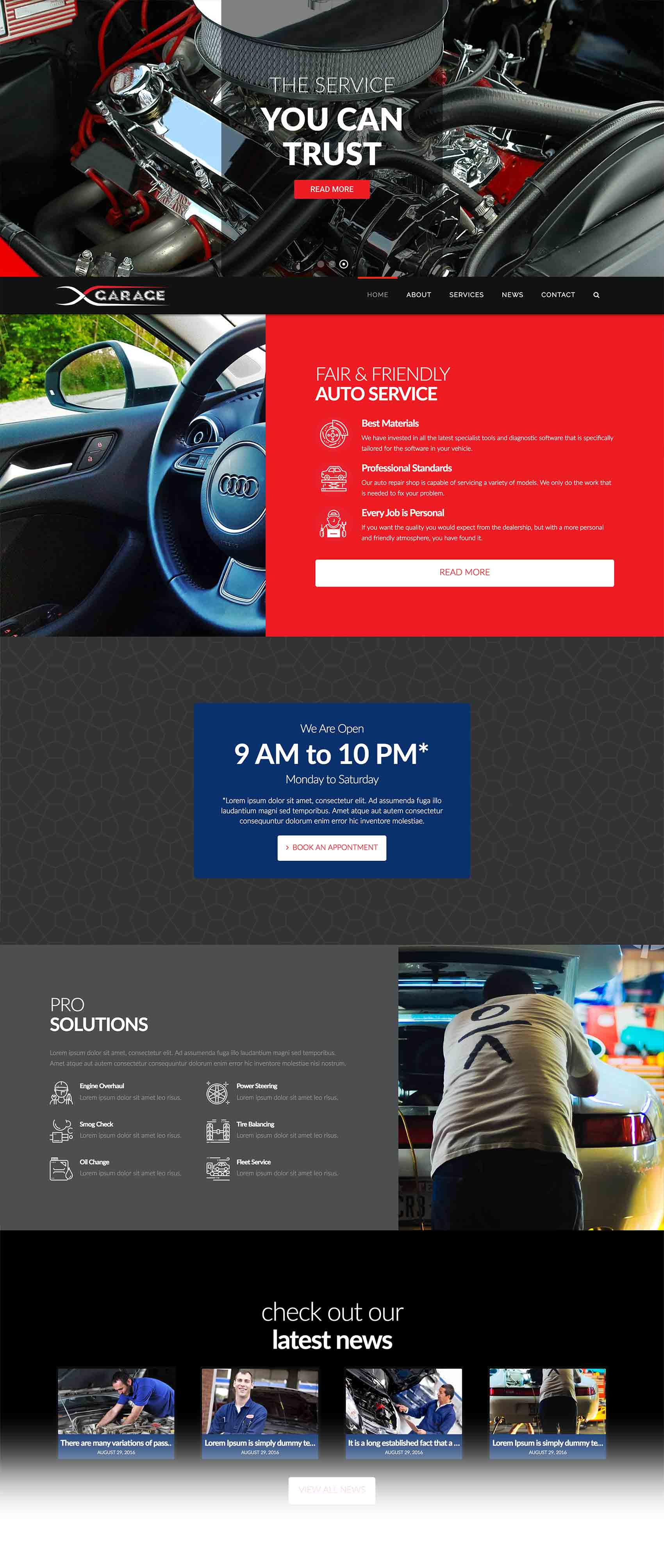
New Expanded Demos X
We've been hard at work to bring you a few new Expanded Demo releases with this version of X: Gym, App, and Auto. Each continues in the spirit of our previous Expanded Demos, providing users with fully realized ideas complete with graphics, layouts, and custom design all ready to go out of the box! Below are some screenshots of the first few sections of each demo's homepage.
Conclusion
After being immersed in a project as expansive as Pro for so long, it is hard for us as a team to even believe that this day has finally arrived. We are incredibly excited that it has finally come as it represents the closing of the biggest development challenge we've taken on as a company to date. There are still many new features we plan on working in over the coming months and years, but today is an important milestone. One that marks the ending of one chapter and the beginning of another. We cannot even begin to express how incredibly grateful we are to have you all along with us on this journey, as we could not have done it without you. We hope you enjoy Pro, and look forward to seeing what new creations you will make with it!
Changelog
- Pro 1.0.4 - April 22, 2017
- Updated: Add .x-root div to isolate styling conflicts when plugins add footer markup.
- Updated: Update theme option mappings to hide unusable controls when a global header or footer is assigned.
- Bugfix: Fix WooCommerce lightbox not loading.
- Bugfix: Fix child theme CSS being enqueued too early
- Bugfix: Fix collapse navigation top level items not opening sub menu when an href is present.
- Bugfix: Fix improper output of unicode characters in header/footer builder previews.
- Bugfix: Output Revolution Slider above and below masthead when Pro header is assigned.
- X 5.0.3 - April 22, 2017
- Updated: Add x-root div to isolate styling conflicts when plugins add footer markup
- Bugfix: Fix WooCommerce lightbox not loading.
- Bugfix: Fix child theme CSS being enqueued too early.
- Cornerstone 2.0.4 - April 22, 2017
- Updated: A few small changes for stability in the main application.
- Pro 1.0.3 - April 18, 2017
- Updated: WooCommerce compatibility.
- Updated: Build tools audit. Javascript now provided as single minified files with sourcemaps.
- Bugfix: Fix front end element javascript failing on IE11 and Edge.
- Bugfix: Fix section separators being output when not enabled.
- X 5.0.2 - April 18, 2017
- Updated: WooCommerce compatibility.
- Cornerstone 2.0.3 - April 14, 2017
- Updated: Build tools audit. Javascript now provided as single minified files with sourcemaps.
- Bugfix: Fix front end element javascript failing on IE11 and Edge.
- Bugfix: Fix section separators being output when not enabled.
- Pro 1.0.2 - April 14, 2017
- Bugfix: Fix minified javascript output causing syntax error.
- Cornerstone 2.0.2 - April 14, 2017
- Bugfix: Fix minified javascript output causing syntax error.
- Pro 1.0.1 - April 13, 2017
- Bugfix: Fix Pro not registering automatic updates.
- Bugfix: Fix custom CSS outputting before generated CSS for header.
- Bugfix: Fix landmark header not displaying when not using header builder.
- Bugfix: Fix javascript conflict preventing accordions and tabs from working.
- Bugfix: Fix lightboxes failing to initialize.
- X 5.0.1 - April 13, 2017
- Bugfix: Fix custom CSS outputting before generated CSS for header.
- Bugfix: Fix landmark header not displaying.
- Cornerstone 2.0.1 - April 13, 2017
- Bugfix: Fix javascript conflict preventing accordions and tabs from working.
- Bugfix: Fix lightboxes failing to initialize.
- Pro 1.0.0 - April 11, 2017
- Feature: Initial release.
- Feature: Header builder.
- Feature: Footer builder.
- Feature: Section dividers.
- Feature: Snippet Extension released.
- Feature: Email Forms Extension released.
- Feature: Woo Checkout Editor Extension released.
- Updated: Revamped theme options panel.
- X 5.0.0 - April 11, 2017
- Feature: Gym Expanded Demo released.
- Feature: App Expanded Demo released.
- Feature: Auto Expanded Demo released.
- Feature: Section dividers.
- Feature: Snippet Extension released.
- Feature: Email Forms Extension released.
- Feature: Woo Checkout Editor Extension released.
- Cornerstone 2.0.0 - April 11, 2017
- Feature: Cornerstone is now an Ember.js App!
- Feature: Interface to search and preview pages before editing.
- Feature: New Options Manager.
- Feature: Section separators.
- Feature: New systems to support future elements and new features in X.
- Updated: Update AJAX handling to not mix POST & GET parameters.
- Updated: Update Font Awesome to 4.7.
- Updated: Address jQuery deprecations.
- Updated: Refactor front end javascript.
- Bugfix: Fix a race condition preventing the preview from loading intermittently.